spurious scholar
Step 1: Gather a bunch of data. There are 25,156 variables in my database. The data ranges from the mundane (air pollution in Chicago) to the weird (Hotdogs consumed by Nathan's Hot Dog Eating Competition Champion) to the super-niche (How clickbait-y Numberphile YouTube video titles are, as rated by an AI).
Step 2: Dredge that data to find random correlations between variables. "Dredging data" means taking one variable and correlating it against every other variable just to see what sticks. It's a dangerous way to go about analysis, because any sufficiently large dataset will yield strong correlations completely at random.
Fun fact: the chart used on the wikipedia page to demonstrate data dredging is also from me. I've been being naughty with data since 2014.
Step 3: Calculate the correlation coefficient, confidence interval, and p-value to see if the connection is statistically significant. "Statistically significant" is a misleading term. It sounds like it means "statistically significant" because, you know, those are the same two words. Unfortunately statistical significance is a technical term that means mumble mumble at least as extreme mumble mumble null hypothesis mumble mumble probability mumble mumble p-values.
You know what? Forget the technical definition. "Statistically significant" just means "someone did some fancy math."
I really did the fancy math below and you can check it by clicking on the "view detailed data" link under each paper. And these really do qualify as "statistically significant" in the technical sense. It's just that "statistically significant" does not mean the results are "significant."
Step 4: If it is, have a large language model draft a research paper.
Step 5: Remind everyone that these papers are AI-generated and are not real. Seriously, just pick one and read the lit review section. The silliness of the papers is an artifact of me (1) having fun and (2) acknowledging that realistic-looking AI-generated noise is a real concern for academic research (peer reviews in particular).
The papers could sound more realistic than they do, but I intentionally prompted the model to write papers that look real but sound silly.
Also: every page says "This paper is AI-generated" at the bottom and the first letters of the names of the authors always spell out C-H-A-T-G-P-T.
Step 6: ...publish:
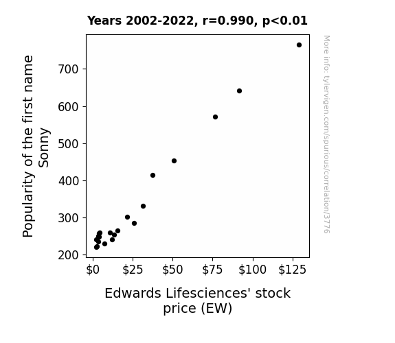

The Journal of Pseudoscientific Economics
r=0.990 · 95% conf. int. [0.975,0.996] · r2=0.980 · p < 0.01
Generated Jan 2024 · View data details
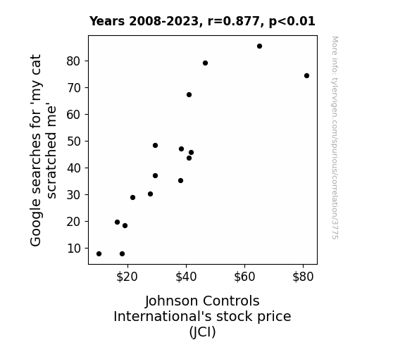
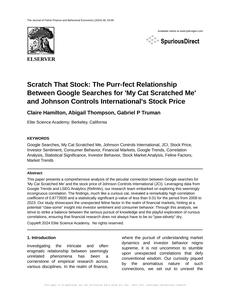
The Journal of Feline Finance and Behavioral Economics
r=0.877 · 95% conf. int. [0.675,0.957] · r2=0.770 · p < 0.01
Generated Jan 2024 · View data details
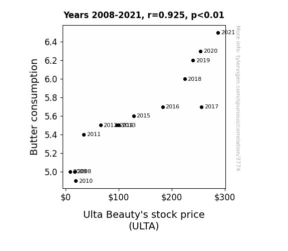
The Journal of Dairy Economics and Consumer Behavior
r=0.925 · 95% conf. int. [0.774,0.976] · r2=0.855 · p < 0.01
Generated Jan 2024 · View data details
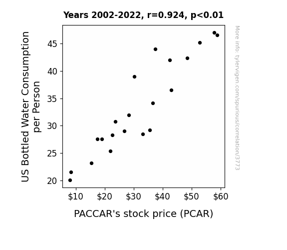
Journal of Hydration Studies
r=0.924 · 95% conf. int. [0.819,0.969] · r2=0.854 · p < 0.01
Generated Jan 2024 · View data details
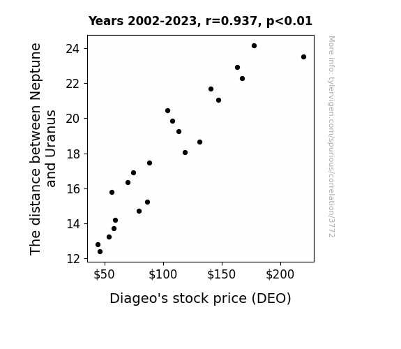

The Astronomical Alcoholic Review
r=0.937 · 95% conf. int. [0.853,0.974] · r2=0.879 · p < 0.01
Generated Jan 2024 · View data details
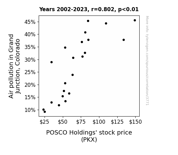

Journal of Environmental Economics and Financial Markets
r=0.802 · 95% conf. int. [0.575,0.915] · r2=0.644 · p < 0.01
Generated Jan 2024 · View data details
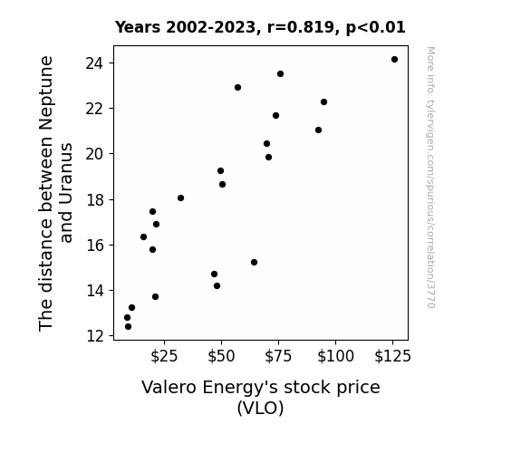
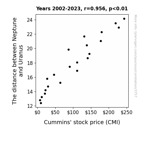
The Journal of Astronomical Economics
r=0.819 · 95% conf. int. [0.608,0.922] · r2=0.671 · p < 0.01
Generated Jan 2024 · View data details
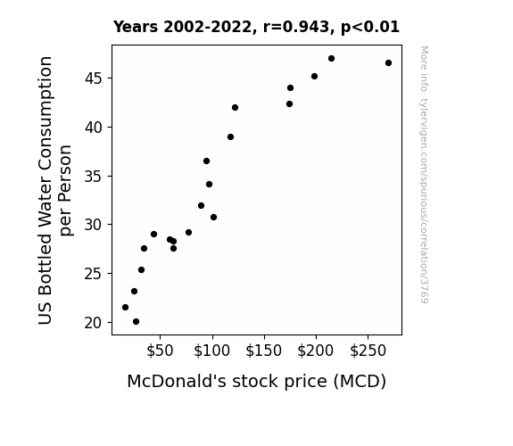
The Journal of Fast Food Finance
r=0.943 · 95% conf. int. [0.861,0.977] · r2=0.889 · p < 0.01
Generated Jan 2024 · View data details
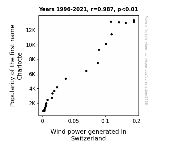

Journal of Windy Science
r=0.987 · 95% conf. int. [0.970,0.994] · r2=0.974 · p < 0.01
Generated Jan 2024 · View data details
Journal of Quirky Interdisciplinary Studies
r=0.915 · 95% conf. int. [0.748,0.973] · r2=0.838 · p < 0.01
Generated Jan 2024 · View data details
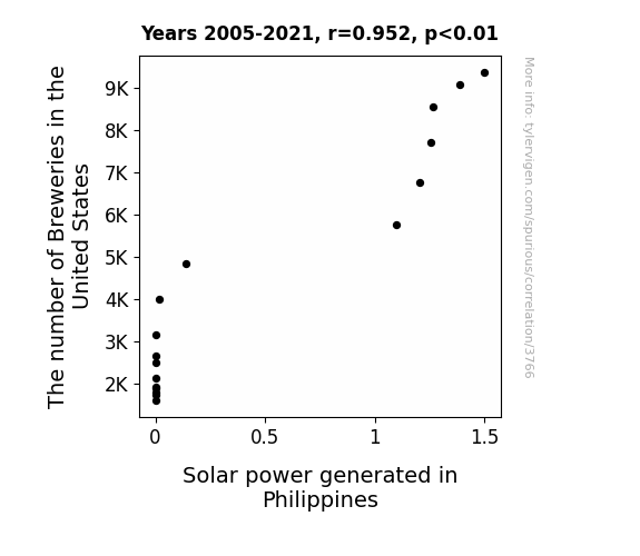
The Journal of Culinary Chemobiology
r=0.952 · 95% conf. int. [0.869,0.983] · r2=0.907 · p < 0.01
Generated Jan 2024 · View data details

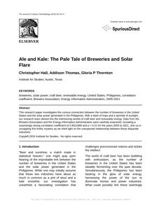
The International Journal of Solar Beverage Studies
r=0.919 · 95% conf. int. [0.745,0.976] · r2=0.844 · p < 0.01
Generated Jan 2024 · View data details
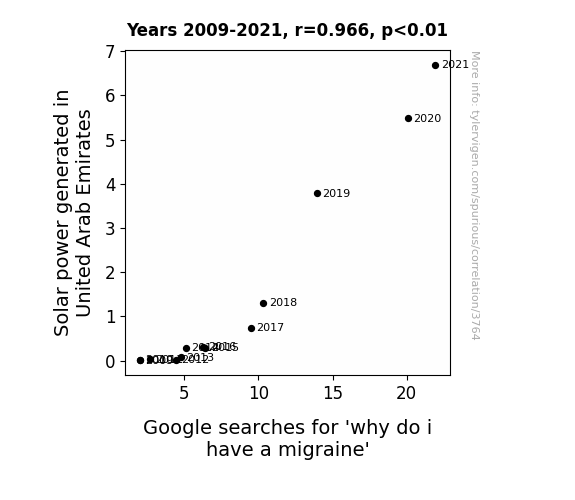

Journal of Solar Psychology
r=0.966 · 95% conf. int. [0.888,0.990] · r2=0.933 · p < 0.01
Generated Jan 2024 · View data details
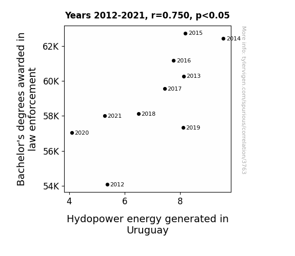

The Journal of Interdisciplinary Law and Sustainable Energy
r=0.750 · 95% conf. int. [0.228,0.937] · r2=0.562 · p < 0.05
Generated Jan 2024 · View data details
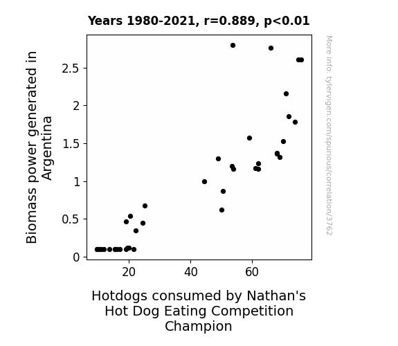
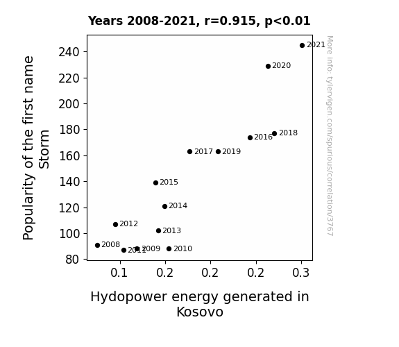
The Journal of Ecological Energy Dynamics
r=0.889 · 95% conf. int. [0.802,0.939] · r2=0.790 · p < 0.01
Generated Jan 2024 · View data details
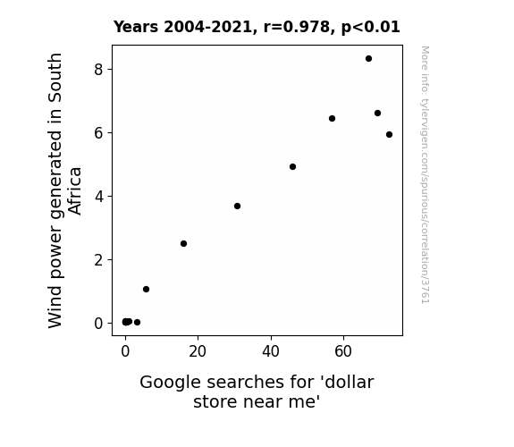

The Journal of Eclectic Energy Ecology
r=0.978 · 95% conf. int. [0.942,0.992] · r2=0.957 · p < 0.01
Generated Jan 2024 · View data details
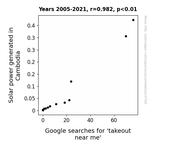

The International Journal of Solar Studies
r=0.982 · 95% conf. int. [0.950,0.994] · r2=0.965 · p < 0.01
Generated Jan 2024 · View data details
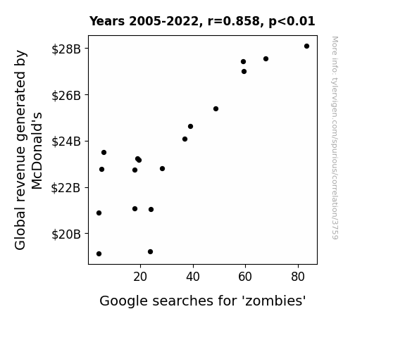

International Journal of Culinary Economics and Trends
r=0.858 · 95% conf. int. [0.652,0.946] · r2=0.735 · p < 0.01
Generated Jan 2024 · View data details

The Journal of Quirky Correlations
r=0.938 · 95% conf. int. [0.851,0.975] · r2=0.880 · p < 0.01
Generated Jan 2024 · View data details

The International Journal of Astro-Economic Studies
r=0.956 · 95% conf. int. [0.895,0.982] · r2=0.913 · p < 0.01
Generated Jan 2024 · View data details
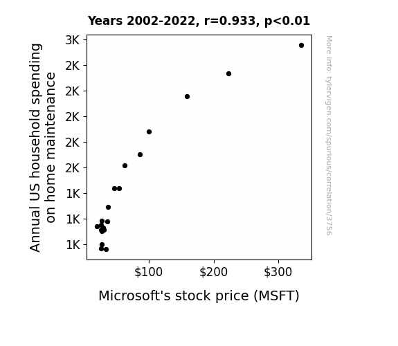

The Journal of Quirky Economic Research
r=0.933 · 95% conf. int. [0.838,0.973] · r2=0.870 · p < 0.01
Generated Jan 2024 · View data details
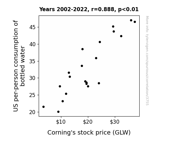
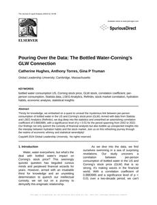
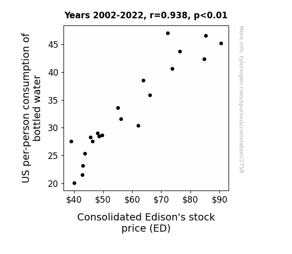
The Journal of Liquid Analysis
r=0.888 · 95% conf. int. [0.741,0.954] · r2=0.789 · p < 0.01
Generated Jan 2024 · View data details

The Journal of Eclectic Energy Studies
r=0.956 · 95% conf. int. [0.919,0.976] · r2=0.914 · p < 0.01
Generated Jan 2024 · View data details
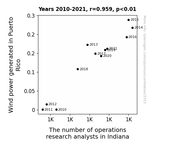

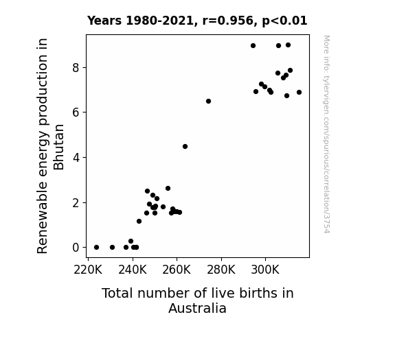
The Journal of Renewable Energy Integration and Regional Economic Analysis
r=0.959 · 95% conf. int. [0.857,0.989] · r2=0.920 · p < 0.01
Generated Jan 2024 · View data details

The Journal of Comparative Ophthalmological and Political Studies
r=0.921 · 95% conf. int. [0.844,0.961] · r2=0.849 · p < 0.01
Generated Jan 2024 · View data details
Currently viewing 25 of 4,731 spurious research papers
Page
1 2 3 4 5 6 7 8 9 10 11 12 13 14 15 16 17 18 19 20 21 22 23 24 25 26 27 28 29 30 31 32 33 34 35 36 37 38 39 40 41 42 43 44 45 46 47 48 49 50 51 52 53 54 55 56 57 58 59 60 61 62 63 64 65 66 67 68 69 70 71 72 73 74 75 76 77 78 79 80 81 82 83 84 85 86 87 88 89 90 91 92 93 94 95 96 97 98 99 100 101 102 103 104 105 106 107 108 109 110 111 112 113 114 115 116 117 118 119 120 121 122 123 124 125 126 127 128 129 130 131 132 133 134 135 136 137 138 139 140 141 142 143 144 145 146 147 148 149 150 151 152 153 154 155 156 157 158 159 160 161 162 163 164 165 166 167 168 169 170 171 172 173 174 175 176 177 178 179 180 181 182 183 184 185 186 187 188 189 190
Why this works
- Data dredging: I have 25,156 variables in my database. I compare all these variables against each other to find ones that randomly match up. That's 632,824,336 correlation calculations! This is called “data dredging.”
Fun fact: the chart used on the wikipedia page to demonstrate data dredging is also from me. I've been being naughty with data since 2014.
Instead of starting with a hypothesis and testing it, I isntead tossed a bunch of data in a blender to see what correlations would shake out. It’s a dangerous way to go about analysis, because any sufficiently large dataset will yield strong correlations completely at random. - Lack of causal connection: There is probably no direct connection between these variables, despite what the AI says above.
Because these pages are automatically generated, it's possible that the two variables you are viewing are in fact causually related. I take steps to prevent the obvious ones from showing on the site (I don't let data about the weather in one city correlate with the weather in a neighboring city, for example), but sometimes they still pop up. If they are related, cool! You found a loophole.
This is exacerbated by the fact that I used "Years" as the base variable. Lots of things happen in a year that are not related to each other! Most studies would use something like "one person" in stead of "one year" to be the "thing" studied. - Observations not independent: For many variables, sequential years are not independent of each other. You will often see trend-lines form. If a population of people is continuously doing something every day, there is no reason to think they would suddenly change how they are doing that thing on January 1. A naive p-value calculation does not take this into account.
You will calculate a lower chance of "randomly" achieving the result than represents reality.
To be more specific: p-value tests are probability values, where you are calculating the probability of achieving a result at least as extreme as you found completely by chance. When calculating a p-value, you need to assert how many "degrees of freedom" your variable has. I count each year (minus one) as a "degree of freedom," but this is misleading for continuous variables.
This kind of thing can creep up on you pretty easily when using p-values, which is why it's best to take it as "one of many" inputs that help you assess the results of your analysis.
- Outliers: Some datasets here have outliers which drag up the correlation.
In concept, "outlier" just means "way different than the rest of your dataset." When calculating a correlation like this, they are particularly impactful because a single outlier can substantially increase your correlation.
Because this page is automatically generated, I don't know whether any of the charts displayed on it have outliers. I'm just a footnote. ¯\_(ツ)_/¯
I intentionally mishandeled outliers, which makes the correlation look extra strong.
Spurious Scholar was launched January 27, 2024. If you have feedback on it, I'd love to hear from you! Shoot me a note: feedback@tylervigen.com.


