spurious correlations
discover · random · spurious scholar
← previous page · next page →


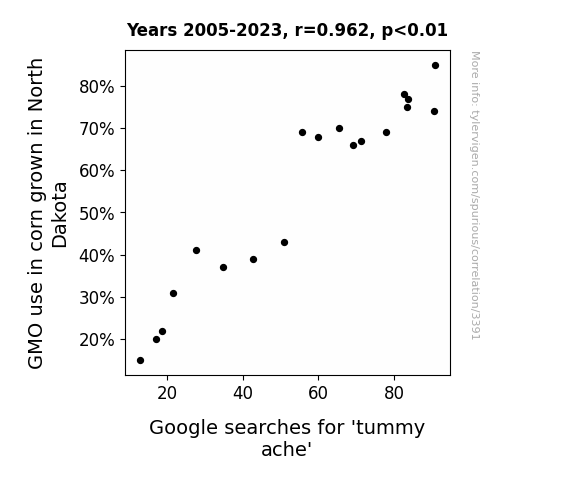
View details about correlation #3,391
Gastric Grit: Genetically Modified Corn in North Dakota and the Googling of 'Tummy Ache'
The corn started expressing FOMO genes, making it emotionally sensitive and causing distress to anyone who consumed it.

What else correlates?
GMO use in corn grown in North Dakota · all food
Google searches for 'tummy ache' · all google searches
GMO use in corn grown in North Dakota · all food
Google searches for 'tummy ache' · all google searches


View details about correlation #1,700
Hydropower Hijinks: The Surprising Swashbuckling Link Between South African Hydropower and Global Pirate Attacks
As hydropower in South Africa increased, it led to more ship traffic in the surrounding waters which inadvertently created ideal conditions for pirate attacks. The calm, electrically charged waters provided the perfect environment for pirates to conduct their dastardly deeds. As the ships powered through the newly energized seas, they unknowingly attracted swashbuckling bandits with their magnetic presence. It was a shocking turn of events as the once peaceful waters became a hotbed for seafaring scallywags. The electrifying connection between hydropower in South Africa and pirate attacks on a global scale left many stunned, but it's clear that these power-hungry pirates were just riding the current of opportunity.


What else correlates?
Hydopower energy generated in South Africa · all energy
Pirate attacks globally · all weird & wacky
Hydopower energy generated in South Africa · all energy
Pirate attacks globally · all weird & wacky


View details about correlation #2,897
A Breath of Fresh Air: The Lungevity of Home Runs in Riverside, California
The particles in the air were actually supercharged with home run energy, giving Matt Kemp's hits an extra oomph as they sailed through the smoggy skies.


What else correlates?
Air pollution in Riverside, California · all weather
Number of home runs hit by Matt Kemp · all sports
Air pollution in Riverside, California · all weather
Number of home runs hit by Matt Kemp · all sports
. The chart goes from 2002 to 2022, and the two variables track closely in value over that time.")

View details about correlation #1,724
Wesley's Wonder: A Wacky Wander into the Wobbly World of Dollar Tree's Delicate Dynamics
As the popularity of the name Wesley rose, so did the demand for Wes Anderson films. This led to an uptick in quirky, indie movie preferences, prompting more people to seek out unique and offbeat items at Dollar Tree. The increased traffic and sales at the stores then bolstered investor confidence, ultimately boosting Dollar Tree's stock price. It's a Wes-tern economic phenomenon!


What else correlates?
Popularity of the first name Wesley · all first names
Dollar Tree's stock price (DLTR) · all stocks
Popularity of the first name Wesley · all first names
Dollar Tree's stock price (DLTR) · all stocks


View details about correlation #1,502
Cotton GMO Grow, Desktop Background Glow: A Rhyme-y Study of Google Trends and Agricultural Prose
As GMO use in cotton decreased, the size of cotton plants also decreased. This led to a shortage of raw material for making oversized, novelty desktop backgrounds. Consequently, people lost interest in searching for desktop backgrounds, especially the ones featuring larger-than-life cotton fields.


What else correlates?
GMO use in cotton · all food
Google searches for 'desktop background' · all google searches
GMO use in cotton · all food
Google searches for 'desktop background' · all google searches


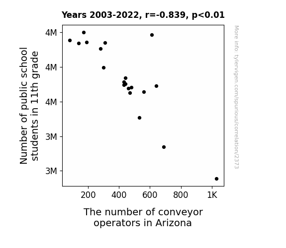
View details about correlation #2,373
Conveyor Operators Can't Handle the 11th Grade: Exploring the Relationship Between Public School Students and Employment in Arizona
As the 11th grade class grew, so did their reputation for effortlessly forming human conga lines in the cafeteria. This led to a statewide shortage of conveyor operators, as students showcased their untapped talent for smoothly transporting goods by shimmying and sashaying their way through the lunch line. Faced with this unexpected career competition, many conveyor operators decided to pursue different professions, like becoming professional dance instructors or starting their own conga line rental businesses. As a result, Arizona saw a decrease in the number of conveyor operators, all thanks to the rhythmic rise of 11th graders.


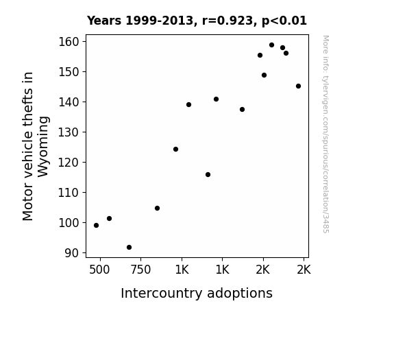
View details about correlation #3,485
Driven to Adopt: Unveiling the Car-zy Connection Between Motor Vehicle Thefts in Wyoming and Intercountry Adoptions
The sudden disappearance of car thieves left the international adoption agencies without their go-to experts in covert transportation logistics.

What else correlates?
Motor vehicle thefts in Wyoming · all random state specific
Intercountry adoptions · all weird & wacky
Motor vehicle thefts in Wyoming · all random state specific
Intercountry adoptions · all weird & wacky
. The chart goes from 2009 to 2021, and the two variables track closely in value over that time.")

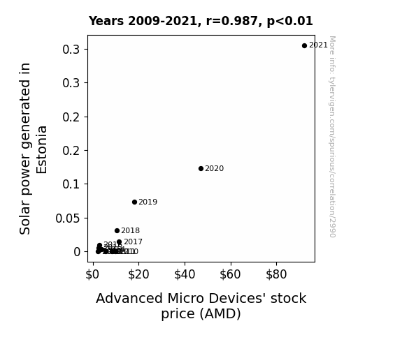
View details about correlation #2,990
Sunshine Stocks: Shedding Light on the Correlation between Estonian Solar Power and AMD's Stock Price
The increased solar power in Estonia provided a renewable energy boost which somehow translated to an increase in productivity at AMD. As sunlight poured down on the tiny Baltic nation, it inadvertently supercharged the semiconductor production process at AMD, leading to higher efficiency and lower costs. This unexpected connection illuminated the stock market as investors realized that Estonia's solar surge was shining a favorable light on AMD's future prospects. This sunny side up scenario left everyone watt-ering for more, as the stock price beamed with unfor-Sol-arable growth.

What else correlates?
Solar power generated in Estonia · all energy
Advanced Micro Devices' stock price (AMD) · all stocks
Solar power generated in Estonia · all energy
Advanced Micro Devices' stock price (AMD) · all stocks


View details about correlation #2,173
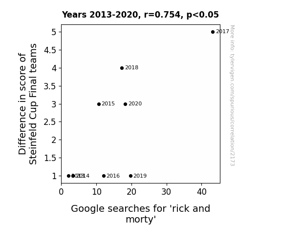
Game of Searchers: Exploring the Interplay Between Steinfeld Cup Final Scores and Google Searches for 'Rick and Morty'
As the excitement and tension levels rose during the Steinfeld Cup Final, viewers found themselves craving something to balance out the intensity. The absurd escapades of Rick and Morty provided the perfect contrast, offering a much-needed dose of levity and bizarre humor. As the difference in score widened, so did the need for a mental palate cleanser, leading to a surge in searches for the animated duo. It seems that even in the world of sports, the multiverse of entertainment has a way of interdimensional cable-ing itself into the fan experience!

What else correlates?
Difference in score of Steinfeld Cup Final teams · all sports
Google searches for 'rick and morty' · all google searches
Difference in score of Steinfeld Cup Final teams · all sports
Google searches for 'rick and morty' · all google searches


View details about correlation #2,705
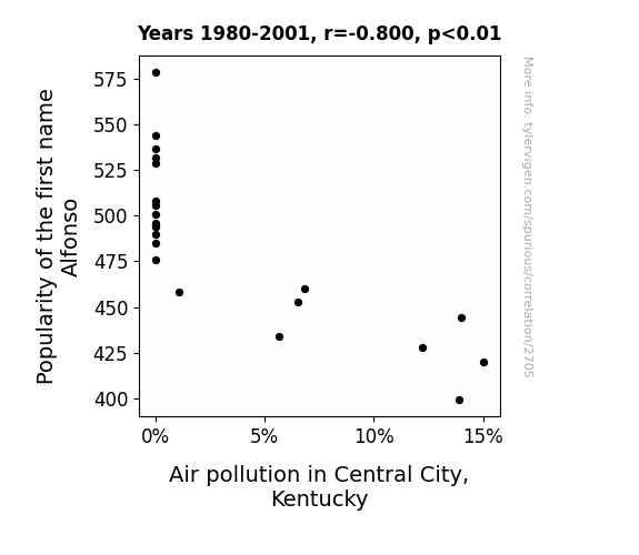
The Peculiar Paradigm: The Perplexing Link Between the Popularity of the First Name Alfonso and Air Pollution in Central City, Kentucky
As the number of Alfonso's grew, so did the demand for fresh air, leading to a campaign for cleaner skies. It seems like they were all about being Al-fresh and Al-clean, sparking a breath of fresh heir!

What else correlates?
Popularity of the first name Alfonso · all first names
Air pollution in Central City, Kentucky · all weather
Popularity of the first name Alfonso · all first names
Air pollution in Central City, Kentucky · all weather


View details about correlation #1,784
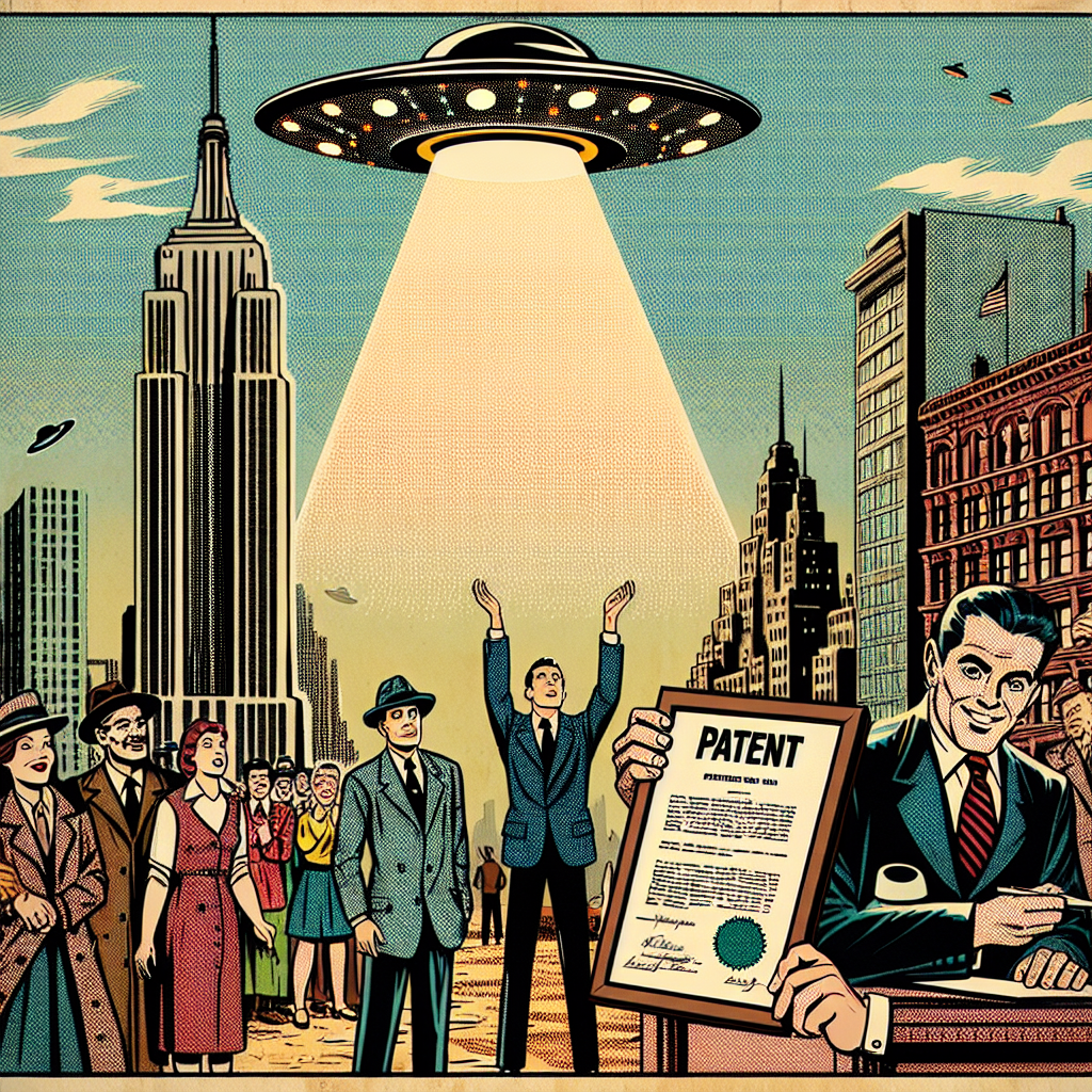
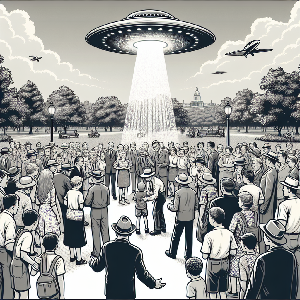
Unidentified Flying Patents: A Close Encounter of the Nth Kind
The UFOs were actually elaborate prototypes for futuristic technology, inspiring and inadvertently leading to the creation of new inventions by innovative individuals. It seems the aliens' intellectual property laws are out of this world!

What else correlates?
UFO sightings in New York · all random state specific
Patents granted in the US · all weird & wacky
UFO sightings in New York · all random state specific
Patents granted in the US · all weird & wacky
. The chart goes from 2002 to 2023, and the two variables track closely in value over that time.")

View details about correlation #2,149
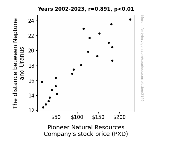
Stellar Stocks: Exploring the Celestial Connection Between Neptune and Uranus and Pioneer Natural Resources Company's Stock Price (PXD)
As the space between these celestial bodies expanded, it created a gravitational rift, pulling in positive energy waves. These waves, also known as 'stock market surges,' directly influenced the performance of Pioneer Natural Resources Company. It seems like even in the vast expanse of outer space, there's a mutual gravitational attraction between stellar distances and stock prices. It's a quantifiably cosmic connection!

What else correlates?
The distance between Neptune and Uranus · all planets
Pioneer Natural Resources Company's stock price (PXD) · all stocks
The distance between Neptune and Uranus · all planets
Pioneer Natural Resources Company's stock price (PXD) · all stocks


View details about correlation #2,177
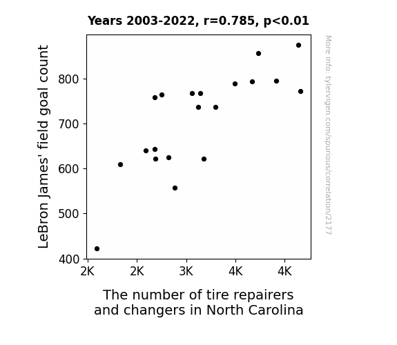
Shooting for Change: The Correlation Between LeBron James' Field Goals and the Tire Repair and Changer Workforce in North Carolina
LeBron's success meant more "air" time for his opponents' tires, leading to increased wear and tear, and ultimately creating more demand for tire repair and changing services in North Carolina. It's a slam dunk correlation! So, the more LeBron scored, the more rubber met the road for the tire professionals in North Carolina.

What else correlates?
LeBron James' field goal count · all sports
The number of tire repairers and changers in North Carolina · all cccupations
LeBron James' field goal count · all sports
The number of tire repairers and changers in North Carolina · all cccupations


View details about correlation #1,651
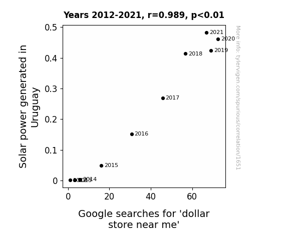
Shining a Light on Solar Power and Dollar Store Fervor: A Sunny Connection
As solar power in Uruguay shines brighter, it's sending a powerful current of energy around the globe. This surge in electricity is actually sparking a 'dollar store near me' search frenzy. It's like the sun is saying, "I'm gonna make you shine on a budget!"

What else correlates?
Solar power generated in Uruguay · all energy
Google searches for 'dollar store near me' · all google searches
Solar power generated in Uruguay · all energy
Google searches for 'dollar store near me' · all google searches


View details about correlation #1,121
The Ailments of Air: A Correlation Between Poor Air Quality in Dallas and Physical Album Shipment Volume in the United States
As the air over Dallas cleared up, it created a domino effect on a global scale. You see, the reduction in air pollution led to a surge in productivity in the local area. This, in turn, caused a spike in the production of bubble wrap. Now, bubble wrap happens to be a crucial component in the packaging of physical albums. With the increased productivity and availability of bubble wrap in Dallas, there was a nationwide shortage of bubble wrap for other industries, including the physical album shipment sector. As a result, the physical album shipment volume in the United States saw a significant decrease. Who knew that the secret to addressing the music industry's challenges lay in the air over Dallas?


What else correlates?
Air pollution in Dallas · all weather
Physical album shipment volume in the United States · all weird & wacky
Air pollution in Dallas · all weather
Physical album shipment volume in the United States · all weird & wacky
. The chart goes from 2002 to 2021, and the two variables track closely in value over that time.")

View details about correlation #2,272
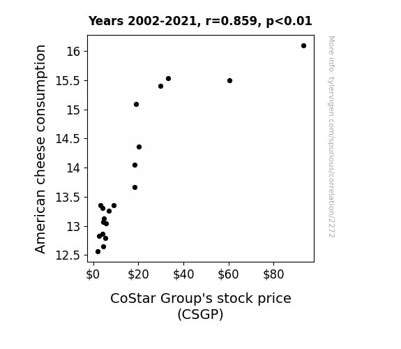
Say Cheese: A Gouda Correlation Between American Cheese Consumption and CoStar Group's Stock Performance
As American cheese consumption melted upward, so did CoStar Group's stock price. It seems the market just couldn't resist the gouda news!

What else correlates?
American cheese consumption · all food
CoStar Group's stock price (CSGP) · all stocks
American cheese consumption · all food
CoStar Group's stock price (CSGP) · all stocks


View details about correlation #2,322
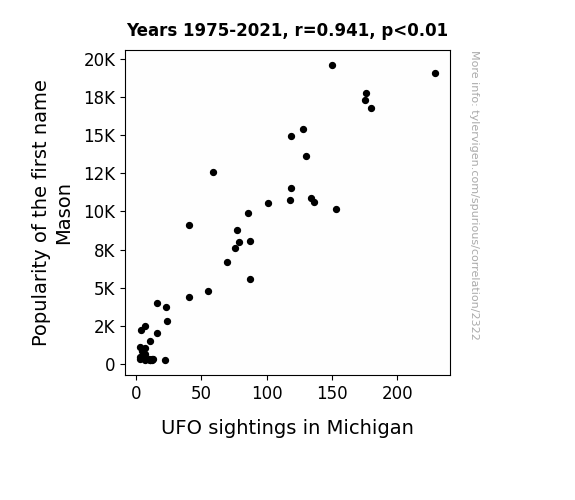
Masonry in the Sky: The Interstellar Influence on Mason Name Popularity and UFO Sightings in Michigan
As more parents named their kids Mason, it inadvertently created a human frequency that resonated with the UFOs, drawing them to Michigan like cosmic magnets. It seems the real 'Masons' in Michigan were actually the little kids all along, building connections with intergalactic beings!
What else correlates?
Popularity of the first name Mason · all first names
UFO sightings in Michigan · all random state specific
Popularity of the first name Mason · all first names
UFO sightings in Michigan · all random state specific


View details about correlation #1,259
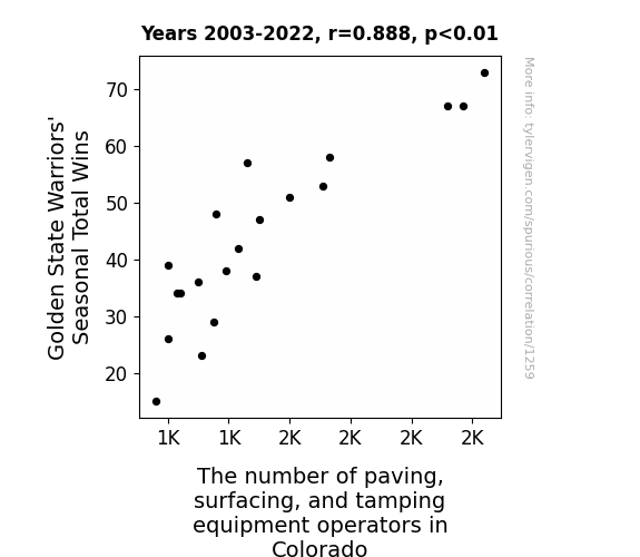
Slam Dunk or Just a Coincidental Bounce? The Correlation between Golden State Warriors' Seasonal Total Wins and Paving, Surfacing, and Tamping Equipment Operators in Colorado
The Warriors' wins inspired a wave of new basketball courts to be constructed across the state, leading to an increased demand for paving and surfacing services to keep up with the sudden hoop dreams. As the saying goes, success starts from the ground up, and the Warriors were clearly laying the foundation for a whole lot of pavement action in Colorado. Remember, when the Warriors bring the heat on the court, it paves the way for a whole different kind of court action off the court!


View details about correlation #2,112
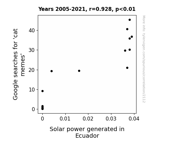
The Feline Meme Supreme: A Gleaming Theme in the Ecuadorian Solar Beam
The increased production of cat memes led to more people laughing, which in turn created a higher positive energy output, spurring solar power generation in Ecuador. Remember, when it comes to renewable energy, every meow counts!

What else correlates?
Google searches for 'cat memes' · all google searches
Solar power generated in Ecuador · all energy
Google searches for 'cat memes' · all google searches
Solar power generated in Ecuador · all energy


View details about correlation #2,834
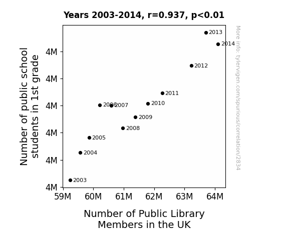
The Great Debate: 1st Grade Fate and Library Member Weight
As the 1st graders learned to read, they began borrowing more books from the public libraries. This increased demand for library cards, leading to a surge in public library memberships across the UK.

Why this works
- Data dredging: I have 25,237 variables in my database. I compare all these variables against each other to find ones that randomly match up. That's 636,906,169 correlation calculations! This is called “data dredging.”
Fun fact: the chart used on the wikipedia page to demonstrate data dredging is also from me. I've been being naughty with data since 2014.
Instead of starting with a hypothesis and testing it, I instead tossed a bunch of data in a blender to see what correlations would shake out. It’s a dangerous way to go about analysis, because any sufficiently large dataset will yield strong correlations completely at random. - Lack of causal connection: There is probably no direct connection between these variables, despite what the AI says above.
Because these pages are automatically generated, it's possible that the two variables you are viewing are in fact causually related. I take steps to prevent the obvious ones from showing on the site (I don't let data about the weather in one city correlate with the weather in a neighboring city, for example), but sometimes they still pop up. If they are related, cool! You found a loophole.
This is exacerbated by the fact that I used "Years" as the base variable. Lots of things happen in a year that are not related to each other! Most studies would use something like "one person" in stead of "one year" to be the "thing" studied. - Observations not independent: For many variables, sequential years are not independent of each other. You will often see trend-lines form. If a population of people is continuously doing something every day, there is no reason to think they would suddenly change how they are doing that thing on January 1. A naive p-value calculation does not take this into account.
You will calculate a lower chance of "randomly" achieving the result than represents reality.
To be more specific: p-value tests are probability values, where you are calculating the probability of achieving a result at least as extreme as you found completely by chance. When calculating a p-value, you need to assert how many "degrees of freedom" your variable has. I count each year (minus one) as a "degree of freedom," but this is misleading for continuous variables.
This kind of thing can creep up on you pretty easily when using p-values, which is why it's best to take it as "one of many" inputs that help you assess the results of your analysis.
- Y-axes doesn't start at zero: I truncated the Y-axes of the graphs above. I also used a line graph, which makes the visual connection stand out more than it deserves.
Nothing against line graphs. They are great at telling a story when you have linear data! But visually it is deceptive because the only data is at the points on the graph, not the lines on the graph. In between each point, the data could have been doing anything. Like going for a random walk by itself!
Mathematically what I showed is true, but it is intentionally misleading. If you click on any of the charts that abuse this, you can scroll down to see a version that starts at zero. - Confounding variable: Confounding variables (like global pandemics) will cause two variables to look connected when in fact a "sneaky third" variable is influencing both of them behind the scenes.
- Outliers: Some datasets here have outliers which drag up the correlation.
In concept, "outlier" just means "way different than the rest of your dataset." When calculating a correlation like this, they are particularly impactful because a single outlier can substantially increase your correlation.
Because this page is automatically generated, I don't know whether any of the charts displayed on it have outliers. I'm just a footnote. ¯\_(ツ)_/¯
I intentionally mishandeled outliers, which makes the correlation look extra strong. - Low n: There are not many data points included in some of these charts.
You can do analyses with low ns! But you shouldn't data dredge with a low n.
Even if the p-value is high, we should be suspicious of using so few datapoints in a correlation.
Pro-tip: click on any correlation to see:
- Detailed data sources
- Prompts for the AI-generated content
- Explanations of each of the calculations (correlation, p-value)
- Python code to calculate it yourself


