spurious correlations
discover · random · spurious scholar
← previous page · next page →
. The chart goes from 2002 to 2023, and the two variables track closely in value over that time.")

View details about correlation #3,447
The Polluted Peculiarities: Probing the Pecuniary Pertinence of Air Pollution in Tallahassee on BP's Bottom Line
As air pollution in Tallahassee increased, more people may have turned to BP for their oil and gas needs, inadvertently boosting the company's stock price. It's like Tallahassee was giving BP a breath of fresh profits!

What else correlates?
Air pollution in Tallahassee · all weather
BP's stock price (BP) · all stocks
Air pollution in Tallahassee · all weather
BP's stock price (BP) · all stocks


View details about correlation #3,077
Inspecting Aubreys: The Quirky Correlation Between Popularity of the Name Aubrey and the Number of Transportation Inspectors in Delaware
Because as the popularity of the name Aubrey increased, more people started naming their kids after the singer Aubrey O'Day from Danity Kane. This caused a surge in Danity Kane fans, who all moved to Delaware to start a fan club. With the sudden influx of fans, Delaware had to hire more transportation inspectors to manage the increased traffic congestion caused by all the fan meetups and impromptu concerts.
What else correlates?
Popularity of the first name Aubrey · all first names
The number of transportation inspectors in Delaware · all cccupations
Popularity of the first name Aubrey · all first names
The number of transportation inspectors in Delaware · all cccupations


View details about correlation #2,524
Spreading Energy: Unraveling the Buttery Biomass Power Connection in Mozambique
As butter consumption increased, people became more 'ener-ghee' and started churning out innovative ideas to generate power from biomass in Mozambique. It seems like they took the statement 'spread the power' quite literally, as they dished out the resources needed to butter up the biomass power industry. Who knew that a little extra butter could help spread a positive 'butter-volt' in the world of clean energy production? It's udderly ridiculous, but it looks like butter truly does make everything better, including the 'moo'-vement towards sustainable power in Mozambique!

What else correlates?
Butter consumption · all food
Biomass power generated in Mozambique · all energy
Butter consumption · all food
Biomass power generated in Mozambique · all energy


View details about correlation #1,581
A Holy Hail Mary: Unveiling the Divine Connection Between Theology Degrees and Drew Brees' Passing Attempts
As the number of theology and religious vocation degrees awarded dropped, there was a corresponding decline in divine intervention availability. This led to a decrease in Brees' passing attempts, as he could no longer count on heavenly Hail Mary passes to secure his throws. Without a direct line to the football gods, Brees had to rely on his earthly skills, ultimately impacting his performance on the field. It's a gridiron conundrum of biblical proportions!


View details about correlation #3,542
Podolski's Goals and Tamagotchi Rolls: An Unlikely Correlation
As Lukas Podolski scored fewer goals for the Germany national team each year, it led to a gradual decline in team morale. This, in turn, caused a national sense of sadness and unfulfillment. As people became sadder, they sought out nostalgic activities to bring them joy and distract them from the soccer disappointment. One such activity was Googling Tamagotchi, a beloved 90s virtual pet. The decrease in Podolski's goals ultimately led to a decrease in Tamagotchi searches as a nation grappled with the existential crisis of unachieved soccer glory.


View details about correlation #3,308
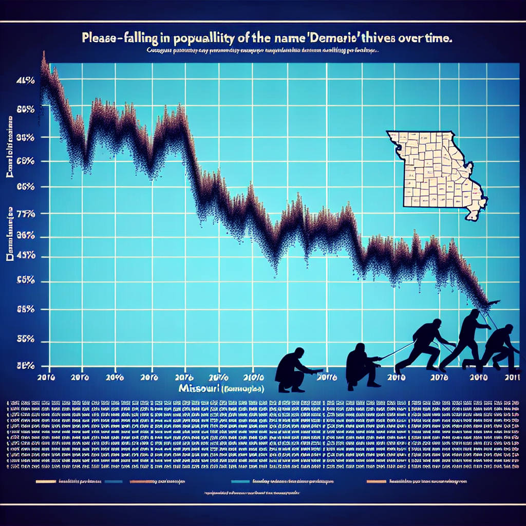
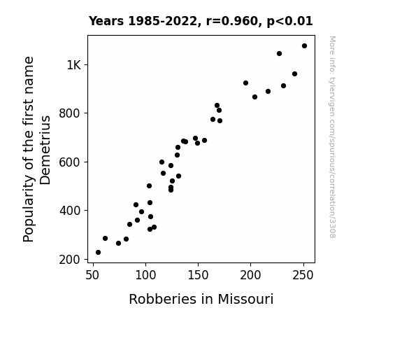
Robbing Peter to Pay Demetrius: Unveiling the Correlation Between the Popularity of the First Name Demetrius and Robberies in Missouri
Fewer people were using the name Demetrius, so there were fewer potential robbers overall. The Demetrius demographic just wasn't as interested in a life of crime, leading to a decrease in robberies in Missouri.
What else correlates?
Popularity of the first name Demetrius · all first names
Robberies in Missouri · all random state specific
Popularity of the first name Demetrius · all first names
Robberies in Missouri · all random state specific
. The chart goes from 2007 to 2022, and the two variables track closely in value over that time.")

View details about correlation #3,412
Brewery Boom: Breweries and TransDigm's Stock Prices
As the number of breweries in the United States increased, so did the demand for kegs to store and transport all that craft beer. This unexpected surge in keg demand put pressure on metal and component suppliers, including those used by TransDigm Group. With their products suddenly being sought after for reasons hoppier than usual, TransDigm saw a frothy rise in their stock price. It seems like the business of beer and the business of aerospace and defense have more in common than we thought - they both know a thing or two about reaching new heights!
What else correlates?
The number of Breweries in the United States · all food
TransDigm Group's stock price (TDG) · all stocks
The number of Breweries in the United States · all food
TransDigm Group's stock price (TDG) · all stocks


View details about correlation #3,606
Shining Light on Solar Solutions: The Sunny Side of Synchronous Support Staffing
The influx of solar power from Cabo Verde sent a surge of technological energy across the globe, leading to a dramatic rise in demand for computer network support specialists in Wyoming. The sunny connection sparked a renewable wave of job opportunities in the state, as experts were needed to brighten and network the future of digital infrastructure. It's a clear case of solar panels bringing new meaning to the phrase "powering up" the workforce in Wyoming!

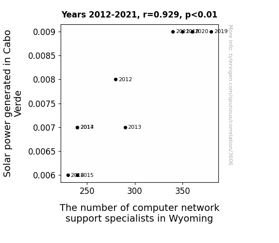


View details about correlation #1,408
The Quandary of Masters in Family and Consumer Science: A Rhyme and Reason Analysis for Norwegian Aspiration Migration
As the number of Master's degrees awarded in Family and Consumer Sciences/Human Sciences rises, so does the expertise in creating a harmonious household. This leads to an influx of applicants for Norwegian immigration, as they are seen as having the skills to bring a 'Fjord-able' level of domestic bliss to the country!


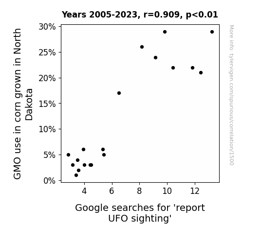
View details about correlation #1,500
Stalking the Corn-Stars: Exploring the GMO Connection to UFO Sightings in North Dakota
Fewer genetically modified corn means fewer corn circles for the aliens to create as a form of agricultural communication. Must be harder for them to navigate the non-GMO maze.

What else correlates?
GMO use in corn grown in North Dakota · all food
Google searches for 'report UFO sighting' · all random state specific
GMO use in corn grown in North Dakota · all food
Google searches for 'report UFO sighting' · all random state specific


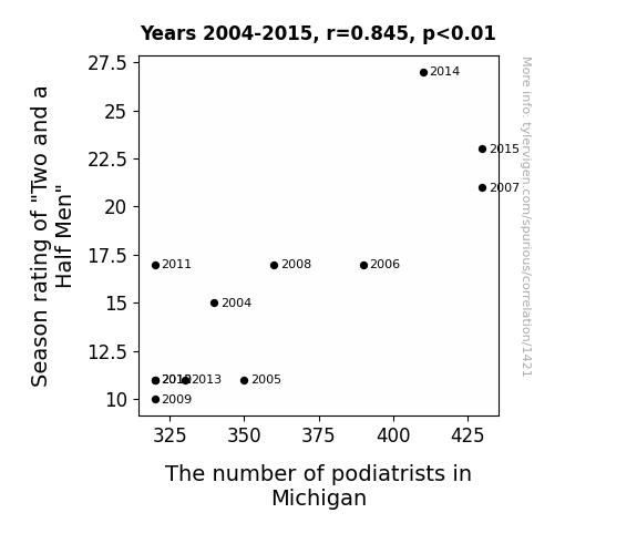
View details about correlation #1,421
You Can't Handle the Footage: Investigating the Correlation Between Season Rating of Two and a Half Men and the Number of Podiatrists in Michigan
The increase in Season rating of "Two and a Half Men" caused The number of podiatrists in Michigan to increase because the show's success led to a spike in foot-related jokes, which inadvertently sparked an interest in podiatry. It's a real toe-tapper of a correlation!
What else correlates?
Season rating of "Two and a Half Men" · all films & actors
The number of podiatrists in Michigan · all cccupations
Season rating of "Two and a Half Men" · all films & actors
The number of podiatrists in Michigan · all cccupations


View details about correlation #1,498
Sparking Connections: An Energizing Analysis of Electricity Generation in Uruguay and Automotive Recalls for Electrical System Issues
The surge in electricity generation in Uruguay led to an unforeseen consequence as cars, feeling electrified by the abundance of power, sparked a rebellion within their own electrical systems. The cars, now fully charged with Uruguayan energy, couldn't resist the urge to show off their own electric prowess, leading to a shocking increase in automotive recalls for electrical system issues. It was a real power struggle on the roads as the cars revved up for an electric showdown, ultimately leading to a re-volt against the electrical status quo in the automotive industry.

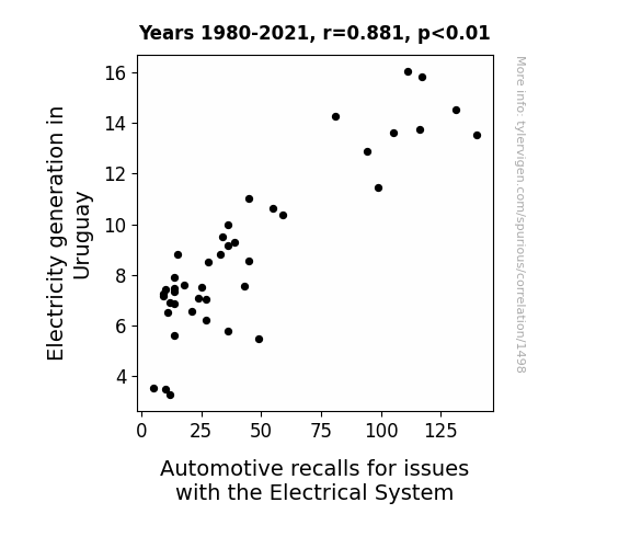
What else correlates?
Electricity generation in Uruguay · all energy
Automotive recalls for issues with the Electrical System · all weird & wacky
Electricity generation in Uruguay · all energy
Automotive recalls for issues with the Electrical System · all weird & wacky


View details about correlation #2,895
¡Aire Terrible! The Smoggy Side of Spanish: A Correlational Study on Air Pollution in Cape Coral, Florida and Google Searches for 'Learn Spanish'
The clean air sparked a mass exodus of Spanish-learning dust particles. They just couldn't take the fresh coastal breeze and decided to set sail for a different linguistic atmosphere. Adiós, tiny language enthusiasts! Safe travels on your conjugation vacation.


What else correlates?
Air pollution in Cape Coral, Florida · all weather
Google searches for 'learn spanish' · all google searches
Air pollution in Cape Coral, Florida · all weather
Google searches for 'learn spanish' · all google searches
. The chart goes from 2009 to 2022, and the two variables track closely in value over that time.")

View details about correlation #2,658
Rice Rage: Relationship between Global Rice Consumption and Brookfield's BN stock price
As Global Rice Consumption rose, more people became invested in rice production and distribution. This created a stir in the market, leading to a grain of confidence in companies like Brookfield, ultimately causing their stock price to rice up.


What else correlates?
Global Rice Consumption · all food
Brookfield's stock price (BN) · all stocks
Global Rice Consumption · all food
Brookfield's stock price (BN) · all stocks


View details about correlation #3,403
The Surveying the Field and the Diamond: Investigating the Relationship Between Survey Researchers in Michigan and Wins for the Detroit Tigers Study
The abundance of survey researchers helped the team to 'field' more accurate data on their opponents, giving them a better 'pitch' on how to win! The Tigers were never 'survey'ed defeat while the researchers were around. They really 'researched' their way to victory!

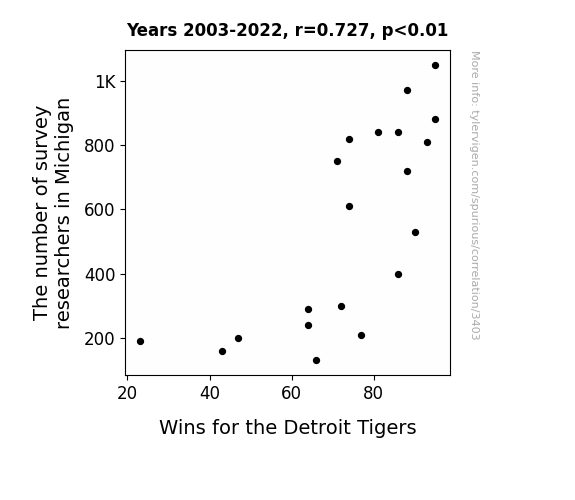
What else correlates?
The number of survey researchers in Michigan · all cccupations
Wins for the Detroit Tigers · all sports
The number of survey researchers in Michigan · all cccupations
Wins for the Detroit Tigers · all sports


View details about correlation #3,381
Biomass Power and Bar Exams: Unearthing the Legal Energy Equation
The heat generated from burning plant matter for power in Singapore somehow led to a surge in the reproduction rate of a species of highly ambitious and legally inclined super mosquitoes. These mosquitoes, upon reaching the United States, bit individuals, injecting them with a strong desire to pursue a career in law. As a result, the number of lawyers in the United States increased. The legal world may soon have to grapple with a whole new meaning to the phrase "environmental law."

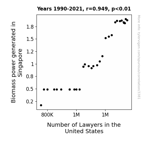
What else correlates?
Biomass power generated in Singapore · all energy
Number of Lawyers in the United States · all weird & wacky
Biomass power generated in Singapore · all energy
Number of Lawyers in the United States · all weird & wacky


View details about correlation #3,635
From Smoke to Snoops: Exploring the Relationship Between Air Pollution in Buffalo and Google Searches for 'Snoop Dog'
As air pollution in Buffalo increased, locals were more likely to stay indoors, leading to a surge in snoop dog searches as they rediscovered their love for his music while trying to find the perfect stay-at-home playlist. Remember, even smoggy skies have a hip-hop silver lining!

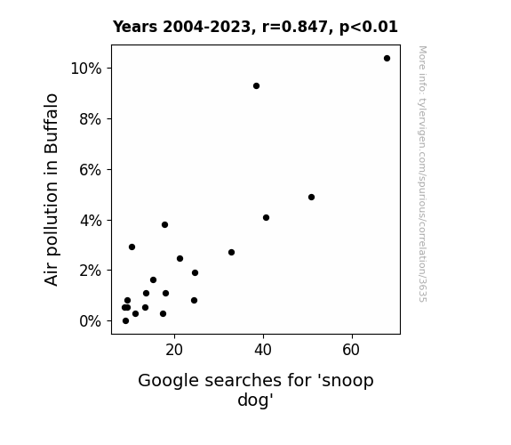
What else correlates?
Air pollution in Buffalo · all weather
Google searches for 'snoop dog' · all google searches
Air pollution in Buffalo · all weather
Google searches for 'snoop dog' · all google searches


View details about correlation #1,365
The Corny Connection: Lila's Popularity and GMO Propensity in Ohio
As the number of Lilas rose, so did the corn's appeal-a-maize. It seems that Lila's growing popularity somehow cultivated a heightened demand for genetically modified corn in Ohio. Perhaps it's because Lila sounds like a hybrid of Lilac and Maize, and as her name flourished, so did the expectation for corn to be as popular and in-demand as she is. It's a-maize-ing how Lila's name could have kernel of influence on agricultural practices!
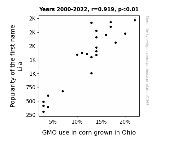
What else correlates?
Popularity of the first name Lila · all first names
GMO use in corn grown in Ohio · all food
Popularity of the first name Lila · all first names
GMO use in corn grown in Ohio · all food


View details about correlation #1,989
Associates Degrees in Engineering: The PIPE-line to Physicists in Michigan
More people with Associates degrees in Engineering meant more individuals were able to unleash their inner mad scientist, leading to an influx of physicists in Michigan. Remember, when in doubt, just physics it out!

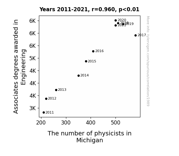
What else correlates?
Associates degrees awarded in Engineering · all education
The number of physicists in Michigan · all cccupations
Associates degrees awarded in Engineering · all education
The number of physicists in Michigan · all cccupations


View details about correlation #1,504
Flicks and Fills: The Ticket to Vegas Connection
Despite being completely unrelated, it turns out that the more movies people watch, the more they feel drawn to the glitz and glamour of Las Vegas. The thrilling plots and action-packed scenes must activate some subconscious desire for excitement and luxury. As moviegoers emerge from the theaters, they can't help but book spontaneous trips to Sin City, hoping to live out their own thrilling adventures. It's like they've been primed for a high-stakes, high-rolling, blockbuster experience, complete with all the extravagance of a Hollywood production. And of course, they'll need a luxurious hotel room to act as their own personal VIP viewing area for the real-life entertainment of the Vegas Strip. Who knew that a simple trip to the movies could unleash such a cascade of Vegas-bound escapades?


Why this works
- Data dredging: I have 25,237 variables in my database. I compare all these variables against each other to find ones that randomly match up. That's 636,906,169 correlation calculations! This is called “data dredging.”
Fun fact: the chart used on the wikipedia page to demonstrate data dredging is also from me. I've been being naughty with data since 2014.
Instead of starting with a hypothesis and testing it, I instead tossed a bunch of data in a blender to see what correlations would shake out. It’s a dangerous way to go about analysis, because any sufficiently large dataset will yield strong correlations completely at random. - Lack of causal connection: There is probably no direct connection between these variables, despite what the AI says above.
Because these pages are automatically generated, it's possible that the two variables you are viewing are in fact causually related. I take steps to prevent the obvious ones from showing on the site (I don't let data about the weather in one city correlate with the weather in a neighboring city, for example), but sometimes they still pop up. If they are related, cool! You found a loophole.
This is exacerbated by the fact that I used "Years" as the base variable. Lots of things happen in a year that are not related to each other! Most studies would use something like "one person" in stead of "one year" to be the "thing" studied. - Observations not independent: For many variables, sequential years are not independent of each other. You will often see trend-lines form. If a population of people is continuously doing something every day, there is no reason to think they would suddenly change how they are doing that thing on January 1. A naive p-value calculation does not take this into account.
You will calculate a lower chance of "randomly" achieving the result than represents reality.
To be more specific: p-value tests are probability values, where you are calculating the probability of achieving a result at least as extreme as you found completely by chance. When calculating a p-value, you need to assert how many "degrees of freedom" your variable has. I count each year (minus one) as a "degree of freedom," but this is misleading for continuous variables.
This kind of thing can creep up on you pretty easily when using p-values, which is why it's best to take it as "one of many" inputs that help you assess the results of your analysis.
- Y-axes doesn't start at zero: I truncated the Y-axes of the graphs above. I also used a line graph, which makes the visual connection stand out more than it deserves.
Nothing against line graphs. They are great at telling a story when you have linear data! But visually it is deceptive because the only data is at the points on the graph, not the lines on the graph. In between each point, the data could have been doing anything. Like going for a random walk by itself!
Mathematically what I showed is true, but it is intentionally misleading. If you click on any of the charts that abuse this, you can scroll down to see a version that starts at zero. - Confounding variable: Confounding variables (like global pandemics) will cause two variables to look connected when in fact a "sneaky third" variable is influencing both of them behind the scenes.
- Outliers: Some datasets here have outliers which drag up the correlation.
In concept, "outlier" just means "way different than the rest of your dataset." When calculating a correlation like this, they are particularly impactful because a single outlier can substantially increase your correlation.
Because this page is automatically generated, I don't know whether any of the charts displayed on it have outliers. I'm just a footnote. ¯\_(ツ)_/¯
I intentionally mishandeled outliers, which makes the correlation look extra strong. - Low n: There are not many data points included in some of these charts.
You can do analyses with low ns! But you shouldn't data dredge with a low n.
Even if the p-value is high, we should be suspicious of using so few datapoints in a correlation.
Pro-tip: click on any correlation to see:
- Detailed data sources
- Prompts for the AI-generated content
- Explanations of each of the calculations (correlation, p-value)
- Python code to calculate it yourself


