spurious correlations
discover · random · spurious scholar
← previous page · next page →
. The chart goes from 2002 to 2023, and the two variables track closely in value over that time.")

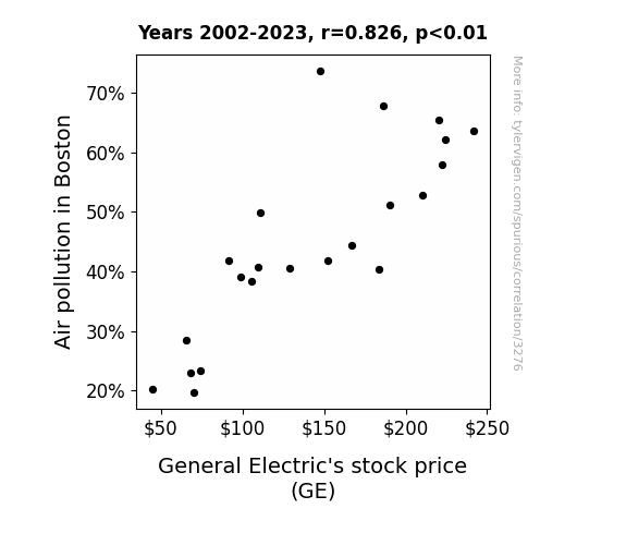
View details about correlation #3,276
Smoke and Mirrors: Uncovering the Relationship Between Air Pollution in Boston and General Electric's Stock Price
The cleaner air led to an increase in productivity and energy, causing a surplus in electrical goods. With an abundance of functioning appliances, the demand for GE products plummeted, sending their stock price into a downward spiral. Remember, when the air is clearer, the stocks may not be!

What else correlates?
Air pollution in Boston · all weather
General Electric's stock price (GE) · all stocks
Air pollution in Boston · all weather
General Electric's stock price (GE) · all stocks


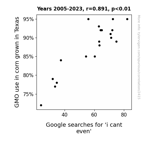
View details about correlation #2,415
Can't Even Hear the Corn Grow: A Kernel of Truth in the Link between GMO Corn Usage in Texas and 'I Can't Even' Google Searches
The genetically modified corn started expressing teenage angst, leading to a statewide existential crisis. It seems the corn wasn't the only thing feeling a little corn-fused!

What else correlates?
GMO use in corn grown in Texas · all food
Google searches for 'i cant even' · all google searches
GMO use in corn grown in Texas · all food
Google searches for 'i cant even' · all google searches


View details about correlation #3,465
The Melody of Biomass: A Key Note on the Correlation Between Music Directors and Composers in Iowa and Biomass Power Generated in the Netherlands
As the number of music directors and composers in Iowa increases, there is a corresponding rise in catchy tunes being created. These infectious melodies somehow make their way to the Netherlands and end up captivating the biomass power generators. The power plants start grooving to the music, leading to an increase in energy production. It seems the key to boosting biomass power lies in conducting a symphony of sounds that resonates all the way to the Netherlands!


What else correlates?
The number of music directors and composers in Iowa · all cccupations
Biomass power generated in Netherlands · all energy
The number of music directors and composers in Iowa · all cccupations
Biomass power generated in Netherlands · all energy


View details about correlation #3,141
The Grade Wiener: A Correlation Between 12th Grade Enrollment and Champion Hotdog Consumption at Nathan's Hot Dog Eating Competition
As the number of 12th graders in public schools increases, so does the collective eagerness for graduation. This excitement creates a ripple effect, leading to more elaborate and joyous graduation parties. Inevitably, at these gatherings, the sizzling hotdogs make their appearance, adding fuel to the fiery competitive spirit. Unbeknownst to many, there's a clandestine pact between the education system and the world of competitive hotdog devouring – as graduation fervor rises, so does the number of hotdogs inhaled by the esteemed Nathan's Hot Dog Eating Competition Champion. It's an unexpected yet undeniable case of academic influence on the realm of competitive eating.


. The chart goes from 2002 to 2022, and the two variables track closely in value over that time.")

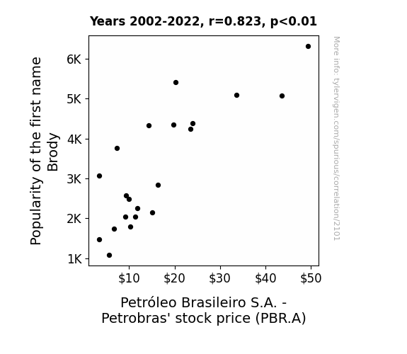
View details about correlation #2,101
Brody or Not Brody: An Unlikely Connection between Name Popularity and Petrobras Stock
Because every time someone named Brody was born, their parents invested in Petrobras as a way of honoring Brody, the patron saint of oil drilling. This led to a surge in stock demand and drove up Petrobras' stock price. It's a little-known fact that the name Brody is secretly synonymous with crude oil success.

What else correlates?
Popularity of the first name Brody · all first names
Petróleo Brasileiro S.A. - Petrobras' stock price (PBR.A) · all stocks
Popularity of the first name Brody · all first names
Petróleo Brasileiro S.A. - Petrobras' stock price (PBR.A) · all stocks


View details about correlation #2,416
Maize Music: The GMO Connection to the Google Searches for 'Gangnam Style'
The non-GMO corn plants started doing the non-GMO style dance, but it just wasn't as catchy as the original!


What else correlates?
GMO use in corn grown in Illinois · all food
Google searches for 'Gangnam Style' · all google searches
GMO use in corn grown in Illinois · all food
Google searches for 'Gangnam Style' · all google searches


View details about correlation #2,167
Statistically Shocking: The Shocking Connection Between Statisticians in Oklahoma and Electricity Generation in Saint Lucia
As the number of statisticians in Oklahoma rises, so does their love for analyzing data. This leads to an increase in figuring out the 'current' trends in electricity usage and production. Their insights spark a power-ful impact on decision making, ultimately shocking the electricity generation in Saint Lucia into reaching new, brighter heights. It's a real case of statisti-can do attitude creating a posi-wattive change!


What else correlates?
The number of statisticians in Oklahoma · all cccupations
Electricity generation in Saint Lucia · all energy
The number of statisticians in Oklahoma · all cccupations
Electricity generation in Saint Lucia · all energy


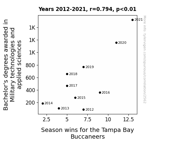
View details about correlation #2,562
Marching Towards Victory: An Analysis of the Relationship Between Military Technology Degrees and Tampa Bay Buccaneers' Wins
As more students specialized in military tactics, the Bucs' game strategy became unbeatable. It was a blitz of knowledge that led to their defensive dominance and offensive maneuvers. The Buccaneers were truly raising the Lombardi Trophy with their armed forces expertise!

What else correlates?
Bachelor's degrees awarded in Military technologies · all education
Season wins for the Tampa Bay Buccaneers · all sports
Bachelor's degrees awarded in Military technologies · all education
Season wins for the Tampa Bay Buccaneers · all sports


View details about correlation #3,458
: Daniel's Dilemma: The Dastardly Dance between Name Popularity and Neighborhood Heists
Fewer people were using the phrase "Open the door, it's Daniel!" as a popular catchphrase, leading to a decrease in successful door-to-door burglaries in Pennsylvania.

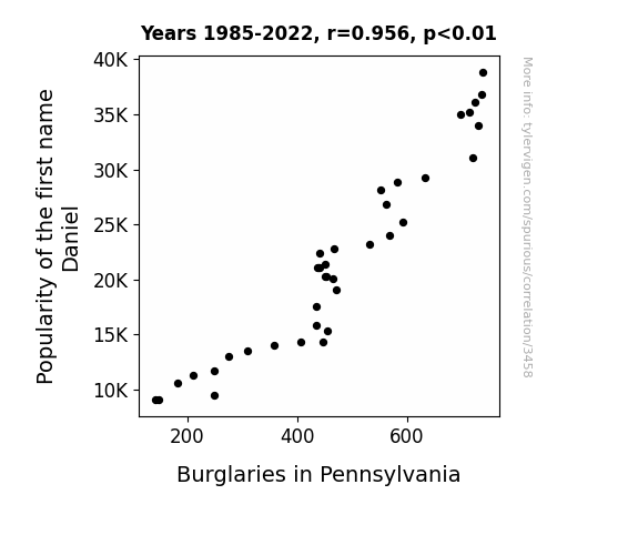
What else correlates?
Popularity of the first name Daniel · all first names
Burglaries in Pennsylvania · all random state specific
Popularity of the first name Daniel · all first names
Burglaries in Pennsylvania · all random state specific
. The chart goes from 2002 to 2022, and the two variables track closely in value over that time.")

View details about correlation #2,661
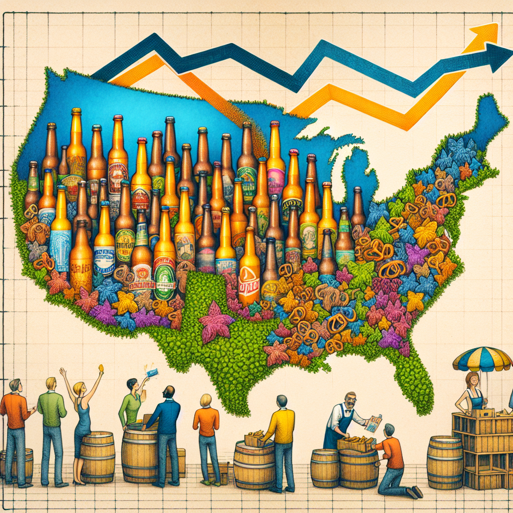
Pouring Over Pints and Portfolios: The Brewtiful Relationship Between Breweries in the United States and M&T Bank's Stock Price
As the number of breweries in the US increased, so did the demand for their delicious beverages. This led to a surge in beer sales, causing a spike in the need for financial services. M&T Bank, being well-versed in hops and barleyonomics, reaped the frothy profits, lifting their stock price to hoppy new heights. It's a sudsy tale of ale and bailouts!

What else correlates?
The number of Breweries in the United States · all food
M&T Bank's stock price (MTB) · all stocks
The number of Breweries in the United States · all food
M&T Bank's stock price (MTB) · all stocks


View details about correlation #2,884
The Bold and the Smoggy: Investigating the Relationship Between Air Pollution in Trenton, New Jersey and Viewership Count for Days of Our Lives
As the air became cleaner, the drama in the show just couldn't compete with the fresh, real-life air drama happening around the viewers.

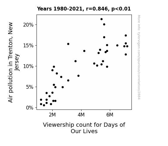
What else correlates?
Air pollution in Trenton, New Jersey · all weather
Viewership count for Days of Our Lives · all weird & wacky
Air pollution in Trenton, New Jersey · all weather
Viewership count for Days of Our Lives · all weird & wacky


View details about correlation #2,374
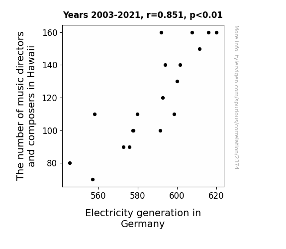
Conducting an Orchestral Analysis: Exploring the Interplay Between Music Directors in Hawaii and Electricity Generation in Germany
As the music leadership in Hawaii dwindled, so did the inspiration for catchy tunes. This, in turn, led to a worldwide decrease in earworms. With fewer people unintentionally humming musical refrains, there was a noticeable dip in human kinetic energy. And as we all know, Germany relies heavily on the subtle, unconscious movements of its populace to generate electricity through the highly classified technology known as the Wiener-dance Generator. With the music mojo taking a hit in Hawaii, the Germans found themselves literally unable to keep the power flowing. Or perhaps it's just a shocking coincidence!

What else correlates?
The number of music directors and composers in Hawaii · all cccupations
Electricity generation in Germany · all energy
The number of music directors and composers in Hawaii · all cccupations
Electricity generation in Germany · all energy


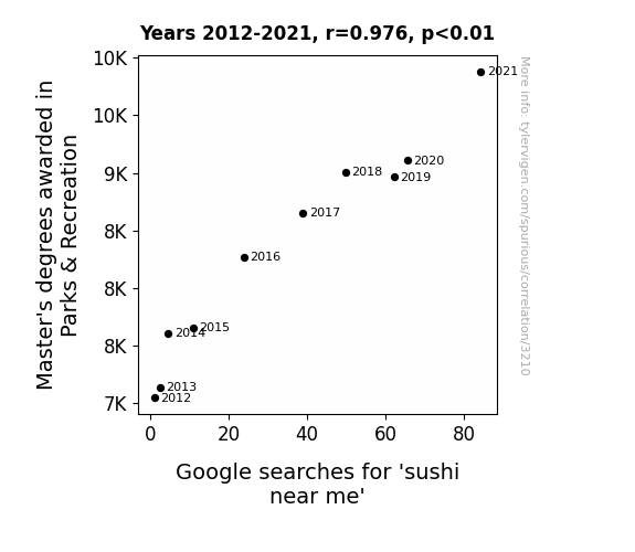
View details about correlation #3,210
Masters of Parks, Searching for Narks: The Sushi Near Me Larks
As more people obtained Master's degrees in Parks & Recreation, they gained a deeper appreciation for aquatic ecosystems. This led to a rise in the establishment of sushi restaurants, creating a greater availability of sushi options in local areas. After all, who better to understand the optimal conditions for fish and seaweed than these highly educated individuals? It's a classic case of academic success leading to a proliferation of raw fish delight!

What else correlates?
Master's degrees awarded in Parks & Recreation · all education
Google searches for 'sushi near me' · all google searches
Master's degrees awarded in Parks & Recreation · all education
Google searches for 'sushi near me' · all google searches


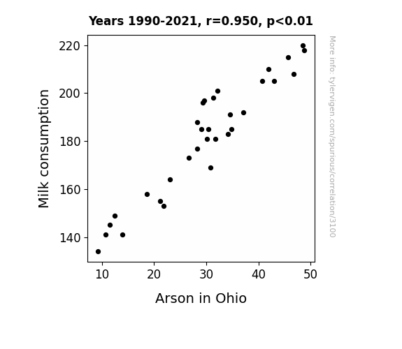
View details about correlation #3,100
Got Milk? Exploring the Bizarre Link between Milk Consumption and Arson Rates in Ohio
As milk consumption decreased, there was a corresponding decrease in lactose-fueled internal fires of frustration, leading to a reduced urge to set things ablaze in Ohio. Seems like there's a real connection between dairy and incendiary behavior - who knew moo juice could be so combusti-moo-ble?

What else correlates?
Milk consumption · all food
Arson in Ohio · all random state specific
Milk consumption · all food
Arson in Ohio · all random state specific
. The chart goes from 2002 to 2022, and the two variables track closely in value over that time.")

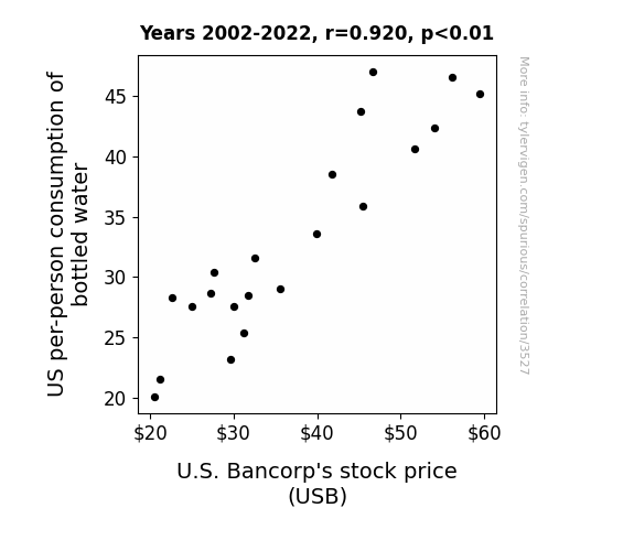
View details about correlation #3,527
Quenching Your Thirst for Profits: A Bottled Water's Influence on USB Stock Price
As bottled water consumption rose, so did the demand for coolers in offices and homes. This led to a surge in electricity usage, boosting the profits of power companies. U.S. Bancorp's stock price rose as a result because they held major investments in these electrifyingly successful utility companies.

What else correlates?
US per-person consumption of bottled water · all weird & wacky
U.S. Bancorp's stock price (USB) · all stocks
US per-person consumption of bottled water · all weird & wacky
U.S. Bancorp's stock price (USB) · all stocks


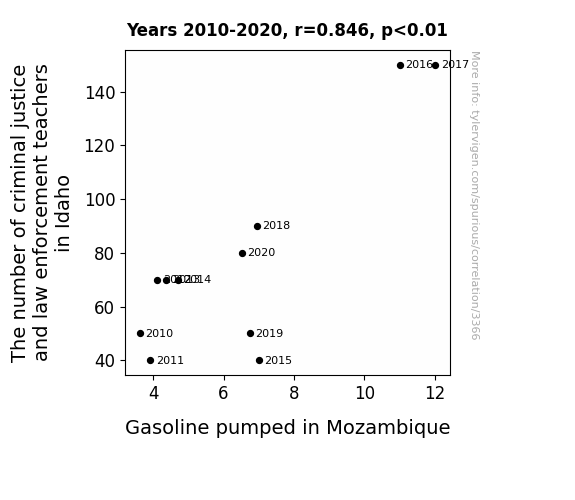
View details about correlation #3,366
Unveiling the Idaho Gasoline Mystery: An Unanticipated Connection between Criminal Justice Educators and Fuel Consumption in Mozambique
As the number of criminal justice and law enforcement teachers in Idaho increases, so does their interest in forensic evidence. This interest leads to a spike in the production of crime shows, which prominently feature high-speed car chases. This, in turn, creates a dramatic surge in the global demand for gasoline. Meanwhile, in a completely unrelated series of events, Mozambique experiences a wave of fascination with Idaho's potato industry, leading to an inexplicable but undeniable craving for French fries. This sudden craving for fries leads to a sharp increase in the import of Idaho potatoes, but due to a mix-up at the docks, a massive shipment of gasoline is sent instead. And that, my friends, is how the academic pursuits of criminal justice and law enforcement teachers in Idaho end up fueling the gasoline pumped in Mozambique. It's a tale of mystery, mix-ups, and a whole lot of unintended connections!


View details about correlation #2,491
St. Louis Smog's Effect on Canadian Yearns: A Correlations Rhyme
The higher air quality in St. Louis led to an influx of Canadian geese, who, in a strange turn of events, started a national campaign promoting the benefits of living in Canada. As more and more people were honked into considering the Great White North, the Google searches for 'how to immigrate to Canada' took flight. It seems like those geese were really spreading their wings and influencing the human newcomers to migrate for a better gander at life in Canada.


What else correlates?
Air quality in St. Louis · all weather
Google searches for 'how to immigrate to canada' · all google searches
Air quality in St. Louis · all weather
Google searches for 'how to immigrate to canada' · all google searches


View details about correlation #2,439
Curious Correlation: Cottage Cheese Consumption and Car Crimes in Ohio
As Cottage cheese consumption decreased, people became lactose intolerant. This led to an increase in the sales of lactose-free milk. The production of lactose-free milk requires specialized equipment, leading to a shortage of parts for manufacturing car engines. With fewer car engines available, motor vehicle thefts in Ohio naturally decreased as there were simply not enough functioning engines to steal. The dairy coincidence had curdled into a cheesy crime conundrum, leaving the lactose-intolerant thieves utterly whey-sted for mischief.


What else correlates?
Cottage cheese consumption · all food
Motor vehicle thefts in Ohio · all random state specific
Cottage cheese consumption · all food
Motor vehicle thefts in Ohio · all random state specific


View details about correlation #1,461
Oh, the Sites to See: The Correlation Between Beau's Popularity and Websites for You and Me
As more and more babies were named Beau, it sparked a trend of creating personalized websites for each little Beau to showcase their adorable baby photos and milestones. This led to a Beau website boom, contributing to the overall increase in the number of websites on the internet. After all, when you're named Beau, you're practically destined for web stardom!


What else correlates?
Popularity of the first name Beau · all first names
Number of websites on the internet · all weird & wacky
Popularity of the first name Beau · all first names
Number of websites on the internet · all weird & wacky
. The chart goes from 2009 to 2021, and the two variables track closely in value over that time.")

View details about correlation #1,773
Playing with Fire: The Biomass Boom in Iran and the High Stakes of Las Vegas Sands' Stock Price
The surplus plant matter in Iran created a unique form of sustainable energy that resonated with the ethos of the Las Vegas Sands company, leading to an unexpected surge in their stock price. It seems like even in the world of finance, going green is always a safe bet!

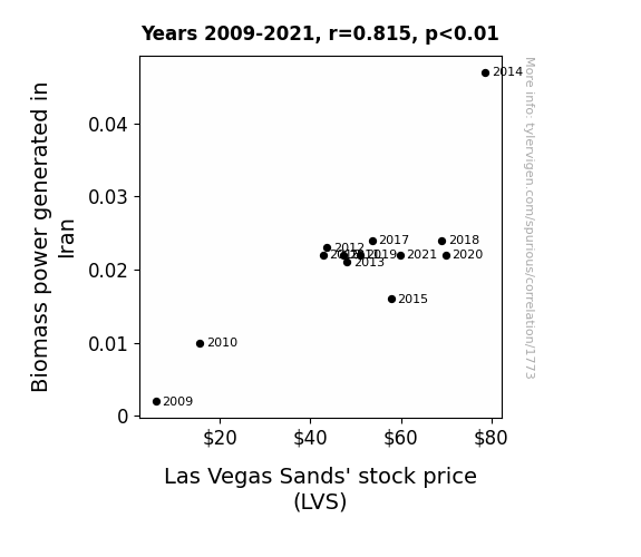
What else correlates?
Biomass power generated in Iran · all energy
Las Vegas Sands' stock price (LVS) · all stocks
Biomass power generated in Iran · all energy
Las Vegas Sands' stock price (LVS) · all stocks
Why this works
- Data dredging: I have 25,237 variables in my database. I compare all these variables against each other to find ones that randomly match up. That's 636,906,169 correlation calculations! This is called “data dredging.”
Fun fact: the chart used on the wikipedia page to demonstrate data dredging is also from me. I've been being naughty with data since 2014.
Instead of starting with a hypothesis and testing it, I instead tossed a bunch of data in a blender to see what correlations would shake out. It’s a dangerous way to go about analysis, because any sufficiently large dataset will yield strong correlations completely at random. - Lack of causal connection: There is probably no direct connection between these variables, despite what the AI says above.
Because these pages are automatically generated, it's possible that the two variables you are viewing are in fact causually related. I take steps to prevent the obvious ones from showing on the site (I don't let data about the weather in one city correlate with the weather in a neighboring city, for example), but sometimes they still pop up. If they are related, cool! You found a loophole.
This is exacerbated by the fact that I used "Years" as the base variable. Lots of things happen in a year that are not related to each other! Most studies would use something like "one person" in stead of "one year" to be the "thing" studied. - Observations not independent: For many variables, sequential years are not independent of each other. You will often see trend-lines form. If a population of people is continuously doing something every day, there is no reason to think they would suddenly change how they are doing that thing on January 1. A naive p-value calculation does not take this into account.
You will calculate a lower chance of "randomly" achieving the result than represents reality.
To be more specific: p-value tests are probability values, where you are calculating the probability of achieving a result at least as extreme as you found completely by chance. When calculating a p-value, you need to assert how many "degrees of freedom" your variable has. I count each year (minus one) as a "degree of freedom," but this is misleading for continuous variables.
This kind of thing can creep up on you pretty easily when using p-values, which is why it's best to take it as "one of many" inputs that help you assess the results of your analysis.
- Y-axes doesn't start at zero: I truncated the Y-axes of the graphs above. I also used a line graph, which makes the visual connection stand out more than it deserves.
Nothing against line graphs. They are great at telling a story when you have linear data! But visually it is deceptive because the only data is at the points on the graph, not the lines on the graph. In between each point, the data could have been doing anything. Like going for a random walk by itself!
Mathematically what I showed is true, but it is intentionally misleading. If you click on any of the charts that abuse this, you can scroll down to see a version that starts at zero. - Confounding variable: Confounding variables (like global pandemics) will cause two variables to look connected when in fact a "sneaky third" variable is influencing both of them behind the scenes.
- Outliers: Some datasets here have outliers which drag up the correlation.
In concept, "outlier" just means "way different than the rest of your dataset." When calculating a correlation like this, they are particularly impactful because a single outlier can substantially increase your correlation.
Because this page is automatically generated, I don't know whether any of the charts displayed on it have outliers. I'm just a footnote. ¯\_(ツ)_/¯
I intentionally mishandeled outliers, which makes the correlation look extra strong. - Low n: There are not many data points included in some of these charts.
You can do analyses with low ns! But you shouldn't data dredge with a low n.
Even if the p-value is high, we should be suspicious of using so few datapoints in a correlation.
Pro-tip: click on any correlation to see:
- Detailed data sources
- Prompts for the AI-generated content
- Explanations of each of the calculations (correlation, p-value)
- Python code to calculate it yourself


