spurious correlations
discover · random · spurious scholar
← previous page · next page →


View details about correlation #2,097
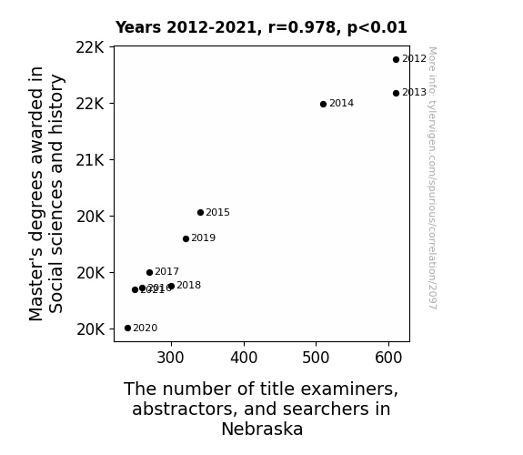
Mastering the Connection: A Quantitative Analysis of Social Sciences and History Master's Degrees and Title Examiners, Abstractors, and Searchers in Nebraska
As fewer people became experts in social sciences and history, there was a statewide crisis of confidence in the accuracy of property titles. This led to an unprecedented wave of self-examination, with many Nebraskan title examiners deciding to pursue their true passion: competitive cornhusking. Remember, in Nebraska, even the job market is corny!


View details about correlation #1,479
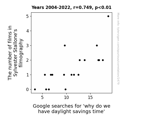
Stallone's Filmography: A Rocky Relationship with Daylight Savings Time
As the number of Sly movies rises, so does the need for more action-packed hours in the day. It's a classic case of Rocky influencing the clock-y! As audiences' demand for his films gains momentum, it seems that every blockbuster hit from Stallone leads to a Spring forward in questions about falling back. It's time to clock out of this theory before it's too late, but remember, in this scenario, Expendable doesn't mean it can't affect our valuable time. Yippee ki-yay, daylight!


View details about correlation #3,422
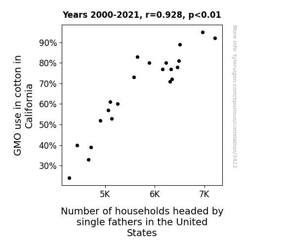
GMO Growth: Gleaning the Garish Gauntlet of Genetically Modified Cotton and the Growth of Gracious Guardianship: A Grandiose Governance Gamble
As the cotton plants grew bigger thanks to GMOs, they developed an overwhelming need for nurturing. This urge somehow transcended species boundaries, leading to a surge in single father households as the cotton plants sought out human dads to care for them. It seems like genetically modified cotton didn't just stop at being a cash crop; it also became the ultimate plant matchmaker for single fathers across the nation.


View details about correlation #1,395
Corey and Effect: Exploring the Vehicular Theft-Victim Nexus
Fewer people naming their kids Corey means there are fewer Coreys around to joyride in cars. It's a simple case of correlation with car stealing Corey's! Who would have thought that baby names could have such a big impact on crime rates?


What else correlates?
Popularity of the first name Corey · all first names
Motor vehicle thefts in New York · all random state specific
Popularity of the first name Corey · all first names
Motor vehicle thefts in New York · all random state specific


View details about correlation #3,290
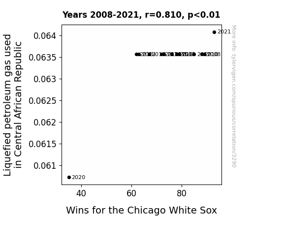
Gas-ing Up the Scoreboard: The LPG-White Sox Wins Correlation in Central African Republic
The extra Liquefied petroleum gas in Central African Republic must have ignited a fiery passion in the Chicago White Sox, propelling them to victory. Looks like they really know how to turn up the heat and propane their way to winning!

What else correlates?
Liquefied petroleum gas used in Central African Republic · all energy
Wins for the Chicago White Sox · all sports
Liquefied petroleum gas used in Central African Republic · all energy
Wins for the Chicago White Sox · all sports


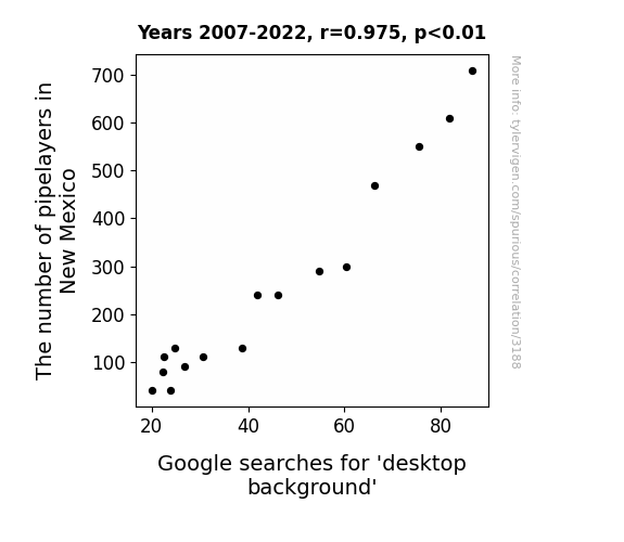
View details about correlation #3,188
Digging into Data: The Novel Relationship Between Pipelayers in New Mexico and Google Searches for 'Desktop Background'
As the ranks of pipelayers in New Mexico dwindled, there was a noticeable ripple effect on the availability of PVC pipes. This shortage inadvertently led to a decrease in the production of picture frames, prompting a nationwide scarcity of aesthetically pleasing desktop backgrounds. Remember, when it comes to internet searches, sometimes the pipeline to results isn't as straightforward as we think!

What else correlates?
The number of pipelayers in New Mexico · all cccupations
Google searches for 'desktop background' · all google searches
The number of pipelayers in New Mexico · all cccupations
Google searches for 'desktop background' · all google searches
. The chart goes from 2008 to 2023, and the two variables track closely in value over that time.")

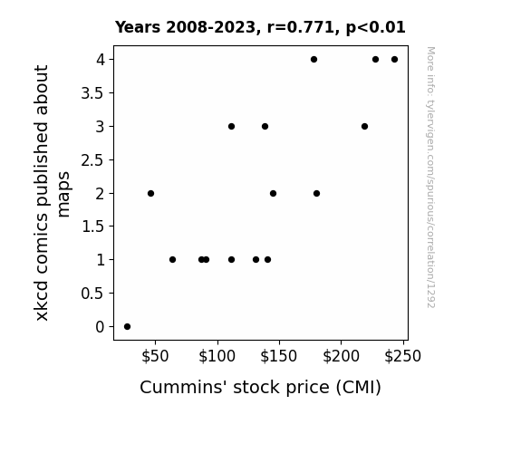
View details about correlation #1,292
Mapping the Way to Market Success: The Correlation Between xkcd Comics on Maps and Cummins' Stock Performance
As the number of xkcd comics about maps increased, more people became interested in cartography, leading to a surge in demand for custom maps. This, in turn, boosted the sales of GPS and navigation systems, such as those produced by Cummins Inc. As the saying goes, "The map to financial success is often drawn with xkcd markers."

What else correlates?
xkcd comics published about maps · all weird & wacky
Cummins' stock price (CMI) · all stocks
xkcd comics published about maps · all weird & wacky
Cummins' stock price (CMI) · all stocks


View details about correlation #1,354
Air Quality and Arson: Fuelling the Fire in Cincinnati
The cleaner air in Cincinnati meant that there was less soot to go around, leaving would-be arsonists feeling like they just couldn't make a clean getaway.


What else correlates?
Air pollution in Cincinnati · all weather
Arson in United States · all random state specific
Air pollution in Cincinnati · all weather
Arson in United States · all random state specific


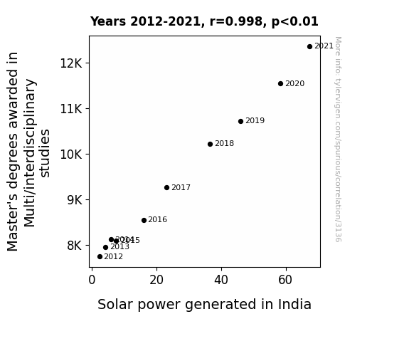
View details about correlation #3,136
Marvelous Multi/Interdisciplinary Master's and Majestic Solar Might: A Mirthful Match
As the number of Master's degrees awarded in Multi/Interdisciplinary Studies rose, so did the expertise in thinking outside the (solar) box. These interdisciplinary whiz-kids were able to bridge the gap between various fields, leading to sunny innovations in solar technology and implementation. It's a ray of sunshine to see how their versatile knowledge illuminated the path to greater solar power output in India. They definitely have a bright spark when it comes to energizing change!

What else correlates?
Master's degrees awarded in Multi/interdisciplinary studies · all education
Solar power generated in India · all energy
Master's degrees awarded in Multi/interdisciplinary studies · all education
Solar power generated in India · all energy


View details about correlation #3,080
Quantum Quirkiness: The 'Smol' Impact of Physicists in Michigan on Google Searches
As the number of physicists in Michigan grows, so does the gravitational pull of their big brains. This tiny but mighty force attracts all things 'smol,' including the interest of internet users. It's a case of scientific minds making 'smol' matters feel like a quantum leap in importance.

What else correlates?
The number of physicists in Michigan · all cccupations
Google searches for 'smol' · all google searches
The number of physicists in Michigan · all cccupations
Google searches for 'smol' · all google searches
. The chart goes from 2002 to 2022, and the two variables track closely in value over that time.")

View details about correlation #3,676
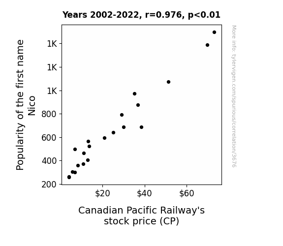
All Aboard the Nico-nomic Train: A Name's Influence on Canadian Pacific Railway Stock Price
As the name Nico gained popularity, more parents were subconsciously drawn to anything "CP"-related, including toy trains. This led to a surge in demand for Canadian Pacific Railway toy sets, boosting the company's overall revenue and ultimately delighting investors. It's amazing how a simple name trend could unexpectedly keep the stock chugging along!

What else correlates?
Popularity of the first name Nico · all first names
Canadian Pacific Railway's stock price (CP) · all stocks
Popularity of the first name Nico · all first names
Canadian Pacific Railway's stock price (CP) · all stocks


View details about correlation #1,514
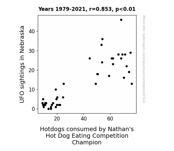
The Unidentified Feast: A Sausage Link between UFO Sightings in Nebraska and Nathan's Hot Dog Eating Competition
The UFOs were actually advanced hot dog grilling machines in disguise, beaming down perfectly cooked hot dogs directly into the champion's mouth. After all, who wouldn't want to abduct some top-notch franks for their own intergalactic cookout?


View details about correlation #1,710
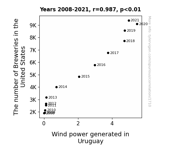
Pouring In: The Sudsy Link Between Breweries in the United States and Wind Power Generation in Uruguay
As the number of breweries in the United States shot up, so did the production of beer. This led to a spike in demand for hops, causing farmers to clear more land for hop crops. Subsequently, the increased clearing of land created stronger, beer-driven air currents that wafted all the way to Uruguay, inadvertently boosting their wind power generation. It seems the brewing industry is really ale-vating the world of renewable energy!
What else correlates?
The number of Breweries in the United States · all food
Wind power generated in Uruguay · all energy
The number of Breweries in the United States · all food
Wind power generated in Uruguay · all energy


View details about correlation #2,653
Engineering a Probationary Connection: The Bachelor's Degrees and the Bureau in Arizona
As the number of students excelled in Engineering technologies, it led to a surge in designing and building pun-derful machines. With all these 'model' citizens, the demand for probation officers in Arizona rose as they had to 'field' any potential 'mechanical' troublemakers. It seems like these technology enthusiasts were really 'gearing' up the need for supervision!


View details about correlation #3,597
Feeling the Kodi: Exploring the Impact of Name Popularity on Stock Market Success
As the name Kodi gained popularity, more parents were inspired to name their kids after multimedia software. This led to a surge in demand for technological products, including the devices used in ICON PLC's clinical research. The stock price rose as investors realized that the company was now at the ICON-vergence of this electronic baby boom.
What else correlates?
Popularity of the first name Kodi · all first names
ICON PLC's stock price (ICLR) · all stocks
Popularity of the first name Kodi · all first names
ICON PLC's stock price (ICLR) · all stocks


View details about correlation #2,458
Airborne Atrocities: Analyzing the Amusing Association between Air Pollution in Chicago and Viewership Count for Days of Our Lives
The decrease in air pollution led to clearer skies and better outdoor visibility. As a result, more people engaged in outdoor activities instead of staying indoors to watch Days of Our Lives. This lowered the viewership count for the show. After all, who needs soap operas when you can have cleaner air and a real-life drama-free day out in the city?

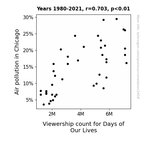
What else correlates?
Air pollution in Chicago · all weather
Viewership count for Days of Our Lives · all weird & wacky
Air pollution in Chicago · all weather
Viewership count for Days of Our Lives · all weird & wacky


View details about correlation #2,212
Fascinating Feline Fad: The Furry Link Between 'Cute Cats' Searches and Liquefied Petroleum in Latvia
As the number of cute cat videos and memes surged, people couldn't resist the urge to pamper their pets with luxurious cat spa experiences, complete with LPG-powered cat saunas and hot tubs, leading to a spike in LPG usage in Latvia. Because nothing says 'feline fine' like a gas-powered relaxation session!

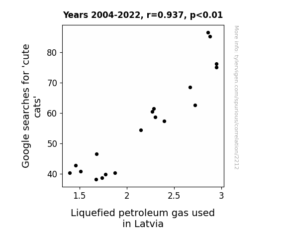
What else correlates?
Google searches for 'cute cats' · all google searches
Liquefied petroleum gas used in Latvia · all energy
Google searches for 'cute cats' · all google searches
Liquefied petroleum gas used in Latvia · all energy


View details about correlation #1,656
Match Point: Correlating Maria Sharapova's WTA Title Count with the Agricultural Affairs of New Hampshire
Every time Maria aced her opponent, it inspired someone to 'serve' the farming community. As her WTA title count rose, so did the 'rural racket' of farm equipment mechanics in New Hampshire. It's as if her success was the 'seed' that sprouted a newfound interest in all things agricultural machinery. After all, when Maria was on fire, it was only natural for others to want to 'rake' in their own victories, 'harvest' their skills, and 'plow' through any obstacles in their career paths. It's safe to say that Maria Sharapova's triumphs didn't just stay confined to the tennis court - they served as a 'grand slam' of motivation for aspiring farm equipment mechanics in the 'granite state.'


What else correlates?
Maria Sharapova's WTA Title Count · all sports
The number of farm equipment mechanics in New Hampshire · all cccupations
Maria Sharapova's WTA Title Count · all sports
The number of farm equipment mechanics in New Hampshire · all cccupations
. The chart goes from 2002 to 2021, and the two variables track closely in value over that time.")

View details about correlation #2,939
The Big Cheese: An Examination of the Relationship Between American Cheese Consumption and Apple's Stock Price
As American cheese consumption melted its way into the hearts of people across the nation, it led to an increase in demand for burgers and sandwiches. This, in turn, boosted the performance of fast-food chains like McDonald's and Starbucks. As these chains sizzled with success, their widespread use of technology, including Apple products for everything from taking orders to playing background music, led to a surge in demand for Apple stock. As cheesy as it may sound, the love for American cheese somehow became gouda for Apple's stock price!

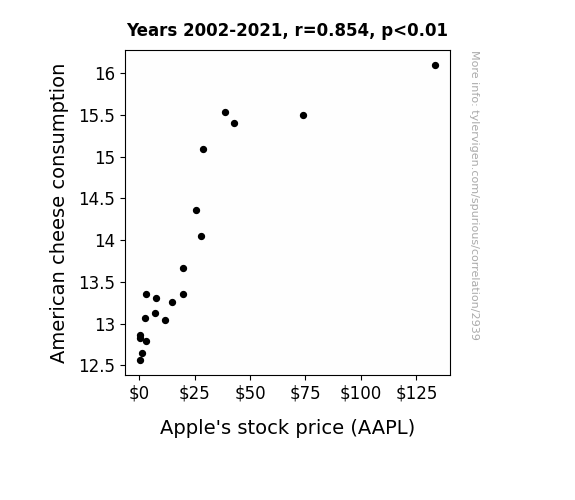
What else correlates?
American cheese consumption · all food
Apple's stock price (AAPL) · all stocks
American cheese consumption · all food
Apple's stock price (AAPL) · all stocks


View details about correlation #1,516
Playing with Fire: The Dire Link Between Arson in Minnesota and Physical Album Shipment Volume in the United States
The firefighters in Minnesota finally extinguished their mixtape, leading to a statewide arson decrease. With fewer fires to put out, the physical album shipment volume in the United States decreased as there was no longer a burning demand for music.

What else correlates?
Arson in Minnesota · all random state specific
Physical album shipment volume in the United States · all weird & wacky
Arson in Minnesota · all random state specific
Physical album shipment volume in the United States · all weird & wacky
Why this works
- Data dredging: I have 25,237 variables in my database. I compare all these variables against each other to find ones that randomly match up. That's 636,906,169 correlation calculations! This is called “data dredging.”
Fun fact: the chart used on the wikipedia page to demonstrate data dredging is also from me. I've been being naughty with data since 2014.
Instead of starting with a hypothesis and testing it, I instead tossed a bunch of data in a blender to see what correlations would shake out. It’s a dangerous way to go about analysis, because any sufficiently large dataset will yield strong correlations completely at random. - Lack of causal connection: There is probably no direct connection between these variables, despite what the AI says above.
Because these pages are automatically generated, it's possible that the two variables you are viewing are in fact causually related. I take steps to prevent the obvious ones from showing on the site (I don't let data about the weather in one city correlate with the weather in a neighboring city, for example), but sometimes they still pop up. If they are related, cool! You found a loophole.
This is exacerbated by the fact that I used "Years" as the base variable. Lots of things happen in a year that are not related to each other! Most studies would use something like "one person" in stead of "one year" to be the "thing" studied. - Observations not independent: For many variables, sequential years are not independent of each other. You will often see trend-lines form. If a population of people is continuously doing something every day, there is no reason to think they would suddenly change how they are doing that thing on January 1. A naive p-value calculation does not take this into account.
You will calculate a lower chance of "randomly" achieving the result than represents reality.
To be more specific: p-value tests are probability values, where you are calculating the probability of achieving a result at least as extreme as you found completely by chance. When calculating a p-value, you need to assert how many "degrees of freedom" your variable has. I count each year (minus one) as a "degree of freedom," but this is misleading for continuous variables.
This kind of thing can creep up on you pretty easily when using p-values, which is why it's best to take it as "one of many" inputs that help you assess the results of your analysis.
- Y-axes doesn't start at zero: I truncated the Y-axes of the graphs above. I also used a line graph, which makes the visual connection stand out more than it deserves.
Nothing against line graphs. They are great at telling a story when you have linear data! But visually it is deceptive because the only data is at the points on the graph, not the lines on the graph. In between each point, the data could have been doing anything. Like going for a random walk by itself!
Mathematically what I showed is true, but it is intentionally misleading. If you click on any of the charts that abuse this, you can scroll down to see a version that starts at zero. - Confounding variable: Confounding variables (like global pandemics) will cause two variables to look connected when in fact a "sneaky third" variable is influencing both of them behind the scenes.
- Outliers: Some datasets here have outliers which drag up the correlation.
In concept, "outlier" just means "way different than the rest of your dataset." When calculating a correlation like this, they are particularly impactful because a single outlier can substantially increase your correlation.
Because this page is automatically generated, I don't know whether any of the charts displayed on it have outliers. I'm just a footnote. ¯\_(ツ)_/¯
I intentionally mishandeled outliers, which makes the correlation look extra strong. - Low n: There are not many data points included in some of these charts.
You can do analyses with low ns! But you shouldn't data dredge with a low n.
Even if the p-value is high, we should be suspicious of using so few datapoints in a correlation.
Pro-tip: click on any correlation to see:
- Detailed data sources
- Prompts for the AI-generated content
- Explanations of each of the calculations (correlation, p-value)
- Python code to calculate it yourself


