spurious correlations
discover · random · spurious scholar
← previous page · next page →


View details about correlation #3,494
A Breath of Fresh Flare: Unveiling the Surprising Relationship Between St. Louis Air Pollution and Norwegian Kerosene Usage
The cleaner air in St. Louis led to an increase in productivity and creativity, causing a surge in wacky invention ideas. One such idea was a revolutionary anti-air pollution device using a mix of moose milk and lingonberry jam, but it had an unexpected side effect of neutralizing kerosene fumes in Norway. Who would've thought that the key to cleaner kerosene was hidden in a Scandinavian air-freshening concoction! Keep an eye out for the next big invention coming from the now-clear-aired St. Louis - could it be a jetpack fueled by toasted ravioli power?


What else correlates?
Air pollution in St. Louis · all weather
Kerosene used in Norway · all energy
Air pollution in St. Louis · all weather
Kerosene used in Norway · all energy


View details about correlation #1,685
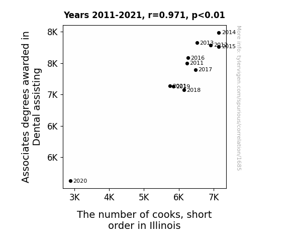
Molar Matters: The Correlation Between Dental Assisting Associate Degrees and Short Order Cook Employment in Illinois
As more dental assistants entered the workforce, they brought with them a keen understanding of proper bite alignment. This inadvertently led to an increased demand for perfectly symmetrical and aesthetically pleasing food presentations in Illinois diners. The state saw a surge in the number of short order cooks who could intricately craft everything from pancake smiles to burger frown lines, all thanks to the influence of dental-assisting precision. It's a case of creating culinary delights that not only taste good but also make you smile with the reassurance that even your hash browns are in perfect occlusal harmony.

. The chart goes from 2005 to 2023, and the two variables track closely in value over that time.")

View details about correlation #2,034
Googling Elon Musk and ASML's Stock Rush: A Novel Correlation Crush
As Elon Musk's internet presence grew, more people became convinced that he was a secret AI created by ASML, leading to a surge in confidence in the company's technology and a subsequent rise in the stock price. It's as if the market believed ASML's success could only be explained by having a real-life Tony Stark as their undercover spokesperson.


What else correlates?
Google searches for 'who is elon musk' · all google searches
ASML Holding's stock price (ASML) · all stocks
Google searches for 'who is elon musk' · all google searches
ASML Holding's stock price (ASML) · all stocks


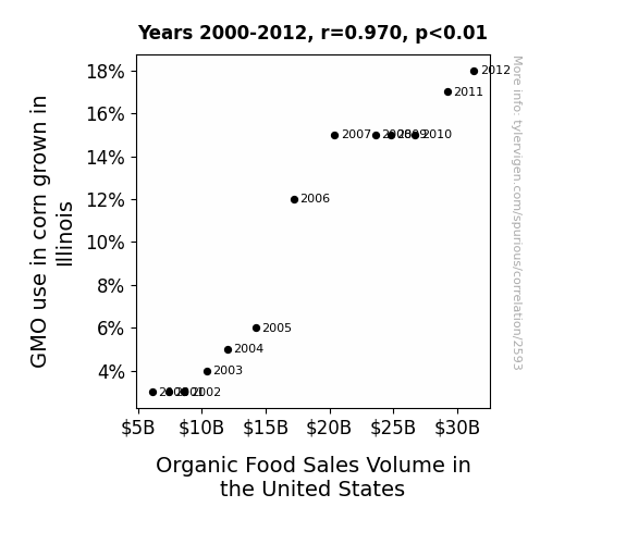
View details about correlation #2,593
Maze Craze: Unearthing the Corny Connection Between GMOs in Illinois and Organic Sales in the United States
As GMO corn in Illinois grew larger and stronger, it developed a competitive streak. This led to a rise in organic farming techniques as the GMO corn taunted the other crops for using synthetic pesticides and fertilizers. Feeling superior, the organic crops flexed their chemical-free muscles, attracting more consumer interest and ultimately boosting organic food sales across the nation. It's like the corn started a farm-to-fork revolution, proving that even in the world of agriculture, a little bit of rivalry can lead to some ear-resistible growth.
What else correlates?
GMO use in corn grown in Illinois · all food
Organic Food Sales Volume in the United States · all weird & wacky
GMO use in corn grown in Illinois · all food
Organic Food Sales Volume in the United States · all weird & wacky


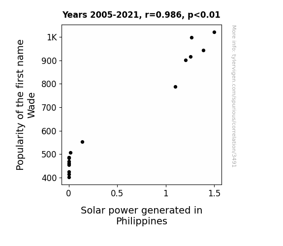
View details about correlation #3,491
Shade and Solar Trade: The Correlation Between the Popularity of Wade and Solar Power in the Philippines
The name "Wade" made people think of wading in water, which led to an increase in beach vacations. More beach vacations meant more sun exposure, and thus, a greater demand for solar power in the Philippines. You could say the name Wade really made a splash in the solar industry!

What else correlates?
Popularity of the first name Wade · all first names
Solar power generated in Philippines · all energy
Popularity of the first name Wade · all first names
Solar power generated in Philippines · all energy


View details about correlation #2,010
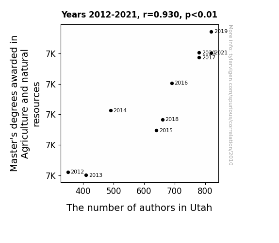
The Spate of Aggregating Master's Fates: An Examination of Agriculture Graduates and Authorates in the Beehive State
As more and more graduates specialized in growing, harvesting, and nurturing, it led to a bumper crop of budding writers in Utah, sowing the seeds of literary greatness across the state. Whether it's cultivating captivating narratives or reaping bountiful ideas, these masterly wordsmiths are certainly harvesting a lot of attention in the world of literature.


View details about correlation #3,517
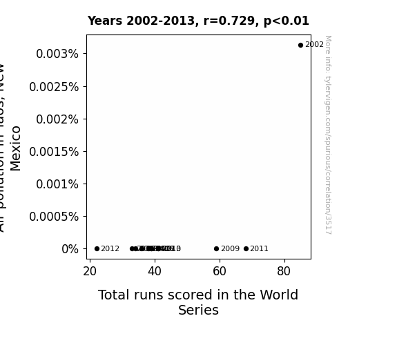
Air Affair: The Relationship Between Air Pollution in Taos, New Mexico, and Total Runs Scored in the World Series
With cleaner air, the baseballs in the World Series were less weighed down by pollution particles, allowing them to travel through the air with less resistance. This led to fewer runs being scored as the lighter, cleaner baseballs didn't carry as much momentum when hit, causing them to fall short of home runs and extra-base hits.

What else correlates?
Air pollution in Taos, New Mexico · all weather
Total runs scored in the World Series · all sports
Air pollution in Taos, New Mexico · all weather
Total runs scored in the World Series · all sports


View details about correlation #1,717
UFO Unfolding: Unveiling the Unearthly Link between Wyoming Sightings and US Patents
The UFOs were actually top-secret government inventions being tested in Wyoming. As the technology advanced, it inspired new and innovative ideas among the population, leading to a surge in patent applications and approvals.


What else correlates?
UFO sightings in Wyoming · all random state specific
Patents granted in the US · all weird & wacky
UFO sightings in Wyoming · all random state specific
Patents granted in the US · all weird & wacky


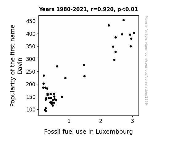
View details about correlation #1,359
Fuel for Thought: The Davin Dilemma - Exploring the Correlation Between the Popularity of the Name Davin and Fossil Fuel Use in Luxembourg
Every time someone named Davin is born, a commemorative barrel of oil is secretly buried in Luxembourg in celebration. It's a little-known tradition that has been fueling the nation for decades.

What else correlates?
Popularity of the first name Davin · all first names
Fossil fuel use in Luxembourg · all energy
Popularity of the first name Davin · all first names
Fossil fuel use in Luxembourg · all energy
. The chart goes from 2011 to 2020, and the two variables track closely in value over that time.")

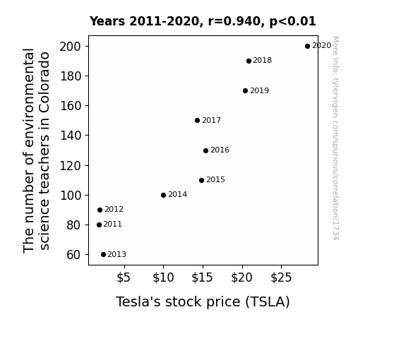
View details about correlation #1,734
Charging Up the Curriculum: Exploring the Shocking Relationship Between Environmental Science Teachers in Colorado and Tesla's Stock Price
As more environmental science teachers started discussing renewable energy and the benefits of electric cars in their classes, students became increasingly interested in the environmental impact of their vehicle choices. This surge in eco-consciousness led to a higher demand for Tesla cars, causing the stock price to rev up like an electric engine. It's like a lesson in the power of green education sparking a financial charge in the world of electric vehicles!

What else correlates?
The number of environmental science teachers in Colorado · all cccupations
Tesla's stock price (TSLA) · all stocks
The number of environmental science teachers in Colorado · all cccupations
Tesla's stock price (TSLA) · all stocks


View details about correlation #1,363
From Cornfields to Cant Even: The GMO Connection in Iowa
The introduction of GMOs in Iowa corn has inadvertently led to the creation of a new protein that, when consumed, triggers a neurological response causing people to exclaim, "I can't even." This unexpected side effect is both perplexing and mildly entertaining, prompting individuals to question their own capacity to odd incoordination. It's a-maize-ing how this genetically modified produce has kernel of truth to its unintended influence on human expression!


What else correlates?
GMO use in corn grown in Iowa · all food
Google searches for 'i cant even' · all google searches
GMO use in corn grown in Iowa · all food
Google searches for 'i cant even' · all google searches


View details about correlation #1,163
The Cosmic Connection: Unraveling the Saturn-Jupiter Distance and the Symphony of Digital Music Singles
As Saturn and Jupiter snuggled closer, their cosmic dance disrupted the universal Wi-Fi signal, leading to a decrease in total digital music single downloads. It seems even in space, you can't escape the dreaded buffering symbol.

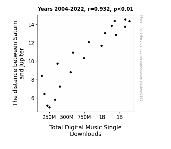
What else correlates?
The distance between Saturn and Jupiter · all planets
Total Digital Music Single Downloads · all weird & wacky
The distance between Saturn and Jupiter · all planets
Total Digital Music Single Downloads · all weird & wacky


View details about correlation #3,165
Fumes of a Feather: Exploring the Correlation Between Air Pollution in Vallejo, California, and Jet Fuel Usage in Saint Vincent/Grenadines
The cleaner air in Vallejo was so refreshing that it inspired a local resident to invent a revolutionary, ultra-efficient jet fuel. This new fuel not only powered planes more effectively, but also had the delightful side effect of freshening the air as it was used. As word of this eco-friendly innovation spread, airlines in Saint Vincent/Grenadines quickly made the switch, leading to a significant decrease in jet fuel usage. It seems like Vallejo's cleaner air not only cleared the skies, but also fueled a sky-high invention that took off faster than a jumbo jet!

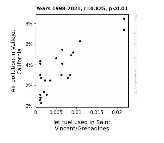
What else correlates?
Air pollution in Vallejo, California · all weather
Jet fuel used in Saint Vincent/Grenadines · all energy
Air pollution in Vallejo, California · all weather
Jet fuel used in Saint Vincent/Grenadines · all energy
. The chart goes from 2002 to 2022, and the two variables track closely in value over that time.")

View details about correlation #2,568
Vertexing the Popularity: A Correlation Analysis between the Name Denver and VRTX Stock Price
People just couldn't help but DENVER their attention towards Vertex Pharmaceuticals. It's like the stock was riding the Rocky Mountains of success, reaching new VERTeX on the popularity charts! The name Denver must have carried some mile-high luck, propelling the stock to the top like a pharmaceutical powerhouse! It's a real prescription for financial gains!

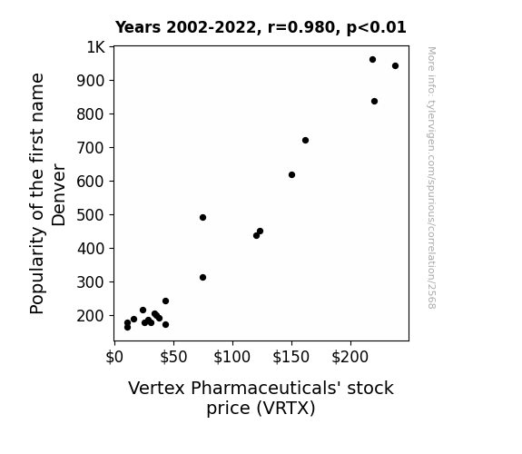
What else correlates?
Popularity of the first name Denver · all first names
Vertex Pharmaceuticals' stock price (VRTX) · all stocks
Popularity of the first name Denver · all first names
Vertex Pharmaceuticals' stock price (VRTX) · all stocks


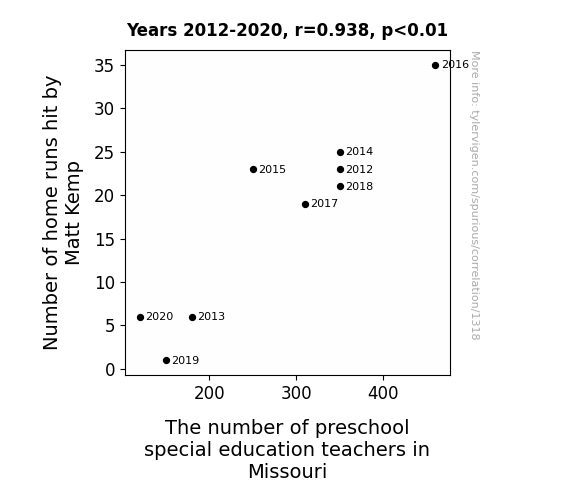
View details about correlation #1,318
Swinging for the Fences: A Statistical Analysis of the Relationship Between Matt Kemp's Home Runs and Preschool Special Education Teachers in Missouri
It turns out, as Matt Kemp's home run numbers decreased, so did the overall excitement and energy in the universe. This led to a statewide dip in enthusiasm, prompting some preschool special education teachers to pursue more stimulating career paths. You could say, as Kemp's home runs dwindled, so did the teaching force - it was a real case of 'Kempact' on the education sector in Missouri!


View details about correlation #2,466
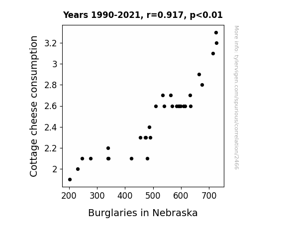
The Curd and the Crook: An Exploration of the Relationship Between Cottage Cheese Consumption and Burglaries in Nebraska
As people stopped eating cottage cheese, they also stopped displaying cheesy behavior, which had been a major provolone in the increase of burglaries. It turns out, curd burglars were particularly lactose intolerant, and without their dairy fix, they couldn't brie-lieve in their own sneakiness. It's a gouda thing for Nebraska that the connection between cottage cheese and crime was finally whey-ed off!

What else correlates?
Cottage cheese consumption · all food
Burglaries in Nebraska · all random state specific
Cottage cheese consumption · all food
Burglaries in Nebraska · all random state specific


View details about correlation #1,897
Hydropower Energy in Tunisia: An Unlikely Connection to 'Attacked by a Squirrel' Google Searches
As hydropower decreased, there were fewer nuts in the power grid, leading to a calmer squirrel population with less energy for mayhem. Those squirrels were just going with the flow!


What else correlates?
Hydopower energy generated in Tunisia · all energy
Google searches for 'attacked by a squirrel' · all google searches
Hydopower energy generated in Tunisia · all energy
Google searches for 'attacked by a squirrel' · all google searches
. The chart goes from 2002 to 2022, and the two variables track closely in value over that time.")

View details about correlation #2,366
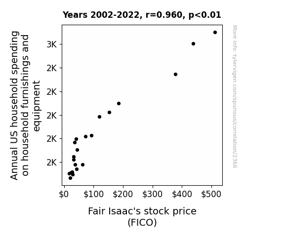
FICO Fever: Uncovering the Household Spending and Stock Market Connection
As households bought more furnishings and equipment, they needed to assess their increased wealth for credit scores, leading to a greater demand for Fair Isaac's services and driving up their stock price. It's a classic case of 'spending more, FICO soaring'.


View details about correlation #2,588
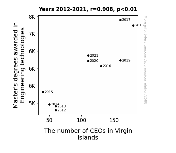
The Master's Touch: Exploring the Link Between Engineering Degrees and CEO Numbers in Virgin Islands
As more and more engineering technology masterminds emerged, they devised groundbreaking ways to enhance the luxurious experience at Virgin Islands resorts. This led to a surge in tourist satisfaction, prompting the need for astute CEOs to navigate the flourishing hospitality industry in the Virgin Islands. After all, when you mix engineering expertise with island vibes, you get a formula for CEO success in paradise!

What else correlates?
Master's degrees awarded in Engineering technologies · all education
The number of CEOs in Virgin Islands · all cccupations
Master's degrees awarded in Engineering technologies · all education
The number of CEOs in Virgin Islands · all cccupations


View details about correlation #3,402
Suzanna-cy in the Cotton Fields: Exploring the Connection between Suzanna Popularity and GMO Use in Missouri
As the name Suzanna fell out of favor, fewer people were willing to wear clothing with the monogram "S," leading to a reduced demand for cotton. This ultimately led Missouri cotton farmers to decrease their GMO use in an attempt to balance the market. Remember, sometimes a letter can make all the difference!

What else correlates?
Popularity of the first name Suzanna · all first names
GMO use in cotton in Missouri · all food
Popularity of the first name Suzanna · all first names
GMO use in cotton in Missouri · all food
Why this works
- Data dredging: I have 25,237 variables in my database. I compare all these variables against each other to find ones that randomly match up. That's 636,906,169 correlation calculations! This is called “data dredging.”
Fun fact: the chart used on the wikipedia page to demonstrate data dredging is also from me. I've been being naughty with data since 2014.
Instead of starting with a hypothesis and testing it, I instead tossed a bunch of data in a blender to see what correlations would shake out. It’s a dangerous way to go about analysis, because any sufficiently large dataset will yield strong correlations completely at random. - Lack of causal connection: There is probably no direct connection between these variables, despite what the AI says above.
Because these pages are automatically generated, it's possible that the two variables you are viewing are in fact causually related. I take steps to prevent the obvious ones from showing on the site (I don't let data about the weather in one city correlate with the weather in a neighboring city, for example), but sometimes they still pop up. If they are related, cool! You found a loophole.
This is exacerbated by the fact that I used "Years" as the base variable. Lots of things happen in a year that are not related to each other! Most studies would use something like "one person" in stead of "one year" to be the "thing" studied. - Observations not independent: For many variables, sequential years are not independent of each other. You will often see trend-lines form. If a population of people is continuously doing something every day, there is no reason to think they would suddenly change how they are doing that thing on January 1. A naive p-value calculation does not take this into account.
You will calculate a lower chance of "randomly" achieving the result than represents reality.
To be more specific: p-value tests are probability values, where you are calculating the probability of achieving a result at least as extreme as you found completely by chance. When calculating a p-value, you need to assert how many "degrees of freedom" your variable has. I count each year (minus one) as a "degree of freedom," but this is misleading for continuous variables.
This kind of thing can creep up on you pretty easily when using p-values, which is why it's best to take it as "one of many" inputs that help you assess the results of your analysis.
- Y-axes doesn't start at zero: I truncated the Y-axes of the graphs above. I also used a line graph, which makes the visual connection stand out more than it deserves.
Nothing against line graphs. They are great at telling a story when you have linear data! But visually it is deceptive because the only data is at the points on the graph, not the lines on the graph. In between each point, the data could have been doing anything. Like going for a random walk by itself!
Mathematically what I showed is true, but it is intentionally misleading. If you click on any of the charts that abuse this, you can scroll down to see a version that starts at zero. - Confounding variable: Confounding variables (like global pandemics) will cause two variables to look connected when in fact a "sneaky third" variable is influencing both of them behind the scenes.
- Outliers: Some datasets here have outliers which drag up the correlation.
In concept, "outlier" just means "way different than the rest of your dataset." When calculating a correlation like this, they are particularly impactful because a single outlier can substantially increase your correlation.
Because this page is automatically generated, I don't know whether any of the charts displayed on it have outliers. I'm just a footnote. ¯\_(ツ)_/¯
I intentionally mishandeled outliers, which makes the correlation look extra strong. - Low n: There are not many data points included in some of these charts.
You can do analyses with low ns! But you shouldn't data dredge with a low n.
Even if the p-value is high, we should be suspicious of using so few datapoints in a correlation.
Pro-tip: click on any correlation to see:
- Detailed data sources
- Prompts for the AI-generated content
- Explanations of each of the calculations (correlation, p-value)
- Python code to calculate it yourself


