spurious correlations
discover · random · spurious scholar
← previous page · next page →


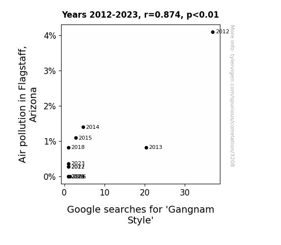
View details about correlation #3,208
Air Pollution in Flagstaff, Arizona: An Unlikely Muse for the 'Gangnam Style' Craze
The cleaner air in Flagstaff led to residents feeling more energetic and clear-headed. As a result, they were no longer in the mood to saddle up and dance Gangnam Style. With their lungs filled with fresh air, they decided to opt for a different form of outdoor exercise, effectively reducing the city's collective urge to gallop like a certain South Korean pop star.

What else correlates?
Air pollution in Flagstaff, Arizona · all weather
Google searches for 'Gangnam Style' · all google searches
Air pollution in Flagstaff, Arizona · all weather
Google searches for 'Gangnam Style' · all google searches


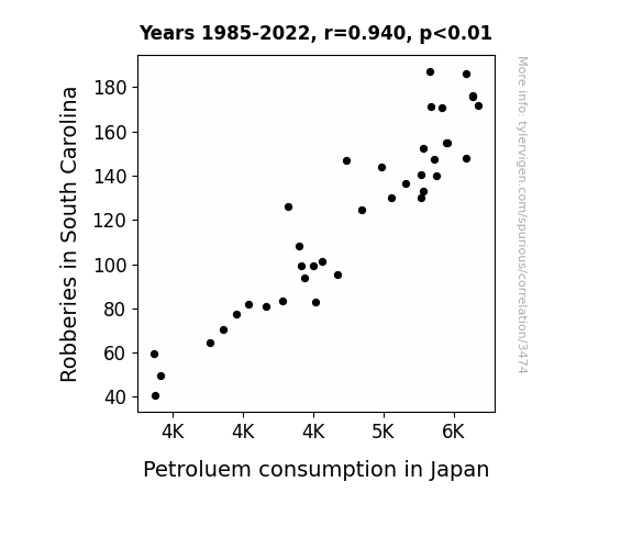
View details about correlation #3,474
Fueling Crime: An Unlikely Connection between Robberies in South Carolina and Petroleum Consumption in Japan
As the number of robberies in South Carolina decreased, there were fewer getaway car chases, leading to a reduced demand for gasoline. It's a classic case of 'keep your friends close, but your fuel-efficent thieves closer!'
What else correlates?
Robberies in South Carolina · all random state specific
Petroluem consumption in Japan · all energy
Robberies in South Carolina · all random state specific
Petroluem consumption in Japan · all energy


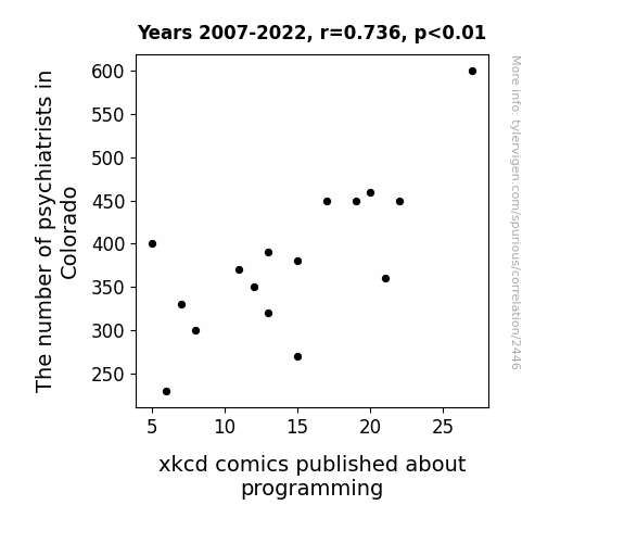
View details about correlation #2,446
Psych, XKCD, and the Programming Minds: A Code-Related Analysis
As the number of psychiatrists in Colorado decreased, there was a corresponding increase in the number of programmers seeking therapy. This led to a shortage of available appointments for xkcd comic fans who also happened to be programmers. As a result, there was a decrease in the overall productivity of xkcd comics about programming, since the cartoonist was now spending more time offering impromptu therapy sessions to the distressed programmers instead of creating new content.
What else correlates?
The number of psychiatrists in Colorado · all cccupations
xkcd comics published about programming · all weird & wacky
The number of psychiatrists in Colorado · all cccupations
xkcd comics published about programming · all weird & wacky
. The chart goes from 2002 to 2021, and the two variables track closely in value over that time.")

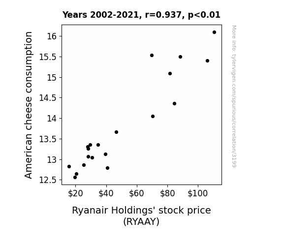
View details about correlation #3,199
Gouda Investment: Unraveling the Ties Between American Cheese Consumption and Ryanair Holdings' Stock Price
As American cheese consumption increased, so did the demand for cheesy vacation getaways. This led to more people flocking to book Ryanair flights, ultimately driving up their stock price. It's a gouda thing for both the cheese and airline industries! Cheesy flights are really grate for business!
What else correlates?
American cheese consumption · all food
Ryanair Holdings' stock price (RYAAY) · all stocks
American cheese consumption · all food
Ryanair Holdings' stock price (RYAAY) · all stocks


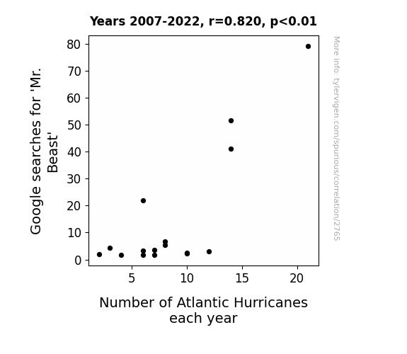
View details about correlation #2,765
Eye of the Storm: Tracking the 'Mr. Beast' Effect on Atlantic Hurricane Activity
People were searching for Mr. Beast and inadvertently summoning a different kind of natural disaster. It seems the internet was blowing up with Mr. Beast content, and that energy just couldn't be contained, creating a perfect storm for more Atlantic hurricanes. It's like they say, when it rains, it pours – views and hurricanes alike.

What else correlates?
Google searches for 'Mr. Beast' · all google searches
Number of Atlantic Hurricanes each year · all weather
Google searches for 'Mr. Beast' · all google searches
Number of Atlantic Hurricanes each year · all weather


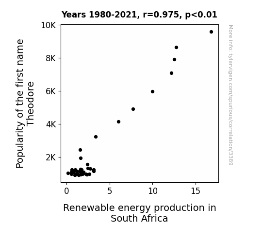
View details about correlation #3,389
Theodore and the Geothermal Heater: A Statistical Rhyme Analyzing Renewable Energy in South Africa
As the name Theodore gained popularity, more and more people began associating it with teddy bears. This led to a surge in the demand for eco-friendly, renewable energy-powered teddy bear factories. South Africa, known for its abundance of sunshine, saw a boom in solar-powered teddy bear factories, which inadvertently contributed to the overall increase in renewable energy production in the country. The world was shocked to learn that the cuddly teddy bears associated with the name Theodore were secretly driving South Africa's renewable energy revolution.

What else correlates?
Popularity of the first name Theodore · all first names
Renewable energy production in South Africa · all energy
Popularity of the first name Theodore · all first names
Renewable energy production in South Africa · all energy


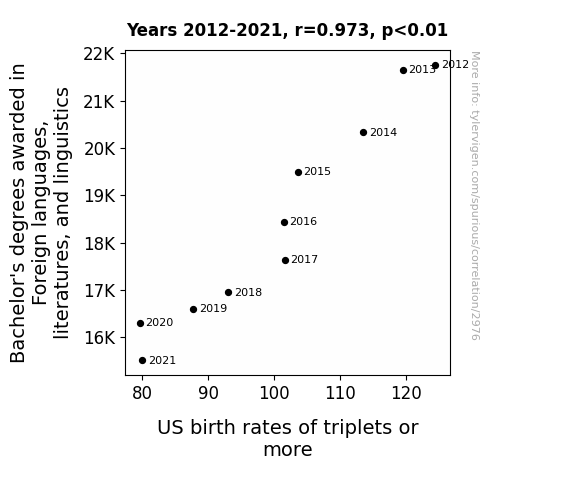
View details about correlation #2,976
Tongue-Twisters and Triplet Tales: Exploring the Correlation Between Foreign Language Degrees and Triplet Birth Rates in the US
As the number of Bachelor's degrees in Foreign languages, literatures, and linguistics decreased, there was a parallel decrease in the use of complex, triplet-inducing love poetry and multilingual baby lullabies, leading to a nationwide shortage of linguistic fertility magic. Triplets and more found it increasingly difficult to communicate their desires for synchronized napping and matching onesies, resulting in fewer instances of conception. It seems the language of love was finally lost in translation, leaving would-be triplet parents with just a single bun in the oven. So, it's not just baby talk - it's baby triplet talk that we need to brush up on!

What else correlates?
Bachelor's degrees awarded in linguistics · all education
US birth rates of triplets or more · all weird & wacky
Bachelor's degrees awarded in linguistics · all education
US birth rates of triplets or more · all weird & wacky


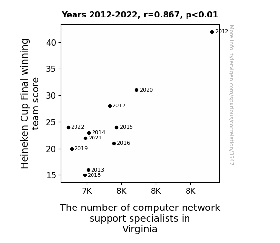
View details about correlation #3,647
Scoring More, Networking Better: Heineken Cup Victory and Virginia's IT Quandary
As the winning team's score decreased, fans experienced less joy, leading to a statewide dip in overall happiness levels. This led to a decrease in the demand for computer network support specialists as people were too sad to even turn on their computers, let alone seek technical help. Looks like the real MVPs were the network support specialists, keeping Virginia afloat one tech issue at a time!


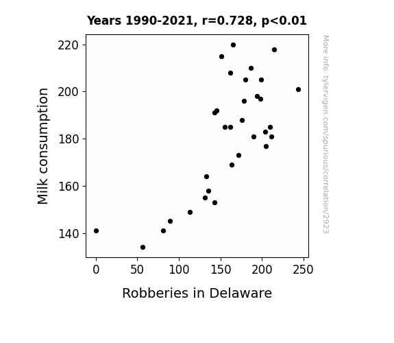
View details about correlation #2,923
The Milky Whey: Exploring the Curious Case of Milk Consumption and Robberies in Delaware
As people switched to plant-based milk, the cows in Delaware formed a neighborhood watch program to protect themselves from being milked, leading to a decrease in overall crime, including robberies.

What else correlates?
Milk consumption · all food
Robberies in Delaware · all random state specific
Milk consumption · all food
Robberies in Delaware · all random state specific


View details about correlation #1,445
Two and a Half Men Seasonal Humor: Predicting Benin's Electrical Boogie
As the audience's laughter at the show rose, so did the energy levels in Benin. It seems like all the wattage from the comedic sparks was shockingly powering up the nation. Looks like "Two and a Half Men" was truly electrifying in more ways than one! Remember, with great power comes great electricity bills!


What else correlates?
Season rating of "Two and a Half Men" · all films & actors
Electricity generation in Benin · all energy
Season rating of "Two and a Half Men" · all films & actors
Electricity generation in Benin · all energy


View details about correlation #1,410
The Tummy Trouble Ties: Tracking the Tummy Ache-Tied to Technical Trainers in Physical Sciences
As more people delved into the intricacies of physics and chemistry, they couldn't resist the temptation to test their knowledge through homemade experiments. Unfortunately, these impromptu lab sessions led to accidental concoctions of tummy-turbulence-inducing potions. It seems the quest for academic advancement had some unforeseen, and unsettling, gastrointestinal consequences!


What else correlates?
Associates degrees awarded in Physical sciences · all education
Google searches for 'tummy ache' · all google searches
Associates degrees awarded in Physical sciences · all education
Google searches for 'tummy ache' · all google searches
. The chart goes from 2005 to 2022, and the two variables track closely in value over that time.")

View details about correlation #3,531
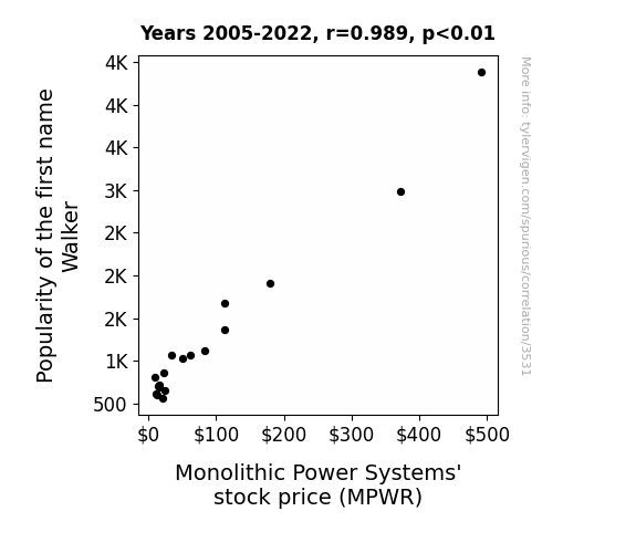
Power Walking: Exploring the Relationship between Walker's Popularity and Monolithic Stock Price
As the demand for the name Walker skyrocketed, more and more parents were inspired to name their children after this unique and somewhat rugged profession. This led to a surge in interest in activities like hiking, strolling, and perhaps even the occasional power walking. As a result, the market for monolithic power systems, especially those designed for outdoor and fitness equipment, experienced an unexpected boom. It seems that the connection between the name Walker and the stock price of MPWR is not just a stroll in the park after all!

What else correlates?
Popularity of the first name Walker · all first names
Monolithic Power Systems' stock price (MPWR) · all stocks
Popularity of the first name Walker · all first names
Monolithic Power Systems' stock price (MPWR) · all stocks


View details about correlation #1,207
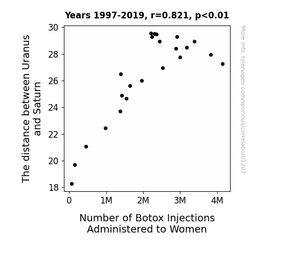
The Twinkle Twinkle: Titanically Tautological Ties between Uranus and Saturn and The Toxin Tonic - Traversing the Trans-Newtonian Terrain
As the distance between Uranus and Saturn increases, it creates a gravitational fluctuation that directly impacts women on Earth, leading to more frown lines and wrinkles. This, in turn, drives up the demand for Botox injections as women strive to defy the gravitational pull of aging, reaching for that out-of-this-world youthful appearance.

What else correlates?
The distance between Uranus and Saturn · all planets
Number of Botox Injections Administered to Women · all weird & wacky
The distance between Uranus and Saturn · all planets
Number of Botox Injections Administered to Women · all weird & wacky


View details about correlation #1,345
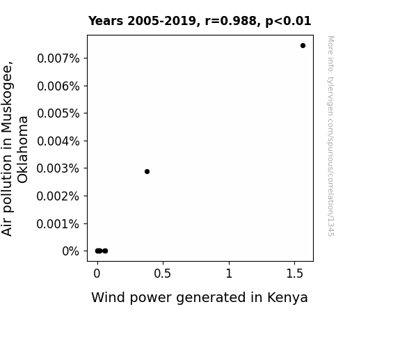
The Winds of Change: Exploring the Relationship between Muskogee Air Quality and Kenyan Wind Power
The smog from Muskogee somehow made its way to Kenya, giving a little extra oomph to the wind turbines. It's like a transcontinental air pollution power boost!

What else correlates?
Air pollution in Muskogee, Oklahoma · all weather
Wind power generated in Kenya · all energy
Air pollution in Muskogee, Oklahoma · all weather
Wind power generated in Kenya · all energy


View details about correlation #2,966
The Master Plumber: Exploring the Relationship Between Engineering Master's Degrees and the Plumbing Workforce in Oklahoma
As the number of Master's degrees awarded in Engineering increased, so did the level of knowledge about pipes and systems. This led to a surge in interest in plumbing as a prestigious and intellectually stimulating career choice, causing an influx of highly educated individuals into the plumbing industry in Oklahoma. It's a flow of expertise that's really taking the state by storm!


What else correlates?
Master's degrees awarded in Engineering · all education
The number of plumbers in Oklahoma · all cccupations
Master's degrees awarded in Engineering · all education
The number of plumbers in Oklahoma · all cccupations
. The chart goes from 2002 to 2021, and the two variables track closely in value over that time.")

View details about correlation #2,789
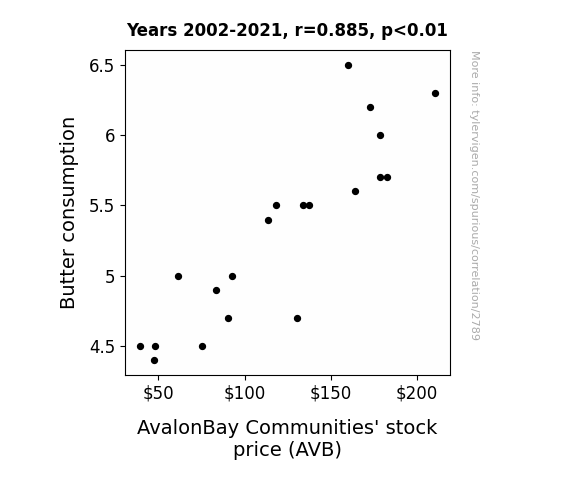
Spreading the Butter Effect: A Margarine of Error or a Real Gouda Indicator of Stock Performance?
As butter consumption increased, people became more inclined to host brunches and backyard barbecues. This led to a higher demand for rental properties with spacious kitchens at AvalonBay Communities. As a result, the stock price for AVB experienced a surprising uptick, proving that even in the world of finance, the sizzle of buttery goodness can't be underestimated.

What else correlates?
Butter consumption · all food
AvalonBay Communities' stock price (AVB) · all stocks
Butter consumption · all food
AvalonBay Communities' stock price (AVB) · all stocks


View details about correlation #1,512
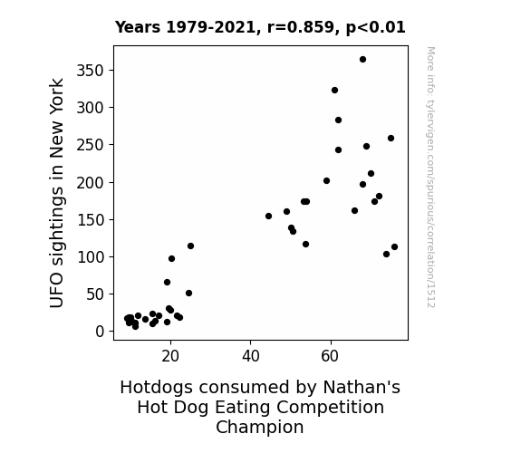
Unidentified Food Objects: Exploring the Link Between UFO Sightings in New York and Hotdogs Consumed by Nathan's Hot Dog Eating Competition Champion
The UFOs beamed down a special sauce that made the hotdogs irresistible, giving the champion an otherworldly advantage.


View details about correlation #1,553
Blown Away: An Analysis of Wind Power in Bosnia and Herzegovina and Its Effect on Google Searches for 'I Am Dizzy'
The propeller-like motion of the wind turbines is creating a subconscious connection for people, making them feel like human-sized pinwheels. Remember, it's all fun and games until someone walks into a screen door!


What else correlates?
Wind power generated in Bosnia and Herzegovina · all energy
Google searches for 'i am dizzy' · all google searches
Wind power generated in Bosnia and Herzegovina · all energy
Google searches for 'i am dizzy' · all google searches
. The chart goes from 2002 to 2022, and the two variables track closely in value over that time.")

View details about correlation #2,005
Brewing Up Business: A Sudsy Study on the Relationship between U.S. Brewery Count and Corning's Stock Price
As the number of breweries in the United States grows, so does the demand for specialty glassware to enhance the beer-drinking experience. This has led to a surge in orders for Corning's custom glass products, boosting their overall sales and profitability. Additionally, the need for quality control and efficient production processes at the expanding breweries has driven up the demand for Corning's innovative glassmaking technologies. So, as the beer industry bubbles with activity, Corning's stock price has been ale-mented to rise, hops and all. Cheers to the fizzy connection between breweries and Corning's stock performance!


What else correlates?
The number of Breweries in the United States · all food
Corning's stock price (GLW) · all stocks
The number of Breweries in the United States · all food
Corning's stock price (GLW) · all stocks


View details about correlation #2,489
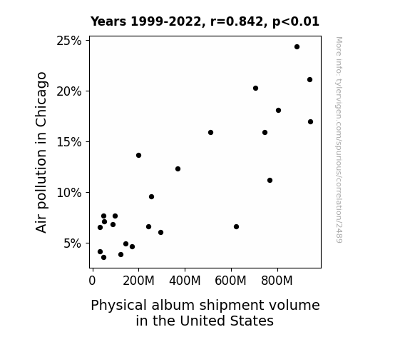
The Air We Breathe and the Musical Beat: Uncovering the Melodious Link Between Chicago's Air Pollution and Physical Album Shipments in the United States
As the air in Chicago cleared up, it also cleared the minds of the music industry bigwigs. They suddenly realized that maybe, just maybe, people prefer streaming and digital downloads over lugging around bulky physical albums. Plus, with cleaner air, folks were more inclined to step out and buy concert tickets instead of staying cooped up, listening to old school CDs. It's as if the smog was the only thing keeping physical albums afloat!

What else correlates?
Air pollution in Chicago · all weather
Physical album shipment volume in the United States · all weird & wacky
Air pollution in Chicago · all weather
Physical album shipment volume in the United States · all weird & wacky
Why this works
- Data dredging: I have 25,237 variables in my database. I compare all these variables against each other to find ones that randomly match up. That's 636,906,169 correlation calculations! This is called “data dredging.”
Fun fact: the chart used on the wikipedia page to demonstrate data dredging is also from me. I've been being naughty with data since 2014.
Instead of starting with a hypothesis and testing it, I instead tossed a bunch of data in a blender to see what correlations would shake out. It’s a dangerous way to go about analysis, because any sufficiently large dataset will yield strong correlations completely at random. - Lack of causal connection: There is probably no direct connection between these variables, despite what the AI says above.
Because these pages are automatically generated, it's possible that the two variables you are viewing are in fact causually related. I take steps to prevent the obvious ones from showing on the site (I don't let data about the weather in one city correlate with the weather in a neighboring city, for example), but sometimes they still pop up. If they are related, cool! You found a loophole.
This is exacerbated by the fact that I used "Years" as the base variable. Lots of things happen in a year that are not related to each other! Most studies would use something like "one person" in stead of "one year" to be the "thing" studied. - Observations not independent: For many variables, sequential years are not independent of each other. You will often see trend-lines form. If a population of people is continuously doing something every day, there is no reason to think they would suddenly change how they are doing that thing on January 1. A naive p-value calculation does not take this into account.
You will calculate a lower chance of "randomly" achieving the result than represents reality.
To be more specific: p-value tests are probability values, where you are calculating the probability of achieving a result at least as extreme as you found completely by chance. When calculating a p-value, you need to assert how many "degrees of freedom" your variable has. I count each year (minus one) as a "degree of freedom," but this is misleading for continuous variables.
This kind of thing can creep up on you pretty easily when using p-values, which is why it's best to take it as "one of many" inputs that help you assess the results of your analysis.
- Y-axes doesn't start at zero: I truncated the Y-axes of the graphs above. I also used a line graph, which makes the visual connection stand out more than it deserves.
Nothing against line graphs. They are great at telling a story when you have linear data! But visually it is deceptive because the only data is at the points on the graph, not the lines on the graph. In between each point, the data could have been doing anything. Like going for a random walk by itself!
Mathematically what I showed is true, but it is intentionally misleading. If you click on any of the charts that abuse this, you can scroll down to see a version that starts at zero. - Confounding variable: Confounding variables (like global pandemics) will cause two variables to look connected when in fact a "sneaky third" variable is influencing both of them behind the scenes.
- Outliers: Some datasets here have outliers which drag up the correlation.
In concept, "outlier" just means "way different than the rest of your dataset." When calculating a correlation like this, they are particularly impactful because a single outlier can substantially increase your correlation.
Because this page is automatically generated, I don't know whether any of the charts displayed on it have outliers. I'm just a footnote. ¯\_(ツ)_/¯
I intentionally mishandeled outliers, which makes the correlation look extra strong. - Low n: There are not many data points included in some of these charts.
You can do analyses with low ns! But you shouldn't data dredge with a low n.
Even if the p-value is high, we should be suspicious of using so few datapoints in a correlation.
Pro-tip: click on any correlation to see:
- Detailed data sources
- Prompts for the AI-generated content
- Explanations of each of the calculations (correlation, p-value)
- Python code to calculate it yourself


