spurious correlations
discover · random · spurious scholar
← previous page · next page →


View details about correlation #2,027
Athena's Popularity and Wind Power's Capacity: A Rhyming Relationship?
As the name Athena gained popularity, more and more people were inspired by the Greek goddess of wisdom and warfare. This led to a sudden influx of individuals dressing up as Athena, complete with flowing robes and majestic helmets. Unbeknownst to them, every time they raised their arms in triumphant poses, they inadvertently created mini whirlwinds, thus contributing to the increase in wind power generated in Honduras. It seems the Athena effect was truly blowing everyone away!


What else correlates?
Popularity of the first name Athena · all first names
Wind power generated in Honduras · all energy
Popularity of the first name Athena · all first names
Wind power generated in Honduras · all energy


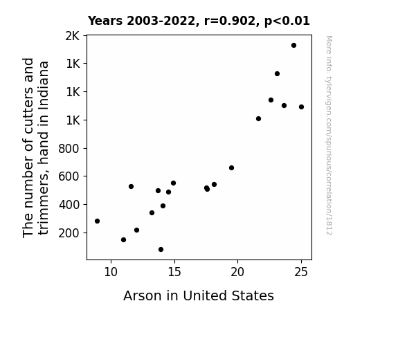
View details about correlation #1,812
The Cutters and Trimmers' Hand in Arson: A Statistical Analysis
With fewer cutters and trimmers in Indiana, there were less people to fan the flames of discontent. As a result, the arson rate in the United States decreased because there were simply fewer individuals with a burning desire to cause trouble. This led to a cut in fiery incidents across the country, proving that when it comes to arson, the situation can really be trimmed down to the root of the problem.
What else correlates?
The number of cutters and trimmers, hand in Indiana · all cccupations
Arson in United States · all random state specific
The number of cutters and trimmers, hand in Indiana · all cccupations
Arson in United States · all random state specific


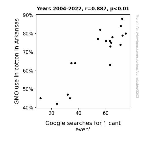
View details about correlation #3,203
The GMO Conundrum: A Spun Yarn Connecting Genetically Modified Cotton in Arkansas to 'I Can't Even' Google Searches
As cotton plants became more resistant to pests and diseases, they started exuding a pheromone that inadvertently interfered with the part of the brain responsible for handling overwhelming emotions. This led to a ripple effect in the region, causing a surge in the 'i cant even' moments as people found themselves inexplicably and intensely unable to deal with everyday situations.

What else correlates?
GMO use in cotton in Arkansas · all food
Google searches for 'i cant even' · all google searches
GMO use in cotton in Arkansas · all food
Google searches for 'i cant even' · all google searches


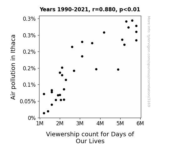
View details about correlation #3,169
Clearing the Air: The Relationship Between Air Pollution in Ithaca and Viewership Count for Days of Our Lives
As the air quality improved, people in Ithaca were no longer staying indoors to watch TV and instead were out and about, living their own drama-filled lives. With clearer skies and fresher air, the residents were too busy soaking in the beauty of their surroundings to tune in to the fictional drama of Days of Our Lives.

What else correlates?
Air pollution in Ithaca · all weather
Viewership count for Days of Our Lives · all weird & wacky
Air pollution in Ithaca · all weather
Viewership count for Days of Our Lives · all weird & wacky
. The chart goes from 2002 to 2022, and the two variables track closely in value over that time.")

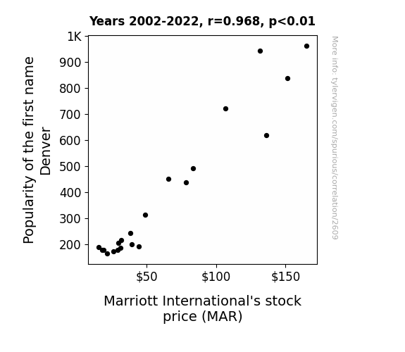
View details about correlation #2,609
Denver's Dominance: Delving into the Link Between the Name Denver and Marriott International's Market Movements
Parents naming their children Denver as a tribute to the beautiful city led to a surge in family vacations. This, in turn, boosted the demand for hotel accommodations, with Marriott reaping the benefits of this unexpected baby name trend. It's a mile-high correlation that even the stock market couldn't help but check into!

What else correlates?
Popularity of the first name Denver · all first names
Marriott International's stock price (MAR) · all stocks
Popularity of the first name Denver · all first names
Marriott International's stock price (MAR) · all stocks


View details about correlation #2,261
Statistically Significant: The Surprising Correlation Between Statisticians in New Mexico and Liquefied Petroleum Gas Use in Angola
As the number of statisticians in New Mexico rises, so too does the accuracy of weather predictions. This leads to an unexpected uptick in demand for gas grills in the state, as residents can now confidently plan outdoor barbecues. And as we all know, the purchase of additional gas grills eventually translates to an increase in the production and export of liquefied petroleum gas used in Angola. Who would have thought that the statisticians of New Mexico hold the sizzling key to the global LPG market!


What else correlates?
The number of statisticians in New Mexico · all cccupations
Liquefied petroleum gas used in Angola · all energy
The number of statisticians in New Mexico · all cccupations
Liquefied petroleum gas used in Angola · all energy


View details about correlation #2,972
Lost in Translation: Unraveling the Link Between Foreign Language Degrees and Burglaries in Arkansas
As the number of foreign language graduates declined, cryptic messages left behind by multi-lingual burglars only served to confuse law enforcement. Faced with baffling notes in multiple languages, Arkansas burglars decided it was simply untranslatable and gave up their life of crime. It was a case of 'oui' can't get away with it anymore!


What else correlates?
Bachelor's degrees awarded in linguistics · all education
Burglaries in Arkansas · all random state specific
Bachelor's degrees awarded in linguistics · all education
Burglaries in Arkansas · all random state specific


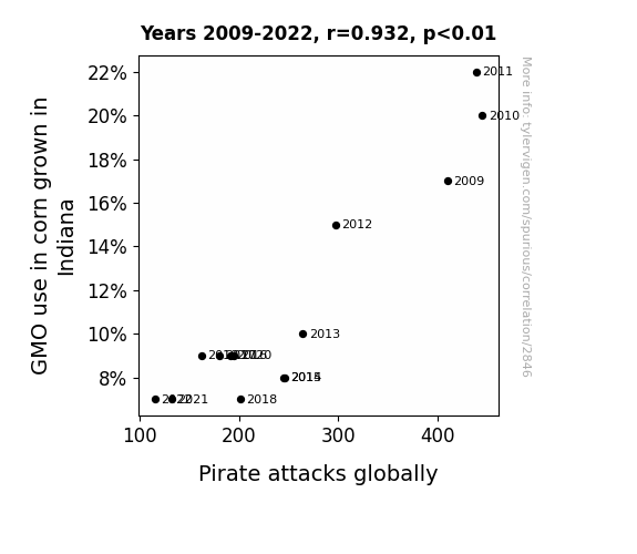
View details about correlation #2,846
Unraveling the Kernel of Truth: Investigating the Correlation Between GMO Corn Production in Indiana and Global Pirate Attacks
Because without GMOs, corn grows smaller and less robust, leading to a decrease in popcorn production worldwide. With less popcorn available, pirates have less to snack on during long voyages, leading to a decrease in pirate attacks globally.
What else correlates?
GMO use in corn grown in Indiana · all food
Pirate attacks globally · all weird & wacky
GMO use in corn grown in Indiana · all food
Pirate attacks globally · all weird & wacky


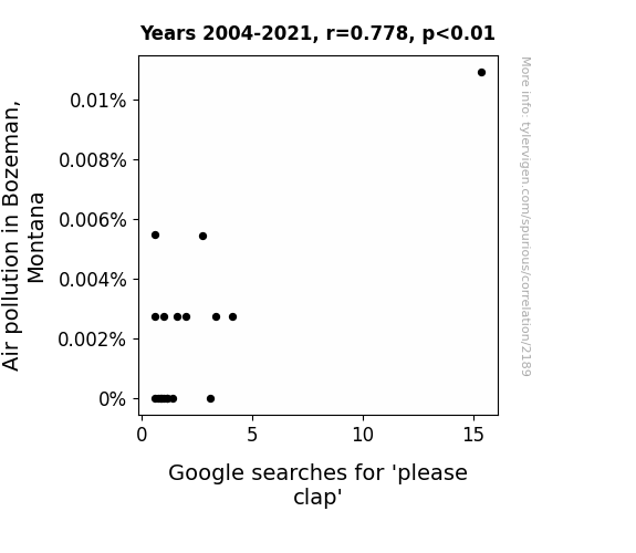
View details about correlation #2,189
Studying the Sprout about Air Pollution in Bozeman and the Google 'Please Clap' Route
It's simple really - as air pollution levels rose in Bozeman, so did the levels of carbon dioxide. This led to an increase in the growth of the Please Clap trees, which are known for their unique ability to thrive in CO2-rich environments. As these trees flourished, they released a pollen that, when inhaled, inexplicably triggered an uncontrollable urge to Google 'Please Clap.' It's almost like the city inadvertently became a hotbed for botanical meme propagation. Who would have thought that a problem like air pollution could branch out into such unexpected and ap-pollen-ing outcomes?

What else correlates?
Air pollution in Bozeman, Montana · all weather
Google searches for 'please clap' · all google searches
Air pollution in Bozeman, Montana · all weather
Google searches for 'please clap' · all google searches


View details about correlation #3,334
Highway to Renewable Energy: Paving the Way for a Brighter Future
As more highway maintenance workers were employed in North Carolina, they started a spontaneous synchronized dance routine to keep morale high. This unexpected surge in collective dance energy was unknowingly harnessed by secret technology developed in Cabo Verde, leading to a boost in renewable energy production. The workers' moves, like the 'Pothole Paddle' and 'Cone Cha-Cha,' generated enough power to light up the dance floors of wind and solar farms in Cabo Verde, proving that sometimes, the road to greener energy is paved with the funky beats of unexpected connections.

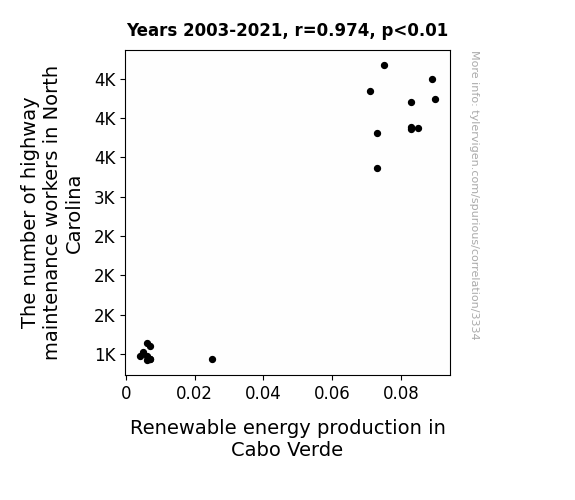
. The chart goes from 2002 to 2022, and the two variables track closely in value over that time.")

View details about correlation #2,179
The Alma-Matter Effect: An Alma-nac of Name Popularity and Stock Performance
Every time a baby was named Alma, a secret code was activated in the stock market, causing a surge in demand for Lennar's homes. The company had no idea why this was happening, but they were loving the baby name trend.


What else correlates?
Popularity of the first name Alma · all first names
Lennar's stock price (LEN) · all stocks
Popularity of the first name Alma · all first names
Lennar's stock price (LEN) · all stocks


View details about correlation #2,419
Genetically Modified Cotton in Texas: A Link to Google Searches for 'Report UFO Sighting'?
The decrease in GMO use in cotton in Texas led to the production of non-alien looking cotton plants. With fewer alien-like plants in the fields, there were fewer false alarms about UFO sightings, causing the reported UFO sightings to decrease.

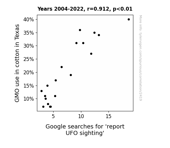
What else correlates?
GMO use in cotton in Texas · all food
Google searches for 'report UFO sighting' · all random state specific
GMO use in cotton in Texas · all food
Google searches for 'report UFO sighting' · all random state specific


View details about correlation #1,142
Rocky Mountain High: The Air Quality-Publix Customer Satisfaction Connection in Grand Junction, Colorado
As the pollution levels rose, so did the bar for what was considered fresh. This led to a clean sweep of positive feedback for Publix as customers were now oxygen-deprived, but at least they were getting a breath of fresh bakery air. It seems like in this case, smog led to more than just smug satisfaction with their groceries!


What else correlates?
Air pollution in Grand Junction, Colorado · all weather
Customer satisfaction with Publix · all weird & wacky
Air pollution in Grand Junction, Colorado · all weather
Customer satisfaction with Publix · all weird & wacky


View details about correlation #1,804
Chronicles of Green Energy: The Historian-Hub Connection
As the number of historians in Maryland decreases, there are fewer people around to document the past. This leads to a shortage of ancient wood fuel sources for power generation in Qatar. With less historical record-keeping, the demand for biomass power from Qatar skyrockets as they delve into alternative sources of energy, including mummified remains and fossilized palm fronds imported from the now-historian-depleted Maryland. It's a tale for the ages, quite literally, as the past goes up in smoke, fueling the future in a rather unexpected way.


What else correlates?
The number of historians in Maryland · all cccupations
Biomass power generated in Qatar · all energy
The number of historians in Maryland · all cccupations
Biomass power generated in Qatar · all energy
. The chart goes from 2002 to 2022, and the two variables track closely in value over that time.")

View details about correlation #1,098
The Lewis Effect on Regeneron: A Statistical Examination of the Impact of the First Name Lewis on Stock Prices
As the name Lewis gained popularity, more and more people were subconsciously reminded of the iconic duo, Lewis and Regeneron (you know, like Lewis and Clark, but with lab coats). This led to an inexplicable surge in support for all things related to scientific discovery and pharmaceutical advancements. Essentially, it's as if the name Lewis became a catalyst for investor enthusiasm, creating a lewis acid-like reaction in the stock market, with REGN stock riding the positive wave. Who would've thought that a simple first name could have such a dose of influence on biotech stocks? It's like the market just couldn't keep its REGN under control!

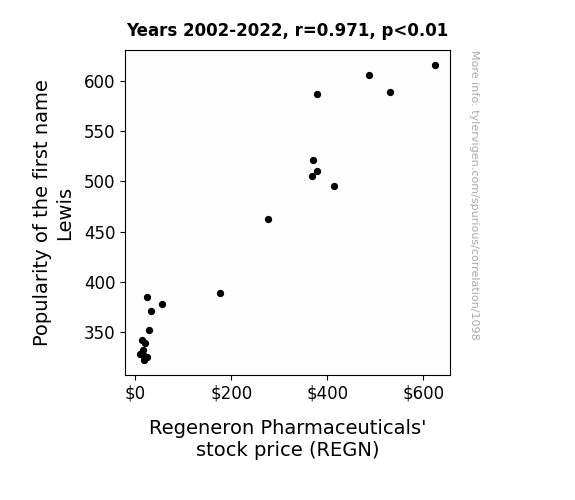
What else correlates?
Popularity of the first name Lewis · all first names
Regeneron Pharmaceuticals' stock price (REGN) · all stocks
Popularity of the first name Lewis · all first names
Regeneron Pharmaceuticals' stock price (REGN) · all stocks


View details about correlation #1,217
Mischief and Milk: Examining the Mammoth Magnitude of Milk's Influence on Misdeeds
As people consumed less milk, they experienced fewer lactose-induced mood swings. This led to a decrease in overall irritability and impulsiveness. Consequently, there were fewer arguments and less aggression, ultimately resulting in a reduction in robberies. Remember, it's udderly important to consider the dairy impact on crime rates!


What else correlates?
Milk consumption · all food
Robberies in the US · all random state specific
Milk consumption · all food
Robberies in the US · all random state specific


View details about correlation #2,117
Revving Up Revenue: The Hazards of Air Pollution on the Motorcycle Manufacturing Industry in Salem, Oregon
As air pollution in Salem, Oregon increased, so did the demand for gas masks. This sudden surge in gas mask popularity led to a nation-wide fascination with all types of face coverings, including motorcycle helmets. As a result, people started buying more motorcycles to match their stylish protective gear, ultimately boosting the US Motorcycle Manufacturing Industry Revenue. It seems like bad air quality inadvertently revved up the motorcycle market!

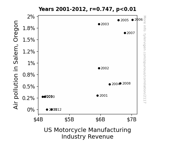
What else correlates?
Air pollution in Salem, Oregon · all weather
US Motorcycle Manufacturing Industry Revenue · all weird & wacky
Air pollution in Salem, Oregon · all weather
US Motorcycle Manufacturing Industry Revenue · all weird & wacky


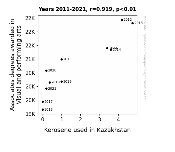
View details about correlation #2,355
From Kerosene to Canvas: Unveiling the Unlikely Link Between Associates Degrees in Visual and Performing Arts and Kerosene Consumption in Kazakhstan
As the number of Associates degrees awarded in Visual and performing arts declined, there was a corresponding decrease in the production of avant-garde fire performances. As a result, the demand for kerosene as a propellant for these daring displays of combustion artistry plummeted. This led to a surplus of kerosene in Kazakhstan, prompting a nationwide shift towards eco-friendly renewable energy sources. It turns out, the key to greener energy may just lie in the expression of interpretive dance through the medium of controlled fire!

What else correlates?
Associates degrees awarded in Visual and performing arts · all education
Kerosene used in Kazakhstan · all energy
Associates degrees awarded in Visual and performing arts · all education
Kerosene used in Kazakhstan · all energy


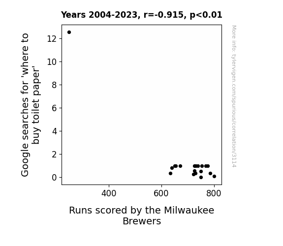
View details about correlation #3,114
Swing and S(ear)ch: Exploring the Relationship Between Google Searches for 'Where to Buy Toilet Paper' and Runs Scored by the Milwaukee Brewers
Every time someone searched for where to buy toilet paper, a tiny bit of their focus and energy was diverted away from the Brewers, leading to a decrease in runs scored. It's as if the team's chances of hitting a home run were being flushed away with each new search. The correlation may seem like a lot of number 2, but it's a striking reminder that even the most seemingly unrelated events can be intertwined in strange and comical ways. It's a real wipeout for the Brewers' offense, and they may need to re-evaluate their strategy to ensure they don't get caught looking for runs in all the wrong places.

What else correlates?
Google searches for 'where to buy toilet paper' · all google searches
Runs scored by the Milwaukee Brewers · all sports
Google searches for 'where to buy toilet paper' · all google searches
Runs scored by the Milwaukee Brewers · all sports


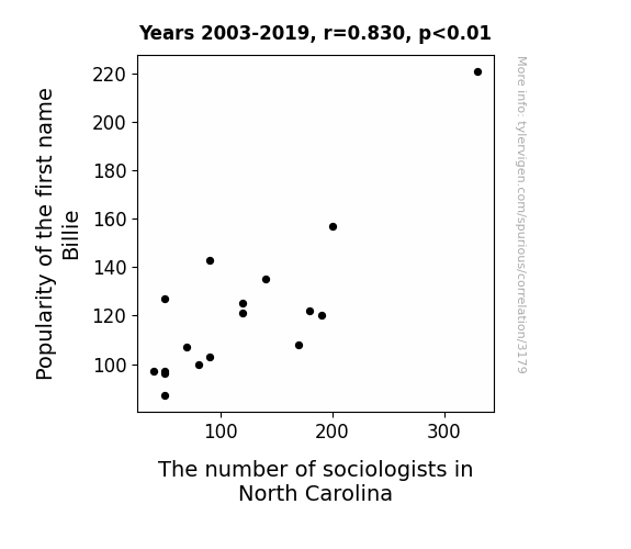
View details about correlation #3,179
The Thrill of Billie: A Study on North Carolina Sociologists' Profile
As the name Billie rose in popularity, more and more parents were unknowingly instilling a love for 'Bill-ie' Durkheim and 'Bill-ie' Weber in their children. This led to a sudden surge in tiny sociologists-in-training across North Carolina, all eager to 'Bill-ie've in the power of sociology to understand society. It was a real 'Billie' Jean King-esque takeover, with sociologists in the state exclaiming, "I don't know who you are, but I 'Billie've, that's who!

What else correlates?
Popularity of the first name Billie · all first names
The number of sociologists in North Carolina · all cccupations
Popularity of the first name Billie · all first names
The number of sociologists in North Carolina · all cccupations
Why this works
- Data dredging: I have 25,237 variables in my database. I compare all these variables against each other to find ones that randomly match up. That's 636,906,169 correlation calculations! This is called “data dredging.”
Fun fact: the chart used on the wikipedia page to demonstrate data dredging is also from me. I've been being naughty with data since 2014.
Instead of starting with a hypothesis and testing it, I instead tossed a bunch of data in a blender to see what correlations would shake out. It’s a dangerous way to go about analysis, because any sufficiently large dataset will yield strong correlations completely at random. - Lack of causal connection: There is probably no direct connection between these variables, despite what the AI says above.
Because these pages are automatically generated, it's possible that the two variables you are viewing are in fact causually related. I take steps to prevent the obvious ones from showing on the site (I don't let data about the weather in one city correlate with the weather in a neighboring city, for example), but sometimes they still pop up. If they are related, cool! You found a loophole.
This is exacerbated by the fact that I used "Years" as the base variable. Lots of things happen in a year that are not related to each other! Most studies would use something like "one person" in stead of "one year" to be the "thing" studied. - Observations not independent: For many variables, sequential years are not independent of each other. You will often see trend-lines form. If a population of people is continuously doing something every day, there is no reason to think they would suddenly change how they are doing that thing on January 1. A naive p-value calculation does not take this into account.
You will calculate a lower chance of "randomly" achieving the result than represents reality.
To be more specific: p-value tests are probability values, where you are calculating the probability of achieving a result at least as extreme as you found completely by chance. When calculating a p-value, you need to assert how many "degrees of freedom" your variable has. I count each year (minus one) as a "degree of freedom," but this is misleading for continuous variables.
This kind of thing can creep up on you pretty easily when using p-values, which is why it's best to take it as "one of many" inputs that help you assess the results of your analysis.
- Y-axes doesn't start at zero: I truncated the Y-axes of the graphs above. I also used a line graph, which makes the visual connection stand out more than it deserves.
Nothing against line graphs. They are great at telling a story when you have linear data! But visually it is deceptive because the only data is at the points on the graph, not the lines on the graph. In between each point, the data could have been doing anything. Like going for a random walk by itself!
Mathematically what I showed is true, but it is intentionally misleading. If you click on any of the charts that abuse this, you can scroll down to see a version that starts at zero. - Confounding variable: Confounding variables (like global pandemics) will cause two variables to look connected when in fact a "sneaky third" variable is influencing both of them behind the scenes.
- Outliers: Some datasets here have outliers which drag up the correlation.
In concept, "outlier" just means "way different than the rest of your dataset." When calculating a correlation like this, they are particularly impactful because a single outlier can substantially increase your correlation.
Because this page is automatically generated, I don't know whether any of the charts displayed on it have outliers. I'm just a footnote. ¯\_(ツ)_/¯
I intentionally mishandeled outliers, which makes the correlation look extra strong. - Low n: There are not many data points included in some of these charts.
You can do analyses with low ns! But you shouldn't data dredge with a low n.
Even if the p-value is high, we should be suspicious of using so few datapoints in a correlation.
Pro-tip: click on any correlation to see:
- Detailed data sources
- Prompts for the AI-generated content
- Explanations of each of the calculations (correlation, p-value)
- Python code to calculate it yourself


