spurious correlations
discover · random · spurious scholar
← previous page · next page →


View details about correlation #3,357
Clearing the Air: Examining the Relationship Between Ithaca's Air Pollution and the Leafy Legacy of the Amazon
As the air in Ithaca became cleaner, it attracted a new breed of eco-conscious, tree-hugging tourists. These nature enthusiasts were in hot pursuit of the freshest, most pristine oxygen on the planet. They embarked on Amazonian expeditions, taking deep breaths of that unadulterated rainforest air. Little did they know, their excessive inhalations were depleting the very oxygen producers they had come to admire. It turns out, even good intentions can have unforested consequences!


What else correlates?
Air pollution in Ithaca · all weather
Remaining Forest Cover in the Brazilian Amazon · all weird & wacky
Air pollution in Ithaca · all weather
Remaining Forest Cover in the Brazilian Amazon · all weird & wacky


View details about correlation #3,038
Churning Winds: The Butter-Wind Power Connection in Turkiye
As butter consumption increased, more people started to get gassy, creating an uptick in wind power generated in Turkiye from all the extra flatulence.


What else correlates?
Butter consumption · all food
Wind power generated in Turkiye · all energy
Butter consumption · all food
Wind power generated in Turkiye · all energy


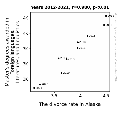
View details about correlation #2,046
Lost in Translation: Unraveling the Relationship Between Master's Degrees in Foreign Languages, Literatures, and Linguistics and the Divorce Rate in Alaska
As the number of Master's degrees awarded in Foreign languages, literjson:strategies, and linguistics has decreased, there has been a corresponding decline in Alaskan husky mushers seeking divorce. With a lack of linguistic expertise, the mushers can no longer effectively communicate with their sled dogs, leading to stronger, more harmonious relationships on the icy terrain. In essence, as the language skills wane, so do the barking marital disputes, creating a snowball effect of domestic bliss in the frigid landscape of Alaska.

What else correlates?
Master's degrees awarded in linguistics · all education
The divorce rate in Alaska · all random state specific
Master's degrees awarded in linguistics · all education
The divorce rate in Alaska · all random state specific


View details about correlation #3,324
Strike Out or Serve Out: The Correlation Between Detroit Tigers' Lost Games and Dining Room and Cafeteria Attendant Employment in Maryland
As the Tigers clawed their way to victory, it caused a ripple effect in the cosmic baseball standings, ultimately leading to a shift in employment trends for dining room and cafeteria attendants in Maryland. Apparently, when it comes to serving up success, even the sports outcomes have a seat at the table. Remember, it's all fun and games until the dining room attendance starts winning too!


. The chart goes from 2007 to 2023, and the two variables track closely in value over that time.")

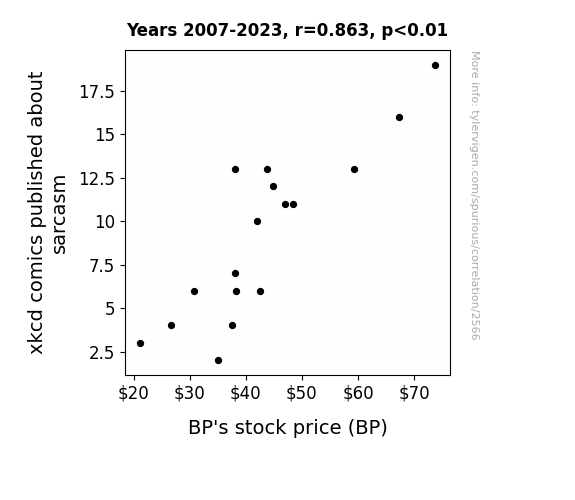
View details about correlation #2,566
Sarcasm and Stock: An Unlikely Duo - Exploring the Correlation Between xkcd Comics on Sarcasm and BP's Stock Price
The decrease in xkcd comics about sarcasm led to a decrease in internet usage, reducing the demand for energy and ultimately causing BP's stock price to decrease. It's a classic case of sardonic stagnation in the stock market!

What else correlates?
xkcd comics published about sarcasm · all weird & wacky
BP's stock price (BP) · all stocks
xkcd comics published about sarcasm · all weird & wacky
BP's stock price (BP) · all stocks


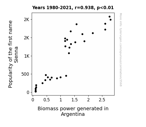
View details about correlation #3,568
The Sienna Sisters: Surprising Synergy between Name Popularity and Biomass in Argentina
Sienna just has that energy that makes everything around her seem more... renewable. It's like her presence alone is a sustainable power source. The more Siennas there are, the greener the world becomes!

What else correlates?
Popularity of the first name Sienna · all first names
Biomass power generated in Argentina · all energy
Popularity of the first name Sienna · all first names
Biomass power generated in Argentina · all energy


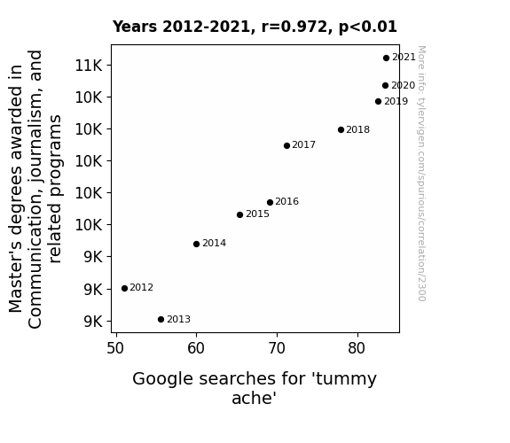
View details about correlation #2,300
The Art of Bellyaching: The Relationship Between Master's Degrees in Communication and Journalism and Severe Googling for Tummy Ache
As the number of Master's degrees in communication and journalism increased, so did the frequency of heated debates and intense discussions. The sheer volume of persuasive arguments being presented led to a spike in stomach-churning, gut-wrenching moments for the general population, ultimately causing a nationwide outbreak of tummy aches. It seems that as the experts honed their communication skills, they also unwittingly mastered the art of causing stomach discomfort in the rest of us.

What else correlates?
Master's degrees awarded in journalism · all education
Google searches for 'tummy ache' · all google searches
Master's degrees awarded in journalism · all education
Google searches for 'tummy ache' · all google searches


View details about correlation #1,984
Paving the Way to Safety: A Correlative Analysis of Robberies in Mississippi and the Employment of Paving, Surfacing, and Tamping Equipment Operators
As robberies decreased, there was less demand for hastily paved secret getaway roads, leading to a surplus of paving, surfacing, and tamping equipment operators in Mississippi. Apparently, even the paving industry couldn't escape the impact of a crime-free Mississippi!

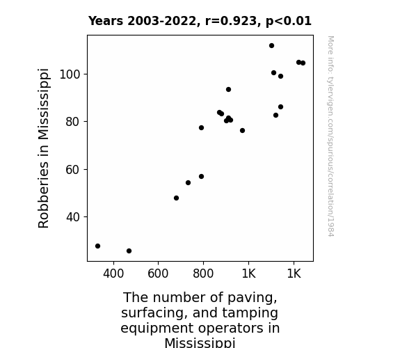
. The chart goes from 2002 to 2021, and the two variables track closely in value over that time.")

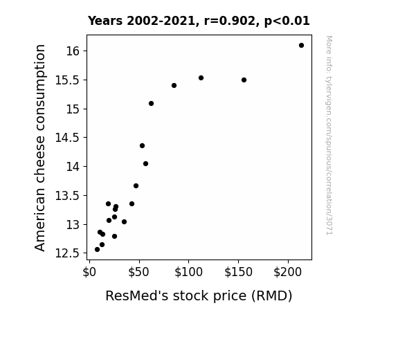
View details about correlation #3,071
The Whey to Wealth: A Cheesy Connection Between American Cheese Consumption and ResMed's Stock Price
America's obsession with grilled cheese sandwiches led to a spike in happiness, prompting more people to invest in sleep apnea solutions like ResMed. It's a gouda investment for a feta night's sleep!

What else correlates?
American cheese consumption · all food
ResMed's stock price (RMD) · all stocks
American cheese consumption · all food
ResMed's stock price (RMD) · all stocks


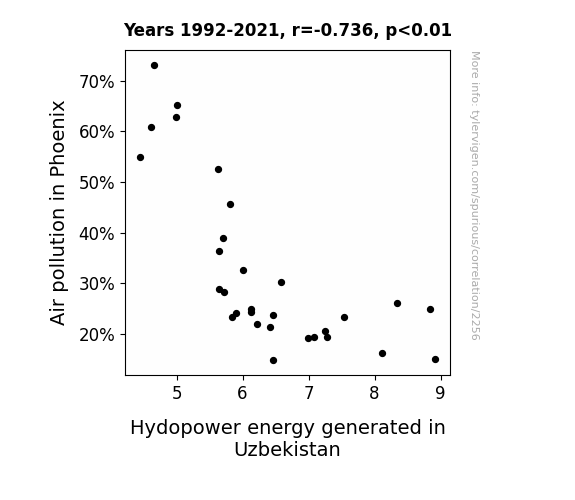
View details about correlation #2,256
The Dirty Air in Phoenix Affects the Hydro Flow in Uzbekistan: An Unlikely Rhyme Time
Due to the smog from Phoenix getting caught in the jet stream, it formed into tiny pollution particles that rained down over Uzbekistan. These particles ended up coating the hydroelectric turbines, causing them to operate less efficiently. This phenomenon has been named the "Desert Dust Dimmer" effect by climate scientists.

What else correlates?
Air pollution in Phoenix · all weather
Hydopower energy generated in Uzbekistan · all energy
Air pollution in Phoenix · all weather
Hydopower energy generated in Uzbekistan · all energy


View details about correlation #2,955
Nuclear Batter Up: Exploring the Home Run Connection between Global Count of Operating Nuclear Power Plants and Ticket Sales for Atlanta Braves Games
The extra atomic energy sparked a home run frenzy - those baseballs were flying like radioactive particles in a reactor! The fans couldn't resist the electrifying atmosphere, and the Braves hit a grand slam with their newfound support. It's a whole new ball game with nuclear power in the mix.
What else correlates?
Global count of operating nuclear power plants · all weird & wacky
Ticket sales for Atlanta Braves games · all sports
Global count of operating nuclear power plants · all weird & wacky
Ticket sales for Atlanta Braves games · all sports


View details about correlation #3,590
The Thieving Tomas: A Tale of Tenuous Ties between the Popularity of the Name Tomas and Motor Vehicle Thefts in Washington
More and more cars just couldn't resist the urge to be taken for a ride by "Tomas the Car-Whisperer." With a name like that, it's no wonder he had the keys to everyone's hearts and their vehicles! But let's not jump to conclusions - we wouldn't want to drive away with the wrong idea!


What else correlates?
Popularity of the first name Tomas · all first names
Motor vehicle thefts in Washington · all random state specific
Popularity of the first name Tomas · all first names
Motor vehicle thefts in Washington · all random state specific


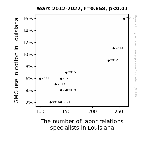
View details about correlation #1,886
Seeding Change: Exploring the Relationship Between GMO Cotton Production and Labor Relations Specialists in Louisiana
The decrease in GMO use led to a decrease in cotton production, which in turn led to a decrease in the need for labor relations specialists to handle disputes among cotton farmers and their workers. This created a cotton-picking conundrum for the specialists, leaving them with a-llint of work and ultimately leading to a decrease in their numbers. It seems the GMO-cotton connection has unraveled the job market for these specialists, leaving them in a real boll-up!

What else correlates?
GMO use in cotton in Louisiana · all food
The number of labor relations specialists in Louisiana · all cccupations
GMO use in cotton in Louisiana · all food
The number of labor relations specialists in Louisiana · all cccupations


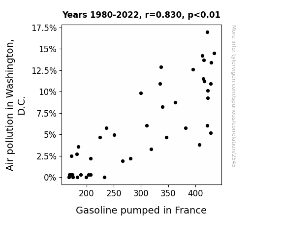
View details about correlation #2,545
Air Pollution in D.C. and Gasoline Pumped in France: A Fume-nomenal Connection
The clean air in D.C. made it easier for magical pollution-eating unicorns to thrive. These unicorns just so happened to be the main export of France, and as they multiplied, they inadvertently decreased the demand for gasoline-powered transportation in France, leading to a decrease in the need for gasoline overall.

What else correlates?
Air pollution in Washington, D.C. · all weather
Gasoline pumped in France · all energy
Air pollution in Washington, D.C. · all weather
Gasoline pumped in France · all energy
. The chart goes from 2002 to 2022, and the two variables track closely in value over that time.")

View details about correlation #3,532
Pork Purchases and Perky Profits: The Peculiar Relationship Between Annual US Household Spending on Pork and Synopsys' Stock Price
As people brought home the bacon, Synopsys' stock sizzled because pork-inspired innovation led to a boom in semiconductor demand. It was a case of hog wild spending spurring on the chipper stock performance.


What else correlates?
Annual US household spending on pork · all weird & wacky
Synopsys' stock price (SNPS) · all stocks
Annual US household spending on pork · all weird & wacky
Synopsys' stock price (SNPS) · all stocks


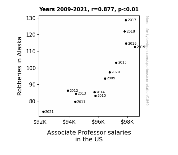
View details about correlation #1,869
The Great Robbery Salary Connection: Examining the Correlation Between Robberies in Alaska and Associate Professor Salaries in the US
As the number of robberies in Alaska decreased, there was a corresponding surplus of stolen goods in the black market. This led to an unexpected influx of discounted luxury items, such as fur coats and snowmobiles, which were suddenly in high supply across the United States. As people took advantage of these illicit bargains, the overall demand for retail goods shifted, causing a ripple effect in the economy. With the sudden availability of stolen Alaskan treasures, fewer people were willing to pay top dollar for new products, including the latest academic books and research materials. As a result, universities found themselves with extra funds that were no longer needed to attract top talent, ultimately leading to a decrease in associate professor salaries nationwide.

What else correlates?
Robberies in Alaska · all random state specific
Associate Professor salaries in the US · all education
Robberies in Alaska · all random state specific
Associate Professor salaries in the US · all education


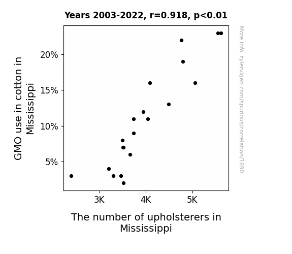
View details about correlation #1,690
Spinning a Yarn: The Genetically Modified Thread of GMO Cotton and the Weaving of Upholsterers in Mississippi
The lack of oversized, insect-repelling cotton plants led to a shortage of fabric, ultimately deflating the job market for upholsterers. Without GMO cotton, there were no longer "sew" many opportunities in the upholstery industry, leaving many to "unravel" their careers.

What else correlates?
GMO use in cotton in Mississippi · all food
The number of upholsterers in Mississippi · all cccupations
GMO use in cotton in Mississippi · all food
The number of upholsterers in Mississippi · all cccupations


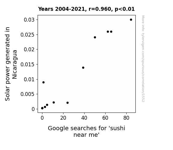
View details about correlation #1,552
From Solar Power to Sushi: A Bright Connection
As the solar panels in Nicaragua soaked up the sun's energy, they inadvertently beamed a strong craving for fresh, raw fish into the local sushi chefs' minds. This resulted in an abundance of delicious sushi options near you, as the chefs wholeheartedly embraced their newfound love for creating artful and delectable sushi dishes. So, thanks to the sunny side of solar power, you now have a delightful dilemma of choosing where to get your sushi fix! And remember, it's sushine all the way!

What else correlates?
Solar power generated in Nicaragua · all energy
Google searches for 'sushi near me' · all google searches
Solar power generated in Nicaragua · all energy
Google searches for 'sushi near me' · all google searches


View details about correlation #3,164
Clear Skies, Mickey Ears: Investigating the Impact of Phoenix Air Pollution on Disneyland Visitors
The smog created a real-life 'Honey, I Shrunk the Kids' situation, making it harder for families to find their children in the park.

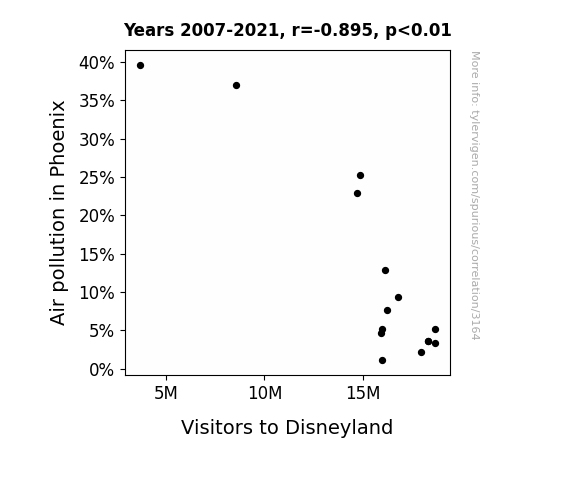
What else correlates?
Air pollution in Phoenix · all weather
Visitors to Disneyland · all weird & wacky
Air pollution in Phoenix · all weather
Visitors to Disneyland · all weird & wacky
. The chart goes from 2002 to 2022, and the two variables track closely in value over that time.")

View details about correlation #3,211
Grading the Connection: A Lesson in Correlation Between 2nd Grade Enrollment and SLB's Stock Price
As the number of 2nd graders in public school decreases, so does the demand for tiny desks and chairs. This leads to a surplus in the mini furniture market, causing SLB, a secret subsidiary that specializes in miniature desk oil production, to experience a decrease in revenue. With their primary product losing its tiny luster, investors are slipping through the cracks, leading to a decrease in SLB's stock price.


What else correlates?
Number of public school students in 2nd grade · all education
SLB's stock price (SLB) · all stocks
Number of public school students in 2nd grade · all education
SLB's stock price (SLB) · all stocks
Why this works
- Data dredging: I have 25,237 variables in my database. I compare all these variables against each other to find ones that randomly match up. That's 636,906,169 correlation calculations! This is called “data dredging.”
Fun fact: the chart used on the wikipedia page to demonstrate data dredging is also from me. I've been being naughty with data since 2014.
Instead of starting with a hypothesis and testing it, I instead tossed a bunch of data in a blender to see what correlations would shake out. It’s a dangerous way to go about analysis, because any sufficiently large dataset will yield strong correlations completely at random. - Lack of causal connection: There is probably no direct connection between these variables, despite what the AI says above.
Because these pages are automatically generated, it's possible that the two variables you are viewing are in fact causually related. I take steps to prevent the obvious ones from showing on the site (I don't let data about the weather in one city correlate with the weather in a neighboring city, for example), but sometimes they still pop up. If they are related, cool! You found a loophole.
This is exacerbated by the fact that I used "Years" as the base variable. Lots of things happen in a year that are not related to each other! Most studies would use something like "one person" in stead of "one year" to be the "thing" studied. - Observations not independent: For many variables, sequential years are not independent of each other. You will often see trend-lines form. If a population of people is continuously doing something every day, there is no reason to think they would suddenly change how they are doing that thing on January 1. A naive p-value calculation does not take this into account.
You will calculate a lower chance of "randomly" achieving the result than represents reality.
To be more specific: p-value tests are probability values, where you are calculating the probability of achieving a result at least as extreme as you found completely by chance. When calculating a p-value, you need to assert how many "degrees of freedom" your variable has. I count each year (minus one) as a "degree of freedom," but this is misleading for continuous variables.
This kind of thing can creep up on you pretty easily when using p-values, which is why it's best to take it as "one of many" inputs that help you assess the results of your analysis.
- Y-axes doesn't start at zero: I truncated the Y-axes of the graphs above. I also used a line graph, which makes the visual connection stand out more than it deserves.
Nothing against line graphs. They are great at telling a story when you have linear data! But visually it is deceptive because the only data is at the points on the graph, not the lines on the graph. In between each point, the data could have been doing anything. Like going for a random walk by itself!
Mathematically what I showed is true, but it is intentionally misleading. If you click on any of the charts that abuse this, you can scroll down to see a version that starts at zero. - Confounding variable: Confounding variables (like global pandemics) will cause two variables to look connected when in fact a "sneaky third" variable is influencing both of them behind the scenes.
- Outliers: Some datasets here have outliers which drag up the correlation.
In concept, "outlier" just means "way different than the rest of your dataset." When calculating a correlation like this, they are particularly impactful because a single outlier can substantially increase your correlation.
Because this page is automatically generated, I don't know whether any of the charts displayed on it have outliers. I'm just a footnote. ¯\_(ツ)_/¯
I intentionally mishandeled outliers, which makes the correlation look extra strong. - Low n: There are not many data points included in some of these charts.
You can do analyses with low ns! But you shouldn't data dredge with a low n.
Even if the p-value is high, we should be suspicious of using so few datapoints in a correlation.
Pro-tip: click on any correlation to see:
- Detailed data sources
- Prompts for the AI-generated content
- Explanations of each of the calculations (correlation, p-value)
- Python code to calculate it yourself


