spurious correlations
discover · random · spurious scholar
← previous page · next page →


View details about correlation #2,262
The Tariq Tendency: A Correlation Between the Popularity of the Name Tariq and the Number of Vending Machine Repairers in New Hampshire
As the name Tariq fell out of favor, fewer parents were willing to name their kids after Tariq, the vending machine enthusiast and amateur repairman. This led to a shortage of budding vending machine repairers in New Hampshire, ultimately causing a decrease in the number of professionals in the field. It seems the popularity of the name Tariq had a real knack for dispensing future talents in vending machine repair!


View details about correlation #1,672
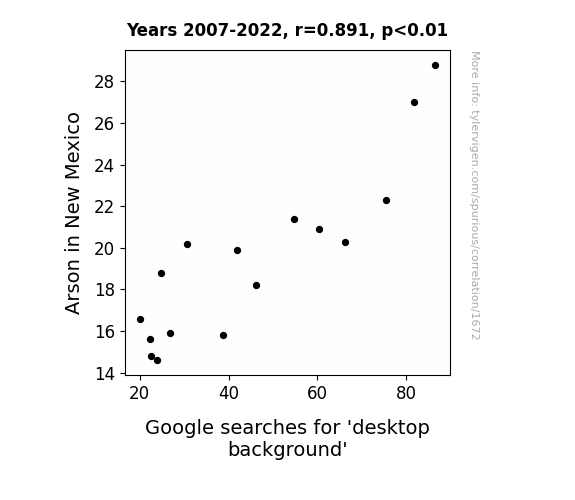
Playing with Fire: Arson's Link to Desktop Background Desire
Apparently, as the number of arson incidents decreased in New Mexico, there was a corresponding decrease in the production of fiery desktop backgrounds. It seems that without the fiery inspiration, people were just not as motivated to search for new and exciting desktop backgrounds.

What else correlates?
Arson in New Mexico · all random state specific
Google searches for 'desktop background' · all google searches
Arson in New Mexico · all random state specific
Google searches for 'desktop background' · all google searches


View details about correlation #3,049
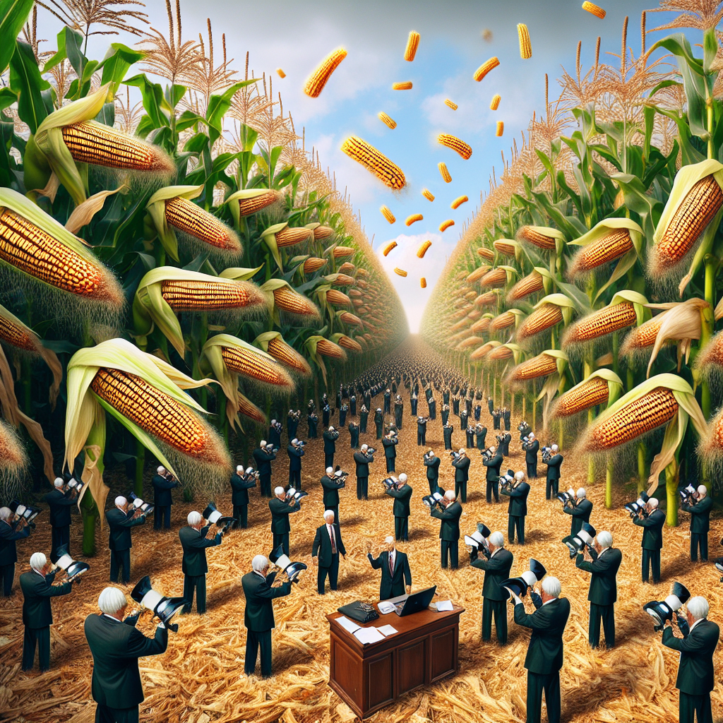
Corn, Lawyers, and GMOs: Unearthing the Kernel of the Connection
As GMO corn in Nebraska flourished, it led to a corn boom. This, in turn, created a need for more corn-related legal processes, such as crop disputes and hybrid patent issues. As a result, more lawyers across the United States specialized in agricultural law, inadvertently linking the growth of GMO corn in Nebraska to a kernel of truth in the legal world. Corngratulations, it's a-maize-ing how the legal field can ear-uably be influenced by agricultural developments!

What else correlates?
GMO use in corn grown in Nebraska · all food
Number of Lawyers in the United States · all weird & wacky
GMO use in corn grown in Nebraska · all food
Number of Lawyers in the United States · all weird & wacky


View details about correlation #3,453
Gasoline Pumped in Austria: A Breath of Fresh Air for Phoenix?
Due to the smog drifting all the way to Europe, Austrian gasoline pumps were experiencing a 'haze' of confusion!


What else correlates?
Air quality in Phoenix · all weather
Gasoline pumped in Austria · all energy
Air quality in Phoenix · all weather
Gasoline pumped in Austria · all energy


View details about correlation #2,245
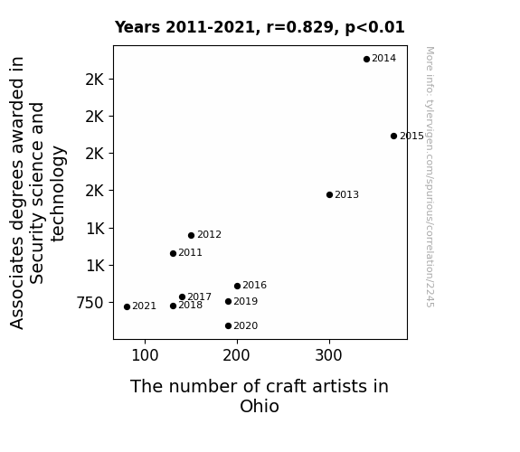
Locked In: The Unlikely Correlation Between Security Science and Technology Associate Degrees Awarded and the Concentration of Craft Artists in Ohio
As security science and technology knowledge waned, so did craft artists' ability to 'lock down' their creative ideas and protect their 'artistic masterpieces'. This left them feeling 'unsecured' in their artistic pursuits, leading to a 'craftpocalypse' in Ohio.

. The chart goes from 2004 to 2023, and the two variables track closely in value over that time.")

View details about correlation #2,120
That Is Sus: Uncovering the 'Suspicious' Connection Between Google Searches and NVIDIA's Stock Price
Clearly, as Google searches for 'that is sus' rise, an unprecedented linguistic shift is underway. This has led to a surge in demand for high-quality visual content, prompting more people to invest in top-notch graphics cards, such as those produced by NVIDIA. As the online community delves deeper into the world of suspicion, NVIDIA's stock price is reaching new heights to power the intense graphics needed for finding the impostor and creating memes.


What else correlates?
Google searches for 'that is sus' · all google searches
NVIDIA's stock price (NVDA) · all stocks
Google searches for 'that is sus' · all google searches
NVIDIA's stock price (NVDA) · all stocks


View details about correlation #1,675
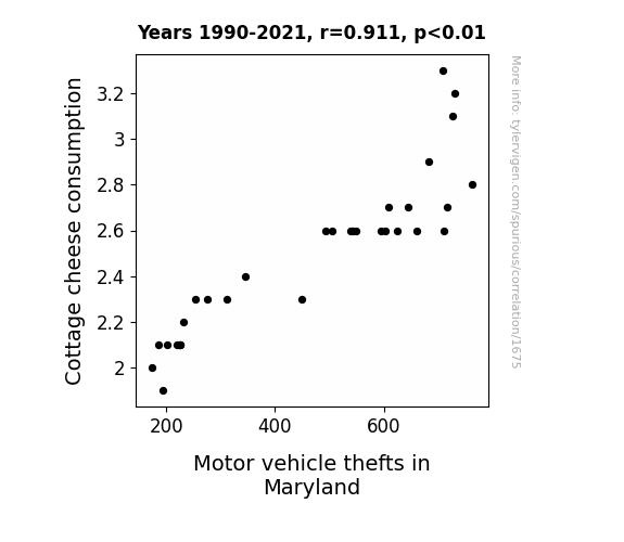
Curdled Crime: Examining the Wheyward Relationship between Cottage Cheese Consumption and Motor Vehicle Thefts in Maryland
As Cottage cheese consumption curdled, it led to a wheely gouda situation for car owners in Maryland. It may sound cheesy, but as people cut back on Cottage cheese, they found themselves whey less inclined to take a break from their illegal activities. It's udderly ridiculous, but it seems that the lack of Cottage cheese just didn't drive thieves to steal cars as much. The connection may seem far-feta-ched, but it's as gouda as it gets! Remember, it's all fun and games until someone steals your cheddar!

What else correlates?
Cottage cheese consumption · all food
Motor vehicle thefts in Maryland · all random state specific
Cottage cheese consumption · all food
Motor vehicle thefts in Maryland · all random state specific


View details about correlation #1,348
Name-Dropping Nora: Exploring the Correlation between Nora's Popularity and Biomass Power Generation in Romania
As the number of Noras grew, so did the demand for wood-based personalized name plaques. This led to a surge in the Romanian biomass industry as Nora-loving customers sought the perfect eco-friendly decor. Who knew that a simple name could spark a chain reaction of tree-powered fame!


What else correlates?
Popularity of the first name Nora · all first names
Biomass power generated in Romania · all energy
Popularity of the first name Nora · all first names
Biomass power generated in Romania · all energy


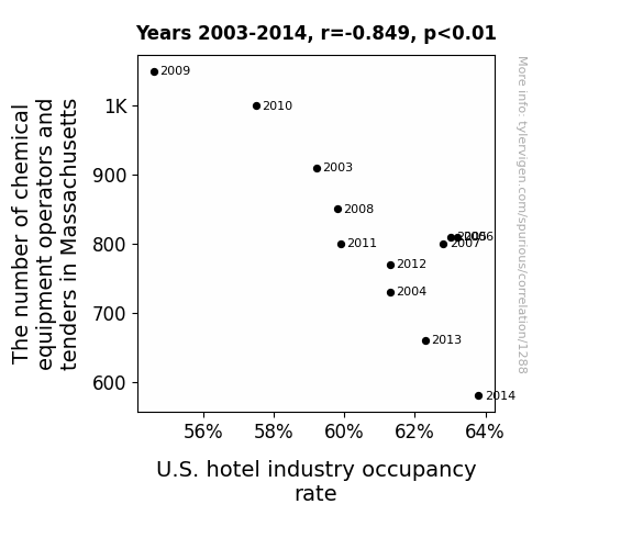
View details about correlation #1,288
The Chemical Conundrum: An Examination of the Correlation Between Chemical Equipment Operators and Tenders in Massachusetts and U.S. Hotel Industry Occupancy Rates
As the number of chemical equipment operators and tenders in Massachusetts decreased, there was a surplus of expertise in handling complex systems. This expertise inadvertently led to a highly efficient and smooth operation of hotel equipment and facilities, resulting in a surge in the U.S. hotel industry occupancy rate. Who knew that mixing chemicals would lead to such a 'suite' success in the hotel industry!
. The chart goes from 2012 to 2021, and the two variables track closely in value over that time.")

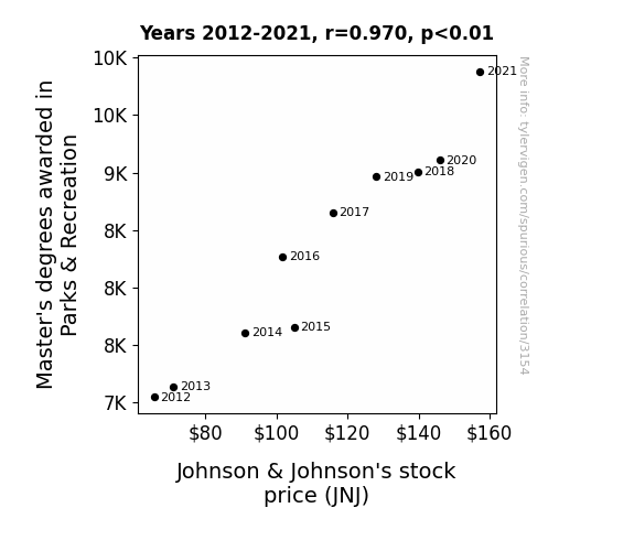
View details about correlation #3,154
The Master’s Touch: Unveiling the Playful Connection Between Park & Rec Studies and Johnson & Johnson’s Stock Price
More Master's degrees in Parks & Recreation meant more people were mastering the art of relaxation. This led to a surge in demand for Johnson & Johnson products as stressed-out individuals sought solace in soothing bath products and comforting baby items. It's as if a wave of zen swept over the stock market, buoying Johnson & Johnson's stock price to new heights.

What else correlates?
Master's degrees awarded in Parks & Recreation · all education
Johnson & Johnson's stock price (JNJ) · all stocks
Master's degrees awarded in Parks & Recreation · all education
Johnson & Johnson's stock price (JNJ) · all stocks


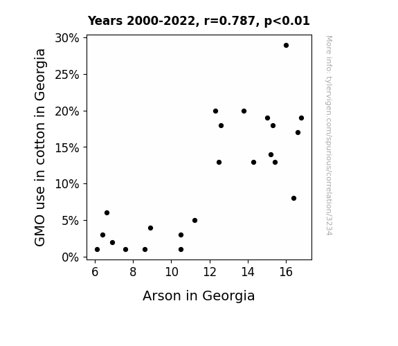
View details about correlation #3,234
Setting Cotton Fields Ablaze: The Flammable Relationship Between GMO Use and Arson in Georgia
The lack of GMOs meant the cotton wasn't fire-resistant, so arsonists had to find a new, less flame-retardant target. Cotton fields just weren't sparking their interest like before!

What else correlates?
GMO use in cotton in Georgia · all food
Arson in Georgia · all random state specific
GMO use in cotton in Georgia · all food
Arson in Georgia · all random state specific


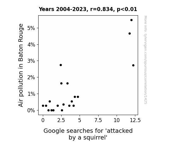
View details about correlation #1,425
Squirrely Connections: Investigating the Relationship Between Air Pollution in Baton Rouge and Google Searches for 'Attacked by a Squirrel'
When the air was cleaner, those squirrels in Baton Rouge didn't have to go nuts trying to find food and shelter. With less pollution messing with their senses, the squirrels were feeling less air-ritated and were more likely to keep to themselves instead of launching surprise attacks. It's like they say, clean air makes for a more peace-fur coexistence.

What else correlates?
Air pollution in Baton Rouge · all weather
Google searches for 'attacked by a squirrel' · all google searches
Air pollution in Baton Rouge · all weather
Google searches for 'attacked by a squirrel' · all google searches


View details about correlation #3,229
Cristiano Ronaldo's Footwork and Maine's Compensation and Benefits Maneuvers: A Correlational Analysis
Cristiano Ronaldo's absence from Portugal matches led to a decrease in demand for fancy footwork, thus rendering the need for managing compensation and benefits in Maine as unnecessary. After all, there's only so much strategic planning and negotiation one can do when the game has changed!


. The chart goes from 2002 to 2022, and the two variables track closely in value over that time.")

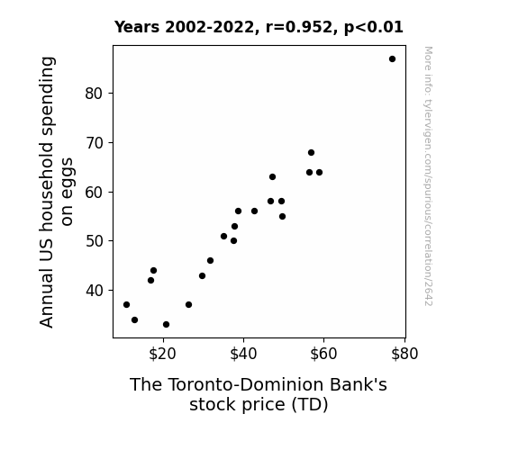
View details about correlation #2,642
Cracking the Case: Correlating Annual Avid Appetite for Eggs and Toronto-Dominion Bank's TD Stock Price
As household spending on eggs increased, more people started eating omelets, leading to a sudden demand for extra cheese. This cheese craze caused a chain reaction in the dairy industry, ultimately leading to increased profits for The Toronto-Dominion Bank. After all, it's a gouda day when egg spending sunny-side ups the stock prices!

What else correlates?
Annual US household spending on eggs · all weird & wacky
The Toronto-Dominion Bank's stock price (TD) · all stocks
Annual US household spending on eggs · all weird & wacky
The Toronto-Dominion Bank's stock price (TD) · all stocks


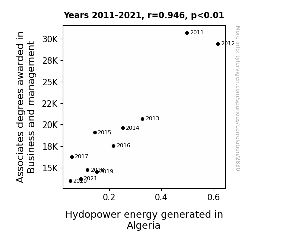
View details about correlation #2,830
The Business of Business Degrees: A Booming or Bunk Connection to Hydropower in Algeria?
As fewer people became qualified for office jobs, there was a dramatic dip in the demand for water cooler conversations, leading to a cascade of reduced hydropower productivity in Algerian workplaces. This left the country high and dry in the energy department, creating a stream of problems for their power supply.

What else correlates?
Associates degrees awarded in Business and management · all education
Hydopower energy generated in Algeria · all energy
Associates degrees awarded in Business and management · all education
Hydopower energy generated in Algeria · all energy


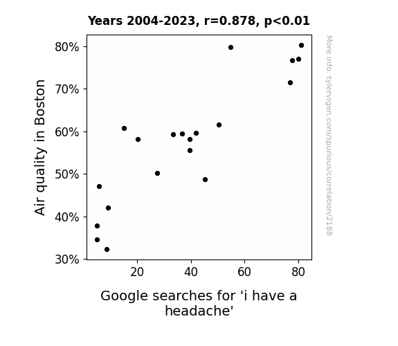
View details about correlation #2,188
Breathing Easy: An Examination of the Air Quality-Induced Headache Searches Link
The fresh, clean air in Boston led to an influx of energetic, outdoor yoga classes. As more and more people attempted the advanced 'upside-down lotus pose,' there was a sharp rise in accidental headstands, resulting in a sudden surge of headache-related Google searches.

What else correlates?
Air quality in Boston · all weather
Google searches for 'i have a headache' · all google searches
Air quality in Boston · all weather
Google searches for 'i have a headache' · all google searches


View details about correlation #2,288
Sparking Trends: The Electrifying Connection Between the Name Dajah and Electric Motor Repairers in Georgia
As the name Dajah fell out of fashion, it sparked a chain reaction in Georgia. With fewer people named Dajah, there were fewer Dajah-vus, leading to a decrease in electric motor malfunctions. As a result, the demand for electric motor repairers in Georgia dwindled, creating a current state of shock in the industry.


What else correlates?
Popularity of the first name Dajah · all first names
The number of electric motor repairers in Georgia · all cccupations
Popularity of the first name Dajah · all first names
The number of electric motor repairers in Georgia · all cccupations


View details about correlation #1,851
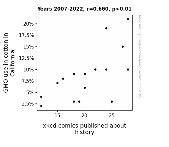
GMO Glee: A Correlation Between Cotton's Modified Gene and xkcd Comics Scene
As GMO cotton production in California grew, it led to an overabundance of historically themed xkcd comic ideas. The Boll Weevil, known for its devastation of cotton crops, inadvertently sparked a renaissance of punny historical xkcd comics.

What else correlates?
GMO use in cotton in California · all food
xkcd comics published about history · all weird & wacky
GMO use in cotton in California · all food
xkcd comics published about history · all weird & wacky
. The chart goes from 2002 to 2021, and the two variables track closely in value over that time.")

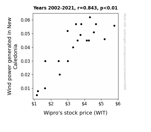
View details about correlation #3,069
Blowin’ in the Wind: A Breezy Connection Between Wind Power in New Caledonia and Wipro's Stock Price
The strong gusts of wind carried whispers of Wipro's success across the seas, leading to a surge in investor confidence and a delightful whirlwind of stock price growth.

What else correlates?
Wind power generated in New Caledonia · all energy
Wipro's stock price (WIT) · all stocks
Wind power generated in New Caledonia · all energy
Wipro's stock price (WIT) · all stocks


View details about correlation #3,672
The Dirty Truth: Air Pollution in Memphis and the Marital Mess in Tennessee
The cleaner air revealed everyone's true colors, making it harder to sweep relationship issues under the rug. As a result, more people in Tennessee realized they just couldn't take the smog of marriage any longer.


What else correlates?
Air pollution in Memphis · all weather
The marriage rate in Tennessee · all random state specific
Air pollution in Memphis · all weather
The marriage rate in Tennessee · all random state specific
Why this works
- Data dredging: I have 25,237 variables in my database. I compare all these variables against each other to find ones that randomly match up. That's 636,906,169 correlation calculations! This is called “data dredging.”
Fun fact: the chart used on the wikipedia page to demonstrate data dredging is also from me. I've been being naughty with data since 2014.
Instead of starting with a hypothesis and testing it, I instead tossed a bunch of data in a blender to see what correlations would shake out. It’s a dangerous way to go about analysis, because any sufficiently large dataset will yield strong correlations completely at random. - Lack of causal connection: There is probably no direct connection between these variables, despite what the AI says above.
Because these pages are automatically generated, it's possible that the two variables you are viewing are in fact causually related. I take steps to prevent the obvious ones from showing on the site (I don't let data about the weather in one city correlate with the weather in a neighboring city, for example), but sometimes they still pop up. If they are related, cool! You found a loophole.
This is exacerbated by the fact that I used "Years" as the base variable. Lots of things happen in a year that are not related to each other! Most studies would use something like "one person" in stead of "one year" to be the "thing" studied. - Observations not independent: For many variables, sequential years are not independent of each other. You will often see trend-lines form. If a population of people is continuously doing something every day, there is no reason to think they would suddenly change how they are doing that thing on January 1. A naive p-value calculation does not take this into account.
You will calculate a lower chance of "randomly" achieving the result than represents reality.
To be more specific: p-value tests are probability values, where you are calculating the probability of achieving a result at least as extreme as you found completely by chance. When calculating a p-value, you need to assert how many "degrees of freedom" your variable has. I count each year (minus one) as a "degree of freedom," but this is misleading for continuous variables.
This kind of thing can creep up on you pretty easily when using p-values, which is why it's best to take it as "one of many" inputs that help you assess the results of your analysis.
- Y-axes doesn't start at zero: I truncated the Y-axes of the graphs above. I also used a line graph, which makes the visual connection stand out more than it deserves.
Nothing against line graphs. They are great at telling a story when you have linear data! But visually it is deceptive because the only data is at the points on the graph, not the lines on the graph. In between each point, the data could have been doing anything. Like going for a random walk by itself!
Mathematically what I showed is true, but it is intentionally misleading. If you click on any of the charts that abuse this, you can scroll down to see a version that starts at zero. - Confounding variable: Confounding variables (like global pandemics) will cause two variables to look connected when in fact a "sneaky third" variable is influencing both of them behind the scenes.
- Outliers: Some datasets here have outliers which drag up the correlation.
In concept, "outlier" just means "way different than the rest of your dataset." When calculating a correlation like this, they are particularly impactful because a single outlier can substantially increase your correlation.
Because this page is automatically generated, I don't know whether any of the charts displayed on it have outliers. I'm just a footnote. ¯\_(ツ)_/¯
I intentionally mishandeled outliers, which makes the correlation look extra strong. - Low n: There are not many data points included in some of these charts.
You can do analyses with low ns! But you shouldn't data dredge with a low n.
Even if the p-value is high, we should be suspicious of using so few datapoints in a correlation.
Pro-tip: click on any correlation to see:
- Detailed data sources
- Prompts for the AI-generated content
- Explanations of each of the calculations (correlation, p-value)
- Python code to calculate it yourself


