spurious correlations
discover · random · spurious scholar
← previous page · next page →


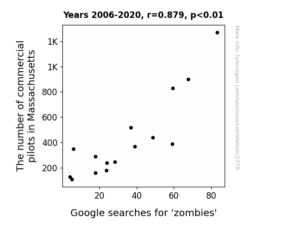
View details about correlation #2,379
Zombie Searches and the Skies: A Study on the Correlation Between Commercial Pilots in Massachusetts and Interest in the Undead
As the number of commercial pilots in Massachusetts soared, it led to an unexpected rise in zombies. It seems the pilots were just dying to fly, and their infectious enthusiasm somehow reanimated an interest in zombies among the locals. It's a dead giveaway that there's a grave connection between taking to the skies and a surge in zombie fascination. It's like they say, when there's a Will, there's a zombae!

What else correlates?
The number of commercial pilots in Massachusetts · all cccupations
Google searches for 'zombies' · all google searches
The number of commercial pilots in Massachusetts · all cccupations
Google searches for 'zombies' · all google searches


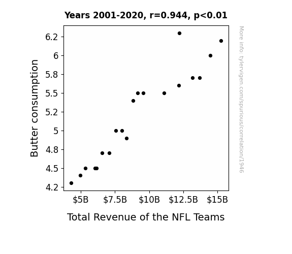
View details about correlation #1,946
Spreading Success: Uncovering the Butterly Connection Between Butter Consumption and Total Revenue of NFL Teams
As butter consumption increased, so did the demand for football games, leading to higher ticket sales and TV revenue. It looks like all that extra butter was really spreading the bread for the NFL teams! The correlation is clear - as buttered popcorn and buttery fingers became game day essentials, the NFL teams raked in the dough.

What else correlates?
Butter consumption · all food
Total Revenue of the NFL Teams · all sports
Butter consumption · all food
Total Revenue of the NFL Teams · all sports


View details about correlation #4,215
The Breezy Connection: Unraveling the Wind Power and Public Library Membership Relationship
The Italian wind power must have blown some literary inspiration across the sea to the UK, sparking a novel interest in reading and leading to a whirlwind of new library members! It's like they say, when it comes to harnessing the power of the elements, it's not just about current, it's also about creating a re-volt of book lovers! Remember, with great wind energy comes great reading responsibility.


What else correlates?
Wind power generated in Italy · all energy
Number of Public Library Members in the UK · all weird & wacky
Wind power generated in Italy · all energy
Number of Public Library Members in the UK · all weird & wacky


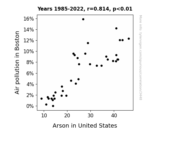
View details about correlation #3,448
Up in Smoke: Unraveling the Fiery Relationship Between Air Pollution in Boston and Arson in the United States
As the air quality in Boston improved, it meant there were fewer smoke particles available to add that extra pizzazz to the arson fires. With cleaner air, the arsonists just couldn't spark the same level of excitement they used to. So, while the flames of passion for arson may still flicker, without the smoky support, they simply couldn't ignite as many fiery shenanigans across the country.

What else correlates?
Air pollution in Boston · all weather
Arson in United States · all random state specific
Air pollution in Boston · all weather
Arson in United States · all random state specific
. The chart goes from 2011 to 2021, and the two variables track closely in value over that time.")

View details about correlation #1,839
Unearthing the Root Causes: Exploring the Relationship Between Associates Degrees in Social Sciences and History and Ross Stores' Stock Price
As more people became knowledgeable about social and historical trends, they developed a heightened appreciation for the fashion at Ross Stores, leading to increased demand and ultimately driving up the stock price. It's like the Enlightenment, but with discounted brand-name clothing!


What else correlates?
Associates degrees awarded in Social sciences and history · all education
Ross Stores' stock price (ROST) · all stocks
Associates degrees awarded in Social sciences and history · all education
Ross Stores' stock price (ROST) · all stocks


View details about correlation #1,247
Dirty Dishes and Box Office Hits: A Correlational Study between UK Films' Global Revenue and the Number of Dishwashers in California
The success of UK films led to more movie nights at home. As people stayed in to watch these British blockbusters, there was a greater need for clean dishes, thus driving up the demand for dishwashers in California. Plus, all the tea-drinking scenes in the movies subconsciously made viewers crave a spotless tea set, further contributing to the surge in dishwasher ownership. It's a soapy, yet surprisingly entertaining, cascade of events!

What else correlates?
Global Box Office Revenue of UK Films · all films & actors
The number of dishwashers in California · all cccupations
Global Box Office Revenue of UK Films · all films & actors
The number of dishwashers in California · all cccupations


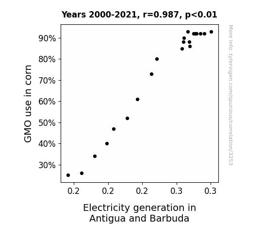
View details about correlation #3,253
Planting the Seeds of Power: The Corny Connection between GMO Use and Electricity Generation in Antigua and Barbuda
As GMO corn production soared, it led to a kernel of truth - the husk about efficient energy conversion. The stalky corn plants conducted themselves like conductors, creating a-maize-ing power opportunities. It seems they really know how to ear-resistibly generate some shocking results. All in all, it's clear that when it comes to sparking electricity, GMO corn is the real *kernel* of power in Antigua and Barbuda!

What else correlates?
GMO use in corn · all food
Electricity generation in Antigua and Barbuda · all energy
GMO use in corn · all food
Electricity generation in Antigua and Barbuda · all energy


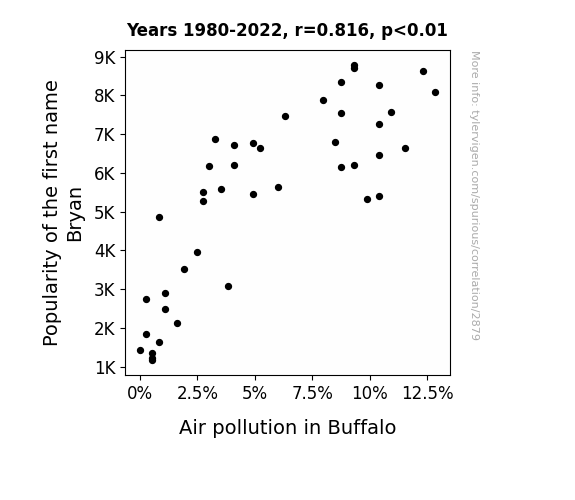
View details about correlation #2,879
Bryan Air Affair: The Correlation Between the Popularity of the Name Bryan and Air Pollution in Buffalo
The decrease in the popularity of the first name Bryan led to fewer people naming their children Bryan. This ultimately resulted in a smaller population size in Buffalo, leading to less traffic congestion and lower overall emissions. As a result, the air quality in Buffalo improved, demonstrating the unexpected impact of baby naming trends on environmental conditions.

What else correlates?
Popularity of the first name Bryan · all first names
Air pollution in Buffalo · all weather
Popularity of the first name Bryan · all first names
Air pollution in Buffalo · all weather


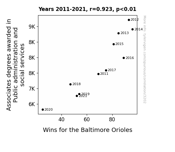
View details about correlation #3,202
Double Play: The Curious Correlation Between Associates Degrees in Public Administration and Social Services and Baltimore Orioles Wins
As the number of public administration and social services graduates declined, there was a shocking shortage of people to organiZe things. This left the Orioles in a state of disarray, with no one to effectively man age their game plans. Without the crucial skills in public administration, the Orioles found themselves striking out both on and off the field.

What else correlates?
Associates degrees awarded in social services · all education
Wins for the Baltimore Orioles · all sports
Associates degrees awarded in social services · all education
Wins for the Baltimore Orioles · all sports


View details about correlation #3,178
The Surveillance of Sudden Spikes: A Statistical Examination of the Relationship Between Private Detectives in Delaware and Google Searches for 'Where to Buy Toilet Paper'
As the number of private detectives in Delaware increased, so did the demand for sneaky ways to purchase toilet paper undetected. These detectives were on the case, following leads to the best and most covert toilet paper suppliers. It became a game of cat and mouse, with TP enthusiasts trying to outsmart the investigators in a high-stakes quest for bathroom tissue. Little did the detectives know, they were inadvertently wiping out the competition for the top spot in where to buy toilet paper search results.


. The chart goes from 2002 to 2022, and the two variables track closely in value over that time.")

View details about correlation #3,408
The Quenched Economy: A Bottled Water's Ripple Effect on FedEx Stock Price
The uptick in bottled water consumption led to increased hydration and a surge in productivity. With people thinking more clearly and working more efficiently, there was a higher demand for shipping services, causing FedEx's stock price to soar. It's a ripple effect of liquid inspiration flowing all the way to the stock market! Remember, stay hydrated for financial elation!


What else correlates?
US per-person consumption of bottled water · all weird & wacky
FedEx's stock price (FDX) · all stocks
US per-person consumption of bottled water · all weird & wacky
FedEx's stock price (FDX) · all stocks


View details about correlation #2,420
The Unidentified Fuels Oddity: Exploring the Curious Link Between UFO Sightings in Illinois and Petroluem Consumption in Solomon Islands
As more UFOs were sighted in Illinois, residents began to leave their car headlights on all night, believing it would attract the extraterrestrial visitors. Unbeknownst to them, the increased light pollution was actually being mistaken for a cosmic distress signal by passing UFOs. This led to a surge in UFOs using their advanced technology to siphon off fuel from vehicles in the Solomon Islands, inadvertently causing a spike in petroleum consumption as they mistook cars for intergalactic gas stations. It's clear that these otherworldly encounters are not just a case of alien abductions, but also alien fuel inductions.

What else correlates?
UFO sightings in Illinois · all random state specific
Petroluem consumption in Solomon Islands · all energy
UFO sightings in Illinois · all random state specific
Petroluem consumption in Solomon Islands · all energy


View details about correlation #1,572
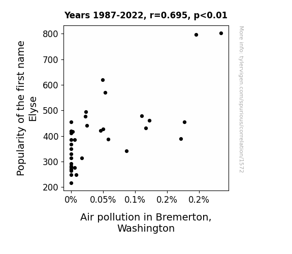
The Elyse Effect: A Whimsical Exploration of the Correlation Between the Popularity of the Name Elyse and Air Quality in Bremerton, Washington
As the popularity of the name Elyse waned, so did the Elyse-mobiles on the roads. You see, these Elyse-mobiles were not just vehicles, they were smog machines in disguise, Elyse-ly contributing to the pollution problem. With fewer Elyses revving their engines, the air in Bremerton finally had a breath of fresh air, all thanks to a de-cline in Elyse.

What else correlates?
Popularity of the first name Elyse · all first names
Air pollution in Bremerton, Washington · all weather
Popularity of the first name Elyse · all first names
Air pollution in Bremerton, Washington · all weather


View details about correlation #2,983
Baking Up Some Statistics: The Correlation Between Gas Plant Operators in Michigan and Google Searches for 'Easy Bake Oven'
The more gas plant operators there are, the more gas there is to fuel the easy bake ovens. It's a recipe for success in the world of miniaturized baking! Keep your oven mitts and your puns at the ready - it's about to get toasty in here!


What else correlates?
The number of gas plant operators in Michigan · all cccupations
Google searches for 'easy bake oven' · all google searches
The number of gas plant operators in Michigan · all cccupations
Google searches for 'easy bake oven' · all google searches


View details about correlation #1,691
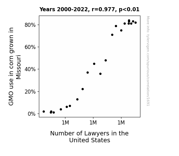
Corn and Counsel: Exploring the Correlation Between GMO Use in Missouri and the Number of Lawyers in the United States
As GMO corn in Missouri became more prevalent, it led to a surplus in corn production. This surplus corn was then used to make all sorts of corn-based products, including the beloved corn chips. As people indulged in these delicious snacks, they had a higher likelihood of getting those pesky snack-related injuries, such as chip-induced mouth wounds. This in turn created a higher demand for legal representation, ultimately leading to an increase in the number of lawyers in the United States. After all, when it comes to corn chip calamities, everyone wants a-maize-ing legal advice!

What else correlates?
GMO use in corn grown in Missouri · all food
Number of Lawyers in the United States · all weird & wacky
GMO use in corn grown in Missouri · all food
Number of Lawyers in the United States · all weird & wacky


View details about correlation #1,405
Kiddies in Kindergarten and Kerosene in Suriname: A Correlational Study
As more kindergarteners learned about airplanes and the wonders of flight, they expressed a strong desire to visit Suriname, leading to a surge in air travel. This, in turn, necessitated an increase in the production and consumption of jet fuel to keep up with the unexpectedly high demand from this pint-sized demographic.


What else correlates?
Number of public school students in Kindergarten · all education
Jet fuel used in Suriname · all energy
Number of public school students in Kindergarten · all education
Jet fuel used in Suriname · all energy


View details about correlation #2,327
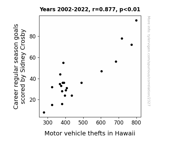
Scoring Goals and Stealing Cars: Unveiling the Unlikely Link between Sidney Crosby's Career Regular Season Goals and Motor Vehicle Thefts in Hawaii
Sidney Crosby's scoring prowess is so legendary that it inadvertently set off a chain reaction of excitement around the world. As he scored fewer goals, there was a dip in overall global happiness and adrenaline levels. This, in turn, led to a decrease in impulsive behavior, including the urge to steal cars. Somehow, even the sunny and laid-back vibes of Hawaii weren't immune to the Crosby Effect on the human psyche! Remember, this is just for laughs!

What else correlates?
Career regular season goals scored by Sidney Crosby · all sports
Motor vehicle thefts in Hawaii · all random state specific
Career regular season goals scored by Sidney Crosby · all sports
Motor vehicle thefts in Hawaii · all random state specific
. The chart goes from 2003 to 2020, and the two variables track closely in value over that time.")

View details about correlation #3,487
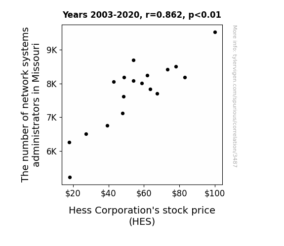
Navigating the Nexus between Network Systems Administrators and Hess Corporation's Hefty Stock
The presence of more network systems administrators in Missouri led to smoother internet connections, allowing for seamless online trading of Hess Corporation's stock. This increased efficiency and accessibility attracted more investors, driving up the demand for HES stock and ultimately boosting its price.


View details about correlation #2,759
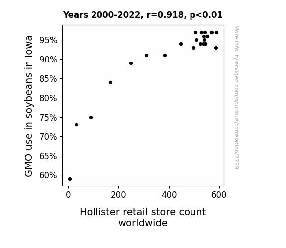
The Soybean GMO Phenomenon: From Iowa to Hollister Store Dominion
As the soybeans in Iowa became more genetically modified, they started emitting a faint, irresistible scent of trendy fashion. This scent, carried by the winds, inexplicably led to a surge in demand for Hollister clothing worldwide. It seems like those soybeans were truly ahead of their time in the world of fashion!

What else correlates?
GMO use in soybeans in Iowa · all food
Hollister retail store count worldwide · all weird & wacky
GMO use in soybeans in Iowa · all food
Hollister retail store count worldwide · all weird & wacky


View details about correlation #3,655
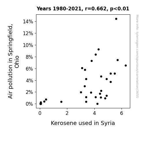
The Burning Issues Linking Air Pollution in Springfield, Ohio and Kerosene Usage in Syria
As the air quality in Springfield declined, it caused a chain reaction of events. This led to an unexpected surge in the global kerosene market. One theory suggests that the smog particles acted as tiny messengers, conveying a newfound appreciation for kerosene and its versatile usage. Additionally, it's believed that as the pollution levels rose, residents may have turned to creative survival strategies, inadvertently sparking a kerosene renaissance. This unforeseen connection has left experts in both environmental science and international trade scratching their heads, as they try to fathom the unconventional link between a small city in Ohio and the kerosene preferences in Syria.

What else correlates?
Air pollution in Springfield, Ohio · all weather
Kerosene used in Syria · all energy
Air pollution in Springfield, Ohio · all weather
Kerosene used in Syria · all energy
Why this works
- Data dredging: I have 25,237 variables in my database. I compare all these variables against each other to find ones that randomly match up. That's 636,906,169 correlation calculations! This is called “data dredging.”
Fun fact: the chart used on the wikipedia page to demonstrate data dredging is also from me. I've been being naughty with data since 2014.
Instead of starting with a hypothesis and testing it, I instead tossed a bunch of data in a blender to see what correlations would shake out. It’s a dangerous way to go about analysis, because any sufficiently large dataset will yield strong correlations completely at random. - Lack of causal connection: There is probably no direct connection between these variables, despite what the AI says above.
Because these pages are automatically generated, it's possible that the two variables you are viewing are in fact causually related. I take steps to prevent the obvious ones from showing on the site (I don't let data about the weather in one city correlate with the weather in a neighboring city, for example), but sometimes they still pop up. If they are related, cool! You found a loophole.
This is exacerbated by the fact that I used "Years" as the base variable. Lots of things happen in a year that are not related to each other! Most studies would use something like "one person" in stead of "one year" to be the "thing" studied. - Observations not independent: For many variables, sequential years are not independent of each other. You will often see trend-lines form. If a population of people is continuously doing something every day, there is no reason to think they would suddenly change how they are doing that thing on January 1. A naive p-value calculation does not take this into account.
You will calculate a lower chance of "randomly" achieving the result than represents reality.
To be more specific: p-value tests are probability values, where you are calculating the probability of achieving a result at least as extreme as you found completely by chance. When calculating a p-value, you need to assert how many "degrees of freedom" your variable has. I count each year (minus one) as a "degree of freedom," but this is misleading for continuous variables.
This kind of thing can creep up on you pretty easily when using p-values, which is why it's best to take it as "one of many" inputs that help you assess the results of your analysis.
- Y-axes doesn't start at zero: I truncated the Y-axes of the graphs above. I also used a line graph, which makes the visual connection stand out more than it deserves.
Nothing against line graphs. They are great at telling a story when you have linear data! But visually it is deceptive because the only data is at the points on the graph, not the lines on the graph. In between each point, the data could have been doing anything. Like going for a random walk by itself!
Mathematically what I showed is true, but it is intentionally misleading. If you click on any of the charts that abuse this, you can scroll down to see a version that starts at zero. - Confounding variable: Confounding variables (like global pandemics) will cause two variables to look connected when in fact a "sneaky third" variable is influencing both of them behind the scenes.
- Outliers: Some datasets here have outliers which drag up the correlation.
In concept, "outlier" just means "way different than the rest of your dataset." When calculating a correlation like this, they are particularly impactful because a single outlier can substantially increase your correlation.
Because this page is automatically generated, I don't know whether any of the charts displayed on it have outliers. I'm just a footnote. ¯\_(ツ)_/¯
I intentionally mishandeled outliers, which makes the correlation look extra strong. - Low n: There are not many data points included in some of these charts.
You can do analyses with low ns! But you shouldn't data dredge with a low n.
Even if the p-value is high, we should be suspicious of using so few datapoints in a correlation.
Pro-tip: click on any correlation to see:
- Detailed data sources
- Prompts for the AI-generated content
- Explanations of each of the calculations (correlation, p-value)
- Python code to calculate it yourself


