spurious correlations
discover · random · spurious scholar
← previous page · next page →


View details about correlation #1,424
A Breath of Fresh Air: Unearthing the Link Between Air Pollution in New York City and Arson in the United States
The cleaner air in New York City meant arsonists' lighters were no longer getting clogged with soot, leading to fewer successful arson attempts nationwide.


What else correlates?
Air pollution in New York City · all weather
Arson in United States · all random state specific
Air pollution in New York City · all weather
Arson in United States · all random state specific


View details about correlation #3,286
Striking Connections: Lukas Podolski's Goal-Scoring Prowess and xkcd Wiki-wonders
As Lukas Podolski scores more in domestic matches, he boosts the overall morale of soccer fans. This increase in happiness leads to a higher frequency of internet usage, particularly on websites like Wikipedia. With more people visiting Wikipedia, there is a rise in the demand for quirky and informative xkcd comics about the online encyclopedia. This surge in interest prompts the creators to publish more xkcd comics about Wikipedia, creating a positive feedback loop of soccer-inspired wiki humor. So, in a way, Podolski's goal-scoring prowess indirectly contributes to the production of xkcd comics about Wikipedia.


What else correlates?
Lukas Podolski's domestic match goal count · all sports
xkcd comics published about wikipedia · all weird & wacky
Lukas Podolski's domestic match goal count · all sports
xkcd comics published about wikipedia · all weird & wacky


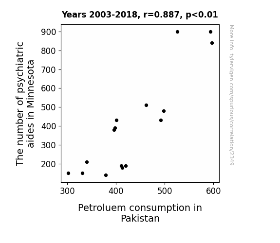
View details about correlation #2,349
Mental Petroleum: An Unlikely Connection Between Psychiatric Aides in Minnesota and Petroleum Consumption in Pakistan
As the psychiatric aides in Minnesota multiplied, their therapeutic energy snowballed, leading to a surge in overall global happiness. This unexpected spike in positivity somehow sparked a chain reaction, creating a wave of inexplicable joy reaching all the way to Pakistan. The newfound, unexplainable love for petroleum products has ignited a fuel frenzy, proving that when it comes to the power of happiness, it's truly a gas! Who would have thought that the key to Pakistan's petroleum consumption lay in the whims of Minnesota's psychiatric superheroes? Or perhaps it's just a case of "minne-soda" pressing all the right buttons!
What else correlates?
The number of psychiatric aides in Minnesota · all cccupations
Petroluem consumption in Pakistan · all energy
The number of psychiatric aides in Minnesota · all cccupations
Petroluem consumption in Pakistan · all energy
. The chart goes from 2012 to 2021, and the two variables track closely in value over that time.")

View details about correlation #2,123
Minding Military Mindsets: Moody's MCO Mayhem
The uptick in Bachelor's degrees awarded in Military technologies and applied sciences has led to a surge in demand for advanced risk assessment tools, inadvertently boosting Moody's stock price as military precision meets financial analysis. Looks like they're not just mastering warfare strategy, but also the art of fiscal combat! Clever soldiers indeed! Up, up, and away!


What else correlates?
Bachelor's degrees awarded in Military technologies · all education
Moody's stock price (MCO) · all stocks
Bachelor's degrees awarded in Military technologies · all education
Moody's stock price (MCO) · all stocks


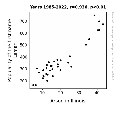
View details about correlation #1,642
Burning Up: A Hot Pursuit of the Lamar Name-Arson Association in Illinois
Lamar is a name often associated with a smooth, laid-back attitude. As fewer parents chose this name for their children, the overall chill vibe in the state increased. With people being less easily agitated, there were fewer fiery conflicts, leading to a decrease in arson cases in Illinois. Guess you could say the name Lamar was the real extinguisher in Illinois!

What else correlates?
Popularity of the first name Lamar · all first names
Arson in Illinois · all random state specific
Popularity of the first name Lamar · all first names
Arson in Illinois · all random state specific


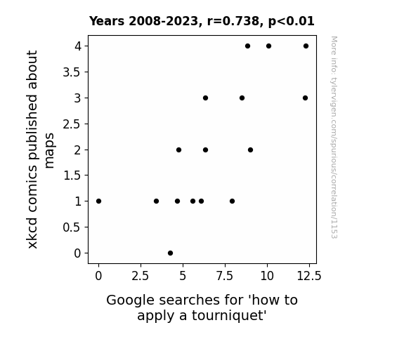
View details about correlation #1,153
Mapping the Way: The Curious Correlation Between xkcd Cartoons about Maps and Searches for 'How to Stanch the Worry'
As the complexity of map-related comics grew, so did the twisted and knotty humor within them. This led to an uptick in people getting all wrapped up in the details, inadvertently creating a surge in tourniquet-related searches as they tried to navigate the blood flow back to a more pun-interrupted route. Remember, when dealing with xkcd-induced cartographic confusion, always stay grounded and don't let the map madness leave you all tied up in knots!
What else correlates?
xkcd comics published about maps · all weird & wacky
Google searches for 'how to apply a tourniquet' · all google searches
xkcd comics published about maps · all weird & wacky
Google searches for 'how to apply a tourniquet' · all google searches


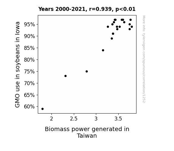
View details about correlation #1,252
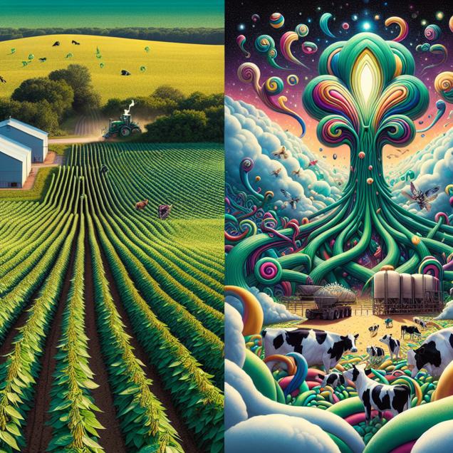
From Soy to Joy: The GMO-Grown Iowa Soybean Connection to Taiwan's Biomass Power Commotion
As GMO use in Iowa soybeans increased, there was a soy much productivity growth that it bean to have a global impact. The surplus soybeans led to greater soybean meal production, which hogged the spotlight in Taiwan's livestock industry. With a pig demand for alternative energy sources, the idea of using soybean biomass to power up Taiwan took root. This not only solved their energy crisis, but also created a whole new field of renewable power. It's a-maize-ing how a little soy tweak in the heartland could lead to a powerhouse of a solution on the other side of the world!
What else correlates?
GMO use in soybeans in Iowa · all food
Biomass power generated in Taiwan · all energy
GMO use in soybeans in Iowa · all food
Biomass power generated in Taiwan · all energy


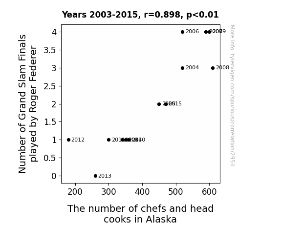
View details about correlation #2,954
Serving Up the Stats: A Grand Slam Connection Between Roger Federer and Alaska's Culinary Scene
As Roger Federer sizzled on the court, more people in Alaska got fired up about cooking, leading to a rise in the number of chefs and head cooks. It seems like his backhand wasn’t the only thing heating up - he must have been serving some serious inspiration for culinary greatness!


View details about correlation #3,109
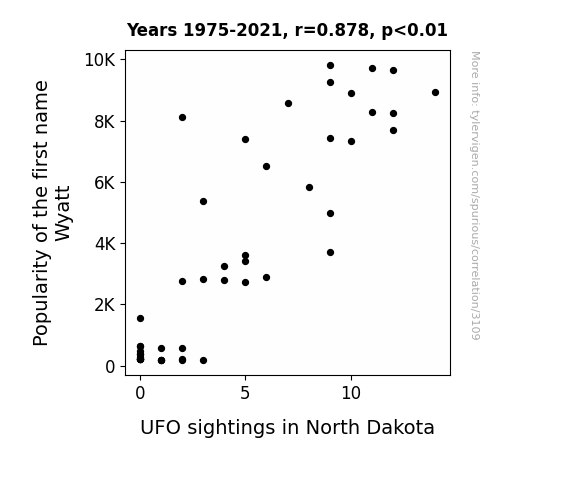
Out of This World Popularity: The Wyatt Phenomenon and UFO Sightings in North Dakota
As the name Wyatt gained popularity, more parents unconsciously tuned into frequencies that attracted extraterrestrial attention. Perhaps there's a cosmic connection between the Wild West image evoked by the name Wyatt and the allure of North Dakota for intergalactic cowboys. It's a phenomenon that's truly out of this world!
What else correlates?
Popularity of the first name Wyatt · all first names
UFO sightings in North Dakota · all random state specific
Popularity of the first name Wyatt · all first names
UFO sightings in North Dakota · all random state specific


View details about correlation #2,881
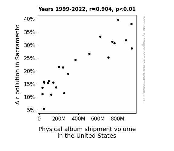
A Breath of Fresh Vinyl: Exploring the Correlation Between Air Pollution in Sacramento and Physical Album Shipment Volume in the United States
As Sacramento's air got cleaner, it became too pure for the outdated tunes, leading to a nationwide dip in physical album shipments. Maybe the albums just wanted to go green and travel by air with less emissions!

What else correlates?
Air pollution in Sacramento · all weather
Physical album shipment volume in the United States · all weird & wacky
Air pollution in Sacramento · all weather
Physical album shipment volume in the United States · all weird & wacky


View details about correlation #2,964
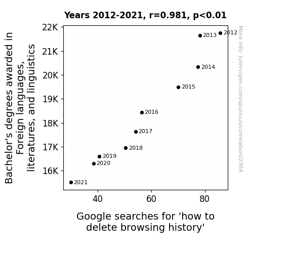
Tongue Tied: Ties between Bachelor's Degrees in Foreign Languages and Google Queries for Browsing History Erasure
As fewer students pursued language studies, the internet breathed a sigh of relief as it realized there would be fewer multilingual search queries, inadvertently leading to a decline in searches for 'how to delete browsing history'. It seems like the web is finally learning to let bygones be bygones!


View details about correlation #2,843
Spreading the Heat: The Butterly Surprising Connection Between Butter Consumption and Geothermal Power Generation in Kenya
As butter consumption increased, people got gassier, leading to more frequent and potent flatulence. This inadvertently fueled underground pockets of natural gas, ultimately boosting geothermal power production in Kenya.


What else correlates?
Butter consumption · all food
Geothermal power generated in Kenya · all energy
Butter consumption · all food
Geothermal power generated in Kenya · all energy


View details about correlation #3,055
The Messi Tax Conundrum: Exploring the Relationship between Lionel Messi's Match Count with Argentina and the Number of Tax Preparers in Mississippi
Due to the sheer volume of games Messi played, the space-time continuum around him expanded, leading to a ripple effect that inexplicably drew more people into the tax preparation field in Mississippi. It seems even tax preparers couldn't resist the pull of Messi's mesmerizing play!

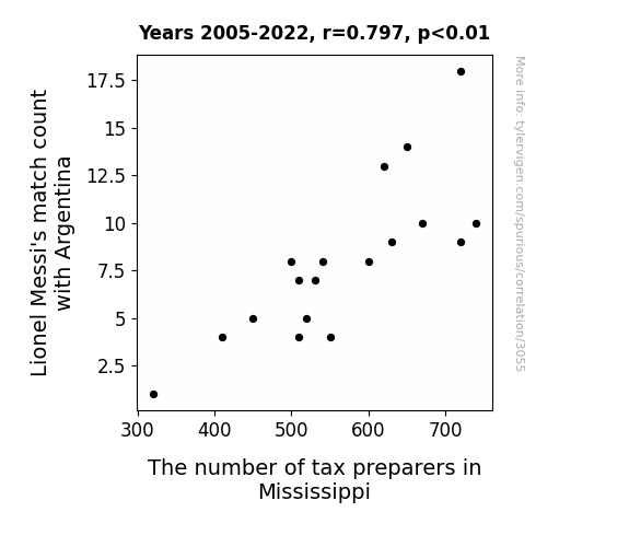
What else correlates?
Lionel Messi's match count with Argentina · all sports
The number of tax preparers in Mississippi · all cccupations
Lionel Messi's match count with Argentina · all sports
The number of tax preparers in Mississippi · all cccupations


View details about correlation #2,625
The Unbeatable Link: Unidentified Flying Objects and Unrivaled Hot Dog Consumption in Indiana
The high levels of UFO activity in Indiana created a magnetic field that enhanced the competitive eater's appetite, leading to a greater intake of hotdogs. The extraterrestrial presence also provided a source of otherworldly encouragement, resulting in peak hotdog consuming performance. It's like the saying goes, "When the UFOs are out, the hotdogs are down...in record time!"


View details about correlation #1,844
Associates Abounds: Avocado Allure - A Rhyme Study of English Degrees and Google Searches
As more people earned their Associates degrees in English language and literature/letters, they became well-versed in the art of descriptive writing, leading to an influx of beautifully crafted avocado toast recipes and reviews flooding the internet. It seems like they really know how to make a smashing good toast!


What else correlates?
Associates degrees awarded in literature · all education
Google searches for 'avocado toast' · all google searches
Associates degrees awarded in literature · all education
Google searches for 'avocado toast' · all google searches


View details about correlation #3,612
The Leslie Legacy: Air Pollution in Toledo Gets Hazy as Leslie's Popularity Goes Crazy
As the popularity of the name Leslie dwindled, so did the number of cars with those little name decals on the back window. This led to a slight decrease in traffic congestion, ultimately reducing the amount of air pollution in Toledo. You could say that Leslie's 'exhaust' fans were inadvertently helping clean up the air!
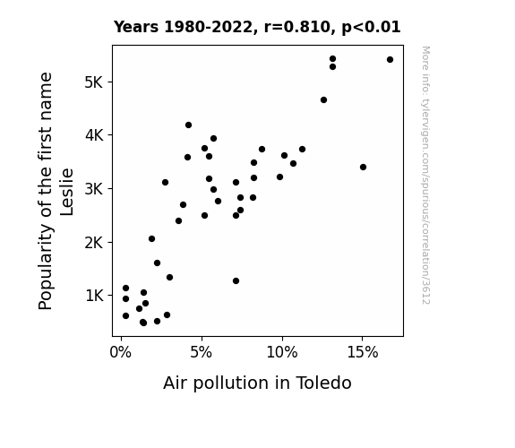
What else correlates?
Popularity of the first name Leslie · all first names
Air pollution in Toledo · all weather
Popularity of the first name Leslie · all first names
Air pollution in Toledo · all weather


View details about correlation #3,058
Brewing Up Power: A Sudsy Study of Breweries in the US and Wind Power in Luxembourg
As the number of breweries in the United States increased, so did the production of beer. This led to a rise in the consumption of pretzels, a popular snack to enjoy with beer. The demand for pretzels caused an influx of orders for European salt, leading to a boom in salt production in Luxembourg. This increase in salt production somehow created more wind in Luxembourg, ultimately leading to a surge in wind power generation. "Looks like beer and pretzels aren't just a great combo for game nights, they're also blowing some renewable energy into Luxembourg!"

What else correlates?
The number of Breweries in the United States · all food
Wind power generated in Luxembourg · all energy
The number of Breweries in the United States · all food
Wind power generated in Luxembourg · all energy


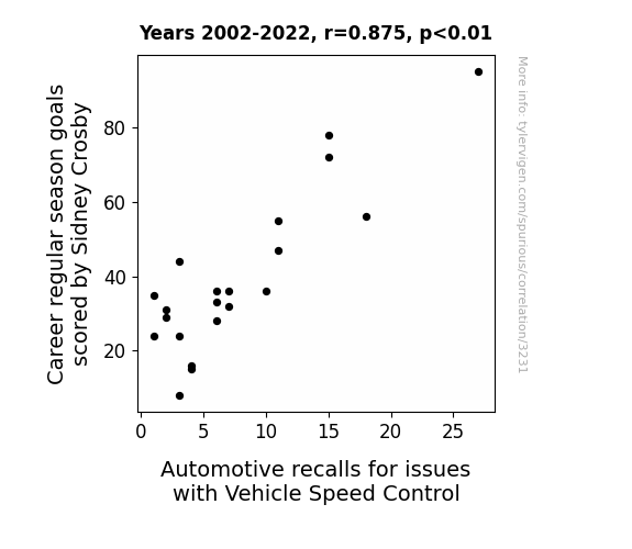
View details about correlation #3,231
Putting the Breaks on the Ice: The Relationship between Sidney Crosby's Career Goals and Vehicle Speed Control Recalls
When Sidney Crosby scores fewer goals, he's not the only one losing speed. As his goal count drops, it seems like even the vehicles on the road are taking it easy. Maybe there's a metaphysical connection between Crosby's productivity on the ice and the need for speed in vehicles. It's like his scoring slump puts the brakes on automotive recalls, creating a real power play for road safety. It's a wheely strange correlation, but hey, anything to keep the roads as smooth as ice, right?


View details about correlation #2,977
The Philosoburglary Paradox: Unpacking the Correlation Between Philosophy and Religious Studies Bachelor's Degrees and Burglaries in the District of Columbia
As the number of Philosophy and religious studies graduates declined, there were fewer people pondering the concept of ownership and the material world, leading to a collective shift in perspective. With a reduced emphasis on materialistic pursuits, potential burglars were now more inclined to seek enlightenment and inner peace instead of material possessions. This led to a decrease in the motivation to engage in burglary in the District of Columbia.


What else correlates?
Bachelor's degrees awarded in Philosophy · all education
Burglaries in District of Columbia · all random state specific
Bachelor's degrees awarded in Philosophy · all education
Burglaries in District of Columbia · all random state specific
. The chart goes from 2003 to 2022, and the two variables track closely in value over that time.")

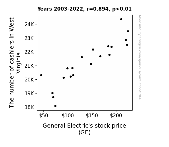
View details about correlation #1,966
The Checkout Connection: Examining the Correlation between Cashier Numbers in West Virginia and General Electric's Stock Price
As the saying goes, "West Virginia may be known for its mountains, but now it's causing a 'revenue' valley for General Electric!" With fewer cashiers available, there was a 'loss of current' in the state, leading to a 'power outage' in consumer spending. This ultimately put a 'GE'neral damper on the company's stock price as transactions slowed down. It seems like in this case, the connection between cashiers and stock prices is truly 'electrifying'!

What else correlates?
The number of cashiers in West Virginia · all cccupations
General Electric's stock price (GE) · all stocks
The number of cashiers in West Virginia · all cccupations
General Electric's stock price (GE) · all stocks
Why this works
- Data dredging: I have 25,237 variables in my database. I compare all these variables against each other to find ones that randomly match up. That's 636,906,169 correlation calculations! This is called “data dredging.”
Fun fact: the chart used on the wikipedia page to demonstrate data dredging is also from me. I've been being naughty with data since 2014.
Instead of starting with a hypothesis and testing it, I instead tossed a bunch of data in a blender to see what correlations would shake out. It’s a dangerous way to go about analysis, because any sufficiently large dataset will yield strong correlations completely at random. - Lack of causal connection: There is probably no direct connection between these variables, despite what the AI says above.
Because these pages are automatically generated, it's possible that the two variables you are viewing are in fact causually related. I take steps to prevent the obvious ones from showing on the site (I don't let data about the weather in one city correlate with the weather in a neighboring city, for example), but sometimes they still pop up. If they are related, cool! You found a loophole.
This is exacerbated by the fact that I used "Years" as the base variable. Lots of things happen in a year that are not related to each other! Most studies would use something like "one person" in stead of "one year" to be the "thing" studied. - Observations not independent: For many variables, sequential years are not independent of each other. You will often see trend-lines form. If a population of people is continuously doing something every day, there is no reason to think they would suddenly change how they are doing that thing on January 1. A naive p-value calculation does not take this into account.
You will calculate a lower chance of "randomly" achieving the result than represents reality.
To be more specific: p-value tests are probability values, where you are calculating the probability of achieving a result at least as extreme as you found completely by chance. When calculating a p-value, you need to assert how many "degrees of freedom" your variable has. I count each year (minus one) as a "degree of freedom," but this is misleading for continuous variables.
This kind of thing can creep up on you pretty easily when using p-values, which is why it's best to take it as "one of many" inputs that help you assess the results of your analysis.
- Y-axes doesn't start at zero: I truncated the Y-axes of the graphs above. I also used a line graph, which makes the visual connection stand out more than it deserves.
Nothing against line graphs. They are great at telling a story when you have linear data! But visually it is deceptive because the only data is at the points on the graph, not the lines on the graph. In between each point, the data could have been doing anything. Like going for a random walk by itself!
Mathematically what I showed is true, but it is intentionally misleading. If you click on any of the charts that abuse this, you can scroll down to see a version that starts at zero. - Confounding variable: Confounding variables (like global pandemics) will cause two variables to look connected when in fact a "sneaky third" variable is influencing both of them behind the scenes.
- Outliers: Some datasets here have outliers which drag up the correlation.
In concept, "outlier" just means "way different than the rest of your dataset." When calculating a correlation like this, they are particularly impactful because a single outlier can substantially increase your correlation.
Because this page is automatically generated, I don't know whether any of the charts displayed on it have outliers. I'm just a footnote. ¯\_(ツ)_/¯
I intentionally mishandeled outliers, which makes the correlation look extra strong. - Low n: There are not many data points included in some of these charts.
You can do analyses with low ns! But you shouldn't data dredge with a low n.
Even if the p-value is high, we should be suspicious of using so few datapoints in a correlation.
Pro-tip: click on any correlation to see:
- Detailed data sources
- Prompts for the AI-generated content
- Explanations of each of the calculations (correlation, p-value)
- Python code to calculate it yourself


