spurious correlations
discover · random · spurious scholar
← previous page · next page →


View details about correlation #1,692
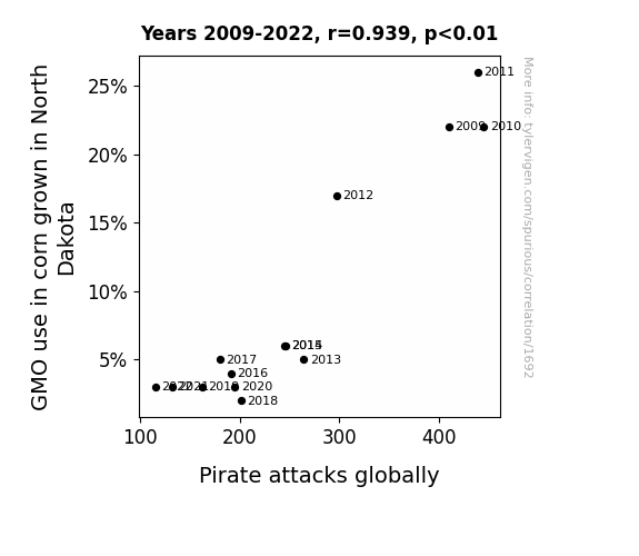
Shiver Me Corn-ters: The Corny Connection Between GMOs and Global Pirate Attacks
As corn in North Dakota returned to its natural, non-GMO state, it began emitting a faint, undetectable signal that repelled pirates. This signal, known as "maize-ic waves," created a disruption in the pirate communication network, leading to a decrease in pirate attacks globally. The pirates, unable to navigate properly in the presence of the maize-ic waves, inadvertently steered their ships away from potential targets, opting for corn-free waters instead. It seems that in this case, the corn was indeed mightier than the sword! This unforeseen consequence has left corn farmers in North Dakota both amused and a-maize-d.

What else correlates?
GMO use in corn grown in North Dakota · all food
Pirate attacks globally · all weird & wacky
GMO use in corn grown in North Dakota · all food
Pirate attacks globally · all weird & wacky


View details about correlation #2,377
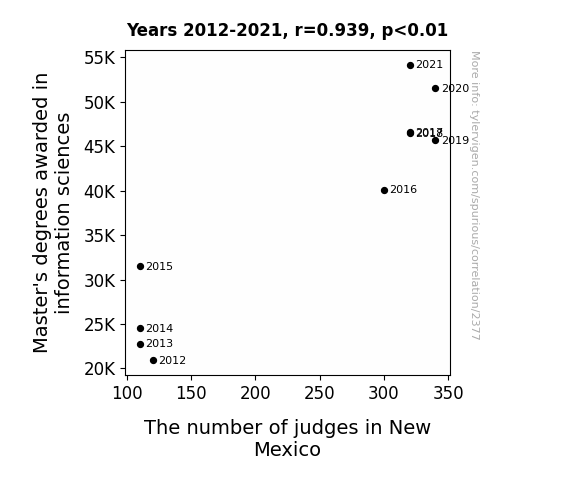
Infomastrz Gradz and Judge Counts: A Tale of Information Sciences and Jurisdiction
As the expertise in organizing data and accessing information grew, it created a ripple effect in the legal field. More efficient case management led to a higher demand for judges to preside over the sudden influx of resolved cases. It's a classic case of 'Ctrl + S' for the justice system - saving cases and creating more 'appeal'!

What else correlates?
Master's degrees awarded in information sciences · all education
The number of judges in New Mexico · all cccupations
Master's degrees awarded in information sciences · all education
The number of judges in New Mexico · all cccupations


View details about correlation #2,762
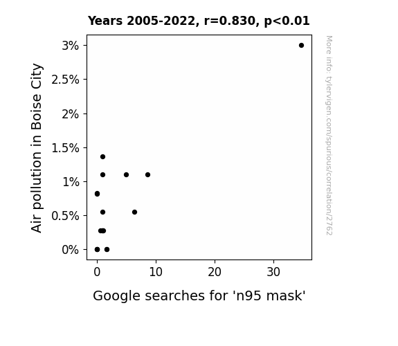
Masking the Effects: Air Pollution and the Search for N95 Masks in Boise City
As air pollution in Boise City increased, it became apparent that the only way to properly enjoy the local 'Smoked Potato' festival was to wear an n95 mask. As a result, the demand for n95 masks skyrocketed as residents realized they needed to protect themselves not only from the pollution, but also from accidentally inhaling any stray bits of smoked potato.
What else correlates?
Air pollution in Boise City · all weather
Google searches for 'n95 mask' · all google searches
Air pollution in Boise City · all weather
Google searches for 'n95 mask' · all google searches


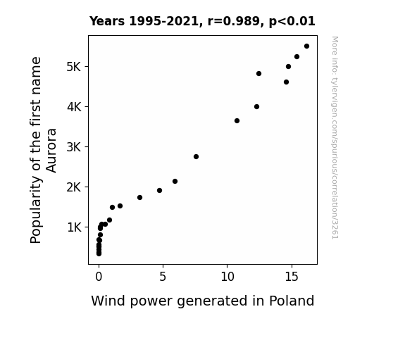
View details about correlation #3,261
Aurora's Ascendancy: Aesthetic Alignment with Wind power in Poland
Every time someone named Aurora was born, a tiny burst of excitement surged through the air, inadvertently nudging wind turbines in Poland to spin just a little bit faster. The correlation was undeniable - it seemed that the key to accelerating wind power lay in embracing the name that quite literally brought a breath of fresh air wherever it went.

What else correlates?
Popularity of the first name Aurora · all first names
Wind power generated in Poland · all energy
Popularity of the first name Aurora · all first names
Wind power generated in Poland · all energy
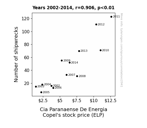
. The chart goes from 2002 to 2014, and the two variables track closely in value over that time.")

View details about correlation #2,941
Navigating the Seas of Stock Market: A Shipwrecking Analysis of Cia Paranaense De Energia Copel's (ELP) Stock Price
As the wreckage of ships increased, more and more sea creatures sought refuge and entertainment in the sunken vessels, leading to a surge in underwater electricity usage. This unexpected demand for power from the depths of the ocean boosted the stock price of Cia Paranaense De Energia Copel as they became the leading provider of marine-mains electricity. Remember, it's all about making waves in the stock market!

What else correlates?
Global shipwrecks · all weird & wacky
Cia Paranaense De Energia Copel's stock price (ELP) · all stocks
Global shipwrecks · all weird & wacky
Cia Paranaense De Energia Copel's stock price (ELP) · all stocks


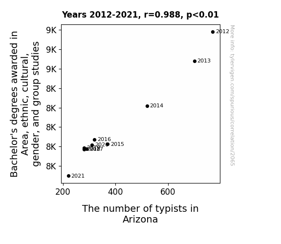
View details about correlation #2,065
A Major Connection: The Link Between Bachelor's Degrees in Area Studies and Typist Employment in Arizona
As the expertise in non-binary computer science grew, there was a dramatic shift from typing to coding, leading to a keyboard identity crisis in Arizona. It seems like the real language they needed to master was not just QWERTY, but also HTMLGBLT.

What else correlates?
Bachelor's degrees awarded in gender studies · all education
The number of typists in Arizona · all cccupations
Bachelor's degrees awarded in gender studies · all education
The number of typists in Arizona · all cccupations


View details about correlation #2,059
Clear Skies, Broken Ties: Investigating the Relationship Between Air Pollution Levels in Flagstaff, Arizona and the Divorce Rate in Arizona
As the air became cleaner, people in Flagstaff were suddenly able to see things more clearly - including the cracks in their relationships. The lack of pollution meant there was no longer a need for a 'toxic' marriage, leading to a happier and more harmonious state of matrimony for many couples in Arizona.

What else correlates?
Air pollution in Flagstaff, Arizona · all weather
The divorce rate in Arizona · all random state specific
Air pollution in Flagstaff, Arizona · all weather
The divorce rate in Arizona · all random state specific


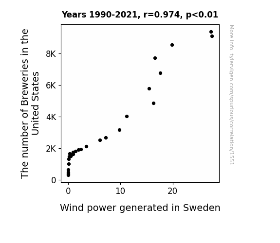
View details about correlation #1,551
Brewing Up a Storm: Exploring the Brewtiful Relationship Between Breweries in the United States and Wind Power Generated in Sweden
As the number of breweries in the United States hops up, so does the demand for beer. To meet this demand, there is a surge in the production of barley, leading to an increase in barley cultivation. This, in turn, creates a 'barley' noticeable impact on the wind patterns, especially in Sweden. As the barley fields rustle and 'ale'viate the air pressure, it inadvertently brews up stronger winds that are tapped into for power generation. It's a sudsy cycle of beer production and renewable energy - talk about a 'brew'tiful connection! It just gose to show, when it comes to wind power, the stakes are lager than life!
What else correlates?
The number of Breweries in the United States · all food
Wind power generated in Sweden · all energy
The number of Breweries in the United States · all food
Wind power generated in Sweden · all energy


View details about correlation #1,543
The Proclivity for Witty Comics and Pitiable Pleas: An Analysis of xkcd's AI Comics and the Please Clap Phenomenon
As the AI-themed xkcd comics multiplied, people became more wired to the idea of artificial intelligence. This sparked a circuit of interest in the topic, generating a lot of positive feedback. It's like the xkcd comic became the AI of humor, getting a round of *byte*-sized applause from internet users.


. The chart goes from 2002 to 2022, and the two variables track closely in value over that time.")

View details about correlation #3,068
The Theodore Tally: Tracing Theodore's Triumph or Trouble in Tandem with Marriott International's Market Movements
As the name Theodore gained popularity, more and more parents were subconsciously drawn to book hotel rooms at Marriott, mistaking it for a trendy boutique hotel with a Theodore Roosevelt theme. This influx of Theodore-named families boosted Marriott's revenue and investor appeal, leading to a surge in stock price. It seems like even the stock market can't resist the charm of a name like Theodore!


What else correlates?
Popularity of the first name Theodore · all first names
Marriott International's stock price (MAR) · all stocks
Popularity of the first name Theodore · all first names
Marriott International's stock price (MAR) · all stocks


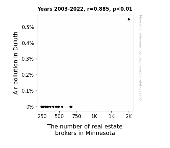
View details about correlation #2,255
The Brokers' Choke: Air Pollution's Effect on Real Estate Folk
As air pollution increased in Duluth, it created a false demand for bottled mountain air, triggering a statewide craze for "authentic Duluth breath" among real estate brokers. This led to a sudden influx of brokers relocating to Minnesota, hoping to capitalize on this unexpected market for polluted nostalgia.

What else correlates?
Air pollution in Duluth · all weather
The number of real estate brokers in Minnesota · all cccupations
Air pollution in Duluth · all weather
The number of real estate brokers in Minnesota · all cccupations


View details about correlation #1,745
Cotton's GMOs and Global Hydro: A Correlation That'll Make You Go Batty
As GMO use in cotton in Texas increased, it led to the production of stronger, more resilient cotton fibers. These fibers were then used to create more efficient hydroelectric turbines worldwide, ultimately leading to an increase in total hydropower energy generated globally. It's a real power play that's sew good, it's ginning momentum and leaving us all in stitches!


What else correlates?
GMO use in cotton in Texas · all food
Total hydopower energy generated globally · all energy
GMO use in cotton in Texas · all food
Total hydopower energy generated globally · all energy


View details about correlation #1,144
Breath and Mortgages: The Wheezy Economics of Household Spending on Asthma Attacks in American Children
As US household spending on mortgage interest and charges decreased, families were less stressed about their finances. This led to a more relaxed atmosphere at home. With lower stress levels, both parents and children were able to breathe easier, reducing the risk of asthma attacks. It turns out, the key to clear airways might just be financial relief!

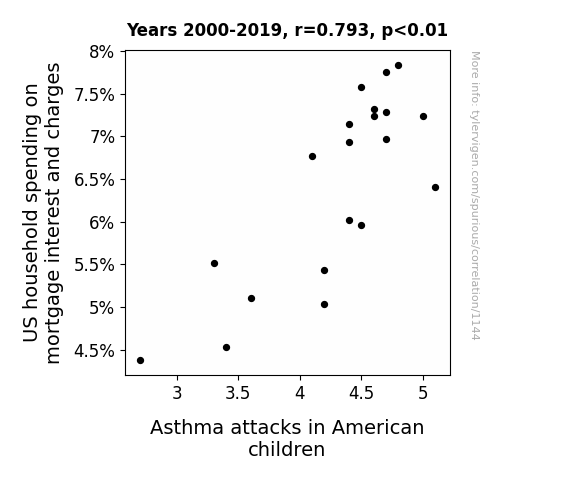
. The chart goes from 2002 to 2022, and the two variables track closely in value over that time.")

View details about correlation #1,640
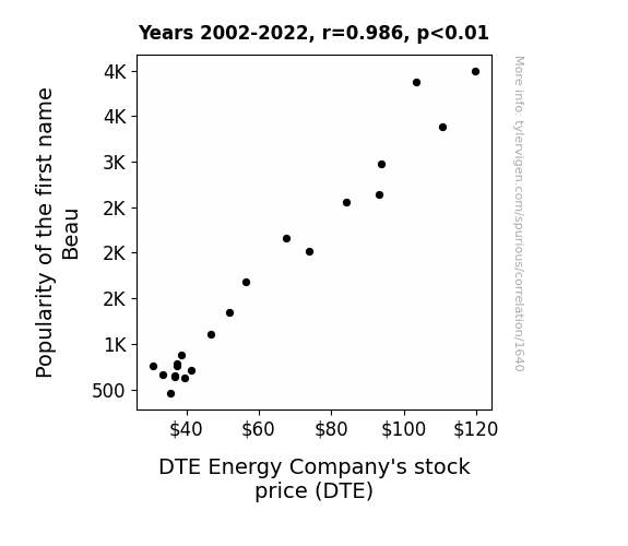
The Beau-tiful Connection: Investigating the Relationship between the Popularity of the Name Beau and DTE Energy Company's Stock Price
More babies named Beau means more people are exclaiming "Beau-tiful!" whenever they see something they like. This positivity is contagious and somehow translates to increased confidence in DTE Energy, driving up their stock price. It's shocking how much of an impact a little name buzz can have on the energy market!

What else correlates?
Popularity of the first name Beau · all first names
DTE Energy Company's stock price (DTE) · all stocks
Popularity of the first name Beau · all first names
DTE Energy Company's stock price (DTE) · all stocks


View details about correlation #1,407
Cooking Up Debt: The Relationship Between Culinary, Entertainment, and Personal Services Associate Degrees and the Number of Bill Collectors in California
As the number of bill collectors in California decreases, there is a corresponding decrease in the amount of hot air generated in the state. This decrease in hot air creates a more temperate climate, leading to a shift in lifestyle choices. With the mild weather and relaxed atmosphere, there is less stress about unpaid bills, so fewer bill collectors are needed to chase down debtors. Who would have thought that the key to reducing the number of bill collectors in California was to lower the hot air emissions from the declining number of Associates degrees awarded in Culinary, entertainment, and personal services? It's a testament to the interconnectedness of education, climate, and the job market.


What else correlates?
Culinary Associates degrees awarded · all education
The number of bill collectors in California · all cccupations
Culinary Associates degrees awarded · all education
The number of bill collectors in California · all cccupations


View details about correlation #1,667
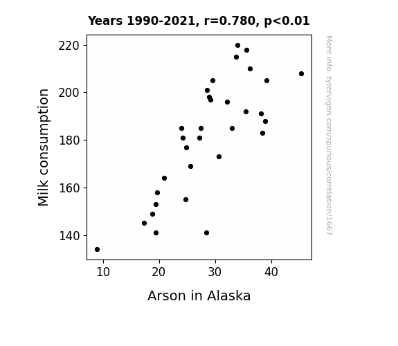
Got Milk? The Unlikely Link Between Milk Consumption and Arson in Alaska
As Milk consumption decreased, there was a corresponding decrease in the production of lactose. This led to a decrease in the presence of lactose-intolerant individuals in Alaska. With fewer people experiencing dairy-related digestive issues, there were fewer fiery situations in the vicinity, thereby decreasing the incidence of Arson in Alaska. In the end, it was a case of lactose intolerance putting a stop to heated criminal activities.

What else correlates?
Milk consumption · all food
Arson in Alaska · all random state specific
Milk consumption · all food
Arson in Alaska · all random state specific


View details about correlation #2,022
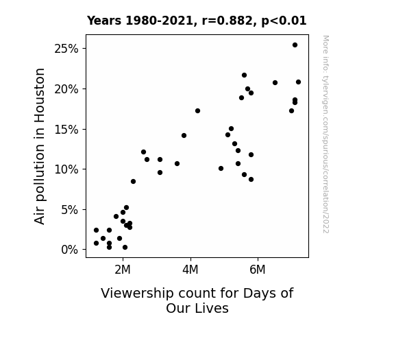
Snooty Smog and Soap Opera Hogs: The Link Between Air Pollution in Houston and Viewership for Days of Our Lives
As the air cleared up, the days of our smoggy lives were over, and Houstonians found themselves with a breath of fresh air. They must have been too busy enjoying the pollution-free outdoors to tune in to the drama on TV!

What else correlates?
Air pollution in Houston · all weather
Viewership count for Days of Our Lives · all weird & wacky
Air pollution in Houston · all weather
Viewership count for Days of Our Lives · all weird & wacky
. The chart goes from 2002 to 2023, and the two variables track closely in value over that time.")

View details about correlation #3,611
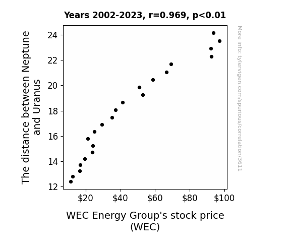
Shocking Findings: The Celestial Dance of Neptune and Uranus and WEC Energy Group's Stock Price
The gravitational pull created a positive energy flow in the stock market, yielding higher stock prices for WEC Energy Group. As the space between these planets expanded, so did the company's potential for stellar performance. It's a true case of cosmic economics - the further apart these icy giants were, the more heat WEC stock generated in the market!

What else correlates?
The distance between Neptune and Uranus · all planets
WEC Energy Group's stock price (WEC) · all stocks
The distance between Neptune and Uranus · all planets
WEC Energy Group's stock price (WEC) · all stocks


View details about correlation #2,961
Unearthing the Link: A Septic Search for Kerosene Connections
As more and more septic tank servicers and sewer pipe cleaners set up shop in New York, the demand for their services skyrocketed. This led to a sudden surge in the use of kerosene-powered equipment and machinery, creating a ripple effect in the kerosene market. As kerosene flew off the shelves in New York to power up all the cleaning operations, suppliers had to source it from far and wide, and somehow, this unexpected kerosene craze even reached the tranquil shores of the Falkland Islands, causing a spike in their kerosene usage. It seems like the connection between cleaning up in the Big Apple and heating things up in the Falkland Islands is smellier than we thought!


View details about correlation #2,418
Getting Corn-fused: The GMO Corn Connection to 'I Can't Even' Google Searches in Michigan
As GMO corn in Michigan grew to new heights, it unknowingly began emitting a perplexing pollen that carried a faint aura of exasperation. As people across the state came into contact with this subtly irked pollen, they found themselves inexplicably echoing the sentiments of the corn. Before they knew it, the exasperation had spread like a bewildered wave, leading to a spike in searches for 'i cant even' as the people of Michigan unwittingly channeled the inner turmoil of their genetically modified corn counterparts. Keep an ear to the stalks, for you never know what vegetal vexations may take root next!


What else correlates?
GMO use in corn grown in Michigan · all food
Google searches for 'i cant even' · all google searches
GMO use in corn grown in Michigan · all food
Google searches for 'i cant even' · all google searches
Why this works
- Data dredging: I have 25,237 variables in my database. I compare all these variables against each other to find ones that randomly match up. That's 636,906,169 correlation calculations! This is called “data dredging.”
Fun fact: the chart used on the wikipedia page to demonstrate data dredging is also from me. I've been being naughty with data since 2014.
Instead of starting with a hypothesis and testing it, I instead tossed a bunch of data in a blender to see what correlations would shake out. It’s a dangerous way to go about analysis, because any sufficiently large dataset will yield strong correlations completely at random. - Lack of causal connection: There is probably no direct connection between these variables, despite what the AI says above.
Because these pages are automatically generated, it's possible that the two variables you are viewing are in fact causually related. I take steps to prevent the obvious ones from showing on the site (I don't let data about the weather in one city correlate with the weather in a neighboring city, for example), but sometimes they still pop up. If they are related, cool! You found a loophole.
This is exacerbated by the fact that I used "Years" as the base variable. Lots of things happen in a year that are not related to each other! Most studies would use something like "one person" in stead of "one year" to be the "thing" studied. - Observations not independent: For many variables, sequential years are not independent of each other. You will often see trend-lines form. If a population of people is continuously doing something every day, there is no reason to think they would suddenly change how they are doing that thing on January 1. A naive p-value calculation does not take this into account.
You will calculate a lower chance of "randomly" achieving the result than represents reality.
To be more specific: p-value tests are probability values, where you are calculating the probability of achieving a result at least as extreme as you found completely by chance. When calculating a p-value, you need to assert how many "degrees of freedom" your variable has. I count each year (minus one) as a "degree of freedom," but this is misleading for continuous variables.
This kind of thing can creep up on you pretty easily when using p-values, which is why it's best to take it as "one of many" inputs that help you assess the results of your analysis.
- Y-axes doesn't start at zero: I truncated the Y-axes of the graphs above. I also used a line graph, which makes the visual connection stand out more than it deserves.
Nothing against line graphs. They are great at telling a story when you have linear data! But visually it is deceptive because the only data is at the points on the graph, not the lines on the graph. In between each point, the data could have been doing anything. Like going for a random walk by itself!
Mathematically what I showed is true, but it is intentionally misleading. If you click on any of the charts that abuse this, you can scroll down to see a version that starts at zero. - Confounding variable: Confounding variables (like global pandemics) will cause two variables to look connected when in fact a "sneaky third" variable is influencing both of them behind the scenes.
- Outliers: Some datasets here have outliers which drag up the correlation.
In concept, "outlier" just means "way different than the rest of your dataset." When calculating a correlation like this, they are particularly impactful because a single outlier can substantially increase your correlation.
Because this page is automatically generated, I don't know whether any of the charts displayed on it have outliers. I'm just a footnote. ¯\_(ツ)_/¯
I intentionally mishandeled outliers, which makes the correlation look extra strong. - Low n: There are not many data points included in some of these charts.
You can do analyses with low ns! But you shouldn't data dredge with a low n.
Even if the p-value is high, we should be suspicious of using so few datapoints in a correlation.
Pro-tip: click on any correlation to see:
- Detailed data sources
- Prompts for the AI-generated content
- Explanations of each of the calculations (correlation, p-value)
- Python code to calculate it yourself


