spurious correlations
discover · random · spurious scholar
← previous page · next page →


View details about correlation #3,034
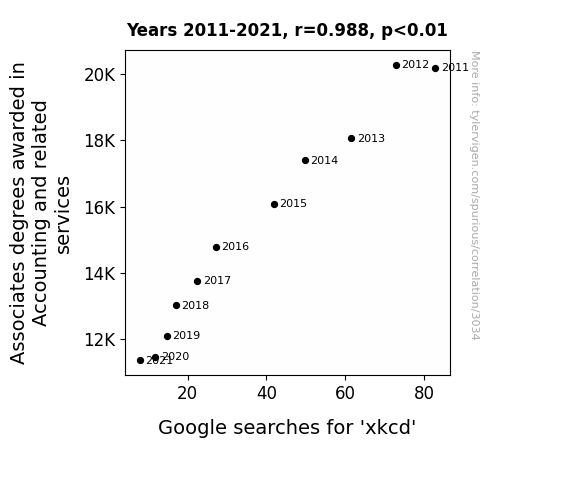
The Counting Connections: Unraveling the Correlation Between Associates Degrees in Accounting and Related Services and Google Searches for 'xkcd'
As the number of Associate degrees awarded in Accounting and related services dropped, there was a corresponding decline in people making boring charts and graphs. This ultimately led to a reduced appreciation for the wry and nerdy humor found in xkcd comics. After all, without the barrage of accountants-in-training, who was left to calculate the exact angle of wit and the differential of humor in Randall Munroe's iconic stick figure creations?

What else correlates?
Associates degrees awarded in Accounting · all education
Google searches for 'xkcd' · all google searches
Associates degrees awarded in Accounting · all education
Google searches for 'xkcd' · all google searches
. The chart goes from 2002 to 2020, and the two variables track closely in value over that time.")

View details about correlation #2,279
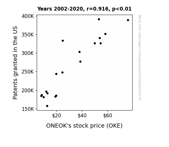
Patenting and ONEOK's Stock: A Rhyme About Prime Time?
As more patents are granted, there is a surge in wacky inventions. ONEOK decides to patent the groundbreaking technology of turning natural gas into dad jokes, creating a monopoly on energy-related humor. This leaves investors gasping for a good laugh, driving up demand for ONEOK's stock and ultimately increasing its price.

What else correlates?
Patents granted in the US · all weird & wacky
ONEOK's stock price (OKE) · all stocks
Patents granted in the US · all weird & wacky
ONEOK's stock price (OKE) · all stocks


View details about correlation #1,401
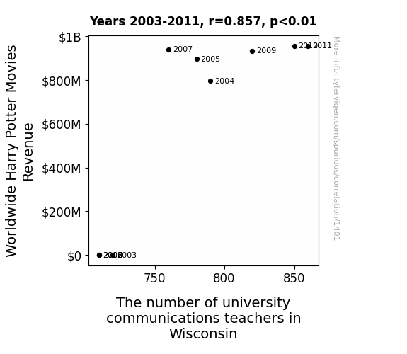
Accio Professors: A Muggle's Guide to the Magical Connection Between Worldwide Harry Potter Movies Revenue and the Number of University Communications Teachers in Wisconsin
As Harry Potter movie revenue soared, more Muggles were enchanted by the magical world, leading them to seek ways to communicate with each other like wizards. This caused a demand for communication teachers in Wisconsin, where they hoped to learn how to cast spells of persuasion and charm their students with captivating lectures, as if under the influence of a Confundus Charm.


View details about correlation #2,433
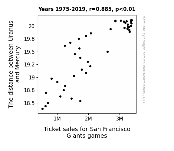
Starry Nights and Home Runs: Exploring the Celestial Influence on San Francisco Giants' Ticket Sales
The gravitational pull created an auspicious cosmic energy that resonated with the baseball fans, leading to a surge in ticket purchases.

What else correlates?
The distance between Uranus and Mercury · all planets
Ticket sales for San Francisco Giants games · all sports
The distance between Uranus and Mercury · all planets
Ticket sales for San Francisco Giants games · all sports


View details about correlation #3,010
Moo-ves and Misdemeanors: Exploring the Milky Way of Milk Consumption and Robberies in South Carolina
A lactose-intolerant master thief was finally able to lay off the dairy, leading to a decrease in his criminal activities. Without the discomfort of dairy consumption, he found inner peace and gave up his life of crime, leading to a overall decrease in robberies in South Carolina.
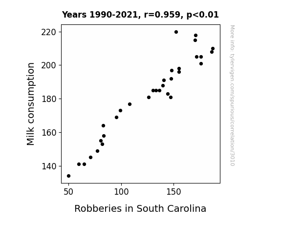
What else correlates?
Milk consumption · all food
Robberies in South Carolina · all random state specific
Milk consumption · all food
Robberies in South Carolina · all random state specific
. The chart goes from 2003 to 2022, and the two variables track closely in value over that time.")

View details about correlation #1,635
Maeve's Moniker and Netflix's Numbers: An Examination of the Name's Popularity and Its Peculiar Relationship with NFLX Stock Price
As the number of Maevellous individuals in the world rose, so did the demand for Netflix, leading to a Maeve-lous boost in their stock price. It's clear that with more people tuning in, Netflix is raeving in the profits!

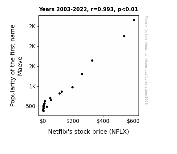
What else correlates?
Popularity of the first name Maeve · all first names
Netflix's stock price (NFLX) · all stocks
Popularity of the first name Maeve · all first names
Netflix's stock price (NFLX) · all stocks


View details about correlation #3,185
Microbiologists in North Carolina and Gasoline in Togo: A Marvelous Mismatch or Mysterious Match?
The increase in microbiologists in North Carolina led to a surplus of expertise in bacterial fermentation, inadvertently boosting the production of biofuels, including gasoline, resulting in more fuel being pumped in Togo. Looks like North Carolina's microbiologists are fueling more than just research!

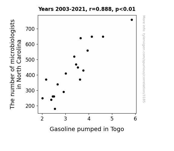
What else correlates?
The number of microbiologists in North Carolina · all cccupations
Gasoline pumped in Togo · all energy
The number of microbiologists in North Carolina · all cccupations
Gasoline pumped in Togo · all energy
 for Spirits. The chart goes from 2011 to 2021, and the two variables track closely in value over that time.")

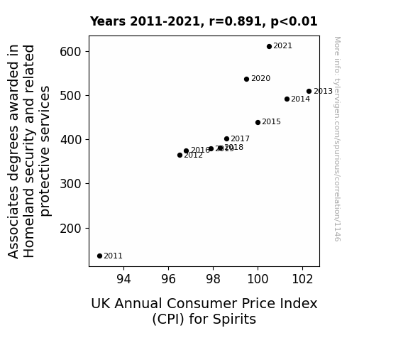
View details about correlation #1,146
A Spirited Connection: Exploring the Link Between Associates Degrees in Homeland Security and Consumer Price Index for Spirits in the UK
The more knowledgeable the graduates became about homeland security, the more they realized the importance of protecting all spirits, which led to an increase in demand for spirit security measures like ghost alarms, poltergeist-proof locks, and exorcism insurance. As a result, the cost of ensuring the safety of spirits in the UK skyrocketed, causing a haunting hike in the Consumer Price Index for Spirits.


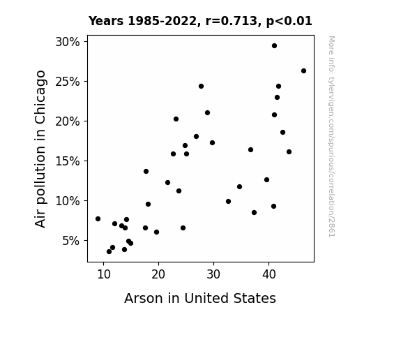
View details about correlation #2,861
Up in Smoke: The Connection Between Air Pollution in the Windy City and Arsons Across the Nation
As the smog cleared, the art of pyromania lost its spark in the Windy City. With cleaner air, it seems the urge to add smoky accents to buildings went up in smoke all across the nation! It's like the arsonists looked around and thought, "Hey, let's not burn down stuff today. The air is nice and crisp. Let's just, you know, not light fires and stuff." Or maybe the former pollution particles were the real fire starters, and without them, the flames just couldn't ignite the same way. It's a conundrum wrapped in a mystery, surrounded by cleaner air.

What else correlates?
Air pollution in Chicago · all weather
Arson in United States · all random state specific
Air pollution in Chicago · all weather
Arson in United States · all random state specific


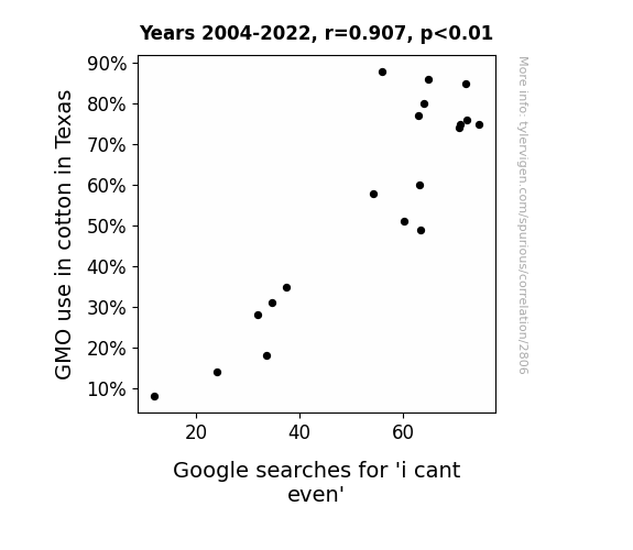
View details about correlation #2,806
From Cotton Picking to Web Browsing: The Can't Even Correlation
It caused a lot of unpicking and rethreading, leaving people in a real fabric of frustration. The GMO cotton just couldn't be hemmed in, leading to a tangled web of exasperation. It seems like the situation has been sewn up, but these cotton-pickin' GMOs have really spun things out of control. It's a real textile dilemma, leaving everyone in stitches and unable to weave their way out of the confusion!

What else correlates?
GMO use in cotton in Texas · all food
Google searches for 'i cant even' · all google searches
GMO use in cotton in Texas · all food
Google searches for 'i cant even' · all google searches
. The chart goes from 2003 to 2022, and the two variables track closely in value over that time.")

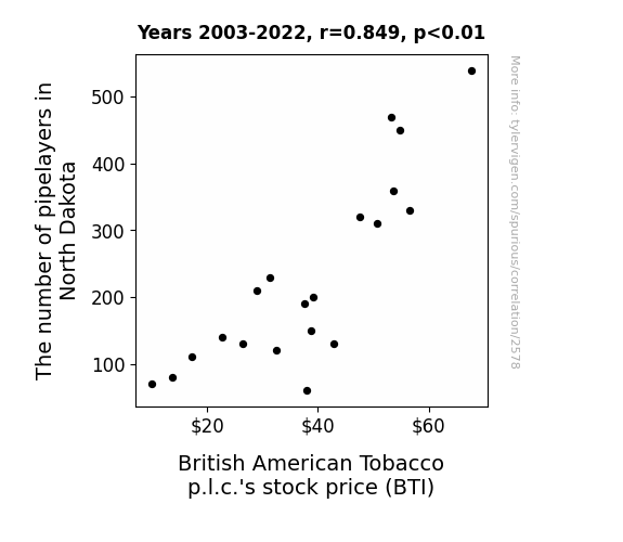
View details about correlation #2,578
Pipelayers in North Dakota and Puffing on BTI: A Peculiar Partnership
As the demand for pipelayers in North Dakota rose, so did the need for pipes and pipe-related products. This unexpected pipe boom led to a surge in tobacco pipe sales, including those fancy Sherlock Holmes-style ones. As British American Tobacco p.l.c. saw their tobacco pipe division rake in the profits, investors were drawn to the smokin' hot potential for growth, causing BTI's stock price to soar like a smoke ring in the wind. Looks like the pipelayers weren't the only ones laying down the pipeline for success!

What else correlates?
The number of pipelayers in North Dakota · all cccupations
British American Tobacco p.l.c.'s stock price (BTI) · all stocks
The number of pipelayers in North Dakota · all cccupations
British American Tobacco p.l.c.'s stock price (BTI) · all stocks


View details about correlation #3,263
Maverick: A Breezy Name or A Windy Character? An Analysis of the Connection between the Name Maverick and Wind Power Production in Luxembourg
As more babies were named Maverick, their parents were unconsciously inspired to move to Luxembourg, where the abundance of mavericks led to a surge in unconventional wind power ideas and technologies. Talk about the power of a name shaping the winds of change!

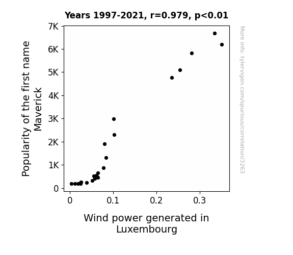
What else correlates?
Popularity of the first name Maverick · all first names
Wind power generated in Luxembourg · all energy
Popularity of the first name Maverick · all first names
Wind power generated in Luxembourg · all energy


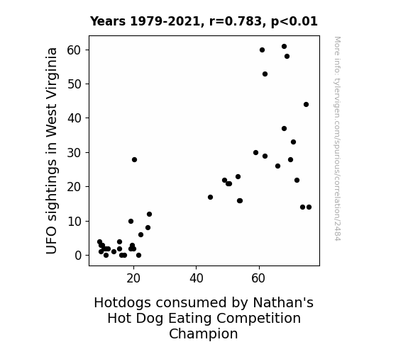
View details about correlation #2,484
Weird Wonders in West Virginia: Wacky Wavelengths of UFO Sightings and Nathan's Notable Hot Dog Consumption Connection
The influx of UFO activity in West Virginia has led to a surge in local hotdog sales as aliens have developed a sudden craving for earthly encased meats. This increased demand for hotdogs has inadvertently boosted the supply of top-quality franks to the Nathan's Hot Dog Eating Competition, allowing the reigning champion to feast on an abundance of perfectly crafted hotdogs, ultimately contributing to their record-breaking consumption levels. It seems our otherworldly visitors have inadvertently sauced up the competitive eating scene with their inexplicable love for all things wiener-related in West Virginia!


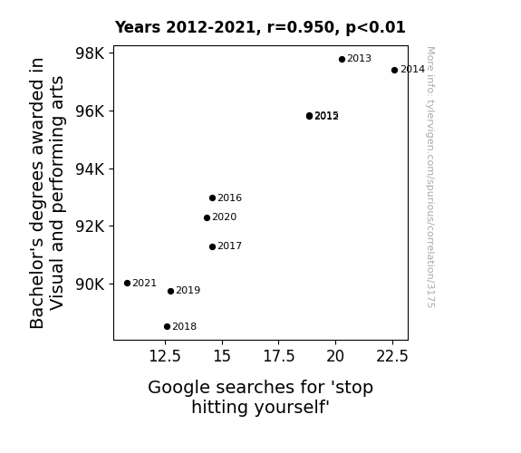
View details about correlation #3,175
The Curtain Call for Visual Arts' Thrall: A Correlation with Google Searches for 'Stop Hitting Yourself'
As fewer artists graduated, there were far fewer hands able to literally bring the concept to life, leading to a decrease in the sheer 'handiwork' available to aid in the searches. Without them, the internet just couldn't orchestrate the same level of self-inflicted slapstick humor. It seems like the correlation was truly a work of 'art' after all!


View details about correlation #2,890
The Air We Breathe: A Maintenance Matter
As air pollution in Orlando decreased, it led to a decline in the population of rust particles in the air. With fewer rust particles in the air, the machinery in Florida experienced reduced wear and tear, leading to decreased maintenance requirements. This unexpected connection between Orlando's air quality and Florida's machinery population has certainly rustled up some interest in the world of industrial maintenance.


What else correlates?
Air pollution in Orlando · all weather
The number of maintenance workers, machinery in Florida · all cccupations
Air pollution in Orlando · all weather
The number of maintenance workers, machinery in Florida · all cccupations


View details about correlation #1,517
The Lorenzo Effect: Shedding Light on the Relationship between Lorenzo's Popularity and Solar Power Generation in Cuba
Every time someone named Lorenzo introduces themselves, the excitement in the air triggers a series of spontaneous dance-offs in Cuba. The rhythmic movements of the dancers somehow sync up with the sun's energy, leading to a surge in solar power generation. It's like a giant, unintentional, and totally groovy generator for clean energy!

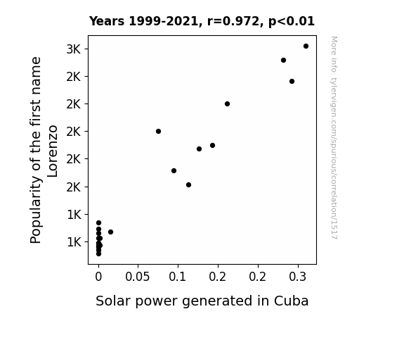
What else correlates?
Popularity of the first name Lorenzo · all first names
Solar power generated in Cuba · all energy
Popularity of the first name Lorenzo · all first names
Solar power generated in Cuba · all energy


View details about correlation #1,555
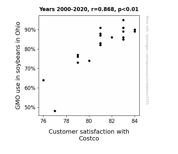
Engineering a Great Harvest: Genetically Modified Soybeans and the Consumer Satisfaction Bean-o-meter
As the soybeans grew larger and heartier, they developed a friendlier disposition, leading to a more pleasant shopping experience at Costco.

What else correlates?
GMO use in soybeans in Ohio · all food
Customer satisfaction with Costco · all weird & wacky
GMO use in soybeans in Ohio · all food
Customer satisfaction with Costco · all weird & wacky
. The chart goes from 2012 to 2021, and the two variables track closely in value over that time.")

View details about correlation #2,637
Merging Military Merits: Measuring the Match between Bachelor's degrees in Military technologies and applied sciences and ST Microelectronics' stock price
As the number of Bachelor's degrees awarded in Military technologies and applied sciences increased, so did the demand for advanced electronic components in the newest generation of military hardware. This in turn boosted the revenue for companies like ST Microelectronics, leading to an increase in their stock price. After all, nothing says "confidence in our national defense" like a well-placed resistor or a strategically sound semiconductor!


What else correlates?
Bachelor's degrees awarded in Military technologies · all education
ST Microelectronics' stock price (STM) · all stocks
Bachelor's degrees awarded in Military technologies · all education
ST Microelectronics' stock price (STM) · all stocks


View details about correlation #3,116
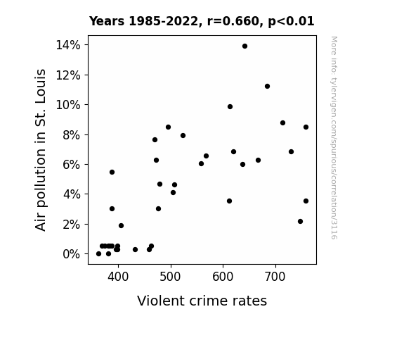
The Hazy Connection: Air Pollution and Violent Crime Rates in St. Louis
As air quality improved, people could finally take deep breaths and calm down instead of being constantly irritable from smog inhalation. This led to a city-wide reduction in agitated behavior, ultimately lowering the overall violent crime rates. Who knew that all it took to pacify the population was some cleaner air!

What else correlates?
Air pollution in St. Louis · all weather
Violent crime rates · all random state specific
Air pollution in St. Louis · all weather
Violent crime rates · all random state specific


View details about correlation #3,426
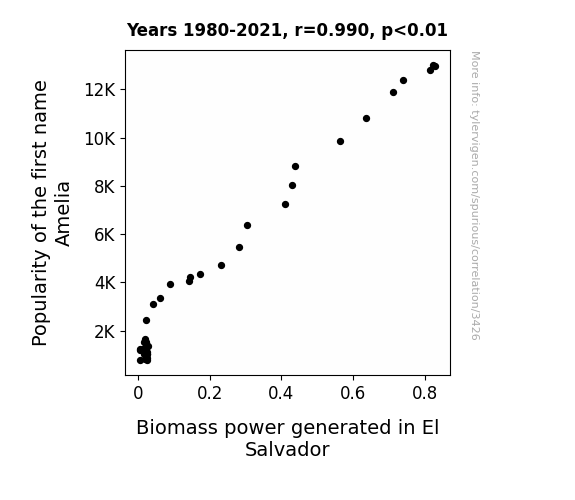
Ameliorating Biomass: The Amelia Effect on Power Generation in El Salvador
As the name Amelia gained popularity, more and more parents were drawn to its classic charm. This led to a baby boom in El Salvador, creating an unexpected demand for diapers. To meet this demand, there was a spike in the production of plant-based diapers, which in turn boosted the need for biomass power to operate the manufacturing plants. It seems that Amelia truly sparked a renewable energy revolution, one diaper at a time!

What else correlates?
Popularity of the first name Amelia · all first names
Biomass power generated in El Salvador · all energy
Popularity of the first name Amelia · all first names
Biomass power generated in El Salvador · all energy
Why this works
- Data dredging: I have 25,237 variables in my database. I compare all these variables against each other to find ones that randomly match up. That's 636,906,169 correlation calculations! This is called “data dredging.”
Fun fact: the chart used on the wikipedia page to demonstrate data dredging is also from me. I've been being naughty with data since 2014.
Instead of starting with a hypothesis and testing it, I instead tossed a bunch of data in a blender to see what correlations would shake out. It’s a dangerous way to go about analysis, because any sufficiently large dataset will yield strong correlations completely at random. - Lack of causal connection: There is probably no direct connection between these variables, despite what the AI says above.
Because these pages are automatically generated, it's possible that the two variables you are viewing are in fact causually related. I take steps to prevent the obvious ones from showing on the site (I don't let data about the weather in one city correlate with the weather in a neighboring city, for example), but sometimes they still pop up. If they are related, cool! You found a loophole.
This is exacerbated by the fact that I used "Years" as the base variable. Lots of things happen in a year that are not related to each other! Most studies would use something like "one person" in stead of "one year" to be the "thing" studied. - Observations not independent: For many variables, sequential years are not independent of each other. You will often see trend-lines form. If a population of people is continuously doing something every day, there is no reason to think they would suddenly change how they are doing that thing on January 1. A naive p-value calculation does not take this into account.
You will calculate a lower chance of "randomly" achieving the result than represents reality.
To be more specific: p-value tests are probability values, where you are calculating the probability of achieving a result at least as extreme as you found completely by chance. When calculating a p-value, you need to assert how many "degrees of freedom" your variable has. I count each year (minus one) as a "degree of freedom," but this is misleading for continuous variables.
This kind of thing can creep up on you pretty easily when using p-values, which is why it's best to take it as "one of many" inputs that help you assess the results of your analysis.
- Y-axes doesn't start at zero: I truncated the Y-axes of the graphs above. I also used a line graph, which makes the visual connection stand out more than it deserves.
Nothing against line graphs. They are great at telling a story when you have linear data! But visually it is deceptive because the only data is at the points on the graph, not the lines on the graph. In between each point, the data could have been doing anything. Like going for a random walk by itself!
Mathematically what I showed is true, but it is intentionally misleading. If you click on any of the charts that abuse this, you can scroll down to see a version that starts at zero. - Confounding variable: Confounding variables (like global pandemics) will cause two variables to look connected when in fact a "sneaky third" variable is influencing both of them behind the scenes.
- Outliers: Some datasets here have outliers which drag up the correlation.
In concept, "outlier" just means "way different than the rest of your dataset." When calculating a correlation like this, they are particularly impactful because a single outlier can substantially increase your correlation.
Because this page is automatically generated, I don't know whether any of the charts displayed on it have outliers. I'm just a footnote. ¯\_(ツ)_/¯
I intentionally mishandeled outliers, which makes the correlation look extra strong. - Low n: There are not many data points included in some of these charts.
You can do analyses with low ns! But you shouldn't data dredge with a low n.
Even if the p-value is high, we should be suspicious of using so few datapoints in a correlation.
Pro-tip: click on any correlation to see:
- Detailed data sources
- Prompts for the AI-generated content
- Explanations of each of the calculations (correlation, p-value)
- Python code to calculate it yourself


