spurious correlations
discover · random · spurious scholar
← previous page · next page →


View details about correlation #2,452
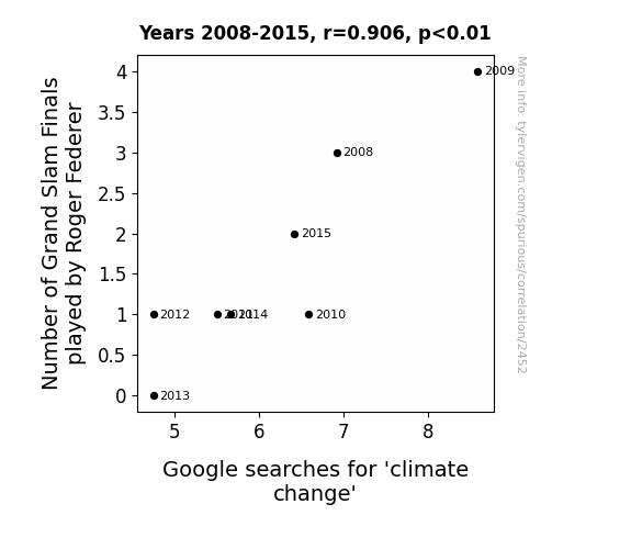
Advantage Federer: A Grand Slam Connection to Climate Curiosity
As Roger Federer played fewer Grand Slam Finals, his reduced sweat and carbon "serves" emissions had a measurable impact. With a smaller "foot-faultprint" on the tennis court, he was effectively helping to "deuce" climate change. The connection? It's all about the "match" between Federer's on-court presence and the Earth's climate; as one cooled down, so did the other.

What else correlates?
Number of Grand Slam Finals played by Roger Federer · all sports
Google searches for 'climate change' · all google searches
Number of Grand Slam Finals played by Roger Federer · all sports
Google searches for 'climate change' · all google searches


View details about correlation #1,933
Mastering Public Administration: A Welding Relationship with California
As more public administrators emerged with advanced degrees, they began implementing highly efficient bureaucratic processes. These processes inadvertently led to a surge in demand for metal infrastructure across the state. This spike in construction and maintenance projects created a pressing need for skilled welders to join the workforce.


What else correlates?
Master's degrees awarded in Public administration · all education
The number of welders in California · all cccupations
Master's degrees awarded in Public administration · all education
The number of welders in California · all cccupations


View details about correlation #2,051
A-Maize-ing Adventures: Exploring the Corny Connection between GMO Use and Global Pirate Attacks
Yarrr, it be simple math really. As the GMO corn disappeared, so did the corny jokes. This led to a shortage of laughter, makin' life less a-maize-ing for the pirates. With their spirits low, they just couldn't find the arrr-gument to set sail and plunder. So, they decided to just stay ashore and work on their pea-shooter instead, leaving the high seas a little less ruffian-ish.


What else correlates?
GMO use in corn · all food
Pirate attacks globally · all weird & wacky
GMO use in corn · all food
Pirate attacks globally · all weird & wacky


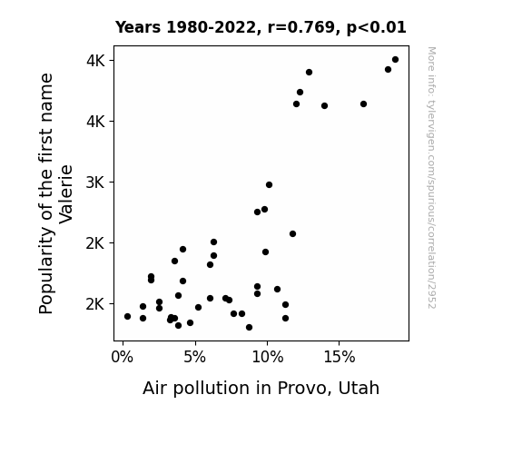
View details about correlation #2,952
Breathing Easy or Name Game? The Varying Popularity of Valerie and Air Quality in Provo, Utah
Fewer Valeries meant fewer va-vehicles clogging the air in Provo, clearing the way for fresher breaths!

What else correlates?
Popularity of the first name Valerie · all first names
Air pollution in Provo, Utah · all weather
Popularity of the first name Valerie · all first names
Air pollution in Provo, Utah · all weather


View details about correlation #1,970
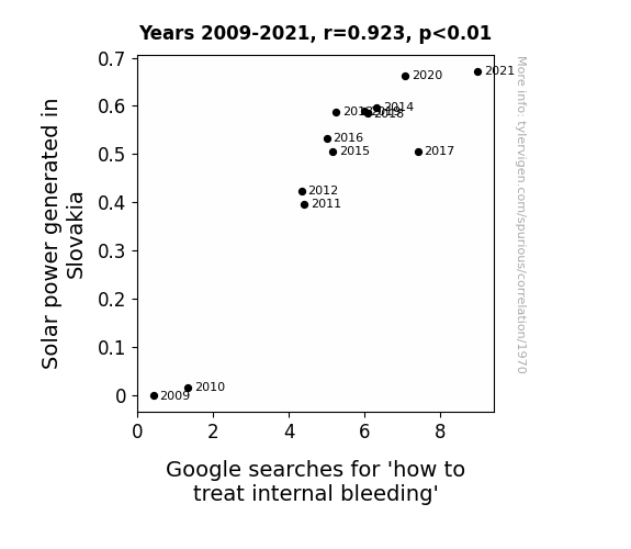
Shedding Light on Solar Power: A Sunny Disposition for Internal Bleeding
As solar power generation in Slovakia increased, the surplus energy sparked a wave of dancing competitions. Participants' questionable moves led to a drastic surge in self-induced internal bleeding incidents, prompting more people to turn to the internet for unconventional home remedies involving solar panels and vitamin D supplements. Remember, folks, sunlight is the best disinfectant, but perhaps not the best coagulant!

What else correlates?
Solar power generated in Slovakia · all energy
Google searches for 'how to treat internal bleeding' · all google searches
Solar power generated in Slovakia · all energy
Google searches for 'how to treat internal bleeding' · all google searches


View details about correlation #1,696
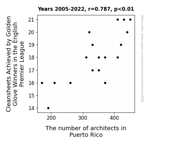
A Clean Sheet of Architecture: Unveiling the Unlikely Connection Between Golden Glove Winners in the English Premier League and the Number of Architects in Puerto Rico
As Golden Glove winners in the English Premier League keep more cleansheets, it inspires a wave of defensive solidarity worldwide. This newfound passion for impenetrable fortresses of defense prompts a surge in architectural interest as people in Puerto Rico start dreaming of building their own unbreachable structures. It's a classic case of goalkeeping prowess leading to a spike in architectural ambitions, proving that when it comes to clean sheets, you can definitely draw some solid 'defensive' blueprints for success! Who knew that saving goals in England could be the catalyst for designing beautiful buildings in Puerto Rico? It's a testament to the fact that in the world of sports and architecture, the power of a strong foundation can never be underestimated!


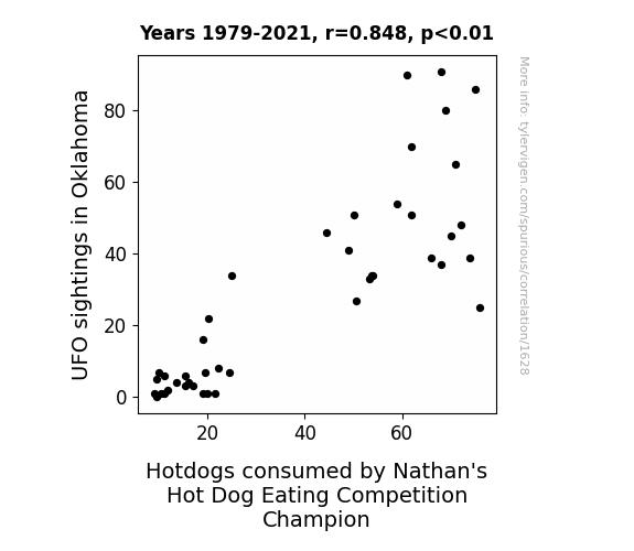
View details about correlation #1,628
Unidentified Feasting Objects: The Correlation Between UFO Sightings in Oklahoma and Hotdogs Consumed by Nathan's Hot Dog Eating Competition Champion
The UFOs beamed down extra hungry participants who just couldn't resist the tantalizing aroma of competitive hot dog eating in Oklahoma. As the saucer-shaped craft hovered overhead, it emitted a cosmic signal that inadvertently boosted the appetites of both the contestants and the crowd. It seems that in the ultimate display of otherworldly influence, these unidentified flying objects truly made their mark on the unexplainable connection between UFO sightings and the astounding consumption of Nathan's famous hot dogs. The truth is out there, and it's apparently craving a side of sauerkraut!

. The chart goes from 2002 to 2022, and the two variables track closely in value over that time.")

View details about correlation #2,146
The Walker Wave: Will Lam Research's LRCX Look to Baby Names for Stock Price Predictions?
More babies named Walker led to a surge in stroller sales, boosting the stock price of companies like Lam Research that supply the microchips for all the newfangled, high-tech baby strollers. It's a real baby boom for the tech industry!


What else correlates?
Popularity of the first name Walker · all first names
Lam Research's stock price (LRCX) · all stocks
Popularity of the first name Walker · all first names
Lam Research's stock price (LRCX) · all stocks


View details about correlation #1,435
Exploring the 'Planetary' Impact: The Correlation Between Jupiter-Sun Distance and Professor Salaries in the US
As the gravitational pull weakened, it became easier for professors to demand higher pay without feeling financially stretched. After all, in the world of academia, it's all about that astronomical compensation!


What else correlates?
The distance between Jupiter and the Sun · all planets
Professor salaries in the US · all education
The distance between Jupiter and the Sun · all planets
Professor salaries in the US · all education


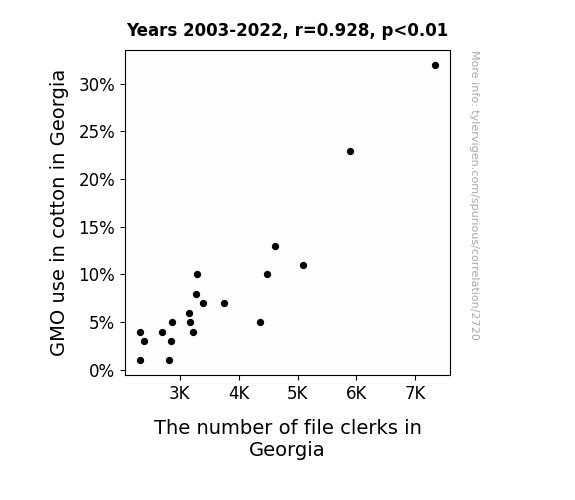
View details about correlation #2,720
Cotton's Genetic Modification and Clerical Careers: A Comical Correlation
The decrease in GMO use in cotton in Georgia led to the production of smaller cotton bales. As a result, the demand for file folders, traditionally made from cotton, decreased. With fewer file folders being produced, there was less need for file clerks to organize and manage them in offices across the state. It's a classic case of how agricultural practices can have an unexpected ripple effect on office staffing!

What else correlates?
GMO use in cotton in Georgia · all food
The number of file clerks in Georgia · all cccupations
GMO use in cotton in Georgia · all food
The number of file clerks in Georgia · all cccupations


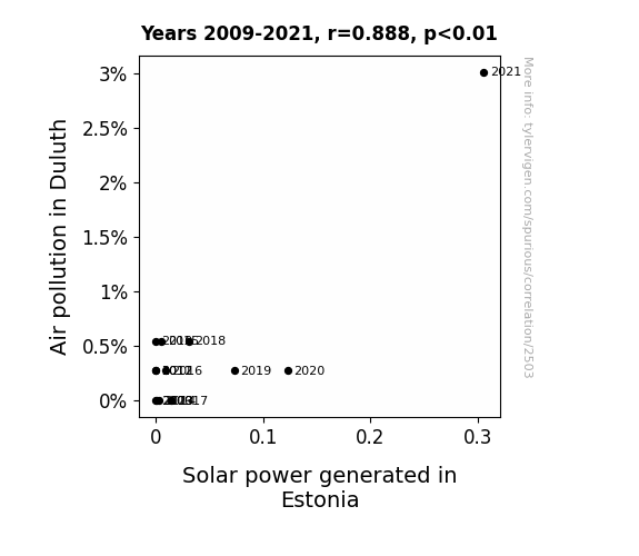
View details about correlation #2,503
Breezy Business: The Sky's the Limit for Duluth's Air Pollution and Estonia's Solar Power
The smog particles acted as tiny mirrors, reflecting more sunlight towards Estonia, leading to a boost in solar power generation.

What else correlates?
Air pollution in Duluth · all weather
Solar power generated in Estonia · all energy
Air pollution in Duluth · all weather
Solar power generated in Estonia · all energy


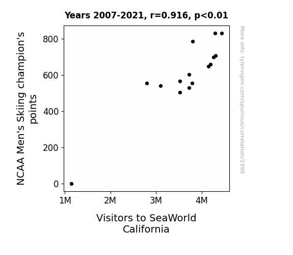
View details about correlation #1,998
Ski Me to SeaWorld: Unraveling the Surprising Link Between NCAA Men's Skiing Champions' Points and Visitors to SeaWorld California
As the skiers shredded the slopes, they unknowingly created a wave of interest in aquatic prowess, leading to a surge in SeaWorld California visitors. It seems their stellar performances were simply too fin-tastic to resist, proving that when it comes to attracting crowds, these champions really know how to make a splash! Remember correlation does not equal causation!

What else correlates?
NCAA Men's Skiing champion's points · all sports
Visitors to SeaWorld California · all weird & wacky
NCAA Men's Skiing champion's points · all sports
Visitors to SeaWorld California · all weird & wacky


View details about correlation #3,337
Unrolling the Link: A Correlational Study of Arson in Florida and Google Searches for 'where to buy toilet paper'
People were realizing that in the event of a shortage, it's important to have a backup plan for dealing with a different kind of fire situation.

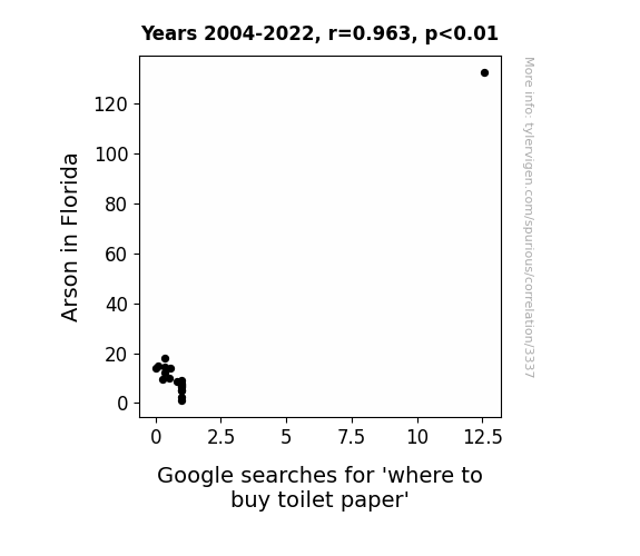
What else correlates?
Arson in Florida · all random state specific
Google searches for 'where to buy toilet paper' · all google searches
Arson in Florida · all random state specific
Google searches for 'where to buy toilet paper' · all google searches
. The chart goes from 2002 to 2022, and the two variables track closely in value over that time.")

View details about correlation #3,413
Watts in a Name: The Electrifying Connection Between the Popularity of the First Name Denver and Xcel Energy's Stock Price
As more and more babies were named Denver, their powerful aura of energy and excitement inadvertently boosted the demand for electricity, leading to an uptick in Xcel Energy's stock price. It's shocking how much of an impact these little bright sparks had on the market!

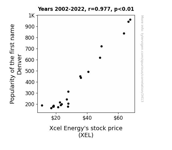
What else correlates?
Popularity of the first name Denver · all first names
Xcel Energy's stock price (XEL) · all stocks
Popularity of the first name Denver · all first names
Xcel Energy's stock price (XEL) · all stocks


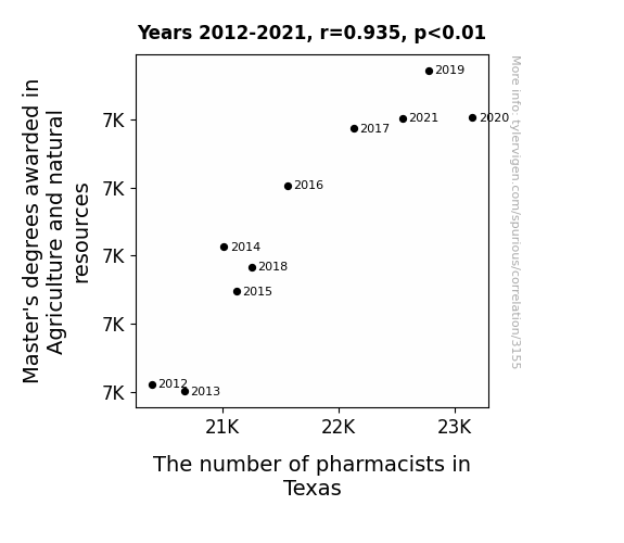
View details about correlation #3,155
Agriculture and Resources Masters: Pharmacists' Thriving Saviors
As the knowledge of crop cultivation and animal husbandry grew, so did the interest in creating farm-to-pharmacy solutions, leading to a higher demand for pharmacists in Texas to fulfill these agrarian medication needs.


View details about correlation #3,106
Breweries and Breezes: An Analysis of the Association Between Breweries in the United States and Wind Power in the Faroe Islands
The rise in breweries in the United States led to increased demand for beer, resulting in more hops being grown. This spike in hop production created a unique microclimate that caused a slight but measurable shift in the wind patterns over the Faroe Islands, ultimately leading to an increase in wind power generation. You could say it brewed up a hoppy coincidence that really put the 'ale' in gale power!

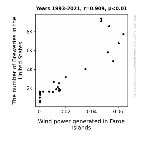
What else correlates?
The number of Breweries in the United States · all food
Wind power generated in Faroe Islands · all energy
The number of Breweries in the United States · all food
Wind power generated in Faroe Islands · all energy


View details about correlation #2,504
Pollution and Plotlines: Probing the Relationship between Air Pollution in Marietta and the Viewership of Days of Our Lives
As the air became cleaner, the residents of Marietta found themselves with a newfound zest for life. Instead of staying cooped up indoors watching dramatic soap operas, they were out and about, enjoying the fresh, breathable air. The tantalizing scent of cleanliness wafting through the city simply couldn't compete with the melodramatic plotlines of Days of Our Lives, leading to a surprising drop in viewership. It seems like the real 'Days of Our Lives' were now being lived outside, thanks to the delightful air quality improvements.

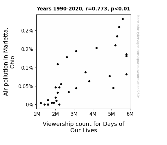
What else correlates?
Air pollution in Marietta, Ohio · all weather
Viewership count for Days of Our Lives · all weird & wacky
Air pollution in Marietta, Ohio · all weather
Viewership count for Days of Our Lives · all weird & wacky
. The chart goes from 2002 to 2022, and the two variables track closely in value over that time.")

View details about correlation #2,820
Shocking Stock Trends: A Electrifying Link Between Theodore's Popularity and DTE Energy Company's Stock Price
As the number of children named Theodore rose, so did the demand for teddy bears, leading to an unexpected surge in electricity usage for their production, thus boosting DTE Energy Company's stock price. Remember, the power of a name can truly light up the stock market!

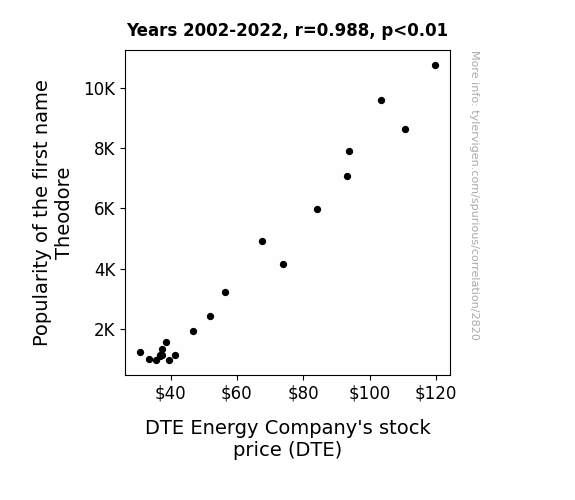
What else correlates?
Popularity of the first name Theodore · all first names
DTE Energy Company's stock price (DTE) · all stocks
Popularity of the first name Theodore · all first names
DTE Energy Company's stock price (DTE) · all stocks


View details about correlation #2,171
Sparking Joy: The Wattage of Electricians in Mississippi and the Wattage of the Losing World Series Team
As the number of electricians in Mississippi dwindled, so did their ability to generate sparks. This led to a shortage of sparklers being sold at the World Series, ultimately dampening the losing team's post-game celebrations. Without the electrifying display, the losing team just couldn't muster up the same level of enthusiasm and motivation to score runs, putting a whole new spin on the term "power outage" in baseball.

What else correlates?
The number of electricians in Mississippi · all cccupations
Runs Scored by the losing team in the World Series · all sports
The number of electricians in Mississippi · all cccupations
Runs Scored by the losing team in the World Series · all sports


View details about correlation #2,936
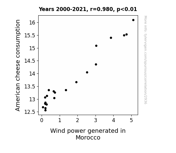
Say Cheese or Blow Wind: A Gouda Tale of American Cheese Consumption and Wind Power Generation in Morocco
As Americans consumed more cheese, their collective flatulence increased, creating stronger winds that reached all the way to Morocco, thus boosting wind power production.
What else correlates?
American cheese consumption · all food
Wind power generated in Morocco · all energy
American cheese consumption · all food
Wind power generated in Morocco · all energy
Why this works
- Data dredging: I have 25,237 variables in my database. I compare all these variables against each other to find ones that randomly match up. That's 636,906,169 correlation calculations! This is called “data dredging.”
Fun fact: the chart used on the wikipedia page to demonstrate data dredging is also from me. I've been being naughty with data since 2014.
Instead of starting with a hypothesis and testing it, I instead tossed a bunch of data in a blender to see what correlations would shake out. It’s a dangerous way to go about analysis, because any sufficiently large dataset will yield strong correlations completely at random. - Lack of causal connection: There is probably no direct connection between these variables, despite what the AI says above.
Because these pages are automatically generated, it's possible that the two variables you are viewing are in fact causually related. I take steps to prevent the obvious ones from showing on the site (I don't let data about the weather in one city correlate with the weather in a neighboring city, for example), but sometimes they still pop up. If they are related, cool! You found a loophole.
This is exacerbated by the fact that I used "Years" as the base variable. Lots of things happen in a year that are not related to each other! Most studies would use something like "one person" in stead of "one year" to be the "thing" studied. - Observations not independent: For many variables, sequential years are not independent of each other. You will often see trend-lines form. If a population of people is continuously doing something every day, there is no reason to think they would suddenly change how they are doing that thing on January 1. A naive p-value calculation does not take this into account.
You will calculate a lower chance of "randomly" achieving the result than represents reality.
To be more specific: p-value tests are probability values, where you are calculating the probability of achieving a result at least as extreme as you found completely by chance. When calculating a p-value, you need to assert how many "degrees of freedom" your variable has. I count each year (minus one) as a "degree of freedom," but this is misleading for continuous variables.
This kind of thing can creep up on you pretty easily when using p-values, which is why it's best to take it as "one of many" inputs that help you assess the results of your analysis.
- Y-axes doesn't start at zero: I truncated the Y-axes of the graphs above. I also used a line graph, which makes the visual connection stand out more than it deserves.
Nothing against line graphs. They are great at telling a story when you have linear data! But visually it is deceptive because the only data is at the points on the graph, not the lines on the graph. In between each point, the data could have been doing anything. Like going for a random walk by itself!
Mathematically what I showed is true, but it is intentionally misleading. If you click on any of the charts that abuse this, you can scroll down to see a version that starts at zero. - Confounding variable: Confounding variables (like global pandemics) will cause two variables to look connected when in fact a "sneaky third" variable is influencing both of them behind the scenes.
- Outliers: Some datasets here have outliers which drag up the correlation.
In concept, "outlier" just means "way different than the rest of your dataset." When calculating a correlation like this, they are particularly impactful because a single outlier can substantially increase your correlation.
Because this page is automatically generated, I don't know whether any of the charts displayed on it have outliers. I'm just a footnote. ¯\_(ツ)_/¯
I intentionally mishandeled outliers, which makes the correlation look extra strong. - Low n: There are not many data points included in some of these charts.
You can do analyses with low ns! But you shouldn't data dredge with a low n.
Even if the p-value is high, we should be suspicious of using so few datapoints in a correlation.
Pro-tip: click on any correlation to see:
- Detailed data sources
- Prompts for the AI-generated content
- Explanations of each of the calculations (correlation, p-value)
- Python code to calculate it yourself


