spurious correlations
discover · random · spurious scholar
← previous page · next page →


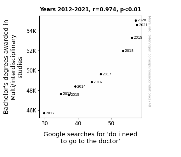
View details about correlation #2,748
The Interdisciplinary Degree Dilemma: Googling for Medical Advice
As the knowledge from various fields intermingles in the brains of these graduates, they become hypervigilant about their health, leading to an increased tendency to consult Dr. Google for even the slightest symptoms. It's a case of too much education leading to self-diagnosis hysteria!


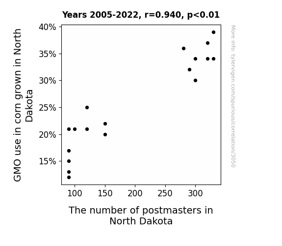
View details about correlation #3,050
The Maize Haze: GMO Craze and the Postmaster Maze in North Dakota
As the GMO corn dwindled, so did the size of the corn, leading to smaller corn shipments. The postmasters, accustomed to handling larger volumes of mail for the bigger GMO corn farms, found themselves with a lot less to sort. With their workload reduced, many postmasters decided to pursue their long-lost dreams of becoming professional cheese sculptors instead.
What else correlates?
GMO use in corn grown in North Dakota · all food
The number of postmasters in North Dakota · all cccupations
GMO use in corn grown in North Dakota · all food
The number of postmasters in North Dakota · all cccupations
. The chart goes from 2012 to 2021, and the two variables track closely in value over that time.")

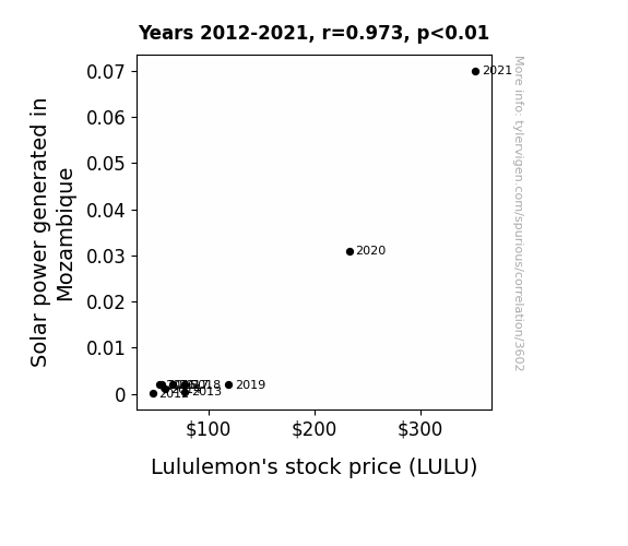
View details about correlation #3,602
Solar Power from Sub-Saharan Africa to Stock Surges: The Lululemon Link
The boost in solar power led to a surge in positive energy, creating a widespread demand for Lululemon's activewear to harness and contain all that newfound sunny optimism. Looks like Mozambique's solar flair is really illuminating the stock market!

What else correlates?
Solar power generated in Mozambique · all energy
Lululemon's stock price (LULU) · all stocks
Solar power generated in Mozambique · all energy
Lululemon's stock price (LULU) · all stocks


View details about correlation #2,868
Breathing in the Hits: A Correlative Analysis of Air Pollution in Allentown and Physical Album Shipment Volume in the United States
The cleaner air in Allentown led to an influx of eco-friendly, paper-loving pigeons who had a knack for conducting smooth jazz orchestras. Their melodic tunes were so in demand that people ditched their usual music purchases, opting instead to listen to the pigeon-performed classics, thus decreasing the need for physical album shipments. Who knew the key to reducing physical album shipments lay in the talons of musical, environmentally-conscious pigeons in Allentown?

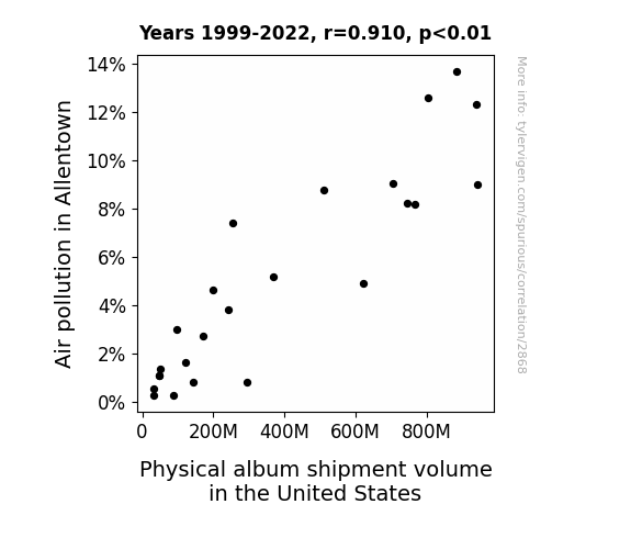
What else correlates?
Air pollution in Allentown · all weather
Physical album shipment volume in the United States · all weird & wacky
Air pollution in Allentown · all weather
Physical album shipment volume in the United States · all weird & wacky


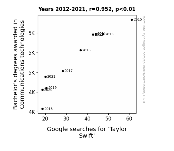
View details about correlation #1,870
Communicating Swiftly: A Study of the Correlation between Bachelor's Degrees in Communications Technologies and Taylor Swift Google Searches
As fewer people became experts in communications technologies, they couldn't keep up with the latest ways to secretly broadcast Taylor Swift's music, leading to a decrease in her online presence.


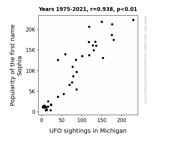
View details about correlation #3,101
Sophia's UFO Mania: A Statistical Insight into Michigan's Extraterrestrial Enigma
As the number of Sophias grew, so did the collective psychic energy, inadvertently attracting curious alien beings to the Great Lakes State. Remember, it's not just Michigan's mitten shape that's out of this world!
What else correlates?
Popularity of the first name Sophia · all first names
UFO sightings in Michigan · all random state specific
Popularity of the first name Sophia · all first names
UFO sightings in Michigan · all random state specific
. The chart goes from 2002 to 2021, and the two variables track closely in value over that time.")

View details about correlation #3,095
Spreading the Wealth: Unveiling the Butter-PWR Connection
As butter consumption rose, so did the demand for toast. This led to an increase in the sales of toasters. The surge in toaster sales necessitated more electrical infrastructure to power all these new appliances. As a result, Quanta Services, a leading provider of electrical infrastructure services, experienced a significant uptick in business, causing their stock price to rise. It's a buttery, toast-driven chain reaction that has investors spreading PWR throughout the market!


What else correlates?
Butter consumption · all food
Quanta Services' stock price (PWR) · all stocks
Butter consumption · all food
Quanta Services' stock price (PWR) · all stocks


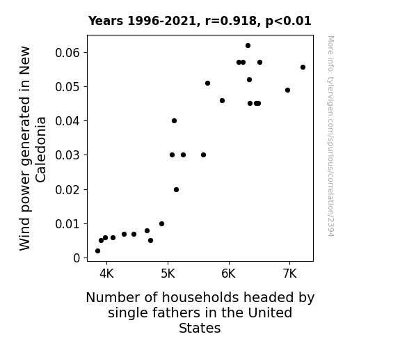
View details about correlation #2,394
Whimsical Wind Power and Wondering Widowers: An Alliterative Assessment
The strong and steady gusts from New Caledonia somehow blew a surge of independence and confidence into single fathers across the United States. As the wind power increased, so did the sense of empowerment for these household heads, leading to a wave of single dads proudly taking on their roles with a newfound energy. It seems like the winds of change were carrying some unexpected inspiration all the way to American homes!


View details about correlation #2,140
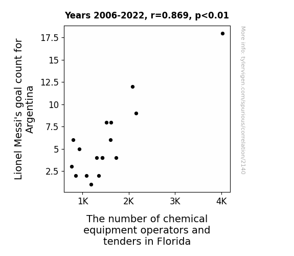
Kicking Goals and Chemistry: The Messi-nic Influence of Lionel Messi's Performance on the Employment of Chemical Equipment Operators and Tenders in Florida
As Lionel Messi's goal count for Argentina rises, the demand for chemical equipment in Florida grows, leading to an increase in operators and tenders wanting to be in on the action. It's a Messi chemical reaction that's just too enticing to resist!


View details about correlation #2,853
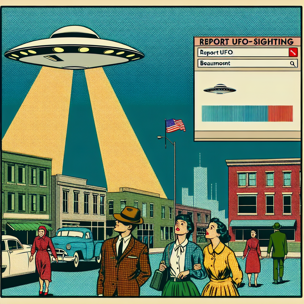
In the Search of Extraterrestrial Smog: The Correlation between Air Pollution in Beaumont, Texas and Google Searches for 'Report UFO Sighting'
The aliens upgraded their spaceship to be eco-friendly and didn't want to be seen in a less-than-pristine Earth environment.

What else correlates?
Air pollution in Beaumont, Texas · all weather
Google searches for 'report UFO sighting' · all random state specific
Air pollution in Beaumont, Texas · all weather
Google searches for 'report UFO sighting' · all random state specific
. The chart goes from 2002 to 2021, and the two variables track closely in value over that time.")

View details about correlation #2,148
The Cheddar and Coca-Cola Connection: An Examination of American Cheese Consumption and KO Stock Price Fluctuations
The more American cheese people ate, the more they craved a refreshing Coke to wash it down. This increased demand for Coca-Cola products, leading to higher sales and ultimately driving up the stock price of The Coca-Cola Company. It's a gouda-licious partnership that's grate for business!


What else correlates?
American cheese consumption · all food
The Coca-Cola Company's stock price (KO) · all stocks
American cheese consumption · all food
The Coca-Cola Company's stock price (KO) · all stocks


View details about correlation #2,934
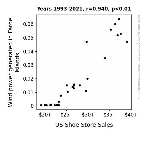
Blown Away: An Analysis of the Wind Power Generated in the Faroe Islands and its Impact on US Shoe Store Sales
The strong gusts in the Faroe Islands led to an unexpected surge in air traffic, prompting an influx of international tourists to the US. As these jet-setting visitors explored American cities, they couldn't resist popping into local shoe stores to snag the latest footwear fashions, ultimately boosting sales. It seems like the winds of change are blowing in some stylish new trends!

What else correlates?
Wind power generated in Faroe Islands · all energy
US Shoe Store Sales · all weird & wacky
Wind power generated in Faroe Islands · all energy
US Shoe Store Sales · all weird & wacky


View details about correlation #1,770
On the Move: Exploring the Relationship Between Transportation Degrees and Craft Artists in Michigan
As more and more transportation and materials experts graduated, they couldn't help but be inspired by the iconic Michigan pastime of creating arts and crafts. Whether it was the influence of road and bridge construction or the sheer artistry of forklift operation, the connection between transportation degrees and craft artists in Michigan was undeniable. It was as if each freshly minted graduate infused the state with a new wave of creative energy, propelling the craft industry to new heights. Who knew that the path to a thriving arts and crafts scene in Michigan was paved with transportation and materials moving degrees? It just go to show, when it comes to the world of creativity, the journey can be just as important as the destination!
What else correlates?
Bachelor's degrees awarded in Transportation · all education
The number of craft artists in Michigan · all cccupations
Bachelor's degrees awarded in Transportation · all education
The number of craft artists in Michigan · all cccupations


View details about correlation #3,546
The Polluted Truth: Unveiling the Air Pollution-Violent Crime Connection in State College, Pennsylvania
As air pollution decreased, people's brains were no longer clouded, leading to a reduction in impulsive and aggressive behavior. It turns out, when you can actually see blue skies, you're less likely to see red!


What else correlates?
Air pollution in State College, Pennsylvania · all weather
Violent crime rates · all random state specific
Air pollution in State College, Pennsylvania · all weather
Violent crime rates · all random state specific
. The chart goes from 2002 to 2022, and the two variables track closely in value over that time.")

View details about correlation #2,926
The Thirsty Stock Market: A Quenching Look at the Relationship Between US Bottled Water Consumption and Pioneer Natural Resources Company's Stock Price
As bottled water consumption rose, so did the demand for plastic bottles. This led to a surge in the need for petroleum, which is a key component in plastic production. With Pioneer Natural Resources Company being a major player in the oil and gas industry, their stock price flowed upwards, riding the wave of liquid profits. It's like the stock was saying, "H2-Oh yeah, this is refreshing for my portfolio!"


What else correlates?
US Bottled Water Consumption per Person · all food
Pioneer Natural Resources Company's stock price (PXD) · all stocks
US Bottled Water Consumption per Person · all food
Pioneer Natural Resources Company's stock price (PXD) · all stocks


View details about correlation #2,510
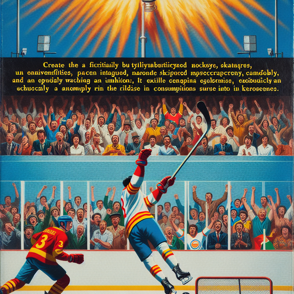
Assessing the Flaming Connection: Total Regular Season Games Played by Nicklas Backstrom and Kerosene Usage in Turkmenistan
Nicklas Backstrom's on-ice performance is so red-hot that it's literally fueling the need for kerosene in Turkmenistan to keep things from getting icy! As he plays more games, the combustion of excitement ignites a chain reaction, leading to an unforeseen increase in the demand for kerosene in Turkmenistan. Who knew that Backstrom's hockey moves could have such a fiery global impact!

What else correlates?
Total regular season games played by Nicklas Backstrom · all sports
Kerosene used in Turkmenistan · all energy
Total regular season games played by Nicklas Backstrom · all sports
Kerosene used in Turkmenistan · all energy


View details about correlation #3,444
The Art of Chemistry: Exploring the Connection Between Bachelor's Degrees in Visual and Performing Arts and the Number of Chemical Plant and System Operators in Wyoming
As fewer artists took the stage, the chemical operators just couldn't find the right 'elements' for their work. The lack of drama in the arts led to a lack of chemical reactions in Wyoming's plants. It seems the real 'art' was in creating a balanced chemical performance!


View details about correlation #1,375
Name Games: The Mason-UFO Connection
As the number of babies named Mason rose, so did the cosmic energy being channeled by this growing army of mini-Masons across the state. In an astonishing display of toddler telekinesis, their collective brainpower inadvertently summoned extraterrestrial beings to Missouri. As these young Masons continue to mature, we can only speculate on the impact of their celestial connection. These celestial phenomena can be explained by increased interest in UFOs leading to more reports and sightings.


What else correlates?
Popularity of the first name Mason · all first names
UFO sightings in Missouri · all random state specific
Popularity of the first name Mason · all first names
UFO sightings in Missouri · all random state specific
. The chart goes from 2002 to 2022, and the two variables track closely in value over that time.")

View details about correlation #3,045
Meat the Market: A Beefy Analysis of Annual US Household Spending on Protein and its Impact on Microsoft's Stock Price
As household spending on meat and poultry went up, more people were inspired to host backyard barbecues. This led to a surge in demand for grills, and coincidentally, Microsoft's Xbox division saw a boost in sales of their popular game 'Cooking Mama: Grill Off Challenge'. This unexpected windfall in the gaming sector impressed investors, causing an uptick in Microsoft's stock price.


View details about correlation #3,394
The Fossil Fumes: Unearthing the Link Between Air Pollution in Grants Pass, Oregon, and Fossil Fuel Use in Burundi
As air pollution in Grants Pass, Oregon increased, it created a ripple effect in global wind patterns. These altered winds inadvertently reached Burundi, leading to a sudden surge in fossil fuel use as the locals tried to power fans to disperse the unexpected smog. The unanticipated demand for electricity further stressed Burundi's limited power infrastructure, prompting a comical series of events that could only be described as a BurundiFossil Fuel Fiasco!


What else correlates?
Air pollution in Grants Pass, Oregon · all weather
Fossil fuel use in Burundi · all energy
Air pollution in Grants Pass, Oregon · all weather
Fossil fuel use in Burundi · all energy
Why this works
- Data dredging: I have 25,237 variables in my database. I compare all these variables against each other to find ones that randomly match up. That's 636,906,169 correlation calculations! This is called “data dredging.”
Fun fact: the chart used on the wikipedia page to demonstrate data dredging is also from me. I've been being naughty with data since 2014.
Instead of starting with a hypothesis and testing it, I instead tossed a bunch of data in a blender to see what correlations would shake out. It’s a dangerous way to go about analysis, because any sufficiently large dataset will yield strong correlations completely at random. - Lack of causal connection: There is probably no direct connection between these variables, despite what the AI says above.
Because these pages are automatically generated, it's possible that the two variables you are viewing are in fact causually related. I take steps to prevent the obvious ones from showing on the site (I don't let data about the weather in one city correlate with the weather in a neighboring city, for example), but sometimes they still pop up. If they are related, cool! You found a loophole.
This is exacerbated by the fact that I used "Years" as the base variable. Lots of things happen in a year that are not related to each other! Most studies would use something like "one person" in stead of "one year" to be the "thing" studied. - Observations not independent: For many variables, sequential years are not independent of each other. You will often see trend-lines form. If a population of people is continuously doing something every day, there is no reason to think they would suddenly change how they are doing that thing on January 1. A naive p-value calculation does not take this into account.
You will calculate a lower chance of "randomly" achieving the result than represents reality.
To be more specific: p-value tests are probability values, where you are calculating the probability of achieving a result at least as extreme as you found completely by chance. When calculating a p-value, you need to assert how many "degrees of freedom" your variable has. I count each year (minus one) as a "degree of freedom," but this is misleading for continuous variables.
This kind of thing can creep up on you pretty easily when using p-values, which is why it's best to take it as "one of many" inputs that help you assess the results of your analysis.
- Y-axes doesn't start at zero: I truncated the Y-axes of the graphs above. I also used a line graph, which makes the visual connection stand out more than it deserves.
Nothing against line graphs. They are great at telling a story when you have linear data! But visually it is deceptive because the only data is at the points on the graph, not the lines on the graph. In between each point, the data could have been doing anything. Like going for a random walk by itself!
Mathematically what I showed is true, but it is intentionally misleading. If you click on any of the charts that abuse this, you can scroll down to see a version that starts at zero. - Confounding variable: Confounding variables (like global pandemics) will cause two variables to look connected when in fact a "sneaky third" variable is influencing both of them behind the scenes.
- Outliers: Some datasets here have outliers which drag up the correlation.
In concept, "outlier" just means "way different than the rest of your dataset." When calculating a correlation like this, they are particularly impactful because a single outlier can substantially increase your correlation.
Because this page is automatically generated, I don't know whether any of the charts displayed on it have outliers. I'm just a footnote. ¯\_(ツ)_/¯
I intentionally mishandeled outliers, which makes the correlation look extra strong. - Low n: There are not many data points included in some of these charts.
You can do analyses with low ns! But you shouldn't data dredge with a low n.
Even if the p-value is high, we should be suspicious of using so few datapoints in a correlation.
Pro-tip: click on any correlation to see:
- Detailed data sources
- Prompts for the AI-generated content
- Explanations of each of the calculations (correlation, p-value)
- Python code to calculate it yourself


