spurious correlations
discover · random · spurious scholar
← previous page · next page →


View details about correlation #3,102
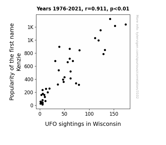
The Kenz-nection: An Empirical Analysis of Kenzie Names and UFO Sightings in Wisconsin
The name Kenzie has been cosmically linked to a surge in UFO interest. Legend has it that as more parents shouted, "Kenzie, the mothership has landed!" at playgrounds, the universe couldn't help but take notice. Perhaps the aliens are just big fans of trendy baby names, or maybe they're conducting an otherworldly census to track the newest Earthlings. Either way, it seems like the skies over Wisconsin are now a preferred destination for both little Kenzies and extraterrestrial visitors. The truth is out there, and it might just be hanging out at a lemonade stand with a child named Kenzie. Or, you know, it could all be a celestial coincidence of galactic proportions!

What else correlates?
Popularity of the first name Kenzie · all first names
UFO sightings in Wisconsin · all random state specific
Popularity of the first name Kenzie · all first names
UFO sightings in Wisconsin · all random state specific


View details about correlation #2,802
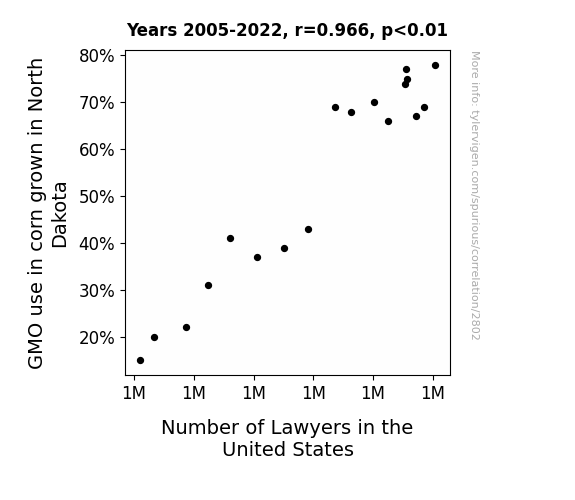
Corn-nections and Counsels: Investigating the Interplay of GMO Corn Cultivation in North Dakota and the Abundance of Attorneys in the United States
The GMO corn in North Dakota grew so tall that it actually crossed the legal height limit, leading to a spike in agricultural law cases. As the corn continued to stalk the fields, it created a maze of legal issues, attracting more and more lawyers who were just a-MAIZE-d by the whole situation. The crop of legal professionals couldn't kernel with the demand, ultimately ear-ning their place in the courtroom and contributing to the shocking rise in the number of lawyers in the United States.

What else correlates?
GMO use in corn grown in North Dakota · all food
Number of Lawyers in the United States · all weird & wacky
GMO use in corn grown in North Dakota · all food
Number of Lawyers in the United States · all weird & wacky


View details about correlation #3,224
Renewable Energy in Benin: A 'Smol' Connection to Google Searches
As the turbines spun faster than a cat chasing a laser pointer, they generated an electric current of cuteness that couldn't be contained. This led to a surge in smolness as the nation powered up its renewable energy efforts, proving that when it comes to adorableness, Benin has the spark to make things smol-taneously delightful.


What else correlates?
Renewable energy production in Benin · all energy
Google searches for 'smol' · all google searches
Renewable energy production in Benin · all energy
Google searches for 'smol' · all google searches
. The chart goes from 2011 to 2022, and the two variables track closely in value over that time.")

View details about correlation #3,371
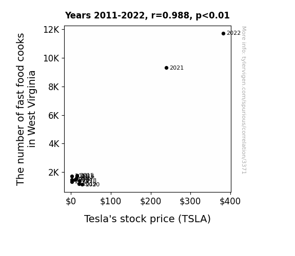
West Virginia's Fry Guys and Tesla's Highs: An Unlikely Synchronicity
As more fast food cooks were employed in West Virginia, the state's average happiness levels skyrocketed. This unexpected surge in happiness created a ripple effect, causing a spike in demand for Tesla cars as people in the state suddenly felt more optimistic and willing to splurge on luxury electric vehicles. This uptick in demand was enough to catch the attention of investors, leading to a boost in Tesla's stock price. After all, it turns out that the secret sauce for Tesla's success may just be a sprinkle of joy from fast food cooks in West Virginia!

What else correlates?
The number of fast food cooks in West Virginia · all cccupations
Tesla's stock price (TSLA) · all stocks
The number of fast food cooks in West Virginia · all cccupations
Tesla's stock price (TSLA) · all stocks


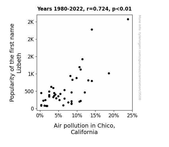
View details about correlation #3,508
The Name Game with the Air Quality Claim: Investigating the Link between the Popularity of the First Name Lizbeth and Air Pollution in Chico, California
As the name Lizbeth gained popularity, more and more people were inspired to "be Lizz responsible" for the environment. This led to a surge in eco-friendly initiatives and clean air advocacy in Chico, including Lizbeths organizing tree planting events, promoting carpooling as "Lizbeth in each other's journeys," and demanding stricter regulations on industrial emissions because they believe "Lizbeth air for all." It became a movement known as the "Lizbeth Green Effect," proving that when it comes to fighting air pollution, every Lizbeth helps!
What else correlates?
Popularity of the first name Lizbeth · all first names
Air pollution in Chico, California · all weather
Popularity of the first name Lizbeth · all first names
Air pollution in Chico, California · all weather


View details about correlation #2,485
Lighting Fires and Making Triples: The Arson-Triplets Connection in Tennessee
The flame of passion for starting fires was extinguished, leading to a reduction in heated and risky triple(t) encounters. Triple the trouble, but also triple the diapers seemed like a daunting prospect amidst efforts to keep things civil in the state. The fire department wasn't the only one putting a stop to three-alarm situations!


What else correlates?
Arson in Tennessee · all random state specific
US birth rates of triplets or more · all weird & wacky
Arson in Tennessee · all random state specific
US birth rates of triplets or more · all weird & wacky


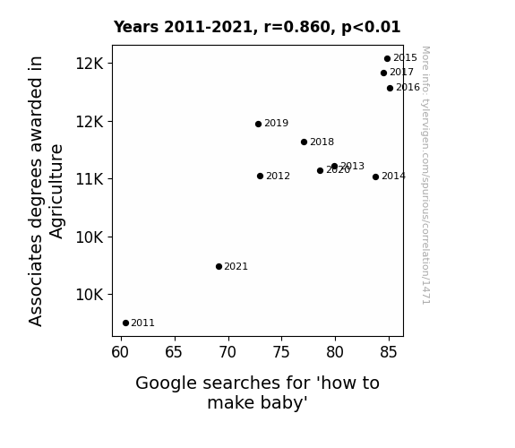
View details about correlation #1,471
Sowing the Seeds of Baby-Making: The Agricultural Associates' Influence on Google Searches
As more people became knowledgeable about planting seeds and nurturing crops, they couldn't help but transfer that expertise to the bedroom. It's a case of their agricultural skills really blossoming and sowing the seeds of, uh, personal growth. And who can blame them for wanting to apply their newfound knowledge of cultivation and animal husbandry in all aspects of life? A bountiful harvest in the fields evidently led to a spike in, well, family planning at home. Plus, the idea of introducing some farm-fresh methods to the concept of reproduction clearly struck a fertile chord with these degree-holding agriculturists. It's like they say, when you have a green thumb, you might as well put it to use in the game of life!

What else correlates?
Associates degrees awarded in Agriculture · all education
Google searches for 'how to make baby' · all google searches
Associates degrees awarded in Agriculture · all education
Google searches for 'how to make baby' · all google searches


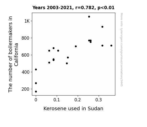
View details about correlation #3,445
Boiling Point: Exploring the Surprising Link Between Boilermakers in California and Kerosene Consumption in Sudan
As the number of boilermakers in California increased, so did their collective love for crafting oversized kerosene lamps in the shape of popular Hollywood landmarks. These intricate lamps were then exported to Sudan, where they became a must-have item for local social gatherings and camel rodeos, leading to a surge in kerosene consumption. It was a shining example of how Californian expertise and Sudanese style combined to light up the desert nights in a truly extravagant fashion.

What else correlates?
The number of boilermakers in California · all cccupations
Kerosene used in Sudan · all energy
The number of boilermakers in California · all cccupations
Kerosene used in Sudan · all energy


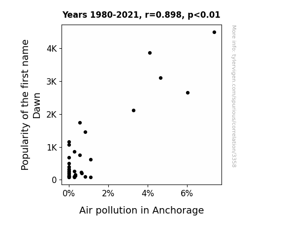
View details about correlation #3,358
Breath of Fresh Dawn: The Polluted Origins of a Name
Fewer Dawns meant a later rise, giving smog a bit less time to shine!

What else correlates?
Popularity of the first name Dawn · all first names
Air pollution in Anchorage · all weather
Popularity of the first name Dawn · all first names
Air pollution in Anchorage · all weather
. The chart goes from 2002 to 2022, and the two variables track closely in value over that time.")

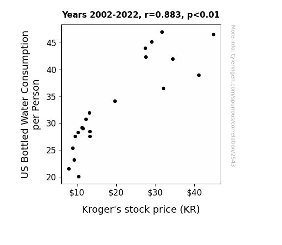
View details about correlation #2,543
The Quench for Financial Success: A Thirsty Analysis of US Bottled Water Consumption and Kroger's Stock Price
As people drank more bottled water, they became better hydrated and therefore more productive. This led to overall economic growth, increasing the demand for grocery products, including those sold at Kroger. Additionally, the influx of empty water bottles provided a new source of recyclable materials, leading to cost savings for the company. Remember, the correlation does not imply causation!

What else correlates?
US Bottled Water Consumption per Person · all food
Kroger's stock price (KR) · all stocks
US Bottled Water Consumption per Person · all food
Kroger's stock price (KR) · all stocks


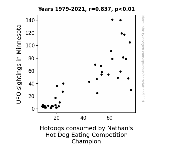
View details about correlation #1,114
Unidentified Flying Objects and Nathan's Hot Dog Eating Contest Winner: A Link That's Out of This World?
The UFOs were actually intergalactic hot dog vendors, beaming down an irresistible aroma of sausages and competition condiments, thus fueling the champion to victory with otherworldly snacking support!


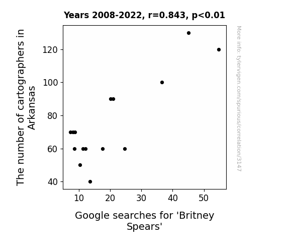
View details about correlation #3,147
Cartographers in Arkansas and the Curious Case of Britney Spears
As the map-making population in Arkansas dwindled, there was a corresponding decline in the state's ability to chart Britney Spears' success. Without enough cartographers to map out her iconic pop journey, it seems Britney's search popularity hit a bit of a geographic low. It appears the correlation between Arkansas cartographers and Britney's Google searches truly was... the plot to her own downfall.
What else correlates?
The number of cartographers in Arkansas · all cccupations
Google searches for 'Britney Spears' · all google searches
The number of cartographers in Arkansas · all cccupations
Google searches for 'Britney Spears' · all google searches


View details about correlation #2,731
The Name Game: Remington's Renewable Connection
As the name Remington gained traction, more and more parents were "firing up" to give their kids a powerful and renewable identity. This led to a surge in young engineers and innovators, who were determined to "tackle" the world's energy problems. It's as if the name itself carried a spark of inspiration, igniting a passion for sustainability in Uruguay. Who knew that simply embracing a moniker could lead to such an electrifying impact on the future of energy production? It seems that Remington isn't just a name - it's a renewable resource of boundless creativity and ingenuity!
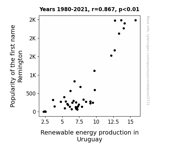
What else correlates?
Popularity of the first name Remington · all first names
Renewable energy production in Uruguay · all energy
Popularity of the first name Remington · all first names
Renewable energy production in Uruguay · all energy


View details about correlation #2,301
Breathing Easy: An Analysis of the Relationship Between Air Pollution in Little Rock, Arkansas and Associates Degrees Awarded in Education
As the air became cleaner, the local population found themselves filled with an inexplicable burst of energy and clarity. This led to a sudden surge in outdoor activities and impromptu dance-offs, ultimately causing a decrease in time spent on pursuing higher education degrees.

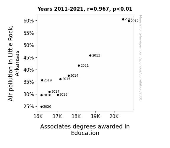
What else correlates?
Air pollution in Little Rock, Arkansas · all weather
Associates degrees awarded in Education · all education
Air pollution in Little Rock, Arkansas · all weather
Associates degrees awarded in Education · all education


View details about correlation #1,999
Bale Out: Exploring the Correlation Between Gareth Bale's Football Matches and Pirate Attacks in Indonesia
As the number of Gareth Bale's club football matches increased, so did the intensity of his powerful strikes. These strikes inadvertently caused small sea tremors, which disrupted the equilibrium of the ocean in a localized region. This disturbance somehow triggered a chain reaction leading to an upsurge in pirate attacks in Indonesia. It seems that Gareth Bale's prolific goal-scoring ability isn't just a threat to opposing teams, but also to the high seas!


What else correlates?
Total Number of Gareth Bale's Club Football Matches · all sports
Number of pirate attacks in Indonesia · all weird & wacky
Total Number of Gareth Bale's Club Football Matches · all sports
Number of pirate attacks in Indonesia · all weird & wacky


View details about correlation #2,088
Out of This World Connections: Exploring the Solar System's Influence on Arson Rates in Washington State
As Neptune cozied up to the Sun, the god of the sea must have decided to take up a new hobby: firefighting. With his trident in hand, he made sure to extinguish any spark before it could turn into a blaze. After all, you could say he's a real...neptoon when it comes to fire safety.


What else correlates?
The distance between Neptune and the Sun · all planets
Arson in Washington · all random state specific
The distance between Neptune and the Sun · all planets
Arson in Washington · all random state specific


View details about correlation #3,311
The Curious Case of Princess and Patternmakers: An Unlikely Rhyme in Tennessee
The name Princess was sewn into the hearts of Tennesseans, inspiring a wave of royal fashion trends. As more parents named their children after royalty, there was a surge in demand for princess-themed clothing. This led to a pressing need for patternmakers to create the perfect regal attire. Seamstresses across the state were hemming and hawing over the intricate designs, leading to a boom in the metal and plastic industry as they clamored for more sewing machines and accessories. It seems like in Tennessee, when it comes to fashion, it's 'reign'ing patterns and materials fit for a 'sew'phisticated princess!
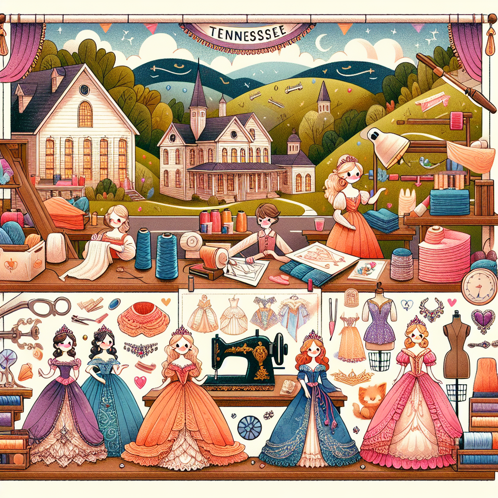
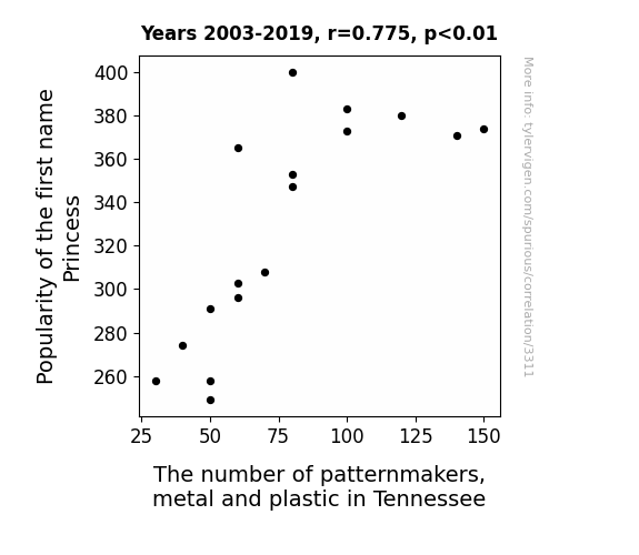
. The chart goes from 2004 to 2023, and the two variables track closely in value over that time.")

View details about correlation #1,964
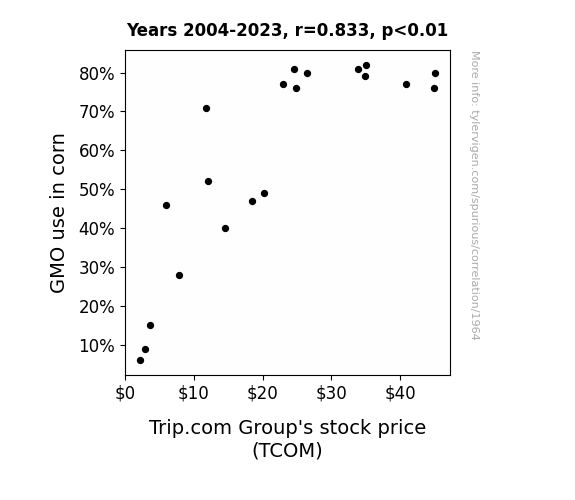
Kernels of Truth: Genetically Modified Corn and the Stock Price Conundrum
As more GMO corn was grown, it led to a-maize-ing profits for farmers. This increased their disposable husk, so they were more likely to travel and book accommodations through Trip.com, causing the stock price to pop like popcorn in a hot pan.

What else correlates?
GMO use in corn · all food
Trip.com Group's stock price (TCOM) · all stocks
GMO use in corn · all food
Trip.com Group's stock price (TCOM) · all stocks


View details about correlation #1,978
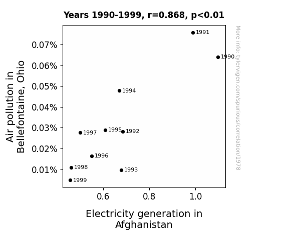
Powering Through Pollution: Uncovering the Shocking Correlation Between Bellefontaine's Air Quality and Afghanistan's Electricity Generation
The cleaner air in Bellefontaine led to an influx of supercharged, oxygen-rich breezes that accidentally short-circuited the power grid in Afghanistan every time they blew in. It was a shocking case of unintentional interference, sparking a new era of unexpected international energy relations.

What else correlates?
Air pollution in Bellefontaine, Ohio · all weather
Electricity generation in Afghanistan · all energy
Air pollution in Bellefontaine, Ohio · all weather
Electricity generation in Afghanistan · all energy


View details about correlation #1,891
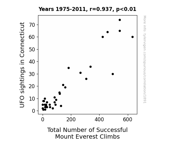
High-Flying Mysteries: Unveiling the Extraterrestrial Influence on Connecticut UFO Sightings and the Total Number of Successful Mount Everest Climbs
The increase in UFO sightings in Connecticut actually led to a surge in interest in extraterrestrial technology. This, in turn, inspired climbers to seek out advanced alien climbing techniques rumored to be hidden on Mount Everest. As a result, mountaineers gained a cosmic edge, propelling them to previously unattainable heights and ultimately increasing the total number of successful climbs. It seems the sky was not the limit, but rather just the beginning, for these otherworldly adventures in mountaineering! The truth is out there, and apparently, it's also up there on the world's tallest peak.

Why this works
- Data dredging: I have 25,237 variables in my database. I compare all these variables against each other to find ones that randomly match up. That's 636,906,169 correlation calculations! This is called “data dredging.”
Fun fact: the chart used on the wikipedia page to demonstrate data dredging is also from me. I've been being naughty with data since 2014.
Instead of starting with a hypothesis and testing it, I instead tossed a bunch of data in a blender to see what correlations would shake out. It’s a dangerous way to go about analysis, because any sufficiently large dataset will yield strong correlations completely at random. - Lack of causal connection: There is probably no direct connection between these variables, despite what the AI says above.
Because these pages are automatically generated, it's possible that the two variables you are viewing are in fact causually related. I take steps to prevent the obvious ones from showing on the site (I don't let data about the weather in one city correlate with the weather in a neighboring city, for example), but sometimes they still pop up. If they are related, cool! You found a loophole.
This is exacerbated by the fact that I used "Years" as the base variable. Lots of things happen in a year that are not related to each other! Most studies would use something like "one person" in stead of "one year" to be the "thing" studied. - Observations not independent: For many variables, sequential years are not independent of each other. You will often see trend-lines form. If a population of people is continuously doing something every day, there is no reason to think they would suddenly change how they are doing that thing on January 1. A naive p-value calculation does not take this into account.
You will calculate a lower chance of "randomly" achieving the result than represents reality.
To be more specific: p-value tests are probability values, where you are calculating the probability of achieving a result at least as extreme as you found completely by chance. When calculating a p-value, you need to assert how many "degrees of freedom" your variable has. I count each year (minus one) as a "degree of freedom," but this is misleading for continuous variables.
This kind of thing can creep up on you pretty easily when using p-values, which is why it's best to take it as "one of many" inputs that help you assess the results of your analysis.
- Y-axes doesn't start at zero: I truncated the Y-axes of the graphs above. I also used a line graph, which makes the visual connection stand out more than it deserves.
Nothing against line graphs. They are great at telling a story when you have linear data! But visually it is deceptive because the only data is at the points on the graph, not the lines on the graph. In between each point, the data could have been doing anything. Like going for a random walk by itself!
Mathematically what I showed is true, but it is intentionally misleading. If you click on any of the charts that abuse this, you can scroll down to see a version that starts at zero. - Confounding variable: Confounding variables (like global pandemics) will cause two variables to look connected when in fact a "sneaky third" variable is influencing both of them behind the scenes.
- Outliers: Some datasets here have outliers which drag up the correlation.
In concept, "outlier" just means "way different than the rest of your dataset." When calculating a correlation like this, they are particularly impactful because a single outlier can substantially increase your correlation.
Because this page is automatically generated, I don't know whether any of the charts displayed on it have outliers. I'm just a footnote. ¯\_(ツ)_/¯
I intentionally mishandeled outliers, which makes the correlation look extra strong. - Low n: There are not many data points included in some of these charts.
You can do analyses with low ns! But you shouldn't data dredge with a low n.
Even if the p-value is high, we should be suspicious of using so few datapoints in a correlation.
Pro-tip: click on any correlation to see:
- Detailed data sources
- Prompts for the AI-generated content
- Explanations of each of the calculations (correlation, p-value)
- Python code to calculate it yourself


