spurious correlations
discover · random · spurious scholar
← previous page · next page →


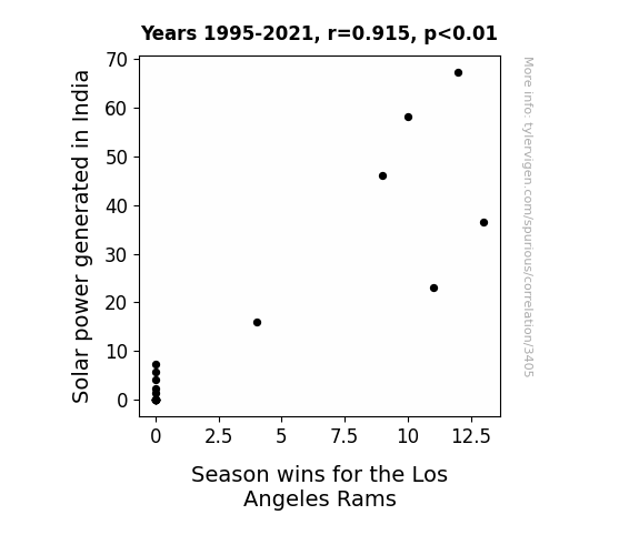
View details about correlation #3,405
Shining Success: Illuminating the Correlation Between Solar Power in India and Season Wins for the Los Angeles Rams
As Solar power capacity in India skyrocketed, it created a positive energy flow that directly influenced the Rams' performance. This influx of renewable energy sparked a supercharged offense and a defense that was able to shine as bright as, well, solar power panels. It's clear that when it comes to the Rams, the sun never sets on their success! The team simply couldn't resist getting their power from afar. So, it's no wonder they were able to outshine their opponents and leave them feeling a bit...dim.

What else correlates?
Solar power generated in India · all energy
Season wins for the Los Angeles Rams · all sports
Solar power generated in India · all energy
Season wins for the Los Angeles Rams · all sports


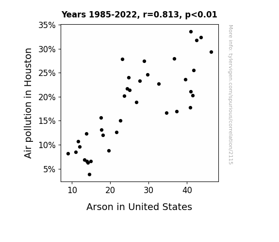
View details about correlation #2,115
Burning Concerns: Unveiling the Link between Air Pollution in the Bayou City and Arson in the Stars and Stripes
As the air quality in Houston improved, it dampened the usual fiery temper of the city. With fewer pollutants in the air, there was less fuel to stoke the flames of discontent. This led to a reduction in cases of spontaneous combustion of tempers, and ultimately a decrease in the overall arson rates across the United States. The link between cleaner air in Houston and a nationwide drop in arson showcases the unexpected ripple effects of environmental changes on human behavior. Remember, correlation does not necessarily imply causation!

What else correlates?
Air pollution in Houston · all weather
Arson in United States · all random state specific
Air pollution in Houston · all weather
Arson in United States · all random state specific
. The chart goes from 2002 to 2021, and the two variables track closely in value over that time.")

View details about correlation #2,940
Spreading the Bread: The Mellow Drama of Butter Consumption and Dollar Tree’s Stock Price
As butter consumption increased, so did the number of people attempting to make homemade croissants. This led to a sudden surge in demand for baking supplies, including those conveniently sold at Dollar Tree. As Dollar Tree's sales unexpectedly rose, investors gained confidence in the company's ability to adapt to changing consumer preferences, causing an uptick in the stock price. Who knew that butter could churn out such unexpected financial results for Dollar Tree!


What else correlates?
Butter consumption · all food
Dollar Tree's stock price (DLTR) · all stocks
Butter consumption · all food
Dollar Tree's stock price (DLTR) · all stocks


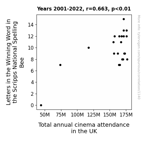
View details about correlation #1,140
Linguistic Lexicons and Leisure: Linking Letters in the Winning Word in the Scripps National Spelling Bee to Total annual cinema attendance in the UK
As the winning word at the Scripps National Spelling Bee became longer, it created a buzz around the UK, prompting more people to flock to cinemas for an a-word-able experience. This led to an increase in total annual cinema attendance as film fanatics were spellbound by the magic of the silver screen, proving that when it comes to spelling success, the reel winner is always the audience!


View details about correlation #1,813
The Nuclear Equation: Exploring Tennessee's Engineers and Togo's Petroleum Consumption
As the number of nuclear engineers in Tennessee increased, it led to a surge in wacky science experiments. One such experiment involved a nuclear-powered car prototype, which accidentally teleported to Togo and somehow ran on petroleum, creating a local demand for gasoline. It's a classic case of Tennessee technologists inadvertently revving up Togo's petrol usage, all thanks to their atomic antics!
What else correlates?
The number of nuclear engineers in Tennessee · all cccupations
Petroluem consumption in Togo · all energy
The number of nuclear engineers in Tennessee · all cccupations
Petroluem consumption in Togo · all energy


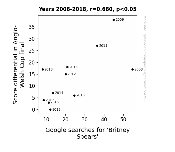
View details about correlation #2,556
Britney Spears Gives Rugby a Cheers: Examining the Link Between Score Tears and Pop Star Fears in Anglo-Welsh Rugby Cup Finals Over the Years
She must have been a fan of rugby songs, because every time the score went up, so did her search hits. It looks like the Anglo-Welsh Cup final really got her 'in the zone'!

What else correlates?
Score differential in Anglo-Welsh Cup final · all sports
Google searches for 'Britney Spears' · all google searches
Score differential in Anglo-Welsh Cup final · all sports
Google searches for 'Britney Spears' · all google searches
. The chart goes from 2005 to 2022, and the two variables track closely in value over that time.")

View details about correlation #2,635
Pour Decisions: The Ale-Effect of Breweries on Alnylam Pharmaceuticals' Stock Price
As the number of breweries in the United States increased, so did the demand for hops. This led to a hop shortage, creating a golden opportunity for Alnylam Pharmaceuticals to develop a revolutionary genetically modified super hop. Investors hopped on board, causing a surge in ALNY stock price as they ale-gedly saw the potential for hoppy returns.


What else correlates?
The number of Breweries in the United States · all food
Alnylam Pharmaceuticals' stock price (ALNY) · all stocks
The number of Breweries in the United States · all food
Alnylam Pharmaceuticals' stock price (ALNY) · all stocks


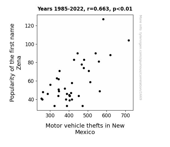
View details about correlation #1,669
Zena’s Bewitching Influence: A Study of the Correlation between the Popularity of the Name Zena and Motor Vehicle Thefts in New Mexico
As the name Zena gained popularity, more and more parents were inspired to name their children after the famous warrior princess. This led to a surge in young girls with fierce, crime-fighting attitudes. As these pint-sized Zenas roamed the streets of New Mexico, they inadvertently incited a wave of motor vehicle thefts, channeling their inner Xena and taking joyrides in a quest for adventure. Little did anyone know, the rise of Zenas across the state was driving a new kind of car chaos.

What else correlates?
Popularity of the first name Zena · all first names
Motor vehicle thefts in New Mexico · all random state specific
Popularity of the first name Zena · all first names
Motor vehicle thefts in New Mexico · all random state specific


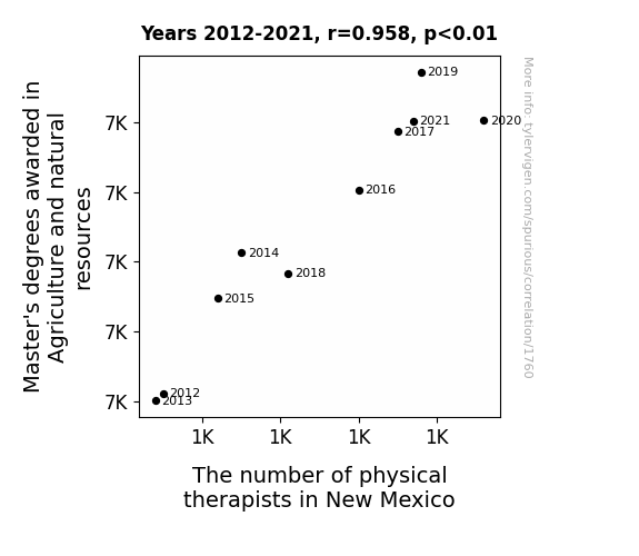
View details about correlation #1,760
Mystery of Master's in Agriculture and Natural Resources: The Mischievous Marriage to New Mexico's Physical Therapists
As more individuals obtained Master's degrees in Agriculture and natural resources, they developed an unprecedented understanding of the interconnectedness of all living organisms. This knowledge somehow led to the discovery of a secret plant in the New Mexico desert with potent healing properties. As word spread, it attracted physical therapists who wanted to incorporate this newfound botanical marvel into their practice, leading to a surprising boom in the number of physical therapists in New Mexico. Who knew that the key to aching muscles and joints lay hidden in the dusty terrain of the Land of Enchantment!


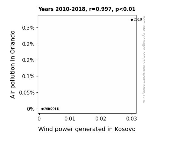
View details about correlation #1,704
The Relationship between Orlando Air Stagnation and Kosovo Wind Generation: A Statistical Investigation
The smog from Orlando somehow formed a supercharged jet stream that boosted the wind turbines in Kosovo. It's like Orlando accidentally became the world's most eco-friendly fan, just by having really bad air!

What else correlates?
Air pollution in Orlando · all weather
Wind power generated in Kosovo · all energy
Air pollution in Orlando · all weather
Wind power generated in Kosovo · all energy


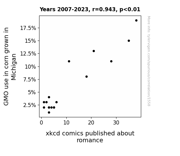
View details about correlation #1,558
GMOs and Giggles: The Correlation between Corn Genetics in Michigan and Romance in xkcd Comics
The decreasing GMO use in Michigan corn led to a resurgence of traditional corn qualities, including a romantic ambiance in the corn fields. This inspired the xkcd comic artist to shift focus from romance to the more captivating topic of non-GMO corn, inadvertently leading to a decrease in romance-themed xkcd comics.

What else correlates?
GMO use in corn grown in Michigan · all food
xkcd comics published about romance · all weird & wacky
GMO use in corn grown in Michigan · all food
xkcd comics published about romance · all weird & wacky
. The chart goes from 2002 to 2022, and the two variables track closely in value over that time.")

View details about correlation #2,154
Denver's Dominance: Deciphering the Droll Connection between the Name and Centene's Stock Price
There could be a rising demand for baby name merchandise like tiny cowboy boots and baby-sized lassos, leading to an unexpected boost in Centene's stock price. After all, nothing says "future success" like a baby named Denver sporting a miniature bolo tie.


What else correlates?
Popularity of the first name Denver · all first names
Centene's stock price (CNC) · all stocks
Popularity of the first name Denver · all first names
Centene's stock price (CNC) · all stocks


View details about correlation #2,362
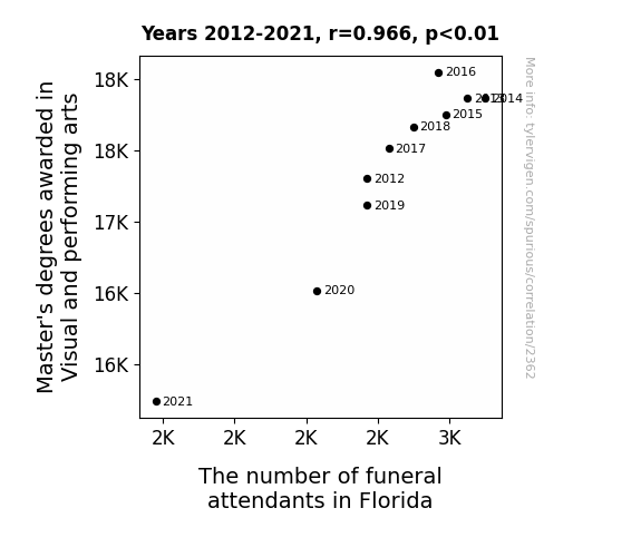
The Arts and the Mass: A Statistical Rhyme of Master's Degrees in Visual and Performing Arts and Funeral Attendance in Florida
As more talented artists pursued alternative careers, the demand for extravagant, over-the-top funerals with Broadway-level productions and avant-garde floral arrangements plummeted, leaving Florida funeral attendants feeling like the curtains had closed on their over-the-top performances. "Rest in peace, Master's degrees in Visual and Performing Arts - your final performance was a real showstopper!"


View details about correlation #2,142
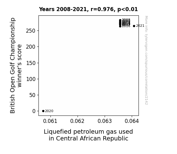
Par for the Course: Uncovering the Correlation Between British Open Golf Championship Winner's Score and Liquefied Petroleum Gas Consumption in Central African Republic
As the British Open Golf Championship winner's score goes up, so does the demand for celebratory fizz, leading to more champagne being sprayed during the victory celebrations. This surge in champagne showers results in a higher need for Liquefied Petroleum Gas (LPG) to fuel the extravagant displays of sportsmanship. It's a hole in one for the LPG industry in the Central African Republic, where they're definitely feeling the *propane* of success!


View details about correlation #1,118
Got Milf? Exploring the Udderly Surprising Relationship Between Milk Consumption and Robberies in Massachusetts
The cows finally organized and formed a neighborhood watch.


What else correlates?
Milk consumption · all food
Robberies in Massachusetts · all random state specific
Milk consumption · all food
Robberies in Massachusetts · all random state specific
. The chart goes from 2002 to 2022, and the two variables track closely in value over that time.")

View details about correlation #2,785
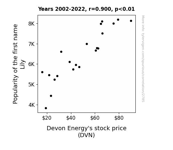
Stock and Baby Names: Drilling into the Lily-DVN Correlation
As the name Lily gained popularity, more parents subconsciously steered their kids toward careers in STEM. This led to an influx of talented engineers and scientists, including some who ended up working for Devon Energy. These new employees were so "rooted" in their expertise that they helped the company blossom and grow, ultimately driving up the stock price.

What else correlates?
Popularity of the first name Lily · all first names
Devon Energy's stock price (DVN) · all stocks
Popularity of the first name Lily · all first names
Devon Energy's stock price (DVN) · all stocks


View details about correlation #3,332
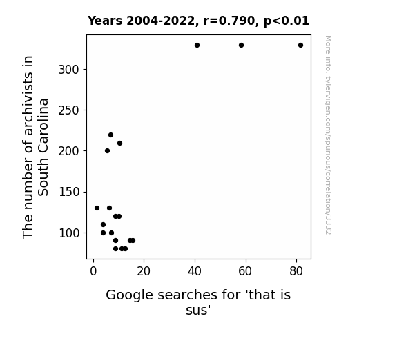
The Curious Case of Archivists' Trace and 'That is Sus' Pace: A Quirky Case Study
As the number of archivists in South Carolina grows, more and more people are being exposed to ancient manuscripts and historical documents. This has led to a rise in the popularity of old-fashioned expressions, like "that is sus-pect," causing an increase in Google searches for 'that is sus'. It seems the love for puns and historical references is archiving its way into modern language!

What else correlates?
The number of archivists in South Carolina · all cccupations
Google searches for 'that is sus' · all google searches
The number of archivists in South Carolina · all cccupations
Google searches for 'that is sus' · all google searches


View details about correlation #1,246
Fueling Satisfaction: Examining the Unlikely Relationship Between Gasoline Pumped in Eritrea and Customer Contentment at Macy's
As the gasoline consumption in Eritrea rises, so does the country's overall mood. The Eritrean people, feeling the rush of being able to travel more, unwittingly project their newfound contentment onto the world, thus inexplicably boosting customer satisfaction with Macy's. It's like a wave of positive energy transcending geographical boundaries and influencing the most unexpected places, proving that happiness at the pump can indeed fuel happiness in the retail realm!


What else correlates?
Gasoline pumped in Eritrea · all energy
Customer satisfaction with Macy's · all weird & wacky
Gasoline pumped in Eritrea · all energy
Customer satisfaction with Macy's · all weird & wacky


View details about correlation #2,538
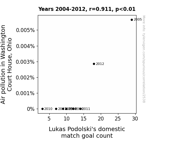
Air Pollution and Podolski's Prolificity: A Goal-scoring Correlation
As air pollution in Washington Court House, Ohio increased, it created stronger wind currents. These winds, filled with smog particles, inadvertently boosted Lukas Podolski's shots with some unconventional spin, leading to an uptick in his goal count. You could say he really 'fouled' the air with those polluted shots! Now that's what I call a smoggy assist!

What else correlates?
Air pollution in Washington Court House, Ohio · all weather
Lukas Podolski's domestic match goal count · all sports
Air pollution in Washington Court House, Ohio · all weather
Lukas Podolski's domestic match goal count · all sports
. The chart goes from 2012 to 2021, and the two variables track closely in value over that time.")

View details about correlation #2,032
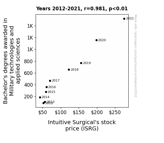
From Battlefield to Stock Yield: The Unlikely Link Between Military Technologies Education and Intuitive Surgical's Stock Price
As the number of military tech and applied science savvy individuals rose, so did the demand for cutting-edge robotic surgical systems from Intuitive Surgical. It seems these graduates were ready to 'operate' their way into the job market, propelling ISRG stock to new heights.

What else correlates?
Bachelor's degrees awarded in Military technologies · all education
Intuitive Surgical's stock price (ISRG) · all stocks
Bachelor's degrees awarded in Military technologies · all education
Intuitive Surgical's stock price (ISRG) · all stocks
Why this works
- Data dredging: I have 25,237 variables in my database. I compare all these variables against each other to find ones that randomly match up. That's 636,906,169 correlation calculations! This is called “data dredging.”
Fun fact: the chart used on the wikipedia page to demonstrate data dredging is also from me. I've been being naughty with data since 2014.
Instead of starting with a hypothesis and testing it, I instead tossed a bunch of data in a blender to see what correlations would shake out. It’s a dangerous way to go about analysis, because any sufficiently large dataset will yield strong correlations completely at random. - Lack of causal connection: There is probably no direct connection between these variables, despite what the AI says above.
Because these pages are automatically generated, it's possible that the two variables you are viewing are in fact causually related. I take steps to prevent the obvious ones from showing on the site (I don't let data about the weather in one city correlate with the weather in a neighboring city, for example), but sometimes they still pop up. If they are related, cool! You found a loophole.
This is exacerbated by the fact that I used "Years" as the base variable. Lots of things happen in a year that are not related to each other! Most studies would use something like "one person" in stead of "one year" to be the "thing" studied. - Observations not independent: For many variables, sequential years are not independent of each other. You will often see trend-lines form. If a population of people is continuously doing something every day, there is no reason to think they would suddenly change how they are doing that thing on January 1. A naive p-value calculation does not take this into account.
You will calculate a lower chance of "randomly" achieving the result than represents reality.
To be more specific: p-value tests are probability values, where you are calculating the probability of achieving a result at least as extreme as you found completely by chance. When calculating a p-value, you need to assert how many "degrees of freedom" your variable has. I count each year (minus one) as a "degree of freedom," but this is misleading for continuous variables.
This kind of thing can creep up on you pretty easily when using p-values, which is why it's best to take it as "one of many" inputs that help you assess the results of your analysis.
- Y-axes doesn't start at zero: I truncated the Y-axes of the graphs above. I also used a line graph, which makes the visual connection stand out more than it deserves.
Nothing against line graphs. They are great at telling a story when you have linear data! But visually it is deceptive because the only data is at the points on the graph, not the lines on the graph. In between each point, the data could have been doing anything. Like going for a random walk by itself!
Mathematically what I showed is true, but it is intentionally misleading. If you click on any of the charts that abuse this, you can scroll down to see a version that starts at zero. - Confounding variable: Confounding variables (like global pandemics) will cause two variables to look connected when in fact a "sneaky third" variable is influencing both of them behind the scenes.
- Outliers: Some datasets here have outliers which drag up the correlation.
In concept, "outlier" just means "way different than the rest of your dataset." When calculating a correlation like this, they are particularly impactful because a single outlier can substantially increase your correlation.
Because this page is automatically generated, I don't know whether any of the charts displayed on it have outliers. I'm just a footnote. ¯\_(ツ)_/¯
I intentionally mishandeled outliers, which makes the correlation look extra strong. - Low n: There are not many data points included in some of these charts.
You can do analyses with low ns! But you shouldn't data dredge with a low n.
Even if the p-value is high, we should be suspicious of using so few datapoints in a correlation.
Pro-tip: click on any correlation to see:
- Detailed data sources
- Prompts for the AI-generated content
- Explanations of each of the calculations (correlation, p-value)
- Python code to calculate it yourself


