spurious correlations
discover · random · spurious scholar
← previous page · next page →


View details about correlation #1,350
Brews and Breezes: Exploring the Link Between US Breweries and Global Wind Power
As the number of breweries in the United States increased, so did the amount of hot air being produced about new craft beer releases. This led to a surge in local wind currents, ultimately contributing to an increase in total wind power generated globally. It's a beery gusty situation!


What else correlates?
The number of Breweries in the United States · all food
Total wind power generated globally · all energy
The number of Breweries in the United States · all food
Total wind power generated globally · all energy


View details about correlation #1,376
Connecting the Cult of Camden: Correlating Camden's Celebrity Status with Curious Cosmic Crashes in Georgia
As the number of Camdens rose, it created a unique energy signature that resonated with intergalactic beings. These aliens, mistaking the enthusiastic calls of "Camden!" for some cosmic greeting, couldn't resist the charm of this burgeoning community. So, they flocked to Georgia in their UFOs, hoping to join the latest trending human club, unknowingly turning the state into the hottest spot for celestial socializing. Remember, it's all fun and games until the aliens start their own reality show - Keeping Up with the Camdens of Georgia!


What else correlates?
Popularity of the first name Camden · all first names
UFO sightings in Georgia · all random state specific
Popularity of the first name Camden · all first names
UFO sightings in Georgia · all random state specific


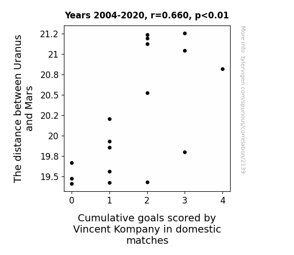
View details about correlation #2,139
The Cosmic Kicker: An Interplanetary Investigation of Vincent Kompany's Domestic Goal Scoring in Relation to Uranus and Mars
Vincent Kompany believes in astrological influences, and whenever Uranus gets too close to Mars, he feels a cosmic shift in his soccer abilities, making it harder for him to score goals.


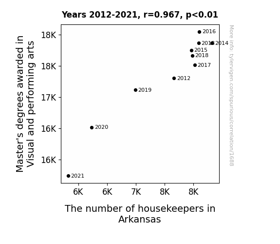
View details about correlation #1,688
Mastering the Mansion: Measuring the Link between Master's Degrees in Visual and Performing Arts and the Mob of Housekeepers in Arkansas
As the number of individuals with advanced knowledge of interpretive dance and avant-garde pottery dwindled, so too did their ability to revolutionize the art of tidying. With fewer masterful artists to choreograph the cleaning routines and innovate in the field of domestic aesthetics, Arkansas found itself in a creative cleaning crisis. The intricate dust sculptures and improvised vacuum symphonies that once graced the homes of the elite were now in peril. Canvases of cleanliness lay bare, devoid of the imaginative touch that only a master's degree in Visual and Performing Arts could bestow. As the saying goes, behind every impeccably made bed, there used to be a Master of Fine Arts. With a dwindling supply of maestros of mop and broom, one can only hope that Arkansas will one day rekindle its passion for household harmony and bohemian cleanliness.


View details about correlation #1,169
Pricing the Power: The Fuelish Connection Between Gasoline Prices in the US and Biomass Power Generated in Sweden
As gasoline prices in the US rise, more Americans decide to carpool. This leads to an increase in human body heat in confined spaces, which is then captured and converted into electricity by specially designed sauna turbines in Sweden, ultimately contributing to a surge in biomass power generation. It's a steamy solution to energy production!

What else correlates?
Gasoline Prices in the US · all weird & wacky
Biomass power generated in Sweden · all energy
Gasoline Prices in the US · all weird & wacky
Biomass power generated in Sweden · all energy


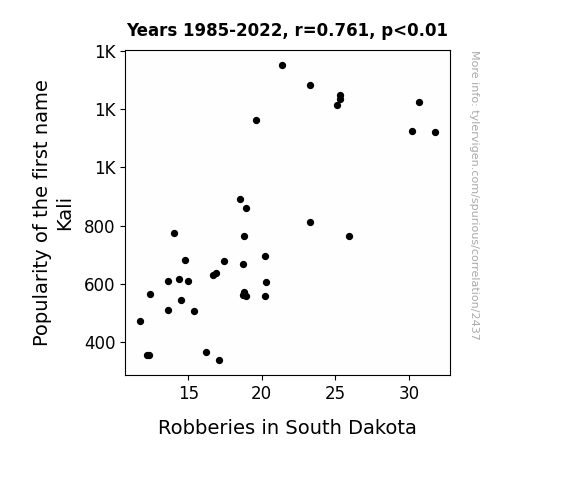
View details about correlation #2,437
The Kali Robbery Connection: A Steal of a Correlation
Every time someone named Kali entered the state, they couldn't help but steal the spotlight, and apparently a few other things while they were at it. It was a case of irresistible charm and undeniable magnetism leading to a rise in notoriety, both for the name and for the crime statistics in South Dakota. It seems Kali wasn't just a popular name; it was also a criminal mastermind in the making, making off with more than just hearts.

What else correlates?
Popularity of the first name Kali · all first names
Robberies in South Dakota · all random state specific
Popularity of the first name Kali · all first names
Robberies in South Dakota · all random state specific
. The chart goes from 2009 to 2022, and the two variables track closely in value over that time.")

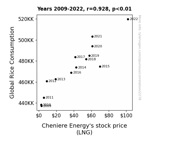
View details about correlation #2,278
Grains & Gains: A Quantitative Analysis of the Rice-LNG Correlation
More rice dishes led to more gas production. As rice consumption rose, so did the demand for natural gas, giving Cheniere Energy a firm foothold in the market. It's clear that when it comes to LNG stocks, the secret ingredient is rice! Remember, that's just a grain of truth in the stock market stir-fry!

What else correlates?
Global Rice Consumption · all food
Cheniere Energy's stock price (LNG) · all stocks
Global Rice Consumption · all food
Cheniere Energy's stock price (LNG) · all stocks


View details about correlation #3,374
Stuck in Traffic: An Insightful Analysis of the Relentless Relationship Between Traffic Technicians in Massachusetts and Assistant Professor Salaries in the US
With fewer traffic technicians in Massachusetts, there was less congestion on the roads. This led to a decrease in demand for assistant processors, who specialize in handling traffic citation paperwork. With less work available, employers were able to offer lower salaries, creating a ripple effect in the job market across the US.

What else correlates?
The number of traffic technicians in Massachusetts · all cccupations
Assistant Processor salaries in the US · all education
The number of traffic technicians in Massachusetts · all cccupations
Assistant Processor salaries in the US · all education


View details about correlation #2,341
Driving through the Smog: The Diesel Dirty Truth Behind Mercedes-Benz USA Recalls
The poor air quality in Grants Pass was actually the result of a secret Mercedes-Benz perfume-spraying drone fleet, which inadvertently led to a spike in automotive malfunctions. It turns out, their luxurious air freshener program was just a little too overzealous, causing a stink among the local vehicles and prompting the unexpected recalls. Looks like even the fanciest of cars couldn't air out this peculiar problem!

What else correlates?
Air pollution in Grants Pass, Oregon · all weather
Automotive recalls issued by Mercedes-Benz USA · all weird & wacky
Air pollution in Grants Pass, Oregon · all weather
Automotive recalls issued by Mercedes-Benz USA · all weird & wacky


View details about correlation #3,004
The Theodore Trend: Tracing the Ties between Theodore's Popularity and Peru's Solar Power Production
Through a complex series of interconnected energy fields, the name Theodore has been found to resonate with the sun's rays on a frequency that is particularly conducive to solar power production in Peru. It's as if the mere utterance of the name creates a surge of celestial enthusiasm, leading to a Theodore-induced spike in sunny productivity. This phenomenon, tentatively named 'Theodorelectricity,' is still being studied by both linguists and solar engineers, but if the trend continues, we may need to rethink our entire approach to renewable energy as it relates to nomenclature.


What else correlates?
Popularity of the first name Theodore · all first names
Solar power generated in Peru · all energy
Popularity of the first name Theodore · all first names
Solar power generated in Peru · all energy


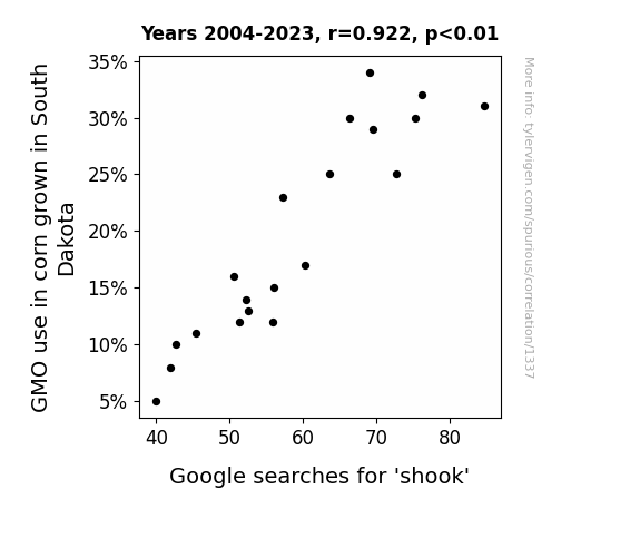
View details about correlation #1,337
GMO Growth in South Dakota: Gauging Googled 'Shook' Searches
The GM corn was allergic to outdated dance moves. As the GMO use decreased, the corn felt less inclined to do the electric slide and the macarena, leading to an overall decrease in shook-ness. A-maize-ing, isn't it? Corny, but true!

What else correlates?
GMO use in corn grown in South Dakota · all food
Google searches for 'shook' · all google searches
GMO use in corn grown in South Dakota · all food
Google searches for 'shook' · all google searches


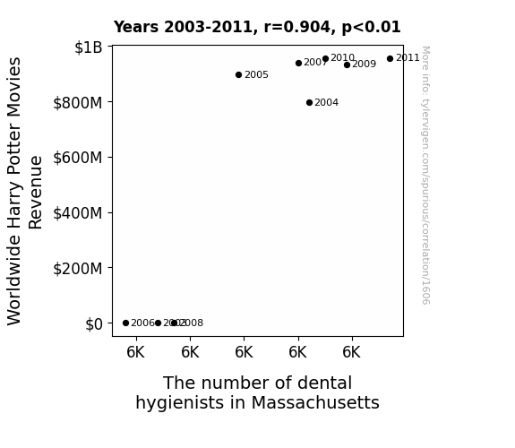
View details about correlation #1,606
The Sorcerer's Teeth: A Gingivitic Analysis of the Relationship between Harry Potter Movies Revenue and Dental Hygienists in Massachusetts
The magic and wonder of the movies led to a surge in people brushing and flossing, creating a higher demand for dental hygienists to keep those pearly whites sparkling. It turns out, Hogwarts wasn't the only place with a spell for a dazzling smile!


View details about correlation #2,790
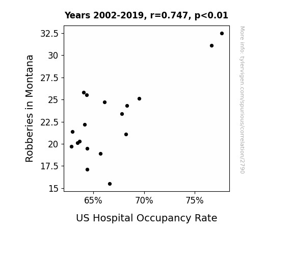
The Great Montana Heist: A Robbery on Hospital Resources?
As robberies decreased in Montana, there was a corresponding drop in the number of 'bandit-related injuries' requiring hospitalization. With fewer bandits on the loose, people were engaging in fewer wild west-style showdowns, thus leading to a decrease in overall hospital admissions. It seems even the healthcare system couldn't escape the far-reaching influence of the rootin' tootin' law enforcement trends in the great state of Montana. Yeehaw for public safety and unforeseen effects on hospital capacity!

What else correlates?
Robberies in Montana · all random state specific
US Hospital Occupancy Rate · all weird & wacky
Robberies in Montana · all random state specific
US Hospital Occupancy Rate · all weird & wacky
. The chart goes from 2002 to 2022, and the two variables track closely in value over that time.")

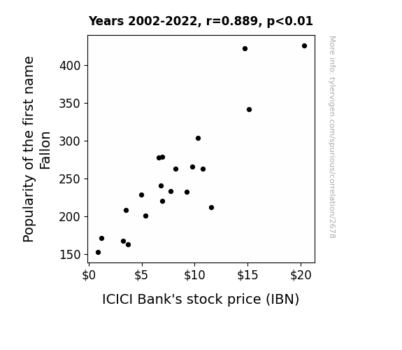
View details about correlation #2,678
Name Fallon's Impact on Bank Balance: A Quirky Connection between Personal Popularity and Stock Performance
The name "Fallon" sounds like "fortune" which subconsciously made people think about money, leading to an increased interest in banking and investments, including ICICI Bank. This heightened demand for the stock drove up its price. It's like the name itself was casting a financial spell!

What else correlates?
Popularity of the first name Fallon · all first names
ICICI Bank's stock price (IBN) · all stocks
Popularity of the first name Fallon · all first names
ICICI Bank's stock price (IBN) · all stocks


View details about correlation #3,671
A Breath of Fresh Air: Unpacking the Link Between Air Pollution in Coeur d'Alene and Norwegian Immigration Aspirations
As the air quality improved in Coeur d'Alene, people's spirits lifted, leading to a newfound zest for life. This unexpected surge in positivity prompted them to rethink their surroundings and consider making a move to Norway for its picturesque landscapes and fresh Nordic air. It's as if the clear skies and pristine environment whispered, "Norway is calling," and sparked a collective interest in starting afresh amidst the fjords. Who knew that a breath of fresh air in Idaho could lead to a whimsical waltz towards the land of the midnight sun!


What else correlates?
Air pollution in Coeur d'Alene, Idaho · all weather
Google searches for 'how to immigrate to norway' · all google searches
Air pollution in Coeur d'Alene, Idaho · all weather
Google searches for 'how to immigrate to norway' · all google searches


View details about correlation #2,404
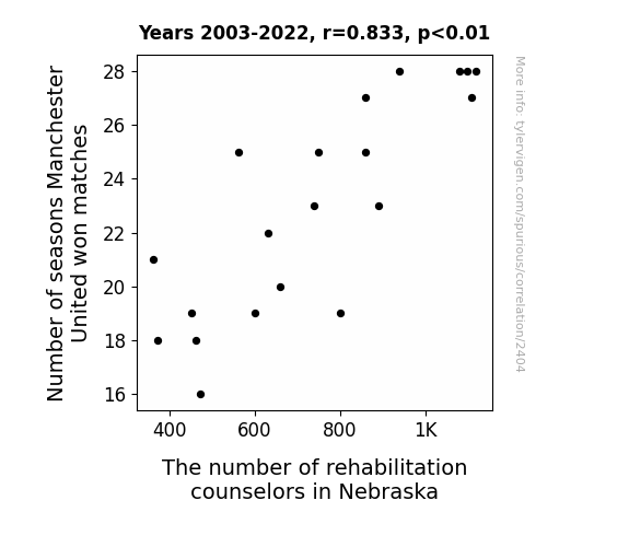
Kicking Around the Numbers: The Curious Link Between Manchester United's Victories and Rehabilitation Counselors in Nebraska
Manchester United fans requested more counseling services due to their team's poor performance, leading to a higher demand for rehabilitation counselors in Nebraska. This created a shortage of counselors, as they were all being booked by distraught fans needing support.


View details about correlation #2,026
Corn’s GMO Connection: Correlating Crop Cultivation in the Midwest to Caribbean Wind Power
As the GMO corn in South Dakota grew taller and stronger, it began to sway more vigorously in the wind. This inadvertently triggered a chain reaction, creating a microclimate of increased air currents. Unbeknownst to all, the corn fields had essentially become giant, unintentional wind farms, providing an unexpected and renewable energy source for Puerto Rico.


What else correlates?
GMO use in corn grown in South Dakota · all food
Wind power generated in Puerto Rico · all energy
GMO use in corn grown in South Dakota · all food
Wind power generated in Puerto Rico · all energy


View details about correlation #1,119
UFO-Patent Paradox: Unveiling the Interstellar Link
The presence of intergalactic technology stimulated the creative thinking of earthlings, leading to a surge in groundbreaking inventions and, ultimately, more patents being approved. It's as if the universe's best-kept secrets were sparking innovation right here on our own home planet!

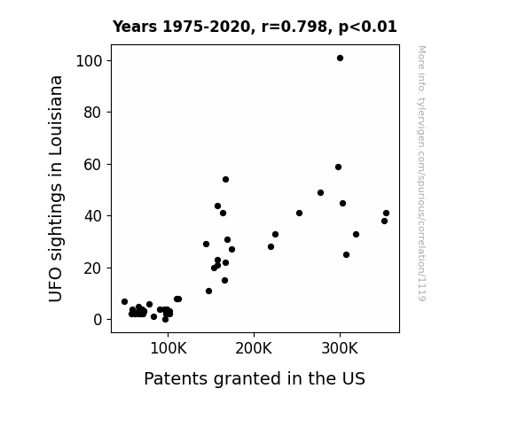
What else correlates?
UFO sightings in Louisiana · all random state specific
Patents granted in the US · all weird & wacky
UFO sightings in Louisiana · all random state specific
Patents granted in the US · all weird & wacky
. The chart goes from 2002 to 2022, and the two variables track closely in value over that time.")

View details about correlation #3,159
A Stroke of Stock: The Sonny-Sherwin-Williams Connection
As the name Sonny gained popularity, more parents were subliminally influenced to associate the sunny disposition of their child with bright, cheerful colors. This led to an overall increase in demand for paint, specifically from The Sherwin-Williams Company. It seems the stock price was on the rise, painting a picture of success for the company.
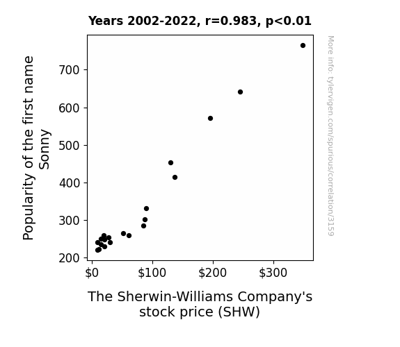
What else correlates?
Popularity of the first name Sonny · all first names
The Sherwin-Williams Company's stock price (SHW) · all stocks
Popularity of the first name Sonny · all first names
The Sherwin-Williams Company's stock price (SHW) · all stocks


View details about correlation #3,524
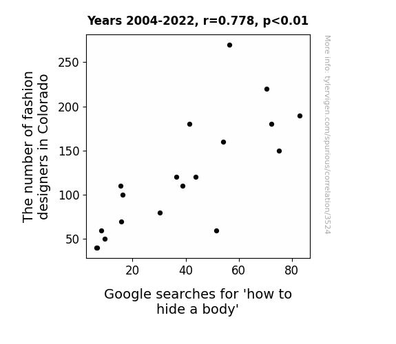
The Colorado Connection: Couture and Corpses - Exploring the Correlation between Fashion Designers and Searches for 'How to Hide a Body'
As the fashion scene in Colorado blossomed, it became clear that even in the afterlife, one must dress to impress. Each designer's latest collection was to die for, leading to a surge in underground fashion competitions. Aspiring couture connoisseurs were furiously researching the best burial couture and the latest trends in clandestine chic. It seems that in Colorado, the bodies weren't the only things that were going 6 feet under in style. The competition was cutthroat, and everyone wanted to leave a fabulous final impression, no matter how grave the situation. Rest in fashion, as they say!

Why this works
- Data dredging: I have 25,237 variables in my database. I compare all these variables against each other to find ones that randomly match up. That's 636,906,169 correlation calculations! This is called “data dredging.”
Fun fact: the chart used on the wikipedia page to demonstrate data dredging is also from me. I've been being naughty with data since 2014.
Instead of starting with a hypothesis and testing it, I instead tossed a bunch of data in a blender to see what correlations would shake out. It’s a dangerous way to go about analysis, because any sufficiently large dataset will yield strong correlations completely at random. - Lack of causal connection: There is probably no direct connection between these variables, despite what the AI says above.
Because these pages are automatically generated, it's possible that the two variables you are viewing are in fact causually related. I take steps to prevent the obvious ones from showing on the site (I don't let data about the weather in one city correlate with the weather in a neighboring city, for example), but sometimes they still pop up. If they are related, cool! You found a loophole.
This is exacerbated by the fact that I used "Years" as the base variable. Lots of things happen in a year that are not related to each other! Most studies would use something like "one person" in stead of "one year" to be the "thing" studied. - Observations not independent: For many variables, sequential years are not independent of each other. You will often see trend-lines form. If a population of people is continuously doing something every day, there is no reason to think they would suddenly change how they are doing that thing on January 1. A naive p-value calculation does not take this into account.
You will calculate a lower chance of "randomly" achieving the result than represents reality.
To be more specific: p-value tests are probability values, where you are calculating the probability of achieving a result at least as extreme as you found completely by chance. When calculating a p-value, you need to assert how many "degrees of freedom" your variable has. I count each year (minus one) as a "degree of freedom," but this is misleading for continuous variables.
This kind of thing can creep up on you pretty easily when using p-values, which is why it's best to take it as "one of many" inputs that help you assess the results of your analysis.
- Y-axes doesn't start at zero: I truncated the Y-axes of the graphs above. I also used a line graph, which makes the visual connection stand out more than it deserves.
Nothing against line graphs. They are great at telling a story when you have linear data! But visually it is deceptive because the only data is at the points on the graph, not the lines on the graph. In between each point, the data could have been doing anything. Like going for a random walk by itself!
Mathematically what I showed is true, but it is intentionally misleading. If you click on any of the charts that abuse this, you can scroll down to see a version that starts at zero. - Confounding variable: Confounding variables (like global pandemics) will cause two variables to look connected when in fact a "sneaky third" variable is influencing both of them behind the scenes.
- Outliers: Some datasets here have outliers which drag up the correlation.
In concept, "outlier" just means "way different than the rest of your dataset." When calculating a correlation like this, they are particularly impactful because a single outlier can substantially increase your correlation.
Because this page is automatically generated, I don't know whether any of the charts displayed on it have outliers. I'm just a footnote. ¯\_(ツ)_/¯
I intentionally mishandeled outliers, which makes the correlation look extra strong. - Low n: There are not many data points included in some of these charts.
You can do analyses with low ns! But you shouldn't data dredge with a low n.
Even if the p-value is high, we should be suspicious of using so few datapoints in a correlation.
Pro-tip: click on any correlation to see:
- Detailed data sources
- Prompts for the AI-generated content
- Explanations of each of the calculations (correlation, p-value)
- Python code to calculate it yourself


