spurious correlations
discover · random · spurious scholar
← previous page · next page →


View details about correlation #4,284
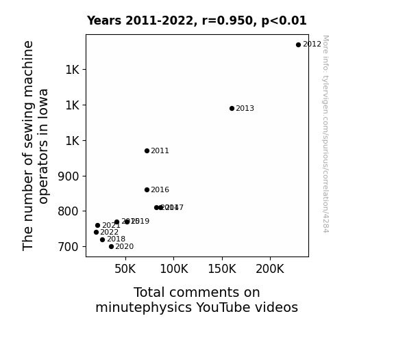
Unraveling Threads of Influence: The Stitch Between Sewing Machine Operators in Iowa and Total Comment-ary on minutephysics YouTube Videos
As the skilled sewing machine operators dwindled in Iowa, their exceptional hand-eye coordination and nimble finger movements were sorely missed. This led to a decrease in the overall dexterity of the Iowa population. Consequently, Iowans found it increasingly challenging to perform tiny tasks, such as typing comments on minutephysics videos with the same level of precision and speed as before. This ultimately resulted in a dip in the total comments on minutephysics YouTube videos.


View details about correlation #5,945
Silly Smol Searches and Satisfied Sky-surfers: An Alliterative Assessment of American Airlines’ Customer Satisfaction
As the internet's love for all things small grew, it inadvertently shrank American Airlines' list of customer complaints. It seems that the more people fixated on tiny, adorable things, the less they noticed the eensy-weensy inconveniences of air travel. It's as if the nation collectively decided that size really does matter, but in this case, smaller was better for everyone's happiness at 30,000 feet. So, perhaps the secret to a smoother flight experience wasn't just in the friendly skies, but in embracing the smol joys that make all the difference!


What else correlates?
Google searches for 'smol' · all google searches
Customer satisfaction with American Airlines · all weird & wacky
Google searches for 'smol' · all google searches
Customer satisfaction with American Airlines · all weird & wacky


View details about correlation #1,528
The Stellar Influence of Alanna: A Celestial Analysis of Name Popularity and Planetary Distance
As more and more babies were named Alanna, the collective sound frequency of their parents proudly calling out to them created small but measurable sonic waves. Over time, these waves interfered with the gravitational pull between Uranus and Venus, inadvertently nudging them slightly further apart. The Alanna Effect, as it was dubbed by baffled astronomers, led to reevaluations of celestial mechanics and left everyone marveling at the cosmic consequences of baby name trends.


What else correlates?
Popularity of the first name Alanna · all first names
The distance between Uranus and Venus · all planets
Popularity of the first name Alanna · all first names
The distance between Uranus and Venus · all planets


View details about correlation #4,541
Delving into the Democrat Vote- Jet Fuel Duo: A Delightful Discovery
Perhaps the Democrats promised to bring some "green energy" solutions to the table, revving up their campaign with a focus on alternative fuels. This ignited a "political climate change" in Delaware, leading to a surge in support for the party. As the enthusiasm for the Democratic candidate soared higher than a jumbo jet, it somehow fueled a ripple effect that reached all the way to Greenland, causing a "political jet stream" that lifted the demand for jet fuel. It's like they say, "where there's a 'blue' wave, there's a 'fuele' wave!" The connection may seem as far-fetched as a trans-Atlantic flight, but hey, in the world of wacky correlations, anything can happen!


What else correlates?
Votes for the Democratic Presidential candidate in Delaware · all elections
Jet fuel used in Greenland · all energy
Votes for the Democratic Presidential candidate in Delaware · all elections
Jet fuel used in Greenland · all energy


View details about correlation #5,137
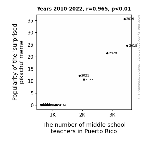
Putting the Surprised in Statistical Significance: An Examination of the 'Surprised Pikachu' Meme and its Impact on Middle School Teacher Population in Puerto Rico
As the 'surprised Pikachu' meme gained traction, it led to an uptick in internet usage. This surge in online activity put a higher demand on the telecommunication infrastructure in Puerto Rico. To meet this demand, more tech companies invested in the region, creating job opportunities. With the expanding job market, there was a need for additional educators to support the growing number of families relocating to Puerto Rico. As a result, the popularity of the meme indirectly contributed to an increase in the number of middle school teachers in Puerto Rico.


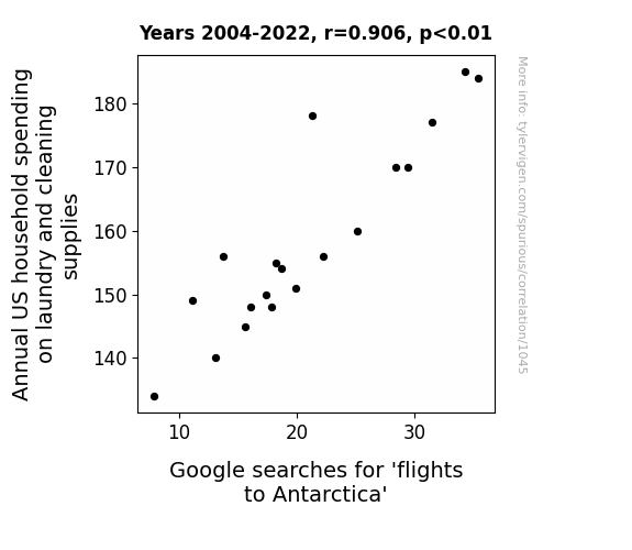
View details about correlation #1,045
The Dirty Laundry of Travel Aspirations: Exploring the Relationship between US Household Spending on Cleaning Supplies and Google Searches for 'Flights to Antarctica'
As US households spent more on laundry and cleaning supplies, they became obsessed with achieving the freshest, cleanest scent possible. This obsession extended to wanting the ultimate fresh air experience, leading people to search for flights to Antarctica, known for its crisp, pure air. After all, if your laundry smells like a refreshing polar breeze, why not experience the real deal, right? And who wouldn't want to see penguins rocking their spotless tuxedos in person? Maybe it's time for a new marketing slogan: "Antarctica: Because Freshness Matters!"


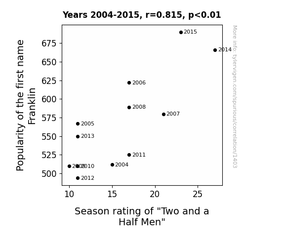
View details about correlation #1,403
Franklin, My Dear Watson: Exploring the Fickle Nature of Names and TV Fame in 'Two and a Half Men' Season Ratings
Every time someone named Franklin tuned in to watch, they couldn't help but laugh at all the puns and dad jokes, creating a subconscious laugh track that boosted the ratings. Additionally, the influx of Franklins sparked a new fan theory that the show was secretly an allegory for Benjamin Franklin's life, leading to renewed interest and speculation. The name Franklin just had a magnetic pull on the success of the show, like a quirky sitcom magnet.

What else correlates?
Popularity of the first name Franklin · all first names
Season rating of "Two and a Half Men" · all films & actors
Popularity of the first name Franklin · all first names
Season rating of "Two and a Half Men" · all films & actors
. The chart goes from 2011 to 2021, and the two variables track closely in value over that time.")

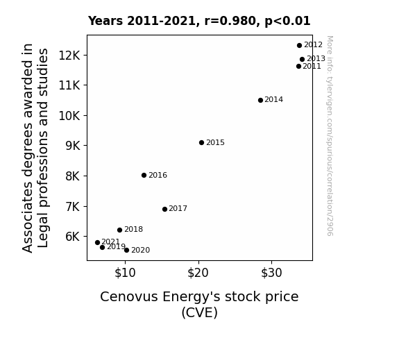
View details about correlation #2,906
Associates Awards in Adjudication: An Analysis of the Alleged Impact on Cenovus Energy's Stock Price
As the number of legal associates dwindled, there was a sharp rise in courtroom antics. With fewer qualified professionals, the legal system became a full-blown circus. Amidst all the chaos, Cenovus Energy found themselves in the middle of a ridiculous lawsuit. It turns out, the case revolved around the rights to a long-lost, highly sought-after oil well, which was accidentally built upon by a clown academy. The whole debacle not only drained Cenovus Energy of resources but also left investors juggling their priorities, ultimately leading to a slippery slope for their stock price.

What else correlates?
Associates degrees awarded in Legal professions and studies · all education
Cenovus Energy's stock price (CVE) · all stocks
Associates degrees awarded in Legal professions and studies · all education
Cenovus Energy's stock price (CVE) · all stocks


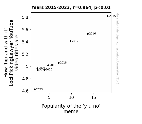
View details about correlation #5,142
LockPickingLawyer's Clickbait Capers and the 'Y U No' Meme: A Hip Connection Analysis
As the 'y u no' meme started to fade, it took with it the very essence of hipness, leaving the LockPickingLawyer feeling oddly less trendy with each video he titled. It seems the meme magic was the key to his coolness all along. Remember, when it comes to internet culture, memes may come and go, but the adept art of lock picking is always on trend!

What else correlates?
How 'hip and with it' LockPickingLawyer YouTube video titles are · all YouTube
Popularity of the 'y u no' meme · all memes
How 'hip and with it' LockPickingLawyer YouTube video titles are · all YouTube
Popularity of the 'y u no' meme · all memes


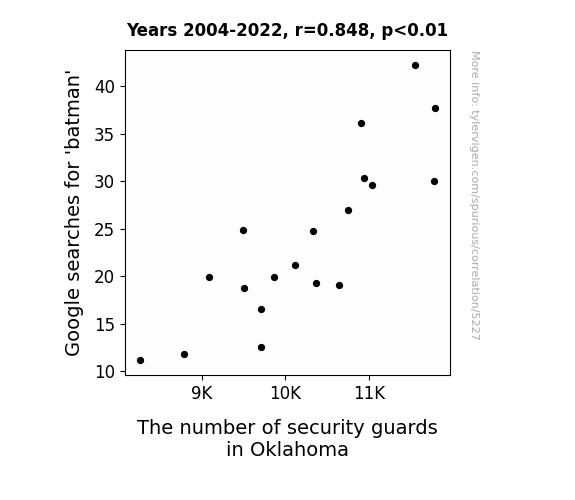
View details about correlation #5,227
The Dark Knight Rises: The Bat Signal Effect on Security Staffing in Oklahoma
The increase in Batman searches led to a rise in vigilante activity across Oklahoma, prompting a need for more security to handle the caped crusaders creating chaos. Looks like the dark knight really sparked a guard-ing presence in the state.

What else correlates?
Google searches for 'batman' · all google searches
The number of security guards in Oklahoma · all cccupations
Google searches for 'batman' · all google searches
The number of security guards in Oklahoma · all cccupations


View details about correlation #2,596
The Wheezy Woes of Tristen: A Statistical Analysis of the Link between Tristen's Popularity and Asthma Attacks in American Children
Fewer Tristens meant less air was being taken up by dramatic sighs, thereby reducing the overall respiratory distress in the country.


What else correlates?
Popularity of the first name Tristen · all first names
Asthma attacks in American children · all weird & wacky
Popularity of the first name Tristen · all first names
Asthma attacks in American children · all weird & wacky


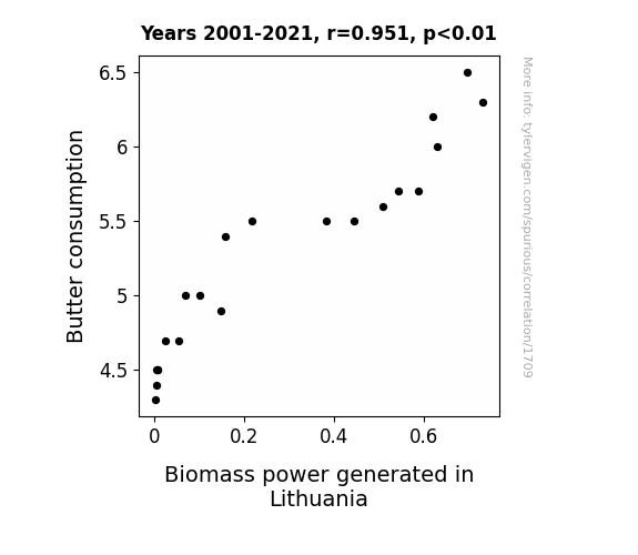
View details about correlation #1,709
Spreading Power: Uncovering the Butterly Connection Between Butter Consumption and Biomass Power Generation in Lithuania
The extra butter intake led to an increase in flatulence, creating more methane for biomass power generation in Lithuania. Looks like butter really is the greener spread!

What else correlates?
Butter consumption · all food
Biomass power generated in Lithuania · all energy
Butter consumption · all food
Biomass power generated in Lithuania · all energy


View details about correlation #2,401
The Big Score: Analyzing the Reel Connection Between Steinfeld Cup Final Teams and Box Office Booms
As the difference in score decreased, fans of the losing team were feeling more down, leading to a decrease in overall enthusiasm. This disparity in team performance really affected the box office, creating a net loss in ticket sales for the top movie of the year. We can say it really threw a 'fowl' on the whole movie-going experience.


View details about correlation #5,895
The (Non) Noble Nexus: Navigating the Nexus between Google Searches for 'Matt Levine' and The Number of college administrators in Ohio
As more people delved into the world of finance through Matt Levine's writings, they were inspired to apply their newfound knowledge in unexpected ways. This led to a surge in individuals creating their own financial theories, prompting colleges in Ohio to hire additional administrators to review and integrate these unconventional ideas into their academic programs. It's a case of Matt-ematical expansion in the education sector!


What else correlates?
Google searches for 'matt levine' · all google searches
The number of college administrators in Ohio · all cccupations
Google searches for 'matt levine' · all google searches
The number of college administrators in Ohio · all cccupations


View details about correlation #4,241
The Sarah Effect: Surprising Association of Sarah's Popularity and Sizable Amazonian Arboreal Attendance
As the popularity of the name Sarah waned, so too did the number of Sarahaus trees, a rare and beloved species found only in the Brazilian Amazon. Local legend has it that these trees whispered the name "Sarah" every time a woodcutter approached, leading to a swift and unintentional protection of the remaining forest cover. Remember, every time a Sarah loses its 'h', a Sarahaus tree loses its leaves!


What else correlates?
Popularity of the first name Sarah · all first names
Remaining Forest Cover in the Brazilian Amazon · all weird & wacky
Popularity of the first name Sarah · all first names
Remaining Forest Cover in the Brazilian Amazon · all weird & wacky


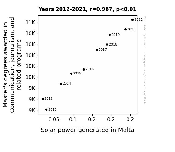
View details about correlation #1,874
Shine a Light on the Connection: Master's Degrees in Communication, journalism, and related programs and Solar Power Generation in Malta
As more people mastered the art of communication, they were able to convince the sun to shine brighter and longer specifically on Malta. It turns out, the real power of journalism and communication lies in influencing celestial bodies!

What else correlates?
Master's degrees awarded in journalism · all education
Solar power generated in Malta · all energy
Master's degrees awarded in journalism · all education
Solar power generated in Malta · all energy
. The chart goes from 2002 to 2023, and the two variables track closely in value over that time.")

View details about correlation #2,697
Amaizeing Connections: Analyzing the GMO Effect on Corn and Its Impact on Enbridge's Stock Price
As the GMO corn in Michigan proliferated, it developed a secret ability to emit tiny amounts of positive energy, inadvertently boosting the stock price of Enbridge. It seems their corny connection led to a-maize-ing results for the stock market! Corn-gratulations, GMOs!


What else correlates?
GMO use in corn grown in Michigan · all food
Enbridge's stock price (ENB) · all stocks
GMO use in corn grown in Michigan · all food
Enbridge's stock price (ENB) · all stocks


View details about correlation #2,285
The Magic of Public Transit: Conjuring the Connection Between Transit Police Numbers in Texas and Google Searches for 'how to do magic'
Without transit police around, there were fewer people to saw in half during their magic acts, leading to a decline in interest in magic tricks and illusions. Guess the real disappearing act is the interest in magic!
What else correlates?
The number of transit police in Texas · all cccupations
Google searches for 'how to do magic' · all google searches
The number of transit police in Texas · all cccupations
Google searches for 'how to do magic' · all google searches


View details about correlation #1,622
Smell in the Air: Exploring the Fertilizing Effects of Dried Manure on Customer Satisfaction with Target
As the dried manure supply dwindled, farmers had to get creative with their fertilizer choices. This led to an increase in the use of unconventional fertilizers, ultimately affecting the aroma around Target stores. In other words, as the manure decreased, so did the 'manure-ity' of the shopping experience at Target. This correlation stinks!


What else correlates?
Dried manure used for fertilizer in the US · all weird & wacky
Customer satisfaction with Target · all weird & wacky
Dried manure used for fertilizer in the US · all weird & wacky
Customer satisfaction with Target · all weird & wacky


View details about correlation #2,724
Dewey Decimals and Dingers: Exploring the Relationship Between Library Science Bachelor's Degrees and Oakland Athletics Ticket Sales
As the number of library science graduates rises, so does the world's appreciation for organization and categorization. This heightened sense of order subtly influences baseball fans, leading to a greater desire to see the players neatly 'cataloged' on the field. It's like the Dewey Decimal System of entertainment - everyone just wants to 'check out' a game! Plus, with their finely honed research skills, these grads may have uncovered the hidden 'book' on how to win at baseball, making the Athletics games a hot ticket!


What else correlates?
Bachelor's degrees awarded in Library science · all education
Ticket sales for Oakland Athletics games · all sports
Bachelor's degrees awarded in Library science · all education
Ticket sales for Oakland Athletics games · all sports
Why this works
- Data dredging: I have 25,237 variables in my database. I compare all these variables against each other to find ones that randomly match up. That's 636,906,169 correlation calculations! This is called “data dredging.”
Fun fact: the chart used on the wikipedia page to demonstrate data dredging is also from me. I've been being naughty with data since 2014.
Instead of starting with a hypothesis and testing it, I instead tossed a bunch of data in a blender to see what correlations would shake out. It’s a dangerous way to go about analysis, because any sufficiently large dataset will yield strong correlations completely at random. - Lack of causal connection: There is probably no direct connection between these variables, despite what the AI says above.
Because these pages are automatically generated, it's possible that the two variables you are viewing are in fact causually related. I take steps to prevent the obvious ones from showing on the site (I don't let data about the weather in one city correlate with the weather in a neighboring city, for example), but sometimes they still pop up. If they are related, cool! You found a loophole.
This is exacerbated by the fact that I used "Years" as the base variable. Lots of things happen in a year that are not related to each other! Most studies would use something like "one person" in stead of "one year" to be the "thing" studied. - Observations not independent: For many variables, sequential years are not independent of each other. You will often see trend-lines form. If a population of people is continuously doing something every day, there is no reason to think they would suddenly change how they are doing that thing on January 1. A naive p-value calculation does not take this into account.
You will calculate a lower chance of "randomly" achieving the result than represents reality.
To be more specific: p-value tests are probability values, where you are calculating the probability of achieving a result at least as extreme as you found completely by chance. When calculating a p-value, you need to assert how many "degrees of freedom" your variable has. I count each year (minus one) as a "degree of freedom," but this is misleading for continuous variables.
This kind of thing can creep up on you pretty easily when using p-values, which is why it's best to take it as "one of many" inputs that help you assess the results of your analysis.
- Y-axes doesn't start at zero: I truncated the Y-axes of the graphs above. I also used a line graph, which makes the visual connection stand out more than it deserves.
Nothing against line graphs. They are great at telling a story when you have linear data! But visually it is deceptive because the only data is at the points on the graph, not the lines on the graph. In between each point, the data could have been doing anything. Like going for a random walk by itself!
Mathematically what I showed is true, but it is intentionally misleading. If you click on any of the charts that abuse this, you can scroll down to see a version that starts at zero. - Confounding variable: Confounding variables (like global pandemics) will cause two variables to look connected when in fact a "sneaky third" variable is influencing both of them behind the scenes.
- Outliers: Some datasets here have outliers which drag up the correlation.
In concept, "outlier" just means "way different than the rest of your dataset." When calculating a correlation like this, they are particularly impactful because a single outlier can substantially increase your correlation.
Because this page is automatically generated, I don't know whether any of the charts displayed on it have outliers. I'm just a footnote. ¯\_(ツ)_/¯
I intentionally mishandeled outliers, which makes the correlation look extra strong. - Low n: There are not many data points included in some of these charts.
You can do analyses with low ns! But you shouldn't data dredge with a low n.
Even if the p-value is high, we should be suspicious of using so few datapoints in a correlation.
Pro-tip: click on any correlation to see:
- Detailed data sources
- Prompts for the AI-generated content
- Explanations of each of the calculations (correlation, p-value)
- Python code to calculate it yourself


