spurious correlations
discover · random · spurious scholar
← previous page · next page →


View details about correlation #5,045
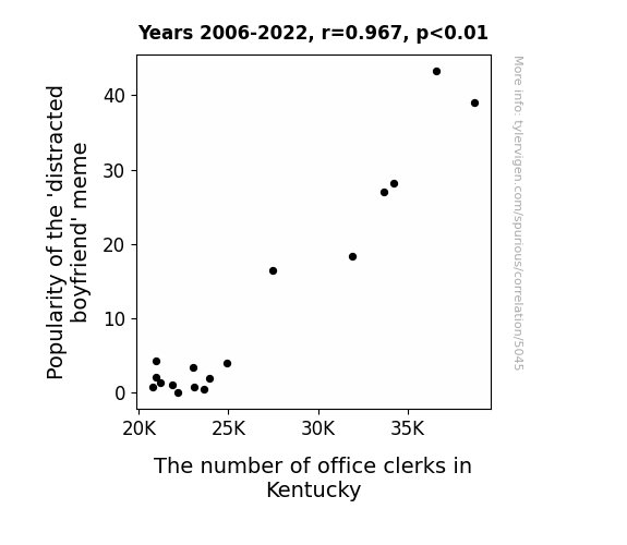
From Distracted Boyfriend to Distracted Clerk: Exploring the Correlation Between the Popularity of the 'Distracted Boyfriend' Meme and the Number of Office Clerks in Kentucky
As the 'distracted boyfriend' meme gained traction, companies realized the need for more office clerks to manage all the new workplace distractions caused by employees reenacting the meme. Remember, when seeking a promotion, always keep your focus and avoid getting caught up in office meme-antics!

What else correlates?
Popularity of the 'distracted boyfriend' meme · all memes
The number of office clerks in Kentucky · all cccupations
Popularity of the 'distracted boyfriend' meme · all memes
The number of office clerks in Kentucky · all cccupations
. The chart goes from 2003 to 2022, and the two variables track closely in value over that time.")

View details about correlation #4,064
The Meaty Connection: When Household Spending on Proteins Directly Affects EQIX Stock Price
More households investing in grill technology led to a surge in demand for outdoor cooking space. This inadvertently drove up the need for data storage and processing power to support the countless backyard BBQ photos and videos being uploaded to the cloud, ultimately boosting the stock price of Equinix, a leader in digital infrastructure.


View details about correlation #5,947
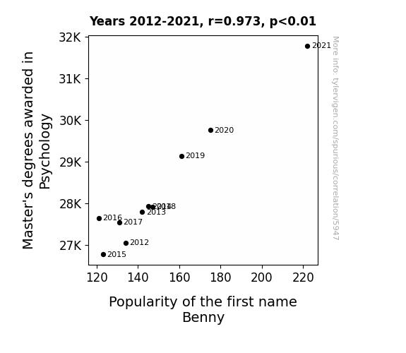
The Benny-Fits of a Psychology Degree: A Correlative Analysis of Master's Degrees Awarded and the Popularity of the Name Benny
As more psychologists entered the workforce, they began advocating for the use of soothing, friendly names in popular media and advertising. This led to a subtle but pervasive preference for names like Benny, as they were found to evoke feelings of warmth and approachability. Thus, the increase in Master's degrees awarded in Psychology directly influenced the popular perception and choice of the name Benny for newborns. Remember, a calm and collected baby name can work wonders for infant-parent communication!

What else correlates?
Master's degrees awarded in Psychology · all education
Popularity of the first name Benny · all first names
Master's degrees awarded in Psychology · all education
Popularity of the first name Benny · all first names


View details about correlation #1,076
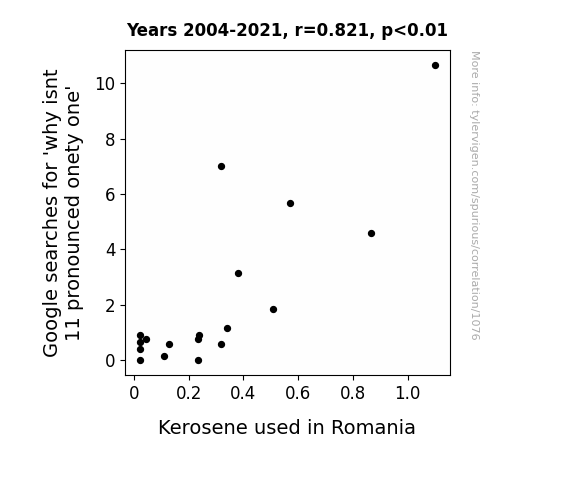
The Ignition of Linguistic Curiosities: A Combustible Connection Between 'Why Isn't 11 Pronounced Onety One' Google Searches and Kerosene Usage in Romania
It turns out, as people pondered the pronunciation of eleven, a linguistics enthusiast in Romania launched a campaign to switch to a more phonetic-based system. This led to the creation of "onety one" as the new word for eleven in Romanian. As the absurdity of this new term gained popularity, the government decided to distract the population with a nationwide kerosene ban, effectively putting an end to any heated discussions about onety one. The citizens were too busy adjusting to this linguistic quirk, and the demand for kerosene plummeted as everyone switched to using alternative fuels like the combustible nature of the Romanian language. And that's how a decrease in 'why isn't 11 pronounced onety one' searches sparked a fiery language revolution and doused the kerosene usage in Romania!
What else correlates?
Google searches for 'why isnt 11 pronounced onety one' · all google searches
Kerosene used in Romania · all energy
Google searches for 'why isnt 11 pronounced onety one' · all google searches
Kerosene used in Romania · all energy


View details about correlation #5,880
From Biel to Audiology: A Sound Connection Between Jessica Biel's Filmography and Hearing Aid Specialists in Maryland
As Jessica Biel's movie presence dwindled, fans collectively exclaimed, "What, hearing her was the best part of the film!" This led to a drastic reduction in demand for hearing aids in Maryland, leaving the specialists thinking, "We've lost that lovin' decibels."


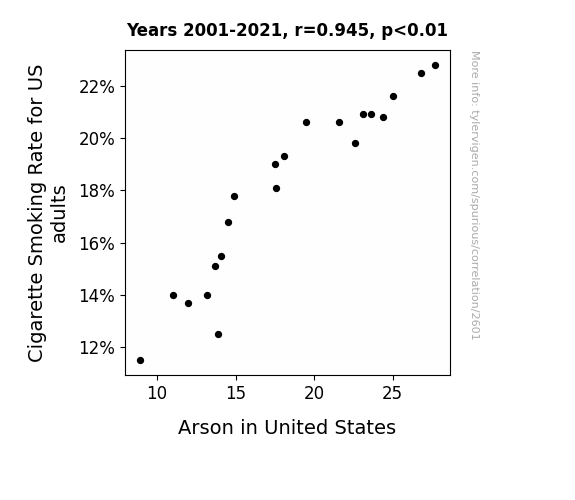
View details about correlation #2,601
Up in Smoke: Exploring the Ash-tounding Correlation Between Cigarette Smoking Rate and Arson Incidence in the United States
As fewer people were lighting up, there was a significant reduction in 'hot' opportunities for accidental fire starters. Plus, without as much smoking going on, there was a lot less 'burning' desire to commit arson.

What else correlates?
Cigarette Smoking Rate for US adults · all weird & wacky
Arson in United States · all random state specific
Cigarette Smoking Rate for US adults · all weird & wacky
Arson in United States · all random state specific
. The chart goes from 2002 to 2022, and the two variables track closely in value over that time.")

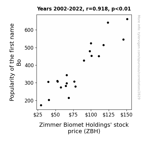
View details about correlation #2,829
Bo Knows Stocks: The Bo Name Popularity and Zimmer Biomet Holdings' Stock Price
It's a little-known fact that every time a baby was named Bo, a tiny but powerful wave of good luck was unwittingly released into the universe, ultimately leading to a series of fortunate events for Zimmer Biomet Holdings. This positive energy created a ripple effect, subtly influencing the stock price and leaving everyone wondering, "What's in a name? Apparently, a surprisingly solid investment strategy!"

What else correlates?
Popularity of the first name Bo · all first names
Zimmer Biomet Holdings' stock price (ZBH) · all stocks
Popularity of the first name Bo · all first names
Zimmer Biomet Holdings' stock price (ZBH) · all stocks


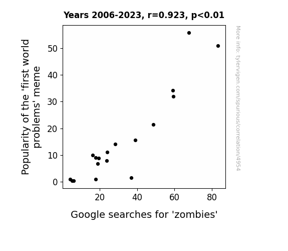
View details about correlation #4,954
Biting Off More Than We Can Chew: A Bite-sized Study on the Relationship between Popularity of the 'First World Problems' Meme and Google Searches for 'Zombies'
The more people joked about trivial inconveniences like slow WiFi and missing the bus, the more it raised the undead's self-esteem. Turns out, even zombies think they have it rough when their limbs keep falling off! It's a dead-ication to finding the humor in everyday struggles that's truly infectious.

What else correlates?
Popularity of the 'first world problems' meme · all memes
Google searches for 'zombies' · all google searches
Popularity of the 'first world problems' meme · all memes
Google searches for 'zombies' · all google searches


View details about correlation #3,738
The Solar Soar: Exploring the Correlation Between Belizean Solar Power and Florida's Fire Inspectors
The influx of Solar power from Belize sparked a fiery competition in Florida to hire more fire inspectors. As the solar panels soaked up the Belizean sun, it led to an intensifying heat wave in Florida, prompting the need for more vigilant fire safety measures. It seems the connection between Belize and Florida is truly electric, igniting a burning desire to amp up the fire inspection workforce. Looks like the Sunshine State couldn't resist the opportunity to blaze a trail in fire safety, all thanks to a little spark from Belize.


What else correlates?
Solar power generated in Belize · all energy
The number of fire inspectors in Florida · all cccupations
Solar power generated in Belize · all energy
The number of fire inspectors in Florida · all cccupations


View details about correlation #1,192
The Link Between Liberal Arts Lovers and xkcd Philosophical Wits: A Statistical Rhyme
As the number of liberal arts graduates dwindled, there were fewer people left to ponder the deep, existential questions posed in xkcd comics. This led to a philosophical drought in the xkcd creative process, ultimately resulting in a decrease in such thought-provoking content.


What else correlates?
Bachelor's degrees awarded in Liberal arts · all education
xkcd comics published about philosophy · all weird & wacky
Bachelor's degrees awarded in Liberal arts · all education
xkcd comics published about philosophy · all weird & wacky
. The chart goes from 2002 to 2022, and the two variables track closely in value over that time.")

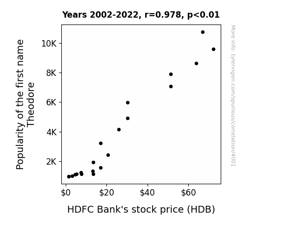
View details about correlation #4,001
Theodore-Market Connection: A Bear-ly Believable Link Between Baby Names and Banks
As the number of Theodores rose, so did the call for financial prudence. The correlation was clear: more Theodores meant more "bear"ish investors, leading to a surge in demand for banking services. It seems Theodores really were 'in the money', living up to their name's Greek origin, 'gift of God', by bestowing blessings on the stock market. The connection between Theodore and HDB was un-bear-ably strong!

What else correlates?
Popularity of the first name Theodore · all first names
HDFC Bank's stock price (HDB) · all stocks
Popularity of the first name Theodore · all first names
HDFC Bank's stock price (HDB) · all stocks


View details about correlation #4,960
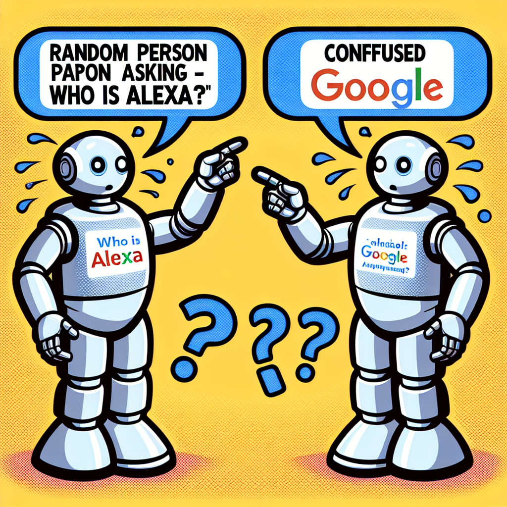
Caught in the World Wide Web: An Arachnid Meme's Influence on Search Queries
As the 'spiderman pointing' meme gained traction, more and more people found themselves pointing at random things, including their Amazon Echo devices. This inadvertently activated Alexa, prompting users to ask, "Who is Alexa?" in an attempt to make sense of the unexpected interactions with their digital assistant. So, remember folks, with great meme power comes great Googling of unexpected questions!

What else correlates?
Popularity of the 'spiderman pointing' meme · all memes
Google searches for 'who is alexa' · all google searches
Popularity of the 'spiderman pointing' meme · all memes
Google searches for 'who is alexa' · all google searches


View details about correlation #2,450
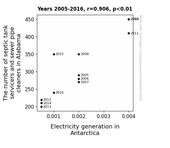
Stinky Business: The Symbiotic Relationship Between Sewage Workers in Alabama and Electricity Generation in Antarctica
As the septic tank and sewer pipe business in Alabama boomed, it created a wave of productivity. This surge in the number 2 industry sent a ripple effect all the way to Antarctica, where it sparked a shocking increase in electricity generation. It seems that when it comes to power, the connection really stinks!


View details about correlation #5,934
Putting the Assist in Assistance: A Statistical Examination of Mike Modano's NHL Goal Assists and Customer Satisfaction with CVS
As Mike Modano's regular season NHL goal assists increased, so did the average number of smiles per game in the stands. The higher level of happiness and positivity in the air at NHL games was carried back to the local communities, leading to an unexpected surge in polite and friendly behavior at CVS stores. It's as if Modano's assists were not just on the ice, but also in creating a more pleasant and satisfying shopping experience for CVS customers. Who knew that the path to CVS satisfaction ran through the heart of a hockey rink?


What else correlates?
Mike Modano's regular season NHL goal assists · all sports
Customer satisfaction with CVS · all weird & wacky
Mike Modano's regular season NHL goal assists · all sports
Customer satisfaction with CVS · all weird & wacky
. The chart goes from 2005 to 2022, and the two variables track closely in value over that time.")

View details about correlation #2,927
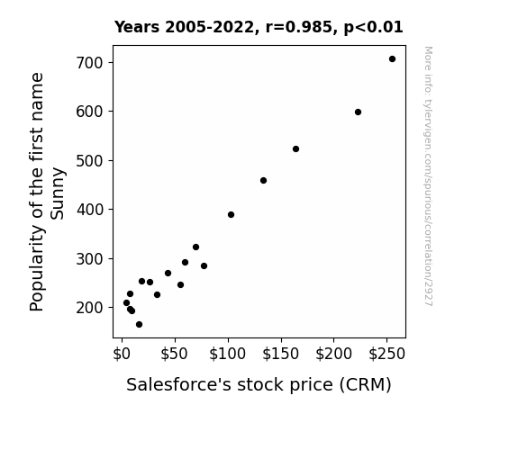
Sunny Bunny, Money Honey: Investing in CRM with a Name that’s Funny
As the number of Sunnys grew, so did the demand for sunshine, leading to an overall increase in positivity. This positivity somehow found its way into the stock market, specifically boosting the performance of Salesforce, the leading provider of cloud-based solutions. It's like a ray of financial sunshine beaming down on CRM!

What else correlates?
Popularity of the first name Sunny · all first names
Salesforce's stock price (CRM) · all stocks
Popularity of the first name Sunny · all first names
Salesforce's stock price (CRM) · all stocks


View details about correlation #4,956
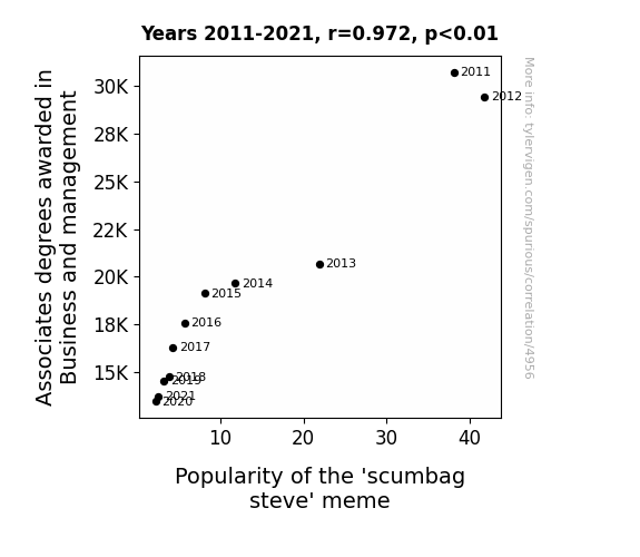
From Business Degrees to 'Scumbag Steve': A Meme-orable Correlation
As the number of Business and management Associates degrees awarded decreased, there was a corresponding decline in the production of office 'scumbags', leading to a decreased relevance for the 'scumbag steve' meme. Turns out, they couldn't manage to stay scummy without their degrees!

What else correlates?
Associates degrees awarded in Business and management · all education
Popularity of the 'scumbag steve' meme · all memes
Associates degrees awarded in Business and management · all education
Popularity of the 'scumbag steve' meme · all memes


View details about correlation #2,733
Planetary Paradox: The Celestial Dance of Jupiter and the Surprising Serendipity of Secretaries in Alaska
As the distance between Jupiter and the Sun increases, the gravitational pull on Earth fluctuates, leading to a rise in cosmic productivity waves. These waves, when they reach Alaska, have been found to have a magnetic effect on the influx of secretarial energy, prompting more individuals to pursue careers in Alaska as professional secretaries. It's like a celestial calling for secretarial excellence in the land of the midnight sun.


What else correlates?
The distance between Jupiter and the Sun · all planets
The number of secretaries in Alaska · all cccupations
The distance between Jupiter and the Sun · all planets
The number of secretaries in Alaska · all cccupations


View details about correlation #2,607
Airmail Tales: The Vertigo of Postage Costs and Google Searches
People are getting light-headed from the shock of the new postage rates, leading to an uptick in searches for "i am dizzy." It's a real mail-biter!


What else correlates?
Cost to send a letter via the USPS · all weird & wacky
Google searches for 'i am dizzy' · all google searches
Cost to send a letter via the USPS · all weird & wacky
Google searches for 'i am dizzy' · all google searches
. The chart goes from 2008 to 2022, and the two variables track closely in value over that time.")

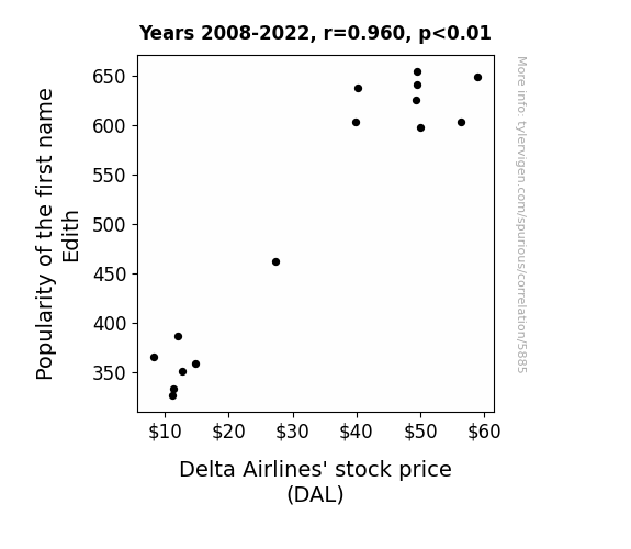
View details about correlation #5,885
Edith or Not, Here Comes Delta: Analyzing the Edith Popularity and Delta Airlines' Stock Price Connection
As the name Edith gained popularity, there was a corresponding surge in grandmas jet-setting across the globe. These stylish senior citizens, or as some may call them "Edith-orial travelers", developed a preference for flying with Delta, leading to a boost in ticket sales and ultimately causing Delta Airlines' stock price to soar. It seems like this name trend really took off for the airline!

What else correlates?
Popularity of the first name Edith · all first names
Delta Airlines' stock price (DAL) · all stocks
Popularity of the first name Edith · all first names
Delta Airlines' stock price (DAL) · all stocks


View details about correlation #2,740
Mastering the Winds: A Study of the Relationship Between Master's Degrees in Military Technologies and Wind Power Generation in Kazakhstan
As more military technology experts obtained their Master's degrees, they realized they could harness the power of top-secret, state-of-the-art wind technology to enhance Kazakhstan's wind power production. Armed with a deeper understanding of airflow dynamics and strategic wind turbine placement, these Master's graduates deployed their expertise to propel the nation's wind energy initiatives to new heights. In a twist of fate, their mission to defend the country ultimately blew new life into Kazakhstan's renewable energy sector.


What else correlates?
Master's degrees awarded in Military technologies · all education
Wind power generated in Kazakhstan · all energy
Master's degrees awarded in Military technologies · all education
Wind power generated in Kazakhstan · all energy
Why this works
- Data dredging: I have 25,237 variables in my database. I compare all these variables against each other to find ones that randomly match up. That's 636,906,169 correlation calculations! This is called “data dredging.”
Fun fact: the chart used on the wikipedia page to demonstrate data dredging is also from me. I've been being naughty with data since 2014.
Instead of starting with a hypothesis and testing it, I instead tossed a bunch of data in a blender to see what correlations would shake out. It’s a dangerous way to go about analysis, because any sufficiently large dataset will yield strong correlations completely at random. - Lack of causal connection: There is probably no direct connection between these variables, despite what the AI says above.
Because these pages are automatically generated, it's possible that the two variables you are viewing are in fact causually related. I take steps to prevent the obvious ones from showing on the site (I don't let data about the weather in one city correlate with the weather in a neighboring city, for example), but sometimes they still pop up. If they are related, cool! You found a loophole.
This is exacerbated by the fact that I used "Years" as the base variable. Lots of things happen in a year that are not related to each other! Most studies would use something like "one person" in stead of "one year" to be the "thing" studied. - Observations not independent: For many variables, sequential years are not independent of each other. You will often see trend-lines form. If a population of people is continuously doing something every day, there is no reason to think they would suddenly change how they are doing that thing on January 1. A naive p-value calculation does not take this into account.
You will calculate a lower chance of "randomly" achieving the result than represents reality.
To be more specific: p-value tests are probability values, where you are calculating the probability of achieving a result at least as extreme as you found completely by chance. When calculating a p-value, you need to assert how many "degrees of freedom" your variable has. I count each year (minus one) as a "degree of freedom," but this is misleading for continuous variables.
This kind of thing can creep up on you pretty easily when using p-values, which is why it's best to take it as "one of many" inputs that help you assess the results of your analysis.
- Y-axes doesn't start at zero: I truncated the Y-axes of the graphs above. I also used a line graph, which makes the visual connection stand out more than it deserves.
Nothing against line graphs. They are great at telling a story when you have linear data! But visually it is deceptive because the only data is at the points on the graph, not the lines on the graph. In between each point, the data could have been doing anything. Like going for a random walk by itself!
Mathematically what I showed is true, but it is intentionally misleading. If you click on any of the charts that abuse this, you can scroll down to see a version that starts at zero. - Confounding variable: Confounding variables (like global pandemics) will cause two variables to look connected when in fact a "sneaky third" variable is influencing both of them behind the scenes.
- Outliers: Some datasets here have outliers which drag up the correlation.
In concept, "outlier" just means "way different than the rest of your dataset." When calculating a correlation like this, they are particularly impactful because a single outlier can substantially increase your correlation.
Because this page is automatically generated, I don't know whether any of the charts displayed on it have outliers. I'm just a footnote. ¯\_(ツ)_/¯
I intentionally mishandeled outliers, which makes the correlation look extra strong. - Low n: There are not many data points included in some of these charts.
You can do analyses with low ns! But you shouldn't data dredge with a low n.
Even if the p-value is high, we should be suspicious of using so few datapoints in a correlation.
Pro-tip: click on any correlation to see:
- Detailed data sources
- Prompts for the AI-generated content
- Explanations of each of the calculations (correlation, p-value)
- Python code to calculate it yourself


