spurious correlations
discover · random · spurious scholar
← previous page · next page →


View details about correlation #2,675
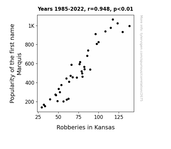
Marquis of Crime: The Correlation Between the Name Marquis and Robberies in Kansas
Fewer Marquises meant fewer people to say "Let's go to Kansas and steal the show!"
What else correlates?
Popularity of the first name Marquis · all first names
Robberies in Kansas · all random state specific
Popularity of the first name Marquis · all first names
Robberies in Kansas · all random state specific


View details about correlation #3,443
Pouring More Bucks on Booze: The Boozy Blues and Septic Tank Crews
As household spending on alcoholic beverages increased, more people experienced a pressing need for the services of septic tank servicers and sewer pipe cleaners in New Hampshire. Remember, when it rains, it pours – especially for those in the septic tank industry!


View details about correlation #5,825
Shake It Off: Unearthing the Correlation between Taylor Swift Searches and Fossil Fuel Usage in British Virgin Islands
As Taylor Swift's music and drama captivated the residents of British Virgin Islands, they found themselves embroiled in a whirlwind of emotions. In an attempt to power through the heartbreaks and shake off the bad vibes, they impulsively cranked up their air conditioners, leading to a surge in fossil fuel use. It seems that in this island paradise, Taylor's chart-topping hits inadvertently became the soundtrack to unsustainable energy consumption.


What else correlates?
Google searches for 'Taylor Swift' · all google searches
Fossil fuel use in British Virgin Islands · all energy
Google searches for 'Taylor Swift' · all google searches
Fossil fuel use in British Virgin Islands · all energy


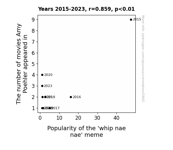
View details about correlation #5,865
Whip it Good: The Amy Poehler Effect on the 'Whip Nae Nae' Meme Phenomenon
As the number of movies Amy Poehler appeared in decreased, there were less Leslie Knope-inspired dance moves to go around. This led to a shortage in quirky, yet endearing dance materials, ultimately causing a decline in the popularity of the 'whip nae nae' meme.

What else correlates?
The number of movies Amy Poehler appeared in · all films & actors
Popularity of the 'whip nae nae' meme · all memes
The number of movies Amy Poehler appeared in · all films & actors
Popularity of the 'whip nae nae' meme · all memes


View details about correlation #2,498
The White Robbery: Unraveling the Correlation Between the Popularity of the Name Blanca and Robberies in Texas
As the popularity of the name Blanca decreased, there were fewer people named Blanca in Texas. This led to a significant decline in the formation of all-female heist crews, who were notorious for their daring Texas bank robberies. With fewer Blanca's participating, the overall violent crime rate in Texas naturally saw a decrease.


What else correlates?
Popularity of the first name Blanca · all first names
Robberies in Texas · all random state specific
Popularity of the first name Blanca · all first names
Robberies in Texas · all random state specific
. The chart goes from 2008 to 2022, and the two variables track closely in value over that time.")

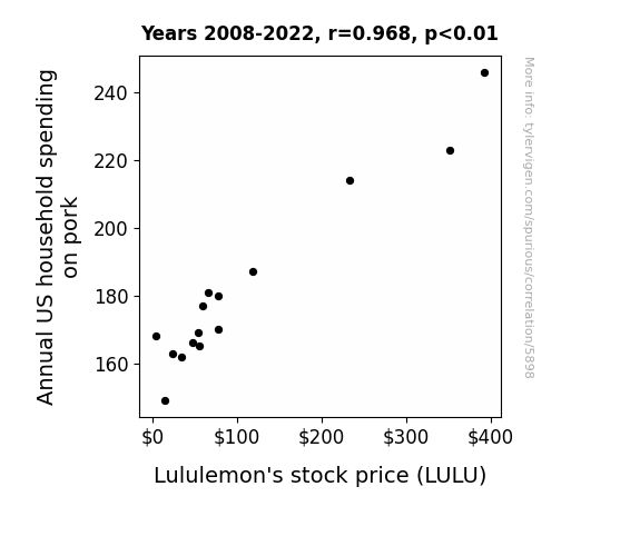
View details about correlation #5,898
Pigging Out: The Swine Connection between Pork Spending and Lululemon Stock Price
As pork consumption rose, so did the demand for stretchy pants with forgiving waistbands, leading to higher profits for Lululemon. It's a classic case of bringing home the bacon and then needing pants with extra give!

What else correlates?
Annual US household spending on pork · all weird & wacky
Lululemon's stock price (LULU) · all stocks
Annual US household spending on pork · all weird & wacky
Lululemon's stock price (LULU) · all stocks


View details about correlation #2,965
Avocado Toast Boasts: Associating Science Technicians with Brunch Addicts
As more students studied science technologies, they engineered a way to create perfectly ripe avocados on demand, leading to a surge in avocado toast popularity. It's a toast to technological advancements in brunch cuisine!


View details about correlation #2,732
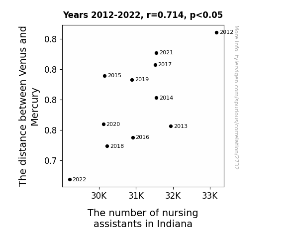
Vexing Venus and Mercurial Metrics: Exploring the Eccentric Relationship Between Planetary Proximity and Nursing Personnel in Indiana
As the distance between Venus and Mercury shrinks, their gravitational pull forms a cosmic vacuum cleaner effect. This inadvertently sucks up the motivation for nursing assistant jobs in Indiana, leading to a decrease in their numbers. It's a case of celestial bodies creating celestial job changes!

What else correlates?
The distance between Venus and Mercury · all planets
The number of nursing assistants in Indiana · all cccupations
The distance between Venus and Mercury · all planets
The number of nursing assistants in Indiana · all cccupations


View details about correlation #1,080
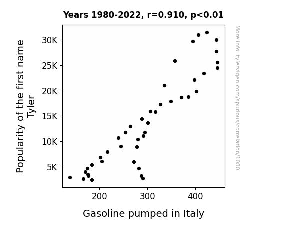
The Pump Factor: Exploring the Tyler-Fueled Relationship Between Name Popularity and Gasoline Consumption in Italy
Perhaps every time someone named Tyler walked by a gas station in Italy, the gas pumps were inexplicably activated by some kind of "Tyler" recognition technology, leading to a surge in gasoline pumped. It's as if the Tylers had some secret power to fuel the Italian gas industry, quite literally. It's a name-based enigma that has left both statisticians and gas station attendants scratching their heads in bewilderment!

What else correlates?
Popularity of the first name Tyler · all first names
Gasoline pumped in Italy · all energy
Popularity of the first name Tyler · all first names
Gasoline pumped in Italy · all energy
. The chart goes from 2002 to 2022, and the two variables track closely in value over that time.")

View details about correlation #2,009
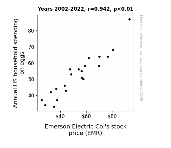
Eggs-travagant Expenses: Examining the Amusing Association between Annual US Household Spending on Eggs and Emerson Electric Co.'s Stock Price
As household spending on eggs went up, so did the demand for egg-related products, like egg poachers and omelet pans. This surge in demand made Emerson Electric Co.'s stock crackle and pop on the market, leading to an over-easy rise in their stock price. It seems like the secret to their success was simply eggs-quisite!

What else correlates?
Annual US household spending on eggs · all weird & wacky
Emerson Electric Co.'s stock price (EMR) · all stocks
Annual US household spending on eggs · all weird & wacky
Emerson Electric Co.'s stock price (EMR) · all stocks


View details about correlation #1,402
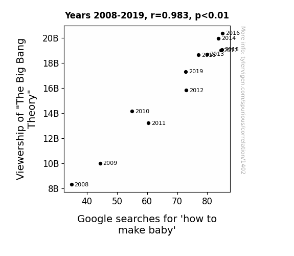
The Big Bang Theory: A Procreative Catalyst? An Examination of the Relationship between Viewership of a Pop Culture Phenomenon and Online Searches for Baby-Making Techniques
As more people tuned in to watch The Big Bang Theory, they couldn't help but be influenced by all the talk of theoretical physics and geeky romance. With all that intellectual and romantic stimulation, it's no wonder there was a sudden surge in people trying to figure out the mechanics of baby-making!

What else correlates?
Viewership of "The Big Bang Theory" · all films & actors
Google searches for 'how to make baby' · all google searches
Viewership of "The Big Bang Theory" · all films & actors
Google searches for 'how to make baby' · all google searches


View details about correlation #5,006
The Meme of Educational Popularity: Unraveling the Connection Between Master's Degrees in Education and the 'Overly Attached Girlfriend' Phenomenon
As fewer people became qualified to teach, there was a commensurate decline in the number of individuals exhibiting overly attached behavior towards education, leading to a waning interest in the meme as it no longer resonated with the general population.


What else correlates?
Master's degrees awarded in Education · all education
Popularity of the 'overly attached girlfriend' meme · all memes
Master's degrees awarded in Education · all education
Popularity of the 'overly attached girlfriend' meme · all memes


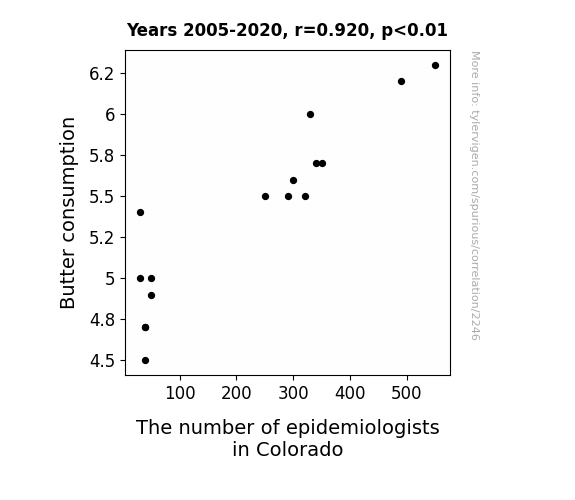
View details about correlation #2,246
The Butter Effect: A Statistical Analysis of Butter Consumption and the Proportion of Epidemiologists in Colorado
As butter consumption in Colorado increased, so did the demand for larger sample sizes in epidemiological studies. This led to a surge in funding for public health research, prompting a migration of epidemiologists to the state, lured by the opportunity to conduct margarineally significant studies and spread their knowledge like, well, butter.

What else correlates?
Butter consumption · all food
The number of epidemiologists in Colorado · all cccupations
Butter consumption · all food
The number of epidemiologists in Colorado · all cccupations


View details about correlation #2,599
The Air Bag Flair and the Name Affair: Exploring the Correlation Between Killian and Recalls
As more babies were named Killian, the collective toddler energy apparently disrupted the delicate air bag sensors. It's a little-known phenomenon called 'infantile air bag agitation syndrome.' The automotive industry has a new challenge to address - designing baby-proof air bag systems. It's a real conundrum - how to keep up with the changing demographics of car passengers. But rest assured, car manufacturers are taking a hands-on approach to this unexpected correlation.


What else correlates?
Popularity of the first name Killian · all first names
Automotive recalls for issues with the Air Bags · all weird & wacky
Popularity of the first name Killian · all first names
Automotive recalls for issues with the Air Bags · all weird & wacky


View details about correlation #5,924
SnowWay! The Chilling Influence of OverSimplified YouTube Video Titles on Snowfall in Chicago
As the snow piles up, so does our understanding of history, thanks to these chill-inducing video titles. It's like each flake brings a new perspective, coating our brains in a fresh layer of knowledge. Clearing the way for some seriously enlightening content, this winter wonderland is definitely not flaking out when it comes to sparking curiosity. So, grab a blanket, cozy up, and get ready to have your mind snowverhauled with these insightful Oversimplified video titles. Remember, when it comes to learning, the forecast calls for a blizzard of brilliance! Stay toasty, stay curious, and let it snow, let it Oversimplify!


What else correlates?
How insightful OverSimplified YouTube video titles are · all YouTube
Snowfall in Chicago · all weather
How insightful OverSimplified YouTube video titles are · all YouTube
Snowfall in Chicago · all weather
. The chart goes from 2004 to 2023, and the two variables track closely in value over that time.")

View details about correlation #1,104
Fizzing Up the Search: The Curious Case of 'Who is J.K. Rowling' and Coca-Cola Stock Prices
More people learning about the author of the Harry Potter series led to a surge in interest and a magical belief in the value of Coke's st-ocks. As the search for literary knowledge Rowling, so did the demand for the classic beverage, causing investors to raise their glasses to Coke's success.


What else correlates?
Google searches for 'who is jk rowling' · all google searches
The Coca-Cola Company's stock price (KO) · all stocks
Google searches for 'who is jk rowling' · all google searches
The Coca-Cola Company's stock price (KO) · all stocks


View details about correlation #2,722
Counting Kids and Calculating Claims: An Examination of the Relationship Between 1st Grade Enrollment and Insurance Adjusters in Illinois
As more and more 1st graders entered public schools, there was a sudden surge in finger painting related insurance claims. This created a demand for additional insurance claims adjusters in Illinois who specialized in assessing the finger painting related damages. The 1st graders were unknowingly crafting a masterpiece of mayhem, leading to a boom in the insurance industry, and a colorful conundrum for the state.


View details about correlation #1,165
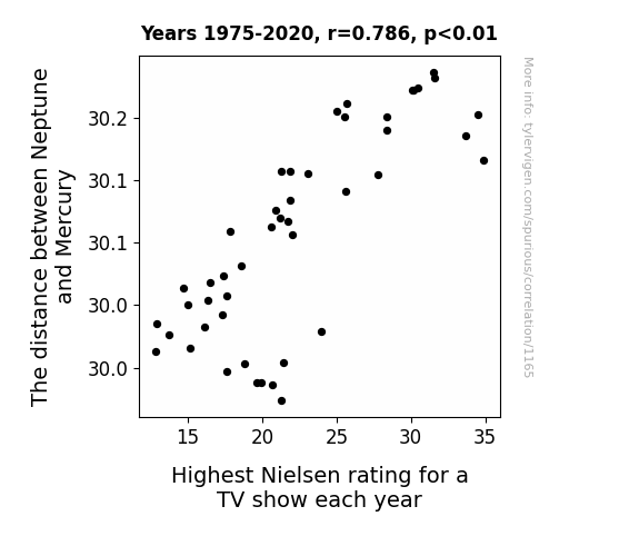
Out of This World Ratings: The Celestial Connection Between Neptune's Distance and Top TV Shows
The gravitational tug-of-war disrupted TV reception, leading to lower ratings as viewers struggled to tune in to their favorite shows. As the planets moved closer, it created celestial interference with the broadcast signals, ultimately affecting the TV ratings on Earth.

What else correlates?
The distance between Neptune and Mercury · all planets
Highest Nielsen rating for a TV show each year · all weird & wacky
The distance between Neptune and Mercury · all planets
Highest Nielsen rating for a TV show each year · all weird & wacky


View details about correlation #2,794
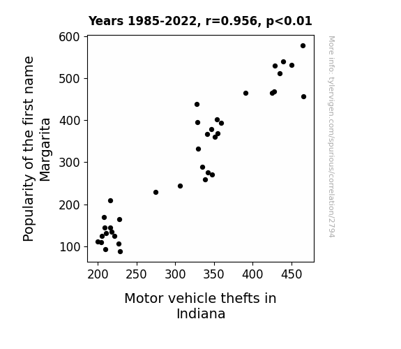
On the Rocks: The Margarita Name's Connection to Motor Vehicle Thefts in Indiana
Fewer Margaritas, fewer car troubles. With less Margarita in the mix, it seems the thieves couldn't find the right recipe for a successful heist.

What else correlates?
Popularity of the first name Margarita · all first names
Motor vehicle thefts in Indiana · all random state specific
Popularity of the first name Margarita · all first names
Motor vehicle thefts in Indiana · all random state specific


View details about correlation #1,889
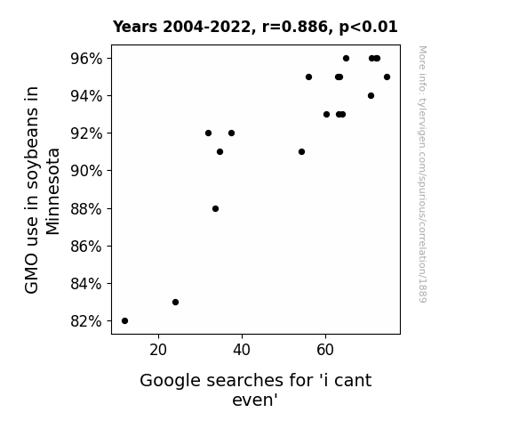
Soy What? Exploring the GMO-ment between Soybeans and 'I Can't Even' Google Searches in Minnesota
The soybeans were so advanced they started expressing existential angst, leading to a wave of soy-inspired ennui that the internet just couldn't handle.

What else correlates?
GMO use in soybeans in Minnesota · all food
Google searches for 'i cant even' · all google searches
GMO use in soybeans in Minnesota · all food
Google searches for 'i cant even' · all google searches
Why this works
- Data dredging: I have 25,237 variables in my database. I compare all these variables against each other to find ones that randomly match up. That's 636,906,169 correlation calculations! This is called “data dredging.”
Fun fact: the chart used on the wikipedia page to demonstrate data dredging is also from me. I've been being naughty with data since 2014.
Instead of starting with a hypothesis and testing it, I instead tossed a bunch of data in a blender to see what correlations would shake out. It’s a dangerous way to go about analysis, because any sufficiently large dataset will yield strong correlations completely at random. - Lack of causal connection: There is probably no direct connection between these variables, despite what the AI says above.
Because these pages are automatically generated, it's possible that the two variables you are viewing are in fact causually related. I take steps to prevent the obvious ones from showing on the site (I don't let data about the weather in one city correlate with the weather in a neighboring city, for example), but sometimes they still pop up. If they are related, cool! You found a loophole.
This is exacerbated by the fact that I used "Years" as the base variable. Lots of things happen in a year that are not related to each other! Most studies would use something like "one person" in stead of "one year" to be the "thing" studied. - Observations not independent: For many variables, sequential years are not independent of each other. You will often see trend-lines form. If a population of people is continuously doing something every day, there is no reason to think they would suddenly change how they are doing that thing on January 1. A naive p-value calculation does not take this into account.
You will calculate a lower chance of "randomly" achieving the result than represents reality.
To be more specific: p-value tests are probability values, where you are calculating the probability of achieving a result at least as extreme as you found completely by chance. When calculating a p-value, you need to assert how many "degrees of freedom" your variable has. I count each year (minus one) as a "degree of freedom," but this is misleading for continuous variables.
This kind of thing can creep up on you pretty easily when using p-values, which is why it's best to take it as "one of many" inputs that help you assess the results of your analysis.
- Y-axes doesn't start at zero: I truncated the Y-axes of the graphs above. I also used a line graph, which makes the visual connection stand out more than it deserves.
Nothing against line graphs. They are great at telling a story when you have linear data! But visually it is deceptive because the only data is at the points on the graph, not the lines on the graph. In between each point, the data could have been doing anything. Like going for a random walk by itself!
Mathematically what I showed is true, but it is intentionally misleading. If you click on any of the charts that abuse this, you can scroll down to see a version that starts at zero. - Confounding variable: Confounding variables (like global pandemics) will cause two variables to look connected when in fact a "sneaky third" variable is influencing both of them behind the scenes.
- Outliers: Some datasets here have outliers which drag up the correlation.
In concept, "outlier" just means "way different than the rest of your dataset." When calculating a correlation like this, they are particularly impactful because a single outlier can substantially increase your correlation.
Because this page is automatically generated, I don't know whether any of the charts displayed on it have outliers. I'm just a footnote. ¯\_(ツ)_/¯
I intentionally mishandeled outliers, which makes the correlation look extra strong. - Low n: There are not many data points included in some of these charts.
You can do analyses with low ns! But you shouldn't data dredge with a low n.
Even if the p-value is high, we should be suspicious of using so few datapoints in a correlation.
Pro-tip: click on any correlation to see:
- Detailed data sources
- Prompts for the AI-generated content
- Explanations of each of the calculations (correlation, p-value)
- Python code to calculate it yourself


