spurious correlations
discover · random · spurious scholar
← previous page · next page →


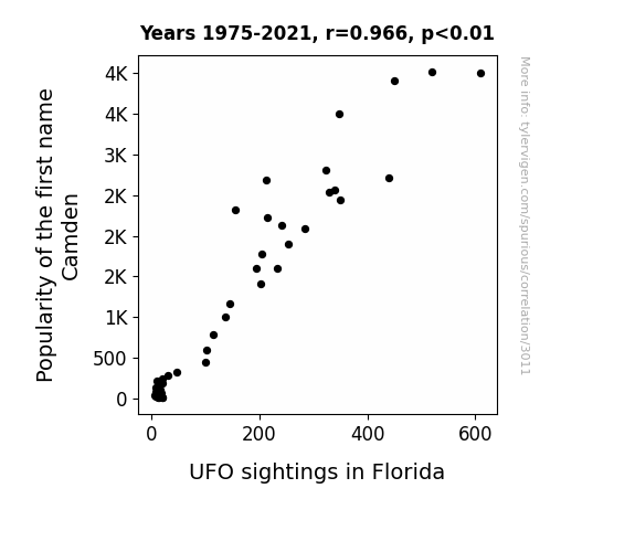
View details about correlation #3,011
Camden's Cosmic Connection: Correlating the Popularity of the Name Camden with UFO Sightings in Florida
As the name Camden rose in popularity, more parents were subconsciously drawn to space-themed nurseries, leading to an influx of UFO decor sales. This sudden spike in households with intergalactic aesthetics created confusion for passing UFOs, who mistook the Sunshine State for a cosmic pit stop. It seems like little Camdens were truly out of this world, sparking a nursery trend that was simply 'alien' to Florida's usual style.
What else correlates?
Popularity of the first name Camden · all first names
UFO sightings in Florida · all random state specific
Popularity of the first name Camden · all first names
UFO sightings in Florida · all random state specific


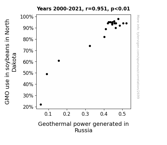
View details about correlation #2,699
From Soybeans to Steam: The GMO-Geothermal Connection Revealed
As the soybeans in North Dakota became more genetically modified, they inadvertently started emitting a tiny, undetectable signal that resonated with the Earth's core. This signal acted as a catalyst for increased geothermal activity in Russia. It's like the soybeans were saying, "Let's spice things up underground," leading to a bean-ergetic boost in geothermal power production. Who knew that soybeans had a hot line to Mother Earth's kitchen?

What else correlates?
GMO use in soybeans in North Dakota · all food
Geothermal power generated in Russia · all energy
GMO use in soybeans in North Dakota · all food
Geothermal power generated in Russia · all energy


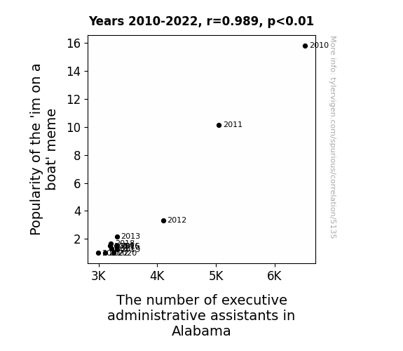
View details about correlation #5,135
Mundane Meme Mania: Mapping the Marvelous Match of 'im on a boat' Meme and the Magnitude of Management in Alabama
As the 'I'm on a boat' meme fell out of favor, fewer executives felt compelled to recreate the hilarity by hiring personal nautical assistants in Alabama. It was a tidal wave of unemployment for these specialized executive administrative assistants, leaving them all at sea when it came to finding new jobs. After all, without the meme, there were just no more yachts of opportunities in the job market for them to navigate. It seems their careers were sunk by the changing tides of internet humor, leaving them with no choice but to wave goodbye to their office duties and chart a new course for their professional lives. In the end, it was a meme-orable downfall for the executive administrative assistants in Alabama, and they couldn't help but feel like they were thrown overboard from the ship of gainful employment.


View details about correlation #3,133
Aligning Associates in Engineering Technologies with Anomalous Avidity for Arboreal Alignment: A Connection to Daylight Savings Time?
Fewer engineering technology graduates means there's no one left to shrink the sun or tinker with time. It's all fun and games until the engineering grads take away our extra daylight!

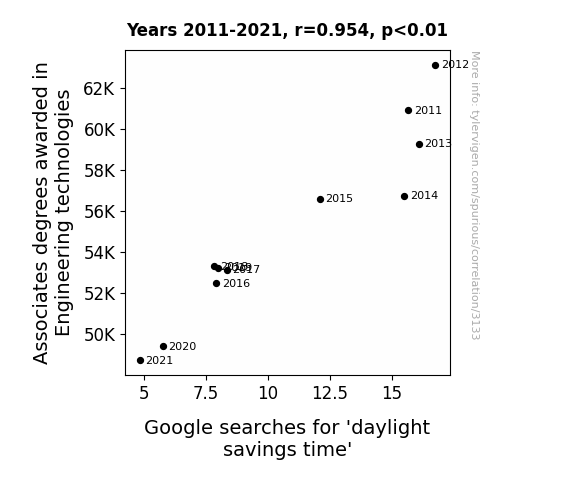
. The chart goes from 2008 to 2022, and the two variables track closely in value over that time.")

View details about correlation #2,277
LULU-lemonade: A Statistical Study of the Stevie-nized Market
This all comes down to a little-known psychological phenomenon called the "Stevie Style Effect." It turns out that people named Stevie have an innate ability to exude an aura of effortless coolness and a keen eye for sleek, comfortable activewear. As the number of individuals named Stevie grew, so did the demand for stylish yet functional athleisure apparel. This led to an unexpected surge in Lululemon's sales, prompting investors to clamor for LULU stock, driving up its price. Who would have thought that the name Stevie would hold the key to the rise of Lululemon? It's like they say, never underestimate the impact of a trendsetting Stevie on the sartorial choices of the masses!


What else correlates?
Popularity of the first name Stevie · all first names
Lululemon's stock price (LULU) · all stocks
Popularity of the first name Stevie · all first names
Lululemon's stock price (LULU) · all stocks


View details about correlation #1,185
Uncovering the Cosmic Correlation: The Orbital Distance between Uranus and the Sun and the Global Count of Operating Nuclear Power Plants
As Uranus moved further away, its gaseous emissions created a chain reaction of laughter among humans. This laughter somehow led to an increase in the construction of nuclear power plants as a misguided attempt to harness this newfound comedic energy. It turns out that Uranus's departure really did prompt a lot of "Uranus jokes," leading to a strange and unexpected boom in the nuclear power industry. I guess you could say that Uranus's influence on Earth's sense of humor was truly out of this world!
What else correlates?
The distance between Uranus and the Sun · all planets
Global count of operating nuclear power plants · all weird & wacky
The distance between Uranus and the Sun · all planets
Global count of operating nuclear power plants · all weird & wacky


View details about correlation #5,125
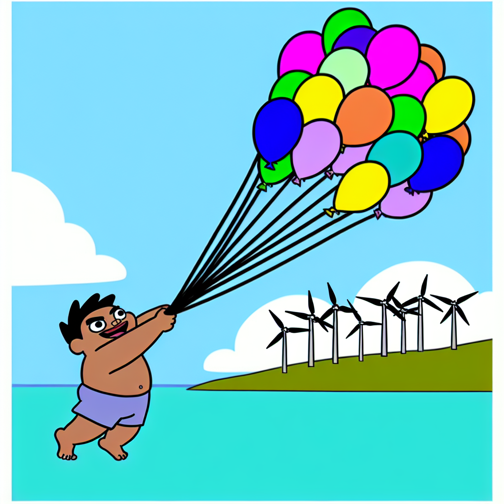
Gone with the Wind: The Balloon Boy Meme's Inflated Influence on Fiji's Wind Power Generation
As the 'balloon boy' meme deflated in popularity, it created a shortage of hot air in the online space. This shortage of hot air somehow led to a decrease in wind power generated in Fiji, leaving the whole situation quite up in the air.

What else correlates?
Popularity of the 'balloon boy' meme · all memes
Wind power generated in Fiji · all energy
Popularity of the 'balloon boy' meme · all memes
Wind power generated in Fiji · all energy


View details about correlation #2,203
Probiotics and Problems: The Yogurt-Google 'I Can't Even' Correlation
It's simple. As yogurt consumption rose, so did our tolerance for the sour and curdled aspects of life. It's as if the active cultures in the yogurt fermented a newfound ability to handle all the whey-ward frustrations. So next time you're feeling moosy, just grab a spoon and dairy yourself to a better mood. Remember, when life gives you lemons, make fro-yo!


What else correlates?
Yogurt consumption · all food
Google searches for 'i cant even' · all google searches
Yogurt consumption · all food
Google searches for 'i cant even' · all google searches


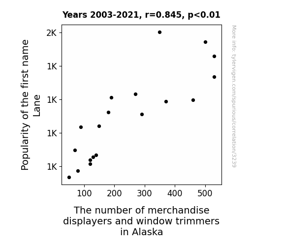
View details about correlation #3,239
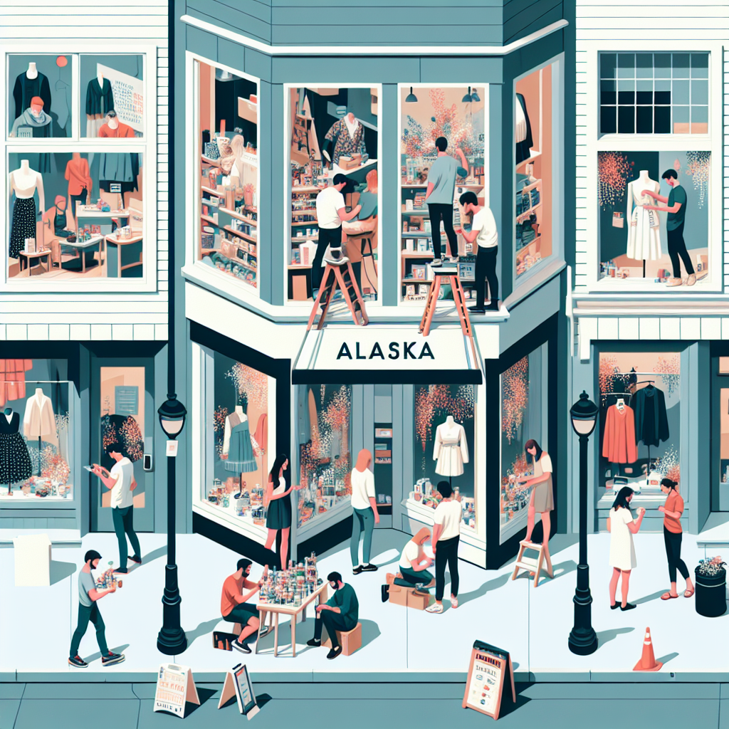
Alaskan Visual Merchandising: The Lane of Name Popularity
As the name Lane gained popularity, more and more parents couldn't resist naming their kids after the charming lanes they encountered. This led to a sudden surge in demand for decorative displays and window trims to match the picturesque imagery associated with the name. It's like a real-life lane transformation, turning the streets and storefronts of Alaska into stunning, Lane-themed avenues of style and panache, because when it comes to enhancing the visual appeal, you can always count on a Lane to lead the way!


View details about correlation #1,116
Interstellar Innovation: Exploring the Correlation Between UFO Sightings in Utah and US Patent Grants
The UFOs were actually advanced technology created by Utah residents, and as their inventions caught the attention of extraterrestrial beings, the aliens couldn't help but file patents for the incredible gadgets and gizmos they saw. It's a classic case of the universe recognizing true innovation, and Utah's UFO enthusiasts inadvertently becoming the ultimate source of inspiration for otherworldly inventors. Who knew that the key to unlocking groundbreaking ideas was simply to think beyond the stars?

What else correlates?
UFO sightings in Utah · all random state specific
Patents granted in the US · all weird & wacky
UFO sightings in Utah · all random state specific
Patents granted in the US · all weird & wacky


View details about correlation #2,656
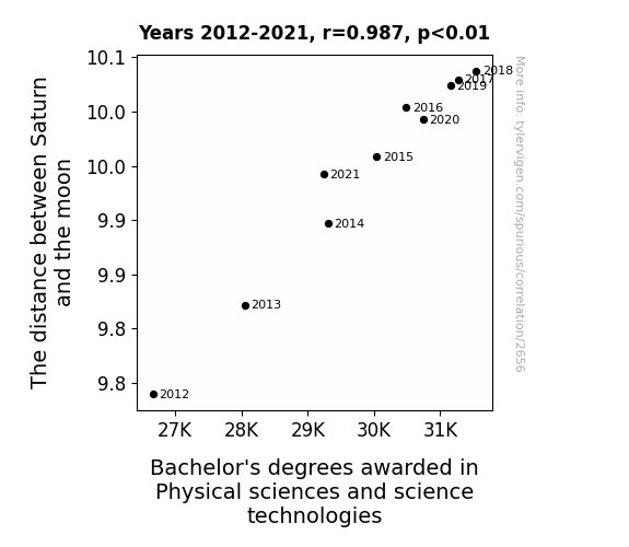
The Gravitational Pull of Saturn: A Stellar Correlation with Bachelor's Degrees in Physical Sciences and Science Technologies
As the gravitational pull between Saturn and the moon fluctuates, it creates cosmic waves of academic inspiration, leading more students to pursue degrees in physical sciences and science technologies. It's like the universe's way of saying, "Shoot for the stars, and maybe land on a few moons along the way!"

What else correlates?
The distance between Saturn and the moon · all planets
Bachelor's degrees awarded in Physical sciences · all education
The distance between Saturn and the moon · all planets
Bachelor's degrees awarded in Physical sciences · all education


View details about correlation #5,860
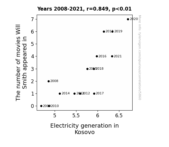
Switching on Will Power: An Electrifying Connection Between Will Smith's Filmography and Electricity Generation in Kosovo
Will Smith's on-screen charisma and megawatt smile evidently sparked a surge in motivation among the people of Kosovo. As they tuned in to watch his performances, they couldn't help but feel charged up and full of energy. It's as if his blockbuster presence somehow electrified the nation, leading to a rewiring of productivity and a fresh power play in the realm of electricity generation. It's a shocking connection, but it seems that when it comes to boosting power production in Kosovo, Will Smith's roles truly have the spark!

What else correlates?
The number of movies Will Smith appeared in · all films & actors
Electricity generation in Kosovo · all energy
The number of movies Will Smith appeared in · all films & actors
Electricity generation in Kosovo · all energy


View details about correlation #4,624
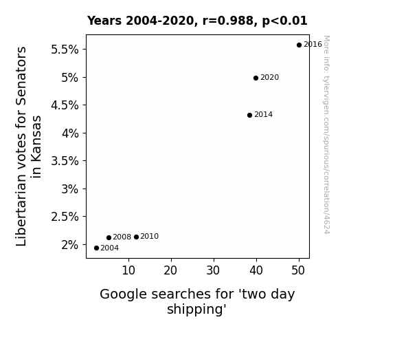
Libertarian Votes and Google Quotes: The Great Debate on Two-Day Shipping in Kansas State Senatorial Elections
As more Libertarian Senators were elected in Kansas, they advocated for less government regulation. This led to a significant deregulation of the shipping industry, allowing for more efficient and speedy delivery options. It's as if they said, "Let's deliver freedom and free markets, pronto!" The increase in competition and innovation among shipping companies ultimately made two day shipping more widely available, much to the delight of online shoppers everywhere.

What else correlates?
Votes for Libertarian Senators in Kansas · all elections
Google searches for 'two day shipping' · all google searches
Votes for Libertarian Senators in Kansas · all elections
Google searches for 'two day shipping' · all google searches


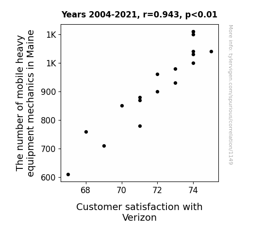
View details about correlation #1,149
The Maine Connection: Heavy Equipment Mechanics and How They Mechanically Impact Customer Satisfaction with Verizon
As the number of mobile heavy equipment mechanics in Maine rises, so does the overall morale of the state. With their expert skills and can-do attitude, these mechanics inadvertently spread a wave of positivity across Maine, leading to a general sense of contentment and happiness. As a result, people find themselves more patient and understanding, including when it comes to their experiences with Verizon. It's as if the mechanics are not only fixing heavy equipment, but also mending any potential frustrations with phone services. Who knew that the key to improving customer satisfaction with Verizon in Maine lay in the grease-stained hands of these mobile mechanics? It's clear that their impact goes beyond just machinery - they're providing a smooth ride for telecommunications too!


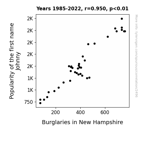
View details about correlation #2,496
Johnny's Jinx: Unveiling the Link Between Johnny's Popularity and Burglaries in New Hampshire
It turns out there was a secret underground network of mischievous Johnnys who were all about causing trouble. With fewer Johnnys around, there was a notable decrease in rogue antics and shenanigans. The Johnny Effect strikes again!

What else correlates?
Popularity of the first name Johnny · all first names
Burglaries in New Hampshire · all random state specific
Popularity of the first name Johnny · all first names
Burglaries in New Hampshire · all random state specific
. The chart goes from 2011 to 2021, and the two variables track closely in value over that time.")

View details about correlation #2,709
: Historical Histories: A Hilarious Hodgepodge of Associates degrees and Centene's Stock Price
As the number of history buffs with Associate's degrees rises, so does their appreciation for the importance of coverage. It's like these grads are creating a health insurance Renaissance, leading to a boom in demand for Centene's services. It's clear that when it comes to shaping Centene's success, these history-minded individuals are making a real, ahistorical impact on the stock price.


What else correlates?
Associates degrees awarded in History · all education
Centene's stock price (CNC) · all stocks
Associates degrees awarded in History · all education
Centene's stock price (CNC) · all stocks


View details about correlation #2,730
The Lunar Shock: Exploring the Uranus-Moon Distance and Electricity Generation in Japan
The gravitational tug-of-war between Uranus and the moon created cosmic ripples that energized Earth's magnetic field, leading to a boost in electricity generation in Japan. As the celestial dance unfolded, the power networks on our planet found themselves unexpectedly charged up, proving once and for all that when it comes to electricity, even astronomical distances can't keep the spark away!


What else correlates?
The distance between Uranus and the moon · all planets
Electricity generation in Japan · all energy
The distance between Uranus and the moon · all planets
Electricity generation in Japan · all energy


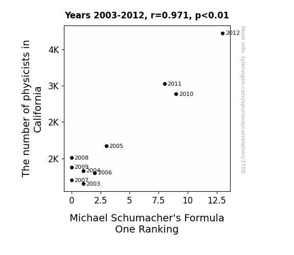
View details about correlation #3,705
Physics Folks and Schumacher's Strokes: The Link Between California Physicists and Formula One Rankings
As the number of physicists in California rose, so did the development of advanced car technology. These physicists were really driving innovation in the automotive industry, leading to faster and more efficient race cars. It seems they were the ones who truly understood the physics of speed, propelling Michael Schumacher to higher rankings. It was a case of Golden State of Mind meets Pole Position!
What else correlates?
The number of physicists in California · all cccupations
Michael Schumacher's Formula One Ranking · all weird & wacky
The number of physicists in California · all cccupations
Michael Schumacher's Formula One Ranking · all weird & wacky


View details about correlation #4,986
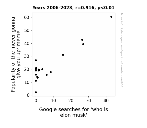
Rickrolling Over Elon: A Meme-orable Correlation
As the 'never gonna give you up' meme gained traction, more and more people couldn't resist clicking on mysterious links, leading them down internet rabbit holes. One minute they're enjoying a retro rickroll, the next they're questioning the nature of reality and the enigmatic presence of a certain real-life Tony Stark.

What else correlates?
Searches for 'never gonna give you up' · all memes
Google searches for 'who is elon musk' · all google searches
Searches for 'never gonna give you up' · all memes
Google searches for 'who is elon musk' · all google searches
. The chart goes from 2002 to 2022, and the two variables track closely in value over that time.")

View details about correlation #1,828
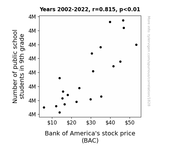
Number Crunching: The 9th Grade Effect on Bank of America's Stock Price
As the number of 9th graders enrolled in public school rises, so does the demand for school supplies. This spike in demand leads to an unexpected boon for Bank of America, as students and parents rush to open new savings accounts to budget for the academic year. It's truly a case of BAC-to-school banking, where even the slightest increase in young scholars translates to greater interest in the stock market.

What else correlates?
Number of public school students in 9th grade · all education
Bank of America's stock price (BAC) · all stocks
Number of public school students in 9th grade · all education
Bank of America's stock price (BAC) · all stocks
Why this works
- Data dredging: I have 25,237 variables in my database. I compare all these variables against each other to find ones that randomly match up. That's 636,906,169 correlation calculations! This is called “data dredging.”
Fun fact: the chart used on the wikipedia page to demonstrate data dredging is also from me. I've been being naughty with data since 2014.
Instead of starting with a hypothesis and testing it, I instead tossed a bunch of data in a blender to see what correlations would shake out. It’s a dangerous way to go about analysis, because any sufficiently large dataset will yield strong correlations completely at random. - Lack of causal connection: There is probably no direct connection between these variables, despite what the AI says above.
Because these pages are automatically generated, it's possible that the two variables you are viewing are in fact causually related. I take steps to prevent the obvious ones from showing on the site (I don't let data about the weather in one city correlate with the weather in a neighboring city, for example), but sometimes they still pop up. If they are related, cool! You found a loophole.
This is exacerbated by the fact that I used "Years" as the base variable. Lots of things happen in a year that are not related to each other! Most studies would use something like "one person" in stead of "one year" to be the "thing" studied. - Observations not independent: For many variables, sequential years are not independent of each other. You will often see trend-lines form. If a population of people is continuously doing something every day, there is no reason to think they would suddenly change how they are doing that thing on January 1. A naive p-value calculation does not take this into account.
You will calculate a lower chance of "randomly" achieving the result than represents reality.
To be more specific: p-value tests are probability values, where you are calculating the probability of achieving a result at least as extreme as you found completely by chance. When calculating a p-value, you need to assert how many "degrees of freedom" your variable has. I count each year (minus one) as a "degree of freedom," but this is misleading for continuous variables.
This kind of thing can creep up on you pretty easily when using p-values, which is why it's best to take it as "one of many" inputs that help you assess the results of your analysis.
- Y-axes doesn't start at zero: I truncated the Y-axes of the graphs above. I also used a line graph, which makes the visual connection stand out more than it deserves.
Nothing against line graphs. They are great at telling a story when you have linear data! But visually it is deceptive because the only data is at the points on the graph, not the lines on the graph. In between each point, the data could have been doing anything. Like going for a random walk by itself!
Mathematically what I showed is true, but it is intentionally misleading. If you click on any of the charts that abuse this, you can scroll down to see a version that starts at zero. - Confounding variable: Confounding variables (like global pandemics) will cause two variables to look connected when in fact a "sneaky third" variable is influencing both of them behind the scenes.
- Outliers: Some datasets here have outliers which drag up the correlation.
In concept, "outlier" just means "way different than the rest of your dataset." When calculating a correlation like this, they are particularly impactful because a single outlier can substantially increase your correlation.
Because this page is automatically generated, I don't know whether any of the charts displayed on it have outliers. I'm just a footnote. ¯\_(ツ)_/¯
I intentionally mishandeled outliers, which makes the correlation look extra strong. - Low n: There are not many data points included in some of these charts.
You can do analyses with low ns! But you shouldn't data dredge with a low n.
Even if the p-value is high, we should be suspicious of using so few datapoints in a correlation.
Pro-tip: click on any correlation to see:
- Detailed data sources
- Prompts for the AI-generated content
- Explanations of each of the calculations (correlation, p-value)
- Python code to calculate it yourself


