spurious correlations
discover · random · spurious scholar
← previous page · next page →


View details about correlation #5,223
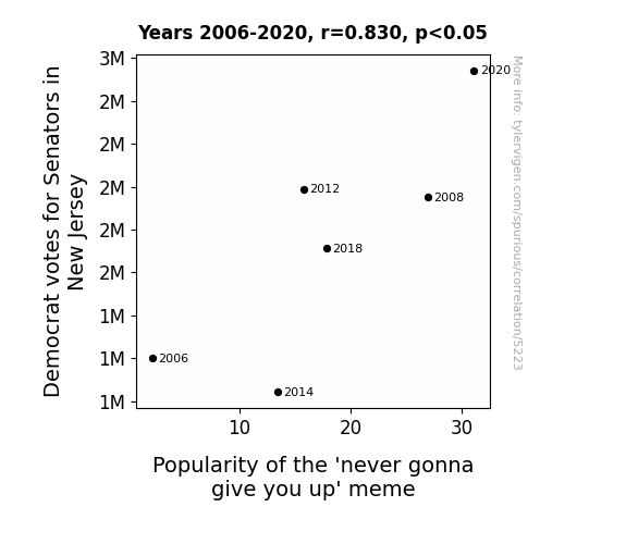
Never Gonna Vote You Up: Analyzing the Correlation Between Democrat Votes for Senators in New Jersey and the Popularity of the 'Never Gonna Give You Up' Meme
As Democrat votes for Senators in New Jersey increased, it led to a rise in overall political enthusiasm. This surge in political energy somehow triggered a chain reaction of internet memes, and the 'never gonna give you up' meme experienced a resurgence as a form of light-hearted, bipartisan rickrolling. Who knew that political shifts in the Garden State could have such a groovy impact on internet culture?

What else correlates?
Votes for Democratic Senators in New Jersey · all elections
Searches for 'never gonna give you up' · all memes
Votes for Democratic Senators in New Jersey · all elections
Searches for 'never gonna give you up' · all memes


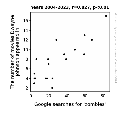
View details about correlation #5,844
The Rock & The Undead: A Correlation Study Between Dwayne Johnson's Movie Appearances and Google Searches for 'Zombies'
The Rock's blockbuster movies were so electrifying, they reanimated an interest in zombies among the audience. It's as if his sheer star power acted as a beacon, drawing people's attention to the undead. His on-screen presence just rocked the world of zombies, proving that even in the afterlife, they couldn't resist the charm of the People's Champion. It's like he unleashed a contagion of zombie fascination, proving that when Dwayne Johnson is in the picture, even the undead can't help but feel like the most electrifying beings in pop culture.
What else correlates?
The number of movies Dwayne Johnson appeared in · all films & actors
Google searches for 'zombies' · all google searches
The number of movies Dwayne Johnson appeared in · all films & actors
Google searches for 'zombies' · all google searches


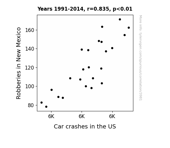
View details about correlation #3,981
The Highwaymen: Exploring the Hold-Up between Robberies in New Mexico and Car Crashes in the US
It turns out the robbers were the ones causing all the high-speed chases! Without them around, the roads are a lot safer. Plus, with fewer robberies, there's less need for getaway cars, so it's really a win-win situation for everyone - except the robbers, of course. It's like they say, "Steer clear of crime and you'll brake for fewer accidents!"
What else correlates?
Robberies in New Mexico · all random state specific
Car crashes in the US · all weird & wacky
Robberies in New Mexico · all random state specific
Car crashes in the US · all weird & wacky


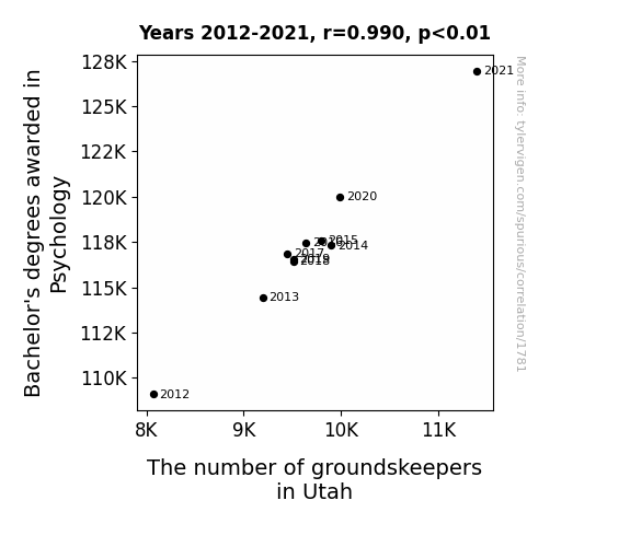
View details about correlation #1,781
Minds Over Matter: The Psych-ing Connection Between Bachelor's Degrees in Psychology and Groundskeepers in Utah
As the number of psychology graduates rose, so did the demand for shrinks, er, I mean shrub experts. It seems like everyone was finally recognizing the deep-rooted issues in Utah's green spaces and decided to take a leaf out of Freud's book by tackling them head-on. As these graduates mulled over their career options, they realized that they could cultivate a fulfilling career in groundskeeping, digging deep into the soil of the human psyche while also mowing lawns. It's a Freudian field of work indeed, where they can help grass cope with its existential crises and provide much-needed therapy for plants experiencing growth issues. It's safe to say that these psychology grads are really raking in the success in the world of horticulture, proving that when it comes to tending to the state of Utah's landscapes, they're not just whistling dixie!

What else correlates?
Bachelor's degrees awarded in Psychology · all education
The number of groundskeepers in Utah · all cccupations
Bachelor's degrees awarded in Psychology · all education
The number of groundskeepers in Utah · all cccupations


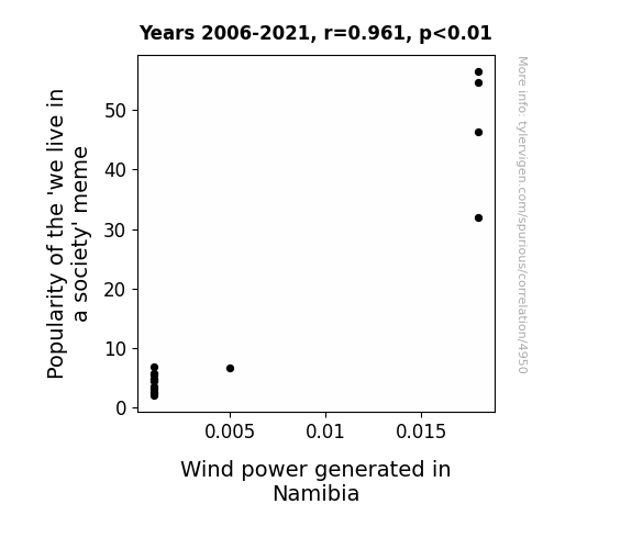
View details about correlation #4,950
We Live in a Current-Generating Society: The Shocking Connection Between 'We Live in a Society' Meme Popularity and Wind Power Generated in Namibia
As the 'we live in a society' meme gained traction, it created a whirlwind of attention. People all over were embracing the idea and it blew a breath of fresh air into the internet. This societal reflection led to a surge in demand for clean energy and a realization that we truly do 'reap what we sow.' In Namibia, this meant a gust of support for wind power, propelling the industry forward. It's a true testament to the power of memes - they can really turbine things around for the better!
What else correlates?
Popularity of the 'we live in a society' meme · all memes
Wind power generated in Namibia · all energy
Popularity of the 'we live in a society' meme · all memes
Wind power generated in Namibia · all energy


View details about correlation #2,867
Chilling Consequences: Uncovering the Icy Relationship between Air Pollution and 'Ice Bath' Google Searches in Appleton, Wisconsin
As the air quality dipped, residents of Appleton, Wisconsin found themselves taking 'chill pills' in the form of ice baths. It seems like the smog just couldn't take a hint and decided to 'mist' with people's routines, leading them to seek refreshing relief in a tub of ice. It's a classic case of pollution causing a cool-ution, as the city's air became more inhospitable, driving folks to 'cool off' in the most literal way possible. Who knew that as the pollution levels rose, so did the temptation to take the plunge into an icy situation? It's enough to make you say, "What in the world is 'smog-nifying' this frosty trend?" But hey, when the going gets 'foggy,' the foggy get going... straight to the freezer for an impromptu arctic dip.


What else correlates?
Air pollution in Appleton, Wisconsin · all weather
Google searches for 'ice bath' · all google searches
Air pollution in Appleton, Wisconsin · all weather
Google searches for 'ice bath' · all google searches


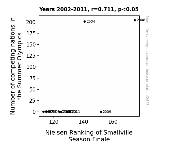
View details about correlation #2,648
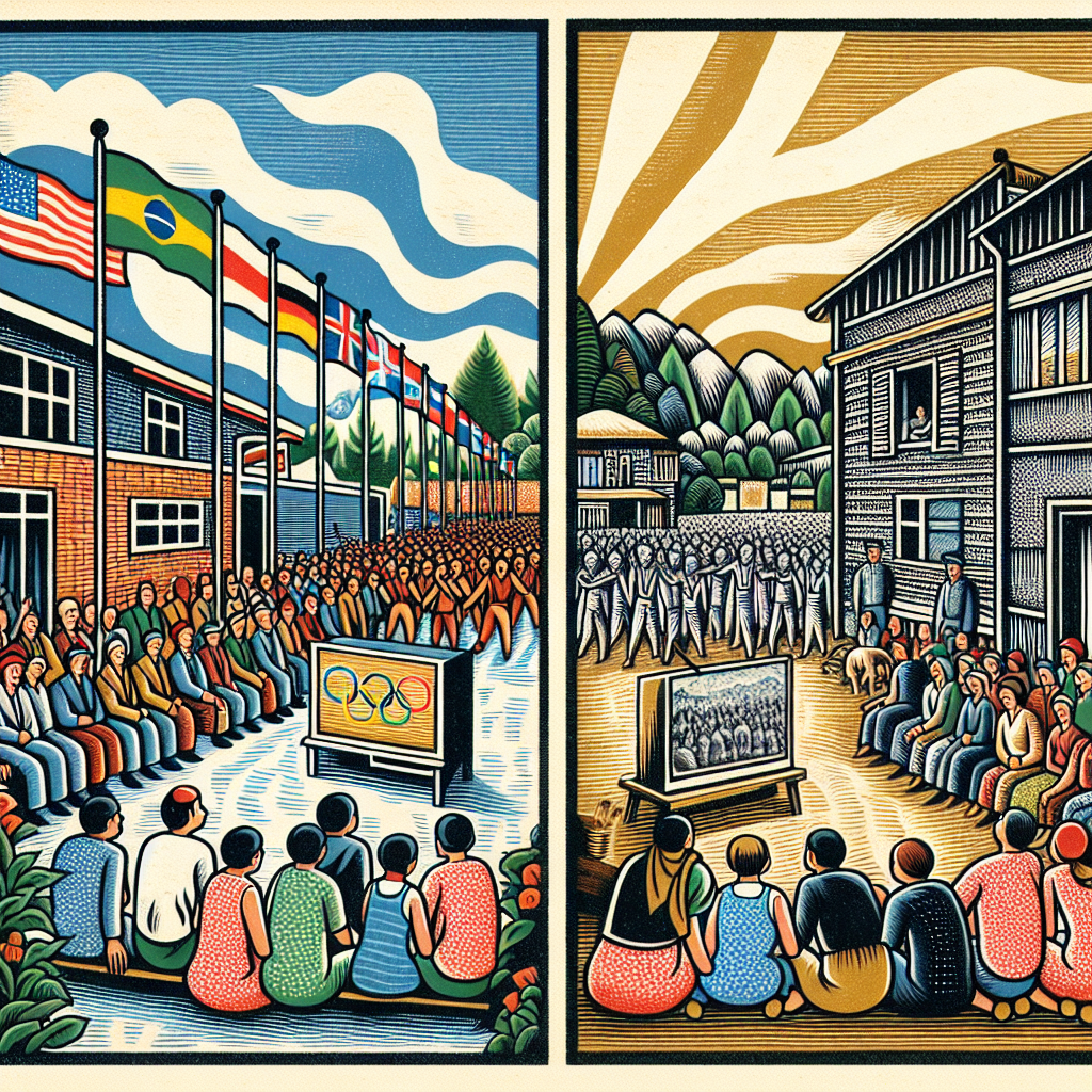
The Olympics Effect: The Interplay between International Sporting Events and Small-Town Dramas
As the international rivalry heated up, more people tuned in to the epic competition between Smallville's superheroes and supervillains. Who knew that Clark Kent's quest for gold would be the ultimate ratings booster for Smallville? As they say, it's not the size of the nation in the Olympics, it's the TV ratings of Smallville's finale that really matters!


View details about correlation #2,985
Ariels in Michigan: Making Waves in Fashion Design
As the name Ariel gained popularity, more and more people were inspired by the fashionable and stylish image of the Disney princess. This led to a surge in interest in fashion and design, including in Michigan. It's as if the trend was making waves in the world of fashion, and the designers just couldn't flounder in their pursuit of creating fabulous looks!


What else correlates?
Popularity of the first name Ariel · all first names
The number of fashion designers in Michigan · all cccupations
Popularity of the first name Ariel · all first names
The number of fashion designers in Michigan · all cccupations


View details about correlation #2,666
Voltage Variety: The Shocking Connection Between Multi/Interdisciplinary Studies Bachelor's Degrees and Electricity Generation in Angola
As more students delved into the vast and varied world of Multi/interdisciplinary studies, they sparked a surge in brainpower. This intellectual firestorm led to an influx of innovative ideas for improving efficiency in electricity generation. It's shocking how these interdisciplinary graduates connected the dots to current flow in Angola's power sector, igniting a revolution in energy production. You could say they truly sparked a bright idea or two!

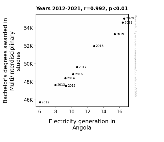
What else correlates?
Bachelor's degrees awarded in interdisciplinary studies · all education
Electricity generation in Angola · all energy
Bachelor's degrees awarded in interdisciplinary studies · all education
Electricity generation in Angola · all energy


View details about correlation #4,994
Hair Today, Like a Boss Tomorrow: The Curious Connection Between 'Like a Boss' Meme Popularity and DIY Haircut Searches
As the 'like a boss' meme gained traction, people's confidence levels soared, leading to a spike in the belief that they could tackle haircuts with the same swag. And, as more folks tried to emulate the fearlessness of 'bosses' in the meme, they bossed up their hair cutting skills, proving that when it comes to DIY haircuts, attitude really does clip-ly everything!


What else correlates?
Popularity of the 'like a boss' meme · all memes
Google searches for 'how to cut own hair' · all google searches
Popularity of the 'like a boss' meme · all memes
Google searches for 'how to cut own hair' · all google searches


View details about correlation #1,604
Popcorn or Pop-Myth: A Butter Truth Serum or a Margarine of Error? Examining the Correlation Between Butter Consumption and Ticket Prices at North American Movie Theaters
As people started slathering on more buttery toppings at the movie theater, there was a sudden surge in demand for extra napkins. This napkin shortage led to an increase in production costs for napkin manufacturers. To offset these rising expenses, the movie theaters had to raise ticket prices in order to cover the cost of the now luxurious, butter-absorbing, premium napkins. Remember, it's not just about the buttery popcorn anymore - it's about the whole buttery experience!


What else correlates?
Butter consumption · all food
Ticket prices at North American movie theaters · all films & actors
Butter consumption · all food
Ticket prices at North American movie theaters · all films & actors
. The chart goes from 2014 to 2023, and the two variables track closely in value over that time.")

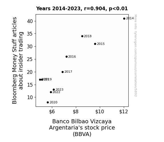
View details about correlation #5,892
The Insider Scoop: Money Stuff Articles and Banco Bilbao Vizcaya Argentaria's Stock Price Dance
As the number of articles about insider trading on Bloomberg Money Stuff decreased, investors began to suspect that something fishy was going on at Banco Bilbao Vizcaya Argentaria (BBVA). With less information about sneaky stock shenanigans, confidence in the bank's transparency also decreased, leading to a sell-off of BBVA shares. Who knew that a lack of white-collar crime news could lead to a bank account that's feeling a little blue?


View details about correlation #2,129
The Harmony Name Game: A Melodic Analysis of Associates Degrees in Agriculture and Natural Resources
As more people were named Harmony, a wave of peaceful and cooperative vibes swept through the agricultural community, leading to a surge in knowledge sharing and mutual support among aspiring agronomists and environmentalists. It's as if the fields were harmonically cultivated for success!


View details about correlation #5,952
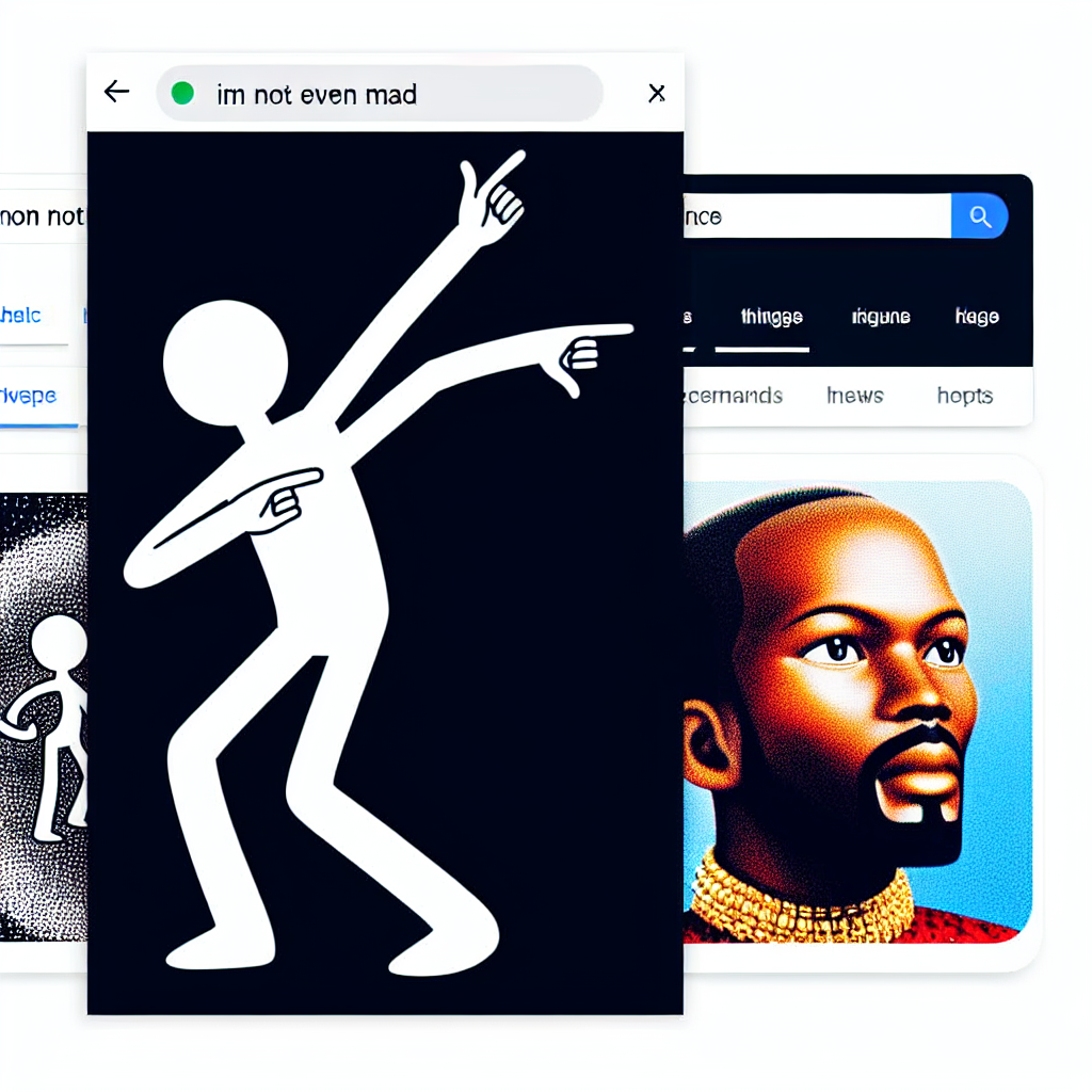
I'm Not Even Mad, Said Rad, So Whip, Nae-Nae: A Correlational Study of Google Searches and Internet Memes
As people's ability to stay chill and not get worked up decreased, they were no longer in the right mindset to whip and/or nae nae with the same level of enthusiasm. The lack of 'not even mad' energy was a major hit to the whip nae nae community, leading to a decline in its overall coolness. Less zen led to less swag, and the meme just couldn't keep its groove without that tranquil vibe.

What else correlates?
Google searches for 'im not even mad' · all google searches
Popularity of the 'whip nae nae' meme · all memes
Google searches for 'im not even mad' · all google searches
Popularity of the 'whip nae nae' meme · all memes


View details about correlation #5,837
Nicolas Cage on Stage: The Movie Craze and North Dakota's Screeners' Raise
The heightened state of unease over the possibility of a 'Con Air' sequel resulted in an influx of security personnel. It just goes to show, when it comes to Nic Cage, the need for increased security is always 'Raising Arizona.'
. The chart goes from 2002 to 2022, and the two variables track closely in value over that time.")

View details about correlation #5,901
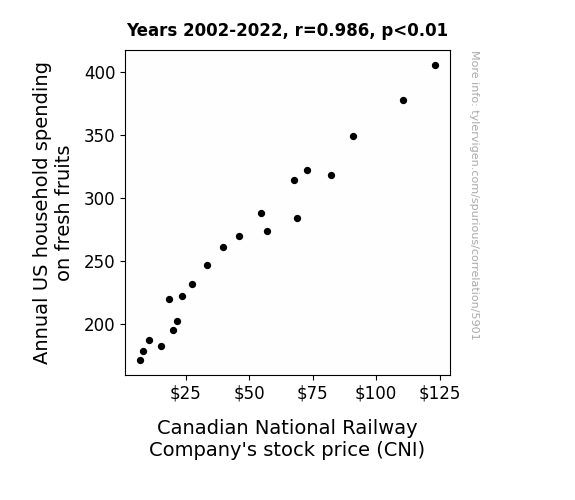
Fruit-Fueled Fortunes: The Correlation between Annual US Household Spending on Fresh Fruits and Canadian National Railway Company's Stock Price
As US households spent more on fresh fruits, there was a higher demand for fruit transportation. This led to Canadian National Railway Company (CNI) to have more business in shipping fruits across the border. This increased revenue and projected earnings, leading to a rise in stock price. It's like the fruits of their labor were ripe for the picking!


View details about correlation #3,029
The Belle and the Beams: A Statistical Analysis of Annabelle's Popularity and UFO Sightings in Maryland
As the number of Annabelles grew, so did the collective power of their positive energy, inadvertently attracting curious extraterrestrial beings to the skies above Maryland. It seems that the universe just couldn't resist the charm and magnetism that this particular name exuded, leading to a surge in close encounters of the Annabelle kind!


What else correlates?
Popularity of the first name Annabelle · all first names
UFO sightings in Maryland · all random state specific
Popularity of the first name Annabelle · all first names
UFO sightings in Maryland · all random state specific


View details about correlation #1,069
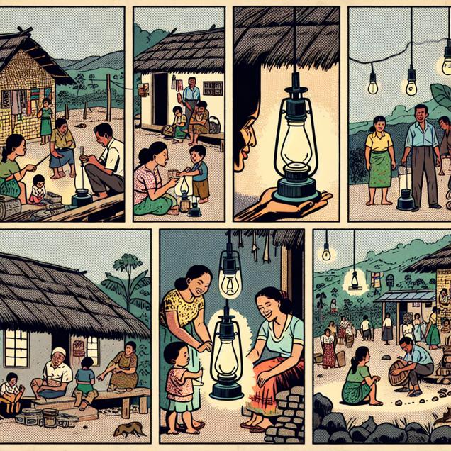
Burning Questions: The Kerosene Connection - A Squirrely Correlation?
As kerosene usage decreased in El Salvador, there were fewer open flames to attract the attention of the power-hungry squirrel overlords, leading to a decrease in their organized attacks on unsuspecting individuals. Without the allure of fiery chaos, the squirrels decided to pursue more peaceful activities like acorn gathering and competitive tree climbing, leaving the people of El Salvador with a slightly lower risk of encountering vengeful, flame-loving squirrels. Remember, a squirrel's plans can be easily derailed when there are no kerosene-fueled sparks flying to ignite their bushy-tailed ambitions!

What else correlates?
Kerosene used in El Salvador · all energy
Google searches for 'attacked by a squirrel' · all google searches
Kerosene used in El Salvador · all energy
Google searches for 'attacked by a squirrel' · all google searches


View details about correlation #4,854
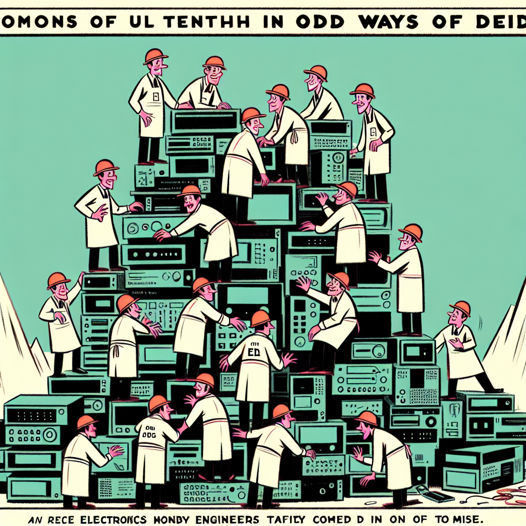
The Trendy Bend: Dumb Ways to Die and the Utah Electronics Engineer Supply
As the 'dumb ways to die' meme gained popularity, more and more people in Utah were exposed to the concept of engineering their way out of risky situations. This led to a surge in interest in electronics and a realization that they wanted to be current in their knowledge. The meme sparked a shocking amount of interest in the field, ultimately sparking a circuit of enthusiasm for electronics engineering in Utah. People were just ohm-ing and hawing over it!
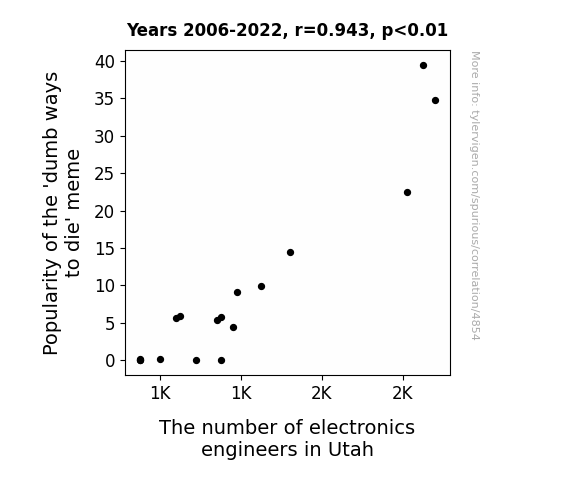
What else correlates?
Popularity of the 'dumb ways to die' meme · all memes
The number of electronics engineers in Utah · all cccupations
Popularity of the 'dumb ways to die' meme · all memes
The number of electronics engineers in Utah · all cccupations
. The chart goes from 2012 to 2021, and the two variables track closely in value over that time.")

View details about correlation #2,298
Par-Fecting the Market: A Link Between Master's Degrees in Parks & Recreation and GOOGL Stock Price
As the number of Parks & Recreation Master's degree holders rose, so did the demand for alphabetically organized activities in public spaces. This led to a surge in people seeking out leisurely pursuits like birdwatching, creating a higher need for Google searches. The correlation between these educated park planners and the stock price of Alphabet was in-tents, because when it comes to boosting Google, they really knew how to *recreate* some positive outcomes.


What else correlates?
Master's degrees awarded in Parks & Recreation · all education
Alphabet's stock price (GOOGL) · all stocks
Master's degrees awarded in Parks & Recreation · all education
Alphabet's stock price (GOOGL) · all stocks
Why this works
- Data dredging: I have 25,237 variables in my database. I compare all these variables against each other to find ones that randomly match up. That's 636,906,169 correlation calculations! This is called “data dredging.”
Fun fact: the chart used on the wikipedia page to demonstrate data dredging is also from me. I've been being naughty with data since 2014.
Instead of starting with a hypothesis and testing it, I instead tossed a bunch of data in a blender to see what correlations would shake out. It’s a dangerous way to go about analysis, because any sufficiently large dataset will yield strong correlations completely at random. - Lack of causal connection: There is probably no direct connection between these variables, despite what the AI says above.
Because these pages are automatically generated, it's possible that the two variables you are viewing are in fact causually related. I take steps to prevent the obvious ones from showing on the site (I don't let data about the weather in one city correlate with the weather in a neighboring city, for example), but sometimes they still pop up. If they are related, cool! You found a loophole.
This is exacerbated by the fact that I used "Years" as the base variable. Lots of things happen in a year that are not related to each other! Most studies would use something like "one person" in stead of "one year" to be the "thing" studied. - Observations not independent: For many variables, sequential years are not independent of each other. You will often see trend-lines form. If a population of people is continuously doing something every day, there is no reason to think they would suddenly change how they are doing that thing on January 1. A naive p-value calculation does not take this into account.
You will calculate a lower chance of "randomly" achieving the result than represents reality.
To be more specific: p-value tests are probability values, where you are calculating the probability of achieving a result at least as extreme as you found completely by chance. When calculating a p-value, you need to assert how many "degrees of freedom" your variable has. I count each year (minus one) as a "degree of freedom," but this is misleading for continuous variables.
This kind of thing can creep up on you pretty easily when using p-values, which is why it's best to take it as "one of many" inputs that help you assess the results of your analysis.
- Y-axes doesn't start at zero: I truncated the Y-axes of the graphs above. I also used a line graph, which makes the visual connection stand out more than it deserves.
Nothing against line graphs. They are great at telling a story when you have linear data! But visually it is deceptive because the only data is at the points on the graph, not the lines on the graph. In between each point, the data could have been doing anything. Like going for a random walk by itself!
Mathematically what I showed is true, but it is intentionally misleading. If you click on any of the charts that abuse this, you can scroll down to see a version that starts at zero. - Confounding variable: Confounding variables (like global pandemics) will cause two variables to look connected when in fact a "sneaky third" variable is influencing both of them behind the scenes.
- Outliers: Some datasets here have outliers which drag up the correlation.
In concept, "outlier" just means "way different than the rest of your dataset." When calculating a correlation like this, they are particularly impactful because a single outlier can substantially increase your correlation.
Because this page is automatically generated, I don't know whether any of the charts displayed on it have outliers. I'm just a footnote. ¯\_(ツ)_/¯
I intentionally mishandeled outliers, which makes the correlation look extra strong. - Low n: There are not many data points included in some of these charts.
You can do analyses with low ns! But you shouldn't data dredge with a low n.
Even if the p-value is high, we should be suspicious of using so few datapoints in a correlation.
Pro-tip: click on any correlation to see:
- Detailed data sources
- Prompts for the AI-generated content
- Explanations of each of the calculations (correlation, p-value)
- Python code to calculate it yourself


