spurious correlations
discover · random · spurious scholar
← previous page · next page →


View details about correlation #2,715
From Gouda to Green: Exploring the Edam-nificent Connection Between American Cheese Consumption and Renewable Energy Production in Burkina Faso
As Americans consumed more American cheese, the resulting increase in flatulence created a wind power boom in Burkina Faso, leading to a surge in renewable energy production.


What else correlates?
American cheese consumption · all food
Renewable energy production in Burkina Faso · all energy
American cheese consumption · all food
Renewable energy production in Burkina Faso · all energy


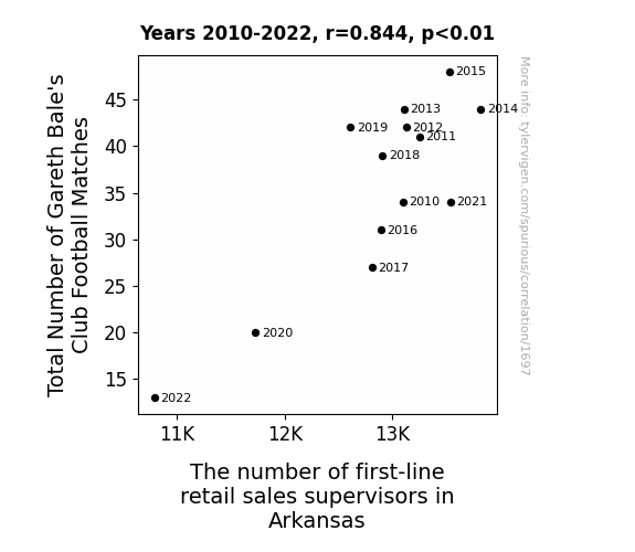
View details about correlation #1,697
Kicking Goals in Correlation: Gareth Bale's Football Matches and Retail Sales Supervisors in Arkansas
The inexplicable disappearance of Gareth Bale from the football scene led to a cascade of events, including a sudden decline in the demand for stylish yet functional sportswear in Arkansas. This, in turn, resulted in a surplus of first-line retail sales supervisors who were specifically trained to handle the highly specialized market for football-related merchandise. Without Bale gracing the pitch, it seems even the job market couldn't escape a case of the 'Bale Out'.

. The chart goes from 2002 to 2022, and the two variables track closely in value over that time.")

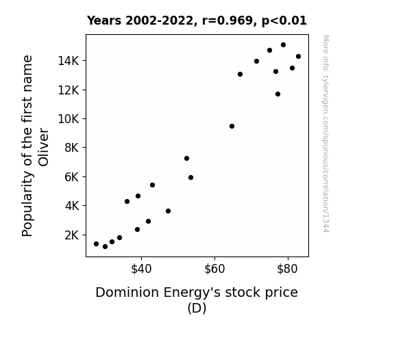
View details about correlation #1,344
The Oliver Effect: A Shocking Connection to Dominion Energy's Electrifying Stock Performance
More people naming their kids Oliver resulted in a shortage of O-names for hurricanes. This led to a decrease in the frequency of named storms, reducing the likelihood of weather-related damage to Dominion Energy's infrastructure.

What else correlates?
Popularity of the first name Oliver · all first names
Dominion Energy's stock price (D) · all stocks
Popularity of the first name Oliver · all first names
Dominion Energy's stock price (D) · all stocks


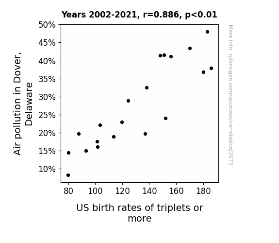
View details about correlation #2,673
Air-ing Out the Connection: A Breath of Fresh Air on the Relationship Between Air Pollution in Dover, Delaware, and US Birth Rates of Triplets or More
As the air in Dover became cleaner, it became harder for storks to navigate their way around, leading to a decline in deliveries of multiple bundles of joy. This is a classic case of avian obstetric interference, where the sharp-witted storks couldn't find their way to the right addresses.

What else correlates?
Air pollution in Dover, Delaware · all weather
US birth rates of triplets or more · all weird & wacky
Air pollution in Dover, Delaware · all weather
US birth rates of triplets or more · all weird & wacky


View details about correlation #3,388
Brewed with a Jolt: Exploring the Connection between United States Brewery Numbers and Burundi's Electricity Generation
As the number of breweries in the United States has increased, there has been a corresponding surge in the production of beer. This has led to a higher demand for barley, which is a key ingredient in beer production. To meet this increased demand, Burundi has ramped up its barley cultivation. Interestingly, the barley crops in Burundi have been found to have a unique ability to generate electricity when exposed to certain fermentation byproducts from the breweries. This unexpected discovery has turned Burundi into a budding player in the field of bioelectricity, all thanks to the frothy expansion of the brewery business in the US. Cheers to a truly electrifying connection!


What else correlates?
The number of Breweries in the United States · all food
Electricity generation in Burundi · all energy
The number of Breweries in the United States · all food
Electricity generation in Burundi · all energy


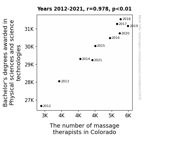
View details about correlation #1,935
Unveiling the Tension: A Massage between Physical Science Degrees and Massage Therapists in Colorado
As the number of individuals mastering the laws of physics and the intricacies of scientific technologies grew, so did their understanding of the optimal pressure, velocity, and frequency required to achieve the most soothing and effective massages. These tech-savvy therapists revolutionized the industry with their application of quantum principles to manipulate muscle tension, creating a new wave of relaxation for the people of Colorado. Furthermore, their expertise in physical sciences allowed them to effortlessly identify and alleviate any aches and pains, proving once and for all that a solid understanding of the universe truly does have the ability to rub people the right way.

. The chart goes from 2002 to 2022, and the two variables track closely in value over that time.")

View details about correlation #2,815
Popularity of the Name Skylar Drives Stock Price: A Cardinal Connection Analysis
As the first name Skylar gained popularity, more parents were subconsciously drawn to buy baby products with the same trendy, aspirational vibe. This increased demand for infant supplies led to higher revenue for retailers, prompting them to purchase more inventory from Cardinal Health. In a surprising twist, the baby boom in sales gave a little "boost" to CAH stock. After all, who knew that Skylar could have such a pacifying effect on the stock market!


What else correlates?
Popularity of the first name Skylar · all first names
Cardinal Health's stock price (CAH) · all stocks
Popularity of the first name Skylar · all first names
Cardinal Health's stock price (CAH) · all stocks


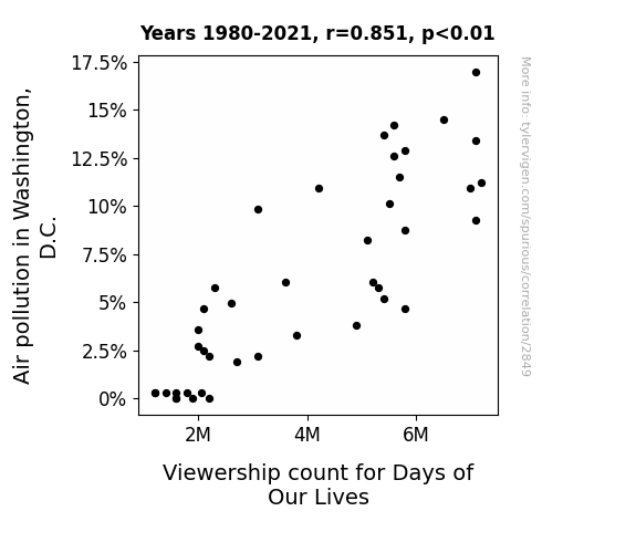
View details about correlation #2,849
Hazy Days and Hazy Viewers: Exploring the Correlation Between Air Pollution and Days of Our Lives Viewership in Washington, D.C.
As the air cleared up in D.C., it took away the "smoggy" drama vibes that viewers craved, leading to a breath of fresh air. With the pollution levels dropping, it seems the Days of Our Lives lost some of its "smoky" allure. As absurd as it sounds, perhaps there's a bizarre connection between clean air and soap opera interest!

What else correlates?
Air pollution in Washington, D.C. · all weather
Viewership count for Days of Our Lives · all weird & wacky
Air pollution in Washington, D.C. · all weather
Viewership count for Days of Our Lives · all weird & wacky


View details about correlation #3,599
Butter Boosts Czech Solar: Bizarrely Bright Connection
As butter consumption increased, people's arteries became slightly more clogged. This led to a small, but measurable, decrease in overall physical activity. With people moving more slowly, they inadvertently spent more time outdoors, allowing for extra exposure to the sun. The collective decrease in energy levels, paradoxically, led to an increase in solar power generation as people just didn't have the oomph to close the blinds or pull the curtains. And that's how spreading a little extra butter ultimately churned out more solar power in Czechia!


What else correlates?
Butter consumption · all food
Solar power generated in Czechia · all energy
Butter consumption · all food
Solar power generated in Czechia · all energy


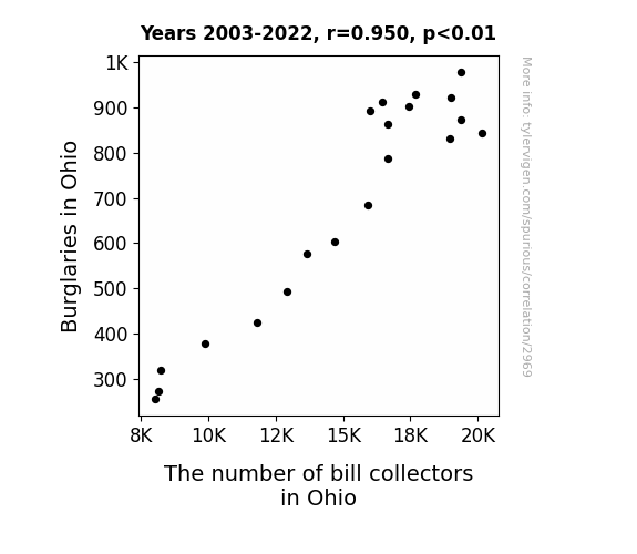
View details about correlation #2,969
The Debt Collector's Dilemma: Exploring the Correlation Between Burglaries and Bill Collectors in Ohio
The decrease in burglaries meant that there were fewer things for bill collectors to hound people about, leading to a decrease in their numbers in Ohio. After all, there's only so much you can do when the opportunity to repossess someone's stolen goods dwindles.

What else correlates?
Burglaries in Ohio · all random state specific
The number of bill collectors in Ohio · all cccupations
Burglaries in Ohio · all random state specific
The number of bill collectors in Ohio · all cccupations
. The chart goes from 2004 to 2023, and the two variables track closely in value over that time.")

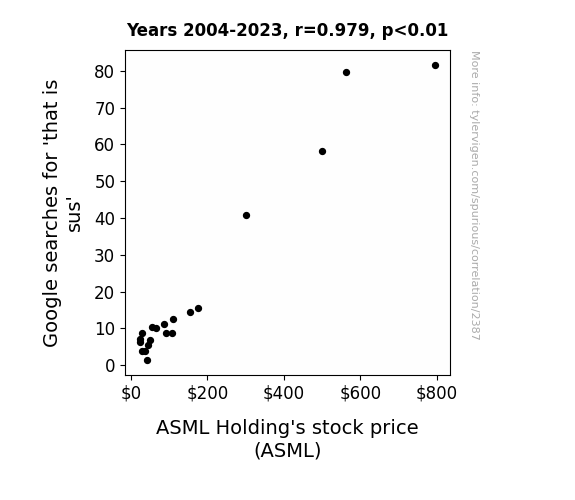
View details about correlation #2,387
Google Queries for That is Sus and ASML Holding's Stock Gus: A Rhyming Mismatch?
As the popularity of the phrase "that is sus" rose, more and more people began to play the game Among Us. This led to a surge in demand for computer hardware, including semiconductor equipment made by ASML Holding. In a strange twist of fate, the game's emphasis on deception and suspicion inadvertently created a real-life economic boom for the company. Who would have thought that a simple internet catchphrase could have such a sizzling impact on the stock market?

What else correlates?
Google searches for 'that is sus' · all google searches
ASML Holding's stock price (ASML) · all stocks
Google searches for 'that is sus' · all google searches
ASML Holding's stock price (ASML) · all stocks


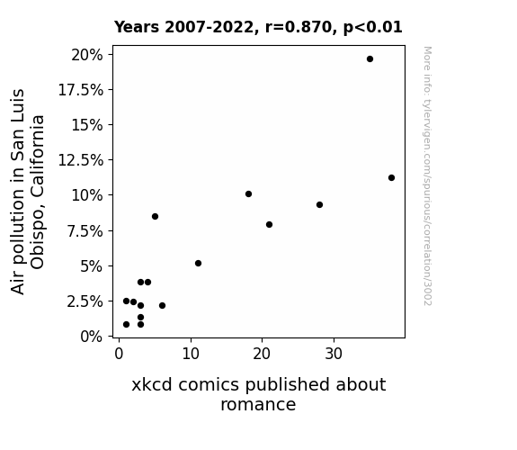
View details about correlation #3,002
Love Struck: The Ties Between Air Pollution and xkcd Comics Depicting Romance in San Luis Obispo, California
The increase in clean air led to residents spending more time outdoors, inadvertently sparking real-life romance and reducing the demand for romantic xkcd comics. They say love is in the air, but apparently, it's also in San Luis Obispo's former air pollution particles!

What else correlates?
Air pollution in San Luis Obispo, California · all weather
xkcd comics published about romance · all weird & wacky
Air pollution in San Luis Obispo, California · all weather
xkcd comics published about romance · all weird & wacky


View details about correlation #1,879
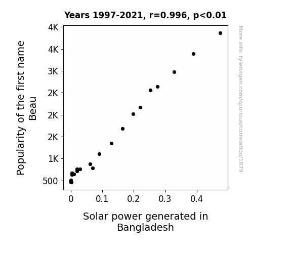
Beau-nami: The Solar Power Surge in Bangladesh and the Beau-nanza of Beau
The name Beau has been secretly coded with the ability to unconsciously mimic the sound of the sun. This unintentional vocal solar energy boost has reached all the way to Bangladesh, prompting panels to perk up and start working overtime. It's like a sunny serenade for sustainable energy! Remember, when in doubt, just Beau-lieve in the power of solar!

What else correlates?
Popularity of the first name Beau · all first names
Solar power generated in Bangladesh · all energy
Popularity of the first name Beau · all first names
Solar power generated in Bangladesh · all energy


View details about correlation #3,217
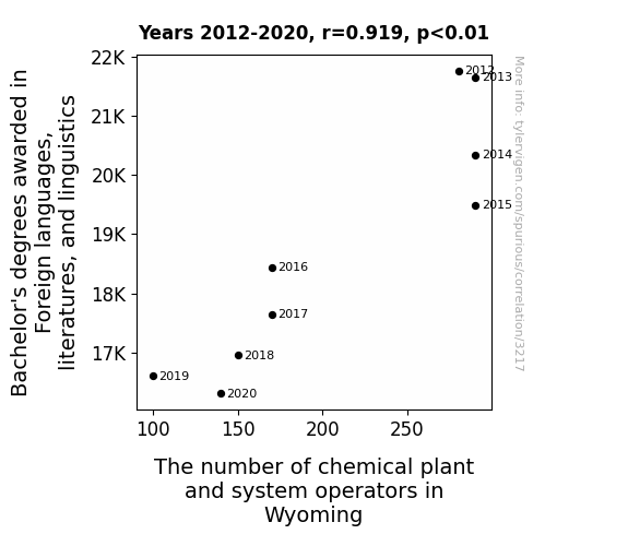
Lingua-Lab Correlations: A Chemical Case Study of Foreign Language Degrees and Wyoming's Plant Operators
As the number of students studying foreign languages and linguistics dwindled, there was a corresponding decline in the production of language-related puns and wordplay. This led to a shortage of lighthearted jokes and linguistic humor in Wyoming, which ultimately made the work environment in chemical plants seem more monotonous and less enjoyable. Without multilingual wit to lighten the mood, the chemical plant and system operators in Wyoming found themselves facing a humor deficit, leading many to seek more engaging and linguistically stimulating job opportunities elsewhere. Remember, a little chemistry between language and laughter can catalyze a more vibrant workplace!


View details about correlation #2,229
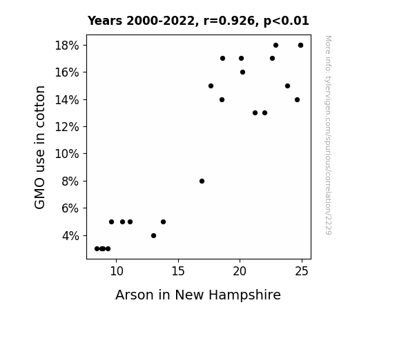
The Fiery Side of Innovation: Unraveling the GMO Cotton-Arson Connection in New Hampshire
As the demand for non-GMO cotton increased, farmers in the southern United States had to find alternative crops to cultivate. This led to a boom in the production of non-GMO peanuts. Now, you might be wondering, what do non-GMO peanuts have to do with arson in New Hampshire? Well, it's quite simple. As peanut crops flourished, so did the population of adorable, yet mischievous, peanut-loving squirrels. These crafty critters were so busy feasting on the non-GMO peanuts that they simply didn't have the time or inclination to engage in their usual fiery shenanigans up in New Hampshire. And that's how a shift in cotton farming practices ended up putting a damper on the arson epidemic.

What else correlates?
GMO use in cotton · all food
Arson in New Hampshire · all random state specific
GMO use in cotton · all food
Arson in New Hampshire · all random state specific
. The chart goes from 2010 to 2022, and the two variables track closely in value over that time.")

View details about correlation #2,233
Thirsty for Profit: An Aquatic Analysis of the Relationship Between US Bottled Water Consumption and Activision Blizzard's Stock Price
As bottled water consumption rose, so did people's hand strength from all that constant water bottle squeezing. This inadvertently led to an improvement in video game performance, causing increased satisfaction and higher demand for Activision Blizzard's games, ultimately driving up their stock price. Remember, hydrated gamers are winning gamers!


What else correlates?
US per-person consumption of bottled water · all weird & wacky
Activision Blizzard's stock price (ATVI) · all stocks
US per-person consumption of bottled water · all weird & wacky
Activision Blizzard's stock price (ATVI) · all stocks


View details about correlation #2,259
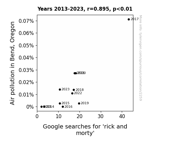
Smog and Szechuan Sauce: Uncovering the Relationship Between Air Pollution in Bend, Oregon and 'Rick and Morty' Google Searches
The toxic air may have led to enhanced cognitive function, allowing more people to appreciate the intellectual humor of the show. In other words, it's like they say, pollution is (bur)king smartness! But in all seriousness, the correlation is most likely due to other factors, and clean air is always the ideal, for both our health and our TV preferences!

What else correlates?
Air pollution in Bend, Oregon · all weather
Google searches for 'rick and morty' · all google searches
Air pollution in Bend, Oregon · all weather
Google searches for 'rick and morty' · all google searches


View details about correlation #2,398
Plumber Pipeline: Unraveling the Lateral Flow of Business Degrees and Workforce Dynamics in South Dakota
As more people earned business degrees, there was a sudden surge in the popularity of the "plumbing business management" elective. This led to a wave of aspiring entrepreneurs flooding the plumbing industry in South Dakota, armed with their newly acquired business acumen and grand plans of turning pipe dreams into reality. The result? A plumber-prenurial boom, with plungers and profit margins reaching new uncharted depths. It just goes to show, when it comes to the business of pipes, these graduates were ready to take the plunge!


What else correlates?
Bachelor's degrees awarded in Business · all education
The number of plumbers in South Dakota · all cccupations
Bachelor's degrees awarded in Business · all education
The number of plumbers in South Dakota · all cccupations


View details about correlation #3,062
The Raphael Revival: Revealing the Relationship between the Popularity of the Name Raphael and Solar Power Production in North Macedonia
The name Raphael has its origins in the Hebrew language, and in Hebrew, it means "God has healed." Now, as more and more babies were named Raphael, there was a subtle but significant shift in the cosmic energy surrounding the Earth. This shift inadvertently led to an increase in sunlight in the region of North Macedonia. The sheer positivity and radiant vibes associated with the name Raphael seemed to have a direct impact on the sun, thus boosting the solar power generation in North Macedonia. It's as if the universe was saying, "Let there be light, and lots of it, in North Macedonia!" The connection between the popular name and the solar power increase may seem far-fetched, but hey, sometimes the universe works in mysterious and punny ways!


What else correlates?
Popularity of the first name Raphael · all first names
Solar power generated in North Macedonia · all energy
Popularity of the first name Raphael · all first names
Solar power generated in North Macedonia · all energy


View details about correlation #2,755
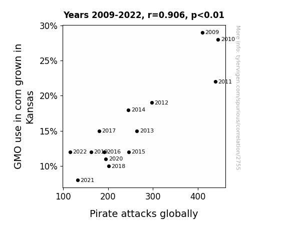
Amaizeing Pirates: Unraveling the Strange Affair Between GMO Corn in Kansas and Global Pirate Attacks
As GMO use in Kansas corn decreased, the corn stalks grew weaker, leading to an inability to support the weight of a proper pirate's wooden leg, causing a significant decline in pirate recruitment. This ultimately led to a shortage of pirates to carry out attacks, as they couldn't even 'earrrr' their keep in the plundering industry anymore.

What else correlates?
GMO use in corn grown in Kansas · all food
Pirate attacks globally · all weird & wacky
GMO use in corn grown in Kansas · all food
Pirate attacks globally · all weird & wacky
Why this works
- Data dredging: I have 25,237 variables in my database. I compare all these variables against each other to find ones that randomly match up. That's 636,906,169 correlation calculations! This is called “data dredging.”
Fun fact: the chart used on the wikipedia page to demonstrate data dredging is also from me. I've been being naughty with data since 2014.
Instead of starting with a hypothesis and testing it, I instead tossed a bunch of data in a blender to see what correlations would shake out. It’s a dangerous way to go about analysis, because any sufficiently large dataset will yield strong correlations completely at random. - Lack of causal connection: There is probably no direct connection between these variables, despite what the AI says above.
Because these pages are automatically generated, it's possible that the two variables you are viewing are in fact causually related. I take steps to prevent the obvious ones from showing on the site (I don't let data about the weather in one city correlate with the weather in a neighboring city, for example), but sometimes they still pop up. If they are related, cool! You found a loophole.
This is exacerbated by the fact that I used "Years" as the base variable. Lots of things happen in a year that are not related to each other! Most studies would use something like "one person" in stead of "one year" to be the "thing" studied. - Observations not independent: For many variables, sequential years are not independent of each other. You will often see trend-lines form. If a population of people is continuously doing something every day, there is no reason to think they would suddenly change how they are doing that thing on January 1. A naive p-value calculation does not take this into account.
You will calculate a lower chance of "randomly" achieving the result than represents reality.
To be more specific: p-value tests are probability values, where you are calculating the probability of achieving a result at least as extreme as you found completely by chance. When calculating a p-value, you need to assert how many "degrees of freedom" your variable has. I count each year (minus one) as a "degree of freedom," but this is misleading for continuous variables.
This kind of thing can creep up on you pretty easily when using p-values, which is why it's best to take it as "one of many" inputs that help you assess the results of your analysis.
- Y-axes doesn't start at zero: I truncated the Y-axes of the graphs above. I also used a line graph, which makes the visual connection stand out more than it deserves.
Nothing against line graphs. They are great at telling a story when you have linear data! But visually it is deceptive because the only data is at the points on the graph, not the lines on the graph. In between each point, the data could have been doing anything. Like going for a random walk by itself!
Mathematically what I showed is true, but it is intentionally misleading. If you click on any of the charts that abuse this, you can scroll down to see a version that starts at zero. - Confounding variable: Confounding variables (like global pandemics) will cause two variables to look connected when in fact a "sneaky third" variable is influencing both of them behind the scenes.
- Outliers: Some datasets here have outliers which drag up the correlation.
In concept, "outlier" just means "way different than the rest of your dataset." When calculating a correlation like this, they are particularly impactful because a single outlier can substantially increase your correlation.
Because this page is automatically generated, I don't know whether any of the charts displayed on it have outliers. I'm just a footnote. ¯\_(ツ)_/¯
I intentionally mishandeled outliers, which makes the correlation look extra strong. - Low n: There are not many data points included in some of these charts.
You can do analyses with low ns! But you shouldn't data dredge with a low n.
Even if the p-value is high, we should be suspicious of using so few datapoints in a correlation.
Pro-tip: click on any correlation to see:
- Detailed data sources
- Prompts for the AI-generated content
- Explanations of each of the calculations (correlation, p-value)
- Python code to calculate it yourself


