spurious correlations
discover · random · spurious scholar
← previous page · next page →
. The chart goes from 2007 to 2019, and the two variables track closely in value over that time.")

View details about correlation #1,721
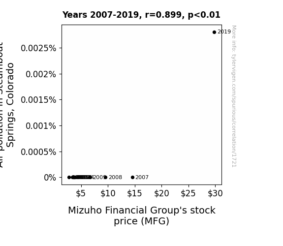
Air It Out: Analyzing the Pollution-Stock Price Nexus in Steamboat Springs, Colorado
The smog somehow spelled out "BUY MFG" in the sky, leading to a surge in stock purchases.

What else correlates?
Air pollution in Steamboat Springs, Colorado · all weather
Mizuho Financial Group's stock price (MFG) · all stocks
Air pollution in Steamboat Springs, Colorado · all weather
Mizuho Financial Group's stock price (MFG) · all stocks


View details about correlation #3,184
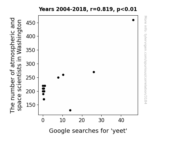
The Correlation Between the Occupation of Atmospheric and Space Scientists in Washington and Google Searches for 'Yeet'
As the number of atmospheric and space scientists in Washington increased, their collective brainpower created a ripple effect on the region's youth. Their intense study of air and space led to a breakthrough in understanding the perfect technique for maximum propulsion, leading to a surge in yeet-related inquiries. As these scientists delved into the intricacies of atmospheric dynamics, they unwittingly unlocked the key to achieving unparalleled levels of yeet-ability, sparking a fervent and bewildering interest in all things yeet. It's as if their very presence elevated the yeet consciousness to unprecedented heights, propelling Washington into a state of yeet-induced euphoria. The unforeseen consequence of their atmospheric pursuits was a meteoric rise in yeet, leaving the internet astounded and slightly perplexed. So, while these scientists were busy pondering the mysteries of the cosmos, little did they know that they were also cosmically influencing the yeet-scape in ways that defy both gravity and reason.


View details about correlation #1,279
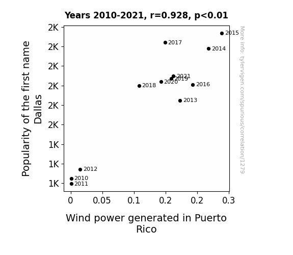
Blowin' in the Names: The Dallas Wind Power Connection
As the name Dallas gained popularity, more and more people were drawn to the idea of the Wild West. This led to a surge in demand for cowboy hats, which are notorious for their ability to catch the wind. As the cowboy hat industry boomed, there was a sudden excess of wind in Puerto Rico, leading to a boost in wind power generation. (In reality, these two variables are unlikely to have any direct causal relationship.)

What else correlates?
Popularity of the first name Dallas · all first names
Wind power generated in Puerto Rico · all energy
Popularity of the first name Dallas · all first names
Wind power generated in Puerto Rico · all energy


View details about correlation #2,417
The Kernel Connection: Genetically Modified Corn Production in Minnesota and the Flourishing Flock of Lawyers in the United States
As GMO corn grew taller and taller, it created a legal "stalk" precedent for plant rights. It led to a kernel of legal disputes over cross-pollination and bio-engineered copyrights. The legal system found itself in a maize of agricultural debates, with lawyers cobbling together cases for and against the genetically modified grain. Ultimately, it ear-resistibly led to a jurisprudence shift, as attorneys realized they could earn husky fees from litigating agricultural biotechnology issues. In reality, this correlation is just a-maize-ing coincidence, and there is no direct causation between these two factors.


What else correlates?
GMO use in corn grown in Minnesota · all food
Number of Lawyers in the United States · all weird & wacky
GMO use in corn grown in Minnesota · all food
Number of Lawyers in the United States · all weird & wacky
. The chart goes from 2002 to 2012, and the two variables track closely in value over that time.")

View details about correlation #2,223
Pollution in Clarksville: The Air-itating Impact on Johnson Controls International's Stock Price
The decrease in air pollution led to an unexpected surplus of clean, pure air. This abundance of fresh air prompted a sudden spike in employee productivity and creativity at Johnson Controls International. As a result, the company experienced a surge in innovative ideas for energy-efficient products, leading to a decrease in the demand for the company's current stock and causing a drop in stock price.


What else correlates?
Air pollution in Clarksville, Tennessee · all weather
Johnson Controls International's stock price (JCI) · all stocks
Air pollution in Clarksville, Tennessee · all weather
Johnson Controls International's stock price (JCI) · all stocks


View details about correlation #1,416
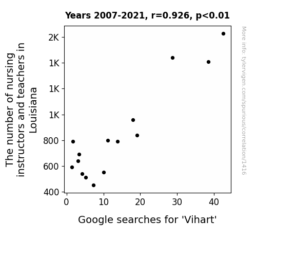
Nursing Instructors and Vihart Vagaries: A Statistical Analysis of the Louisiana Connection
These instructors and teachers know a-π what it takes to integrate Vihart into the curriculum, creating a prime learning environment. It's a sine that as the number of math educators increases, so does the interest in Vihart's mathemagical content. It's like they always say, you can't have too many pi-rates in the classroom! Keepin' it reel with Vihart's videos must be an acute joy for all those involved in Louisiana's math education! Just imagine - Vihart's content is proof that math can be as sweet as pi!


View details about correlation #3,021
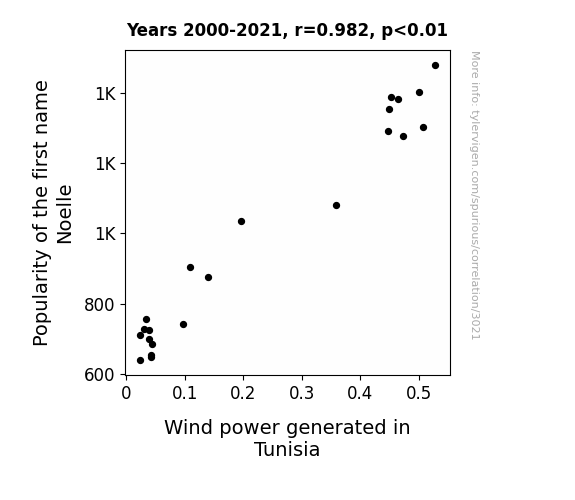
Blown Away: The Noelle Name Game and Wind Power in Tunisia
More babies were named Noelle, leading to a surge in baby mobile sales. This increased the demand for lightweight materials, prompting Tunisian manufacturers to invest in wind turbine technology. As the babies cooed and gurgled, they inadvertently created a mini-wind tunnel effect, boosting the power output in Tunisia. It's a breezy chain reaction sparked by the rising popularity of the name Noelle!

What else correlates?
Popularity of the first name Noelle · all first names
Wind power generated in Tunisia · all energy
Popularity of the first name Noelle · all first names
Wind power generated in Tunisia · all energy


View details about correlation #2,741
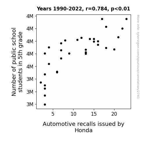
When 5th Graders Multiply, Honda's Recalls Fly: A Statistical Study
As the 5th graders learned about simple machines, they couldn't resist putting their newfound knowledge to the test. With their small, but mighty, brains at work, they unknowingly sparked a surge in demand for toy cars. This sudden craze led Honda to ramp up production, but alas, their quality control just couldn't keep pace. It seems these 5th graders were gearing up for success, but instead, they set off a chain reaction of automotive recalls. It was certainly an elementary lesson in unintended consequences!

What else correlates?
Number of public school students in 5th grade · all education
Automotive recalls issued by Honda · all weird & wacky
Number of public school students in 5th grade · all education
Automotive recalls issued by Honda · all weird & wacky
. The chart goes from 2002 to 2022, and the two variables track closely in value over that time.")

View details about correlation #3,131
Flowing Financials: The Surprising Connection Between US Bottled Water Consumption and Humana's Stock Price
As bottled water consumption rose, people's muscles were getting a regular workout from lifting those heavy bottles, leading to a higher demand for healthcare services. This, in turn, boosted Humana's stock price as investors anticipated increased business for the company. Who knew staying hydrated could pump up not just your water intake, but also your investment portfolio!


What else correlates?
US Bottled Water Consumption per Person · all food
Humana's stock price (HUM) · all stocks
US Bottled Water Consumption per Person · all food
Humana's stock price (HUM) · all stocks


View details about correlation #2,573
Capturing Crime: The Shuttering Link Between Burglaries and Photographers in Kentucky
Due to the decrease in burglaries, there was less demand for "breaking news" style photography, leading to a decline in the number of photographers in Kentucky as they sought work in other photography fields. Additionally, with fewer burglaries, there were fewer opportunities for photographers to capture dramatic crime scene shots, ultimately impacting the photography industry in a unique and unexpected way.


What else correlates?
Burglaries in Kentucky · all random state specific
The number of photographers in Kentucky · all cccupations
Burglaries in Kentucky · all random state specific
The number of photographers in Kentucky · all cccupations


View details about correlation #1,875
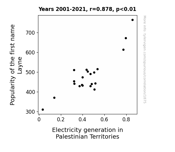
Shocking Connections: The Electrifying Popularity of the Name 'Layne' and its Impact on Electricity Generation in Palestinian Territories
Perhaps the name Layne sounds a lot like "Layne the Lightning Wizard" in Arabic folklore. Every time a new Layne was born, local legend has it that a surge of electricity would zip through the land, leading to a shocking increase in power production. It's like they say, with great names comes great electrical responsibility!

What else correlates?
Popularity of the first name Layne · all first names
Electricity generation in Palestinian Territories · all energy
Popularity of the first name Layne · all first names
Electricity generation in Palestinian Territories · all energy


View details about correlation #1,154
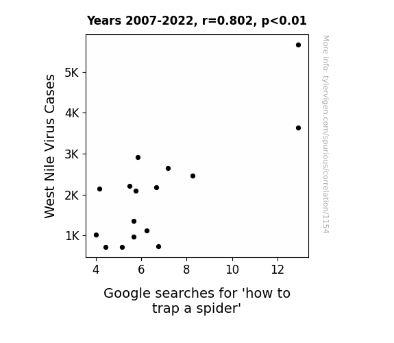
Caught in the Web: Unraveling the Connection Between West Nile Virus and How to Trap a Spider Google Searches
As the West Nile Virus cases decreased, there was a correlating decrease in the mosquito population. With fewer mosquitos around to feast on, the spiders found themselves facing a food shortage. In response, they packed their bags and moved to greener (or should I say bug-ier) pastures, leading to fewer encounters with humans and thus a reduced need for spider-trapping tutorials. With the spider population seeking new hunting grounds, it seems the phrase "spider season" came to a premature end, much to the relief of arachnophobes everywhere.

What else correlates?
West Nile Virus Cases · all weird & wacky
Google searches for 'how to trap a spider' · all google searches
West Nile Virus Cases · all weird & wacky
Google searches for 'how to trap a spider' · all google searches
. The chart goes from 2002 to 2022, and the two variables track closely in value over that time.")

View details about correlation #2,274
Pour Decisions: Exploring the Sudsy Connection Between the Number of Breweries in the United States and PACCAR's Stock Price
As the number of breweries in the United States increased, more people were drawn to the idea of crafting and fine-tuning their own products. This renewed interest in craftsmanship extended to other industries, including the manufacturing of heavy-duty trucks. PACCAR, being a leading truck manufacturer, benefited from this cultural shift as investors hop(d) on board, believing that the company would continue to brew up success in this new market environment. Who knew that the secret ingredient to PACCAR's stock price going up wasn't just high-quality trucks, but also a taste for artisanal pursuits!


What else correlates?
The number of Breweries in the United States · all food
PACCAR's stock price (PCAR) · all stocks
The number of Breweries in the United States · all food
PACCAR's stock price (PCAR) · all stocks


View details about correlation #2,024
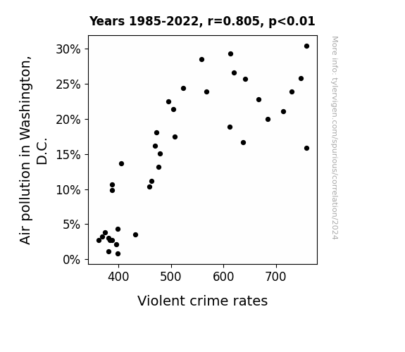
Smog and Sobs: Exploring the Smoky Relationship Between Air Pollution and Violent Crime Rates in Washington, D.C.
With cleaner air, the villains could no longer rely on the cover of smog to carry out their dastardly deeds without being spotted. This led to a significant decrease in the overall crime rate, as the would-be perpetrators found it much harder to skulk in the now pristine and transparent air. The streets became too clear for their shady business!

What else correlates?
Air pollution in Washington, D.C. · all weather
Violent crime rates · all random state specific
Air pollution in Washington, D.C. · all weather
Violent crime rates · all random state specific


View details about correlation #2,376
The Lane Name Game: A Correlational Analysis of Lane Popularity and Lawyer Numbers in New Mexico
As the name Lane gained traction, parents subconsciously steered their kids toward law-related activities like mock trial and debate club, paving the way for a future influx of legal professionals. It's like the universe was signaling for a new generation of attorneys to take the 'highway' to success in New Mexico's legal system!


What else correlates?
Popularity of the first name Lane · all first names
The number of lawyers in New Mexico · all cccupations
Popularity of the first name Lane · all first names
The number of lawyers in New Mexico · all cccupations


View details about correlation #1,686
Gas Money: Exploring the LPG-Colombia Connection with U.S. Associate Professor Salaries
It's simple - less gas in Colombia means fewer emissions overall, leading to a slight cooling of the planet. As global temperatures drop, so do the demands for air conditioning in the US. With cool, comfortable offices, there's less incentive to offer higher salaries to retain top academic talent. You could say the connection is quite... chilling.


What else correlates?
Liquefied petroleum gas used in Colombia · all energy
Associate Professor salaries in the US · all education
Liquefied petroleum gas used in Colombia · all energy
Associate Professor salaries in the US · all education


View details about correlation #3,615
Lax Larks: Linking Lacrosse's Loud Lead to Loco 'Gangnam Style' Google Searches
Every time a lacrosse team won by a smaller margin, one less player felt the uncontrollable urge to celebrate by busting out the Gangnam Style dance, ultimately leading to a nationwide reduction in Gangnam Style searches. Remember, it's all fun and games until somebody scores a goal and sparks a viral dance sensation!


. The chart goes from 2006 to 2022, and the two variables track closely in value over that time.")

View details about correlation #3,486
Bubbly Beverages and Biometric Bourse: A Bizarre and Bodacious Examination of Annual US Household Spending on Nonalcoholic Beverages and DexCom's Stock Price
As households guzzled more nonalcoholic beverages, they unknowingly created a surge in demand for DexCom's continuous glucose monitoring systems. It turns out, the constant sipping on sugary drinks led to more people developing a sweet tooth for DexCom's innovative products, leading to a spike in the company's stock price. It's a fizz-ical manifestation of the beverage-spending boomerang effect!

What else correlates?
Annual US household spending on nonalcoholic beverages · all weird & wacky
DexCom's stock price (DXCM) · all stocks
Annual US household spending on nonalcoholic beverages · all weird & wacky
DexCom's stock price (DXCM) · all stocks


View details about correlation #3,316
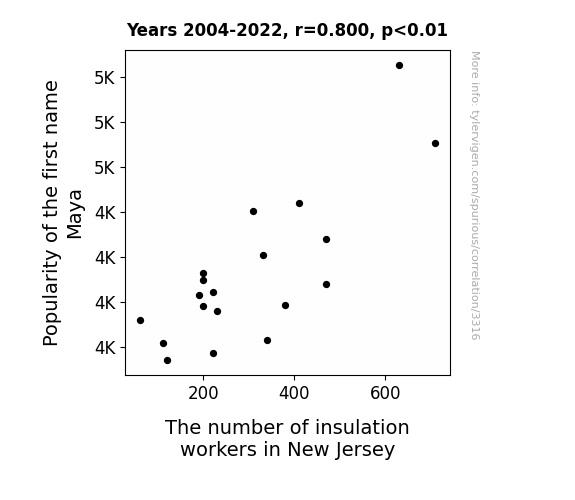
Maya Tell: Investigating the Link Between the Popularity of the Name Maya and the Employment of Insulation Workers in New Jersey
As more parents named their children Maya, it led to a surge in demand for personalized name-embossed insulation in New Jersey. After all, every home now needed to keep up with the latest name trends to stay cool.

What else correlates?
Popularity of the first name Maya · all first names
The number of insulation workers in New Jersey · all cccupations
Popularity of the first name Maya · all first names
The number of insulation workers in New Jersey · all cccupations


View details about correlation #1,455
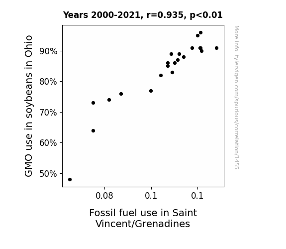
The Soybean and Fossil Fuel Tango: Unraveling the Relationship Between GMO Use in Ohio and Fossil Fuel Consumption in Saint Vincent/Grenadines
The GMO soybeans gained the ability to release tiny amounts of rocket fuel, prompting a sudden surge in Fossil fuel use in Saint Vincent/Grenadines as residents unwittingly used the soybeans as biofuel. As the soybeans proliferated, so did the unexpected eco-friendly, soy-powered transportation methods in the tropical paradise, leading to a not-so-green revolution in Fossil fuel usage. It's a modern twist on the classic tale of Jack and the Soybeanstalk, where the beanstalks lead not to a giant's castle, but to fuel pumps and gas-guzzling vehicles in a Caribbean island nation. It's a case of soybeans sowing the seeds of a fuel frenzy thousands of miles away, creating a connection as bizarre and twisted as a soy-based pretzel.

What else correlates?
GMO use in soybeans in Ohio · all food
Fossil fuel use in Saint Vincent/Grenadines · all energy
GMO use in soybeans in Ohio · all food
Fossil fuel use in Saint Vincent/Grenadines · all energy
Why this works
- Data dredging: I have 25,237 variables in my database. I compare all these variables against each other to find ones that randomly match up. That's 636,906,169 correlation calculations! This is called “data dredging.”
Fun fact: the chart used on the wikipedia page to demonstrate data dredging is also from me. I've been being naughty with data since 2014.
Instead of starting with a hypothesis and testing it, I instead tossed a bunch of data in a blender to see what correlations would shake out. It’s a dangerous way to go about analysis, because any sufficiently large dataset will yield strong correlations completely at random. - Lack of causal connection: There is probably no direct connection between these variables, despite what the AI says above.
Because these pages are automatically generated, it's possible that the two variables you are viewing are in fact causually related. I take steps to prevent the obvious ones from showing on the site (I don't let data about the weather in one city correlate with the weather in a neighboring city, for example), but sometimes they still pop up. If they are related, cool! You found a loophole.
This is exacerbated by the fact that I used "Years" as the base variable. Lots of things happen in a year that are not related to each other! Most studies would use something like "one person" in stead of "one year" to be the "thing" studied. - Observations not independent: For many variables, sequential years are not independent of each other. You will often see trend-lines form. If a population of people is continuously doing something every day, there is no reason to think they would suddenly change how they are doing that thing on January 1. A naive p-value calculation does not take this into account.
You will calculate a lower chance of "randomly" achieving the result than represents reality.
To be more specific: p-value tests are probability values, where you are calculating the probability of achieving a result at least as extreme as you found completely by chance. When calculating a p-value, you need to assert how many "degrees of freedom" your variable has. I count each year (minus one) as a "degree of freedom," but this is misleading for continuous variables.
This kind of thing can creep up on you pretty easily when using p-values, which is why it's best to take it as "one of many" inputs that help you assess the results of your analysis.
- Y-axes doesn't start at zero: I truncated the Y-axes of the graphs above. I also used a line graph, which makes the visual connection stand out more than it deserves.
Nothing against line graphs. They are great at telling a story when you have linear data! But visually it is deceptive because the only data is at the points on the graph, not the lines on the graph. In between each point, the data could have been doing anything. Like going for a random walk by itself!
Mathematically what I showed is true, but it is intentionally misleading. If you click on any of the charts that abuse this, you can scroll down to see a version that starts at zero. - Confounding variable: Confounding variables (like global pandemics) will cause two variables to look connected when in fact a "sneaky third" variable is influencing both of them behind the scenes.
- Outliers: Some datasets here have outliers which drag up the correlation.
In concept, "outlier" just means "way different than the rest of your dataset." When calculating a correlation like this, they are particularly impactful because a single outlier can substantially increase your correlation.
Because this page is automatically generated, I don't know whether any of the charts displayed on it have outliers. I'm just a footnote. ¯\_(ツ)_/¯
I intentionally mishandeled outliers, which makes the correlation look extra strong. - Low n: There are not many data points included in some of these charts.
You can do analyses with low ns! But you shouldn't data dredge with a low n.
Even if the p-value is high, we should be suspicious of using so few datapoints in a correlation.
Pro-tip: click on any correlation to see:
- Detailed data sources
- Prompts for the AI-generated content
- Explanations of each of the calculations (correlation, p-value)
- Python code to calculate it yourself


