spurious correlations
discover · random · spurious scholar
← previous page · next page →


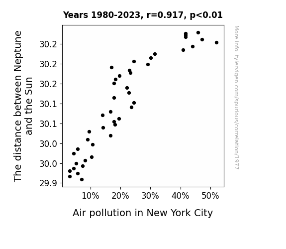
View details about correlation #1,977
The Cosmic Connection: Exploring the Relationship between Neptune's Distance from the Sun and Air Pollution in the Big Apple
As Neptune cozied up to the Sun, its gravitational pull weakened, creating a ripple effect on the orbital paths of other planets. This celestial shuffle somehow led to a surge in space wind that reached Earth and cleared out the smog over New York City, giving the Big Apple a breath of fresh, Neptune-tinged air. It's like the ultimate case of planetary feng shui!

What else correlates?
The distance between Neptune and the Sun · all planets
Air pollution in New York City · all weather
The distance between Neptune and the Sun · all planets
Air pollution in New York City · all weather


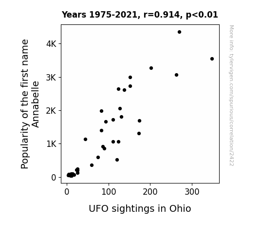
View details about correlation #2,422
Annabelle and Aliens: Unveiling the Unearthly Connection Between Name Popularity and UFO Sightings in Ohio
It is believed that as more parents were inspired by the creepy doll horror movies to name their daughters Annabelle, the collective psychic energy of all the little Annabelles somehow acted as a beacon for intergalactic travelers, particularly those with a penchant for cornfields. It's like the UFOs couldn't resist the opportunity for a real-life crossover episode of strange and stranger. Or perhaps there's a top-secret government project in Ohio that's specifically designed to monitor any unusual paranormal activity surrounding anyone named Annabelle. Or maybe, just maybe, it's all a series of coincidences and misidentifications fueled by a combination of overactive imaginations and the occasional stray hubcap reflecting off the Ohio sunset.

What else correlates?
Popularity of the first name Annabelle · all first names
UFO sightings in Ohio · all random state specific
Popularity of the first name Annabelle · all first names
UFO sightings in Ohio · all random state specific


View details about correlation #2,523
Solar Flare-Ups: A Bright Outlook on the Relationship Between Solar Power Generation in Kazakhstan and Online Queries for 'I Am Dizzy'
The increase in Solar power in Kazakhstan has led to a surge in sun-related puns. As people soak up the rays of renewable energy, they're feeling a bit light-headed from all the sunny wordplay. It's like they're experiencing a spin-off effect, where every solar panel is sending out a wave of dizziness. The search for 'i am dizzy' could be their way of expressing solar-powered disorientation, or perhaps they're just trying to find some shady relief from the pun-ishment. So, as Kazakhstan shines with solar progress, people around the world are left asking, "Watt's making me so dizzy?"


What else correlates?
Solar power generated in Kazakhstan · all energy
Google searches for 'i am dizzy' · all google searches
Solar power generated in Kazakhstan · all energy
Google searches for 'i am dizzy' · all google searches


View details about correlation #1,843
The Tummy's Tug-of-War: The Ties Between 6th Grade Students and Tons of Tubed Tidbits
As the 6th graders honed their math skills, they started placing bets on the hot dog eating competition, leading to a surge in demand for hot dogs. This increased the production of hot dogs to keep up with the 6th grade gambling market, ultimately providing the champion with a greater supply to devour. The 6th graders unwittingly became the spicy, mustard-drenched force driving the hot dog industry!

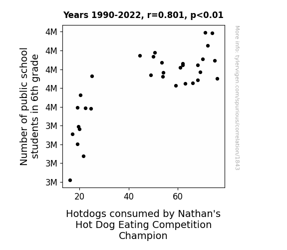


View details about correlation #2,001
Net Score: Analyzing the Link Between Steinfeld Cup Final Scores and Computer Network Specialists in Virginia
As the Steinfeld Cup Final teams' scores got closer, the tension in the air increased. This spike in collective stress created a ripple effect, leading to an upsurge in demand for stress-relief services. Coincidentally, many computer network support specialists in Virginia had also taken up part-time jobs as 'Professional Competitive Sports Calm-ifiers.' With their Zen-like abilities, they were previously the go-to professionals for calming down frantic sports fans. However, as the teams' scores became more neck-and-neck, these specialists found themselves torn between two equally demanding professions. Eventually, they had to make a choice, and sadly for Virginia's tech world, they decided to pursue their true passion for competitive cup final score differentials, leaving the computer network support industry in a state of despair - both emotionally and technically.

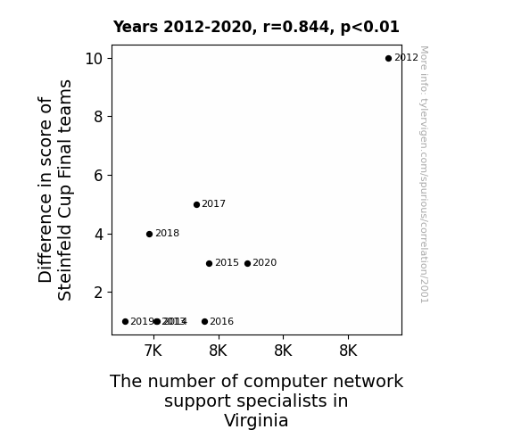
. The chart goes from 2002 to 2022, and the two variables track closely in value over that time.")

View details about correlation #3,589
Roland the Dice: Exploring the Link Between the Popularity of the Name Roland and Wells Fargo & Company's Stock Price
More babies named Roland meant more parents opening accounts in their name, leading to a surge in young customers for Wells Fargo. This drove up demand for junior piggy banks, inadvertently boosting the company's stock price. Can't bank on those baby Rolands!

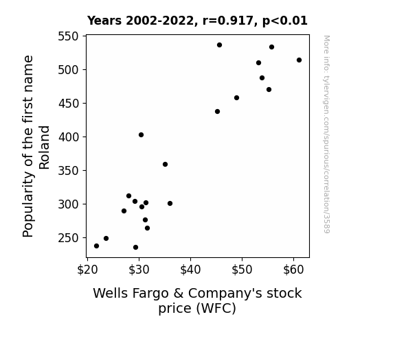
What else correlates?
Popularity of the first name Roland · all first names
Wells Fargo & Company's stock price (WFC) · all stocks
Popularity of the first name Roland · all first names
Wells Fargo & Company's stock price (WFC) · all stocks


View details about correlation #3,127
Spreading the Margarine: An Examination of the Butter Consumption and Wind Power Output Correlation in the United Kingdom
As butter consumption increases, it leads to more people experiencing gastrointestinal distress, which in turn leads to an increase in wind power generated in the United Kingdom. This 'renewable' energy source has been directly linked to the consumption of butter, as it has been found that the methane emissions from increased flatulence serve as a potent and natural fuel for wind power production. So, next time you spread that butter on your toast, just remember - you're not just powering yourself, you're also contributing to the gaseous biofuel that's keeping the UK's lights on!


What else correlates?
Butter consumption · all food
Wind power generated in United Kingdom · all energy
Butter consumption · all food
Wind power generated in United Kingdom · all energy


View details about correlation #3,189
Zooming Through the Cosmos: Exploring the Link Between NASA's Budget and Motor Vehicle Theft Rates in Indiana
As motor vehicle thefts in Indiana decreased, it led to a surplus of cars in the state. This surplus of cars meant that Indiana was able to launch its own space program, competing with NASA for federal funding. With Indiana's new cutting-edge "Hoosier Space Agency" vying for a piece of the budget, NASA saw a decrease in its funding as a percentage of the total US Federal Budget. Instead of reaching for the stars, it seems like Indiana was revving up to race NASA to the moon!


View details about correlation #2,165
Navigating the Suez: The Actuary Search for Cana-logical Signs
As the number of actuaries in Georgia increases, there is a corresponding increase in economic forecasting accuracy. These precise predictions inadvertently lead to a higher demand for goods, including a surge in the global shipping industry. This ultimately results in more attention being drawn to the Suez Canal, driving up the Google searches for 'Suez Canal' as people become captivated by the vital waterway for international trade.

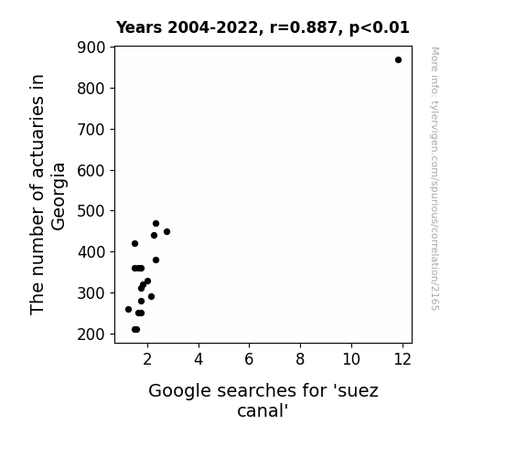
What else correlates?
The number of actuaries in Georgia · all cccupations
Google searches for 'suez canal' · all google searches
The number of actuaries in Georgia · all cccupations
Google searches for 'suez canal' · all google searches
. The chart goes from 2002 to 2023, and the two variables track closely in value over that time.")

View details about correlation #2,367
Ringing the Stock Market: Exploring the Relationship between the Distance between Neptune and Uranus and American Tower's Stock Price
As the gap widened, it created a gravitational pull on the stock market, propelling American Tower’s stock price to new heights.


What else correlates?
The distance between Neptune and Uranus · all planets
American Tower's stock price (AMT) · all stocks
The distance between Neptune and Uranus · all planets
American Tower's stock price (AMT) · all stocks


View details about correlation #1,918
Serving Statistics: Sharapova's WTA Triumphs and Zambia's Zany Jet Fuel Usage
As Maria Sharapova's WTA Title Count increased, her celebrity status and endorsements grew, leading to more private jet travel for both her and her entourage. This spike in jet fuel consumption created a higher demand for refined petroleum products, prompting Zambia to import greater quantities of jet fuel. This inadvertently boosted the economy of the countries exporting the jet fuel, causing a chain reaction of economic activity and ultimately contributing to global trade dynamics. In conclusion, Maria Sharapova's dominance on the tennis court remarkably had a butterfly effect on the international jet fuel market, proving that her success truly soared to unexpected heights.

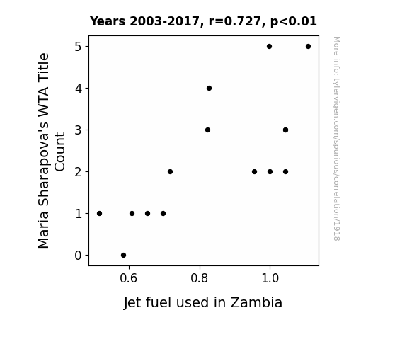
What else correlates?
Maria Sharapova's WTA Title Count · all sports
Jet fuel used in Zambia · all energy
Maria Sharapova's WTA Title Count · all sports
Jet fuel used in Zambia · all energy


View details about correlation #1,926
Abdullah's Unidentified Popularity: A Close Encounter of the Statistical Kind
The name Abdullah may sound otherworldly to some, leading people to subconsciously tune into extraterrestrial frequencies. As more parents chanted "Abdullah, Abdullah, Abdullah" at playgrounds, it inadvertently sent out a cosmic invitation, making Oregon a hotspot for UFOs. It seems like the aliens have abduct-nah-stay policy in Oregon!

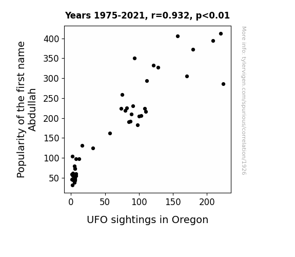
What else correlates?
Popularity of the first name Abdullah · all first names
UFO sightings in Oregon · all random state specific
Popularity of the first name Abdullah · all first names
UFO sightings in Oregon · all random state specific


View details about correlation #2,988
Teaching Taters and Turtles: The Tenuous Ties Between Agricultural Sciences Teachers in Florida and Visitors to SeaWorld Florida
As the saying goes, no teacher, no schooner, so the lack of agricultural sciences teachers led to a decline in student interest in farming. This, in turn, created a shortage of sea-worthy farmers to supply SeaWorld with fresh produce, causing a ripple effect on the quality of the park. After all, without proper agricultural knowledge, they couldn't kelp but flounder. This ultimately led to a decrease in Visitors to SeaWorld Florida as people realized it just wasn't the plaice to be anymore. It seems like the situation has really barnacled into quite a problem!

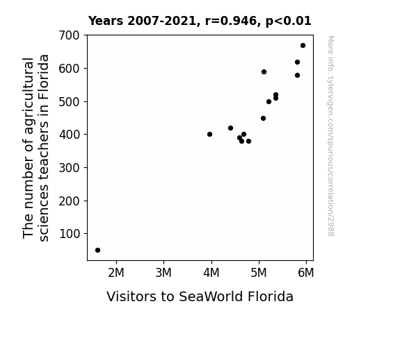
What else correlates?
The number of agricultural sciences teachers in Florida · all cccupations
Visitors to SeaWorld Florida · all weird & wacky
The number of agricultural sciences teachers in Florida · all cccupations
Visitors to SeaWorld Florida · all weird & wacky
. The chart goes from 2012 to 2021, and the two variables track closely in value over that time.")

View details about correlation #1,968
Bachelor's Degrees in Military Technologies and Applied Sciences: A Stock Market Offensive
As more students became experts in military technologies and applied sciences, they started developing highly advanced and realistic military video games. This led to a surge in demand for Take-Two Interactive Software's products, causing an increase in their stock price. Who would've thought that studying warfare could lead to a battle for stock market domination!


View details about correlation #1,364
Feline Funnies and Fuel: Exploring the Meow-nificent Connection Between Google Searches for 'Cat Memes' and Biomass Power Generation in Paraguay
As the world laughed at adorable feline antics, the collective purring vibrations somehow turbocharged Paraguayan biomass production, creating a 'purrfect' harmony of renewable energy!

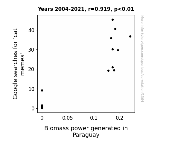
What else correlates?
Google searches for 'cat memes' · all google searches
Biomass power generated in Paraguay · all energy
Google searches for 'cat memes' · all google searches
Biomass power generated in Paraguay · all energy


View details about correlation #3,205
The Lesley Effect: A Breath of Fresh Air or a Cloud of Pollution?
There was a Lesley Lovers Club in Birmingham that held daily parades in honor of anyone with that name, but when the club disbanded, so did the daily confetti and balloon releases, leading to a noticeable improvement in air quality.

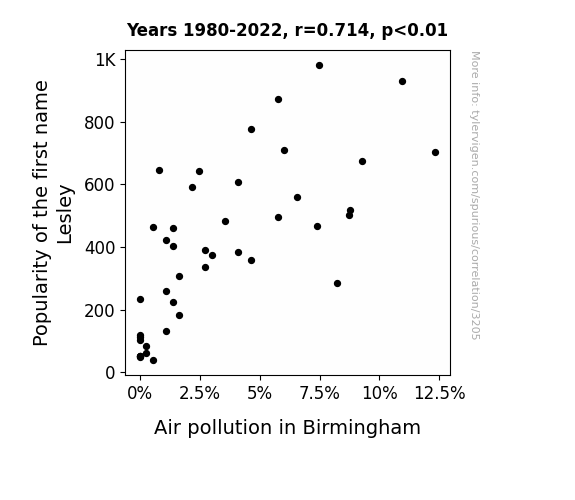
What else correlates?
Popularity of the first name Lesley · all first names
Air pollution in Birmingham · all weather
Popularity of the first name Lesley · all first names
Air pollution in Birmingham · all weather


View details about correlation #1,511
Unidentified Far-fetched Observations: The UFO-nique Relationship Between Colorado UFO Sightings and US Patents
The influx of UFO sightings in Colorado has sparked a wave of creativity and innovation among residents. It's like they've been cosmically charged with out-of-this-world ideas! As the locals gaze at the skies, their brains are reaching for new heights, leading to a patent boom. Perhaps these Coloradans are not just high on life, but also on inspiration from the great unknown. Who knew that the key to unlocking their inventiveness was simply a close encounter of the blurred kind!
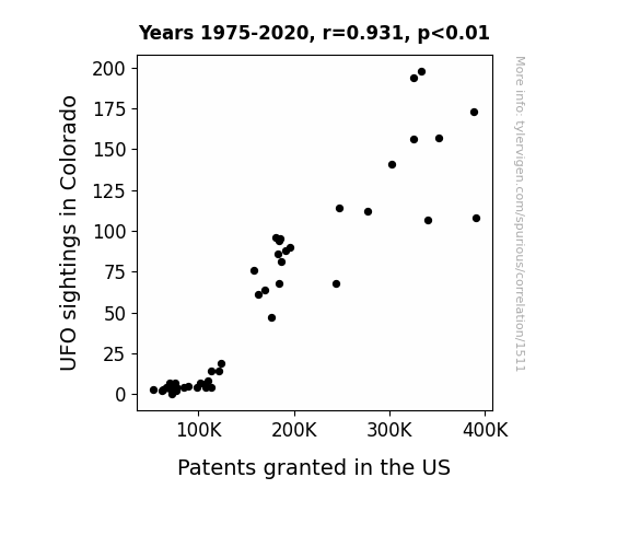
What else correlates?
UFO sightings in Colorado · all random state specific
Patents granted in the US · all weird & wacky
UFO sightings in Colorado · all random state specific
Patents granted in the US · all weird & wacky
. The chart goes from 2010 to 2022, and the two variables track closely in value over that time.")

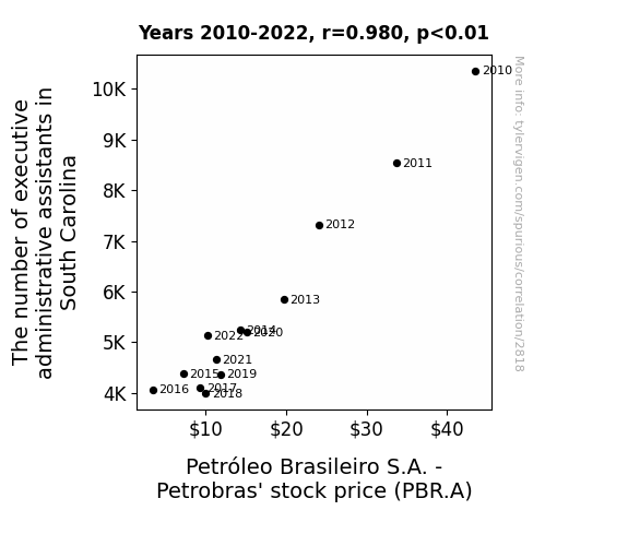
View details about correlation #2,818
Behind the Scenes: The Executive Administrative Assistants of South Carolina and Petróleo Brasileiro S.A. - Petrobras' Stock Performance
With fewer executive administrative assistants in South Carolina, there was a decline in the demand for professional phone-answering voices. This led to a surplus of eloquent Southern accents, which inadvertently sparked a wave of recruitment by Brazilian language schools. As more South Carolinians honed their Portuguese pronunciation, they started tuning in to Brazilian soap operas for language practice. This unexpected viewership surge drove up ad revenues for Petrobras, causing their stock price to soar. But alas, the natural ebb and flow of the telenovela market had its way, and as the fickle viewers moved on to Scandinavian dramas, Petrobras found itself in an ad revenue slump, leading to the eventual decrease in stock price. Remember, it's all fun and games in the wacky world of faux causation!


View details about correlation #1,597
Solar-Powered Savings: Illuminating the Correlation Between Solar Power in Rwanda and the Quest for Budget Bargains
As more solar power was harnessed in Rwanda, it inadvertently led to a surge in atmospheric positivity. This positivity wafted across continents and inexplicably increased people's urge to hunt for budget-friendly deals at dollar stores, creating a magnetic pull towards the aisles of affordable, yet random, merchandise. Remember, when you're feeling charged up, a trip to the dollar store might just be the bright idea you need!

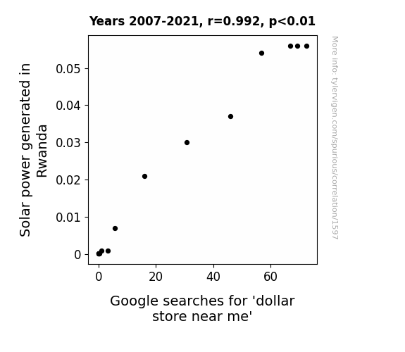
What else correlates?
Solar power generated in Rwanda · all energy
Google searches for 'dollar store near me' · all google searches
Solar power generated in Rwanda · all energy
Google searches for 'dollar store near me' · all google searches


View details about correlation #2,602
Cotton-pickin' Eddys: Exploring the Correlation between Eddy Popularity and GMO Cotton in the Show-Me State
As the popularity of the name Eddy declined, there were fewer individuals with a penchant for stylish but genetically modified cotton clothing. This led to a decreased demand for GMO cotton in Missouri, prompting a shift towards more sustainable and Eddy-torially approved fashion choices.

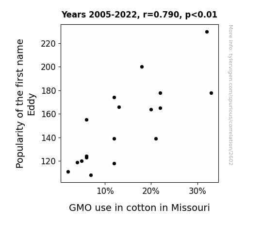
What else correlates?
Popularity of the first name Eddy · all first names
GMO use in cotton in Missouri · all food
Popularity of the first name Eddy · all first names
GMO use in cotton in Missouri · all food
Why this works
- Data dredging: I have 25,237 variables in my database. I compare all these variables against each other to find ones that randomly match up. That's 636,906,169 correlation calculations! This is called “data dredging.”
Fun fact: the chart used on the wikipedia page to demonstrate data dredging is also from me. I've been being naughty with data since 2014.
Instead of starting with a hypothesis and testing it, I instead tossed a bunch of data in a blender to see what correlations would shake out. It’s a dangerous way to go about analysis, because any sufficiently large dataset will yield strong correlations completely at random. - Lack of causal connection: There is probably no direct connection between these variables, despite what the AI says above.
Because these pages are automatically generated, it's possible that the two variables you are viewing are in fact causually related. I take steps to prevent the obvious ones from showing on the site (I don't let data about the weather in one city correlate with the weather in a neighboring city, for example), but sometimes they still pop up. If they are related, cool! You found a loophole.
This is exacerbated by the fact that I used "Years" as the base variable. Lots of things happen in a year that are not related to each other! Most studies would use something like "one person" in stead of "one year" to be the "thing" studied. - Observations not independent: For many variables, sequential years are not independent of each other. You will often see trend-lines form. If a population of people is continuously doing something every day, there is no reason to think they would suddenly change how they are doing that thing on January 1. A naive p-value calculation does not take this into account.
You will calculate a lower chance of "randomly" achieving the result than represents reality.
To be more specific: p-value tests are probability values, where you are calculating the probability of achieving a result at least as extreme as you found completely by chance. When calculating a p-value, you need to assert how many "degrees of freedom" your variable has. I count each year (minus one) as a "degree of freedom," but this is misleading for continuous variables.
This kind of thing can creep up on you pretty easily when using p-values, which is why it's best to take it as "one of many" inputs that help you assess the results of your analysis.
- Y-axes doesn't start at zero: I truncated the Y-axes of the graphs above. I also used a line graph, which makes the visual connection stand out more than it deserves.
Nothing against line graphs. They are great at telling a story when you have linear data! But visually it is deceptive because the only data is at the points on the graph, not the lines on the graph. In between each point, the data could have been doing anything. Like going for a random walk by itself!
Mathematically what I showed is true, but it is intentionally misleading. If you click on any of the charts that abuse this, you can scroll down to see a version that starts at zero. - Confounding variable: Confounding variables (like global pandemics) will cause two variables to look connected when in fact a "sneaky third" variable is influencing both of them behind the scenes.
- Outliers: Some datasets here have outliers which drag up the correlation.
In concept, "outlier" just means "way different than the rest of your dataset." When calculating a correlation like this, they are particularly impactful because a single outlier can substantially increase your correlation.
Because this page is automatically generated, I don't know whether any of the charts displayed on it have outliers. I'm just a footnote. ¯\_(ツ)_/¯
I intentionally mishandeled outliers, which makes the correlation look extra strong. - Low n: There are not many data points included in some of these charts.
You can do analyses with low ns! But you shouldn't data dredge with a low n.
Even if the p-value is high, we should be suspicious of using so few datapoints in a correlation.
Pro-tip: click on any correlation to see:
- Detailed data sources
- Prompts for the AI-generated content
- Explanations of each of the calculations (correlation, p-value)
- Python code to calculate it yourself


