spurious correlations
discover · random · spurious scholar
← previous page · next page →


View details about correlation #2,174
Sparking Interest: The Shocking Connection Between Formula One World Drivers' Champion's Point Margin and Automotive Recalls for Electrical System Issues
As the point margin increases, the drivers become more electrified, leading to a surge in electrical system issues for the automotive industry. It's shocking how winning in Formula One can spark a recall.


. The chart goes from 2002 to 2022, and the two variables track closely in value over that time.")

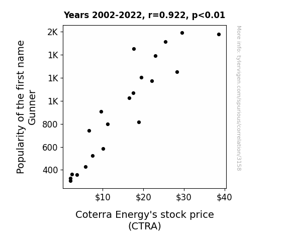
View details about correlation #3,158
Stocking Up on Gunners: A Name-dropping Analysis of Coterra Energy's Performance
As more babies were named Gunner, the demand for futuristic-sounding energy sources like laser beams and plasma reactors skyrocketed. This led to speculation about Coterra Energy's secret development of sci-fi energy technology, causing their stock price to surge to new intergalactic heights. It's a bullish market for unconventional energy, thanks to all the little Gunners running around!

What else correlates?
Popularity of the first name Gunner · all first names
Coterra Energy's stock price (CTRA) · all stocks
Popularity of the first name Gunner · all first names
Coterra Energy's stock price (CTRA) · all stocks


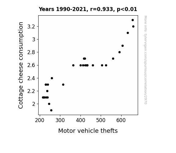
View details about correlation #2,970
Say Cheese! The Whey to a Safer Neighborhood: An Empirical Analysis of Cottage Cheese Consumption and Motor Vehicle Thefts
It turns out, as Cottage cheese consumption decreased, there was a surplus of it in the abandoned dairies. As a result, cunning individuals decided to stage elaborate heists to steal the valuable commodity, leading to a decrease in available manpower for motor vehicle thefts. It was a dairy good reason for the unexpected correlation!

What else correlates?
Cottage cheese consumption · all food
Motor vehicle thefts · all random state specific
Cottage cheese consumption · all food
Motor vehicle thefts · all random state specific


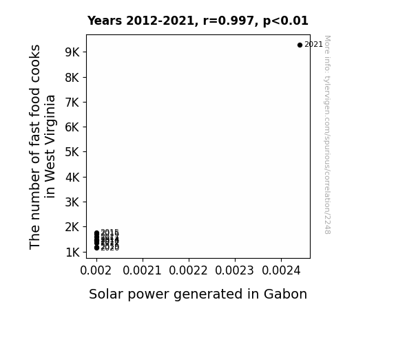
View details about correlation #2,248
Grease and Gleam: The Grim Correlation Between Fast Food Cooks in West Virginia and Solar Power in Gabon
As more fries sizzled in West Virginia, the sun felt the need to show off its own sizzling power in Gabon, leading to an unexpected surge in solar energy production. It's as if the universe said, "If you're gonna fry, then I'm gonna shine!"

What else correlates?
The number of fast food cooks in West Virginia · all cccupations
Solar power generated in Gabon · all energy
The number of fast food cooks in West Virginia · all cccupations
Solar power generated in Gabon · all energy


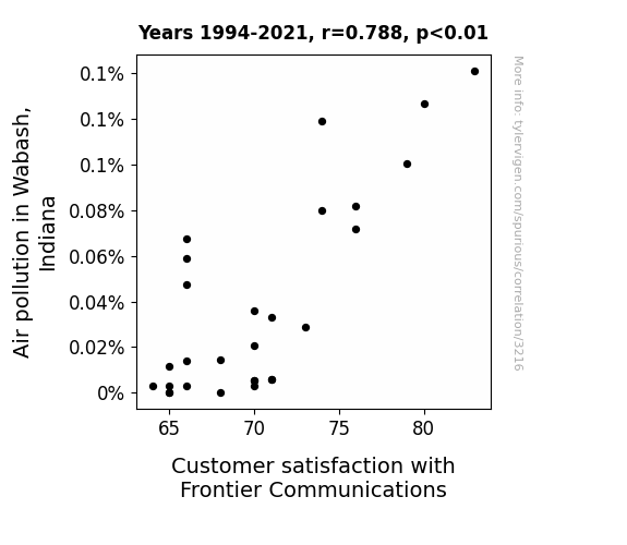
View details about correlation #3,216
Airborne Aggravation: Analyzing the Amusing Association Between Air Pollution in Wabash and Customer Contentment with Frontier Communications
As the air cleared in Wabash, it also cleared people's minds, making them more aware of the subpar service provided by Frontier Communications. It seems like Frontier's connection with customer satisfaction was as unstable as their internet connection!

What else correlates?
Air pollution in Wabash, Indiana · all weather
Customer satisfaction with Frontier Communications · all weird & wacky
Air pollution in Wabash, Indiana · all weather
Customer satisfaction with Frontier Communications · all weird & wacky
. The chart goes from 2002 to 2022, and the two variables track closely in value over that time.")

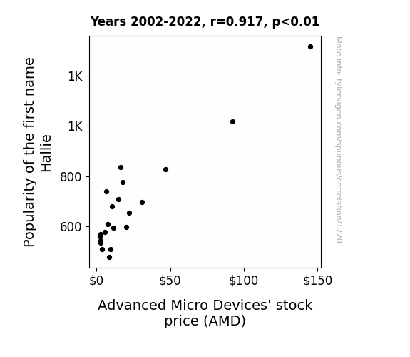
View details about correlation #1,720
Name Popularity and Chip Stocks: The 'Hallie' Effect on AMD
Rumor has it that every time a baby was named Hallie, a little spark of good luck was zapped into the semiconductor industry. As more and more parents fell in love with the name Hallie, the cumulative effect of all that baby-induced luck created a rising tide that lifted AMD's stock price. Some say it's all down to a secret Hallie-Halley's Comet connection, but it could just be that Hallie sounds like 'hallelujah,' and investors couldn't help but chant it as AMD's numbers soared.

What else correlates?
Popularity of the first name Hallie · all first names
Advanced Micro Devices' stock price (AMD) · all stocks
Popularity of the first name Hallie · all first names
Advanced Micro Devices' stock price (AMD) · all stocks


View details about correlation #2,198
Stalk-ing Success: The Corny Connection Between GMO Use in Texas Corn and National Lacrosse Champions' Final Point
The decrease in GMO use led to a decrease in corn production, which in turn led to a shortage of corn syrup. With less corn syrup available, the lacrosse team had to switch to a different sports drink, which affected their performance, ultimately causing a decrease in their final point.


What else correlates?
GMO use in corn grown in Texas · all food
National Lacrosse Champions' Final Point · all sports
GMO use in corn grown in Texas · all food
National Lacrosse Champions' Final Point · all sports


View details about correlation #2,260
Sew Many Burglaries: Unraveling the Connection Between Tailors and Burglaries in Alabama
As the number of tailors, dressmakers, and custom sewers in Alabama decreased, there was a parallel decrease in the production of trendy and fashionable clothing items. This led to a statewide fashion crisis, where even the most stylish burglars were caught off guard by the lack of chic loot. Unable to steal classy and up-to-date attire, the burglars either gave up their thieving ways or resorted to pilfering vintage clothing, inadvertently becoming the quirkiest and most anachronistic criminals in Alabama's history. The lack of sartorial splendor effectively thwarted the burglary epidemic, as the once fashion-forward felons found themselves at the mercy of out-of-date wardrobes, ultimately trading their black masks for old-timey bonnets and their swag bags for embroidered handbags from yesteryear. It turns out, the real crime was the lack of fashion sense!


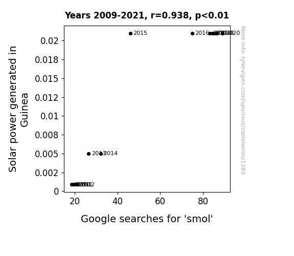
View details about correlation #1,283
Shining Light on 'Smol': Illuminating the Connection Between Solar Power in Guinea and Google Searches for 'smol'
As solar power usage in Guinea increased, the nation's enthusiasm for renewable energy lit up. This newfound focus on all things solar sparked a wave of adorably compact solar panels, leading to a surge in the market for smol, Guinea-made energy solutions. As the country embraced the cuteness of pint-sized power sources, the internet couldn't help but join in on the trend, giving a whole new meaning to the term "powering smol devices."

What else correlates?
Solar power generated in Guinea · all energy
Google searches for 'smol' · all google searches
Solar power generated in Guinea · all energy
Google searches for 'smol' · all google searches


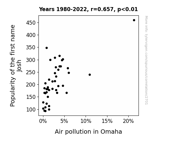
View details about correlation #2,701
Josh-ing the Air: A Gaseous Connection Between the Popularity of the Name Josh and Air Pollution in Omaha
As the popularity of the name Josh decreased, there were fewer people named Josh. This led to a decrease in the collective hot air being blown, reducing the overall emissions in Omaha.

What else correlates?
Popularity of the first name Josh · all first names
Air pollution in Omaha · all weather
Popularity of the first name Josh · all first names
Air pollution in Omaha · all weather


View details about correlation #1,478
Theatrical Trends and Traveling Treasures: Exploring the Link Between Movie Releases and US Hotel Revenue
As the number of movies released annually increased, more people sought out cinematic experiences, leading to a greater demand for hotel accommodations. Coincidentally, these films were so captivating that audiences couldn't help but book rooms to extend their movie-watching vacations. It's like the movies were saying, "Check in for drama, check out with a comedy of errors!"


What else correlates?
Number of Movies Released Annually · all films & actors
US hotel industry's revenue per available room · all weird & wacky
Number of Movies Released Annually · all films & actors
US hotel industry's revenue per available room · all weird & wacky


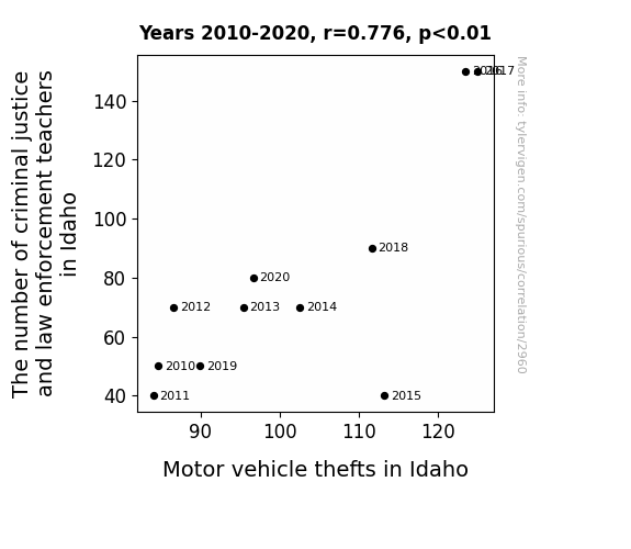
View details about correlation #2,960
The Criminal Justice Education Effect: Unveiling the Link Between Law Enforcement Teachers in Idaho and Motor Vehicle Thefts
These teachers were just really driving home the lesson on criminal behavior, sparking a new wave of car theft enthusiasts. It seems like Idaho's law enforcement education program may have unintentionally revved up the criminal car theft industry.


View details about correlation #2,108
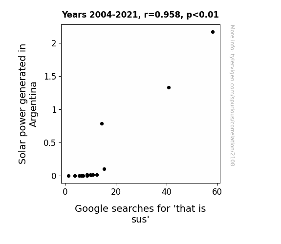
Charging Up Sus-picious Behavior: The Solar Side of 'That Is Sus' Google Searches in Argentina
As the solar panels absorbed more and more sunlight, they began to develop a sassy attitude, leading people to question their behavior and utter, "That is sus." It's like the panels were not just converting solar energy, but also emitting a vibe of suspicion, making everyone wonder what shifty business they were up to. Remember, with great power comes great sus-ponsibility!

What else correlates?
Solar power generated in Argentina · all energy
Google searches for 'that is sus' · all google searches
Solar power generated in Argentina · all energy
Google searches for 'that is sus' · all google searches
. The chart goes from 2012 to 2021, and the two variables track closely in value over that time.")

View details about correlation #2,397
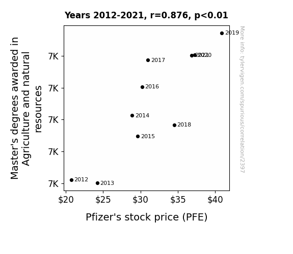
Sowing the Seeds of Financial Growth: The Agri-Masters-PFE Nexus
As the number of individuals with advanced agricultural knowledge grew, so did the quality and quantity of organic produce. This led to a surge in demand for fresh, natural ingredients, including those used in Pfizer's pharmaceutical products. As Pfizer's production costs for plant-based medicines decreased, their profit margins bloomed, positively impacting their stock price. It's like the circle of life, but for stocks and leafy greens.

What else correlates?
Master's degrees awarded in Agriculture and natural resources · all education
Pfizer's stock price (PFE) · all stocks
Master's degrees awarded in Agriculture and natural resources · all education
Pfizer's stock price (PFE) · all stocks


View details about correlation #3,233
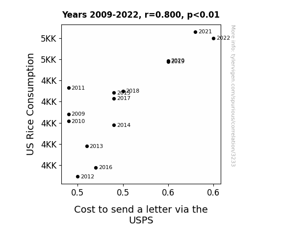
Rice and Rates: The Relationship Between US Rice Consumption and the Cost of Sending a Letter
As US rice consumption increased, more people were consuming carbohydrates, leading to higher energy levels. This resulted in a spike in productivity and a greater demand for sending letters, thereby causing the cost to send a letter via the USPS to increase. The increased energy from rice consumption indirectly fueled the postal service!
What else correlates?
US Rice Consumption · all food
Cost to send a letter via the USPS · all weird & wacky
US Rice Consumption · all food
Cost to send a letter via the USPS · all weird & wacky


View details about correlation #2,378
Lighthearted Look: Lilian's Link with Local Craftsmen in North Carolina
The decrease in popularity of the first name Lilian led to fewer lilies being named after people. This caused a shortage of floral inspiration for craft artists in North Carolina, ultimately leading to a decrease in their numbers. It seems the Lilian name held more petal power than we realized, leaving craft artists in a perennial predicament!


What else correlates?
Popularity of the first name Lilian · all first names
The number of craft artists in North Carolina · all cccupations
Popularity of the first name Lilian · all first names
The number of craft artists in North Carolina · all cccupations


View details about correlation #3,163
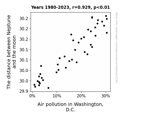
Lunar Lunacy: The Celestial Connection to DC's Dirty Air
As the gravitational pull from Neptune got stronger, it inadvertently pulled in all the smog and pollution particles from the D.C. air, effectively giving the city an otherworldly, celestial air purification system. It's like Neptune said, "I've got this, Earthlings. Let me just sweep away these pollutants for you." So, basically, Neptune mooned D.C. and cleared the air.

What else correlates?
The distance between Neptune and the moon · all planets
Air pollution in Washington, D.C. · all weather
The distance between Neptune and the moon · all planets
Air pollution in Washington, D.C. · all weather


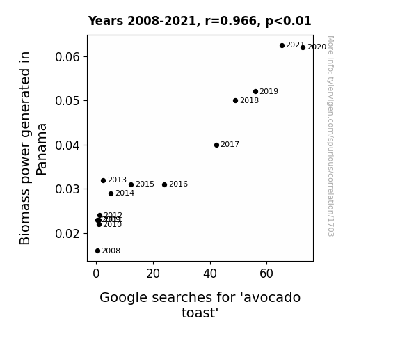
View details about correlation #1,703
Biomass Power and Smashed Avocado: A Toast to Panama's Energy Industry
As the avocado trees basked in the glory of being part of a sustainable energy cycle, they couldn't help but produce extra-creamy avocados, perfect for mashing onto toast. It's as if the avocados were saying, "We're ripe, we're delicious, and we're here to power up your love for brunch!" And thus, a brunch revolution was born, all thanks to the energizing vibes of Biomass power in Panama.

What else correlates?
Biomass power generated in Panama · all energy
Google searches for 'avocado toast' · all google searches
Biomass power generated in Panama · all energy
Google searches for 'avocado toast' · all google searches


View details about correlation #2,431
Striking Out: The Novel Correlation Between Annual Book Sales and Wins for the Houston Astros
As book sales dropped, fewer fans were able to brush up on their understanding of 'The Physics of Baseball,' leading to a decrease in wins for the Houston Astros. It seems their championship hopes were just a novel idea.


What else correlates?
Annual book sales in the US · all weird & wacky
Wins for the Houston Astros · all sports
Annual book sales in the US · all weird & wacky
Wins for the Houston Astros · all sports
. The chart goes from 2002 to 2022, and the two variables track closely in value over that time.")

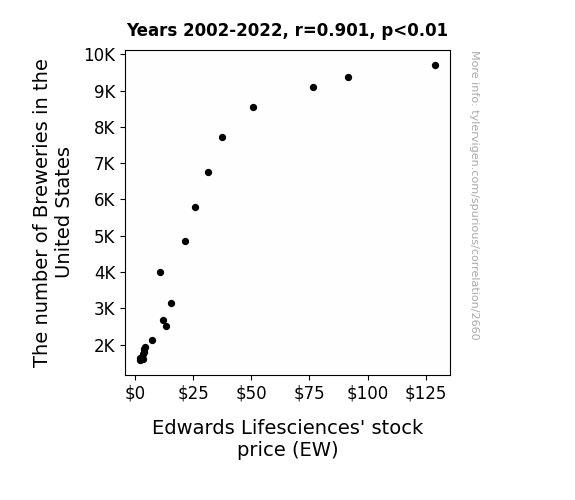
View details about correlation #2,660
Brewing up Stock Success: The Fermentation of Breweries in the United States and Edwards Lifesciences' Stock Price
As the number of breweries in the United States increases, so does the demand for beer. This leads to more people indulging in hearty, malty beverages, which in turn creates a greater need for heart-related medical devices, like the ones produced by Edwards Lifesciences. After all, nothing gets the heart pumping like a new, refreshing craft beer, leading to a surge in stock prices for the company. Cheers to heart health and hoppiness!

What else correlates?
The number of Breweries in the United States · all food
Edwards Lifesciences' stock price (EW) · all stocks
The number of Breweries in the United States · all food
Edwards Lifesciences' stock price (EW) · all stocks
Why this works
- Data dredging: I have 25,237 variables in my database. I compare all these variables against each other to find ones that randomly match up. That's 636,906,169 correlation calculations! This is called “data dredging.”
Fun fact: the chart used on the wikipedia page to demonstrate data dredging is also from me. I've been being naughty with data since 2014.
Instead of starting with a hypothesis and testing it, I instead tossed a bunch of data in a blender to see what correlations would shake out. It’s a dangerous way to go about analysis, because any sufficiently large dataset will yield strong correlations completely at random. - Lack of causal connection: There is probably no direct connection between these variables, despite what the AI says above.
Because these pages are automatically generated, it's possible that the two variables you are viewing are in fact causually related. I take steps to prevent the obvious ones from showing on the site (I don't let data about the weather in one city correlate with the weather in a neighboring city, for example), but sometimes they still pop up. If they are related, cool! You found a loophole.
This is exacerbated by the fact that I used "Years" as the base variable. Lots of things happen in a year that are not related to each other! Most studies would use something like "one person" in stead of "one year" to be the "thing" studied. - Observations not independent: For many variables, sequential years are not independent of each other. You will often see trend-lines form. If a population of people is continuously doing something every day, there is no reason to think they would suddenly change how they are doing that thing on January 1. A naive p-value calculation does not take this into account.
You will calculate a lower chance of "randomly" achieving the result than represents reality.
To be more specific: p-value tests are probability values, where you are calculating the probability of achieving a result at least as extreme as you found completely by chance. When calculating a p-value, you need to assert how many "degrees of freedom" your variable has. I count each year (minus one) as a "degree of freedom," but this is misleading for continuous variables.
This kind of thing can creep up on you pretty easily when using p-values, which is why it's best to take it as "one of many" inputs that help you assess the results of your analysis.
- Y-axes doesn't start at zero: I truncated the Y-axes of the graphs above. I also used a line graph, which makes the visual connection stand out more than it deserves.
Nothing against line graphs. They are great at telling a story when you have linear data! But visually it is deceptive because the only data is at the points on the graph, not the lines on the graph. In between each point, the data could have been doing anything. Like going for a random walk by itself!
Mathematically what I showed is true, but it is intentionally misleading. If you click on any of the charts that abuse this, you can scroll down to see a version that starts at zero. - Confounding variable: Confounding variables (like global pandemics) will cause two variables to look connected when in fact a "sneaky third" variable is influencing both of them behind the scenes.
- Outliers: Some datasets here have outliers which drag up the correlation.
In concept, "outlier" just means "way different than the rest of your dataset." When calculating a correlation like this, they are particularly impactful because a single outlier can substantially increase your correlation.
Because this page is automatically generated, I don't know whether any of the charts displayed on it have outliers. I'm just a footnote. ¯\_(ツ)_/¯
I intentionally mishandeled outliers, which makes the correlation look extra strong. - Low n: There are not many data points included in some of these charts.
You can do analyses with low ns! But you shouldn't data dredge with a low n.
Even if the p-value is high, we should be suspicious of using so few datapoints in a correlation.
Pro-tip: click on any correlation to see:
- Detailed data sources
- Prompts for the AI-generated content
- Explanations of each of the calculations (correlation, p-value)
- Python code to calculate it yourself


