spurious correlations
discover · random · spurious scholar
← previous page · next page →


View details about correlation #1,379
Neptune's Dance with Uranus: A Stellar Connection to Stock Price Romance?
As the gap between the ice giants widened, it created a ripple effect in the celestial stock market. This led to a surge in demand for cosmic communication infrastructure, causing an interplanetary expansion for Crown Castle. The gravitational pull of profits just couldn't be ignored, prompting investors on Earth to launch CCI stock to the moon - and beyond!


What else correlates?
The distance between Neptune and Uranus · all planets
Crown Castle's stock price (CCI) · all stocks
The distance between Neptune and Uranus · all planets
Crown Castle's stock price (CCI) · all stocks


View details about correlation #1,353
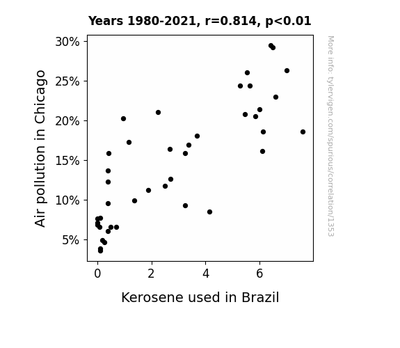
Up in the Air: Unraveling the Correlation Between Chicago Air Pollution and Brazilian Kerosene Consumption
As the air pollution in Chicago decreased, it created a ripple effect that traveled all the way to Brazil. This unexpected connection can be attributed to the little-known phenomenon of atmospheric dominoes, where changes in one city's air quality can knock over a chain of events leading to reduced kerosene usage in another country. It's a testament to the truly global impact of local environmental improvements.

What else correlates?
Air pollution in Chicago · all weather
Kerosene used in Brazil · all energy
Air pollution in Chicago · all weather
Kerosene used in Brazil · all energy


View details about correlation #1,501
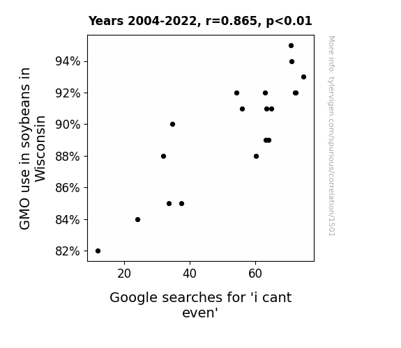
Soy Can't Even GMO: The Link Between Genetically Modified Soybeans in Wisconsin and 'I Cant Even' Google Searches
The soybeans became so ridiculously photogenic that people couldn't even handle it. #GMOgoals

What else correlates?
GMO use in soybeans in Wisconsin · all food
Google searches for 'i cant even' · all google searches
GMO use in soybeans in Wisconsin · all food
Google searches for 'i cant even' · all google searches


View details about correlation #3,113
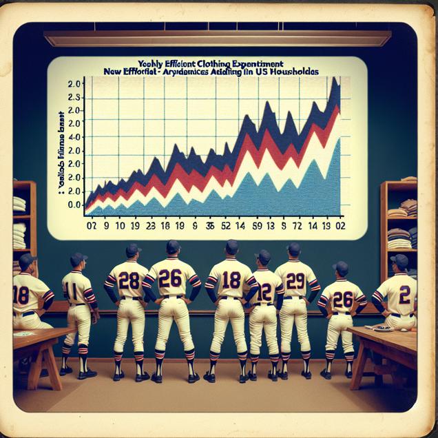
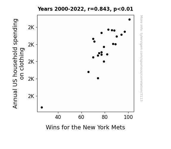
A Stitch in Time Saves Nine: Unraveling the Interwoven Relationship Between Annual US Household Spending on Clothing and Wins for the New York Mets
As household spending on clothing increased, more people were able to afford Mets merchandise, boosting the team's revenue and allowing them to invest in better players and training facilities. This ultimately led to more wins for the New York Mets, proving that when it comes to success, the Mets really can "clothes" the deal.
What else correlates?
Annual US household spending on clothing · all weird & wacky
Wins for the New York Mets · all sports
Annual US household spending on clothing · all weird & wacky
Wins for the New York Mets · all sports


View details about correlation #1,715
The Blazing Larry Effect: Exploring the Correlation Between the Popularity of the Name Larry and Arson Rates in Maine
As the name Larry fell out of favor, the number of people being called "Larry" also declined. With fewer individuals responding to the name, there were less sparks of fiery passion for starting fires, leading to a notable decrease in arson incidents in Maine. You could say the connection went up in smoke, but it was all a matter of Larry ignition!


What else correlates?
Popularity of the first name Larry · all first names
Arson in Maine · all random state specific
Popularity of the first name Larry · all first names
Arson in Maine · all random state specific


View details about correlation #2,074
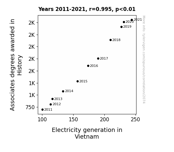
Connections Current: Amping Up History Degrees and Electricity Generation in Vietnam
As more people became familiar with the past, they were shocked to learn that Vietnam War-era electrical infrastructure was outdated. This led to a surge in support for modernization efforts, sparking a historical connection to Vietnam's power surge today. After all, it's truly electrifying to witness the sparks of knowledge igniting progress!

What else correlates?
Associates degrees awarded in History · all education
Electricity generation in Vietnam · all energy
Associates degrees awarded in History · all education
Electricity generation in Vietnam · all energy


View details about correlation #1,383
The Pungent Pollution Puzzle: Probing the Pertinence of Particulate Matter on Itaú Unibanco Holding's Stock Price
The smog from all that air pollution acted as a natural smokescreen, hiding any potential red flags from investors. Itaú Unibanco Holding's stock was on the rise, smog or no smog. Who knew the key to financial success was just a breath of fresh... or not so fresh air.


What else correlates?
Air pollution in Vernal, Utah · all weather
Itaú Unibanco Holding's stock price (ITUB) · all stocks
Air pollution in Vernal, Utah · all weather
Itaú Unibanco Holding's stock price (ITUB) · all stocks


View details about correlation #3,503
GMOs and Multiples: The Cotton Connection
By reducing genetic modification in cotton, we've inadvertently minimized the 'fabric' of our society, leading to a 'seeding' decrease in multiple births. Seems like these GMO-free cotton fields have really mastered the art of 'unstitching' unexpected triplets! It's like the old saying goes, when it comes to non-GMO cotton, three's a crowd!


What else correlates?
GMO use in cotton in Mississippi · all food
US birth rates of triplets or more · all weird & wacky
GMO use in cotton in Mississippi · all food
US birth rates of triplets or more · all weird & wacky


View details about correlation #2,448
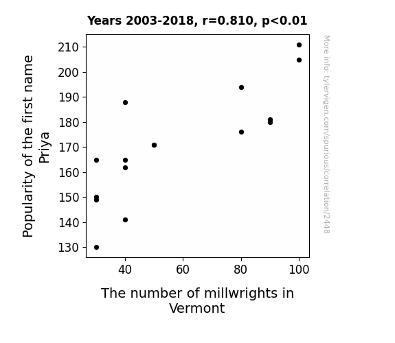
A Mill-wry Look at Priya: Exploring the Correlation Between the Popularity of the Name Priya and the Number of Millwrights in Vermont
The name Priya means 'beloved' in Sanskrit and as the popularity of this name waned, so did the love for millwork, leading to a decrease in the number of millwrights in Vermont. It seems Priya wasn't able to pri-ya them away from pursuing other careers!

What else correlates?
Popularity of the first name Priya · all first names
The number of millwrights in Vermont · all cccupations
Popularity of the first name Priya · all first names
The number of millwrights in Vermont · all cccupations


View details about correlation #3,262
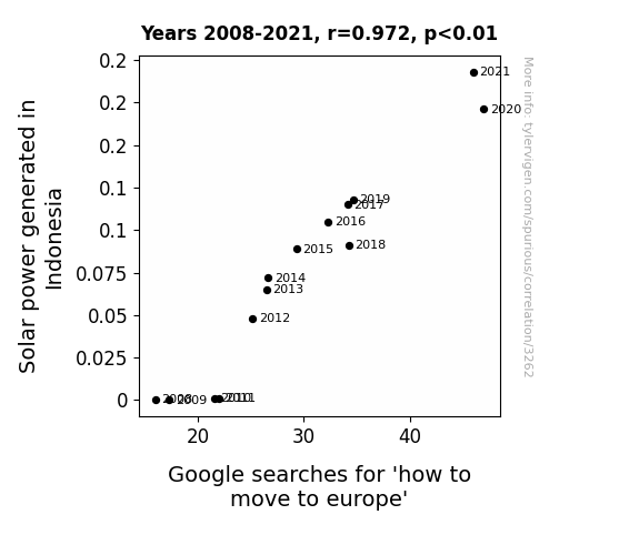
Sunny Money: The Illuminating Link between Solar Power in Indonesia and Searches for 'How to Scoot to Butte' in Europe
The influx of solar power in Indonesia has led to an unprecedented energy surplus. This surplus energy is inadvertently being transmitted as subliminal messages encouraging people to consider new horizons. As a result, the allure of Europe, with its rich history and diverse cultures, is now inexplicably tugging at the heartstrings of Indonesians, prompting them to seek out the most practical methods of relocating to the continent. It seems that the sun, in all its radiant glory, is not just powering homes and businesses, but also sparking a continent-wide case of wanderlust!

What else correlates?
Solar power generated in Indonesia · all energy
Google searches for 'how to move to europe' · all google searches
Solar power generated in Indonesia · all energy
Google searches for 'how to move to europe' · all google searches


View details about correlation #1,570
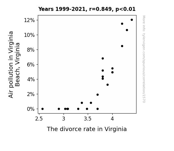
Air Pollution in Virginia Beach and the Alarming Amalgamation with the Alimony Affair: An Alliterative Analysis.
As the air became cleaner, the love was literally easier to breathe.

What else correlates?
Air pollution in Virginia Beach, Virginia · all weather
The divorce rate in Virginia · all random state specific
Air pollution in Virginia Beach, Virginia · all weather
The divorce rate in Virginia · all random state specific


View details about correlation #3,089
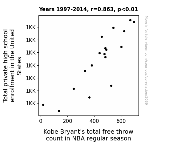
The Ties between Total private high school enrollment in the United States and Total free throw count of the Tenacious Kobe Bryant in NBA regular seasons: A Tantalizing Tidbit
The more high school students there are, the greater the demand for basketball hoops, leading to an increase in the number of available basketball hoops across the country. With more opportunities to practice, Kobe Bryant was able to perfect his free throw technique and score more points in NBA regular season games.



View details about correlation #2,449
Microbiologists and Best Sellers: The Rhyme and Reason
As the number of microbiologists in North Carolina increased, so did their love for microscopic details. This love for details led to more intricate and compelling storylines in the New York Times Fiction Best Sellers, capturing the readers' imaginations at a cellular level.


What else correlates?
The number of microbiologists in North Carolina · all cccupations
New York Times Fiction Best Sellers · all weird & wacky
The number of microbiologists in North Carolina · all cccupations
New York Times Fiction Best Sellers · all weird & wacky


View details about correlation #3,047
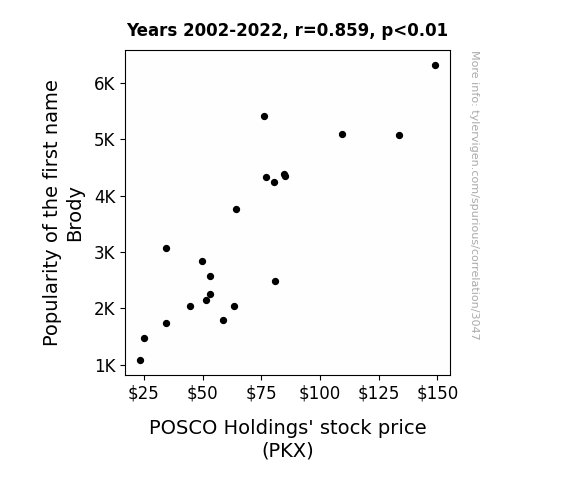
Brody or Not Brody: The Broder Picture of Name Popularity and Stock Prices
As the number of Brodys increased, so did the demand for surfboards. This surge in demand boosted the profitability of surfboard manufacturers, including some companies that were secretly owned by POSCO Holdings. With their diverse business interests, it turns out they were riding the waves of Brody's popularity all the way to financial success.

What else correlates?
Popularity of the first name Brody · all first names
POSCO Holdings' stock price (PKX) · all stocks
Popularity of the first name Brody · all first names
POSCO Holdings' stock price (PKX) · all stocks


View details about correlation #2,441
Spread or Shock: Unveiling the Buttery Connection between Butter Consumption and Electricity Generation in the Palestinian Territories
As butter consumption increased, so did the average girth of individuals. This led to a higher demand for larger-sized clothing, prompting a spike in textile production. The textile industry, in need of churning out more fabric, sought ways to optimize their manufacturing processes. This inadvertently led to technological advancements in machinery and ultimately, an unexpected surge in electricity generation in Palestinian Territories as a byproduct of the booming textile industry.


What else correlates?
Butter consumption · all food
Electricity generation in Palestinian Territories · all energy
Butter consumption · all food
Electricity generation in Palestinian Territories · all energy


View details about correlation #2,100
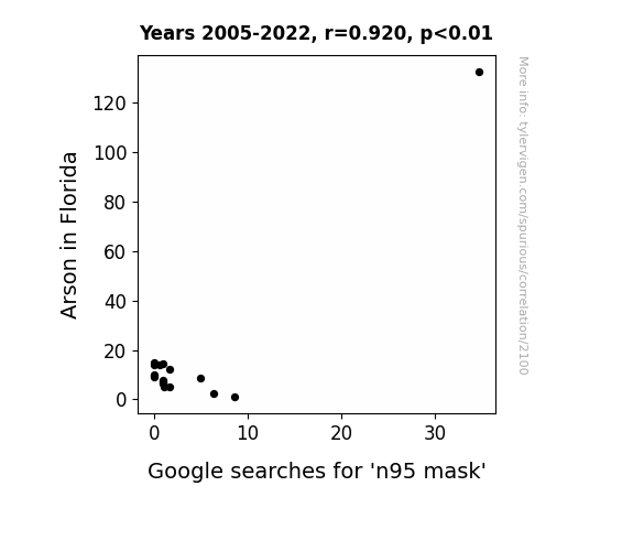
Sparking Arson in the Sunshine State: An Examination of the Relationship between Florida Arson Incidents and Google Searches for N95 Masks
The surge in arson cases in Florida led to a sudden spike in the demand for N95 masks, as both firefighters and amateur fire-starters realized the importance of airway protection. As the flames kept rising, so did the interest in respiratory safety, proving once again that even in the midst of chaos, people will always remember to prioritize their lungs.

What else correlates?
Arson in Florida · all random state specific
Google searches for 'n95 mask' · all google searches
Arson in Florida · all random state specific
Google searches for 'n95 mask' · all google searches


View details about correlation #2,312
Compiling Connections: An Examination of the Correlation Between College Computer Science Teachers in New Mexico and Romance-themed XKCD Comics
The shortage of computer science teachers led to a decline in the creation of lovable algorithms, which in turn, affected the romantic content of xkcd comics. Without proper guidance, the binary hearts of the xkcd characters just couldn't find their true loops! With fewer professors to profess their love for coding, the comic strip's romantic subroutines experienced a syntax error, ultimately leading to a reduction in academia-influenced amorous illustrations. The diminishing supply of computer science mentors put a strain on the interconnectedness of xkcd's romantic plots, proving that in the algorithm of love, a lack of teaching can truly divide by zero hearts.


View details about correlation #3,355
A Tale of Two Markets: The Bard and the Bull - A Correlational Study of Associates Degrees in English Language and Literature/Letters and Public Service Enterprise Group's Stock Price
As more people became well-versed in English, they began crafting incredibly persuasive jingles and slogans for the Public Service Enterprise Group. Customers couldn't resist the catchy advertising, leading to an uptick in demand for the company's services. In other words, the power of proper punctuation and poetic prose propelled PEG's profits to new heights!


What else correlates?
Associates degrees awarded in literature · all education
Public Service Enterprise Group's stock price (PEG) · all stocks
Associates degrees awarded in literature · all education
Public Service Enterprise Group's stock price (PEG) · all stocks


View details about correlation #1,518
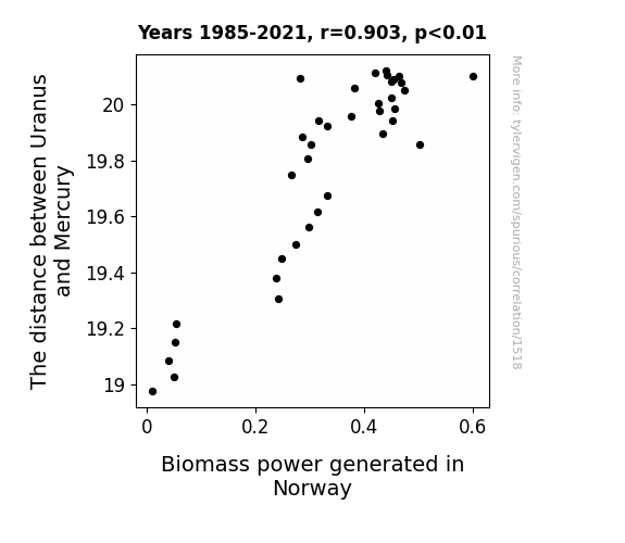
The Celestial Measure of Uranus to Mercury: A Link to Biomass Power in Norway
As the gravitational pull between Uranus and Mercury fluctuates, it creates cosmic energy waves. These waves travel through space and ultimately reach Earth, where they inexplicably boost the efficiency of biomass power generation in Norway. It's truly a stellar example of interplanetary renewable energy influence. Remember, a little space separation can lead to a whole lot of biomass electrification!

What else correlates?
The distance between Uranus and Mercury · all planets
Biomass power generated in Norway · all energy
The distance between Uranus and Mercury · all planets
Biomass power generated in Norway · all energy


View details about correlation #1,310
The Peculiar Parallels: Pollutants and Parachutes in Greenville
The smog got so thick that the skydivers mistook it for the landing zone!


What else correlates?
Air pollution in Greenville, North Carolina · all weather
Google searches for 'skydiving accident' · all google searches
Air pollution in Greenville, North Carolina · all weather
Google searches for 'skydiving accident' · all google searches
Why this works
- Data dredging: I have 25,237 variables in my database. I compare all these variables against each other to find ones that randomly match up. That's 636,906,169 correlation calculations! This is called “data dredging.”
Fun fact: the chart used on the wikipedia page to demonstrate data dredging is also from me. I've been being naughty with data since 2014.
Instead of starting with a hypothesis and testing it, I instead tossed a bunch of data in a blender to see what correlations would shake out. It’s a dangerous way to go about analysis, because any sufficiently large dataset will yield strong correlations completely at random. - Lack of causal connection: There is probably no direct connection between these variables, despite what the AI says above.
Because these pages are automatically generated, it's possible that the two variables you are viewing are in fact causually related. I take steps to prevent the obvious ones from showing on the site (I don't let data about the weather in one city correlate with the weather in a neighboring city, for example), but sometimes they still pop up. If they are related, cool! You found a loophole.
This is exacerbated by the fact that I used "Years" as the base variable. Lots of things happen in a year that are not related to each other! Most studies would use something like "one person" in stead of "one year" to be the "thing" studied. - Observations not independent: For many variables, sequential years are not independent of each other. You will often see trend-lines form. If a population of people is continuously doing something every day, there is no reason to think they would suddenly change how they are doing that thing on January 1. A naive p-value calculation does not take this into account.
You will calculate a lower chance of "randomly" achieving the result than represents reality.
To be more specific: p-value tests are probability values, where you are calculating the probability of achieving a result at least as extreme as you found completely by chance. When calculating a p-value, you need to assert how many "degrees of freedom" your variable has. I count each year (minus one) as a "degree of freedom," but this is misleading for continuous variables.
This kind of thing can creep up on you pretty easily when using p-values, which is why it's best to take it as "one of many" inputs that help you assess the results of your analysis.
- Y-axes doesn't start at zero: I truncated the Y-axes of the graphs above. I also used a line graph, which makes the visual connection stand out more than it deserves.
Nothing against line graphs. They are great at telling a story when you have linear data! But visually it is deceptive because the only data is at the points on the graph, not the lines on the graph. In between each point, the data could have been doing anything. Like going for a random walk by itself!
Mathematically what I showed is true, but it is intentionally misleading. If you click on any of the charts that abuse this, you can scroll down to see a version that starts at zero. - Confounding variable: Confounding variables (like global pandemics) will cause two variables to look connected when in fact a "sneaky third" variable is influencing both of them behind the scenes.
- Outliers: Some datasets here have outliers which drag up the correlation.
In concept, "outlier" just means "way different than the rest of your dataset." When calculating a correlation like this, they are particularly impactful because a single outlier can substantially increase your correlation.
Because this page is automatically generated, I don't know whether any of the charts displayed on it have outliers. I'm just a footnote. ¯\_(ツ)_/¯
I intentionally mishandeled outliers, which makes the correlation look extra strong. - Low n: There are not many data points included in some of these charts.
You can do analyses with low ns! But you shouldn't data dredge with a low n.
Even if the p-value is high, we should be suspicious of using so few datapoints in a correlation.
Pro-tip: click on any correlation to see:
- Detailed data sources
- Prompts for the AI-generated content
- Explanations of each of the calculations (correlation, p-value)
- Python code to calculate it yourself


