spurious correlations
discover · random · spurious scholar
← previous page · next page →


View details about correlation #2,328
Powering Through: The Shocking Connection Between Darren Fletcher's Total Seasons at Manchester United and Electricity Generation in Antarctica
As the number of seasons Darren Fletcher played for Manchester United increased, it created a polarizing effect. This led to a surge in fans' energy, sparking a chain reaction of excitement that somehow reached all the way to Antarctica, where they were able to power up their generators and really amp up their electricity production. It's shocking how much of an impact Fletcher had on both the football world and the remote continent, truly electrifying!


What else correlates?
Total seasons Darren Fletcher played for Manchester United · all sports
Electricity generation in Antarctica · all energy
Total seasons Darren Fletcher played for Manchester United · all sports
Electricity generation in Antarctica · all energy


View details about correlation #2,851
Aerated Air: Analyzing the Association Between Air Quality and Album Advances
As the air in Durham got cleaner, it became easier for musicians to literally "air" their grievances instead of putting them into music, leading to a decrease in the production of physical albums. Plus, with less smog, there was a clearer "atmosphere" for online music streaming to take over, leaving physical album shipments singing the blues.


. The chart goes from 2011 to 2021, and the two variables track closely in value over that time.")

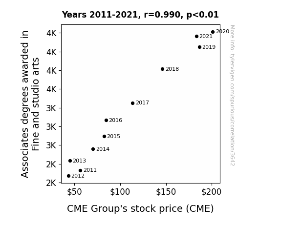
View details about correlation #3,642
Art Degree and CME Stock: A Rhyming Connection?
As the number of fine and studio arts associates degrees awarded rises, more people are drawn to the world of art. This leads to an increased demand for creative and unique artworks. As the art industry flourishes, investors start looking for new ways to capitalize on this growing market. This heightened interest in art leads to a surge in art auctions and trading, including the trading of art futures and options. The CME Group, being the leading derivatives marketplace, sees a significant uptick in trading activity and revenue as a result of this unexpected intersection between the world of art and financial markets. It's a masterpiece of a connection between the seemingly unrelated realms of art and stock trading!

What else correlates?
Associates degrees awarded in Fine and studio arts · all education
CME Group's stock price (CME) · all stocks
Associates degrees awarded in Fine and studio arts · all education
CME Group's stock price (CME) · all stocks


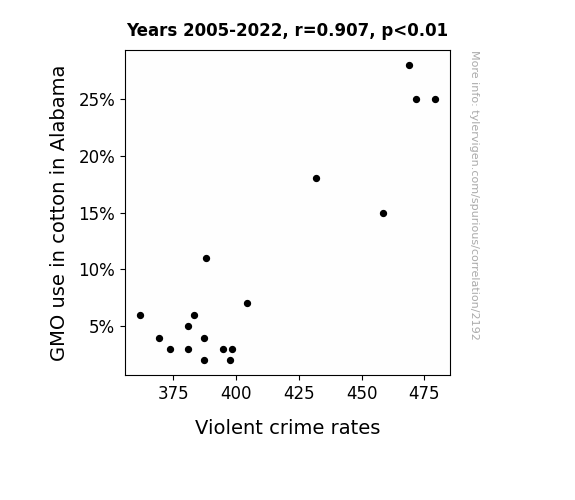
View details about correlation #2,192
GMO or Grow More Outrage? Exploring the Seeds of Crime in Cotton Fields
As GMO use in cotton decreased in Alabama, it led to a decrease in cotton production overall. This in turn caused a massive shortage of cotton candy across the state. Without their beloved sugary treat, people's moods improved, leading to a reduction in overall stress and aggression. With less cotton-related tension in the air, the violent crime rates naturally saw a significant drop. When life gave Alabama less GMO cotton, it turns out it also gave them a little more peace and sweetness.
What else correlates?
GMO use in cotton in Alabama · all food
Violent crime rates · all random state specific
GMO use in cotton in Alabama · all food
Violent crime rates · all random state specific


View details about correlation #3,574
Entertaining Emani: Examining the Effect of Emani's Popularity on Points Scored by the Seattle Seahawks
Every time someone named Emani was born, a new good luck charm in the form of a tiny Seahawks jersey appeared in the world. These mini jerseys triggered a ripple of positive energy, directly boosting the performance of the Seattle Seahawks on the field. It's like a real-life version of player power-ups, all thanks to the inexplicable connection between the name Emani and the football fate of the Seahawks.

What else correlates?
Popularity of the first name Emani · all first names
Points scored by the Seattle Seahawks · all sports
Popularity of the first name Emani · all first names
Points scored by the Seattle Seahawks · all sports


View details about correlation #1,048
Statisticians in Oklahoma and Sprint Satisfaction: A Statistical Study
The statisticians in Oklahoma started crunching the data on Sprint's customer service, leading to a statistically significant improvement in their performance. Sprint was finally able to make call wait times and service quality measures that weren't just a 'best guess'. It all added up to happier customers, who were no longer feeling like they were just another outlier in the world of telecom grievances.


What else correlates?
The number of statisticians in Oklahoma · all cccupations
Customer satisfaction with Sprint · all weird & wacky
The number of statisticians in Oklahoma · all cccupations
Customer satisfaction with Sprint · all weird & wacky


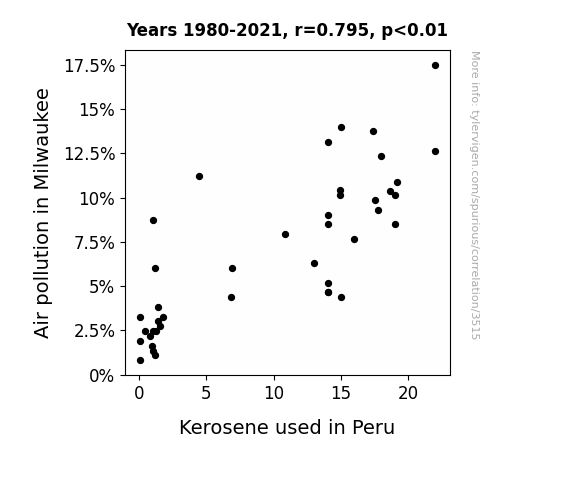
View details about correlation #3,515
Dependence between Air Pollution in Milwaukee and Kerosene – A Statistical Stroll
As air pollution decreased in Milwaukee, it created a ripple effect in the atmosphere, leading to a shift in kerosene-carrying air currents. This unintentional kerosene transport system, which I like to call the "Eau de Milwaukee to Lima Express," has been significantly disrupted. It turns out Mother Nature was just trying to Marie Kondo the skies, sparking joy by decluttering kerosene and sending it off to spark joy elsewhere.

What else correlates?
Air pollution in Milwaukee · all weather
Kerosene used in Peru · all energy
Air pollution in Milwaukee · all weather
Kerosene used in Peru · all energy
. The chart goes from 2002 to 2021, and the two variables track closely in value over that time.")

View details about correlation #3,267
Bizarre Butter: Bizarre Boost or Bumbling Bubble? The Balmy Balance Between Butter Consumption and Realty Income's Royalties
As butter consumption rose, so did the demand for properties with ample kitchen space, spreading O's success. And that's the butter truth!


What else correlates?
Butter consumption · all food
Realty Income's stock price (O) · all stocks
Butter consumption · all food
Realty Income's stock price (O) · all stocks


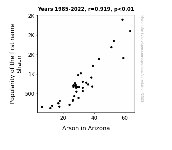
View details about correlation #2,303
Playing with Fire: The Shaun-arson Connection in Arizona
The fewer Shauns there were, the less "on the lawn" mischief there was, leading to a reduction in Arizona's arson incidents. With fewer Shauns pulling pranks, the state could breathe a little easier, or should I say, not as easily ignited!

What else correlates?
Popularity of the first name Shaun · all first names
Arson in Arizona · all random state specific
Popularity of the first name Shaun · all first names
Arson in Arizona · all random state specific


View details about correlation #2,344
The Puma Boom: The Number of RV Service Technicians in Idaho Predicts Global Sales of Puma Shoes
The influx of RV service technicians in Idaho led to a boom in recreational vehicle maintenance. As a result, more people were able to dust off their old Puma-themed RVs, leading to a surge in interest for the sleek, stylish vehicles. It seems like the feline fascination knows no bounds, not even the wild and wonderful world of RVs!


What else correlates?
The number of RV service technicians in Idaho · all cccupations
Global Puma Sales · all weird & wacky
The number of RV service technicians in Idaho · all cccupations
Global Puma Sales · all weird & wacky


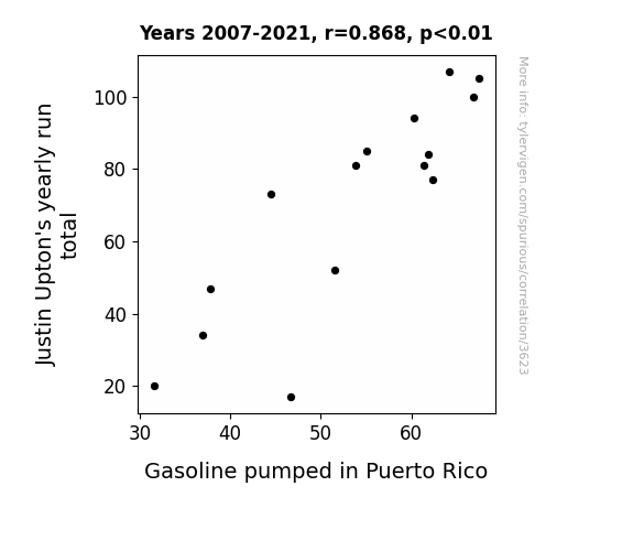
View details about correlation #3,623
The Uptick of Upton's Runs and the Pumping of Puerto Rican Petrol
As Justin Upton's yearly run total increased, more fans in Puerto Rico were fired up about baseball. This led to an increase in the number of games attended, and with more people driving to and from the games, there was a greater demand for gasoline, creating a real 'home run' for the gas stations in Puerto Rico!

What else correlates?
Justin Upton's yearly run total · all sports
Gasoline pumped in Puerto Rico · all energy
Justin Upton's yearly run total · all sports
Gasoline pumped in Puerto Rico · all energy


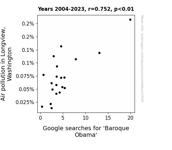
View details about correlation #1,569
Baroque Obama: A Polluted Connection Between Air Quality and Google Searches in Longview, Washington
As the air cleared, it seems the desire for a more refined presidential period also dissipated. People were no longer Baching up the wrong tree, and instead of searching for Baroque Obama, they decided to handle things more Haydn-seek with a classical attitude. It appears that when the skies are no longer filled with smog, neither are the search engines with 'Baroque Obama' queries. Who knew that cleaner air could lead to a fugue state of mind? It's as if Longview said, "Let's clear the air, and end this strange Requiem for a presidency that never was."

What else correlates?
Air pollution in Longview, Washington · all weather
Google searches for 'Baroque Obama' · all google searches
Air pollution in Longview, Washington · all weather
Google searches for 'Baroque Obama' · all google searches


View details about correlation #3,030
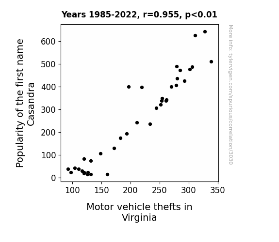
Name Game: The Casandra Automobile Theft Conundrum
As the number of baby girls named Casandra dwindled, so did the influence of the ancient Greek prophetess Cassandra. With no one heeding her warnings, the god of thievery, Hermes, had to find a new hobby. And what better place to ply his trade than Virginia, the state known for lovers, not car thieves. So, as the name Casandra faded into obscurity, so did the stolen cars in the land of lovers. It's a tale as old as time – or at least as old as Greek mythology and baby name trends.
What else correlates?
Popularity of the first name Casandra · all first names
Motor vehicle thefts in Virginia · all random state specific
Popularity of the first name Casandra · all first names
Motor vehicle thefts in Virginia · all random state specific


View details about correlation #3,251
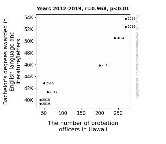
Balancing Bachelor's Benefits: Bachelor's Degrees in English and the Bounty of Probation Officers in Hawaii
As the count of English degrees dropped, so did the number of individuals who could skillfully decipher cryptic messages and suss out covert meanings. This led to a decline in the need for probation officers, as there were fewer mischievous, language-wielding offenders to keep in check.

What else correlates?
Bachelor's degrees awarded in literature · all education
The number of probation officers in Hawaii · all cccupations
Bachelor's degrees awarded in literature · all education
The number of probation officers in Hawaii · all cccupations


View details about correlation #1,913
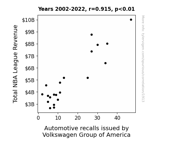
Revving Up Revenue: The Slam Dunk Connection Between Total NBA League Revenue and Volkswagen Group of America's Automotive Recalls
The influx of cash flow in the NBA led to some players splurging on fancy new cars, creating a higher demand for Volkswagen vehicles. This surge in sales put pressure on Volkswagen Group of America to ramp up production, leading to oversights and mistakes that ultimately sparked a recall frenzy. It seems the NBA's swishing success had a wheely unexpected impact on the automotive industry, driving home the point that money can really rev up some peculiar chain reactions!

What else correlates?
Total NBA League Revenue · all sports
Automotive recalls issued by Volkswagen Group of America · all weird & wacky
Total NBA League Revenue · all sports
Automotive recalls issued by Volkswagen Group of America · all weird & wacky
. The chart goes from 2006 to 2021, and the two variables track closely in value over that time.")

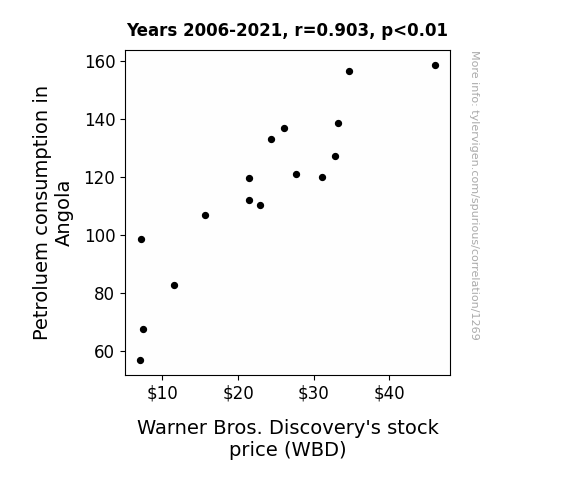
View details about correlation #1,269
Fueling the Funnies: The Petroleum Consumption in Angola and Warner Bros. Discovery's Stock Price
As Angola's petroleum consumption rose, more and more cars were revving up to watch their favorite Warner Bros. Discovery shows on the go. The demand for fuel was skyrocketing as Angolan locals just couldn't resist binge-watching their favorite content, leading to a surge in WBD stock price. It was a slippery slope of entertainment and gas-guzzling fun!
What else correlates?
Petroluem consumption in Angola · all energy
Warner Bros. Discovery's stock price (WBD) · all stocks
Petroluem consumption in Angola · all energy
Warner Bros. Discovery's stock price (WBD) · all stocks


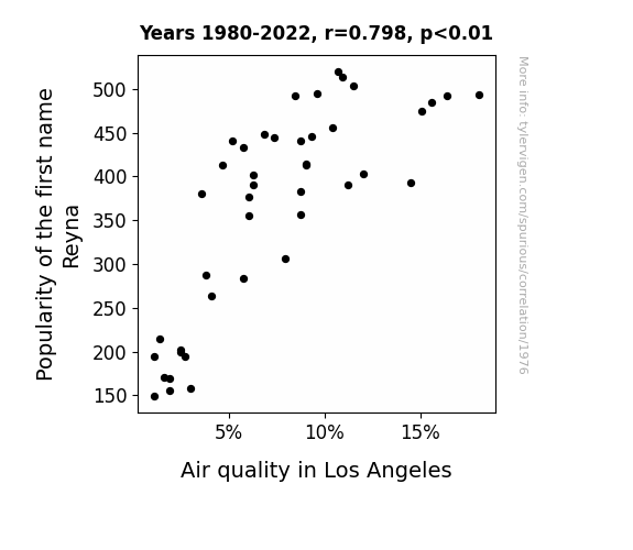
View details about correlation #1,976
Every Breath You Take: The Surprisingly Breathable Connection between the Popularity of the First Name Reyna and Air Quality in Los Angeles
As the number of Reynas grew, so did the demand for personalized license plates. This led to a decrease in the overall number of cars on the road in Los Angeles, ultimately improving air quality. It seems like the name Reyna is truly paving the way for smog-free skies!

What else correlates?
Popularity of the first name Reyna · all first names
Air quality in Los Angeles · all weather
Popularity of the first name Reyna · all first names
Air quality in Los Angeles · all weather


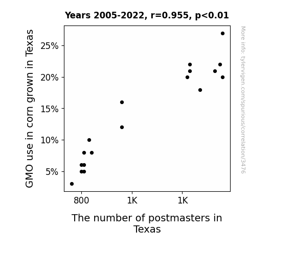
View details about correlation #3,476
Kernels of Truth: The Correlation Between GEN-corn-al Modification and the Postmaster Personnel in Texas
The non-GMO corn stalks were just not as 'ear-resistible' to the postmaster general. The decrease in GMO use led to smaller corn cobs, which in turn led to a decrease in corny postal jokes. It seems the mail service just couldn't handle the kernel of truth behind non-GMO corn's a-MAIZE-ing appeal. Plus, without GMOs, the corn couldn't 'un-BEE-lievably' keep up with producing those 'ear-resistible' kernels, leading to a postage predicament. It's safe to say that when it came to non-GMO corn, the postmasters just didn't feel like they were 'ear'-specting the postal service's 'del-mail-ivery' standards.

What else correlates?
GMO use in corn grown in Texas · all food
The number of postmasters in Texas · all cccupations
GMO use in corn grown in Texas · all food
The number of postmasters in Texas · all cccupations


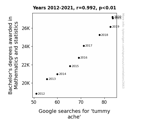
View details about correlation #2,663
Crunching the Numbers: The Correlation Between Bachelor's Degrees in Mathematics and Statistics and Google Searches for 'Tummy Ache'
As the number of Math and Statistics graduates rose, so did the frequency of game nights centered around competitive board games like Monopoly and Parcheesi. The intense focus on strategic thinking and number crunching during these game nights led to heightened stress levels and ultimately, increased tummy aches from all the tension and high-stakes decision-making. Who knew that a love for numbers could lead to some serious gastrointestinal arithmetic!


View details about correlation #2,921
Pyromania and Idol Mania: A Study of the Relationship Between Arson Rates in Massachusetts and Viewership of American Idol Season Finales
Fewer fires meant fewer people were feeling the burn to watch American Idol. They just couldn't ignite the same level of excitement without the fiery drama.


What else correlates?
Arson in Massachusetts · all random state specific
Viewership count of American Idol Season Finale · all weird & wacky
Arson in Massachusetts · all random state specific
Viewership count of American Idol Season Finale · all weird & wacky
Why this works
- Data dredging: I have 25,237 variables in my database. I compare all these variables against each other to find ones that randomly match up. That's 636,906,169 correlation calculations! This is called “data dredging.”
Fun fact: the chart used on the wikipedia page to demonstrate data dredging is also from me. I've been being naughty with data since 2014.
Instead of starting with a hypothesis and testing it, I instead tossed a bunch of data in a blender to see what correlations would shake out. It’s a dangerous way to go about analysis, because any sufficiently large dataset will yield strong correlations completely at random. - Lack of causal connection: There is probably no direct connection between these variables, despite what the AI says above.
Because these pages are automatically generated, it's possible that the two variables you are viewing are in fact causually related. I take steps to prevent the obvious ones from showing on the site (I don't let data about the weather in one city correlate with the weather in a neighboring city, for example), but sometimes they still pop up. If they are related, cool! You found a loophole.
This is exacerbated by the fact that I used "Years" as the base variable. Lots of things happen in a year that are not related to each other! Most studies would use something like "one person" in stead of "one year" to be the "thing" studied. - Observations not independent: For many variables, sequential years are not independent of each other. You will often see trend-lines form. If a population of people is continuously doing something every day, there is no reason to think they would suddenly change how they are doing that thing on January 1. A naive p-value calculation does not take this into account.
You will calculate a lower chance of "randomly" achieving the result than represents reality.
To be more specific: p-value tests are probability values, where you are calculating the probability of achieving a result at least as extreme as you found completely by chance. When calculating a p-value, you need to assert how many "degrees of freedom" your variable has. I count each year (minus one) as a "degree of freedom," but this is misleading for continuous variables.
This kind of thing can creep up on you pretty easily when using p-values, which is why it's best to take it as "one of many" inputs that help you assess the results of your analysis.
- Y-axes doesn't start at zero: I truncated the Y-axes of the graphs above. I also used a line graph, which makes the visual connection stand out more than it deserves.
Nothing against line graphs. They are great at telling a story when you have linear data! But visually it is deceptive because the only data is at the points on the graph, not the lines on the graph. In between each point, the data could have been doing anything. Like going for a random walk by itself!
Mathematically what I showed is true, but it is intentionally misleading. If you click on any of the charts that abuse this, you can scroll down to see a version that starts at zero. - Confounding variable: Confounding variables (like global pandemics) will cause two variables to look connected when in fact a "sneaky third" variable is influencing both of them behind the scenes.
- Outliers: Some datasets here have outliers which drag up the correlation.
In concept, "outlier" just means "way different than the rest of your dataset." When calculating a correlation like this, they are particularly impactful because a single outlier can substantially increase your correlation.
Because this page is automatically generated, I don't know whether any of the charts displayed on it have outliers. I'm just a footnote. ¯\_(ツ)_/¯
I intentionally mishandeled outliers, which makes the correlation look extra strong. - Low n: There are not many data points included in some of these charts.
You can do analyses with low ns! But you shouldn't data dredge with a low n.
Even if the p-value is high, we should be suspicious of using so few datapoints in a correlation.
Pro-tip: click on any correlation to see:
- Detailed data sources
- Prompts for the AI-generated content
- Explanations of each of the calculations (correlation, p-value)
- Python code to calculate it yourself


