spurious correlations
discover · random · spurious scholar
← previous page · next page →


View details about correlation #3,658
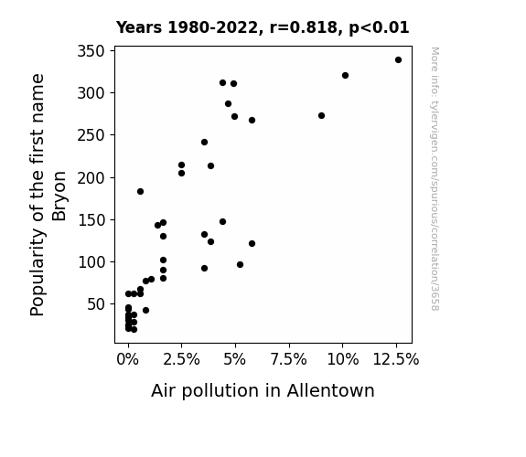
Byron's Breathing Brouhaha: The Correlation between the Popularity of the Name Bryon and Air Pollution in Allentown
Bryons were known for their excessive hairspray usage, leading to a localized depletion of the ozone layer over Allentown. Remember, it's not just the thought that counts; it's also the air quality!

What else correlates?
Popularity of the first name Bryon · all first names
Air pollution in Allentown · all weather
Popularity of the first name Bryon · all first names
Air pollution in Allentown · all weather


View details about correlation #1,766
Inspecting the Jet Set: The Curious Relationship Between Transportation Inspectors in Montana and Jet Fuel Consumption in Congo-Brazzaville
Well, with more transportation inspectors in Montana, there's a higher demand for inspections overall. This has led to a shortage of qualified inspectors in other areas. As a result, Congo-Brazzaville has seen an influx of jet fuel shipments that are now going uninspected, because all the inspectors are being drawn to Montana. It's a classic case of fueling the inspector job market, and the skies of Congo-Brazzaville are bearing the brunt of it!
What else correlates?
The number of transportation inspectors in Montana · all cccupations
Jet fuel used in Congo-Brazzaville · all energy
The number of transportation inspectors in Montana · all cccupations
Jet fuel used in Congo-Brazzaville · all energy


View details about correlation #2,779
“GMO-Google Connection: Corny Puns and Search Queries”
As GMO use in Missouri corn increased, it inadvertently led to the production of corn with a higher level of perplexing protein complexes. This protein, when consumed by individuals, somehow influenced their neural pathways, causing a temporary cognitive disarray. This led to a surge in people experiencing situations that were just too overwhelming or nonsensical, prompting them to exclaim, "I can't even." It seems that amidst the quest for heartier crops, corn has sown the seeds of bewilderment in our daily lives.


What else correlates?
GMO use in corn grown in Missouri · all food
Google searches for 'i cant even' · all google searches
GMO use in corn grown in Missouri · all food
Google searches for 'i cant even' · all google searches


View details about correlation #1,664
The Unidentified Flying Object of Desire: Exploring the Connection Between UFO Sightings in Georgia and Nathan's Hot Dog Eating Competition Champion Hotdog Consumption
The UFOs beamed down a special condiment that made the hotdogs irresistible, leading to record-breaking consumption by the champion.

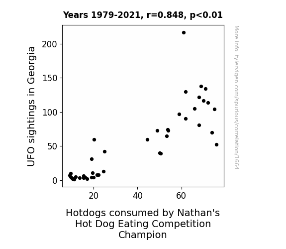
. The chart goes from 2002 to 2022, and the two variables track closely in value over that time.")

View details about correlation #3,090
Name-Dropping on Wall Street: The Wesley Effect on Novo Nordisk's Stock Price
As the popularity of the first name Wesley rose, so did the demand for adorable personalized baby onesies. This increased demand led to higher sales at baby clothing stores, prompting investors to buy stock in companies like Novo Nordisk in a desperate attempt to profit from the unexpected baby apparel boom. After all, nothing says "cute baby outfit" like the steady growth of a pharmaceutical giant's stock!


What else correlates?
Popularity of the first name Wesley · all first names
Novo Nordisk's stock price (NVO) · all stocks
Popularity of the first name Wesley · all first names
Novo Nordisk's stock price (NVO) · all stocks


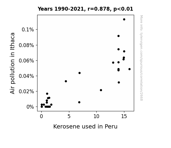
View details about correlation #2,668
Correlating Kerosene Consumption in Peru with Air Pollution in Ithaca
As air pollution in Ithaca decreased, the local pigeons felt rejuvenated and decided to take up international diplomacy. They negotiated a pigeon peace treaty that led to a decrease in the production and use of kerosene in Peru for pigeon-powered heating and lighting systems. The pigeons are now working on a global clean energy initiative, one dropping at a time.
What else correlates?
Air pollution in Ithaca · all weather
Kerosene used in Peru · all energy
Air pollution in Ithaca · all weather
Kerosene used in Peru · all energy


View details about correlation #3,661
Engineered for Success: The Correlation Between Industrial Engineers in Illinois and Runs Scored by the Winning Team in the World Series
As the number of industrial engineers in Illinois increased, so did the efficiency of the state's production lines. This led to a surplus of baseball bats being manufactured, ultimately giving the winning team in the World Series a competitive edge in scoring runs. It's proof that when it comes to baseball, you can always count on engineers to 'pitch' in and help the game 'swing' in the right direction!

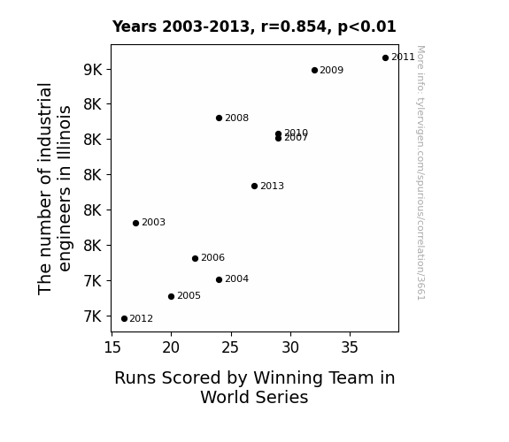
What else correlates?
The number of industrial engineers in Illinois · all cccupations
Runs Scored by Winning Team in World Series · all sports
The number of industrial engineers in Illinois · all cccupations
Runs Scored by Winning Team in World Series · all sports


View details about correlation #1,333
From Maize to Maze: Exploring the Correlation Between GMO Corn and Cornily Crafty Criminals in Texas
As GMO use in Texas corn decreased, it led to a decrease in corn production. This caused a corn shortage, making it harder for corn-loving burglars to sustain their energy levels for late-night heists. After all, it's tough to commit a burglary on an empty stomach when there's a lack of GM-corn to fuel their corny cravings! Corny burglars need their GMO fix to get popping, and without it, they just can't cob with their nightly shenanigans!
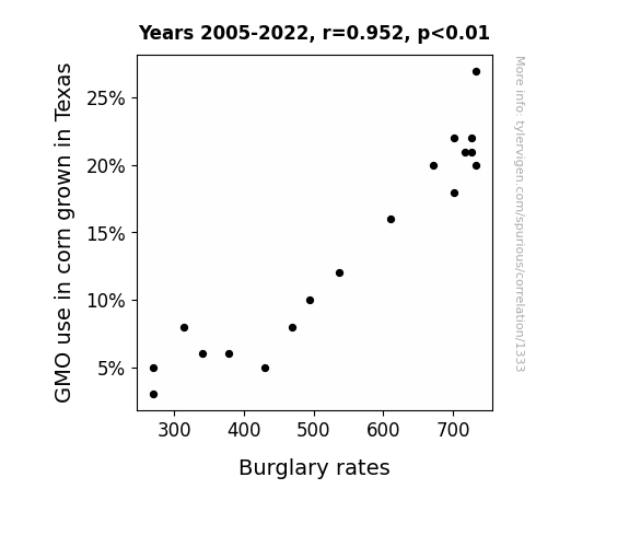
What else correlates?
GMO use in corn grown in Texas · all food
Burglary rates in the US · all random state specific
GMO use in corn grown in Texas · all food
Burglary rates in the US · all random state specific
. The chart goes from 2002 to 2022, and the two variables track closely in value over that time.")

View details about correlation #3,598
The Big Apple's Influence: How US Household Spending on Processed Fruits Can A-peel to Sony's Stock Price
As household spending on processed fruits increased, more people started using blenders to make fruit smoothies. This led to a surge in demand for high-quality blenders, and Sony, known for its innovative technology, secretly entered the blender market with their state-of-the-art SmoothieSonic™ blenders. The unexpected success of these blenders boosted investor confidence in Sony's diverse product capabilities, leading to an increase in their stock price. Remember, a rising stock price isn't the only thing that's smoothie with Sony!


What else correlates?
Annual US household spending on processed fruits · all weird & wacky
Sony Group's stock price (SONY) · all stocks
Annual US household spending on processed fruits · all weird & wacky
Sony Group's stock price (SONY) · all stocks


View details about correlation #1,777
Shocking Solar Solutions: Studying Solar Power's Surprising Search Correlations
The increase in solar power generated in Afghanistan has inadvertently led to more people taking ice baths due to the constant need to cool down the sweltering solar panels, ultimately driving up the demand for ice bath sessions. It's a shocking development in the world of renewable energy and self-care!


What else correlates?
Solar power generated in Afghanistan · all energy
Google searches for 'ice bath' · all google searches
Solar power generated in Afghanistan · all energy
Google searches for 'ice bath' · all google searches


View details about correlation #2,211
Marvelous Mercury's Magnetic Pull on the Magnitude of Idaho's Social Workers
As the distance between Mercury and Earth fluctuates, it affects the gravitational pull on Idaho, leading to an increase in job satisfaction among social workers. In a surprising turn of events, the cosmic dance of the planets seems to have a direct impact on the demand for social workers in the gem state.


What else correlates?
The distance between Mercury and Earth · all planets
The number of social workers in Idaho · all cccupations
The distance between Mercury and Earth · all planets
The number of social workers in Idaho · all cccupations


View details about correlation #2,459
The Thomas Theorem: Unearthing the Connection Between Name Popularity and Air Pollution in Chicago
As the popularity of the name Thomas waned, there were fewer people shouting "Tom, a car!" This unexpected drop in car reminders led to reduced traffic congestion and a breath of fresh air for Chicago. Who would have thought that a decrease in Thomas shoutouts could lead to cleaner air routes for the Windy City? It just goes to show, sometimes the key to a pollution solution is right in front of your car grill.


What else correlates?
Popularity of the first name Thomas · all first names
Air pollution in Chicago · all weather
Popularity of the first name Thomas · all first names
Air pollution in Chicago · all weather


View details about correlation #1,831
Corn-y Lawyers: Exploring the Correlation Between GMO Corn in Ohio and the Number of Lawyers in the United States
The GMO corn in Ohio is developing a strong resistance to pests, much like how lawyers are resistant to legal 'pests' looking for trouble. Looks like these lawyers are corn-fused about their career choices!

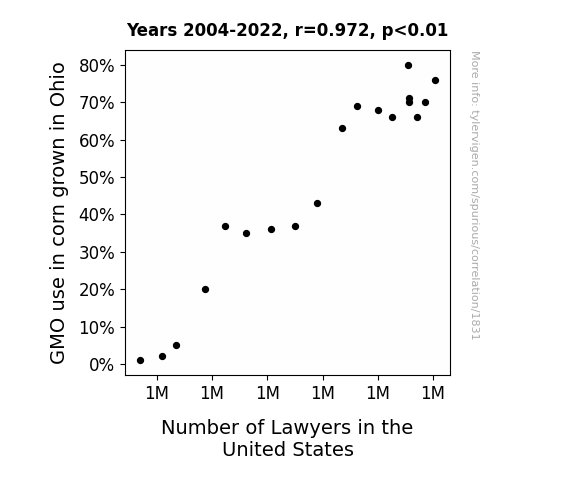
What else correlates?
GMO use in corn grown in Ohio · all food
Number of Lawyers in the United States · all weird & wacky
GMO use in corn grown in Ohio · all food
Number of Lawyers in the United States · all weird & wacky


View details about correlation #3,572
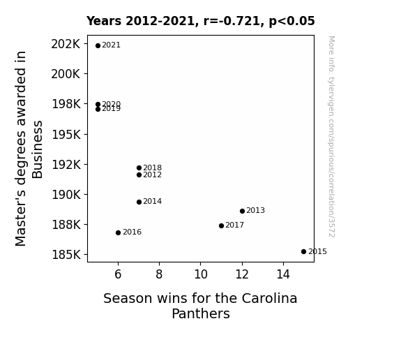
Mastering the Game: Unraveling the Link Between Business Master's Degrees and Carolina Panthers' Season Wins
As more people obtained Master's degrees in Business, there was a subsequent rise in the number of consultants entering the workforce. These consultants, armed with their 'MBA = Must Blame Anybody' mentality, couldn't resist the opportunity to offer the Carolina Panthers unsolicited advice on everything from game strategies to team management. This led to confusion and discord within the team, as the players struggled to understand why someone with a PowerPoint presentation on profit margins was now critiquing their touchdown celebrations. In the end, the Panthers just couldn't handle the constant interference and overbearing analyses, and sadly, it all added up to a decrease in their season wins. It seems in this case, too many business degrees really did lead to a 'Panther-nity' of problems!

What else correlates?
Master's degrees awarded in Business · all education
Season wins for the Carolina Panthers · all sports
Master's degrees awarded in Business · all education
Season wins for the Carolina Panthers · all sports
. The chart goes from 2003 to 2022, and the two variables track closely in value over that time.")

View details about correlation #3,008
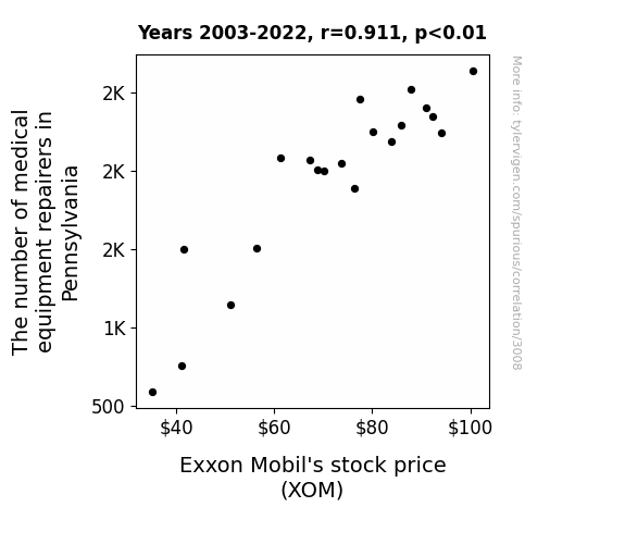
Breaking Down the Market: A Repairing Tale of Medical Equipment and Exxon Mobil's Stock Price
As the medical equipment repairers in Pennsylvania multiplied, they inadvertently created a surge in demand for lubricants. This led to a slippery slope for Exxon Mobil's stock price, propelling it to new heights. It seems like when it comes to stocks, even a small rise in repairers can stethoscope a big change!

What else correlates?
The number of medical equipment repairers in Pennsylvania · all cccupations
Exxon Mobil's stock price (XOM) · all stocks
The number of medical equipment repairers in Pennsylvania · all cccupations
Exxon Mobil's stock price (XOM) · all stocks


View details about correlation #1,282
Luminous Boon: Solar Swoon: Evaluating the Relationship Between Solar Power Harvested in Estonia and the Search Queries for 'Mr. Beast'
The solar panels coincidentally formed a pattern in Mr. Beast's likeness, prompting people to search for this new solar-powered internet sensation.

What else correlates?
Solar power generated in Estonia · all energy
Google searches for 'Mr. Beast' · all google searches
Solar power generated in Estonia · all energy
Google searches for 'Mr. Beast' · all google searches


View details about correlation #3,640
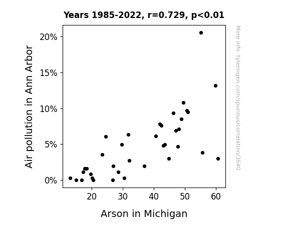
Aerated Atmosphere and Accidental Arson: An Analysis of Air Pollution's Influence on Incendiary Incidents in Michigan
As air pollution in Ann Arbor decreased, the smog particles became less effective kindling for would-be arsonists in Michigan. Without the air-pollution-enhanced fire capabilities, the arson rates naturally declined. Remember, only you can prevent smog-enhanced arson.

What else correlates?
Air pollution in Ann Arbor · all weather
Arson in Michigan · all random state specific
Air pollution in Ann Arbor · all weather
Arson in Michigan · all random state specific


View details about correlation #1,931
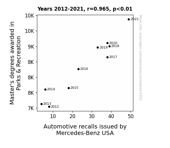
Parks & Wrecks: An Unexpected Correlation Between Master's Degrees in Parks & Recreation and Automotive Recalls by Mercedes-Benz USA
As the number of Parks & Recreation Master's degree holders grows, so does their expertise in leisure and play. This has led to an uptick in demand for top-notch, ultra-smooth, and turbo-charged park benches, setting off a chain reaction at Mercedes-Benz USA to rev up their luxury car features to meet these unexpectedly high standards, ultimately leading to more automotive recalls. It seems like these graduates are really driving change in the automotive industry, turning every park visit into a bumper-to-bumper experience!


View details about correlation #1,803
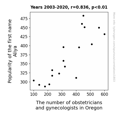
AliyaGYN: An Obstetric Tale of Name Popularity and Physician Numbers
As the name Aliya gained popularity, more and more parents subconsciously developed an interest in obstetrics and gynecology. It's as if the name itself exudes a gynecological aura, leading to a baby boom of future obstetricians and gynecologists in Oregon. Perhaps there's something truly special about the name Aliya that sparks a passion for women's health and childbirth. Who knew that a seemingly simple name could have such a profound impact on the future of medical specialization in a state? It's like a self-fulfilling prophecy of reproductive healthcare professionals!


View details about correlation #1,300
Genetically Modified Maize in Michigan: An Analysis of its Impact on Google Searches for 'Download Firefox'
As the GMO use in Michigan corn decreased, corn mazes became wildly popular. Participants navigated the mazes to find the non-GMO corn, inadvertently stumbling upon hidden computer terminals. This led to a statewide surge in unauthorized Firefox downloads, prompting the authorities to launch a campaign: "Get lost in the corn, not online!"


What else correlates?
GMO use in corn grown in Michigan · all food
Google searches for 'download firefox' · all google searches
GMO use in corn grown in Michigan · all food
Google searches for 'download firefox' · all google searches
Why this works
- Data dredging: I have 25,237 variables in my database. I compare all these variables against each other to find ones that randomly match up. That's 636,906,169 correlation calculations! This is called “data dredging.”
Fun fact: the chart used on the wikipedia page to demonstrate data dredging is also from me. I've been being naughty with data since 2014.
Instead of starting with a hypothesis and testing it, I instead tossed a bunch of data in a blender to see what correlations would shake out. It’s a dangerous way to go about analysis, because any sufficiently large dataset will yield strong correlations completely at random. - Lack of causal connection: There is probably no direct connection between these variables, despite what the AI says above.
Because these pages are automatically generated, it's possible that the two variables you are viewing are in fact causually related. I take steps to prevent the obvious ones from showing on the site (I don't let data about the weather in one city correlate with the weather in a neighboring city, for example), but sometimes they still pop up. If they are related, cool! You found a loophole.
This is exacerbated by the fact that I used "Years" as the base variable. Lots of things happen in a year that are not related to each other! Most studies would use something like "one person" in stead of "one year" to be the "thing" studied. - Observations not independent: For many variables, sequential years are not independent of each other. You will often see trend-lines form. If a population of people is continuously doing something every day, there is no reason to think they would suddenly change how they are doing that thing on January 1. A naive p-value calculation does not take this into account.
You will calculate a lower chance of "randomly" achieving the result than represents reality.
To be more specific: p-value tests are probability values, where you are calculating the probability of achieving a result at least as extreme as you found completely by chance. When calculating a p-value, you need to assert how many "degrees of freedom" your variable has. I count each year (minus one) as a "degree of freedom," but this is misleading for continuous variables.
This kind of thing can creep up on you pretty easily when using p-values, which is why it's best to take it as "one of many" inputs that help you assess the results of your analysis.
- Y-axes doesn't start at zero: I truncated the Y-axes of the graphs above. I also used a line graph, which makes the visual connection stand out more than it deserves.
Nothing against line graphs. They are great at telling a story when you have linear data! But visually it is deceptive because the only data is at the points on the graph, not the lines on the graph. In between each point, the data could have been doing anything. Like going for a random walk by itself!
Mathematically what I showed is true, but it is intentionally misleading. If you click on any of the charts that abuse this, you can scroll down to see a version that starts at zero. - Confounding variable: Confounding variables (like global pandemics) will cause two variables to look connected when in fact a "sneaky third" variable is influencing both of them behind the scenes.
- Outliers: Some datasets here have outliers which drag up the correlation.
In concept, "outlier" just means "way different than the rest of your dataset." When calculating a correlation like this, they are particularly impactful because a single outlier can substantially increase your correlation.
Because this page is automatically generated, I don't know whether any of the charts displayed on it have outliers. I'm just a footnote. ¯\_(ツ)_/¯
I intentionally mishandeled outliers, which makes the correlation look extra strong. - Low n: There are not many data points included in some of these charts.
You can do analyses with low ns! But you shouldn't data dredge with a low n.
Even if the p-value is high, we should be suspicious of using so few datapoints in a correlation.
Pro-tip: click on any correlation to see:
- Detailed data sources
- Prompts for the AI-generated content
- Explanations of each of the calculations (correlation, p-value)
- Python code to calculate it yourself


