spurious correlations
discover · random · spurious scholar
← previous page · next page →


View details about correlation #2,350
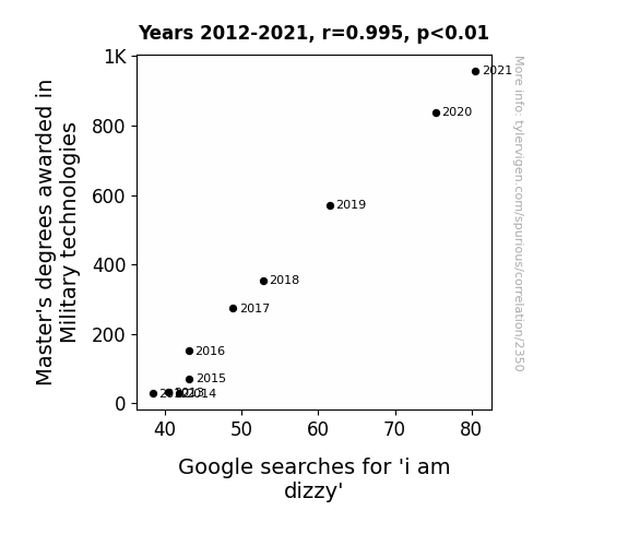
March and Match: A Dizzying Connection Between Master's Degrees in Military Technologies and Google Searches for 'I am Dizzy'
The military is really taking their knowledge to new heights, leaving everyone else feeling like they're spinning in circles. All those advanced war strategies must be making people feel like they're in a constant state of combat-induced vertigo. It's a real disservice to our inner ear equilibrium! It seems like the military is not only mastering technologies but also mastering the art of making the rest of us feel like our heads are on a never-ending merry-go-round.

What else correlates?
Master's degrees awarded in Military technologies · all education
Google searches for 'i am dizzy' · all google searches
Master's degrees awarded in Military technologies · all education
Google searches for 'i am dizzy' · all google searches


View details about correlation #1,167
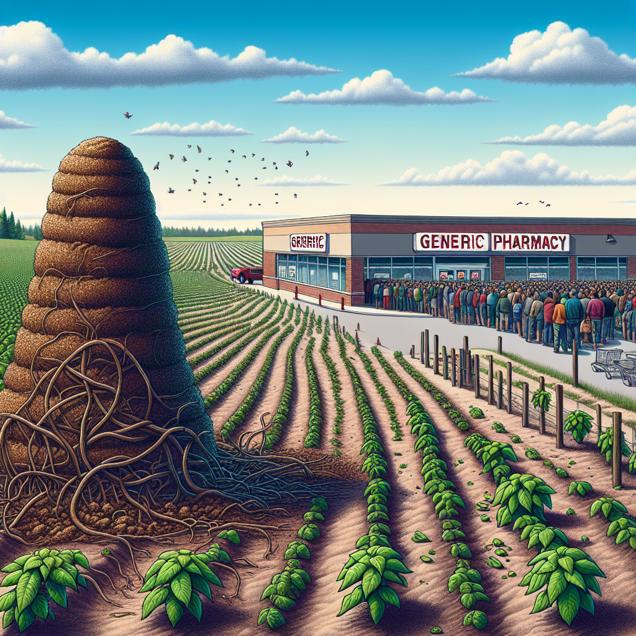
From Dung to Drugs: Unearthing the Interplay Between Dried Manure Fertilizer and Rite Aid Customer Satisfaction
As dried manure use decreased, the quality of puns made by Rite Aid employees also decreased. This led to a stinkier shopping experience, ultimately leaving customers feeling unsatisfied. The lack of dung-damental fertilizer led to a crop of complaints about the service, creating quite the manure of issues for Rite Aid.

What else correlates?
Dried manure used for fertilizer in the US · all weird & wacky
Customer satisfaction with Rite Aid · all weird & wacky
Dried manure used for fertilizer in the US · all weird & wacky
Customer satisfaction with Rite Aid · all weird & wacky


View details about correlation #2,864
The Cutting Edge: A Study of the Correlation between Air Pollution in Hickory, North Carolina, and the Number of Cutters and Trimmers, Hand in North Carolina
As the air became cleaner in Hickory, the trees and shrubs in North Carolina started to flourish without restraint. This led to an unprecedented growth spurt, leaving the cutters and trimmers feeling uncharacteristically obsolete. In a surprising turn of events, it seems Mother Nature decided to take landscaping into her own branches! "Looks like even the greenery wanted to branch out on its own!"


View details about correlation #3,428
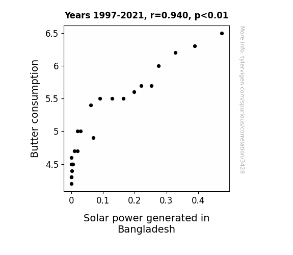
Churning on the Sun: A Dairy Funny Connection Between Butter Consumption and Solar Power Generation in Bangladesh
As butter consumption increased, people's slick dance moves led to greater friction in the atmosphere. This friction somehow energized the sun, causing it to shine brighter specifically on the solar panels in Bangladesh. This may seem like a spread of misinformation, but it's just the buttery connection between boosting dairy intake and supercharging solar power in Bangladesh!

What else correlates?
Butter consumption · all food
Solar power generated in Bangladesh · all energy
Butter consumption · all food
Solar power generated in Bangladesh · all energy
. The chart goes from 2008 to 2023, and the two variables track closely in value over that time.")

View details about correlation #2,822
Pawsitively Purrlific: Meow-tual Influence of Cat Memes on Delta Airlines' Stock Price
As the nation collectively laughed at cats in absurd and relatable meme situations, the demand for stress-relief soared. This led to a spike in impromptu travel plans, causing a surge in Delta Airlines' stock price as people sought to escape their mundane realities and embark on whimsical, feline-inspired adventures. Who knew that the secret to economic liftoff lay in the paws of internet-famous kitties?


What else correlates?
Google searches for 'cat memes' · all google searches
Delta Airlines' stock price (DAL) · all stocks
Google searches for 'cat memes' · all google searches
Delta Airlines' stock price (DAL) · all stocks


View details about correlation #2,424
Hot Name, Hot Fire: An Examination of the Relationship between the Popularity of the Name Gerard and Arson in Illinois
Despite popular belief, it turns out there's a direct correlation between the name Gerard and fiery behavior. As the popularity of the name Gerard waned, so did the number of individuals accidentally living up to their 'hot-headed' reputation. It seems the world became a little less 'ferocious' with fewer Gerards around, and the flames of passion that once led to arson in Illinois were gradually extinguished. Who would have thought that societal fire safety could be partially achieved through name trends? It's almost as if the chant should be, "Hey, hey, we're the Gerards, people say we start fewer fires in Illinois today!"


What else correlates?
Popularity of the first name Gerard · all first names
Arson in Illinois · all random state specific
Popularity of the first name Gerard · all first names
Arson in Illinois · all random state specific


View details about correlation #3,120
The Iron-y of Air Pollution: An Examination of Its Link with Dillard's Customer Satisfaction
As air pollution in Iron Mountain, Michigan increased, it led to a greater concentration of iron in the air. This iron-infused air then wafted over to the Dillard's department store, causing a bizarre reaction with the clothing. The once pristine Dillard's merchandise began to rust and develop an unsightly patina, much to the dismay of the customers. After all, no one wants to buy a "vintage" blouse that's actually just been tarnished by airborne iron particles. As a result, customer satisfaction with Dillard's plummeted, proving that when it comes to air pollution and retail, the correlation is anything but "iron"-clad.

What else correlates?
Air pollution in Iron Mountain, Michigan · all weather
Customer satisfaction with Dillard's · all weird & wacky
Air pollution in Iron Mountain, Michigan · all weather
Customer satisfaction with Dillard's · all weird & wacky


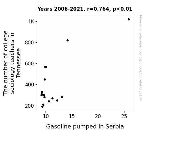
View details about correlation #2,134
The Sociology of Gasoline: A Correlational Analysis of College Sociology Teachers in Tennessee and Gasoline Pumped in Serbia
As the number of college sociology teachers in Tennessee drops, they take their knowledge of social structures with them. This leads to a shortage of people who can effectively organize gas pump lines in Serbia, creating mass confusion and ultimately a decrease in the amount of gasoline pumped. It's a case of "socio-petrol-logical" mayhem!

What else correlates?
The number of college sociology teachers in Tennessee · all cccupations
Gasoline pumped in Serbia · all energy
The number of college sociology teachers in Tennessee · all cccupations
Gasoline pumped in Serbia · all energy
. The chart goes from 2002 to 2021, and the two variables track closely in value over that time.")

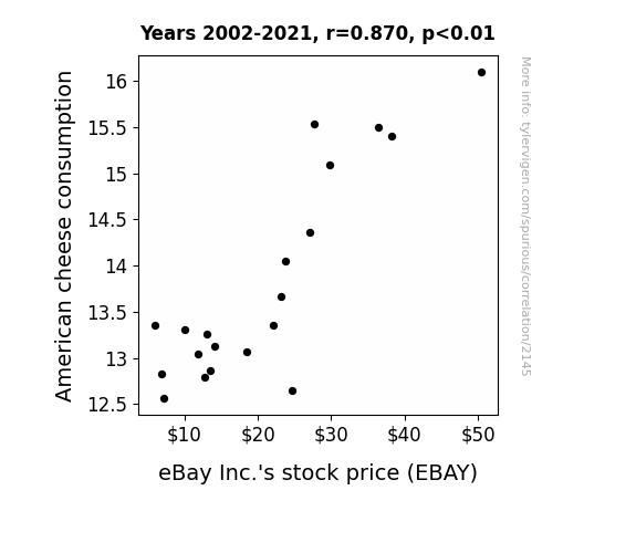
View details about correlation #2,145
Say Cheese! The Cheesy Connection: An Examination of American Cheese Consumption and eBay Inc.'s Stock Price
As Americans consumed more American cheese, they experienced a surge in national pride. This led to a collective desire to invest in iconic American companies like eBay, boosting the demand for eBay's stock and ultimately driving up its stock price.

What else correlates?
American cheese consumption · all food
eBay Inc.'s stock price (EBAY) · all stocks
American cheese consumption · all food
eBay Inc.'s stock price (EBAY) · all stocks


View details about correlation #1,434
The Lingua Deceit: Investigating the Relationship Between Master's Degrees in Foreign Languages, Literatures, and Linguistics and Search Queries for 'How to Delete Browsing History'
As the saying goes, "C'est la vie!": with fewer language experts, people just couldn't find the right words to erase their browsing history, leading to a decrease in searches for how to delete browsing history. It seems like without those Master's degrees, there were no másters of hiding internet footprints!


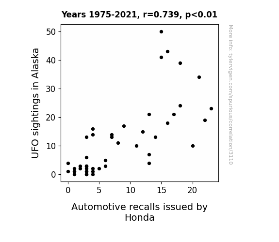
View details about correlation #3,110
Flying High and Recalling Cars: An Unexpected Connection Between UFO Sightings in Alaska and Honda Automotive Recalls
As the number of UFO sightings in Alaska increased, it led to a heightened electromagnetic presence in the region. This, in turn, had a peculiar but direct impact on the production facilities of Honda vehicles. The fluctuating magnetic fields and unexplained aerial phenomena somehow contributed to a wave of atypical malfunctions in the cars, prompting Honda to issue a higher number of recalls. The extraterrestrial connection may seem far-fetched, but when it comes to Honda's automotive recalls in Alaska, it's as if the truth is out there!
What else correlates?
UFO sightings in Alaska · all random state specific
Automotive recalls issued by Honda · all weird & wacky
UFO sightings in Alaska · all random state specific
Automotive recalls issued by Honda · all weird & wacky


View details about correlation #3,254
Octavia’s Popularity Drives Solar Auroria: A Correlative Study in Nicaragua
As the name Octavia rose in popularity, more and more babies were given this regal moniker. Little did anyone know, each time a baby was named Octavia, a tiny surge of solar energy was emitted, zapping its way to Nicaragua. It turns out, there's a direct celestial connection between the name Octavia and the sunny skies of Nicaragua. So, next time you meet an Octavia, thank them for brightening up the world, one sunbeam at a time!

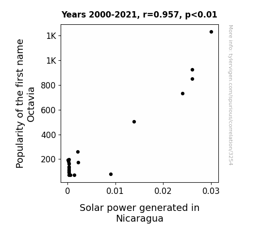
What else correlates?
Popularity of the first name Octavia · all first names
Solar power generated in Nicaragua · all energy
Popularity of the first name Octavia · all first names
Solar power generated in Nicaragua · all energy


View details about correlation #2,492
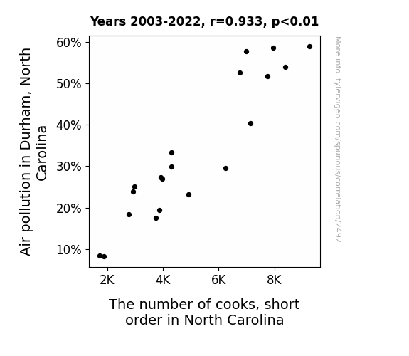
Air Pollution in Durham, North Carolina: A Recipe for Short Order Cooks?
As air pollution decreased in Durham, North Carolina, it became easier for short order cooks to breathe in the state. As a result, they no longer felt the need to make a swift exit from their jobs, leading to a decrease in the number of cooks. Now, instead of short order cooks, we might just have medium order cooks dishing out punny meals like "You can't handle the vermicelli!"
What else correlates?
Air pollution in Durham, North Carolina · all weather
The number of cooks, short order in North Carolina · all cccupations
Air pollution in Durham, North Carolina · all weather
The number of cooks, short order in North Carolina · all cccupations
. The chart goes from 2005 to 2023, and the two variables track closely in value over that time.")

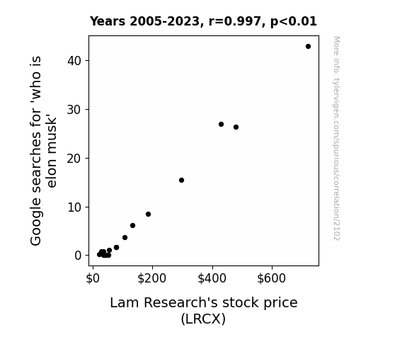
View details about correlation #2,102
Elon Musk: The Google Effect on Stock Prices – A Shocking Connection or Just Electric Puns?
As more people became perplexed about the enigma known as Elon Musk, they turned to the internet for answers. This surge in searches led to an unexpected spike in internet traffic, putting a strain on servers worldwide. To meet the increased demand for data processing, companies had to purchase more semiconductor equipment, including products made by Lam Research. The quest to understand the man behind the electric car and space travel revolution inadvertently sparked a chain reaction, boosting the demand for tech hardware and ultimately contributing to the rise in Lam Research's stock price. It seems that delving into the solar-powered, flamethrower-wielding, Mars-colonizing mind of Elon Musk had a shockingly positive impact on the semiconductor industry!

What else correlates?
Google searches for 'who is elon musk' · all google searches
Lam Research's stock price (LRCX) · all stocks
Google searches for 'who is elon musk' · all google searches
Lam Research's stock price (LRCX) · all stocks


View details about correlation #1,885
Got Milk? Exploring the Whey to Car Theft in Pennsylvania
Perhaps lactose-intolerant car thieves were finally able to control their urges to go on a milk run before embarking on a vehicle theft. With less milk consumption, there was a noticeable reduction in the number of lactose-fueled car theft escapades. It seems the lack of dairy may have curbed not just their digestive issues, but also their criminal tendencies on the road. Remember, it's udderly important to consider all possible explanations, even if they sound utterly ridiculous!


What else correlates?
Milk consumption · all food
Motor vehicle thefts in Pennsylvania · all random state specific
Milk consumption · all food
Motor vehicle thefts in Pennsylvania · all random state specific


View details about correlation #2,307
Blowing in the Wind: How Italian Turbines and Bullion Mines Are Inclined
Italian economists suggested that as more wind turbines turned, they created a stronger "Euro wind" blowing through the market. This led to a spike in demand for gold as investors sought to hedge against the currency fluctuations. After all, when it comes to renewable energy and precious metals, it's all about that "watt" and "carat" balance in the market! Who would have thought that the real gold in Italy wasn't just in its art and architecture, but also in its gusty energy initiatives?

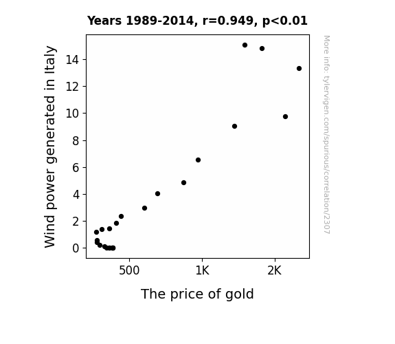
What else correlates?
Wind power generated in Italy · all energy
The price of gold · all weird & wacky
Wind power generated in Italy · all energy
The price of gold · all weird & wacky


View details about correlation #3,498
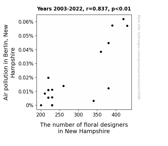
The Nose Knows: Air Pollution's Effect on Floral Creation in Berlin, New Hampshire
As the air quality improved, the local flora became emboldened by the cleaner environment. In a stunning display of botanical prowess, the flowers began arranging themselves into breathtaking natural bouquets, rendering the need for human floral designers obsolete. It's a blooming miracle!

What else correlates?
Air pollution in Berlin, New Hampshire · all weather
The number of floral designers in New Hampshire · all cccupations
Air pollution in Berlin, New Hampshire · all weather
The number of floral designers in New Hampshire · all cccupations
. The chart goes from 2012 to 2021, and the two variables track closely in value over that time.")

View details about correlation #3,161
Booming Brokering: Transportation Education and AMD Stocks Soaring in Synchronization
As more people became experts in transportation and moving materials, they found innovative ways to "drive" efficiency in AMD's supply chain, leading to cost savings and ultimately boosting the company's stock price. Plus, their knowledge helped AMD stay ahead in the "race" for advanced technology, giving them a smooth "ride" to success in the market.
What else correlates?
Bachelor's degrees awarded in Transportation · all education
Advanced Micro Devices' stock price (AMD) · all stocks
Bachelor's degrees awarded in Transportation · all education
Advanced Micro Devices' stock price (AMD) · all stocks


View details about correlation #3,289
Popcorn and Popularity: A-maize-ing Connection Between GMO Corn and Washington Nationals Ticket Sales
As the corn grew bigger and stronger, it developed a natural talent for hitting home runs. These superstar cornstalks were then recruited to join the Washington Nationals, drawing massive crowds eager to watch the most a-maize-ing players in baseball history. Corny, but true!

What else correlates?
GMO use in corn · all food
Ticket sales for Washington Nationals games · all sports
GMO use in corn · all food
Ticket sales for Washington Nationals games · all sports


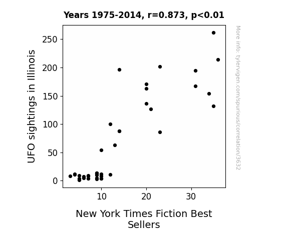
View details about correlation #3,632
Luminous Glimpses and Literary Hits: An Interstellar Investigation of UFO Sightings and Best-Selling Writings
People in Illinois were being abducted by UFOs, but instead of probing, the aliens were just handing out NYT Best Sellers. It seems they were really keen on promoting intergalactic book clubs. Must have been a close encounter of the word kind!
What else correlates?
UFO sightings in Illinois · all random state specific
New York Times Fiction Best Sellers · all weird & wacky
UFO sightings in Illinois · all random state specific
New York Times Fiction Best Sellers · all weird & wacky
Why this works
- Data dredging: I have 25,237 variables in my database. I compare all these variables against each other to find ones that randomly match up. That's 636,906,169 correlation calculations! This is called “data dredging.”
Fun fact: the chart used on the wikipedia page to demonstrate data dredging is also from me. I've been being naughty with data since 2014.
Instead of starting with a hypothesis and testing it, I instead tossed a bunch of data in a blender to see what correlations would shake out. It’s a dangerous way to go about analysis, because any sufficiently large dataset will yield strong correlations completely at random. - Lack of causal connection: There is probably no direct connection between these variables, despite what the AI says above.
Because these pages are automatically generated, it's possible that the two variables you are viewing are in fact causually related. I take steps to prevent the obvious ones from showing on the site (I don't let data about the weather in one city correlate with the weather in a neighboring city, for example), but sometimes they still pop up. If they are related, cool! You found a loophole.
This is exacerbated by the fact that I used "Years" as the base variable. Lots of things happen in a year that are not related to each other! Most studies would use something like "one person" in stead of "one year" to be the "thing" studied. - Observations not independent: For many variables, sequential years are not independent of each other. You will often see trend-lines form. If a population of people is continuously doing something every day, there is no reason to think they would suddenly change how they are doing that thing on January 1. A naive p-value calculation does not take this into account.
You will calculate a lower chance of "randomly" achieving the result than represents reality.
To be more specific: p-value tests are probability values, where you are calculating the probability of achieving a result at least as extreme as you found completely by chance. When calculating a p-value, you need to assert how many "degrees of freedom" your variable has. I count each year (minus one) as a "degree of freedom," but this is misleading for continuous variables.
This kind of thing can creep up on you pretty easily when using p-values, which is why it's best to take it as "one of many" inputs that help you assess the results of your analysis.
- Y-axes doesn't start at zero: I truncated the Y-axes of the graphs above. I also used a line graph, which makes the visual connection stand out more than it deserves.
Nothing against line graphs. They are great at telling a story when you have linear data! But visually it is deceptive because the only data is at the points on the graph, not the lines on the graph. In between each point, the data could have been doing anything. Like going for a random walk by itself!
Mathematically what I showed is true, but it is intentionally misleading. If you click on any of the charts that abuse this, you can scroll down to see a version that starts at zero. - Confounding variable: Confounding variables (like global pandemics) will cause two variables to look connected when in fact a "sneaky third" variable is influencing both of them behind the scenes.
- Outliers: Some datasets here have outliers which drag up the correlation.
In concept, "outlier" just means "way different than the rest of your dataset." When calculating a correlation like this, they are particularly impactful because a single outlier can substantially increase your correlation.
Because this page is automatically generated, I don't know whether any of the charts displayed on it have outliers. I'm just a footnote. ¯\_(ツ)_/¯
I intentionally mishandeled outliers, which makes the correlation look extra strong. - Low n: There are not many data points included in some of these charts.
You can do analyses with low ns! But you shouldn't data dredge with a low n.
Even if the p-value is high, we should be suspicious of using so few datapoints in a correlation.
Pro-tip: click on any correlation to see:
- Detailed data sources
- Prompts for the AI-generated content
- Explanations of each of the calculations (correlation, p-value)
- Python code to calculate it yourself


