spurious correlations
discover · random · spurious scholar
← previous page · next page →


View details about correlation #1,950
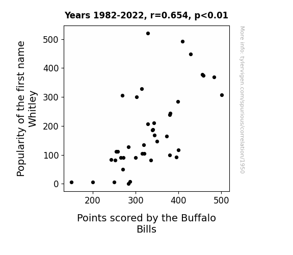
The Name Game: Whitley's Placekicker/Receiver Paradox
Every time a baby was named Whitley, a magical aura of good luck enveloped the Buffalo Bills, leading to heightened focus, agility, and scoring abilities on the field. It's like they were receiving a direct infusion of positive energy and unstoppable determination from all the little Whitleys out there. It got to the point where the announcers were considering replacing the phrase "He shoots, he scores!" with "Whitley is in the air, and the Bills are on fire!"
What else correlates?
Popularity of the first name Whitley · all first names
Points scored by the Buffalo Bills · all sports
Popularity of the first name Whitley · all first names
Points scored by the Buffalo Bills · all sports


View details about correlation #1,596
Dizzying Dilemma: Dominican Republic's Solar Power and Symptoms of Vertigo
As the solar panels soaked up the Caribbean sun, they inadvertently transmitted a frequency that harmonized with the inner ear, leading to a spike in searches for 'i am dizzy.' It seems the quest for renewable energy has taken an unexpected spin on the dance floor of dizziness!


What else correlates?
Solar power generated in Dominican Republic · all energy
Google searches for 'i am dizzy' · all google searches
Solar power generated in Dominican Republic · all energy
Google searches for 'i am dizzy' · all google searches


View details about correlation #3,342
Branching Out: The Influentree of University Economics Teachers on Artificial Christmas Tree Sales in the US
As the number of university economics teachers in Idaho increased, so did the understanding of supply and demand. This led to a nationwide surge in the artificial Christmas tree market, as consumers responded to the newfound knowledge with heightened enthusiasm for festive economics. This of course, resulted in an unexpected boost in holiday tree sales throughout the United States.


. The chart goes from 2002 to 2023, and the two variables track closely in value over that time.")

View details about correlation #3,679
The Celestial and Corporate Dance: Exploring the Relationship Between the Distance Between Neptune and Uranus and Archer-Daniels-Midland Company's Stock Price
As the icy blue planets drifted further apart, their gravitational pull inadvertently tugged on the Earth's economic decision-making processes. This cosmically influenced an uptick in the consumption of agricultural products, leading to higher demand for ADM's goods and ultimately boosting their stock price. After all, it's not every day that celestial bodies moonlight as the ultimate stock market influencers!


What else correlates?
The distance between Neptune and Uranus · all planets
Archer-Daniels-Midland Company's stock price (ADM) · all stocks
The distance between Neptune and Uranus · all planets
Archer-Daniels-Midland Company's stock price (ADM) · all stocks


View details about correlation #1,699
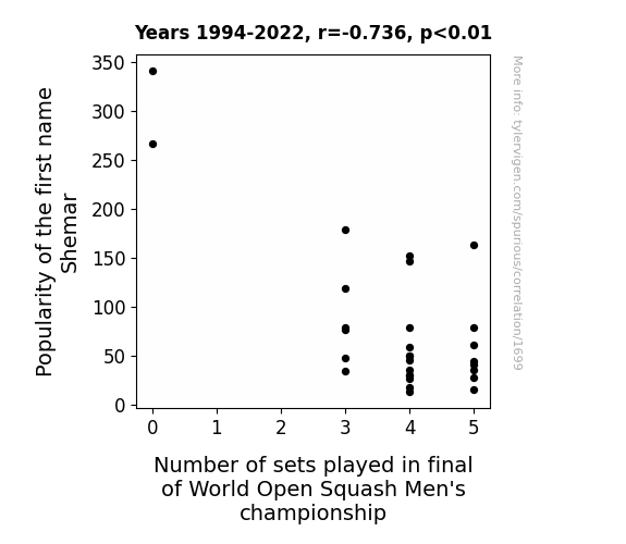
Smashing Connections: A Squashy Study of the Shemar Name and World Open Squash Men's Championship Sets
Every time someone shouted "Shemar, Shemar, Shemar!" the players thought it was a new squash move and would stop to see this new technique, extending the match.


View details about correlation #1,112
Bright Lights, Big Ignition: Unearthing the Link Between Google Searches for 'Report UFO Sighting' and Kerosene Consumption in South Korea
The aliens finally perfected their cloaking technology and no longer needed to siphon off kerosene from South Korea to power their spaceships, leading to a decrease in both reported UFO sightings and kerosene usage in the country.


What else correlates?
Google searches for 'report UFO sighting' · all random state specific
Kerosene used in South Korea · all energy
Google searches for 'report UFO sighting' · all random state specific
Kerosene used in South Korea · all energy


View details about correlation #2,250
A-Maize-ing Connections: Exploring the Relationship Between GMO Corn and Postal Service Machine Operators in Nebraska
As corn in Nebraska became less genetically modified, it started to develop a strong preference for handwritten letters over electronic communication. This increased the workload for the postal service, and unfortunately, the machine operators couldn't keep up with the sudden surge in demand for hand-canceling and sorting letters.

What else correlates?
GMO use in corn grown in Nebraska · all food
The number of postal service machine operators in Nebraska · all cccupations
GMO use in corn grown in Nebraska · all food
The number of postal service machine operators in Nebraska · all cccupations
. The chart goes from 2002 to 2022, and the two variables track closely in value over that time.")

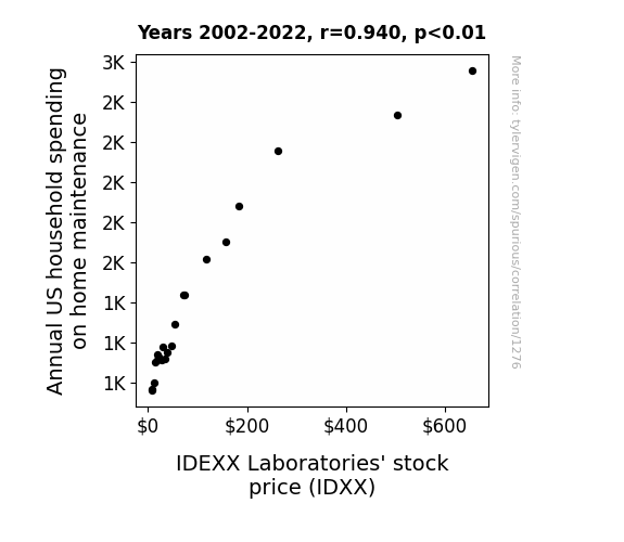
View details about correlation #1,276
The Paw-sitively Purrfect Pair: Exploring the Feline Connection Between Annual US Household Spending on Home Maintenance and IDEXX Laboratories' Stock Price
As households spent more on home maintenance, they realized they had a lot of *pawsibilities* for pet ownership. This led to an uptick in pet ownership, ultimately boosting the demand for IDEXX's veterinary products and services. Plus, as homes got more *purrfect*, families had the time and resources to care for their furry friends, driving overall spending on pet healthcare. So, in essence, it seems like a well-maintained home really does lead to a *healthy* stock price for IDEXX Laboratories. Who knew that fixing a leaky faucet could unleash such *unbe-leash-able* market effects!
What else correlates?
Annual US household spending on home maintenance · all weird & wacky
IDEXX Laboratories' stock price (IDXX) · all stocks
Annual US household spending on home maintenance · all weird & wacky
IDEXX Laboratories' stock price (IDXX) · all stocks


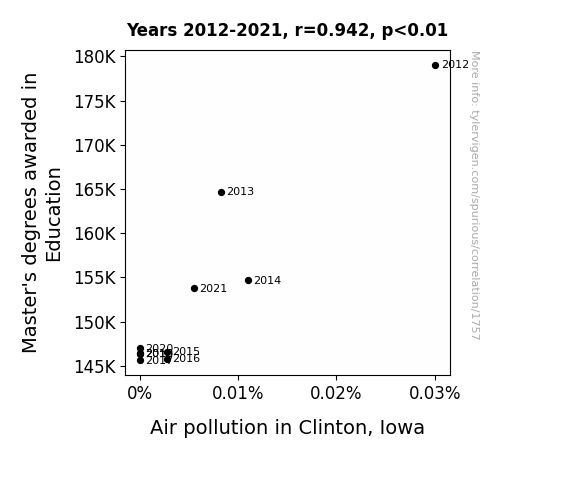
View details about correlation #1,757
Master's Degrees in Education and the Miasma of Air Pollution: A Case Study of Clinton, Iowa
As the number of Master's degrees awarded in Education decreased, there was a corresponding decrease in the use of red correction pens. With fewer red correction pens in circulation, there was a reduced demand for red ink production. This led to a surplus of red dye, which was then repurposed by a local artist in Clinton, Iowa to create environmentally friendly air filters for cars. These innovative filters somehow had the miraculous ability to purify the air, effectively reducing air pollution in Clinton, Iowa. Who would have thought that the key to cleaner air in Clinton was actually fewer Master's degrees in Education?

What else correlates?
Master's degrees awarded in Education · all education
Air pollution in Clinton, Iowa · all weather
Master's degrees awarded in Education · all education
Air pollution in Clinton, Iowa · all weather


View details about correlation #3,380
Jayce and the Extraterrestrial: Unearthing the Fossil Fuels of Brazil
As the name Jayce gained popularity, more and more parents were inspired to buy toy cars for their kids, leading to a spike in the demand for plastic. This led to an increase in the production of plastic toys in Brazil, ultimately boosting the consumption of fossil fuels for manufacturing and transportation. Looks like Jayce wasn't just revving up in the popularity charts, but also igniting a fossil fuel frenzy in Brazil!


What else correlates?
Popularity of the first name Jayce · all first names
Fossil fuel use in Brazil · all energy
Popularity of the first name Jayce · all first names
Fossil fuel use in Brazil · all energy


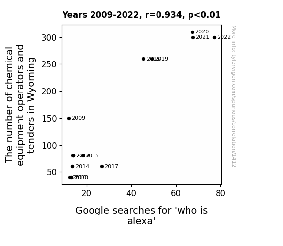
View details about correlation #1,412
Operation Alexa: Exploring the Interplay Between Chemical Equipment Operators and Tenders in Wyoming and Google Searches for 'Who is Alexa'
These operators and tenders must have been reACTing to the demand for chemical expertise, inadvertently raising questions about Alexa the ALEXA. It seems like the state was just trying to find the right formula for success, but ended up creating a whole new kind of search query reaction. Who knew Wyoming's chemical operators and tenders would spark such an ALEXA-lling interest in everyone's favorite virtual assistant!


View details about correlation #2,792
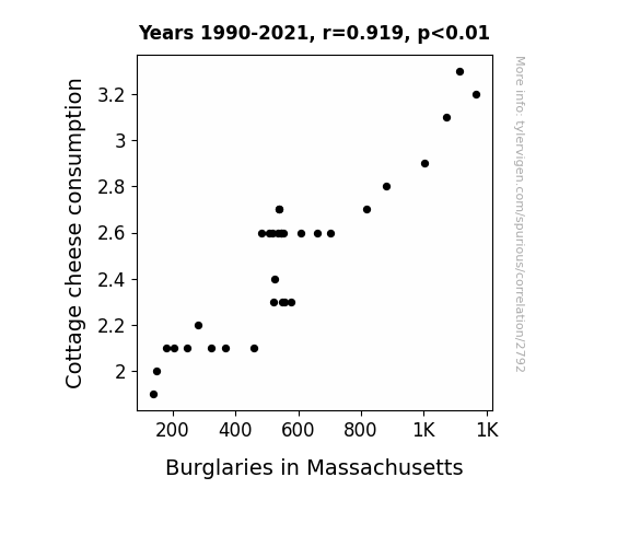
Cheese and Crime: Unraveling the Curd-ious Connection Between Cottage Cheese Consumption and Burglaries in Massachusetts
As people consumed less cottage cheese, they were less likely to have any "grate" ideas for late-night snacking, leading to fewer trips to the kitchen. With no need to "curd" the hunger, there were lower chances of bumping into a would-be burglar or hearing any suspicious "whey" noises. As a result, the overall less appetizing scenario led to a decrease in burglaries.
What else correlates?
Cottage cheese consumption · all food
Burglaries in Massachusetts · all random state specific
Cottage cheese consumption · all food
Burglaries in Massachusetts · all random state specific


View details about correlation #1,730
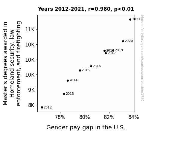
Securing the Bag: An Investigation into the Link between Master's Degrees in Homeland Security, Law Enforcement, and Firefighting and the Gender Pay Gap in the United States
Master's of Disaster: As the number of M.A. holders in homeland security, law enforcement, and firefighting surged, so did the gender pay gap. It seems that instead of extinguishing inequality, these degrees were just adding fuel to the fire. Perhaps they were simply too adept at maintaining the status quo, creating a fiery gap in wages between male and female professionals. It's a heated issue, but it looks like these master's programs might need to work on promoting equal pay for blaze! For now, it's clear that when it comes to the gender pay gap, these master's degrees might be part of the problem rather than the solution.

What else correlates?
Master's degrees awarded in law enforcement and firefighting · all education
Gender pay gap in the U.S. · all weird & wacky
Master's degrees awarded in law enforcement and firefighting · all education
Gender pay gap in the U.S. · all weird & wacky


View details about correlation #2,141
Kicking Kerosene: Examining the Entertaining Interplay Between Manchester United's Match Wins and Uganda's Use of Unusual Uncleared Energy Sources
The more seasons Manchester United won, the more fans celebrated by lighting up fireworks, leading to a higher demand for kerosene to ignite those post-victory pyrotechnics in Uganda.


What else correlates?
Number of seasons Manchester United won matches · all sports
Kerosene used in Uganda · all energy
Number of seasons Manchester United won matches · all sports
Kerosene used in Uganda · all energy


View details about correlation #2,866
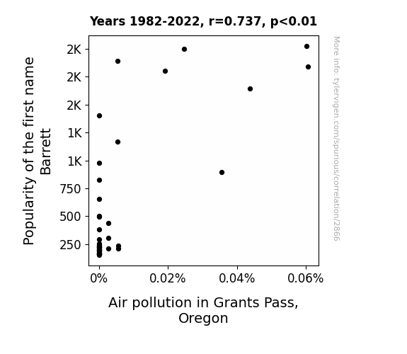
The Bizarre Barrett Phenomenon: Exploring the Link Between Name Popularity and Air Pollution in Grants Pass, Oregon
As the number of Barretts rose, so did the demand for personalized "Barrett" license plates. This led to an influx of cars in Grants Pass, Oregon, ultimately revving up air pollution levels.
What else correlates?
Popularity of the first name Barrett · all first names
Air pollution in Grants Pass, Oregon · all weather
Popularity of the first name Barrett · all first names
Air pollution in Grants Pass, Oregon · all weather
. The chart goes from 2002 to 2022, and the two variables track closely in value over that time.")

View details about correlation #2,388
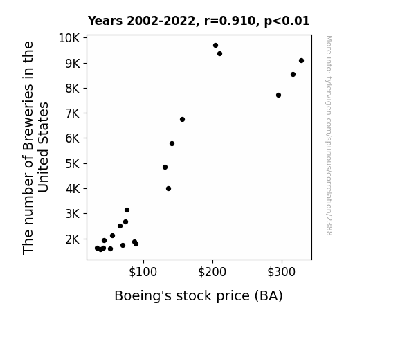
The Brews and the Bulls: Exploring the Ale-Phabet Soup of Breweries and Boeing's Stock Price
As the number of breweries in the United States increased, so did the demand for beer. This led to more people wanting to travel to visit different breweries, boosting the need for airplanes. With Boeing being a major supplier of aircraft, their stock price naturally rose as they scrambled to keep up with the beer-fueled travel craze. It's a brew-tiful example of how hops, barley, and aviation can all come together to lift stocks to new heights.

What else correlates?
The number of Breweries in the United States · all food
Boeing's stock price (BA) · all stocks
The number of Breweries in the United States · all food
Boeing's stock price (BA) · all stocks


View details about correlation #3,252
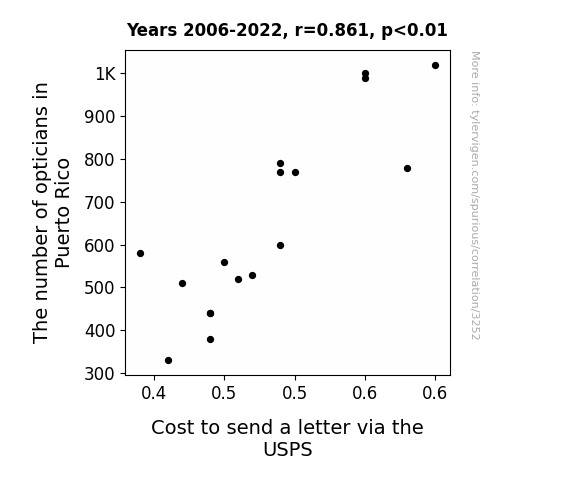
Visual Visionaries: The Vexing Venture of Vision and Postage in Puerto Rico
As the number of opticians in Puerto Rico rose, so did the cost to send a letter via USPS. It seems the opticians were really framing the issue, leading to a clearer view of the rising postal prices. Perhaps they were just all about making a spectacle of the situation, or maybe they saw an opportunity to lens a hand in the mailing costs. It's a vision of economic influence that's just too eye-catching to ignore!
What else correlates?
The number of opticians in Puerto Rico · all cccupations
Cost to send a letter via the USPS · all weird & wacky
The number of opticians in Puerto Rico · all cccupations
Cost to send a letter via the USPS · all weird & wacky


View details about correlation #3,339
Unearthing Extraterrestrial Energy: Unveiling the Connection Between UFO Sightings in Michigan and Fossil Fuel Use in Ecuador
The UFOs were actually advanced drones powered by fossil fuels, and they were secretly conducting research on the state of Michigan's automotive industry. This inadvertently led to an increase in fossil fuel use in Ecuador as the UFOs beamed down knowledge about efficient fuel extraction and usage to random bystanders, who then inexplicably felt compelled to invest in Ecuador's oil production. This surprising chain of events demonstrates how even the most outlandish connections can have real-world consequences.


What else correlates?
UFO sightings in Michigan · all random state specific
Fossil fuel use in Ecuador · all energy
UFO sightings in Michigan · all random state specific
Fossil fuel use in Ecuador · all energy


View details about correlation #1,326
Net Goals or Nutty Squirrels: Investigating the Link Between National Lacrosse League Finalist Score Difference and Google Searches for 'Attacked by a Squirrel'
The decrease in National Lacrosse League Finalist Score Difference has led to a decrease in overly competitive squirrels who are now pursuing friendlier, non-confrontational activities such as knitting acorn sweaters and hosting tea parties in the park. This has ultimately reduced the likelihood of encountering a hostile, playoff-mentality squirrel that's ready to defend its territory at all costs. Remember, a peaceful squirrel is a squirrel that won't go for the championship title of your picnic basket!
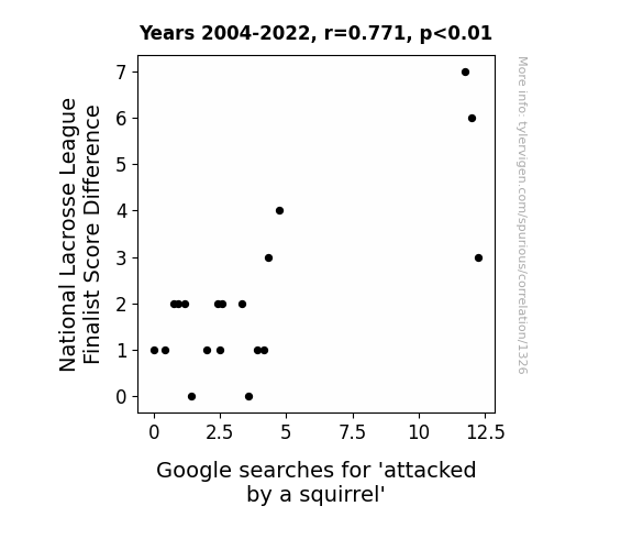
. The chart goes from 2003 to 2022, and the two variables track closely in value over that time.")

View details about correlation #2,784
May the NDAQ Be Ever in Your Favor: The Correlation Between the Popularity of the Name Maeve and Nasdaq Stock Prices
As more and more babies were named Maeve, their innate sense of fiscal responsibility and investment acumen inadvertently led to a surge in stock market activity. It seems that the name Maeve is not just popular, but also has a Midas touch when it comes to financial matters! Who would've thought that a simple change in baby-naming trends could have such far-reaching effects on the economy?

What else correlates?
Popularity of the first name Maeve · all first names
Nasdaq's stock price (NDAQ) · all stocks
Popularity of the first name Maeve · all first names
Nasdaq's stock price (NDAQ) · all stocks
Why this works
- Data dredging: I have 25,237 variables in my database. I compare all these variables against each other to find ones that randomly match up. That's 636,906,169 correlation calculations! This is called “data dredging.”
Fun fact: the chart used on the wikipedia page to demonstrate data dredging is also from me. I've been being naughty with data since 2014.
Instead of starting with a hypothesis and testing it, I instead tossed a bunch of data in a blender to see what correlations would shake out. It’s a dangerous way to go about analysis, because any sufficiently large dataset will yield strong correlations completely at random. - Lack of causal connection: There is probably no direct connection between these variables, despite what the AI says above.
Because these pages are automatically generated, it's possible that the two variables you are viewing are in fact causually related. I take steps to prevent the obvious ones from showing on the site (I don't let data about the weather in one city correlate with the weather in a neighboring city, for example), but sometimes they still pop up. If they are related, cool! You found a loophole.
This is exacerbated by the fact that I used "Years" as the base variable. Lots of things happen in a year that are not related to each other! Most studies would use something like "one person" in stead of "one year" to be the "thing" studied. - Observations not independent: For many variables, sequential years are not independent of each other. You will often see trend-lines form. If a population of people is continuously doing something every day, there is no reason to think they would suddenly change how they are doing that thing on January 1. A naive p-value calculation does not take this into account.
You will calculate a lower chance of "randomly" achieving the result than represents reality.
To be more specific: p-value tests are probability values, where you are calculating the probability of achieving a result at least as extreme as you found completely by chance. When calculating a p-value, you need to assert how many "degrees of freedom" your variable has. I count each year (minus one) as a "degree of freedom," but this is misleading for continuous variables.
This kind of thing can creep up on you pretty easily when using p-values, which is why it's best to take it as "one of many" inputs that help you assess the results of your analysis.
- Y-axes doesn't start at zero: I truncated the Y-axes of the graphs above. I also used a line graph, which makes the visual connection stand out more than it deserves.
Nothing against line graphs. They are great at telling a story when you have linear data! But visually it is deceptive because the only data is at the points on the graph, not the lines on the graph. In between each point, the data could have been doing anything. Like going for a random walk by itself!
Mathematically what I showed is true, but it is intentionally misleading. If you click on any of the charts that abuse this, you can scroll down to see a version that starts at zero. - Confounding variable: Confounding variables (like global pandemics) will cause two variables to look connected when in fact a "sneaky third" variable is influencing both of them behind the scenes.
- Outliers: Some datasets here have outliers which drag up the correlation.
In concept, "outlier" just means "way different than the rest of your dataset." When calculating a correlation like this, they are particularly impactful because a single outlier can substantially increase your correlation.
Because this page is automatically generated, I don't know whether any of the charts displayed on it have outliers. I'm just a footnote. ¯\_(ツ)_/¯
I intentionally mishandeled outliers, which makes the correlation look extra strong. - Low n: There are not many data points included in some of these charts.
You can do analyses with low ns! But you shouldn't data dredge with a low n.
Even if the p-value is high, we should be suspicious of using so few datapoints in a correlation.
Pro-tip: click on any correlation to see:
- Detailed data sources
- Prompts for the AI-generated content
- Explanations of each of the calculations (correlation, p-value)
- Python code to calculate it yourself


