spurious correlations
discover · random · spurious scholar
← previous page · next page →


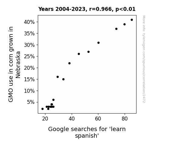
View details about correlation #2,472
Maizey Habla Español: The Corny Connection Between GMOs and Spanish Language Learning
The corn stalks were no longer ear-responsible for the spike in 'learn spanish' searches as people had to maize elsewhere for language inspiration. Without GMOs, Nebraskans couldn't plant the idea to 'stalk' up on Spanish knowledge, leading to a kernel of truth - the crop in language interest was all but husked! Remember, when it comes to GMOs and language learning, it's all about the Ears of the corn.

What else correlates?
GMO use in corn grown in Nebraska · all food
Google searches for 'learn spanish' · all google searches
GMO use in corn grown in Nebraska · all food
Google searches for 'learn spanish' · all google searches


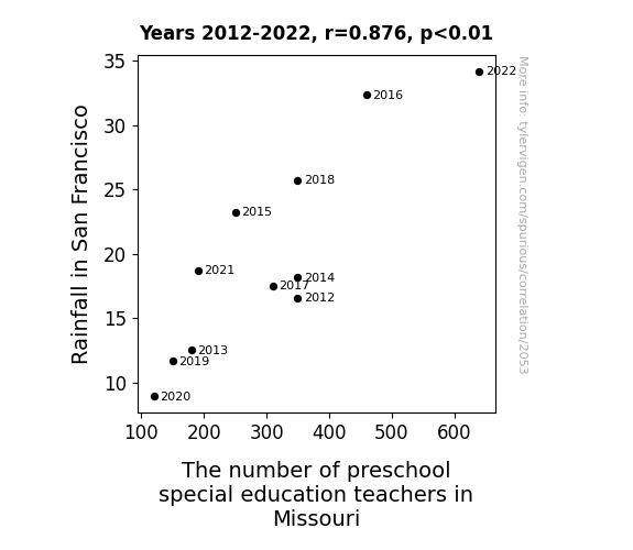
View details about correlation #2,053
Rain or Shine: A Precipitation of Preschool Personnel in Missouri
As the rain fell in San Francisco, it created a ripple effect of joy and prosperity. This led to an increase in the production of rainbow-colored crayons, which are the preferred writing utensils for young children. As demand for preschool education in Missouri surged, so did the need for special education teachers, especially those with expertise in finger painting and cloud-shaped block building. After all, every drop of rain has the power to shape a budding mind, and apparently, it's raining knowledge in more ways than one!

What else correlates?
Rainfall in San Francisco · all weather
The number of preschool special education teachers in Missouri · all cccupations
Rainfall in San Francisco · all weather
The number of preschool special education teachers in Missouri · all cccupations


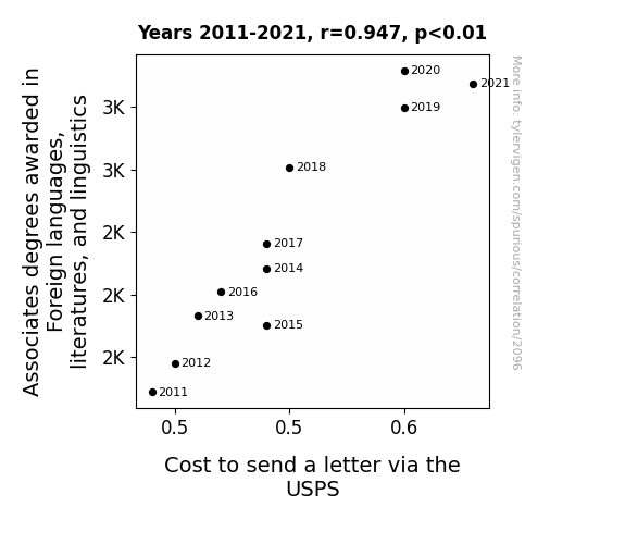
View details about correlation #2,096
The Linguistics of Linguistic Studies: The Nexus between Foreign Language Degrees and USPS Letter Costs
As more people became proficient in foreign languages, the demand for pen pals from around the world skyrocketed, leading to a surge in letter writing. The USPS had to adjust their pricing to account for the international pen pal phenomenon, ultimately raising the cost to send a letter. Who knew that mastering French or Japanese could lead to a global epistolary revolution?
What else correlates?
Associates degrees awarded in linguistics · all education
Cost to send a letter via the USPS · all weird & wacky
Associates degrees awarded in linguistics · all education
Cost to send a letter via the USPS · all weird & wacky


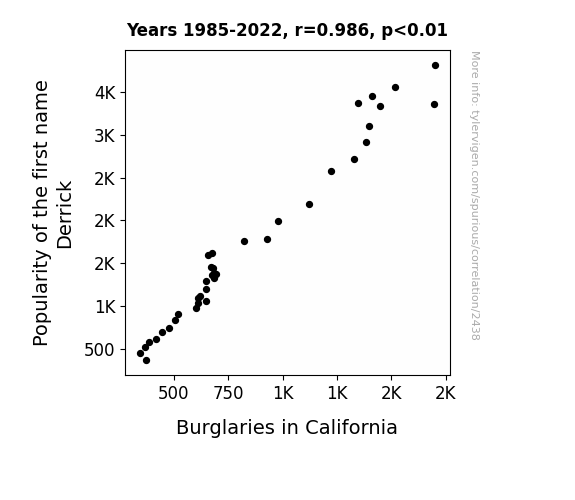
View details about correlation #2,438
Derek to the Crime - The Curious Case of Derrick: A Correlational Study of Derrickness and Burglaries in California
Hearing the name Derrick reminded people of the phrase "break in," inadvertently prompting them to become more vigilant and security-conscious. This collective mindset shift led to a decrease in successful burglary attempts in California. But in reality, the two are completely unrelated.

What else correlates?
Popularity of the first name Derrick · all first names
Burglaries in California · all random state specific
Popularity of the first name Derrick · all first names
Burglaries in California · all random state specific


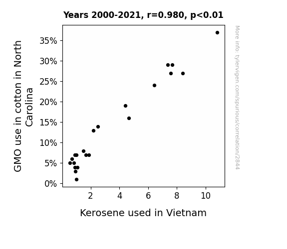
View details about correlation #2,844
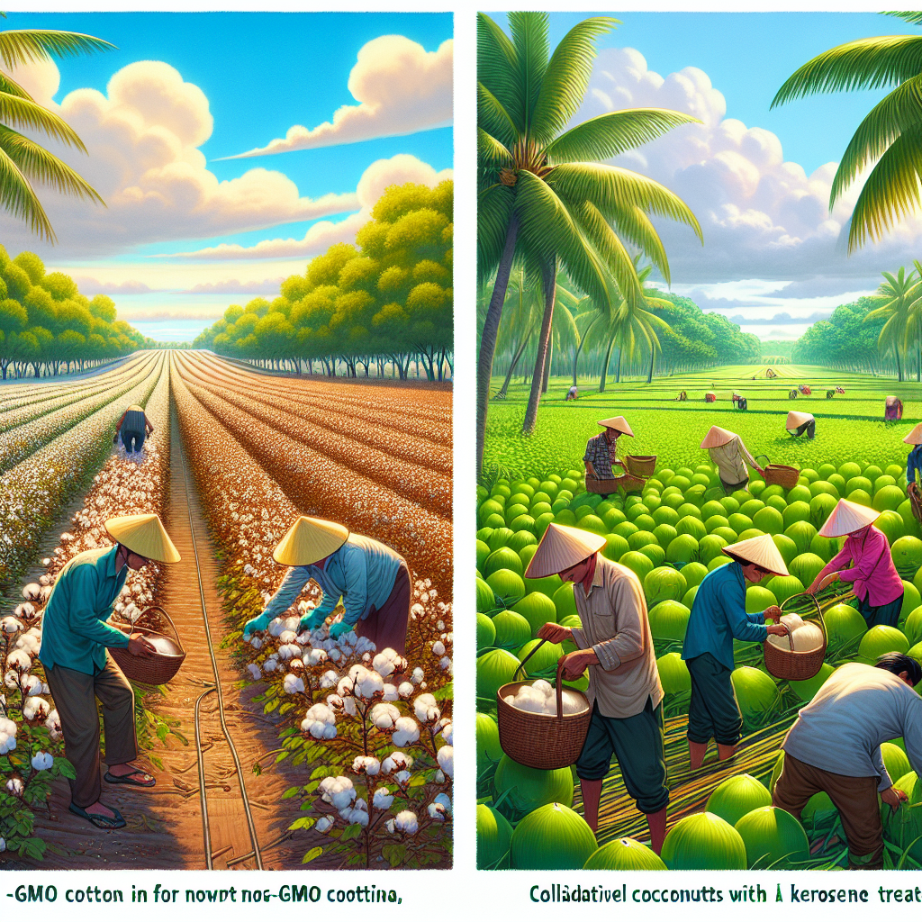
The Cotton Connection: Unraveling the Link Between GMO Usage in North Carolina and Kerosene Consumption in Vietnam
As the demand for non-GMO cotton in North Carolina increased, farmers there had to switch to old-fashioned kerosene lamps to inspect their crops at night, leading to a sudden spike in local kerosene consumption. This unexpected shift in lighting methods caught the attention of kerosene traders in Vietnam, prompting them to cut back on their own kerosene usage in a bid to save the precious resource for future generations. It's a classic case of agricultural decision-making sparking a luminous chain reaction halfway across the globe!
What else correlates?
GMO use in cotton in North Carolina · all food
Kerosene used in Vietnam · all energy
GMO use in cotton in North Carolina · all food
Kerosene used in Vietnam · all energy


View details about correlation #3,507
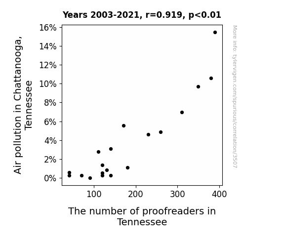
A Breath of Fresh Jest: The Link Between Air Pollution Zest and the Best Proofreaders in the West
As the air cleared up, there was less need for error correction. The proofreaders were simply left "aerated" and decided to pursue new career paths. With fewer typos to catch, they couldn't handle the lack of "atmosphere" in their line of work. It seems like the cleaner air led to some "proof-reading between the lines" of their professional goals.
What else correlates?
Air pollution in Chattanooga, Tennessee · all weather
The number of proofreaders in Tennessee · all cccupations
Air pollution in Chattanooga, Tennessee · all weather
The number of proofreaders in Tennessee · all cccupations


View details about correlation #1,200
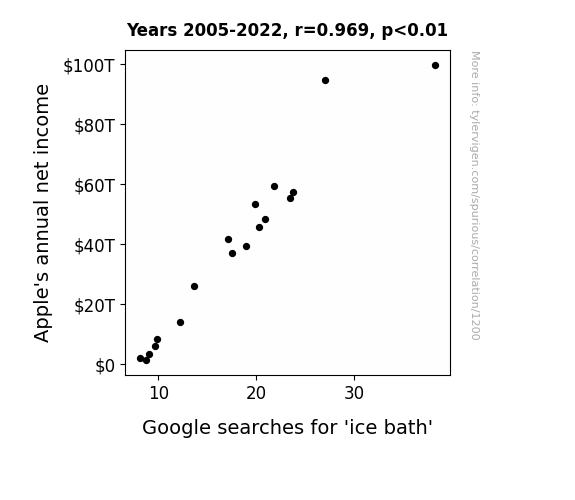
Chilling Relationship: An Examination of the Correlation Between Apple's Annual Net Income and Google Searches for 'Ice Bath'
People were so excited about the new iPhone that they were taking ice baths to cool off from the hot deals. Looks like Apple's success really gave their competition the cold shoulder!

What else correlates?
Apple's annual net income · all weird & wacky
Google searches for 'ice bath' · all google searches
Apple's annual net income · all weird & wacky
Google searches for 'ice bath' · all google searches


View details about correlation #3,582
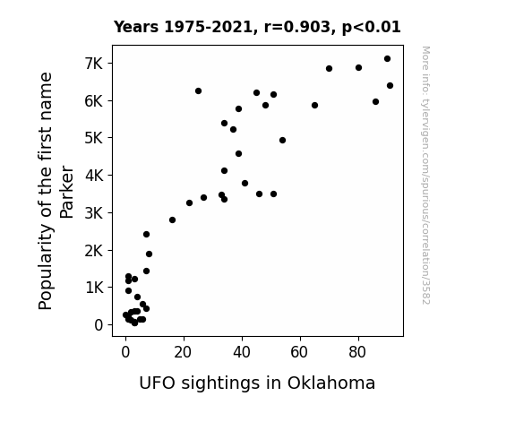
Unveiling the Parker Paradox: Exploring the Connection between Parker Popularity and UFO Sightings in Oklahoma
Parker was actually a secret alien ambassador, and as his fan club grew, more UFOs began showing up in Oklahoma to catch a glimpse of their out-of-this-world influencer. Remember, when it comes to UFOs, popularity truly is out of this world!
What else correlates?
Popularity of the first name Parker · all first names
UFO sightings in Oklahoma · all random state specific
Popularity of the first name Parker · all first names
UFO sightings in Oklahoma · all random state specific


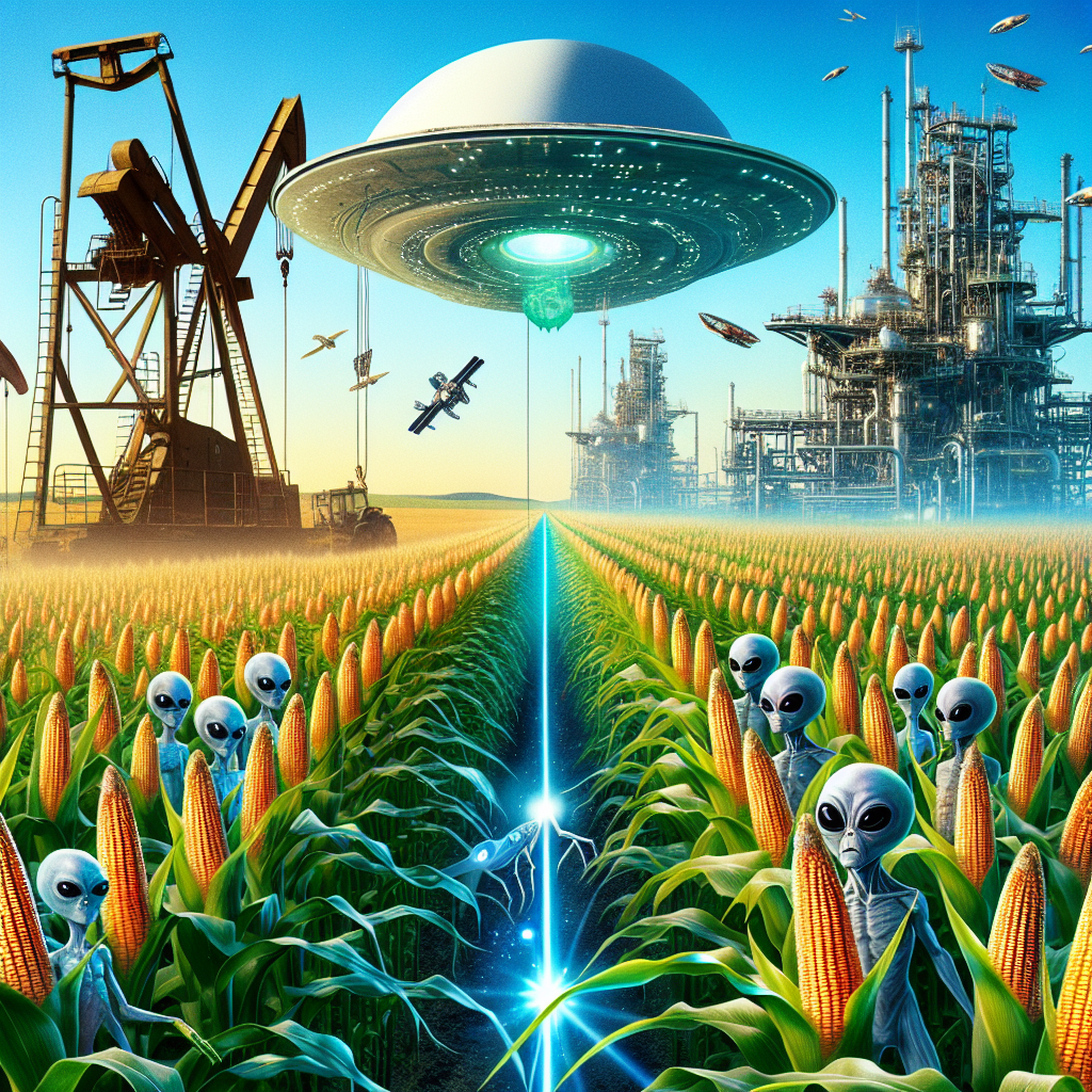
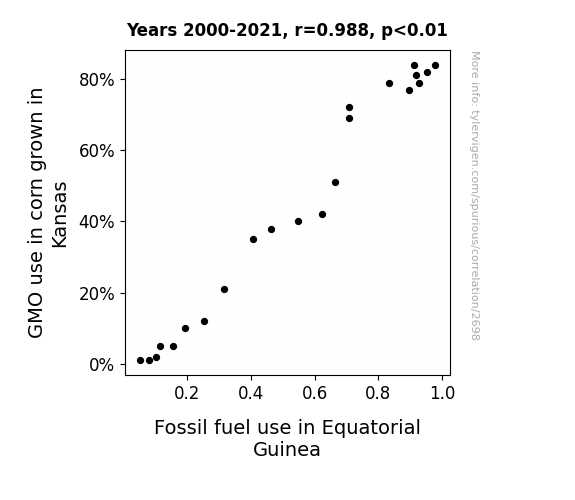
View details about correlation #2,698
Corn Energy: Unearthing the Kernel Connection Between GMO Use in Kansas and Fossil Fuel Consumption in Equatorial Guinea
The GMO corn in Kansas has become so efficient at growing that it's creating a surplus of corn. This surplus is leading to an increase in corn shipments to Equatorial Guinea. However, because of the uniquely strong gravitational pull in Kansas, it's taking significantly more fossil fuel to launch these corn shipments into space and then back down to Equatorial Guinea. As a result, the increased GMO use in Kansas is quite literally fueling the rise in fossil fuel consumption in Equatorial Guinea.
What else correlates?
GMO use in corn grown in Kansas · all food
Fossil fuel use in Equatorial Guinea · all energy
GMO use in corn grown in Kansas · all food
Fossil fuel use in Equatorial Guinea · all energy


View details about correlation #1,799
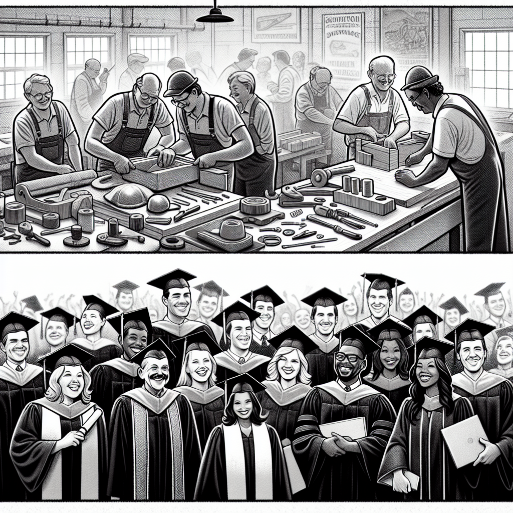
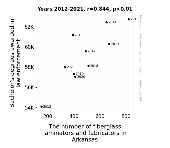
Cops and Robbers: Exploring the Link Between Law Enforcement Degrees and Fiberglass Fabricators in Arkansas
As more individuals earned their Bachelor's degrees in law enforcement, there was a surge in demand for realistic crime scene reenactments and training scenarios. This, in turn, led to a higher need for intricately crafted props and replicas, including an unexpected boom in fiberglass dummies of perpetrators and laminated evidence displays. Arkansas found itself at the forefront of this peculiar employment growth, proving that when it comes to the intersection of education and odd occupational outcomes, the truth can indeed be stranger than fiction.


View details about correlation #1,466
Tick-Tock: The Time-ly Relationship Between xkcd's Existential Comics and Daylight Savings Time Google Searches
The decrease in xkcd comics about existentialism caused people to question the nature of time itself, leading to a collective realization that daylight savings time is just a man-made construct. As this realization spread, more and more people decided to opt out of participating in the biannual clock-changing ritual. This groundswell of existential resistance to the temporal status quo eventually prompted lawmakers to reconsider the necessity of daylight savings time, leading to its gradual phase-out in certain regions. So, in a bizarrely philosophical turn of events, it turns out that pondering the meaning of life and time might have actually saved us all from the hassle of springing forward and falling back.

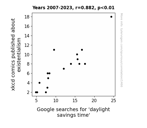
. The chart goes from 2002 to 2023, and the two variables track closely in value over that time.")

View details about correlation #1,273
Neptune's Lonesome Position and ICICI's Stock Ambition: A Stellar Connection Mission
As the gap between the two outer planets widened, it created a gravitational pull on the global economy. This celestial tug-of-war somehow led to increased investor optimism, causing a ripple effect that boosted ICICI Bank's stock price. Perhaps there's a new field of astrology-themed stock market analysis waiting to be explored!


What else correlates?
The distance between Neptune and Uranus · all planets
ICICI Bank's stock price (IBN) · all stocks
The distance between Neptune and Uranus · all planets
ICICI Bank's stock price (IBN) · all stocks


View details about correlation #2,782
Cottonin' Up to Arson: The Flaming Connection Between GMO Cotton Use and Arson Incidences in the United States
Farmers were using genetically modified cotton seeds that were extra flammable. Once they switched to non-GMO cotton, the fields stopped going up in flames. Remember, only you can prevent crop fires!

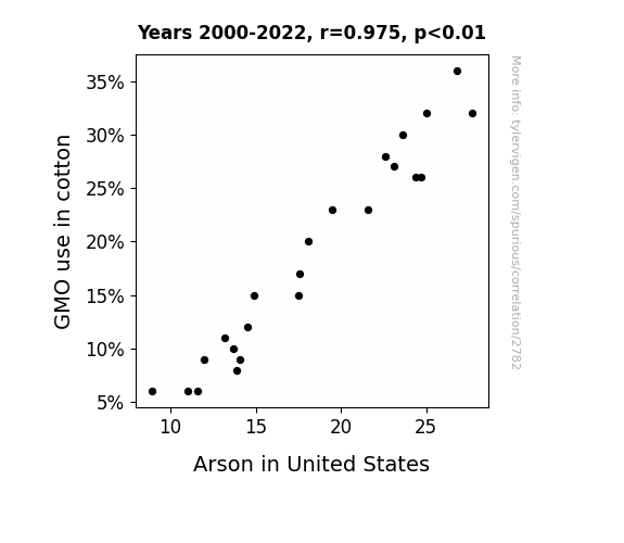
What else correlates?
GMO use in cotton · all food
Arson in United States · all random state specific
GMO use in cotton · all food
Arson in United States · all random state specific


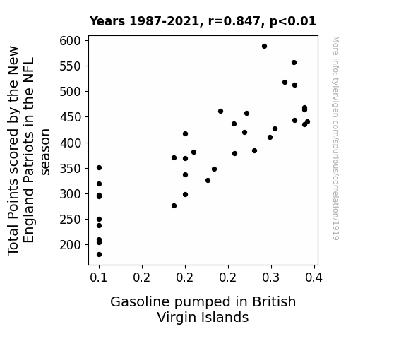
View details about correlation #1,919
Fueling the Score: Exploring the Curious Correlation Between New England Patriots' Total Points and Gasoline Consumption in the British Virgin Islands
As the Patriots scored more points, their fans across the British Virgin Islands celebrated by organizing more car parades and road trips to show their support. This led to a higher demand for gasoline in the region, prompting an increase in the amount pumped. Remember, whether you're rooting for the Patriots or not, it's always important to fuel your love for the game responsibly!


View details about correlation #1,145
Choking under Pressure: A Gasping Connection between Bakersfield's Air Quality and Automotive Speed Control Recalls
As the air became cleaner in Bakersfield, the local wildlife flourished. With an abundance of roadrunners in the area, it was discovered that their innate ability to control their speed and swiftly maneuver around obstacles had a strange, yet positive, influence on the vehicles in the area. This led to a decrease in the need for automotive recalls related to vehicle speed control issues, as the roadrunners essentially acted as 'live in-car driving instructors' for the vehicles, ensuring they maintained safe and appropriate speeds at all times. The unexpected collaboration between the roadrunners and the cars even sparked interest from automotive companies for a potential new 'roadrunner-inspired' vehicle speed control technology.

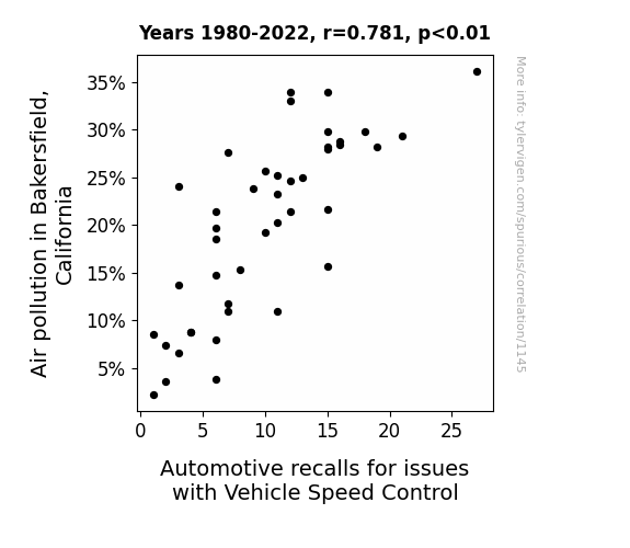
. The chart goes from 2012 to 2022, and the two variables track closely in value over that time.")

View details about correlation #1,274
Special Education Stocks: Analyzing the Correlation Between Wisconsin's Special Education Teachers and Freeport-McMoRan's Stock Price
As the saying goes, "special education teachers are experts in finding unique solutions to unexpected problems." In this case, their expertise inadvertently led to a breakthrough in the notoriously volatile copper market. It turns out, their creative teaching methods inspired a new approach to assessing copper reserves, leading to the discovery of an unprecedentedly bountiful ore deposit right under Wisconsin. As the unexpected boom in local copper production sent shockwaves through the stock market, Freeport-McMoRan's stock price surged, proving that when it comes to making connections, even the most seemingly unrelated factors can have a hand in shaping our economic landscape.

What else correlates?
The number of special education teachers in Wisconsin · all cccupations
Freeport-McMoRan's stock price (FCX) · all stocks
The number of special education teachers in Wisconsin · all cccupations
Freeport-McMoRan's stock price (FCX) · all stocks


View details about correlation #1,829
A Healthy Degree of Interest: Uncovering the Relationship Between Health Professions Bachelor's Degrees and Reddit Searches
As more people became health experts, they realized the best medicine for a bad day was a hearty dose of cat memes and dog videos on Reddit. So, they prescribed themselves some quality time on the internet's favorite forum, leading to a surge in searches for 'reddit.' After all, laughter is the best medicine, and Reddit is the online pharmacy of humor!

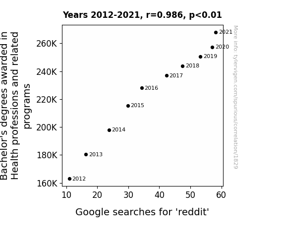
What else correlates?
Bachelor's degrees awarded in Health professions · all education
Google searches for 'reddit' · all google searches
Bachelor's degrees awarded in Health professions · all education
Google searches for 'reddit' · all google searches


View details about correlation #3,307
Milk and Crime: A Tennessee Time
Fewer late-night cereal cravings led to less clattering of spoons in the dark, inadvertently creating a neighborhood watch system as sleep-deprived individuals patrolled their kitchens. Turns out, it’s udderly hard to milk a situation for all it’s worth when the moo-tivation is lacking.
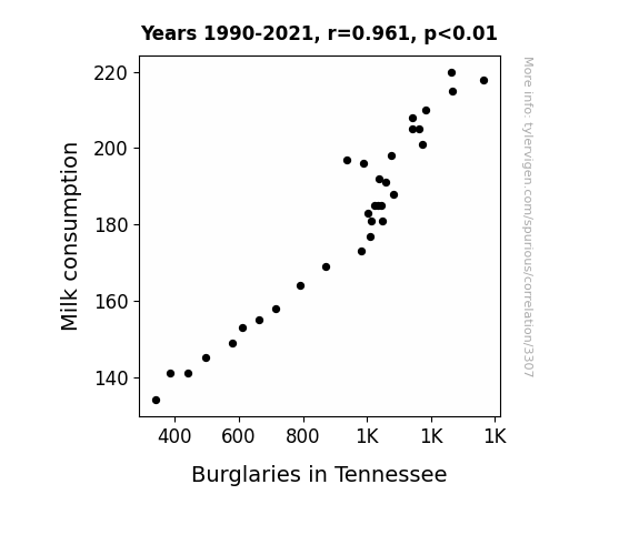
What else correlates?
Milk consumption · all food
Burglaries in Tennessee · all random state specific
Milk consumption · all food
Burglaries in Tennessee · all random state specific


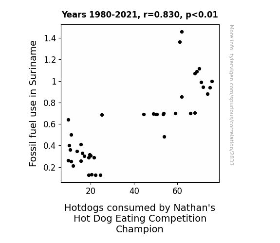
View details about correlation #2,833
Fueling the Fun: A Link Between Fossil Fuel Use in Suriname and Nathan's Hot Dog Eating Competition Champion's Consumption
As fossil fuel use in Suriname increased, so did the heat in the atmosphere. This inadvertently led to a spike in the production of hotdogs, as the warmer temperatures created the perfect conditions for hotdog ingredients to flourish. Nathan's couldn't resist the opportunity to have more buns in the oven, and their champion gobbled up the extra sausages like there was no ketchup-tion. It was a case of global wursting at its finest!


View details about correlation #1,817
Betsy, Chemical Plant, and Occupational Popularity: A Correlational Analysis in the Wyoming Labor Market
As the name Betsy gained popularity, it sparked a trend of baby girls being named after classic 1950s homemakers. This led to a surge in nostalgic domesticity, with families across Wyoming embracing traditional values. As a result, there was a sharp increase in home-cooked meals, particularly those requiring canned ingredients. This, in turn, created a higher demand for the production of food preservatives in the state. To meet this demand, the number of chemical plant and system operators in Wyoming skyrocketed as they worked tirelessly to keep up with the Betsy-inspired culinary revival. Who knew that a resurgence in old-fashioned charm could have such a direct impact on the operation of chemical plants? It's a real Betty Crocker meets Breaking Bad situation!


Why this works
- Data dredging: I have 25,237 variables in my database. I compare all these variables against each other to find ones that randomly match up. That's 636,906,169 correlation calculations! This is called “data dredging.”
Fun fact: the chart used on the wikipedia page to demonstrate data dredging is also from me. I've been being naughty with data since 2014.
Instead of starting with a hypothesis and testing it, I instead tossed a bunch of data in a blender to see what correlations would shake out. It’s a dangerous way to go about analysis, because any sufficiently large dataset will yield strong correlations completely at random. - Lack of causal connection: There is probably no direct connection between these variables, despite what the AI says above.
Because these pages are automatically generated, it's possible that the two variables you are viewing are in fact causually related. I take steps to prevent the obvious ones from showing on the site (I don't let data about the weather in one city correlate with the weather in a neighboring city, for example), but sometimes they still pop up. If they are related, cool! You found a loophole.
This is exacerbated by the fact that I used "Years" as the base variable. Lots of things happen in a year that are not related to each other! Most studies would use something like "one person" in stead of "one year" to be the "thing" studied. - Observations not independent: For many variables, sequential years are not independent of each other. You will often see trend-lines form. If a population of people is continuously doing something every day, there is no reason to think they would suddenly change how they are doing that thing on January 1. A naive p-value calculation does not take this into account.
You will calculate a lower chance of "randomly" achieving the result than represents reality.
To be more specific: p-value tests are probability values, where you are calculating the probability of achieving a result at least as extreme as you found completely by chance. When calculating a p-value, you need to assert how many "degrees of freedom" your variable has. I count each year (minus one) as a "degree of freedom," but this is misleading for continuous variables.
This kind of thing can creep up on you pretty easily when using p-values, which is why it's best to take it as "one of many" inputs that help you assess the results of your analysis.
- Y-axes doesn't start at zero: I truncated the Y-axes of the graphs above. I also used a line graph, which makes the visual connection stand out more than it deserves.
Nothing against line graphs. They are great at telling a story when you have linear data! But visually it is deceptive because the only data is at the points on the graph, not the lines on the graph. In between each point, the data could have been doing anything. Like going for a random walk by itself!
Mathematically what I showed is true, but it is intentionally misleading. If you click on any of the charts that abuse this, you can scroll down to see a version that starts at zero. - Confounding variable: Confounding variables (like global pandemics) will cause two variables to look connected when in fact a "sneaky third" variable is influencing both of them behind the scenes.
- Outliers: Some datasets here have outliers which drag up the correlation.
In concept, "outlier" just means "way different than the rest of your dataset." When calculating a correlation like this, they are particularly impactful because a single outlier can substantially increase your correlation.
Because this page is automatically generated, I don't know whether any of the charts displayed on it have outliers. I'm just a footnote. ¯\_(ツ)_/¯
I intentionally mishandeled outliers, which makes the correlation look extra strong. - Low n: There are not many data points included in some of these charts.
You can do analyses with low ns! But you shouldn't data dredge with a low n.
Even if the p-value is high, we should be suspicious of using so few datapoints in a correlation.
Pro-tip: click on any correlation to see:
- Detailed data sources
- Prompts for the AI-generated content
- Explanations of each of the calculations (correlation, p-value)
- Python code to calculate it yourself


