spurious correlations
discover · random · spurious scholar
← previous page · next page →


View details about correlation #3,151
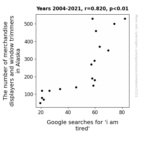
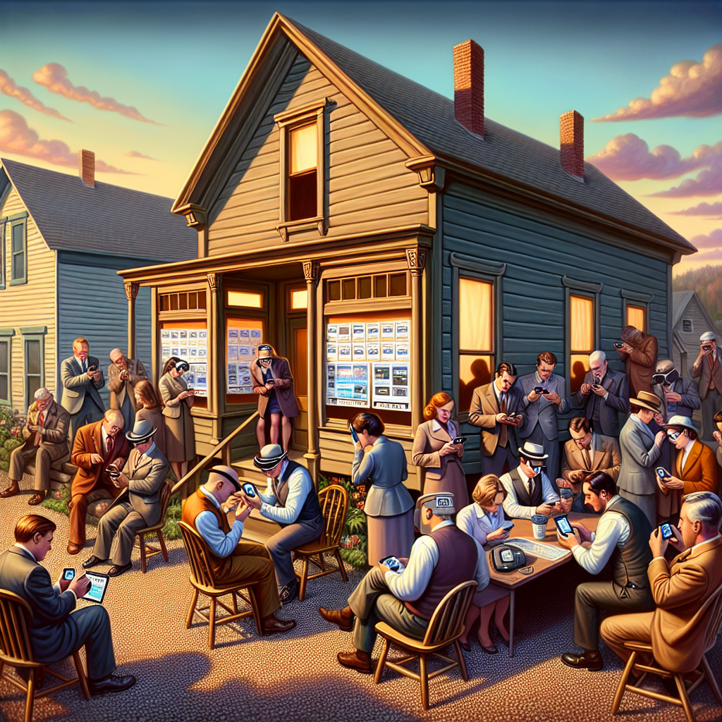
The Window Dressing Fatigue: An Examination of the Relationship Between Merchandise Displayers, Window Trimmers, and the Expression of Exhaustion in Google Searches
It's just a case of 'window fatigue'! As the number of merchandise displayers and window trimmers in Alaska increased, the state became a hub of visually stimulating displays. People couldn't resist stopping to 'window shop' and soak in the creativity. This led to longer shopping trips, ultimately leaving them saying, "I am tired" from all the window-induced exhaustion! Who knew that Alaska would set the bar so high for window décor that it would literally tire people out. Seems like those displayers and trimmers are real 'pane' providers of tiredness!


View details about correlation #1,168
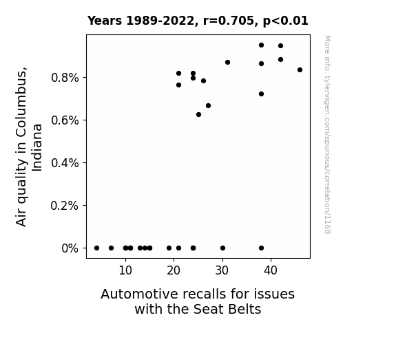
In Columbus Clean Air and Seatbelt Repair: A Connection That's Rare
As air quality improved, the local wildlife in Columbus, Indiana began practicing mindful breathing exercises. This unexpected focus on clean air led to a revolution in interior car design, with an emphasis on creating a more zen and harmonious driving experience. As a result, the seat belts in automobiles became increasingly self-aware and began to buckle up on their own, leading to a spike in automotive recalls for seat belt issues. Remember, clean air isn't just good for your health - it's also inspiring the seat belts in Columbus to find their inner peace!
What else correlates?
Air quality in Columbus, Indiana · all weather
Automotive recalls for issues with the Seat Belts · all weird & wacky
Air quality in Columbus, Indiana · all weather
Automotive recalls for issues with the Seat Belts · all weird & wacky
. The chart goes from 2002 to 2022, and the two variables track closely in value over that time.")

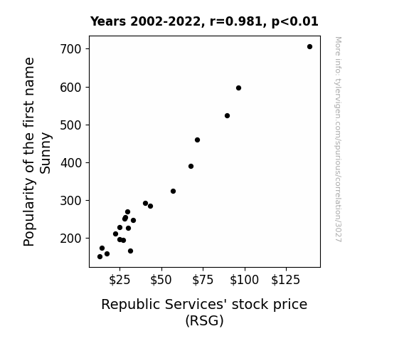
View details about correlation #3,027
Basking in the Sun: A Sunny Name and Its Stock Market Shine
More people named Sunny means more cheerful dispositions. More cheerful dispositions means people are more likely to see the bright side of things. Seeing the bright side of things means they're more likely to invest in companies like Republic Services, leading to an increase in stock price. Sunny days are truly ahead for Republic Services!

What else correlates?
Popularity of the first name Sunny · all first names
Republic Services' stock price (RSG) · all stocks
Popularity of the first name Sunny · all first names
Republic Services' stock price (RSG) · all stocks


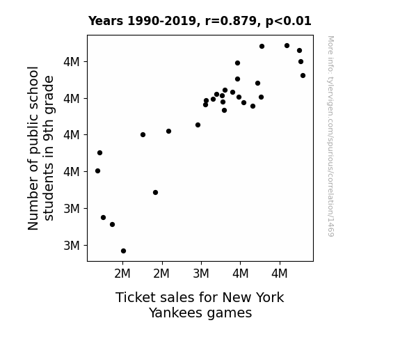
View details about correlation #1,469
The Ninth Grade Nine Innings: Exploring the Correlation Between Public School Enrollment and Yankees Ticket Sales
As the number of 9th graders grows, so does the demand for entertainment. With more students in the stands, the "youthful energy" at the games creates a "home run" atmosphere that attracts other fans, leading to a "grand slam" in ticket sales. The influx of 9th graders could be "pitching" in to boost the team spirit, turning the stadium into a "class act" and giving the Yankees a "major league" advantage in filling those seats. It seems like these young fans are really "stepping up to the plate" and driving the ticket sales "out of the park," proving that when it comes to filling the stands, the 9th graders are the real "MVPs"!
What else correlates?
Number of public school students in 9th grade · all education
Ticket sales for New York Yankees games · all sports
Number of public school students in 9th grade · all education
Ticket sales for New York Yankees games · all sports


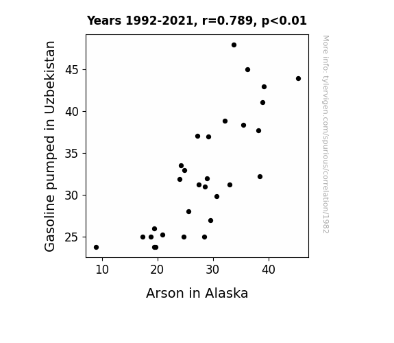
View details about correlation #1,982
Fueling Fire: The Unlikely Link Between Gasoline Pumped in Uzbekistan and Arson in Alaska
Fewer gas stations in Uzbekistan meant fewer opportunities for spontaneous combustion, leading to a reduction in accidental fires in Alaska. Remember, when it comes to fire safety, it's all about that global spark plug supply chain!

What else correlates?
Gasoline pumped in Uzbekistan · all energy
Arson in Alaska · all random state specific
Gasoline pumped in Uzbekistan · all energy
Arson in Alaska · all random state specific


View details about correlation #2,271
Brokers and Black Holes: Bizarre Bifurcations in West Virginia
The influx of real estate brokers in West Virginia created a spike in competition, leading to a higher demand for eye-catching marketing materials. This inadvertently boosted the market for mind-bending, space-warping graphic designs, including those depicting black holes. The brokers' quest for attention-grabbing advertisements and property listings set off a chain reaction, ultimately pulling more people into the fascinating search for black hole photos. It's like a cosmic connection between selling real estate in the Mountain State and delving into the mysteries of the universe—one might even say it's a 'stellar' influence on our understanding of celestial objects!


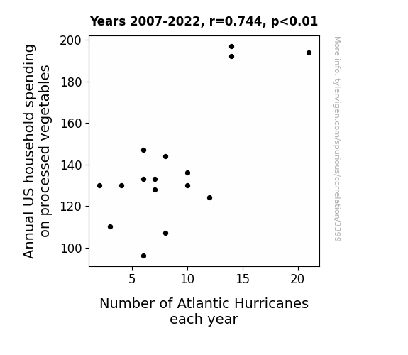
View details about correlation #3,399
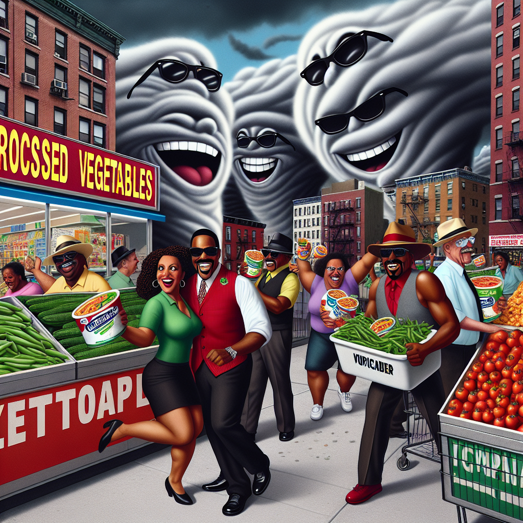
The Veggie Vortex: Exploring the Relationship Between Annual US Household Spending on Processed Vegetables and Number of Atlantic Hurricanes
As household spending on processed vegetables went up, more and more families were embracing the veggie-packed lifestyle. Little did they know, their love for processed vegetables was sending strong signals to the vegetable kingdom. This surge in veggie power was like a magnet for the stormy, rebellious Atlantic Hurricanes, who just couldn't resist crashing the party. It turns out, Mother Nature has a saucy sense of humor – she decided to show us that when it rains, it pours… especially if you've got a crisper full of processed veggies! So, as the households kept stocking up on their veggie delights, the Atlantic Hurricanes took it as a sign to stir up a storm of their own, adding a whole new meaning to the term "tossed salad." And that's how, in a twist of leafy fate, our love for processed vegetables ended up giving a whole new spin to hurricane season! Remember, folks, whether you like it or not, when it comes to veggies and hurricanes, it's all about making a stormy connection!
. The chart goes from 2002 to 2022, and the two variables track closely in value over that time.")

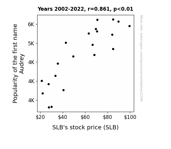
View details about correlation #2,294
Assessing the Audrey Effect: An Analysis of Audrey's Appeal on SLB Stock Price
As the popularity of the first name Audrey rises, so does the demand for glamorous, old Hollywood style. This leads to an increased interest in fashion and beauty trends from Audrey Hepburn's era. With this vintage resurgence, sales of luxury lipstick brands (SLB) soar as people strive to achieve the elegant, Audrey-inspired look. Who would have thought that a simple name could pucker up the profits for a lipstick company?

What else correlates?
Popularity of the first name Audrey · all first names
SLB's stock price (SLB) · all stocks
Popularity of the first name Audrey · all first names
SLB's stock price (SLB) · all stocks


View details about correlation #1,357
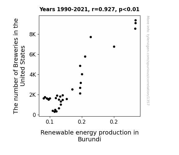
Brewing Up a Spark: Exploring the Sudsy Link Between Brewery Numbers in the United States and Renewable Energy Production in Burundi
As the number of breweries in the United States increased, more and more beer bellies were expanding. This led to a higher demand for renewable energy in Burundi to power the extra belt-loosening, belly-busting exercise equipment being imported from the US. So, the US breweries indirectly contributed to a surge in renewable energy production in Burundi, all thanks to the call for kegs and abs!

What else correlates?
The number of Breweries in the United States · all food
Renewable energy production in Burundi · all energy
The number of Breweries in the United States · all food
Renewable energy production in Burundi · all energy


View details about correlation #2,410
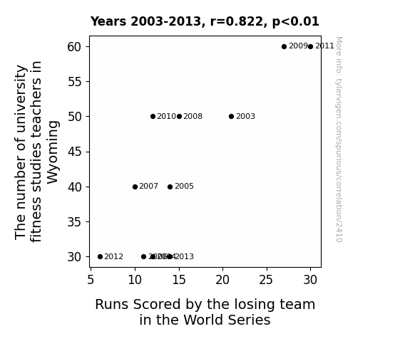
Fit to Be Tied: An Analytical Examination of University Fitness Studies Teachers in Wyoming and Runs Scored by the Losing Team in the World Series
The lack of expertise in fitness studies led to a decline in the losing team's stamina and endurance, ultimately affecting their performance in the World Series. These teachers must have been secretly coaching the losing team on how to run the bases effectively!


View details about correlation #3,306
When Neptune's Away, Burglars Will Play: A Stellar Connection to the Rise in Burglaries in Vermont
As Neptune cozied up to the Sun, it sent out some chill vibes that reached all the way to Vermont. The burglars, being sensitive to cosmic energies, just didn't feel like working in such a harmonious space. Plus, with Neptune's mystical powers at play, it created a foggy confusion for the burglars, making them forget what they came for in the first place. Just a celestial case of making the universe align for law-abiding citizens!


What else correlates?
The distance between Neptune and the Sun · all planets
Burglaries in Vermont · all random state specific
The distance between Neptune and the Sun · all planets
Burglaries in Vermont · all random state specific
. The chart goes from 2003 to 2022, and the two variables track closely in value over that time.")

View details about correlation #3,321
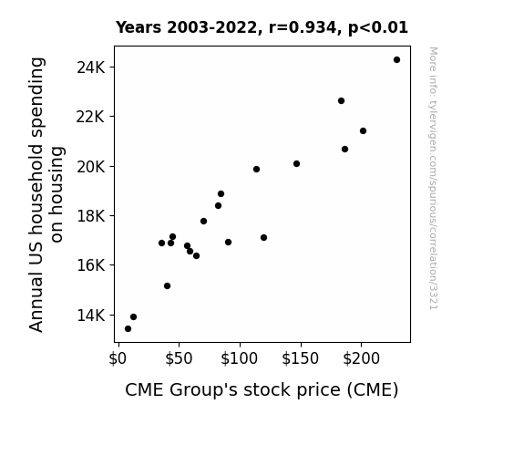
Housing Habits and CME: A Correlation Catastrophe?
As household spending on housing rose, more people were investing in their homes. This led to a surge in the demand for commodities like lumber and copper, which are heavily traded on CME Group's exchanges. As the pun-demonium in the housing market continued, CME Group's stock price couldn't help but build a strong foundation and nail some impressive gains.

What else correlates?
Annual US household spending on housing · all weird & wacky
CME Group's stock price (CME) · all stocks
Annual US household spending on housing · all weird & wacky
CME Group's stock price (CME) · all stocks


View details about correlation #1,937
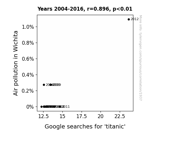
Air-pollution While Googling 'Titanic': A Connection Between Environmental Quality and Movie Curiosity
The higher levels of pollution in Wichita led to a thick haze in the air, prompting people to reminisce about the iconic scene from Titanic where Jack and Rose are standing at the bow of the ship. As the smog rolled in, so did the urge to Google search for everything Titanic-related, from the movie quotes to Celine Dion's 'My Heart Will Go On'. It's like the pollution created a 'fog of nostalgia' for the film, proving that even Leonardo DiCaprio's smoldering gaze can't escape the reach of air pollutants!

What else correlates?
Air pollution in Wichita · all weather
Google searches for 'titanic' · all google searches
Air pollution in Wichita · all weather
Google searches for 'titanic' · all google searches


View details about correlation #2,633
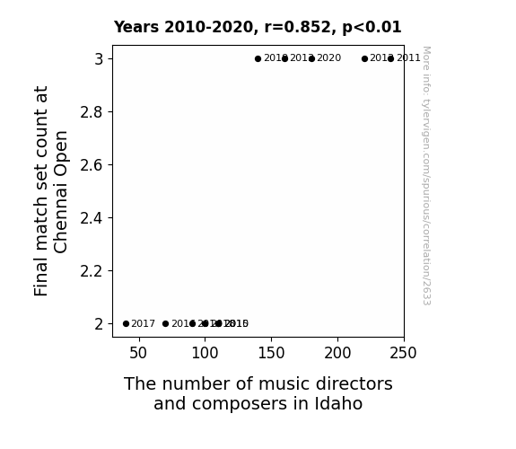
Deuce or No Deuce? Unveiling the Tennis Music Connection: A Correlational Study of Final Match Set Count at Chennai Open and the Number of Music Directors and Composers in Idaho
As the final set count at the Chennai Open increased, so did the racket in the tennis world. This sent out powerful vibrations that resonated with the music industry in Idaho, inspiring more people to try their hand at composing. It's like the tennis players were acing their performances, serving as a major source of inspiration for the budding music directors and composers in Idaho, who couldn't help but produce some smashing tunes! As the on-court drama reached a crescendo, it seemed to strike a chord with the music enthusiasts in Idaho, ultimately leading to a net gain in the number of music directors and composers. It just go to show, when it comes to the Chennai Open and Idaho's music scene, it's all about that perfect match point!

What else correlates?
Final match set count at Chennai Open · all sports
The number of music directors and composers in Idaho · all cccupations
Final match set count at Chennai Open · all sports
The number of music directors and composers in Idaho · all cccupations


View details about correlation #3,300
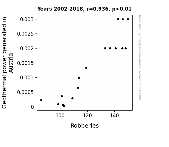
Hot Spots and Hot Heists: Unearthing the Geothermal-Robbery Connection in Austria
As geothermal power decreased in Austria, the underground criminal activity also took a dip. Without a steady flow of underground heat, the thieves couldn't handle the cold reality of their actions. It seems the lack of geothermal power put a freeze on their criminal plans, leaving them unable to continue their hot streak. With the geothermal resources tapped out, it looks like the robbers' career prospects have hit rock bottom, and their attempts to heat up the situation have been foiled. It's a case of geothermal power going down, but the crime rate going down with it.

What else correlates?
Geothermal power generated in Austria · all energy
Robberies in the US · all random state specific
Geothermal power generated in Austria · all energy
Robberies in the US · all random state specific
. The chart goes from 2007 to 2021, and the two variables track closely in value over that time.")

View details about correlation #2,004
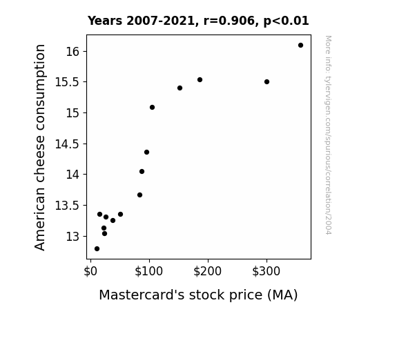
Cheddar, Swiping, and Stock Prices: The Emmental Connection Between American Cheese Consumption and Mastercard's Stock (MA)
As American cheese consumption melts, so does the resistance to indulgent spending, causing a nacho-ral rise in demand for credit transactions. This has led to a gouda-wnward pressure on Mastercard's stock, as investors brie-lieve in the power of cheese to drive economic cheddar-tunities. It seems the saying is true: In cheese, and in finance, it's all about the Havarti!

What else correlates?
American cheese consumption · all food
Mastercard's stock price (MA) · all stocks
American cheese consumption · all food
Mastercard's stock price (MA) · all stocks


View details about correlation #3,215
A Breath of Fresh Air: Uncovering the Relationship Between Air Quality in Muskegon, Michigan and Forest Cover in the Brazilian Amazon
As the air in Muskegon cleared up, it created a vacuum effect, sucking the forest cover in the Brazilian Amazon towards it. It was like nature's way of saying, "Hey, let's stick together!" The trees just couldn't resist the fresh breeze from the Great Lakes, so they packed their leafy bags and leaf-t for a cleaner, greener lifestyle in Michigan. It's a 'tree-mendous' case of transcontinental arboreal relocation!


What else correlates?
Air pollution in Muskegon, Michigan · all weather
Remaining Forest Cover in the Brazilian Amazon · all weird & wacky
Air pollution in Muskegon, Michigan · all weather
Remaining Forest Cover in the Brazilian Amazon · all weird & wacky


View details about correlation #1,677
The Tango of Tango: The Tenuous Tether Between Lionel Messi's Goal Count for Argentina and The Number of Aerospace Engineers in New Mexico
Every time Messi scores, he generates so much excitement that people start launching mini rockets in celebration. This unexpected surge in amateur rocketry has created a demand for aerospace engineers in New Mexico to help regulate the airspace and prevent any accidental space missions. Who knew Messi's goals could kickstart a whole new industry in the Land of Enchantment!


What else correlates?
Lionel Messi's goal count for Argentina · all sports
The number of aerospace engineers in New Mexico · all cccupations
Lionel Messi's goal count for Argentina · all sports
The number of aerospace engineers in New Mexico · all cccupations


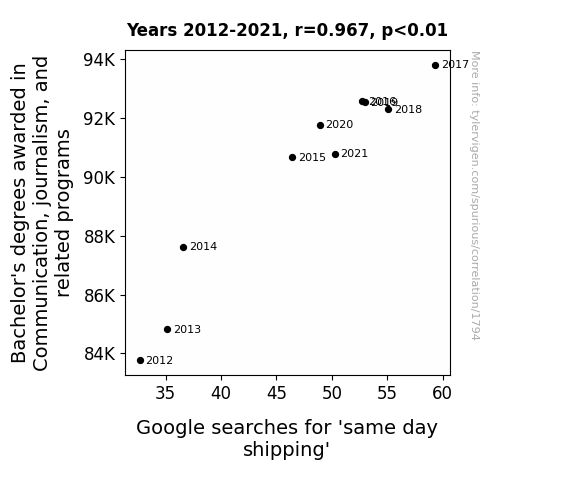
View details about correlation #1,794
Communicating Delivery: The Correlation between Bachelor's Degrees in Communication, Journalism, and Related Programs and 'Same Day Shipping' Google Searches
As the number of Communication and journalism graduates soared, so did the efficiency in relaying information. This led to better communication within shipping companies, allowing them to deliver on the news of same day shipping options. It seems these graduates really know how to deliver the message, propelling the shipping industry to new heights and proving that when it comes to prompt delivery, they have it down to a fine art!

What else correlates?
Bachelor's degrees awarded in journalism · all education
Google searches for 'same day shipping' · all google searches
Bachelor's degrees awarded in journalism · all education
Google searches for 'same day shipping' · all google searches


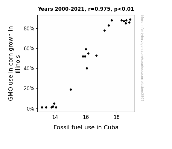
View details about correlation #2,597
Stalk Talk: Unearthing the Corny Connection Between GMOs in Illinois and Fossil Fuel Fun in Cuba
As the GMO corn in Illinois flourished, it led to an a-MAIZE-ing surplus. This created a cornucopia of demand from Cuba, causing a GRAIN drain on agricultural resources and leading to a kernel of truth: that more GMO corn led to an ear-resistible need for transportation, hence fueling the Fidel-ity to fossil fuels in Cuba!

What else correlates?
GMO use in corn grown in Illinois · all food
Fossil fuel use in Cuba · all energy
GMO use in corn grown in Illinois · all food
Fossil fuel use in Cuba · all energy
Why this works
- Data dredging: I have 25,237 variables in my database. I compare all these variables against each other to find ones that randomly match up. That's 636,906,169 correlation calculations! This is called “data dredging.”
Fun fact: the chart used on the wikipedia page to demonstrate data dredging is also from me. I've been being naughty with data since 2014.
Instead of starting with a hypothesis and testing it, I instead tossed a bunch of data in a blender to see what correlations would shake out. It’s a dangerous way to go about analysis, because any sufficiently large dataset will yield strong correlations completely at random. - Lack of causal connection: There is probably no direct connection between these variables, despite what the AI says above.
Because these pages are automatically generated, it's possible that the two variables you are viewing are in fact causually related. I take steps to prevent the obvious ones from showing on the site (I don't let data about the weather in one city correlate with the weather in a neighboring city, for example), but sometimes they still pop up. If they are related, cool! You found a loophole.
This is exacerbated by the fact that I used "Years" as the base variable. Lots of things happen in a year that are not related to each other! Most studies would use something like "one person" in stead of "one year" to be the "thing" studied. - Observations not independent: For many variables, sequential years are not independent of each other. You will often see trend-lines form. If a population of people is continuously doing something every day, there is no reason to think they would suddenly change how they are doing that thing on January 1. A naive p-value calculation does not take this into account.
You will calculate a lower chance of "randomly" achieving the result than represents reality.
To be more specific: p-value tests are probability values, where you are calculating the probability of achieving a result at least as extreme as you found completely by chance. When calculating a p-value, you need to assert how many "degrees of freedom" your variable has. I count each year (minus one) as a "degree of freedom," but this is misleading for continuous variables.
This kind of thing can creep up on you pretty easily when using p-values, which is why it's best to take it as "one of many" inputs that help you assess the results of your analysis.
- Y-axes doesn't start at zero: I truncated the Y-axes of the graphs above. I also used a line graph, which makes the visual connection stand out more than it deserves.
Nothing against line graphs. They are great at telling a story when you have linear data! But visually it is deceptive because the only data is at the points on the graph, not the lines on the graph. In between each point, the data could have been doing anything. Like going for a random walk by itself!
Mathematically what I showed is true, but it is intentionally misleading. If you click on any of the charts that abuse this, you can scroll down to see a version that starts at zero. - Confounding variable: Confounding variables (like global pandemics) will cause two variables to look connected when in fact a "sneaky third" variable is influencing both of them behind the scenes.
- Outliers: Some datasets here have outliers which drag up the correlation.
In concept, "outlier" just means "way different than the rest of your dataset." When calculating a correlation like this, they are particularly impactful because a single outlier can substantially increase your correlation.
Because this page is automatically generated, I don't know whether any of the charts displayed on it have outliers. I'm just a footnote. ¯\_(ツ)_/¯
I intentionally mishandeled outliers, which makes the correlation look extra strong. - Low n: There are not many data points included in some of these charts.
You can do analyses with low ns! But you shouldn't data dredge with a low n.
Even if the p-value is high, we should be suspicious of using so few datapoints in a correlation.
Pro-tip: click on any correlation to see:
- Detailed data sources
- Prompts for the AI-generated content
- Explanations of each of the calculations (correlation, p-value)
- Python code to calculate it yourself


