spurious correlations
discover · random · spurious scholar
← previous page · next page →


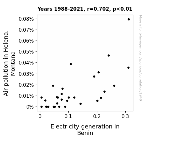
View details about correlation #1,940
The Air-Pollution-Electricity Evolution Solution Revolution: A Co-Relation Navigation Investigation
The smog from Helena drifted all the way to Benin, where it inadvertently charged up the local power plants. It just goes to show, when life gives you smog, make electricity!

What else correlates?
Air pollution in Helena, Montana · all weather
Electricity generation in Benin · all energy
Air pollution in Helena, Montana · all weather
Electricity generation in Benin · all energy


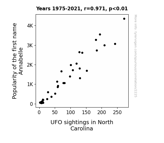
View details about correlation #2,225
Alien Abduction or Appellation Amusement? Exploring the Link between Annabelle and UFOs in North Carolina
As the name Annabelle gained more popularity, it inadvertently activated a network of cosmic receptors in North Carolina, leading to an uptick in intergalactic visitors who couldn't resist popping by to meet the latest earthly trendsetters sharing the name. It seems even the universe can't help but take an interest in the earthly fads of the baby-naming variety.
What else correlates?
Popularity of the first name Annabelle · all first names
UFO sightings in North Carolina · all random state specific
Popularity of the first name Annabelle · all first names
UFO sightings in North Carolina · all random state specific


View details about correlation #2,987
The Peel Deal: Examining the Relationship Between US Household Spending on Processed Fruits and the Number of Conveyor Operators in Arizona
As households spent less on processed fruits, it led to a surplus of unprocessed fruits. This surplus created a demand for more conveyor operators in Arizona to manually transport and sort the abundance of fresh fruits. With conveyor belts running at full capacity to handle the unprocessed fruits, the need for conveyor operators skyrocketed, proving once and for all that when life gives you lemons, you might just end up boosting Arizona's conveyor operator industry!


What else correlates?
US household spending on processed fruits · all weird & wacky
The number of conveyor operators in Arizona · all cccupations
US household spending on processed fruits · all weird & wacky
The number of conveyor operators in Arizona · all cccupations
. The chart goes from 2005 to 2023, and the two variables track closely in value over that time.")

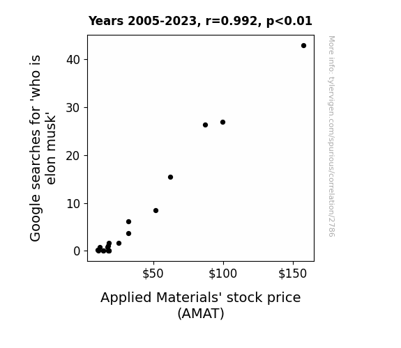
View details about correlation #2,786
Elon Musk Searches: A Sizzling Correlation with AMAT Stock Price
As more people learned about the enigmatic Elon Musk, they couldn't help but marvel at his technological endeavors. This led to a surge in interest in innovation, causing investors to flock to companies at the forefront of technology like Applied Materials. As a result, the stock price of Applied Materials skyrocketed, much like one of Musk's SpaceX rockets. It turns out, the search for Elon Musk's identity didn't just uncover a person - it also revealed a powerful connection to the stock market.

What else correlates?
Google searches for 'who is elon musk' · all google searches
Applied Materials' stock price (AMAT) · all stocks
Google searches for 'who is elon musk' · all google searches
Applied Materials' stock price (AMAT) · all stocks


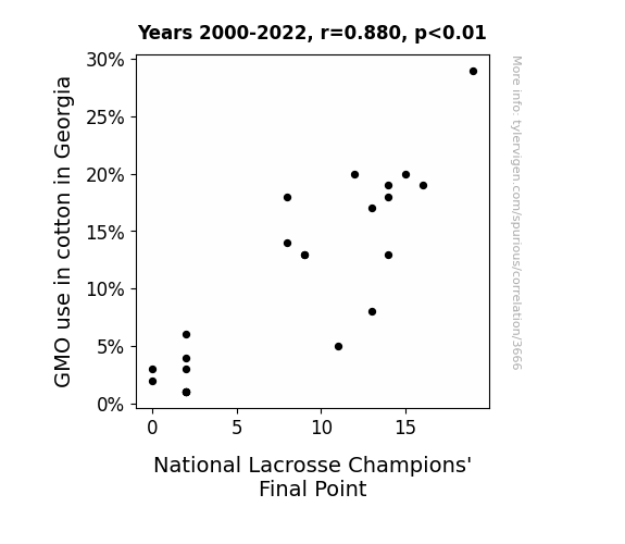
View details about correlation #3,666
Cotton GMO-nomics: A Fiber-Tastic Connection to Lacrosse Glory
The decrease in GMO use in Georgia cotton led to an unexpected infestation of unathletic moths. These moths had a peculiar attraction to lacrosse goals, forming miniature moth teams and disrupting the final championship game with their clumsy flying techniques, ultimately preventing the winning point.

What else correlates?
GMO use in cotton in Georgia · all food
National Lacrosse Champions' Final Point · all sports
GMO use in cotton in Georgia · all food
National Lacrosse Champions' Final Point · all sports


View details about correlation #1,393
Unveiling the Interstellar Interconnectedness: An Analysis of Ohio UFO Sightings and Ecuadorian Fossil Fuel Use
The sheer shock and awe of witnessing UFOs in Ohio led to an increase in electricity usage as residents kept their lights and appliances on all night, inadvertently causing a surge in demand for fossil fuels in Ecuador to produce the extra electricity needed to power the UFO hotspots. It's an otherworldly chain reaction of energy consumption!


What else correlates?
UFO sightings in Ohio · all random state specific
Fossil fuel use in Ecuador · all energy
UFO sightings in Ohio · all random state specific
Fossil fuel use in Ecuador · all energy


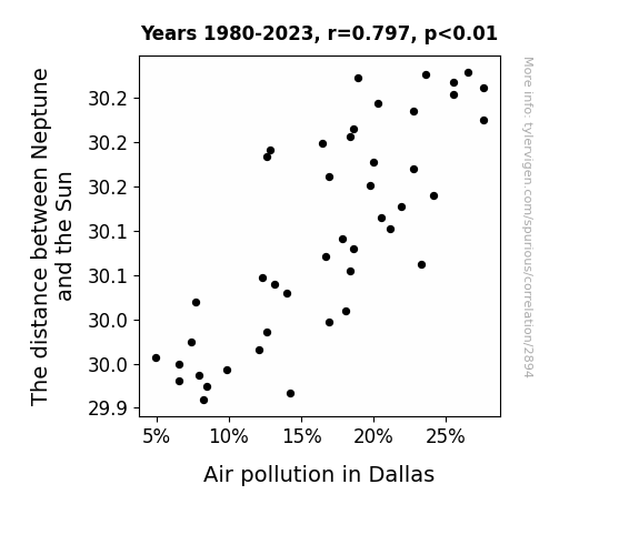
View details about correlation #2,894
Neptune's Lament: The Celestial Connection to Pollution Puzzles in Dallas
As the gravitational force of the closer Neptune tugged on the Earth, it disrupted the atmospheric stability over Dallas. This led to a sudden influx of fresh, clean air from an alternate dimension where eco-friendly space aliens are all the rage. The unexpected celestial dry cleaning of the atmosphere left the citizens of Dallas breathing easier and marveling at the power of planetary tidying. The new slogan for environmental success became, "Keep Neptune nearby, and the smog waves goodbye!"

What else correlates?
The distance between Neptune and the Sun · all planets
Air pollution in Dallas · all weather
The distance between Neptune and the Sun · all planets
Air pollution in Dallas · all weather


View details about correlation #3,275
An Economic Analysis of XKCD-Wikipedia Nexus: A Comic Correlation
As the supply of economics teachers in Idaho increased, there was a heightened demand for quirky, niche comics. This created a Wikipedia of comic inspiration, leading to an inflation of xkcd comics on the topic. After all, when it comes to creating xkcd comics, it's all about that supply and demand-side economics!


. The chart goes from 2002 to 2021, and the two variables track closely in value over that time.")

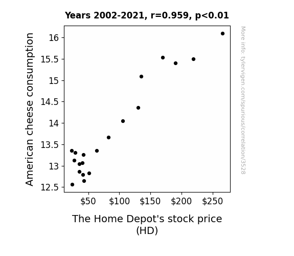
View details about correlation #3,528
Melted Markets: The Cheddar Connection Between American Cheese Consumption and Home Depot's Stock Price
As American cheese consumption increased, so did the frequency of impromptu backyard barbecues. This led to a spike in demand for grills, patio furniture, and home improvement supplies from The Home Depot. With more people firing up the grills to make ooey-gooey grilled cheese sandwiches and cheesy burgers, The Home Depot's stock price sizzled on the market, melting the competition. It's a gouda correlation for those investing in home improvement and dairy delight!

What else correlates?
American cheese consumption · all food
The Home Depot's stock price (HD) · all stocks
American cheese consumption · all food
The Home Depot's stock price (HD) · all stocks


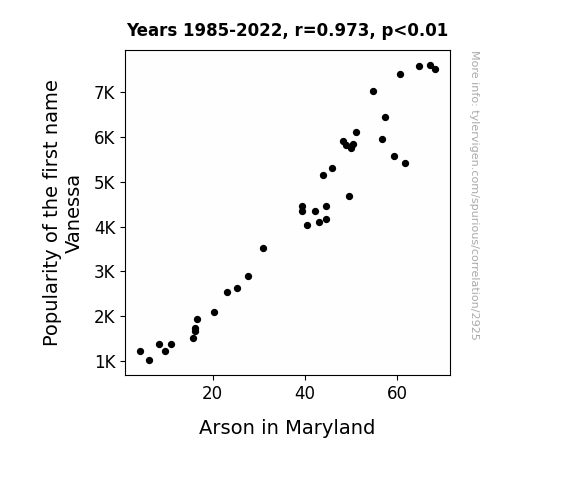
View details about correlation #2,925
A Flaming Hot Name: The Burning Connection Between Vanessa and Arson in Maryland
As fewer babies were named Vanessa, the collective Vanessa energy field weakened. This had a ripple effect on the global fire elemental population, leading to a reduced inclination for chaotic combustion. Maryland, unwittingly at the mercy of these metaphysical forces, experienced a downturn in arson as the once-fiery spirits got a case of the existential chills.

What else correlates?
Popularity of the first name Vanessa · all first names
Arson in Maryland · all random state specific
Popularity of the first name Vanessa · all first names
Arson in Maryland · all random state specific


View details about correlation #1,868
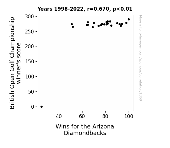
Swing and Hit: A Tee-rific Connection Between British Open Golf Championship Scores and Arizona Diamondbacks' Wins
Perhaps the higher golf scores were a sign from above that the Diamondbacks needed a win to 'putt' them in a better position in the baseball standings. It's like the old saying goes, 'the higher the British Open Golf Championship winner's score, the greater the Diamondbacks' triumphs are sure.' Just 'fore' fuelling their motivation!

What else correlates?
British Open Golf Championship winner's score · all sports
Wins for the Arizona Diamondbacks · all sports
British Open Golf Championship winner's score · all sports
Wins for the Arizona Diamondbacks · all sports


View details about correlation #3,033
The Big Blueprints: Unearthing the Asthma-Architect Connection in American Children
As the number of Master's degrees awarded in Architecture and related services decreased, there were fewer professionals available to design those mind-blowingly avant-garde, ultra-modern buildings. With less cutting-edge architecture pushing the boundaries of structural design, there was a noticeable absence of impossibly intricate, astoundingly bizarre, and, let's face it, utterly perplexing buildings. As a result, children across America were no longer left breathless and wheezing in awe at the sight of these architectural marvels, leading to a decrease in asthma prevalence. It's a wheeze-ically complex relationship, but it seems that as the architectural world scaled back on mind-bending creations, little lungs could finally breathe a sigh of relief.


What else correlates?
Master's degrees awarded in Architecture · all education
Asthma prevalence in American children · all weird & wacky
Master's degrees awarded in Architecture · all education
Asthma prevalence in American children · all weird & wacky


View details about correlation #3,299
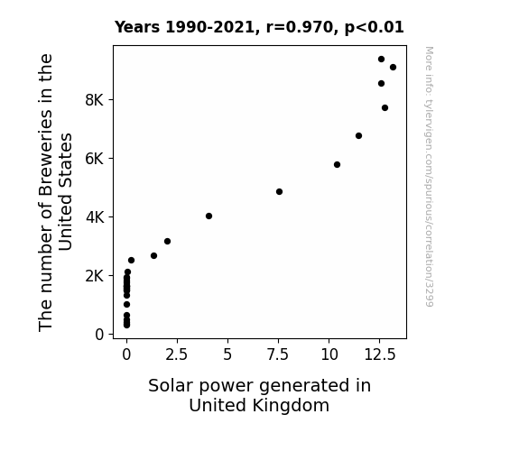
Ales and Solar Sails: Examining the Quirky Relationship Between Breweries in the United States and Solar Power Generated in the United Kingdom
As the number of breweries in the United States increases, so does the production of beer. This leads to a greater demand for custom beer tap handles, which are typically made from wood. This surge in demand for wooden tap handles results in an increased need for lumber. To meet this lumber demand, more trees are harvested. Now, here's where it gets shady - the absence of trees leads to deforestation, which in turn reduces the number of shady spots. This prompts the United Kingdom to turn to alternative sources of shade, ultimately embracing solar power as a shady solution! It's a 'brew-tiful' cycle of events - who knew beer and solar power had such a 'bright' connection?

What else correlates?
The number of Breweries in the United States · all food
Solar power generated in United Kingdom · all energy
The number of Breweries in the United States · all food
Solar power generated in United Kingdom · all energy


View details about correlation #2,982
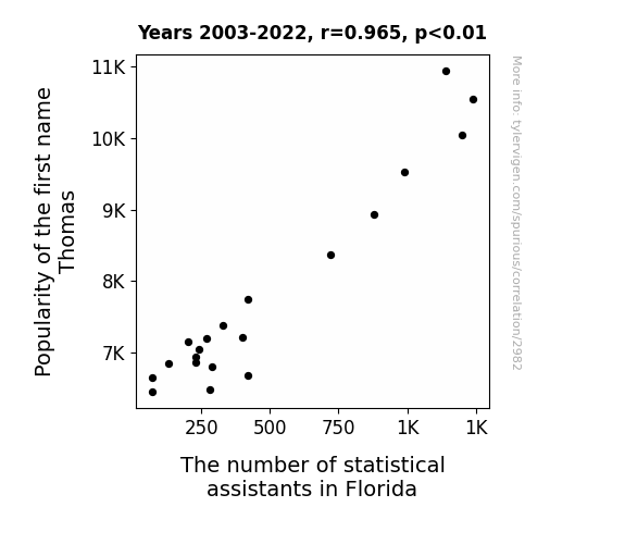
The Thomas Theorem: An Analysis of the Correlation Between Thomas' Popularity and the Number of Statistical Assistants in Florida
Fewer babies being named Thomas meant fewer potential statisticians wanting to move to Florida, causing a shortage of statistical assistants in the state. After all, everyone knows that Florida is the top destination for people with the name Thomas pursuing a career in statistics. It's just basic Thomas-istics!

What else correlates?
Popularity of the first name Thomas · all first names
The number of statistical assistants in Florida · all cccupations
Popularity of the first name Thomas · all first names
The number of statistical assistants in Florida · all cccupations


View details about correlation #2,434
Out of This World Investments: The Extraterrestrial Influence on Hollywood Blockbusters
The extraterrestrial tourism industry in Nevada has been booming, leading to a surge in demand for big-budget blockbuster films about epic space battles and alien invasions. As more UFOs zipped through the night skies, Hollywood executives couldn't help but greenlight extravagant projects fueled by their belief that truth is not only out there, but also makes for box office gold. It's a close encounter of the budget-inflating kind, as the UFO sightings in Nevada have truly become the starship troopers of the movie industry's financial decisions. It's a UFOpian future for filmmaking in the Silver State, where the sky's not the limit - it's just the beginning of a blockbuster bonanza!

What else correlates?
UFO sightings in Nevada · all random state specific
Budget for largest movie production · all films & actors
UFO sightings in Nevada · all random state specific
Budget for largest movie production · all films & actors
. The chart goes from 2002 to 2022, and the two variables track closely in value over that time.")

View details about correlation #2,569
Spinning Gold: Examining the Relationship Between LP/Vinyl Album Sales and D.R. Horton's Stock Price
The surge in vinyl album sales led to a revival of 70s-style home decor, prompting a sudden demand for shag carpeting and avocado-colored appliances, boosting D.R. Horton's retro home sales. Looks like D.R. Horton is riding the groovy wave of success!


What else correlates?
Sales of LP/Vinyl Albums · all weird & wacky
D.R. Horton's stock price (DHI) · all stocks
Sales of LP/Vinyl Albums · all weird & wacky
D.R. Horton's stock price (DHI) · all stocks


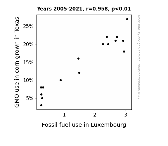
View details about correlation #1,847
Maize and Petroleum: Unearthing the Correlation Between GMO Corn Cultivation in Texas and Fossil Fuel Consumption in Luxembourg
As Texas corn lost its GMO superpowers, it could no longer fuel the demand for fossil fuels in Luxembourg. It's like the domino effect, but with kernels of corn and barrels of oil. So, remember, the next time you're at the gas station, it might just be a-maize-ing non-GMO corn from Texas that's keeping your car running!

What else correlates?
GMO use in corn grown in Texas · all food
Fossil fuel use in Luxembourg · all energy
GMO use in corn grown in Texas · all food
Fossil fuel use in Luxembourg · all energy


View details about correlation #2,346
Checking In on the Relationship Between Hotel Managers in Vermont and Google Searches for Practical Engineering: A Quirky Correlation?
As the number of hotel managers in Vermont increased, there was a corresponding rise in demand for practical engineering solutions to build the most efficient pancake breakfast stations and maple syrup piping systems. These hotel managers were seeking all the practical engineering know-how to ensure that their guests had a truly elevated and syrup-erb experience during their stay in the picturesque state. It was a sticky situation, but with practical engineering, they were able to waffle-proof their operations and flip success in their favor, creating a sweet synergy between hospitality and practicality. So, the search for 'Practical Engineering' on Google surged as Vermont's hotels scrambled to implement the latest and greatest in practical engineering marvels. Who knew that behind every perfectly fluffed pillow in a Vermont hotel, there's a cadre of practical engineers making sure that everything is just right?


What else correlates?
The number of hotel managers in Vermont · all cccupations
Google searches for 'Practical Engineering' · all google searches
The number of hotel managers in Vermont · all cccupations
Google searches for 'Practical Engineering' · all google searches


View details about correlation #3,168
Dusty Connections: Exploring the Link Between the Popularity of the Name Dusty and Air Pollution in Toledo
As fewer babies were named Dusty, there were fewer fans of dusty, old cars, leading to a decrease in their usage and ultimately reducing air pollution in Toledo. It seems the Dusty name just couldn't help but leave the air a little cleaner in the end!


What else correlates?
Popularity of the first name Dusty · all first names
Air pollution in Toledo · all weather
Popularity of the first name Dusty · all first names
Air pollution in Toledo · all weather


View details about correlation #2,475
Setting Fire to the Charts: Exploring the Fiery Connection Between Arson in Hawaii and China's Rare Earth Element Export Volume
As the saying goes, 'Hawaii is the land of aloha, not the land of a-blaze-a,' and with fewer fires, the demand for fire-resistant materials like rare earth elements from China has cooled down. It's a case of arson in one place igniting a fiery need elsewhere, but it seems like these elements are just not feeling the heat like before.


What else correlates?
Arson in Hawaii · all random state specific
China's Rare Earth Element Export Volume · all weird & wacky
Arson in Hawaii · all random state specific
China's Rare Earth Element Export Volume · all weird & wacky
Why this works
- Data dredging: I have 25,237 variables in my database. I compare all these variables against each other to find ones that randomly match up. That's 636,906,169 correlation calculations! This is called “data dredging.”
Fun fact: the chart used on the wikipedia page to demonstrate data dredging is also from me. I've been being naughty with data since 2014.
Instead of starting with a hypothesis and testing it, I instead tossed a bunch of data in a blender to see what correlations would shake out. It’s a dangerous way to go about analysis, because any sufficiently large dataset will yield strong correlations completely at random. - Lack of causal connection: There is probably no direct connection between these variables, despite what the AI says above.
Because these pages are automatically generated, it's possible that the two variables you are viewing are in fact causually related. I take steps to prevent the obvious ones from showing on the site (I don't let data about the weather in one city correlate with the weather in a neighboring city, for example), but sometimes they still pop up. If they are related, cool! You found a loophole.
This is exacerbated by the fact that I used "Years" as the base variable. Lots of things happen in a year that are not related to each other! Most studies would use something like "one person" in stead of "one year" to be the "thing" studied. - Observations not independent: For many variables, sequential years are not independent of each other. You will often see trend-lines form. If a population of people is continuously doing something every day, there is no reason to think they would suddenly change how they are doing that thing on January 1. A naive p-value calculation does not take this into account.
You will calculate a lower chance of "randomly" achieving the result than represents reality.
To be more specific: p-value tests are probability values, where you are calculating the probability of achieving a result at least as extreme as you found completely by chance. When calculating a p-value, you need to assert how many "degrees of freedom" your variable has. I count each year (minus one) as a "degree of freedom," but this is misleading for continuous variables.
This kind of thing can creep up on you pretty easily when using p-values, which is why it's best to take it as "one of many" inputs that help you assess the results of your analysis.
- Y-axes doesn't start at zero: I truncated the Y-axes of the graphs above. I also used a line graph, which makes the visual connection stand out more than it deserves.
Nothing against line graphs. They are great at telling a story when you have linear data! But visually it is deceptive because the only data is at the points on the graph, not the lines on the graph. In between each point, the data could have been doing anything. Like going for a random walk by itself!
Mathematically what I showed is true, but it is intentionally misleading. If you click on any of the charts that abuse this, you can scroll down to see a version that starts at zero. - Confounding variable: Confounding variables (like global pandemics) will cause two variables to look connected when in fact a "sneaky third" variable is influencing both of them behind the scenes.
- Outliers: Some datasets here have outliers which drag up the correlation.
In concept, "outlier" just means "way different than the rest of your dataset." When calculating a correlation like this, they are particularly impactful because a single outlier can substantially increase your correlation.
Because this page is automatically generated, I don't know whether any of the charts displayed on it have outliers. I'm just a footnote. ¯\_(ツ)_/¯
I intentionally mishandeled outliers, which makes the correlation look extra strong. - Low n: There are not many data points included in some of these charts.
You can do analyses with low ns! But you shouldn't data dredge with a low n.
Even if the p-value is high, we should be suspicious of using so few datapoints in a correlation.
Pro-tip: click on any correlation to see:
- Detailed data sources
- Prompts for the AI-generated content
- Explanations of each of the calculations (correlation, p-value)
- Python code to calculate it yourself


