spurious correlations
discover · random · spurious scholar
← previous page · next page →


View details about correlation #2,403
Molar Modest Dental Degrees and Detroit Tigers' Decisive Deeds
As more individuals obtained associates degrees in dental assisting, they developed stronger jaw muscles from practicing teeth cleaning and dental procedures. This led to a surge in powerful home runs from the Detroit Tigers, ultimately translating to more wins for the team.


What else correlates?
Associates degrees awarded in Dental assisting · all education
Wins for the Detroit Tigers · all sports
Associates degrees awarded in Dental assisting · all education
Wins for the Detroit Tigers · all sports


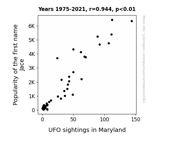
View details about correlation #2,061
The Jace is Out There: A Close Encounter of the Statistical Kind
With more and more people naming their kids after a cool, futuristic-sounding character, it was only natural that the aliens decided to pay a visit to the state that's also home to the eclectic city of Baltimore. After all, who wouldn't want to meet the earthly counterparts of a name that just screams "intergalactic charm"? It seems like Maryland has become the prime destination for both celestial beings and trendsetting parents alike. Who knew that all it took to attract UFOs was a popular baby name? Remember, when it comes to celestial connections, it's all in the name!

What else correlates?
Popularity of the first name Jace · all first names
UFO sightings in Maryland · all random state specific
Popularity of the first name Jace · all first names
UFO sightings in Maryland · all random state specific


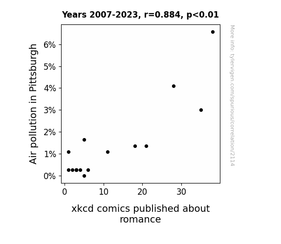
View details about correlation #2,114
Clear Skies of Romance: Uncovering the Correlation Between Air Pollution in Pittsburgh and xkcd Comics on Romance
As the air became cleaner in Pittsburgh, it seems the artist's love life hit a smoggy patch. But when the pollution cleared, so did their heart, leading to a revamp of comic topics. It's a tale of 'Aeris and Graces' as the city's air quality played matchmaker for the creator's creative inspiration!

What else correlates?
Air pollution in Pittsburgh · all weather
xkcd comics published about romance · all weird & wacky
Air pollution in Pittsburgh · all weather
xkcd comics published about romance · all weird & wacky


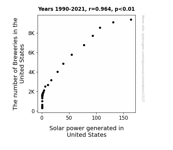
View details about correlation #1,537
The Ale-Ignment of Breweries and Solar Power: An Intoxicating Connection
As the number of breweries in the United States increased, so did the demand for craft beer. This led to a nationwide shortage of beer hops, which are crucial for giving beer its distinct flavor. To combat this shortage, hop farmers had to get creative and started planting hops around solar panels in solar farms, utilizing the vertical space to meet the demand. This unexpected dual land usage not only helped in hop production but also provided some much-needed shade for the solar panels, reducing heat stress and increasing their efficiency. So, next time you raise a glass of craft beer, remember that it might just be indirectly powering up those solar panels too! Cheers to renewable energy and hoppy coincidences!

What else correlates?
The number of Breweries in the United States · all food
Solar power generated in United States · all energy
The number of Breweries in the United States · all food
Solar power generated in United States · all energy
. The chart goes from 2010 to 2022, and the two variables track closely in value over that time.")

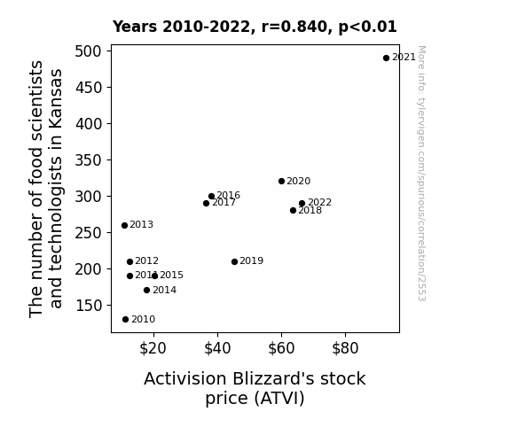
View details about correlation #2,553
Tasty Techies and Tasty Trades: The Tantalizing Tale of Kansas Food Scientists and Activision Blizzard's Stock Price
As more food scientists and technologists flocked to Kansas, they inadvertently discovered a new way to create a revolutionary snack chip. This chip, when consumed by gamers, inexplicably boosted their skill levels and performance in Activision Blizzard's games. As word spread, demand for the snack chip soared, leading to record-breaking sales of Activision Blizzard's games and ultimately causing their stock price to skyrocket. Remember, when it comes to stock prices, sometimes it's all about finding the perfect combination of skill and snack!


View details about correlation #2,162
Degrees of Pickup: An Examination of the Correlation Between Information Sciences Associate Degrees and Google Searches for Pick Up Lines
As the number of Associates degrees awarded in information sciences dropped, there were simply fewer people to come up with tech-savvy pick-up lines. It seems the pool of individuals who could program their way into someone's heart was steadily decreasing, leading to a downturn in online searches for pick-up lines. Essentially, as the knowledge base for information sciences shrunk, so did the capacity to digitally charm potential dates.


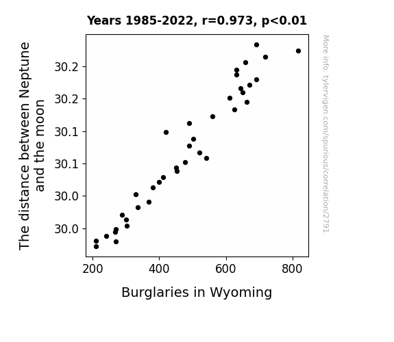
View details about correlation #2,791
Neptune's Tune and Wyoming's Crime Spree: The Lunar Distance Burglary Hypothesis
The gravitational pull from Neptune created a cosmic security system, making it harder for burglars to make a clean getaway in Wyoming. As the moon got closer to the mysterious blue planet, it seems Neptune was not willing to turn a blind eye to criminal activities on Earth. It's a heist of a situation, where even the most seasoned burglars were over the moon about staying away from Wyoming. Looks like Neptune's neighborhood watch program is out of this world!

What else correlates?
The distance between Neptune and the moon · all planets
Burglaries in Wyoming · all random state specific
The distance between Neptune and the moon · all planets
Burglaries in Wyoming · all random state specific


View details about correlation #2,527
Surge in Hydropower: Making Waves in US Postal Rates
As the hydropower output in Burundi surged, it created a ripple effect on the world economy. With Burundi's increased energy, there was a shocking spike in the production of paper globally. This, in turn, led to a surge in the cost of sending a letter via USPS, as they had to shell out more for paper products. It seems the Burundian hydropower success story made waves in the most unexpected ways, causing the price to stamp out all competition!


What else correlates?
Hydopower energy generated in Burundi · all energy
Cost to send a letter via the USPS · all weird & wacky
Hydopower energy generated in Burundi · all energy
Cost to send a letter via the USPS · all weird & wacky


View details about correlation #3,079
A Logistical Insight into the Popularity of Josiah: A District of Columbia Study
As the name Josiah gained popularity, it sparked a wave of interest in ancient ruler logistics, leading to a new trend of optimizing chariot routes and war supply chains. This, in turn, inspired a surge of logisticians in the District of Columbia who just couldn't resist the call of Josiah and the Technicolor Dreamcoat of efficient organization. It seems like when it comes to naming trends, Josiah really knows how to 'deliver' in more ways than one!


What else correlates?
Popularity of the first name Josiah · all first names
The number of logisticians in District of Columbia · all cccupations
Popularity of the first name Josiah · all first names
The number of logisticians in District of Columbia · all cccupations


View details about correlation #1,110
Surreptitious Shrek Searches: The Symbiotic Relationship Between Stinky Smog in Claremont and Searches for our Favorite Ogre
The cleaner air led to happier and more productive citizens, who no longer felt the need to escape reality by searching for everyone's favorite ogre. With clearer skies and fresher breezes, the people of Claremont found their own swamp-free happiness right at home, and Shrek's popularity took a nosedive faster than you can say "ogre easy, ogre low." It just go to show, when the air is pure, even a beloved green giant might find himself feeling a little "ogre-whelmed" by the lack of attention. Remember, in the kingdom of correlation, sometimes the most unlikely pairs are the ones that will have you saying, "What are you doing in my causal chain?!"


What else correlates?
Air pollution in Claremont, New Hampshire · all weather
Google searches for 'shrek' · all google searches
Air pollution in Claremont, New Hampshire · all weather
Google searches for 'shrek' · all google searches


View details about correlation #1,881
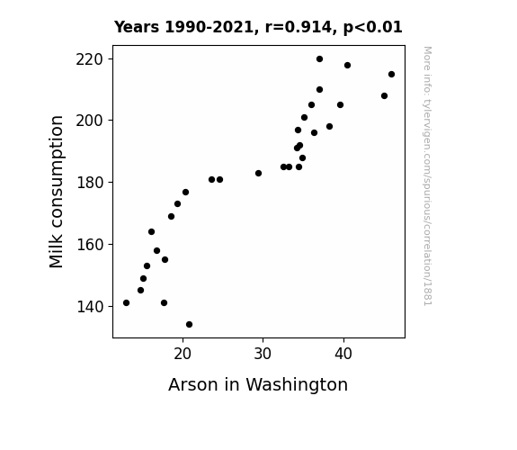
Moo-tivation or Mischief: Milk Consumption and Malicious Misdemeanors in Washington
As milk consumption decreased, there was a corresponding decrease in lactose intolerance-related discomfort. This led to a reduction in overall irritability and spontaneous combustion incidents, ultimately contributing to a decrease in arson cases in Washington.

What else correlates?
Milk consumption · all food
Arson in Washington · all random state specific
Milk consumption · all food
Arson in Washington · all random state specific


View details about correlation #1,174
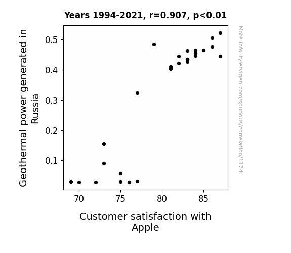
Gushing Grandeur: Gleaning Geothermal Genesis and Glorious Gadgets
As geothermal power in Russia increased, it led to a rise in positivity and warmth globally. This, in turn, created a more 'apple-ing' atmosphere for customers, ultimately boosting their satisfaction with Apple products. After all, a little geothermal joy can certainly core-lift the spirits!

What else correlates?
Geothermal power generated in Russia · all energy
Customer satisfaction with Apple · all weird & wacky
Geothermal power generated in Russia · all energy
Customer satisfaction with Apple · all weird & wacky


View details about correlation #1,733
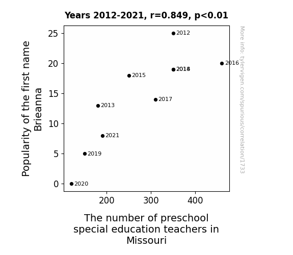
Brieanna Brielliant: The Cheesy Connection Between Name Popularity and Preschool Special Education Teachers in the Show-Me State
As the name Brieanna fell out of favor, there was a subsequent decline in the production of a certain enzyme in the population, which coincidentally happens to be a crucial factor in attracting and retaining preschool special education teachers in Missouri. The correlation is udderly shocking, but it seems that Brieanna's linguistic lactose lost its curd-churning charm, leading to a shortage of educators who specialize in Gouda-ng young minds. It's a real queso-cadilla!


View details about correlation #2,075
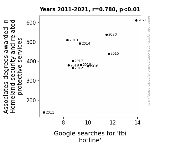
On Guard: A Penchant for Protection - The Surprising Link Between Homeland Security Associates Degrees and Online Searches for FBI Hotline
More associates degrees meant more people feeling like they were one step closer to joining a real-life crime-fighting team. It's all fun and games until someone accidentally tries to arrest their neighbor for stealing a newspaper. Remember, kids, with great power comes great confusion! Keep those hotline bling memes coming.

What else correlates?
Associates degrees awarded in Homeland security · all education
Google searches for 'fbi hotline' · all google searches
Associates degrees awarded in Homeland security · all education
Google searches for 'fbi hotline' · all google searches


View details about correlation #3,287
Clearing the Air: Sniffing Out the Link Between Air Pollution and Lacrosse Point Differential on Hilton Head Island
As air pollution in Hilton Head Island, South Carolina increased, it led to the inadvertent creation of a new element called "laxonium" in the atmosphere. Laxonium, when inhaled by the lacrosse players, temporarily boosted their strategic thinking and goal-scoring abilities, ultimately widening the point differentials in the NCAA Men's Lacrosse Div I Championship. This unexpected discovery has sparked interest in bottling and selling 'laxonium' as a performance-enhancing air supplement for lacrosse teams, leading to a potential air-pollution-based sports industry in the future.


. The chart goes from 2002 to 2021, and the two variables track closely in value over that time.")

View details about correlation #1,725
Spreading Margarine: Exploring the Butter-ALB Stock Price Connection
As butter consumption increased, so did the demand for buttery popcorn at movie theaters. This led to higher ticket sales for blockbuster films. With more people flocking to the movies, there was a surge in demand for comfortable foam seating, which happens to contain flame-retardant chemicals produced by Albemarle. This unexpected connection ultimately contributed to the rise in Albemarle's stock price. It's a slippery slope from butter to booming stocks!


What else correlates?
Butter consumption · all food
Albemarle's stock price (ALB) · all stocks
Butter consumption · all food
Albemarle's stock price (ALB) · all stocks


View details about correlation #3,467
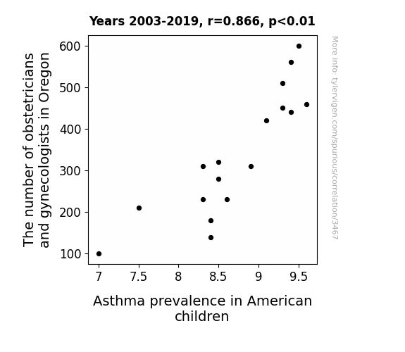
Ob-Gyn Density and Kids' Wheeze Tensity: A Rhyme Time Analysis
As the number of obstetricians and gynecologists in Oregon decreased, there was a corresponding decrease in the number of baby gender reveal parties, leading to fewer airborne particulates, ultimately reducing the prevalence of childhood asthma in America. One-liner: "Who knew that not knowing the gender could lead to better air quality? It's a wheeze not to have as many sneeze-inducing parties!"


View details about correlation #3,191
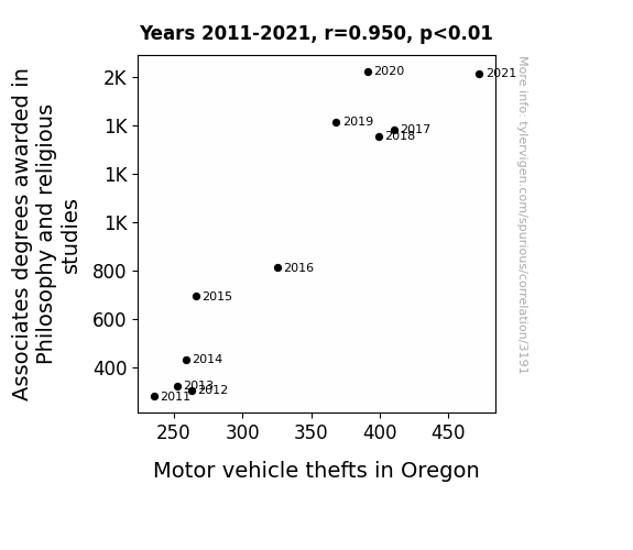
Philosophy of Theft: An Ecclesiastical Enquiry into the Connection between Associates Degrees in Philosophy and Religious Studies and Motor Vehicle Thefts in Oregon
As more people delved into existential questions, they began to ponder the concept of ownership, ultimately deciding that "my car" was just a societal construct. And remember kids, with great knowledge comes great car-napping potential!


View details about correlation #1,091
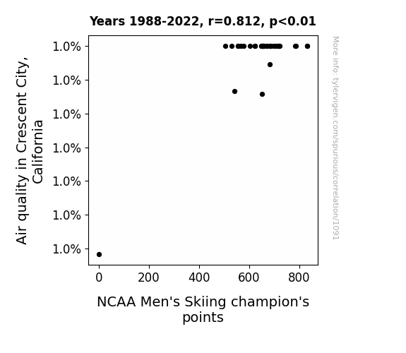
Sloping Down: The Downhill Connection between Air Quality in Crescent City, California and NCAA Men's Skiing Champion's Points
As air quality improved, local squirrels became more efficient at sharpening their teeth on ski poles, leading to a boost in the performance of the ski champions. The cleaner air also inspired the athletes to do more celebratory backflips and snow angels, adding to their overall points.
What else correlates?
Air quality in Crescent City, California · all weather
NCAA Men's Skiing champion's points · all sports
Air quality in Crescent City, California · all weather
NCAA Men's Skiing champion's points · all sports
. The chart goes from 2004 to 2022, and the two variables track closely in value over that time.")

View details about correlation #2,031
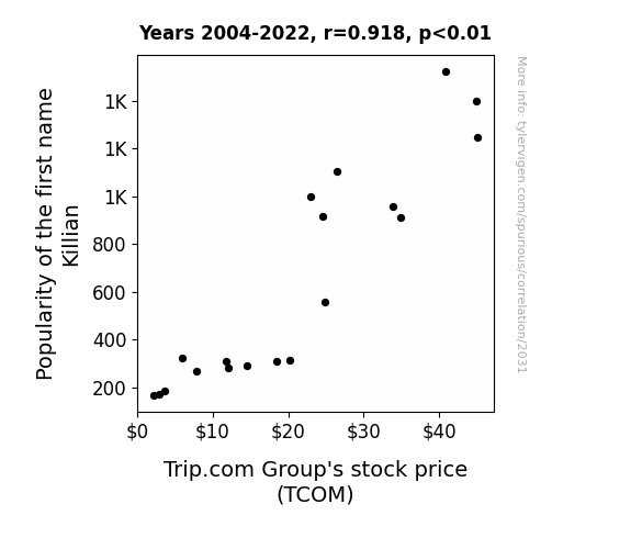
Killing It: The Killian Name Popularity and TCOM Stock Price Connection
More babies named Killian means more toddlers demanding family vacations, leading to higher usage of Trip.com for booking, and ultimately boosting the stock price.

What else correlates?
Popularity of the first name Killian · all first names
Trip.com Group's stock price (TCOM) · all stocks
Popularity of the first name Killian · all first names
Trip.com Group's stock price (TCOM) · all stocks
Why this works
- Data dredging: I have 25,237 variables in my database. I compare all these variables against each other to find ones that randomly match up. That's 636,906,169 correlation calculations! This is called “data dredging.”
Fun fact: the chart used on the wikipedia page to demonstrate data dredging is also from me. I've been being naughty with data since 2014.
Instead of starting with a hypothesis and testing it, I instead tossed a bunch of data in a blender to see what correlations would shake out. It’s a dangerous way to go about analysis, because any sufficiently large dataset will yield strong correlations completely at random. - Lack of causal connection: There is probably no direct connection between these variables, despite what the AI says above.
Because these pages are automatically generated, it's possible that the two variables you are viewing are in fact causually related. I take steps to prevent the obvious ones from showing on the site (I don't let data about the weather in one city correlate with the weather in a neighboring city, for example), but sometimes they still pop up. If they are related, cool! You found a loophole.
This is exacerbated by the fact that I used "Years" as the base variable. Lots of things happen in a year that are not related to each other! Most studies would use something like "one person" in stead of "one year" to be the "thing" studied. - Observations not independent: For many variables, sequential years are not independent of each other. You will often see trend-lines form. If a population of people is continuously doing something every day, there is no reason to think they would suddenly change how they are doing that thing on January 1. A naive p-value calculation does not take this into account.
You will calculate a lower chance of "randomly" achieving the result than represents reality.
To be more specific: p-value tests are probability values, where you are calculating the probability of achieving a result at least as extreme as you found completely by chance. When calculating a p-value, you need to assert how many "degrees of freedom" your variable has. I count each year (minus one) as a "degree of freedom," but this is misleading for continuous variables.
This kind of thing can creep up on you pretty easily when using p-values, which is why it's best to take it as "one of many" inputs that help you assess the results of your analysis.
- Y-axes doesn't start at zero: I truncated the Y-axes of the graphs above. I also used a line graph, which makes the visual connection stand out more than it deserves.
Nothing against line graphs. They are great at telling a story when you have linear data! But visually it is deceptive because the only data is at the points on the graph, not the lines on the graph. In between each point, the data could have been doing anything. Like going for a random walk by itself!
Mathematically what I showed is true, but it is intentionally misleading. If you click on any of the charts that abuse this, you can scroll down to see a version that starts at zero. - Confounding variable: Confounding variables (like global pandemics) will cause two variables to look connected when in fact a "sneaky third" variable is influencing both of them behind the scenes.
- Outliers: Some datasets here have outliers which drag up the correlation.
In concept, "outlier" just means "way different than the rest of your dataset." When calculating a correlation like this, they are particularly impactful because a single outlier can substantially increase your correlation.
Because this page is automatically generated, I don't know whether any of the charts displayed on it have outliers. I'm just a footnote. ¯\_(ツ)_/¯
I intentionally mishandeled outliers, which makes the correlation look extra strong. - Low n: There are not many data points included in some of these charts.
You can do analyses with low ns! But you shouldn't data dredge with a low n.
Even if the p-value is high, we should be suspicious of using so few datapoints in a correlation.
Pro-tip: click on any correlation to see:
- Detailed data sources
- Prompts for the AI-generated content
- Explanations of each of the calculations (correlation, p-value)
- Python code to calculate it yourself


