spurious correlations
discover · random · spurious scholar
← previous page · next page →


View details about correlation #2,505
Nut-so Clean Air: The Squirrelly Connection Between Air Pollution in San Antonio, Texas and Google Searches for 'Attacked by a Squirrel'
As the air quality improved, the squirrels in San Antonio were no longer feeling so "squirrelly" and aggressive. With cleaner air to breathe, they were just nuts about spreading peace and harmony instead of launching surprise acorn-attacks on unsuspecting residents. This proves that when it comes to reducing squirrel-related incidents, a breath of fresh air in the city can truly work wonders. As the old saying goes, "Cleaner air leads to fewer beware-of-squirrel scares!"


What else correlates?
Air pollution in San Antonio, Texas · all weather
Google searches for 'attacked by a squirrel' · all google searches
Air pollution in San Antonio, Texas · all weather
Google searches for 'attacked by a squirrel' · all google searches
. The chart goes from 2012 to 2021, and the two variables track closely in value over that time.")

View details about correlation #1,965
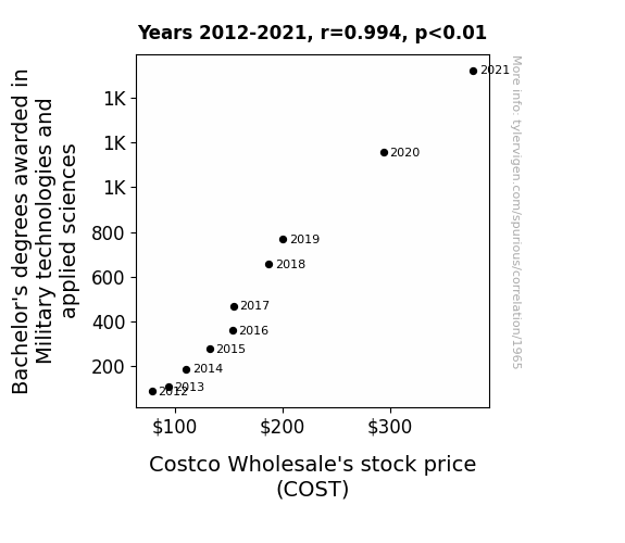
Shield Stocks: The Battle-Tested Connection Between Military Technologies and Costco Wholesale's Stock Price
As more students became experts in military technologies, they devised efficient strategies for restocking and organizing goods at Costco, leading to lower operational costs and higher profits for the company. After all, nothing ensures a well-stocked store quite like a battalion of tech-savvy, highly organized Costco employees!

What else correlates?
Bachelor's degrees awarded in Military technologies · all education
Costco Wholesale's stock price (COST) · all stocks
Bachelor's degrees awarded in Military technologies · all education
Costco Wholesale's stock price (COST) · all stocks


View details about correlation #1,446
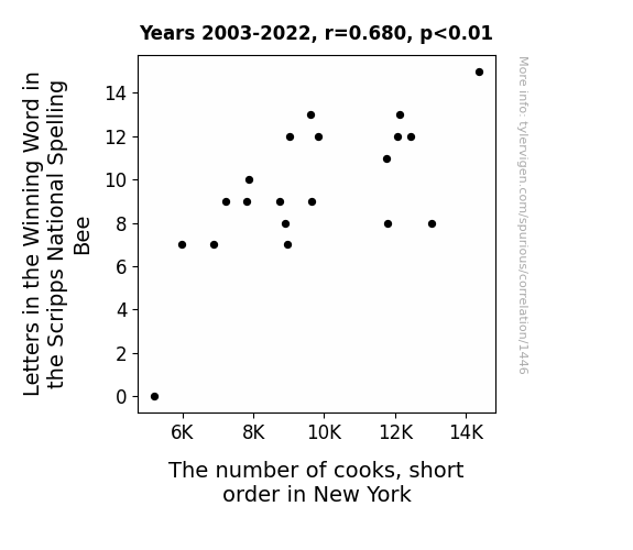
Spellebrity Chef: The Correlation Between Winning Spelling Bee Words and Short Order Cooks in New York
As the winning word in the Scripps National Spelling Bee gets longer, it also gets more complex. This prompts an odd tradition among short order cooks in New York - for each additional letter in the winning word, they feel compelled to add an extra ingredient to their omelets. So, as these words become veritable linguistic behemoths, short order cooks are tossing in everything but the kitchen sink into their breakfast dishes. It's a scramble to keep up with the bee, and the omelet creativity is eggs-quisite!


View details about correlation #2,483
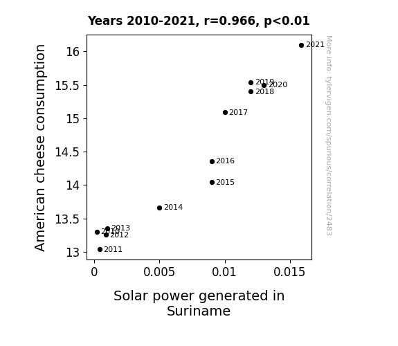
Cheddar and Solar: Connecting American Cheese Consumption to Solar Power in Suriname
As American cheese consumption increased, so did the level of lactose in the atmosphere. This lactose acted as a catalyst, leading to a dairy strange reaction in Suriname, ultimately generating more solar power. It's a gouda thing the sun and cheese have such a strong connection! Remember, April Fools!

What else correlates?
American cheese consumption · all food
Solar power generated in Suriname · all energy
American cheese consumption · all food
Solar power generated in Suriname · all energy


View details about correlation #2,932
Breaking the Ice: A Preliminary Investigation into the Brennon Effect on Detroit Red Wings NHL Success
As the popularity of the name Brennon rose, so did the number of fans shouting "Brennon to win!" at Detroit Red Wings' games. This influx of support created a powerful sense of motivation and determination within the team, driving them to score more goals and outmaneuver their opponents. It was truly a case of 'Brennon-fused victory' on the ice, as the Red Wings skated their way to success with the backing of the spirited Brennon fanbase.


What else correlates?
Popularity of the first name Brennon · all first names
Number of games won by Detroit Red Wings in NHL season · all sports
Popularity of the first name Brennon · all first names
Number of games won by Detroit Red Wings in NHL season · all sports


View details about correlation #1,729
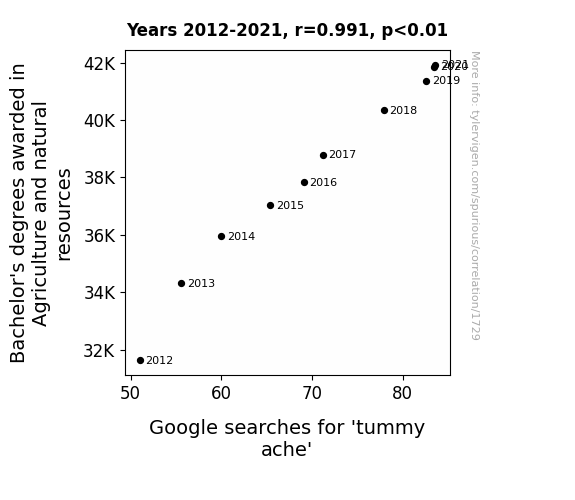
Farming for Answers: A Correlative Study of Bachelor's Degrees in Agriculture and Natural Resources and Google Searches for 'Tummy Ache'
As more students delved into the world of agriculture and natural resources, they became overly excited about the concept of crop rotations. This led to a bizarre trend of individuals attempting to rotate the foods in their stomachs, believing it would yield a bountiful harvest of digestion. Alas, the result was nothing but a tumultuous tummy terrain, as carrots clashed with cookies and broccoli battled with burgers. The stomach, not being a fertile field, revolted against this agricultural upheaval, causing widespread tummy aches and a newfound respect for the simplicity of antacids.

What else correlates?
Bachelor's degrees awarded in Agriculture · all education
Google searches for 'tummy ache' · all google searches
Bachelor's degrees awarded in Agriculture · all education
Google searches for 'tummy ache' · all google searches


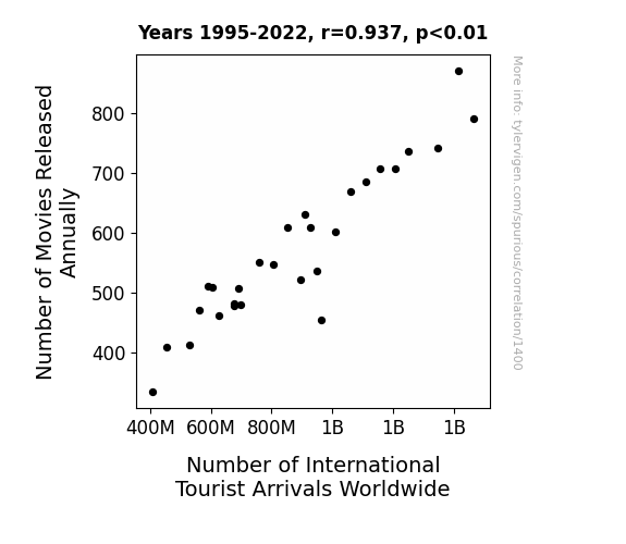
View details about correlation #1,400
Flicks' Tricks: How Film Production Predicts Globe Roaming Seduction
As the number of movies released annually increased, so did the Number of International Tourist Arrivals Worldwide. This correlation can be attributed to the 'Movie Wanderlust Effect' - a phenomenon where people, inspired by films, developed a sudden urge to travel to the locations where their favorite movies were filmed. It's as if Hollywood had a direct line to the global tourism industry, proving once again that in the battle of lights, camera, action, it's the tourists who are the true box office stars!


View details about correlation #1,979
Connecting the Clouds: Correlating Air Quality in Phoenix with Kerosene Consumption in Cuba
As the air quality in Phoenix decreased, it led to an updraft of sorts, which inadvertently carried away some of the kerosene molecules destined for Cuba. This caused a shortage, leaving the Cubans feeling a bit burned out. It's a case of pollution leading to a defuelopment in another country! But don't worry, they'll just have to wait for the winds of change to bring in a fresher supply.


What else correlates?
Air quality in Phoenix · all weather
Kerosene used in Cuba · all energy
Air quality in Phoenix · all weather
Kerosene used in Cuba · all energy


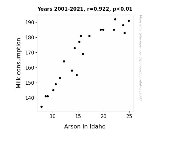
View details about correlation #2,087
Moo-ving Evidence: Exploring the Dairy-fy Connection Between Milk Consumption and Arson in Idaho
As people drank less milk, their calcium levels dropped, leading to decreased bone density. With weaker bones, individuals found it increasingly difficult to strike a match with the same level of force as before, inadvertently lowering the incidence of arson in Idaho.

What else correlates?
Milk consumption · all food
Arson in Idaho · all random state specific
Milk consumption · all food
Arson in Idaho · all random state specific


View details about correlation #1,822
Removing Hazards and Searching for Math: A Correlation Between Hazardous Materials Removal Workers in Kansas and Google Searches for '3Blue1Brown'
The more hazardous materials removal workers there are in Kansas, the greater the demand for their services. As a result, Kansans become increasingly concerned about the presence of hazardous materials in their daily lives. This leads to a spike in anxiety and a desire for distraction. As Kansans frantically search for ways to cope, they turn to the mesmerizing and soothing math and science videos of 3Blue1Brown, causing a significant uptick in Google searches for '3Blue1Brown.' It's a classic case of hazardous materials removal workers unintentionally multiplying the beauty of mathematics in the Sunflower State! Who knew that the path to mathematical enlightenment could be paved with hazmat suits and caution tape in the heartland of America? Keep crunching those numbers, Kansas!


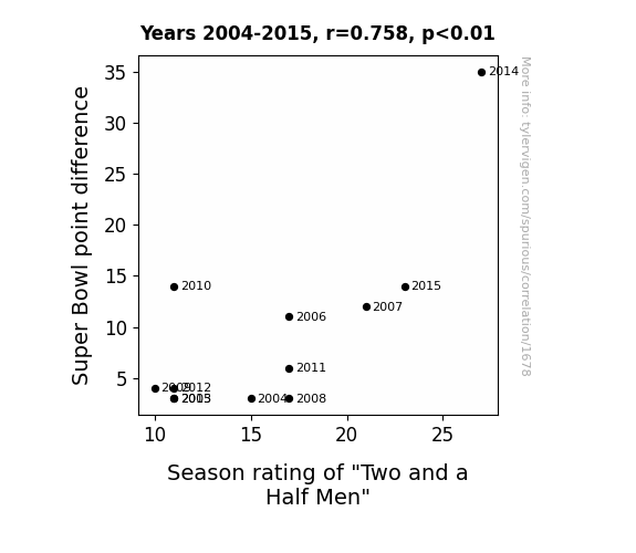
View details about correlation #1,678
Pointing to Success: The Super Bowl Point Difference and the Rating of Two and a Half Men
As Super Bowl point differences widened, football fans became more accustomed to lopsided outcomes. This, in turn, made the subtle humor and nuanced plot developments of "Two and a Half Men" seem comparatively more exciting and unpredictable, leading to higher season ratings. It's like they say - a blowout game on the field makes for a blockbuster night of TV!

What else correlates?
Super Bowl point difference · all sports
Season rating of "Two and a Half Men" · all films & actors
Super Bowl point difference · all sports
Season rating of "Two and a Half Men" · all films & actors
. The chart goes from 2002 to 2022, and the two variables track closely in value over that time.")

View details about correlation #2,814
The Stevie Effect: An Empirical Examination of the Relationship Between the Popularity of the Name 'Stevie' and Analog Devices' Stock Price
As the name Stevie gained popularity, more and more parents were subconsciously drawn to musicians like Stevie Wonder, leading to a surge in demand for musical instruments. This unexpected boom in the music industry caused a ripple effect, increasing the need for Analog Devices' electronic components in state-of-the-art audio equipment. It's a harmonious chain reaction that even Stevie Wonder himself couldn't have foreseen!

What else correlates?
Popularity of the first name Stevie · all first names
Analog Devices' stock price (ADI) · all stocks
Popularity of the first name Stevie · all first names
Analog Devices' stock price (ADI) · all stocks


View details about correlation #1,398
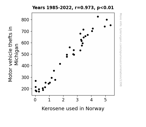
Fuel for Thought: Kerosene Consumption in Norway and Motor Vehicle Thefts in Michigan
With fewer car thefts in Michigan, there was a reduced demand for getaway vehicles. This led to a surplus of kerosene in Norway, as it was no longer needed for torching stolen cars.

What else correlates?
Motor vehicle thefts in Michigan · all random state specific
Kerosene used in Norway · all energy
Motor vehicle thefts in Michigan · all random state specific
Kerosene used in Norway · all energy


View details about correlation #3,245
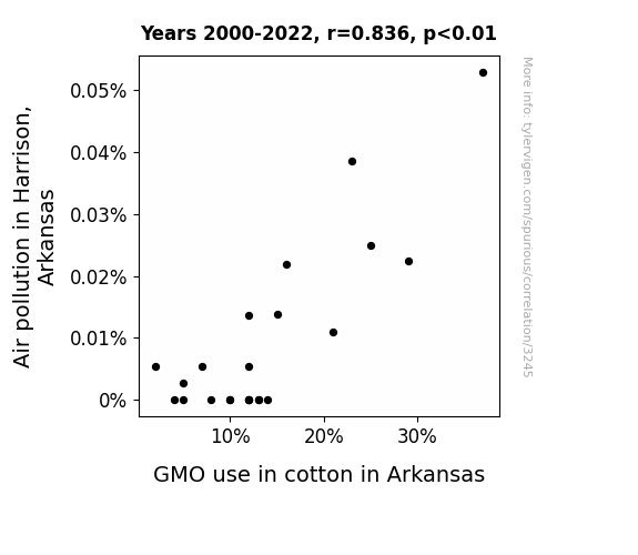
From Cotton Fields to Polluted Skies: Unraveling the Air-y Connection Between GMO Cotton Use and Air Pollution in Harrison, Arkansas
The cleaner air in Harrison led to an unexpected side effect - it boosted the morale of a nearby group of rebellious, eco-conscious cotton plants. Feeling invigorated by the fresh atmosphere, they collectively decided to ditch the genetically modified lifestyle and embrace their organic roots. It turns out, clean air isn't just a breath of fresh oxygen for us; it's also a catalyst for cotton rebellion against GMOs.

What else correlates?
Air pollution in Harrison, Arkansas · all weather
GMO use in cotton in Arkansas · all food
Air pollution in Harrison, Arkansas · all weather
GMO use in cotton in Arkansas · all food


View details about correlation #2,071
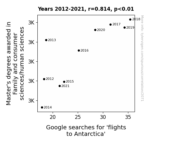
Degrees of Wanderlust: Exploring the Connection Between Family and Consumer Sciences Master's Degrees and Google Searches for Flights to Antarctica
As more people became experts in family and consumer sciences, they realized the importance of bonding and togetherness. This sparked a peculiar trend of unconventional family vacations. Families, now equipped with advanced knowledge of human behavior and resource management, decided to take their bonding experiences to the next level by embarking on adventurous trips to Antarctica. Perhaps they wanted to study the dynamics of penguin families or conduct field research on the science of snowman-building competitions. It's a chillingly heartwarming development in the world of travel!


View details about correlation #2,334
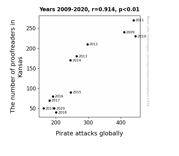
Precarious Proofs: The Puzzling Relationship Between Kansas Proofreaders and Global Pirate Attacks
Proofreaders in Kansas were mistakenly changing "sea" to "see" in pirate communications, leading to confusion and communication breakdowns on the high seas. As the number of proofreaders decreased, the pirates were able to clarify their messages and coordinate their attacks more effectively, resulting in an overall decrease in pirate activity globally.
What else correlates?
The number of proofreaders in Kansas · all cccupations
Pirate attacks globally · all weird & wacky
The number of proofreaders in Kansas · all cccupations
Pirate attacks globally · all weird & wacky


View details about correlation #2,922
Heat Wave: Exploring the Fiery Connection Between the Name Jacqueline and Arson in Washington
Fewer Jacquelines meant fewer Jakes, leading to a decrease in fire-related incidents in Washington. Looks like the name Jacqueline was just too hot to handle!


What else correlates?
Popularity of the first name Jacqueline · all first names
Arson in Washington · all random state specific
Popularity of the first name Jacqueline · all first names
Arson in Washington · all random state specific


View details about correlation #1,916
Fueling Victory: Exploring the Interplay Between New York Yankees' Success and LPG Consumption in Central African Republic
The more the Yankees win, the more fans celebrate by firing up their grills for a victory barbecue, causing a surge in demand for LPG. You could say the Yankees' victories are really igniting a flame for LPG in the Central African Republic!


What else correlates?
New York Yankees' victories · all sports
Liquefied petroleum gas used in Central African Republic · all energy
New York Yankees' victories · all sports
Liquefied petroleum gas used in Central African Republic · all energy
. The chart goes from 2002 to 2023, and the two variables track closely in value over that time.")

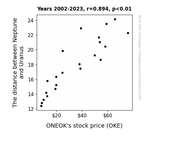
View details about correlation #2,181
Stellar Stock Surprises: Unveiling the Celestial Correlation Between Neptune and Uranus Distance and ONEOK's OKE Stock Price
As the gravitational pull between the two distant planets weakened, it created a ripple effect on Earth's energy fields. This celestial shift somehow boosted the demand for natural gas, ultimately driving up the stock price of ONEOK, a leading natural gas company. It's like the universe whispered, "Buy high, sell solar!"

What else correlates?
The distance between Neptune and Uranus · all planets
ONEOK's stock price (OKE) · all stocks
The distance between Neptune and Uranus · all planets
ONEOK's stock price (OKE) · all stocks


View details about correlation #1,103
Grave Matters: The Afterlife of Tax Examiners and Collectors in Louisiana
It's simple - with fewer tax examiners around, people in Louisiana realized they didn't need to go to such drastic measures to avoid taxes. There's no need to fake your own death when you can just, you know, pay your taxes like a regular non-fake-dead person.


Why this works
- Data dredging: I have 25,237 variables in my database. I compare all these variables against each other to find ones that randomly match up. That's 636,906,169 correlation calculations! This is called “data dredging.”
Fun fact: the chart used on the wikipedia page to demonstrate data dredging is also from me. I've been being naughty with data since 2014.
Instead of starting with a hypothesis and testing it, I instead tossed a bunch of data in a blender to see what correlations would shake out. It’s a dangerous way to go about analysis, because any sufficiently large dataset will yield strong correlations completely at random. - Lack of causal connection: There is probably no direct connection between these variables, despite what the AI says above.
Because these pages are automatically generated, it's possible that the two variables you are viewing are in fact causually related. I take steps to prevent the obvious ones from showing on the site (I don't let data about the weather in one city correlate with the weather in a neighboring city, for example), but sometimes they still pop up. If they are related, cool! You found a loophole.
This is exacerbated by the fact that I used "Years" as the base variable. Lots of things happen in a year that are not related to each other! Most studies would use something like "one person" in stead of "one year" to be the "thing" studied. - Observations not independent: For many variables, sequential years are not independent of each other. You will often see trend-lines form. If a population of people is continuously doing something every day, there is no reason to think they would suddenly change how they are doing that thing on January 1. A naive p-value calculation does not take this into account.
You will calculate a lower chance of "randomly" achieving the result than represents reality.
To be more specific: p-value tests are probability values, where you are calculating the probability of achieving a result at least as extreme as you found completely by chance. When calculating a p-value, you need to assert how many "degrees of freedom" your variable has. I count each year (minus one) as a "degree of freedom," but this is misleading for continuous variables.
This kind of thing can creep up on you pretty easily when using p-values, which is why it's best to take it as "one of many" inputs that help you assess the results of your analysis.
- Y-axes doesn't start at zero: I truncated the Y-axes of the graphs above. I also used a line graph, which makes the visual connection stand out more than it deserves.
Nothing against line graphs. They are great at telling a story when you have linear data! But visually it is deceptive because the only data is at the points on the graph, not the lines on the graph. In between each point, the data could have been doing anything. Like going for a random walk by itself!
Mathematically what I showed is true, but it is intentionally misleading. If you click on any of the charts that abuse this, you can scroll down to see a version that starts at zero. - Confounding variable: Confounding variables (like global pandemics) will cause two variables to look connected when in fact a "sneaky third" variable is influencing both of them behind the scenes.
- Outliers: Some datasets here have outliers which drag up the correlation.
In concept, "outlier" just means "way different than the rest of your dataset." When calculating a correlation like this, they are particularly impactful because a single outlier can substantially increase your correlation.
Because this page is automatically generated, I don't know whether any of the charts displayed on it have outliers. I'm just a footnote. ¯\_(ツ)_/¯
I intentionally mishandeled outliers, which makes the correlation look extra strong. - Low n: There are not many data points included in some of these charts.
You can do analyses with low ns! But you shouldn't data dredge with a low n.
Even if the p-value is high, we should be suspicious of using so few datapoints in a correlation.
Pro-tip: click on any correlation to see:
- Detailed data sources
- Prompts for the AI-generated content
- Explanations of each of the calculations (correlation, p-value)
- Python code to calculate it yourself


