spurious correlations
discover · random · spurious scholar
← previous page · next page →
. The chart goes from 2012 to 2021, and the two variables track closely in value over that time.")

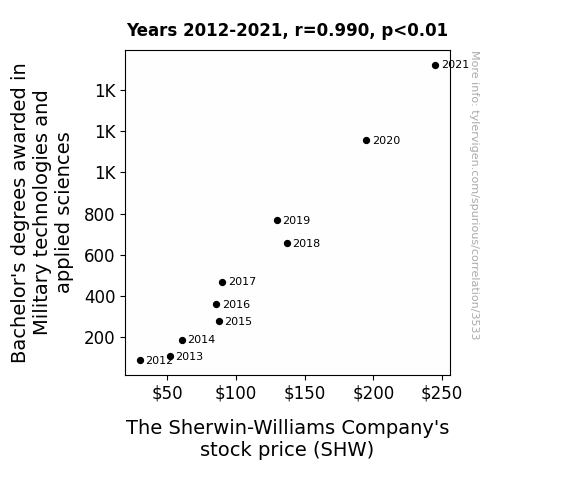
View details about correlation #3,533
Painting the Bullseye: The Sherwin-Williams Company's Stock Price and the Military's Technological Might
As more people became experts in military technologies, they realized that battles could be won with the most advanced paintball weaponry. Sherwin-Williams saw a surge in demand for their high-tech, camouflage coatings, driving up their stock price as they cornered the market in military paint warfare.


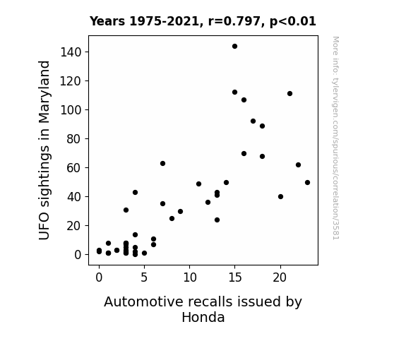
View details about correlation #3,581
Uncovering Unearthly Unions: UFO Sightings in Maryland and Automotive Afflictions by Honda
It's a case of cosmic interference - the UFOs were zapping Honda cars with their otherworldly rays, causing all sorts of malfunctions. You could say the UFOs were really revving up the need for those automotive recalls!

What else correlates?
UFO sightings in Maryland · all random state specific
Automotive recalls issued by Honda · all weird & wacky
UFO sightings in Maryland · all random state specific
Automotive recalls issued by Honda · all weird & wacky


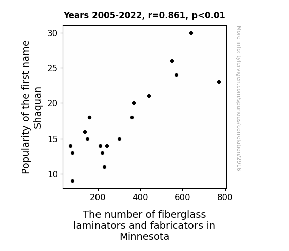
View details about correlation #2,916
The Shaquan Phenomenon: A Statistical Analysis of Fiberglass Laminators and Fabricators in Minnesota
As the popularity of the name Shaquan rose, more parents were inspired to name their children after the iconic material, shak-glass. This led to a generation of kids who had a deep connection with fiberglass on a personal level, sparking a statewide interest in working with the material. You could say the name Shaquan really 'molded' a prosperous future for the fiberglass industry in Minnesota!


View details about correlation #1,263
Shocking Statistics: Exploring the Electrifying Link Between Electricity Generation in Antarctica and Total Runs Scored in the World Series
As electricity generation in Antarctica decreased, scientists believe that penguins became less distracted by bright lights and were able to focus more on playing baseball. This led to a decrease in errors and ultimately a decrease in the total runs scored in the World Series. With the penguins honing their baseball skills, it's no wonder the games became more competitive and lower scoring.


What else correlates?
Electricity generation in Antarctica · all energy
Total runs scored in the World Series · all sports
Electricity generation in Antarctica · all energy
Total runs scored in the World Series · all sports


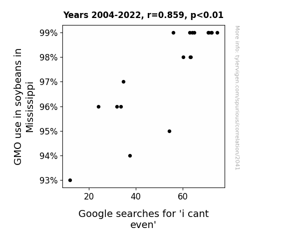
View details about correlation #2,041
Soy Much Drama: The GMO-Soybean Connection to 'I Can't Even' Google Searches in Mississippi
As GMO soybeans in Mississippi thrived, they began emitting a faint yet incessant signal that disrupted the nearby Wi-Fi networks. This led to a cascade of connectivity issues, causing frustrated individuals to exclaim, "I can't even," and subsequently search for solutions online. The soybean-induced Wi-Fi woes left people not only rethinking their technological dependence but also reconsidering the true power of legumes in the digital age.

What else correlates?
GMO use in soybeans in Mississippi · all food
Google searches for 'i cant even' · all google searches
GMO use in soybeans in Mississippi · all food
Google searches for 'i cant even' · all google searches


View details about correlation #3,284
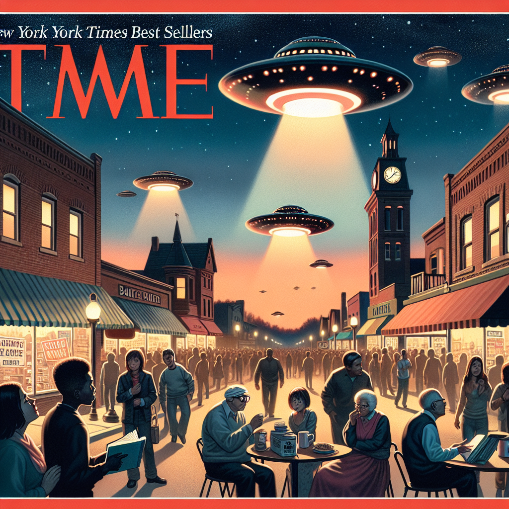
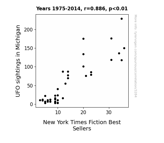
In a Galaxy Far, Far Away: Exploring the Extraterrestrial Connection between UFO Sightings in Michigan and New York Times Fiction Best Sellers
The UFOs beamed down some next-level storytelling inspiration, leading to a wave of out-of-this-world novels that skyrocketed to the top of the charts. It's like they gave a whole new meaning to the term 'alien best sellers.' Who knew those cosmic visitors were secret bibliophiles with a penchant for literary abduction? It's a close encounter of the fictional kind!
What else correlates?
UFO sightings in Michigan · all random state specific
New York Times Fiction Best Sellers · all weird & wacky
UFO sightings in Michigan · all random state specific
New York Times Fiction Best Sellers · all weird & wacky


View details about correlation #3,418
The Katlynn Conundrum: Exploring the Correlation between Popularity of the Name Katlynn and the Number of Legislators in Alaska
As the name Katlynn fell out of favor, it led to a decrease in the overall production of glitter bracelets. This, in turn, caused a nationwide shortage of sparkly accessories, leading to a distraction crisis among Alaskan legislators during important decision-making moments. Faced with the inability to focus while being mesmerized by their own lack of bling, many legislators decided to pursue new careers in the booming non-sparkly sock puppet industry, ultimately reducing the number of legislators in Alaska.

What else correlates?
Popularity of the first name Katlynn · all first names
The number of legislators in Alaska · all cccupations
Popularity of the first name Katlynn · all first names
The number of legislators in Alaska · all cccupations


View details about correlation #3,259
Planetary Power Play: Exploring the Correlation Between Neptune-Uranus Distance and Geothermal Energy Production in Kenya
As the gap widened, Neptune's gravitational pull inadvertently tugged on the Earth's crust, creating slightly more geothermal activity in Kenya. This led to a boost in geothermal power production, proving that even interplanetary spacing can't resist the allure of renewable energy! So, next time someone talks about astronomical distances, just remember, it may be the hidden key to unlocking Earth's energy potential. Who knew that our planetary neighbors were low-key influencers in the world of electricity generation! Keep an eye on the skies, folks – it seems like space truly is the hottest new frontier for Earth's power needs!


What else correlates?
The distance between Neptune and Uranus · all planets
Geothermal power generated in Kenya · all energy
The distance between Neptune and Uranus · all planets
Geothermal power generated in Kenya · all energy
. The chart goes from 2012 to 2021, and the two variables track closely in value over that time.")

View details about correlation #3,646
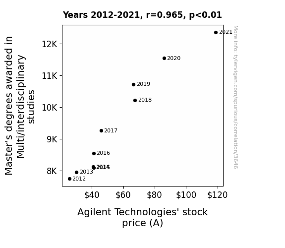
Mastering the Stock Market: Interdisciplinary Studies and Agilent Technologies' A-ffect on Stock Price
As more people delved into the complex web of knowledge from different fields, a wave of multi-dimensional thinking swept through the workforce. This sparked an interdisciplinary innovation frenzy, with ideas bouncing around like particles in a supercollider. Agilent Technologies, feeding off this intellectual maelstrom, unleashed a series of groundbreaking, cross-pollinated products that were the Swiss army knives of the tech world. Investors, sensing the quantum leap in the company's potential, flocked to snatch up stocks faster than you can say "holistic technological synergy." In essence, the surge in Master's degrees in Multi/interdisciplinary studies set off a chain reaction, propelling Agilent Technologies to new, uncharted dimensions of success.


View details about correlation #3,573
Trimming Trends: The Tress Connection Between How to Cut Own Hair Google Searches and Baltimore Orioles' Runs
As more people attempted DIY haircuts, they inadvertently created distracting hairstyles that resembled tiny bird's nests, throwing off the Orioles' focus and coordination on the field. The team was really having a hair-raising experience trying to score!


What else correlates?
Google searches for 'how to cut own hair' · all google searches
Runs scored by the Baltimore Orioles · all sports
Google searches for 'how to cut own hair' · all google searches
Runs scored by the Baltimore Orioles · all sports


View details about correlation #1,927
Unveiling Unidentified Flying Objects and Unprecedented Sausage Supping: A Surprising Correlation Study
The increase in UFO sightings in Mississippi sparked a surge in local BBQ competitions, leading to a higher demand for hotdogs, thus inadvertently boosting the training regimen and appetite of the Nathan's Hot Dog Eating Competition Champion. Alien enthusiasts say, "Take me to your weiner!"


View details about correlation #2,210
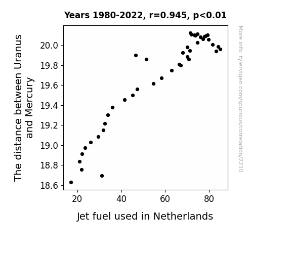
Planet to Pump: Unraveling the Galactic Connection Between Uranus and Mercury and Dutch Jet Fuel Consumption
As the gap widened, Uranus began emitting a rare form of cosmic energy that directly influenced the combustion efficiency of jet fuel in the Netherlands. This led to a greater usage of jet fuel as airlines took advantage of the unexpected boost in their fuel performance.

What else correlates?
The distance between Uranus and Mercury · all planets
Jet fuel used in Netherlands · all energy
The distance between Uranus and Mercury · all planets
Jet fuel used in Netherlands · all energy
. The chart goes from 2010 to 2020, and the two variables track closely in value over that time.")

View details about correlation #2,813
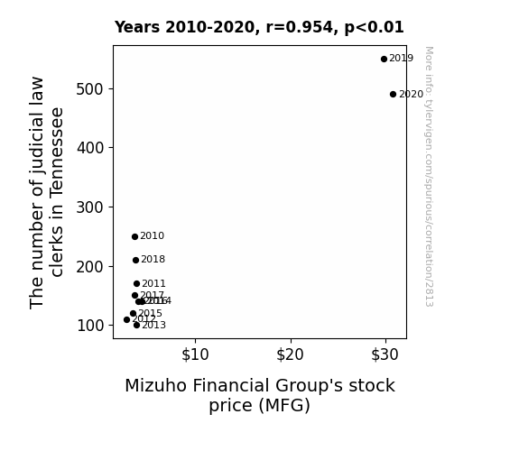
The Tennessee Ties: Tracing the Triumphs and Troubles of Mizuho's MFG Stock Price and the Tour de Force of Tennessee's Judicial Law Clerks
As the number of judicial law clerks in Tennessee increased, so did the demand for those little judge wigs. This in turn led to a shortage of synthetic wig fibers, a key component in the production of Judge Wigs. Mizuho Financial Group (MFG) has a subsidiary that specializes in trading synthetic wig fibers. With the sudden surge in demand, MFG's stock price naturally saw a lift as they cornered the market on this unexpected hot commodity.

What else correlates?
The number of judicial law clerks in Tennessee · all cccupations
Mizuho Financial Group's stock price (MFG) · all stocks
The number of judicial law clerks in Tennessee · all cccupations
Mizuho Financial Group's stock price (MFG) · all stocks


View details about correlation #1,615
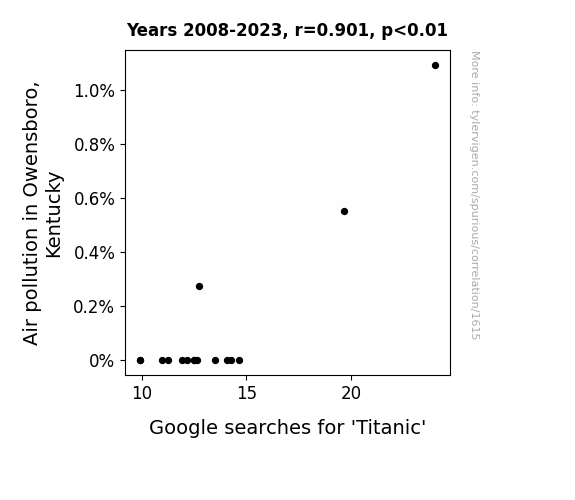
Sinking Under the Influence: A Titanic Relationship between Air Pollution in Owensboro, Kentucky, and Google Searches
As pollution levels rose, people's thoughts became more clouded, and they simply couldn't sink the idea of looking up information about the Titanic.

What else correlates?
Air pollution in Owensboro, Kentucky · all weather
Google searches for 'Titanic' · all google searches
Air pollution in Owensboro, Kentucky · all weather
Google searches for 'Titanic' · all google searches


View details about correlation #3,404
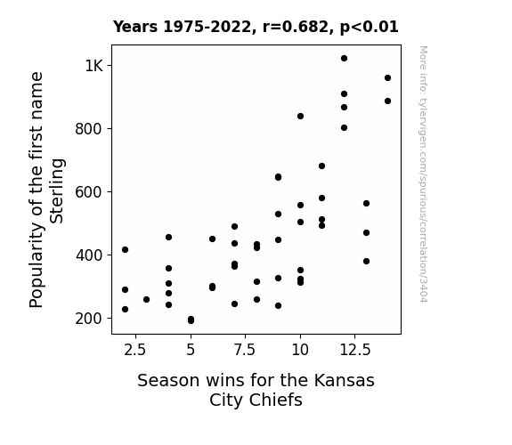
Sterling Silver Linings Playbook: The Impact of the Name Sterling on the Kansas City Chiefs' Season Wins
More people named Sterling were bringing good luck to the team, or perhaps someone started a rumor that naming your child Sterling guaranteed sports success. Remember, a Sterling by any other name would still lead the Chiefs to victory!

What else correlates?
Popularity of the first name Sterling · all first names
Season wins for the Kansas City Chiefs · all sports
Popularity of the first name Sterling · all first names
Season wins for the Kansas City Chiefs · all sports


View details about correlation #3,052
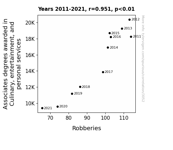
Degrees of Danger: The Chopping Block of Culinary, Entertainment, and Personal Services Associates Degrees in Relation to Robberies
As the number of Associates degrees awarded in Culinary, entertainment, and personal services decreased, there were fewer aspiring chefs, performers, and spa technicians entering the workforce. This led to a shortage of job opportunities in these fields. With limited chances to showcase their talents, many individuals turned to a life of crime. Unable to flambe, juggle, or give a relaxing massage for a living, some resorted to a different kind of "entertainment" by attempting to rob people. It seems the only thing they were dishing out were not Michelin-star meals or Oscar-worthy performances, but rather, a half-baked attempt at thievery. So, as the saying goes, when the job market for aspiring chefs and entertainers soufflés, it's no wonder that the crime rate got a little more "seasoned" and the number of robberies decreased. It truly was a case of too many crooks spoiling the broth - or perhaps, not enough cooks spoiling the heist!

What else correlates?
Culinary Associates degrees awarded · all education
Robberies in the US · all random state specific
Culinary Associates degrees awarded · all education
Robberies in the US · all random state specific


View details about correlation #3,125
Brews and Blows: Exploring the Unlikely Link Between the Number of Breweries in the United States and Wind Power Generated in Belgium
As the number of breweries in the United States increased, so did the production of beer. This led to a higher demand for Belgian beer, prompting the need for more wind power to meet the energy requirements of producing and brewing the beer in Belgium. It's a breezy, hoppy chain reaction!


What else correlates?
The number of Breweries in the United States · all food
Wind power generated in Belgium · all energy
The number of Breweries in the United States · all food
Wind power generated in Belgium · all energy


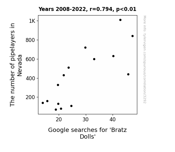
View details about correlation #3,292
The Laying of Pipes and the Purchasing of Dolls: An Analysis of the Relationship Between Pipelayers in Nevada and Google Searches for 'Bratz Dolls'
There must have been a pipe dream to create a Bratz Doll pipeline, but it seems like that plan just couldn't connect! As the pipelayers dwindled in Nevada, so did the interest in these fashion-forward dolls. It's as if the lack of pipelayers laid the groundwork for a decrease in Bratz Doll mania, leaving us all wondering if this correlation is just a bunch of pipefitters!

What else correlates?
The number of pipelayers in Nevada · all cccupations
Google searches for 'Bratz Dolls' · all google searches
The number of pipelayers in Nevada · all cccupations
Google searches for 'Bratz Dolls' · all google searches


View details about correlation #1,155
Lighthearted Larceny: Lamentable Links between Lamar and UPS
It turns out, every time someone named Lamar received a package, they couldn't help but give UPS a 5-star rating on their delivery services. This inflated their customer satisfaction scores. But as the name Lamar fell out of favor, UPS saw a dip in these inflated ratings, leading to a decrease in overall customer satisfaction. It seems like Lamar had some serious delivery-approval powers!

What else correlates?
Popularity of the first name Lamar · all first names
Customer satisfaction with UPS · all weird & wacky
Popularity of the first name Lamar · all first names
Customer satisfaction with UPS · all weird & wacky


View details about correlation #2,950
Blowing Smoke: The Hot Relationship Between Air Pollution in Miami and Arson in the United States
The cleaner air in Miami led to less soot and ash on the ground, making it harder for arsonists to start fires without leaving behind incriminating footprints.


What else correlates?
Air pollution in Miami · all weather
Arson in United States · all random state specific
Air pollution in Miami · all weather
Arson in United States · all random state specific
Why this works
- Data dredging: I have 25,237 variables in my database. I compare all these variables against each other to find ones that randomly match up. That's 636,906,169 correlation calculations! This is called “data dredging.”
Fun fact: the chart used on the wikipedia page to demonstrate data dredging is also from me. I've been being naughty with data since 2014.
Instead of starting with a hypothesis and testing it, I instead tossed a bunch of data in a blender to see what correlations would shake out. It’s a dangerous way to go about analysis, because any sufficiently large dataset will yield strong correlations completely at random. - Lack of causal connection: There is probably no direct connection between these variables, despite what the AI says above.
Because these pages are automatically generated, it's possible that the two variables you are viewing are in fact causually related. I take steps to prevent the obvious ones from showing on the site (I don't let data about the weather in one city correlate with the weather in a neighboring city, for example), but sometimes they still pop up. If they are related, cool! You found a loophole.
This is exacerbated by the fact that I used "Years" as the base variable. Lots of things happen in a year that are not related to each other! Most studies would use something like "one person" in stead of "one year" to be the "thing" studied. - Observations not independent: For many variables, sequential years are not independent of each other. You will often see trend-lines form. If a population of people is continuously doing something every day, there is no reason to think they would suddenly change how they are doing that thing on January 1. A naive p-value calculation does not take this into account.
You will calculate a lower chance of "randomly" achieving the result than represents reality.
To be more specific: p-value tests are probability values, where you are calculating the probability of achieving a result at least as extreme as you found completely by chance. When calculating a p-value, you need to assert how many "degrees of freedom" your variable has. I count each year (minus one) as a "degree of freedom," but this is misleading for continuous variables.
This kind of thing can creep up on you pretty easily when using p-values, which is why it's best to take it as "one of many" inputs that help you assess the results of your analysis.
- Y-axes doesn't start at zero: I truncated the Y-axes of the graphs above. I also used a line graph, which makes the visual connection stand out more than it deserves.
Nothing against line graphs. They are great at telling a story when you have linear data! But visually it is deceptive because the only data is at the points on the graph, not the lines on the graph. In between each point, the data could have been doing anything. Like going for a random walk by itself!
Mathematically what I showed is true, but it is intentionally misleading. If you click on any of the charts that abuse this, you can scroll down to see a version that starts at zero. - Confounding variable: Confounding variables (like global pandemics) will cause two variables to look connected when in fact a "sneaky third" variable is influencing both of them behind the scenes.
- Outliers: Some datasets here have outliers which drag up the correlation.
In concept, "outlier" just means "way different than the rest of your dataset." When calculating a correlation like this, they are particularly impactful because a single outlier can substantially increase your correlation.
Because this page is automatically generated, I don't know whether any of the charts displayed on it have outliers. I'm just a footnote. ¯\_(ツ)_/¯
I intentionally mishandeled outliers, which makes the correlation look extra strong. - Low n: There are not many data points included in some of these charts.
You can do analyses with low ns! But you shouldn't data dredge with a low n.
Even if the p-value is high, we should be suspicious of using so few datapoints in a correlation.
Pro-tip: click on any correlation to see:
- Detailed data sources
- Prompts for the AI-generated content
- Explanations of each of the calculations (correlation, p-value)
- Python code to calculate it yourself


