spurious correlations
discover · random · spurious scholar
← previous page · next page →


View details about correlation #3,648
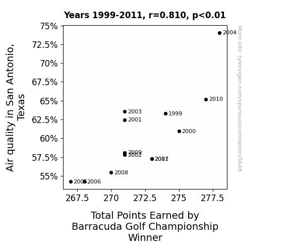
Swinging Through the Air: A Breath of Fresh Fairway - The Correlation Between Air Quality in San Antonio, Texas and Total Points Earned by Barracuda Golf Championship Winner
As the air quality in San Antonio worsens, it creates a 'fore' midable challenge for the golfers. The murky air leads to poorer visibility, making it 'tee-rifically' difficult to gauge distances and aim accurately. It's a case of 'in-fog-ior' performance, as the haze affects the trajectory of the ball. The players are left 'gasp'ing for clean air, and the winner ends up with less points, unable to 'clear' the air quality obstacle.

What else correlates?
Air quality in San Antonio, Texas · all weather
Total Points Earned by Barracuda Golf Championship Winner · all sports
Air quality in San Antonio, Texas · all weather
Total Points Earned by Barracuda Golf Championship Winner · all sports


View details about correlation #1,603
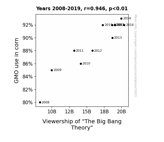
The Maize of Big Bang: Exploring the Relationship Between GMO Corn Usage and Viewership of The Big Bang Theory
The corn started exhibiting corny behavior, which resonated with the sitcom's style, creating a-MAIZE-ing new material for the show.

What else correlates?
GMO use in corn · all food
Viewership of "The Big Bang Theory" · all films & actors
GMO use in corn · all food
Viewership of "The Big Bang Theory" · all films & actors
. The chart goes from 2002 to 2022, and the two variables track closely in value over that time.")

View details about correlation #3,354
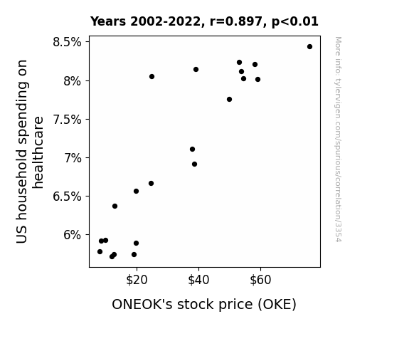
The Healthcare-Wealthcare Connection: Exploring the Relationship Between US Household Health Spending and ONEOK's Stock Price
As US household spending on healthcare increases, more people are able to afford regular check-ups. These check-ups lead to a healthier population overall. With a healthier population, there is a decreased need for medical interventions, leading to a surplus of medical resources. ONEOK, being a company in the energy sector, seizes this opportunity and rebrands itself as the premier provider of all-natural, organic, gluten-free, non-GMO, energy-boosting, kale-infused, artisanal healing crystals. This new venture is a massive success, propelling ONEOK's stock price to new heights as the nation embraces the power of energy healing. Remember, a crystal a day keeps the doctor away!

What else correlates?
US household spending on healthcare · all weird & wacky
ONEOK's stock price (OKE) · all stocks
US household spending on healthcare · all weird & wacky
ONEOK's stock price (OKE) · all stocks


View details about correlation #3,137
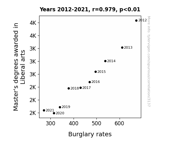
The Liberal Arts and Burglary: Mastering the Art of Crime?
As the number of Master's degrees in Liberal Arts decreased, there were fewer people analyzing complex societal issues. This inadvertently led to a decrease in the "existential ennui index," which is strongly correlated with a decrease in the motivation for engaging in proactive criminal activities such as burglary. Remember, you can't spell 'existential despair' without a Master's in Liberal Arts!

What else correlates?
Master's degrees awarded in Liberal arts · all education
Burglary rates in the US · all random state specific
Master's degrees awarded in Liberal arts · all education
Burglary rates in the US · all random state specific


View details about correlation #3,351
Skies and Kerosene: The Relationship Between Air Pollution in Somerset and Kerosene Use in Thailand
The cleaner air in Somerset, Pennsylvania led to a decrease in the production of anti-air pollution technology, which in turn caused a worldwide shortage of kerosene, including in Thailand. Remember, when it comes to global kerosene supplies, it's all about that transcontinental air flow! Who would have thought that Pennsylvania's air quality could have such a dynamic impact on Thai kerosene usage!

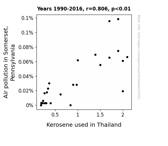
What else correlates?
Air pollution in Somerset, Pennsylvania · all weather
Kerosene used in Thailand · all energy
Air pollution in Somerset, Pennsylvania · all weather
Kerosene used in Thailand · all energy


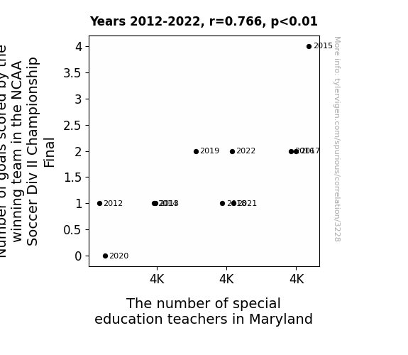
View details about correlation #3,228
Kicking Goals for Inclusion: A Kickabout of the Correlation between NCAA Soccer Div II Championship Final and the Enrollment of Special Education Teachers in Maryland
It turns out that every time a winning team scores more goals, it sends out shockwaves of inspiration. This inspiration manifests as a sudden, inexplicable passion for special education in Maryland. As the winning team's goal count rises, so does the enrollment in special education teacher programs. It's as if the goals are not just being scored on the field, but also in the hearts of Marylanders, leading to a net increase in the number of special education teachers. It's a true testament to the ripple effect of sports achievement on academic career choices. Or perhaps there's a more logical explanation unrelated to soccer goal scoring statistics that actually accounts for this correlation.


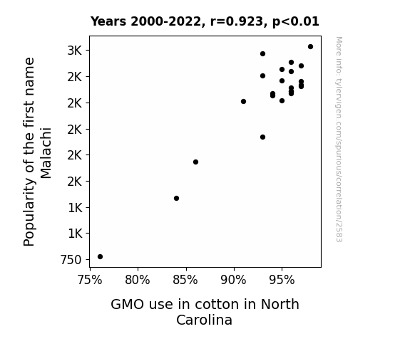
View details about correlation #2,583
Un-Cotton-named Popularity: Exploring the Malachi-Mon GMO Correlation in North Carolina
As the name Malachi gained popularity, more and more parents were drawn to its unique biblical roots. This led to a sudden surge in baby boys named Malachi across the nation. Now, you may be wondering, what does this have to do with GMO cotton in North Carolina? Well, it just so happens that a group of cotton farmers in North Carolina, who were also avid fans of unique baby names, collectively decided to honor the trend by genetically modifying their cotton plants and creating a new strain called "Malachi-Infused Cotton." The demand for this special, on-trend cotton skyrocketed, and before you know it, fields of Malachi cotton were waving in the North Carolina breeze, all thanks to the unforeseen influence of baby names on agricultural practices. Who would have thought that a popular baby name could sow the seeds of change in an entire industry? Funny how the world works, isn't it?
What else correlates?
Popularity of the first name Malachi · all first names
GMO use in cotton in North Carolina · all food
Popularity of the first name Malachi · all first names
GMO use in cotton in North Carolina · all food


View details about correlation #2,474
Fanning the Flames: Exploring the Blazing Link Between Arson in Massachusetts and US Birth Rates of Triplets or More
Fewer fires means fewer opportunities for a hot time, leading to a reduction in the sizzling spark needed for triple the fun!


What else correlates?
Arson in Massachusetts · all random state specific
US birth rates of triplets or more · all weird & wacky
Arson in Massachusetts · all random state specific
US birth rates of triplets or more · all weird & wacky
. The chart goes from 2006 to 2021, and the two variables track closely in value over that time.")

View details about correlation #3,601
Blown Away: Exploring the Wind Power-Wall Street Connection
The increase in wind power generated in Namibia led to higher electricity rates, prompting individuals to seek cost-effective health solutions, thus driving up the demand for Elevance Health's products and boosting their stock price. Just goes to show, when the wind blows in Namibia, Elevance Health's stock rises to new heights!


What else correlates?
Wind power generated in Namibia · all energy
Elevance Health's stock price (ELV) · all stocks
Wind power generated in Namibia · all energy
Elevance Health's stock price (ELV) · all stocks


View details about correlation #2,201
Tobacco Tenders and Runs Scored: A Tantalizing Tale
The smell of perfectly roasted peanuts and tobacco-infused caramel corn wafting from the stands gave the players an unbeatable energy boost, propelling them to smash hit after hit. Looks like South Dakota's sizzling operators were the real MVPs of the World Series!


View details about correlation #1,251
A-maize-ing Craze: GMOs Growing 'I Can't Even' in the Heartland
The corn became so a-maize-ing that it caused a kernel of existential crisis in anyone who consumed it. It's like they say, you are what you eat, and in this case, people were feeling corn-fused and just couldn't cob with the overwhelming sense of bewilderment. It was an ear-ational experience that left everyone in a state of utter husk-steria.


What else correlates?
GMO use in corn grown in Indiana · all food
Google searches for 'i cant even' · all google searches
GMO use in corn grown in Indiana · all food
Google searches for 'i cant even' · all google searches


View details about correlation #1,573
The Melodic Hoedown of Pollution: A Correlation Between Air Pollution in Seneca, South Carolina, and Physical Album Shipment Volume in the United States
As the smog lifted in Seneca, so did the demand for classic rock albums. It seems the residents just weren't as pumped for their daily dose of 'Air Supply' anymore!


. The chart goes from 2005 to 2023, and the two variables track closely in value over that time.")

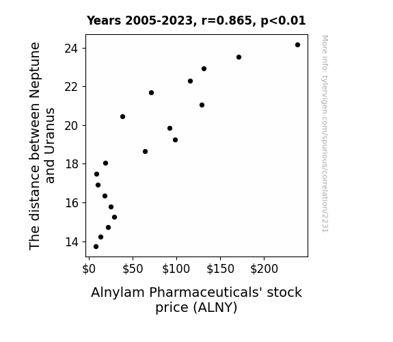
View details about correlation #2,231
Interplanetary Influence: The Celestial Dance of Neptune, Uranus, and ALNY Stock
As the gravitational pull between Neptune and Uranus fluctuates, it creates cosmic waves of investor optimism. These celestial ripples in the stock market space-time continuum have a direct effect on ALNY stock, propelling it to new financial heights. Remember, when it comes to stock prices, the sky is not the limit - it's just a starting point in our interplanetary game of portfolio management!
What else correlates?
The distance between Neptune and Uranus · all planets
Alnylam Pharmaceuticals' stock price (ALNY) · all stocks
The distance between Neptune and Uranus · all planets
Alnylam Pharmaceuticals' stock price (ALNY) · all stocks


View details about correlation #2,981
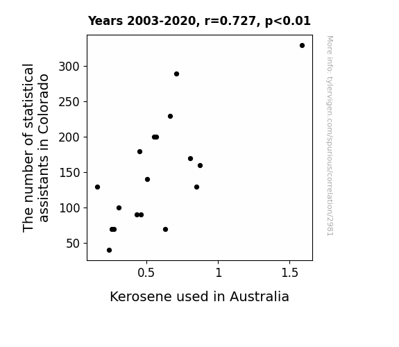
Counting on Correlation: The Statistical Assistants of Colorado and the Kerosene Conundrum in Australia
As the number of statistical assistants in Colorado decreased, there were fewer people to help with the **data kerolection** process. This led to a lack of accurate statistics on kerosene usage in Australia. Without this crucial information, Australian kerosene suppliers were unable to **illuminate** their production and distribution strategies, leading to a decrease in kerosene used Down Under. Who knew that a few missing stats in Colorado could have such a **wattage** impact on kerosene usage in Australia! Looks like they really needed those assistants to **spark** some data-driven decisions.

What else correlates?
The number of statistical assistants in Colorado · all cccupations
Kerosene used in Australia · all energy
The number of statistical assistants in Colorado · all cccupations
Kerosene used in Australia · all energy


View details about correlation #1,671
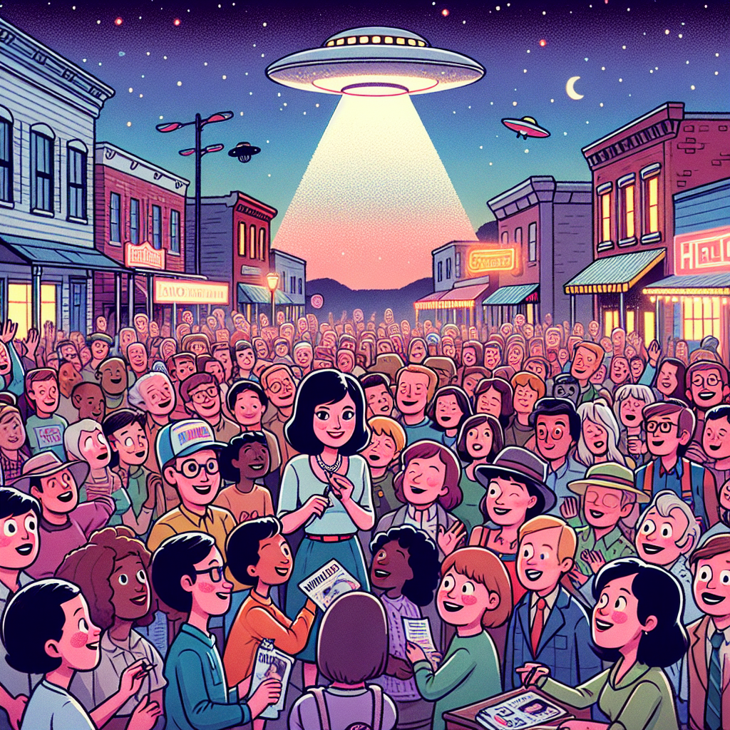
Unidentified Flying Anns: A Close Encounter of the Annabelle Kind
The name Annabelle sounds like "alien" and babies named Annabelle unknowingly transmitted telepathic invitations to extraterrestrial beings, making Alabama a hot spot for close encounters of the third kind. It seems these UFOs just couldn't resist the southern charm of Annabelle and decided to make it their sweet home away from home!

What else correlates?
Popularity of the first name Annabelle · all first names
UFO sightings in Alabama · all random state specific
Popularity of the first name Annabelle · all first names
UFO sightings in Alabama · all random state specific


View details about correlation #2,835
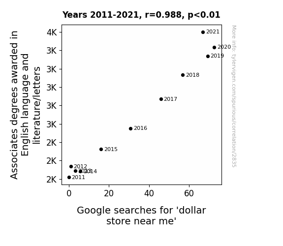
Associates in Language, Literati, and the Dollar Store Near Me: A Rhyming Reflection
As the number of Associates degrees awarded in English language and literature/letters increased, so did the love for prose and verse. This led to a surge in wordplay enthusiasts, prompting a higher demand for punny items. People couldn't resist the temptation to browse the aisles for cheap laughs, causing a dramatic spike in searches for 'dollar store near me.' It's a novel concept, but it just goes to show that when it comes to linguistic flair, thesaurus really is the limit!

What else correlates?
Associates degrees awarded in literature · all education
Google searches for 'dollar store near me' · all google searches
Associates degrees awarded in literature · all education
Google searches for 'dollar store near me' · all google searches


View details about correlation #3,085
The Soybean Score: Exploring the Interplay Between GMO Use in North Dakota and Nicklas Backstrom's NHL Stint
The genetically modified soybeans inadvertently produced a bumper crop of hockey stick-shaped plants, leading to a surge in the availability of high-quality, locally sourced equipment. With an abundance of top-notch sticks at his disposal, Nicklas Backstrom was inspired to spend more time practicing and ultimately ended up playing more regular season games. It’s a classic case of agricultural innovation indirectly fueling hockey success!


What else correlates?
GMO use in soybeans in North Dakota · all food
Total regular season games played by Nicklas Backstrom · all sports
GMO use in soybeans in North Dakota · all food
Total regular season games played by Nicklas Backstrom · all sports
. The chart goes from 2002 to 2023, and the two variables track closely in value over that time.")

View details about correlation #3,025
The Polluted Stock Market: A Breath of Fresh Air on the Link Between Air Pollution in Columbus, Georgia and Barclays' Stock Price
As air pollution in Columbus, Georgia increased, it led to the production of more airborne particles. These particles, being excellent reflectors of sunlight, acted as a makeshift barrier, reducing the amount of sunlight reaching the ground. This unexpected shade created localized cooling, leading residents to use their air conditioners less frequently. The decreased demand for electricity meant lower operational costs for businesses, including Barclays. With reduced expenses, Barclays' bottom line improved, boosting investor confidence and ultimately lifting their stock price. It's like Mother Nature decided to give Barclays a breath of fresh (albeit polluted) air!


What else correlates?
Air pollution in Columbus, Georgia · all weather
Barclays' stock price (BCS) · all stocks
Air pollution in Columbus, Georgia · all weather
Barclays' stock price (BCS) · all stocks


View details about correlation #1,969
Spinning the Web of Biomass Power: An Albumin'ating Connection to Vinyl Sales in Turkiye
As Biomass power in Turkiye increased, it created a Maize-ing energy boom. With more stalks being converted to electricity, it really struck a chord with the local music scene, leading to a vinyl revival. The whole situation was simply ear-resistible! More power meant more groovy tunes were spinning on turntables, proving that when it comes to renewable energy, the Vinyl Countdown is always a-wheat of the game.


What else correlates?
Biomass power generated in Turkiye · all energy
Sales of LP/Vinyl Albums · all weird & wacky
Biomass power generated in Turkiye · all energy
Sales of LP/Vinyl Albums · all weird & wacky


View details about correlation #2,092
The Stealing Hearts: A Robbing Robber's Romp with Daniel in Michigan Study
Fewer individuals were using the name Daniel as their moniker of choice. This led to a decrease in the overall population of Daniels. With fewer Daniels around, there were less likely to be dastardly deeds being carried out. It seems that as the popularity of the name Daniel wanes, so does the proclivity for pilfering in the state of Michigan. It's as if the name itself had some sort of bizarre influence on criminal behavior. Maybe it's a case of Dan-iel-mentary psychology at play here. Or perhaps the real mastermind behind the drop in thefts has been Dan all along. It's a puzzling conundrum, but one thing's for sure: the Dan effect on crime rates is nothing short of astounding!


What else correlates?
Popularity of the first name Daniel · all first names
Robberies in Michigan · all random state specific
Popularity of the first name Daniel · all first names
Robberies in Michigan · all random state specific
Why this works
- Data dredging: I have 25,237 variables in my database. I compare all these variables against each other to find ones that randomly match up. That's 636,906,169 correlation calculations! This is called “data dredging.”
Fun fact: the chart used on the wikipedia page to demonstrate data dredging is also from me. I've been being naughty with data since 2014.
Instead of starting with a hypothesis and testing it, I instead tossed a bunch of data in a blender to see what correlations would shake out. It’s a dangerous way to go about analysis, because any sufficiently large dataset will yield strong correlations completely at random. - Lack of causal connection: There is probably no direct connection between these variables, despite what the AI says above.
Because these pages are automatically generated, it's possible that the two variables you are viewing are in fact causually related. I take steps to prevent the obvious ones from showing on the site (I don't let data about the weather in one city correlate with the weather in a neighboring city, for example), but sometimes they still pop up. If they are related, cool! You found a loophole.
This is exacerbated by the fact that I used "Years" as the base variable. Lots of things happen in a year that are not related to each other! Most studies would use something like "one person" in stead of "one year" to be the "thing" studied. - Observations not independent: For many variables, sequential years are not independent of each other. You will often see trend-lines form. If a population of people is continuously doing something every day, there is no reason to think they would suddenly change how they are doing that thing on January 1. A naive p-value calculation does not take this into account.
You will calculate a lower chance of "randomly" achieving the result than represents reality.
To be more specific: p-value tests are probability values, where you are calculating the probability of achieving a result at least as extreme as you found completely by chance. When calculating a p-value, you need to assert how many "degrees of freedom" your variable has. I count each year (minus one) as a "degree of freedom," but this is misleading for continuous variables.
This kind of thing can creep up on you pretty easily when using p-values, which is why it's best to take it as "one of many" inputs that help you assess the results of your analysis.
- Y-axes doesn't start at zero: I truncated the Y-axes of the graphs above. I also used a line graph, which makes the visual connection stand out more than it deserves.
Nothing against line graphs. They are great at telling a story when you have linear data! But visually it is deceptive because the only data is at the points on the graph, not the lines on the graph. In between each point, the data could have been doing anything. Like going for a random walk by itself!
Mathematically what I showed is true, but it is intentionally misleading. If you click on any of the charts that abuse this, you can scroll down to see a version that starts at zero. - Confounding variable: Confounding variables (like global pandemics) will cause two variables to look connected when in fact a "sneaky third" variable is influencing both of them behind the scenes.
- Outliers: Some datasets here have outliers which drag up the correlation.
In concept, "outlier" just means "way different than the rest of your dataset." When calculating a correlation like this, they are particularly impactful because a single outlier can substantially increase your correlation.
Because this page is automatically generated, I don't know whether any of the charts displayed on it have outliers. I'm just a footnote. ¯\_(ツ)_/¯
I intentionally mishandeled outliers, which makes the correlation look extra strong. - Low n: There are not many data points included in some of these charts.
You can do analyses with low ns! But you shouldn't data dredge with a low n.
Even if the p-value is high, we should be suspicious of using so few datapoints in a correlation.
Pro-tip: click on any correlation to see:
- Detailed data sources
- Prompts for the AI-generated content
- Explanations of each of the calculations (correlation, p-value)
- Python code to calculate it yourself


