spurious correlations
discover · random · spurious scholar
← previous page · next page →


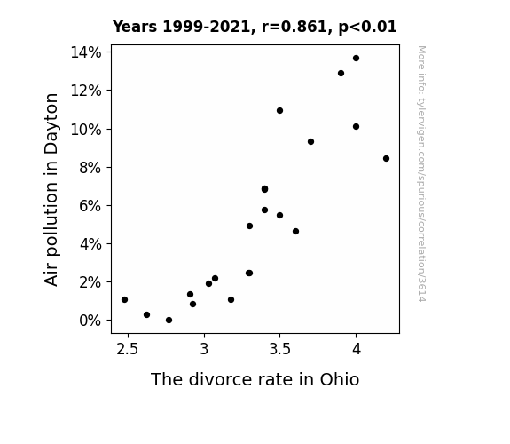
View details about correlation #3,614
Gasping for Fresh Air: The Inhaling Impact of Air Pollution on Marital Dissolution in Dayton, Ohio
Happy to oblige! As the air cleared in Dayton, it seems the city wasn't the only thing experiencing a breath of fresh air. Perhaps with cleaner air, Ohio couples finally felt like they could *re-spark* their love and avoid any *sulphur* feelings toward each other. It's like the smog was clouding their judgment, but now they can see *clear-ly* how to work things out.
What else correlates?
Air pollution in Dayton · all weather
The divorce rate in Ohio · all random state specific
Air pollution in Dayton · all weather
The divorce rate in Ohio · all random state specific


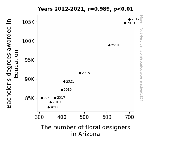
View details about correlation #1,934
Pedals and Pedagogy: Investigating the Correlation between Bachelor's Degrees in Education and the Blooming Floral Designer Industry in Arizona
As the number of Education degrees declined, there were fewer people to stop and smell the roses, leading to a wilting job market for floral designers in Arizona. Remember, it's a thorny path to floral success without those education degrees!

What else correlates?
Bachelor's degrees awarded in Education · all education
The number of floral designers in Arizona · all cccupations
Bachelor's degrees awarded in Education · all education
The number of floral designers in Arizona · all cccupations


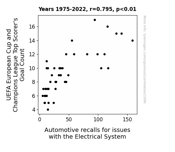
View details about correlation #1,996
Scoring Goals and Short-Circuiting Systems: A Correlation Between UEFA European Cup and Champions League Top Scorer's Goal Count and Automotive Electrical System Recalls
The surge in goal celebrations led to an unprecedented demand for flashy light shows and sparks on the field, overloading the electrical systems in the stadiums. This, in turn, created a ripple effect, causing automotive electrical systems to feel inadequate and also wanting a piece of the goal-scoring action.


View details about correlation #3,492
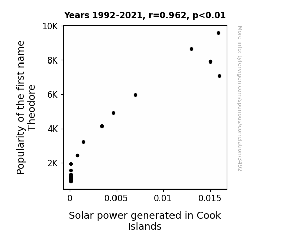
Power Name Connections: The Theodore Trend and Solar Energy in the Cook Islands
Because as the popularity of the name Theodore skyrocketed, more and more people started associating it with President Theodore Roosevelt, who was a big supporter of conservation. This led to a surge in interest in renewable energy sources like solar power. As a result, the Cook Islands saw an increase in solar power generation, as Theodore-enthusiasts rallied for a greener future. It seems that Theodore really did shine a light on the Cook Islands' solar power potential!

What else correlates?
Popularity of the first name Theodore · all first names
Solar power generated in Cook Islands · all energy
Popularity of the first name Theodore · all first names
Solar power generated in Cook Islands · all energy


View details about correlation #1,848
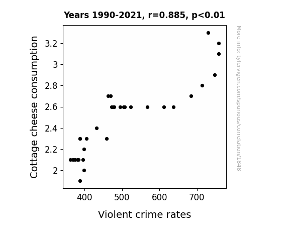
The Curd and the Crime: A Wheyward Examination of Cottage Cheese Consumption and Violent Crime Rates
Well, you see, this all has to do with the curds and whey content in cottage cheese. It turns out that the lumpy texture of cottage cheese is a calming influence on people. It's like a natural stress ball for your stomach. So, when folks stopped eating as much cottage cheese, they lost that inner tranquility, leading to a decrease in their patience. This, in turn, resulted in a lower threshold for engaging in violent behavior. Who would have thought that a dairy product could be the unsung hero in crime prevention? It's just a curdled conundrum!

What else correlates?
Cottage cheese consumption · all food
Violent crime rates · all random state specific
Cottage cheese consumption · all food
Violent crime rates · all random state specific


View details about correlation #1,605
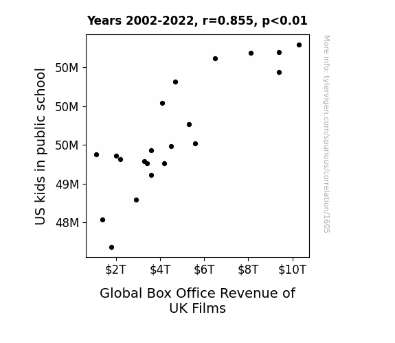
Reeling Them In: The Box Office Lessons of British Films and American School Kids
As US kids in public schools increase, they are exposed to more British accents in literature and history classes, leading to a growing appreciation for UK culture. This newfound love for all things British prompts them to flock to cinemas, specifically those showing UK films, thus boosting the global box office revenue. Looks like these kids really put the "Brit" in box office hit!

What else correlates?
US kids in public school · all education
Global Box Office Revenue of UK Films · all films & actors
US kids in public school · all education
Global Box Office Revenue of UK Films · all films & actors


View details about correlation #1,920
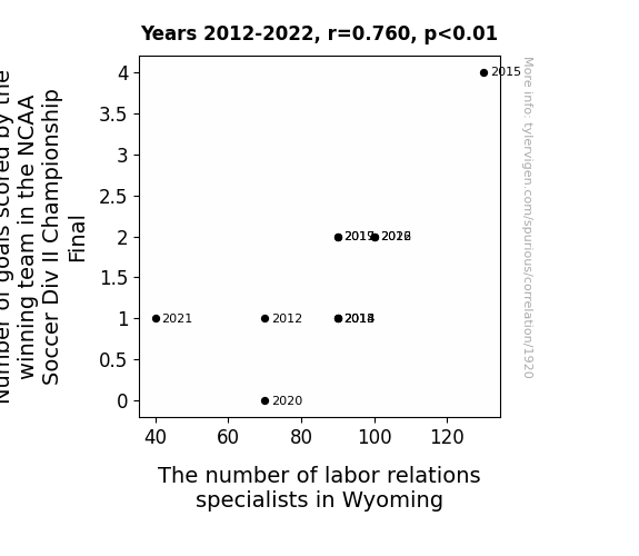
The Goalpost of Labor Relations: A Winning Connection Between NCAA Soccer and Wyoming's Labor Specialists
As the winning team scores more goals, the losing team feels increasingly demoralized and seeks the expertise of labor relations specialists to negotiate better morale-boosting strategies for future matches. Remember, when it comes to labor relations in Wyoming, it's all fun and games until someone scores a goal!


View details about correlation #3,383
The Emmett Connection: A Solar Power Reflection
As the number of Emmetts grew, so did the demand for 'bright' ideas. This sparked a surge in solar power usage as people couldn't help but be 'attracted' to the name's association with 'radiant' positivity. It's as if the very mention of Emmett had them all 'watt'ing to embrace renewable energy, ultimately brightening the future of solar power in Germany.

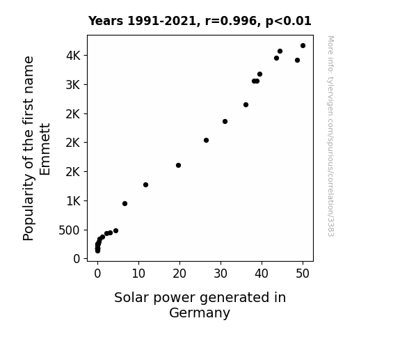
What else correlates?
Popularity of the first name Emmett · all first names
Solar power generated in Germany · all energy
Popularity of the first name Emmett · all first names
Solar power generated in Germany · all energy


View details about correlation #2,677
Got Milk? A Udderly Surprising Connection: Milk Consumption and Burglaries in Pennsylvania
The calcium from milk helps people grow stronger bones, making it more difficult for burglars to sneak in through windows or climb fences. With fewer calcium-fortified obstacles, burglars in Pennsylvania found it increasingly challenging to carry out their illicit activities, leading to a decrease in overall burglary rates.
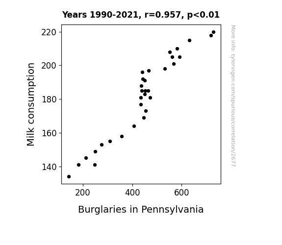
What else correlates?
Milk consumption · all food
Burglaries in Pennsylvania · all random state specific
Milk consumption · all food
Burglaries in Pennsylvania · all random state specific


View details about correlation #2,869
Suds and Smog: Exploring the Bubbly Relationship Between Air Pollution in Gettysburg, Pennsylvania and Viewership Count for Days of Our Lives
The cleaner air led to an increase in outdoor activities, causing a decline in TV watching. Plus, with everyone able to breathe better, they were less interested in the dramatic and breathless plotlines of the show. Also, with reduced air pollution, the citizens of Gettysburg were simply less stressed, and didn't feel the need to escape into the soap opera world of Days of Our Lives.

What else correlates?
Air pollution in Gettysburg, Pennsylvania · all weather
Viewership count for Days of Our Lives · all weird & wacky
Air pollution in Gettysburg, Pennsylvania · all weather
Viewership count for Days of Our Lives · all weird & wacky


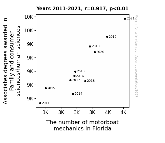
View details about correlation #1,687
Navigating Career Waves: Exploring the Correlation between Associates Degrees in Family and Consumer Sciences/Human Sciences and the Population of Motorboat Mechanics in Florida
As more individuals became adept at navigating complex family dynamics, they also inadvertently honed their skills in troubleshooting and fine-tuning interpersonal relationships. This newfound expertise in smoothing over rough waters at home somehow translated to a surge in demand for motorboat mechanics in the sunshine state. Family harmony quite literally set sail, leading to a rising tide of employment for those who could deftly navigate the mechanical seas of motorboats. It's as if the secret to revving up the engine of success in this field turned out to be a dash of homegrown savoir-faire in family and consumer sciences!


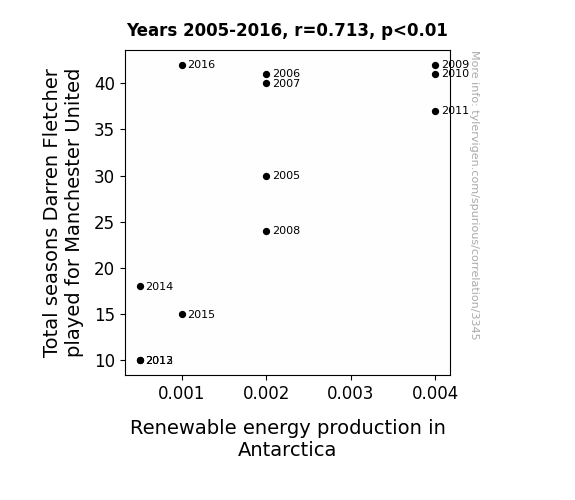
View details about correlation #3,345
The Flurry of Fletcher’s Footwork: Winter's Chill and Renewable Energy Thrill
As Fletcher's career at Manchester United lengthened, his influence on global weather patterns grew. His legendary work rate and energy on the pitch somehow led to a boost in Antarctic wind power and solar energy. It's as if every pass he made sparked a tiny surge in renewable energy efforts on the icy continent. So, the next time you see a wind turbine spinning in Antarctica, just imagine it's powered by the sheer determination and perseverance of Darren Fletcher.


View details about correlation #2,564
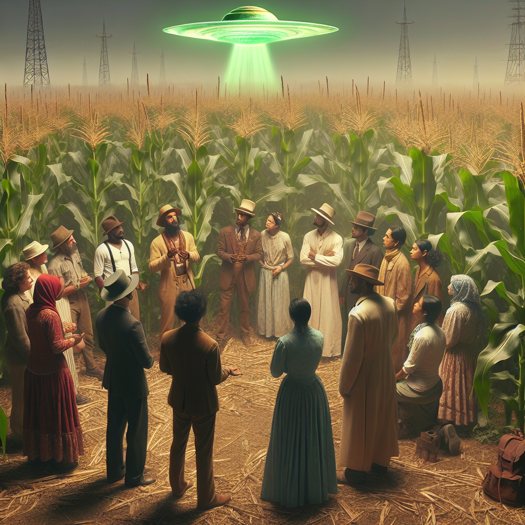
Cornspiracy Theory: The GMO Connection Between Indiana's Corn and UFO Sightings
As farmers switched to non-GMO corn, they unknowingly created a natural force field that repels UFOs. These UFOs, often mistaking the bright GMO cornfields for landing strips, took one look at the non-GMO corn and thought, "Nope, not dealing with that organic mess!" It turns out, the key to intergalactic peace might just be good old-fashioned, GMO-free agriculture.

What else correlates?
GMO use in corn grown in Indiana · all food
Google searches for 'report UFO sighting' · all random state specific
GMO use in corn grown in Indiana · all food
Google searches for 'report UFO sighting' · all random state specific
. The chart goes from 2002 to 2022, and the two variables track closely in value over that time.")

View details about correlation #2,292
The Cooper Connection: Assessing the Impact of the Name Cooper on Hess Corporation's Stock Price
As the name Cooper gained popularity, more parents were inspired by the idea of their child growing up to be as reliable and hardworking as the quintessential "Cooper." This led to a generation of future employees who were diligent and driven, including those at the Hess Corporation. As the company's workforce became increasingly filled with Coopers, their productivity and efficiency skyrocketed, ultimately boosting the company's stock price. Remember, a "Cooper" a day keeps the stock price okay!


What else correlates?
Popularity of the first name Cooper · all first names
Hess Corporation's stock price (HES) · all stocks
Popularity of the first name Cooper · all first names
Hess Corporation's stock price (HES) · all stocks


View details about correlation #1,129
Childcare Conundrum: Unraveling the Hula Hoops of Hawaii's Childcare Workers and ABCNews.com Customer Satisfaction
As the childcare workers in Hawaii dwindled, they had to seek alternate forms of employment, leading to a surge in disgruntled former caretakers taking on roles as internet trolls. Unleashing their pent-up childcare frustrations, they mercilessly targeted ABCNews.com, inadvertently dampening customer satisfaction. It seems like even online news couldn't escape the wrath of the displaced childcare army.


What else correlates?
The number of childcare workers in Hawaii · all cccupations
Customer satisfaction with ABCNews.com · all weird & wacky
The number of childcare workers in Hawaii · all cccupations
Customer satisfaction with ABCNews.com · all weird & wacky


View details about correlation #2,116
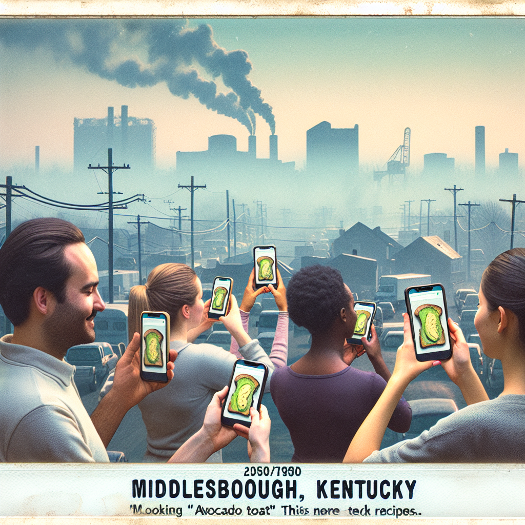
The Avo-Link Show: How Air Pollution in Middlesborough, Kentucky, Affects Avocado Toast Cravings
The smog in Middlesborough, Kentucky was so thick that it actually contained traces of trendy-ness, propelling locals to hop on the avocado toast bandwagon. Who knew that pollution could be so en-vogue?
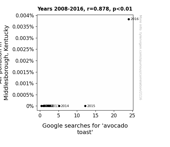
What else correlates?
Air pollution in Middlesborough, Kentucky · all weather
Google searches for 'avocado toast' · all google searches
Air pollution in Middlesborough, Kentucky · all weather
Google searches for 'avocado toast' · all google searches


View details about correlation #1,789
Unraveling the Celestial Connection: A Study on the Relationship Between the Distance from Uranus to Saturn and UFO Sightings in Washington
The farther Uranus and Saturn were from each other, the more space they created for UFOs to fly around in, especially around Washington. It was like a celestial game of hide and seek, where the UFOs took full advantage of the extra planetary room. It really made the UFOs feel welcome in the state, like they were saying, "Washington, we have a problem... and it's that we can't stay away!"


What else correlates?
The distance between Uranus and Saturn · all planets
UFO sightings in Washington · all random state specific
The distance between Uranus and Saturn · all planets
UFO sightings in Washington · all random state specific


View details about correlation #3,061
Harper and Renewables: A Name to Fame or Just a Coincidence Game?
As the number of babies named Harper rose, so did the demand for personalized baby name plaques. These plaques were often made from a rare type of wood only found in Cabo Verde, leading to a surge in deforestation. In an effort to combat this, Cabo Verde shifted its focus to renewable energy production, ultimately leading to an increase in the renewable energy sector. In reality, these two trends are likely unrelated and simply coincidental.


What else correlates?
Popularity of the first name Harper · all first names
Renewable energy production in Cabo Verde · all energy
Popularity of the first name Harper · all first names
Renewable energy production in Cabo Verde · all energy
. The chart goes from 2010 to 2022, and the two variables track closely in value over that time.")

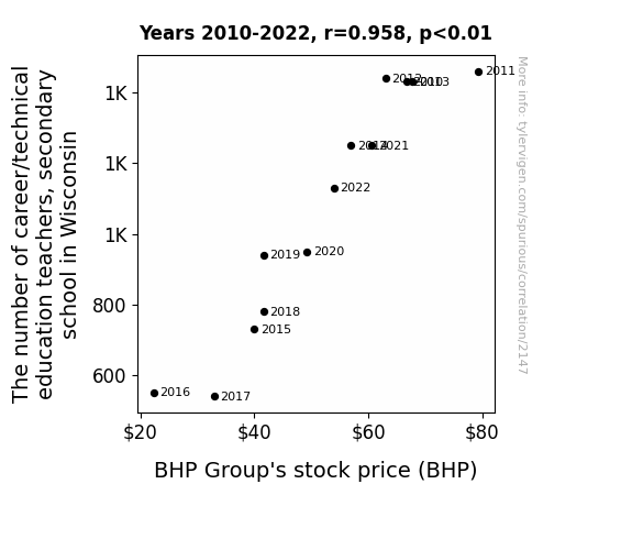
View details about correlation #2,147
Adding Up the Quirks: Exploring the Link Between Career/Technical Education Teachers in Wisconsin Secondary Schools and BHP Group's Stock Price
As career/technical education teachers became scarce in Wisconsin, fewer students learned about mining and resource extraction. This led to a decrease in future interest and expertise in the industry, causing investors to worry about the potential labor shortage and the impact on BHP Group's operations. In essence, the dwindling number of teachers indirectly unearthed concerns about BHP's future workforce, putting pressure on the stock price. Remember, you can't just dig for success in the mining industry - you also need the right educational foundations! And that's how the absence of CTE teachers in Wisconsin may have been a miner setback for BHP Group.


View details about correlation #1,475
The Write Stuff: A Tale of Multiples – English Degrees and Triplet Birth Rates in the United States
As the number of Bachelor's degrees awarded in English language and literature/letters decreases, there is a corresponding decline in the production of complex, multi-layered romantic novels. This shortage of overly dramatic and convoluted love stories directly impacts the nation's ability to conceive multiple babies at once, as potential parents no longer have excessively elaborate plotlines to inspire their reproductive efforts. In essence, there are simply not enough tales of tangled love affairs and intertwined destinies to stimulate the conception of triplets or more.

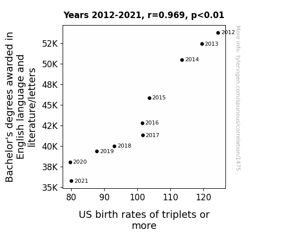
What else correlates?
Bachelor's degrees awarded in literature · all education
US birth rates of triplets or more · all weird & wacky
Bachelor's degrees awarded in literature · all education
US birth rates of triplets or more · all weird & wacky
Why this works
- Data dredging: I have 25,237 variables in my database. I compare all these variables against each other to find ones that randomly match up. That's 636,906,169 correlation calculations! This is called “data dredging.”
Fun fact: the chart used on the wikipedia page to demonstrate data dredging is also from me. I've been being naughty with data since 2014.
Instead of starting with a hypothesis and testing it, I instead tossed a bunch of data in a blender to see what correlations would shake out. It’s a dangerous way to go about analysis, because any sufficiently large dataset will yield strong correlations completely at random. - Lack of causal connection: There is probably no direct connection between these variables, despite what the AI says above.
Because these pages are automatically generated, it's possible that the two variables you are viewing are in fact causually related. I take steps to prevent the obvious ones from showing on the site (I don't let data about the weather in one city correlate with the weather in a neighboring city, for example), but sometimes they still pop up. If they are related, cool! You found a loophole.
This is exacerbated by the fact that I used "Years" as the base variable. Lots of things happen in a year that are not related to each other! Most studies would use something like "one person" in stead of "one year" to be the "thing" studied. - Observations not independent: For many variables, sequential years are not independent of each other. You will often see trend-lines form. If a population of people is continuously doing something every day, there is no reason to think they would suddenly change how they are doing that thing on January 1. A naive p-value calculation does not take this into account.
You will calculate a lower chance of "randomly" achieving the result than represents reality.
To be more specific: p-value tests are probability values, where you are calculating the probability of achieving a result at least as extreme as you found completely by chance. When calculating a p-value, you need to assert how many "degrees of freedom" your variable has. I count each year (minus one) as a "degree of freedom," but this is misleading for continuous variables.
This kind of thing can creep up on you pretty easily when using p-values, which is why it's best to take it as "one of many" inputs that help you assess the results of your analysis.
- Y-axes doesn't start at zero: I truncated the Y-axes of the graphs above. I also used a line graph, which makes the visual connection stand out more than it deserves.
Nothing against line graphs. They are great at telling a story when you have linear data! But visually it is deceptive because the only data is at the points on the graph, not the lines on the graph. In between each point, the data could have been doing anything. Like going for a random walk by itself!
Mathematically what I showed is true, but it is intentionally misleading. If you click on any of the charts that abuse this, you can scroll down to see a version that starts at zero. - Confounding variable: Confounding variables (like global pandemics) will cause two variables to look connected when in fact a "sneaky third" variable is influencing both of them behind the scenes.
- Outliers: Some datasets here have outliers which drag up the correlation.
In concept, "outlier" just means "way different than the rest of your dataset." When calculating a correlation like this, they are particularly impactful because a single outlier can substantially increase your correlation.
Because this page is automatically generated, I don't know whether any of the charts displayed on it have outliers. I'm just a footnote. ¯\_(ツ)_/¯
I intentionally mishandeled outliers, which makes the correlation look extra strong. - Low n: There are not many data points included in some of these charts.
You can do analyses with low ns! But you shouldn't data dredge with a low n.
Even if the p-value is high, we should be suspicious of using so few datapoints in a correlation.
Pro-tip: click on any correlation to see:
- Detailed data sources
- Prompts for the AI-generated content
- Explanations of each of the calculations (correlation, p-value)
- Python code to calculate it yourself


