spurious correlations
discover · random · spurious scholar
← previous page · next page →


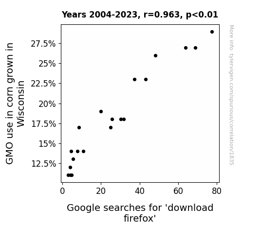
View details about correlation #1,835
The Genetically Modified Mayhem: GMO Corn Growth in Wisconsin and the Google Enigma of 'Download Firefox'
As corn in Wisconsin became more resistant to pests, it started a secret underground campaign to promote internet safety. The corn, being the good digital citizens they are, recognized the importance of secure browsing and encouraged people to switch to Firefox for a more a-maize-ing online experience. So, as the GMO corn thrived, it silently whispered to the farmers, "Keep growing, and let's stalk the web using the foxtail of internet security - Firefox!" This led to a kernel of change in internet behavior, causing a cob-ntastic surge in searches for 'download firefox.'

What else correlates?
GMO use in corn grown in Wisconsin · all food
Google searches for 'download firefox' · all google searches
GMO use in corn grown in Wisconsin · all food
Google searches for 'download firefox' · all google searches


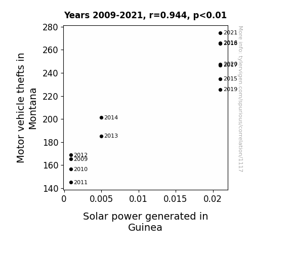
View details about correlation #1,117
Sun-Powered Theft: A Bright Spot in the Correlation Between Motor Vehicle Thefts in Montana and Solar Power Generated in Guinea
As motor vehicle thefts in Montana increased, it led to a shortage of getaway cars. This inadvertently created a demand for alternative modes of transportation, prompting a group of car enthusiasts to promote solar-powered vehicles. Their enthusiasm and advocacy for eco-friendly transportation somehow went viral, capturing the attention of Guinea's energy sector. Inspired by the unexpected endorsement, Guinea decided to invest heavily in solar power, leading to a significant increase in solar power generated. The irony of car thefts indirectly contributing to a greener, solar-powered future was not lost on anyone. And that, my friends, is how a bizarre chain of events led to a shocking yet strangely uplifting correlation between motor vehicle thefts in Montana and the surge in solar power generated in Guinea. Who knew that the path to a brighter, more sustainable world could involve such unexpected twists and turns?

What else correlates?
Motor vehicle thefts in Montana · all random state specific
Solar power generated in Guinea · all energy
Motor vehicle thefts in Montana · all random state specific
Solar power generated in Guinea · all energy
. The chart goes from 2010 to 2020, and the two variables track closely in value over that time.")

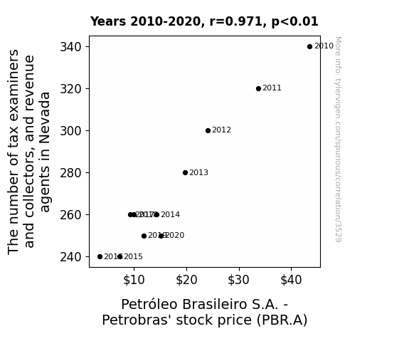
View details about correlation #3,529
Nevada Tax Squad and Petrobras: Oiling the Gears of Stock Prices
Nevada's sudden shortage of tax professionals inadvertently sparked a ripple effect on a global scale. With tax examiners and collectors in short supply, a series of miscalculations occurred, leading to an unusual tax break for a Brazilian novelty car company. This unexpected windfall caused a surge in demand for novelty cars, leading to a shortage of a key component - customized, diamond-encrusted oil filters. As a result, Petrobras' production line ground to a halt, causing a dramatic decrease in stock price. The moral of the story? Even a tiny hiccup in Nevada can leave Petrobras feeling the pressure!


View details about correlation #1,352
Georgina's Gasping: The Correlation between Georgina's Popularity and Gaseous Pollutants in Ithaca
Fewer personalized license plates meant fewer cars on the road proudly displaying "GEORGINA" or "GEEORG" or "GINA1".


What else correlates?
Popularity of the first name Georgina · all first names
Air pollution in Ithaca · all weather
Popularity of the first name Georgina · all first names
Air pollution in Ithaca · all weather


View details about correlation #2,156
Brewed to Perfection: The Hoppy Relationship Between the Number of Breweries in the United States and Google's Net Income
As the number of breweries in the United States increased, so did the demand for hops and barley. This led to higher prices for these key beer ingredients. Farmers who grew hops and barley found themselves with more income, which they then decided to invest. Many of them turned to the stock market and, you guessed it, Google was one of the hot stocks they invested in. This influx of investment in Google caused their net income to soar. It's a brew-tiful example of how a seemingly unrelated industry can have a hopsy-turvy impact on a tech giant's bottom line!

What else correlates?
The number of Breweries in the United States · all food
Google's Net Income · all stocks
The number of Breweries in the United States · all food
Google's Net Income · all stocks


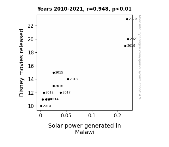
View details about correlation #1,476
Solar Flares and Box Office Wares: A Sunny Connection Between Disney Movies and Solar Power Generation in Malawi
As the number of Disney movies released rose, so did the solar power generated in Malawi. It seems that the Lion King's 'circle of life' resonated with Malawian citizens, inspiring them to 'let it glow, let it glow' and harness the power of the sun. It's as if every new Disney movie acted as a 'powerful' motivator, sparking a 'frozen' tide of enthusiasm for renewable energy. It's a truly 'illu-Mickey-nating' connection that's leaving everyone saying, 'Moana, mo' solar power, mo' problems solved!'

What else correlates?
Disney movies released · all films & actors
Solar power generated in Malawi · all energy
Disney movies released · all films & actors
Solar power generated in Malawi · all energy


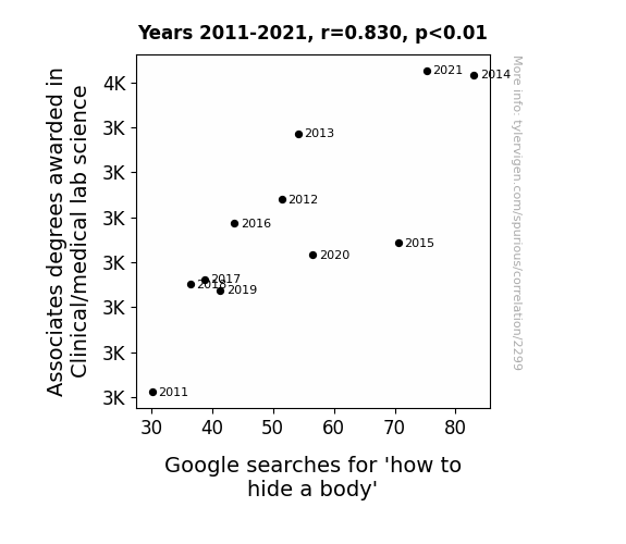
View details about correlation #2,299
The Criminology Confession: Associates Degrees in Clinical/Medical Lab Science and Google Searches for 'How to Hide a Body'
As more people became knowledgeable about clinical and medical lab science, they also became more skilled at preserving and concealing bodies using the latest scientific methods. Additionally, their understanding of anatomy and physiology may have led to more creative and effective ways of hiding a body. Perhaps there's a correlation between knowing how to conduct lab tests and knowing how to cover up the evidence. Or maybe it's just a case of having a 'diploma' in making cadavers disappear!


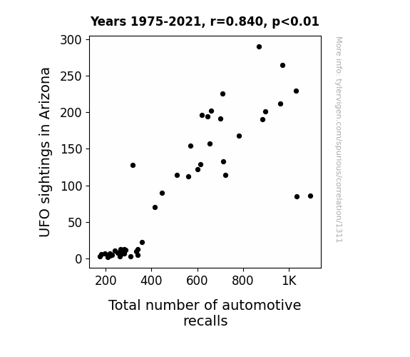
View details about correlation #1,311
UFO Sightings in Arizona: A Cosmic Connection to Total Automotive Recalls Comes to Light
The UFOs were actually extraterrestrial tourists who, being unfamiliar with our traffic laws, were zipping around in their flying saucers and inadvertently causing malfunctions in the cars below with their advanced technology. The sudden influx of UFO activity created a surge in bizarre automotive issues, prompting the need for a higher number of recalls to address these otherworldly malfunctions.
What else correlates?
UFO sightings in Arizona · all random state specific
Total number of automotive recalls · all weird & wacky
UFO sightings in Arizona · all random state specific
Total number of automotive recalls · all weird & wacky
. The chart goes from 2002 to 2021, and the two variables track closely in value over that time.")

View details about correlation #1,272
American Cheese Please: A Cheesy Connection to Disney's Stock Price Squeezy
As American cheese consumption increased, so did the demand for cheese. This led to a surge in dairy profits, causing investors to take a fondue-like interest in dairy stocks. The cheesy boom in the dairy industry sprinkled some magic on the stock market, including The Walt Disney Company (DIS), as investors brie-came more attracted to all things dairy-related. It was a gouda time for Disney's stock price, proving that when it comes to Wall Street, the potential for cheddar really can make it the happiest place on earth!


What else correlates?
American cheese consumption · all food
The Walt Disney Company's stock price (DIS) · all stocks
American cheese consumption · all food
The Walt Disney Company's stock price (DIS) · all stocks


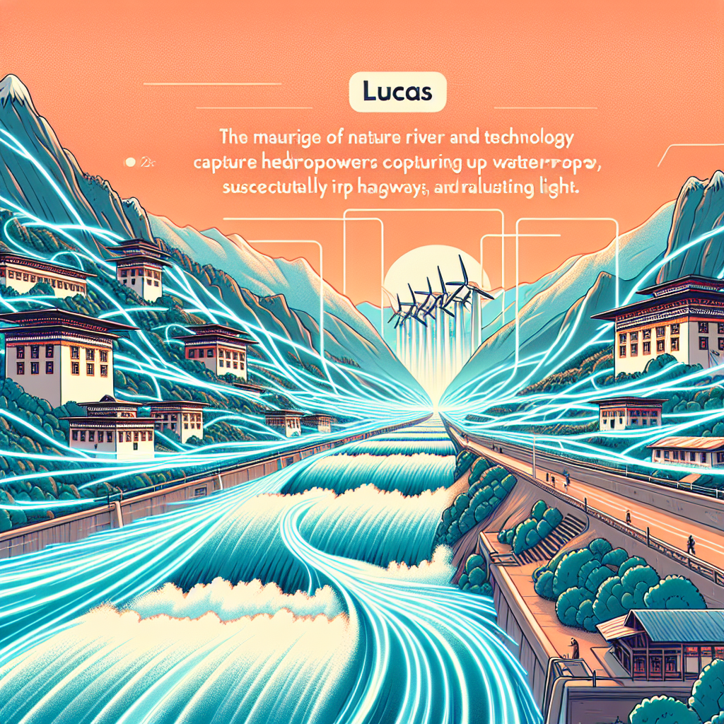
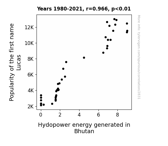
View details about correlation #2,831
Hydropower Hijinks: The Lukewarm Connection Between the Name Lucas and Energy Production in Bhutan
Every time someone named Lucas walked into a room, they exuded such electrifying charm and appeal that the nearby water molecules couldn't help but align themselves accordingly, creating a small but significant surge in hydropower energy. It seems the connection between Lucas and hydro is truly current!
What else correlates?
Popularity of the first name Lucas · all first names
Hydopower energy generated in Bhutan · all energy
Popularity of the first name Lucas · all first names
Hydopower energy generated in Bhutan · all energy


View details about correlation #2,166
Scouting for Silicon Valley: An Analysis of the Link between Sports Personnel and Public Interest in Tech Tycoons
As more coaches and scouts flocked to Puerto Rico, the island's athletic talent skyrocketed. This led to a surge in exceptional athletes, one of whom was a pro rocketeer. As these new sporting sensations gained fame, people couldn't help but wonder, "Who is Elon Musk, and can he throw a touchdown?" It's all about finding the next star... whether on the field or in the cosmos!


View details about correlation #2,436
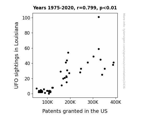
Luminous Louisiana: Linking UFO Sightings and US Patent Grants
The increase in UFO sightings in Louisiana led to a surge in creativity as people's imaginations ran wild, sparking a new wave of innovative ideas. It's as if the UFOs were beaming down inspiration for out-of-this-world inventions!
What else correlates?
UFO sightings in Louisiana · all random state specific
Patents granted in the US · all weird & wacky
UFO sightings in Louisiana · all random state specific
Patents granted in the US · all weird & wacky
. The chart goes from 2002 to 2023, and the two variables track closely in value over that time.")

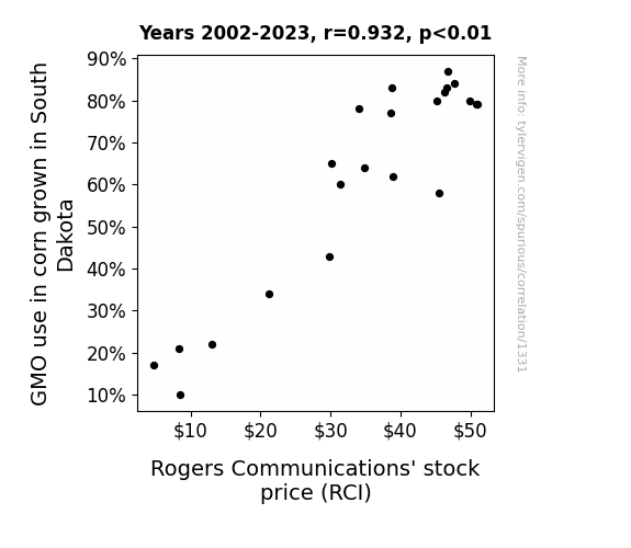
View details about correlation #1,331
GMO Corn: A-Maize-ing Effects on RCI Stock Price Yield Unlikely Connection
As South Dakota corn became more genetically modified, it developed a natural ability to transmit positive vibes. These vibes were inexplicably in sync with Rogers Communications' business philosophy, creating a strange but undeniable link between the two. As a result, the stock price of Rogers Communications (RCI) experienced an unexpected boost, riding the wave of good vibes all the way to financial success. It seems the key to a fruitful investment may just be growing GMO corn in sync with the stock market!

What else correlates?
GMO use in corn grown in South Dakota · all food
Rogers Communications' stock price (RCI) · all stocks
GMO use in corn grown in South Dakota · all food
Rogers Communications' stock price (RCI) · all stocks


View details about correlation #3,673
From Miami to Portugal: The Hazy Connection Between Air Pollution and Kerosene Consumption
As the air over Miami cleared up, it created a ripple effect in the atmosphere, leading to a kerosene-cooling phenomenon specifically targeted at Portugal. Less pollution in Miami meant less atmospheric interference with the kerosene molecules' travel plans, resulting in an overall decrease in kerosene used in Portugal. Clearly, Mother Nature is a fan of international energy conservation!


What else correlates?
Air pollution in Miami · all weather
Kerosene used in Portugal · all energy
Air pollution in Miami · all weather
Kerosene used in Portugal · all energy


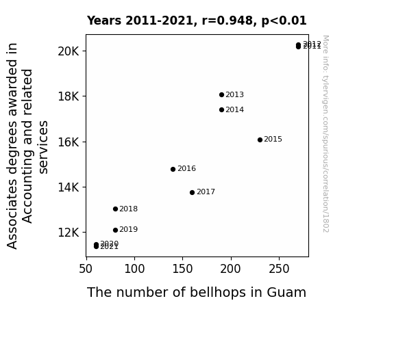
View details about correlation #1,802
Counting the Beans: Investigating the Correlation Between Associates Degrees in Accounting and the Surprising Surge in Guam's Bellhop Population
As more accounting tasks became automated, there was a surplus of unemployed accounting graduates who decided to pursue their lifelong dreams of becoming professional hula dancers, leaving the bellhop industry high and dry.

What else correlates?
Associates degrees awarded in Accounting · all education
The number of bellhops in Guam · all cccupations
Associates degrees awarded in Accounting · all education
The number of bellhops in Guam · all cccupations


View details about correlation #1,195
Yogurt Yields Yields: Yeasty Yummies and Yearly Yields of Part-Time Employees in the United States
As yogurt consumption increased, so did the demand for active, enthusiastic individuals who could handle the upswing in fro-yo shops and yogurt production facilities. Yogurt's probiotic powers seemed to fuel a workforce ready to take on part-time work, creating a symbiotic relationship between dairy delights and job opportunities. It's as if the nation collectively agreed to 'yo'-gurt to work part-time!


What else correlates?
Yogurt consumption · all food
Annual count of part-time employees in the United States · all weird & wacky
Yogurt consumption · all food
Annual count of part-time employees in the United States · all weird & wacky


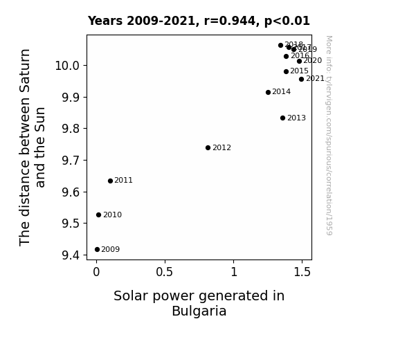
View details about correlation #1,959
Shining a Light on Solar Power: The Cosmic Correlation Between Saturn's Distancing and Bulgaria's Energy
As the distance between Saturn and the Sun increases, the gravitational pull also weakens, creating a ripple effect on all celestial bodies. This leads to a planetary alignment that aligns Bulgaria perfectly to receive maximum sunlight for solar power generation. It's like the universe's way of giving Bulgaria a literal energy boost, all thanks to Saturn deciding to play a cosmic game of "catch me if you can" with the Sun. Keep reaching for the stars, Bulgaria - or, in this case, for the slightly more distant Saturn!

What else correlates?
The distance between Saturn and the Sun · all planets
Solar power generated in Bulgaria · all energy
The distance between Saturn and the Sun · all planets
Solar power generated in Bulgaria · all energy


View details about correlation #2,016
A Breath of Fresh Aja: Exploring the Surprising Relationship Between Name Popularity and Air Quality in Toledo
As the number of Ajas dwindled, so did the demand for personalized name-embossed car air fresheners. With fewer cars smelling like a tropical paradise, emissions in Toledo took a much-needed nosedive. Remember, when it comes to clean air, every Aja counts!


What else correlates?
Popularity of the first name Aja · all first names
Air pollution in Toledo · all weather
Popularity of the first name Aja · all first names
Air pollution in Toledo · all weather


View details about correlation #1,795
The Detective's Dilemma: Uncovering the Link Between Master's Degrees in Psychology and Private Investigators in North Carolina
More people were finally able to figure out what everyone else was thinking, leading to a surge in demand for professional snoopers who could uncover even the sneakiest secrets. Now there are more spies in the Carolinas than at a double-agent convention!


What else correlates?
Master's degrees awarded in Psychology · all education
The number of private detectives in North Carolina · all cccupations
Master's degrees awarded in Psychology · all education
The number of private detectives in North Carolina · all cccupations


View details about correlation #2,719
Corn Yields and American Idol Fields: A Genetically Modified Connection?
As farmers reduced the use of GMOs in Michigan corn, they inadvertently decreased the production of a substance that had been unknowingly wafting through the air and subtly influencing people's TV preferences. This substance, dubbed "corny-ness factor," was found to have a direct link to increased viewership of American Idol. Without the GMOs, the corn lost its pop culture appeal, leading to a nationwide disinterest in the Season Finale. It seems the corn really was the ear-resistible secret behind the show's success.


What else correlates?
GMO use in corn grown in Michigan · all food
Viewership count of American Idol Season Finale · all weird & wacky
GMO use in corn grown in Michigan · all food
Viewership count of American Idol Season Finale · all weird & wacky
Why this works
- Data dredging: I have 25,237 variables in my database. I compare all these variables against each other to find ones that randomly match up. That's 636,906,169 correlation calculations! This is called “data dredging.”
Fun fact: the chart used on the wikipedia page to demonstrate data dredging is also from me. I've been being naughty with data since 2014.
Instead of starting with a hypothesis and testing it, I instead tossed a bunch of data in a blender to see what correlations would shake out. It’s a dangerous way to go about analysis, because any sufficiently large dataset will yield strong correlations completely at random. - Lack of causal connection: There is probably no direct connection between these variables, despite what the AI says above.
Because these pages are automatically generated, it's possible that the two variables you are viewing are in fact causually related. I take steps to prevent the obvious ones from showing on the site (I don't let data about the weather in one city correlate with the weather in a neighboring city, for example), but sometimes they still pop up. If they are related, cool! You found a loophole.
This is exacerbated by the fact that I used "Years" as the base variable. Lots of things happen in a year that are not related to each other! Most studies would use something like "one person" in stead of "one year" to be the "thing" studied. - Observations not independent: For many variables, sequential years are not independent of each other. You will often see trend-lines form. If a population of people is continuously doing something every day, there is no reason to think they would suddenly change how they are doing that thing on January 1. A naive p-value calculation does not take this into account.
You will calculate a lower chance of "randomly" achieving the result than represents reality.
To be more specific: p-value tests are probability values, where you are calculating the probability of achieving a result at least as extreme as you found completely by chance. When calculating a p-value, you need to assert how many "degrees of freedom" your variable has. I count each year (minus one) as a "degree of freedom," but this is misleading for continuous variables.
This kind of thing can creep up on you pretty easily when using p-values, which is why it's best to take it as "one of many" inputs that help you assess the results of your analysis.
- Y-axes doesn't start at zero: I truncated the Y-axes of the graphs above. I also used a line graph, which makes the visual connection stand out more than it deserves.
Nothing against line graphs. They are great at telling a story when you have linear data! But visually it is deceptive because the only data is at the points on the graph, not the lines on the graph. In between each point, the data could have been doing anything. Like going for a random walk by itself!
Mathematically what I showed is true, but it is intentionally misleading. If you click on any of the charts that abuse this, you can scroll down to see a version that starts at zero. - Confounding variable: Confounding variables (like global pandemics) will cause two variables to look connected when in fact a "sneaky third" variable is influencing both of them behind the scenes.
- Outliers: Some datasets here have outliers which drag up the correlation.
In concept, "outlier" just means "way different than the rest of your dataset." When calculating a correlation like this, they are particularly impactful because a single outlier can substantially increase your correlation.
Because this page is automatically generated, I don't know whether any of the charts displayed on it have outliers. I'm just a footnote. ¯\_(ツ)_/¯
I intentionally mishandeled outliers, which makes the correlation look extra strong. - Low n: There are not many data points included in some of these charts.
You can do analyses with low ns! But you shouldn't data dredge with a low n.
Even if the p-value is high, we should be suspicious of using so few datapoints in a correlation.
Pro-tip: click on any correlation to see:
- Detailed data sources
- Prompts for the AI-generated content
- Explanations of each of the calculations (correlation, p-value)
- Python code to calculate it yourself


