spurious correlations
discover · random · spurious scholar
← previous page · next page →
. The chart goes from 2012 to 2021, and the two variables track closely in value over that time.")

View details about correlation #2,859
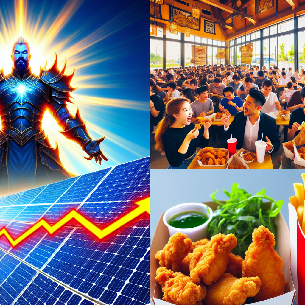
Shining a Light on YUM! Brands: The Sunny Side of Solar Power in Laos
The increased solar power in Laos has led to a surplus of energy, creating a fried chicken boom as KFC locations in the area can now operate deep fryers at maximum capacity all day. As a result, Yum! Brands' stock price has skyrocketed, riding the greasy wave of renewable energy-fueled poultry production. Who knew that the sun's rays could also power our cravings for extra crispy deliciousness?

What else correlates?
Solar power generated in Laos · all energy
Yum! Brands' stock price (YUM) · all stocks
Solar power generated in Laos · all energy
Yum! Brands' stock price (YUM) · all stocks


View details about correlation #1,674
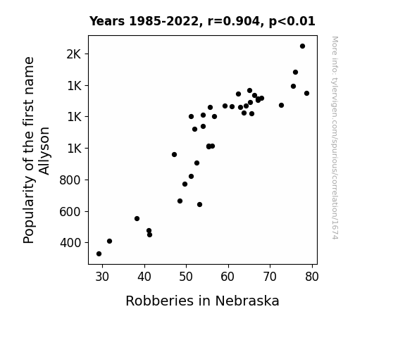
The Allyson and Robbery Roll Call: Investigating the Comical Connection between Name Popularity and Crime Trends in Nebraska
As the name Allyson fell out of favor, it led to a shortage of unsuspecting individuals to distract the robbers. Without Allysons around to shout "All eyes on me!" the robbers found it increasingly difficult to carry out their heists. This ultimately resulted in a bizarre yet noticeable drop in Nebraska's robbery rates.

What else correlates?
Popularity of the first name Allyson · all first names
Robberies in Nebraska · all random state specific
Popularity of the first name Allyson · all first names
Robberies in Nebraska · all random state specific


View details about correlation #2,013
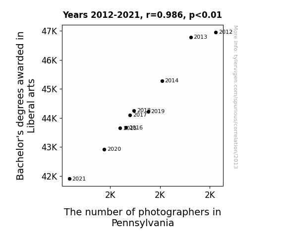
Exposing the Lens: Unraveling the Correlation between Liberal Arts Degrees and the Photographic Population in Pennsylvania
As the supply of Liberal arts graduates dwindled, there were fewer individuals able to capture the perfect shot of their avocado toast or interpretive dance performance. This led to increased demand for photographic services, causing a mass migration of photographers to states with a surplus of poetry-reciting, philosophy-debating, soft-skills professionals.

What else correlates?
Bachelor's degrees awarded in Liberal arts · all education
The number of photographers in Pennsylvania · all cccupations
Bachelor's degrees awarded in Liberal arts · all education
The number of photographers in Pennsylvania · all cccupations


View details about correlation #2,691
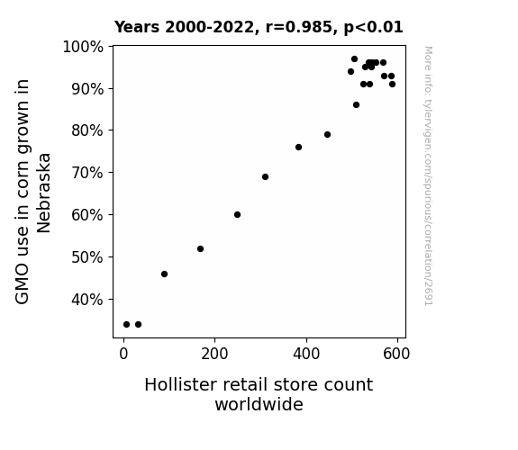
Stalk Market: The Corny Connection Between GMOs in Nebraska and Hollister Store Count Worldwide
As the size of the corn increased, so did the demand for larger overalls and plaid shirts, prompting Hollister to ramp up production and open more stores to meet the sartorial needs of the husky corn farmers. It's a case of agricultural fashion trends ear-resistibly shaping the retail landscape!

What else correlates?
GMO use in corn grown in Nebraska · all food
Hollister retail store count worldwide · all weird & wacky
GMO use in corn grown in Nebraska · all food
Hollister retail store count worldwide · all weird & wacky


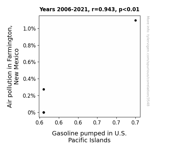
View details about correlation #3,548
Up in the Air: Uncovering the Unlikely Link Between Air Pollution in Farmington, New Mexico, and Gasoline Pumped in U.S. Pacific Islands
The cleaner air in Farmington led to an unexpected increase in productivity at the gasoline pumping facilities. This surplus of productivity somehow translated to reduced gasoline production and distribution in the U.S. Pacific Islands. It's like a bizarre domino effect of efficiency, all stemming from Farmington's fresher air!

What else correlates?
Air pollution in Farmington, New Mexico · all weather
Gasoline pumped in U.S. Pacific Islands · all energy
Air pollution in Farmington, New Mexico · all weather
Gasoline pumped in U.S. Pacific Islands · all energy
. The chart goes from 2002 to 2022, and the two variables track closely in value over that time.")

View details about correlation #1,382
Shoot for the Stars: The Lockheed Martin Theodore Connection
As the name Theodore gained popularity, more parents were inspired by the idea of their child growing up to be a "defender of the people." This led to a surge in demand for all things related to protection and security. As a result, Lockheed Martin, a prominent defense company, saw an unexpected boost in stock price. It's a classic case of Theodore-ical market influence!


What else correlates?
Popularity of the first name Theodore · all first names
Lockheed Martin's stock price (LMT) · all stocks
Popularity of the first name Theodore · all first names
Lockheed Martin's stock price (LMT) · all stocks


View details about correlation #1,482
Trimming the Fat: The Tackling Connection Between Utah Handymen and Adrian Wilson
Fewer cutters and trimmers led to an abundance of unruly bushes and shrubbery across Utah. This created a wild and untamed landscape, which in turn distracted Adrian Wilson during his football games, ultimately leading to a decrease in his tackle count.


What else correlates?
The number of cutters and trimmers, hand in Utah · all cccupations
Adrian Wilson's tackle count · all sports
The number of cutters and trimmers, hand in Utah · all cccupations
Adrian Wilson's tackle count · all sports


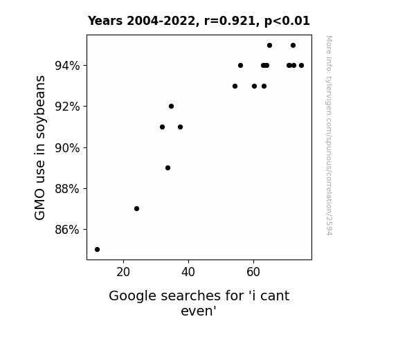
View details about correlation #2,594
I Can't Even Believe It! The GMO-iety of Soybeans: A Study on the Relationship between GMO Use in Soybeans and Google Searches for 'I Can't Even'
The GMO soybeans were so efficient at growing that they began to outpace the mental capacity of internet users, leading to an epidemic of cognitive overload and an inability to even. It's like they say, too much soy makes the brain go oi-vey!

What else correlates?
GMO use in soybeans · all food
Google searches for 'i cant even' · all google searches
GMO use in soybeans · all food
Google searches for 'i cant even' · all google searches


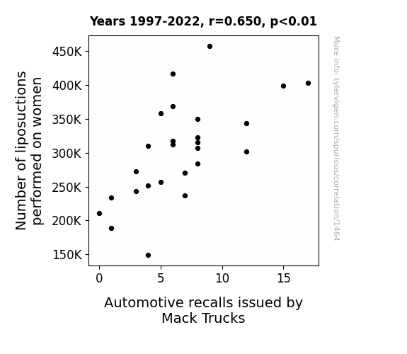
View details about correlation #1,464
From Truck Recalls to Tummy Tucks: Unveiling the Curious Correlation Between Liposuctions and Mack Truck Automotive Recalls
The extra fat removed from the women was being used to grease the truck parts, leading to malfunctions and prompting the recalls.

What else correlates?
Number of liposuctions performed on women · all weird & wacky
Automotive recalls issued by Mack Trucks · all weird & wacky
Number of liposuctions performed on women · all weird & wacky
Automotive recalls issued by Mack Trucks · all weird & wacky


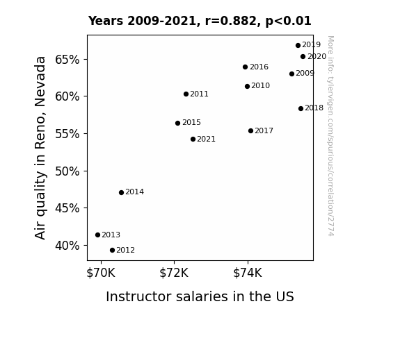
View details about correlation #2,774
When Smog Meets Salary: Exploring the Peculiar Relationship Between Air Quality in Reno, Nevada and Instructor Salaries in the US
As the air quality in Reno worsened, it led to an influx of air filtration sales. This increased demand for filters caused a shortage of materials, leading to higher prices for manufacturing essentials. As a result, the cost of producing educational resources rose, forcing educational institutions to cut down on their budgets, including instructor salaries. Who knew the air in Reno could have such far-reaching effects on the nation's educators!

What else correlates?
Air quality in Reno, Nevada · all weather
Instructor salaries in the US · all education
Air quality in Reno, Nevada · all weather
Instructor salaries in the US · all education


View details about correlation #2,238
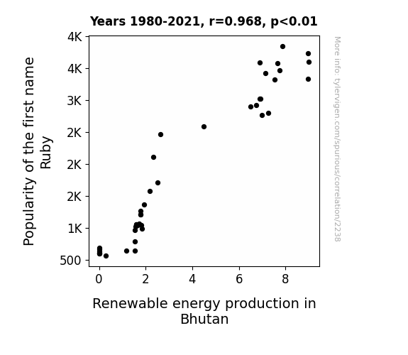
Ruby's Renowned Role: Exploring the Correlation Between the Popularity of the Name Ruby and Renewable Energy Production in Bhutan
The sound waves produced by people saying the name Ruby coincidentally matched the resonant frequency needed to boost energy production in Bhutan. It's like a real-life Ruby-powered renewable energy spell!

What else correlates?
Popularity of the first name Ruby · all first names
Renewable energy production in Bhutan · all energy
Popularity of the first name Ruby · all first names
Renewable energy production in Bhutan · all energy


View details about correlation #1,930
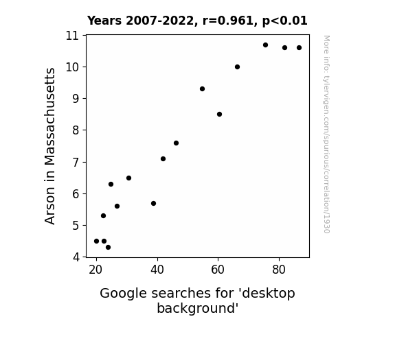
Ablaze in the Bay State: The Correlation Between Arson and Searches for 'Desktop Background'
Firefighters had more time to curate stunning desktop backgrounds amidst the reduction in fiery incidents, leading to an overall decline in the need to seek out aesthetically pleasing wallpapers online.

What else correlates?
Arson in Massachusetts · all random state specific
Google searches for 'desktop background' · all google searches
Arson in Massachusetts · all random state specific
Google searches for 'desktop background' · all google searches


View details about correlation #1,298
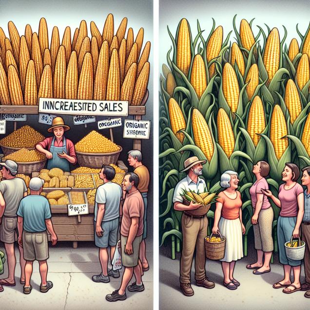
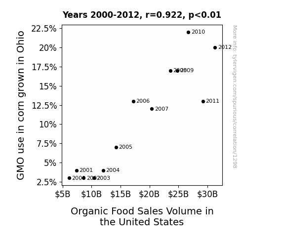
From GMO to Yo' Money: The Corn-nection Between GMO Use in Ohio and Organic Food Sales Volume in the United States
As more and more Ohio corn became genetically modified, a super secret underground network of organic food aficionados, known as the "Corn Connoisseurs," realized that they needed to ramp up their organic food consumption to counteract the GMO invasion. This led to a nationwide surge in demand for organic products, as these self-proclaimed organic warriors vowed to maintain the balance in the food universe. It's the untold story of how a corny conspiracy inadvertently sparked a boom in organic food sales across the country.
What else correlates?
GMO use in corn grown in Ohio · all food
Organic Food Sales Volume in the United States · all weird & wacky
GMO use in corn grown in Ohio · all food
Organic Food Sales Volume in the United States · all weird & wacky


View details about correlation #1,904
Checking In on Air Pollution: A Bellhop Barometer
As the air quality improved, the demand for smog-resistant bellhops decreased. The clean air meant there was no longer a need for "bell-hop and lock" protection services. With the fresh breeze blowing through, it seems the bellhops decided to "check out" of the hotel industry!
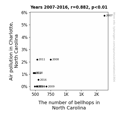
What else correlates?
Air pollution in Charlotte, North Carolina · all weather
The number of bellhops in North Carolina · all cccupations
Air pollution in Charlotte, North Carolina · all weather
The number of bellhops in North Carolina · all cccupations


View details about correlation #2,138
Charging the Batter: A Shocking Connection between Electricity Generation in Antarctica and Runs Scored by the Winning Team in the World Series
Due to the decrease in electricity generation in Antarctica, penguins are now unable to host their annual baseball tournaments, leading to a decline in the overall skill and competitiveness of baseball teams around the world. As a result, there are fewer runs being scored by the winning team in the World Series.


What else correlates?
Electricity generation in Antarctica · all energy
Runs Scored by Winning Team in World Series · all sports
Electricity generation in Antarctica · all energy
Runs Scored by Winning Team in World Series · all sports
. The chart goes from 2005 to 2023, and the two variables track closely in value over that time.")

View details about correlation #3,006
That is Sus Google Search Buzz: A Correlation with Monolithic Power Systems' Stock Fuzz
The increase in 'that is sus' searches led to a surge in demand for online multiplayer games like Among Us, putting a strain on the current supply of gaming consoles. This caused a ripple effect, leading to a higher demand for semiconductor chips, which are crucial for producing these gaming consoles. As a leading semiconductor company, Monolithic Power Systems reaped the benefits of this 'suspiciously' high demand, propelling their stock price to astronomical levels. Looks like MPWR is truly plugged into the gaming industry's power-ups, creating a circuit of success that no one can resist!

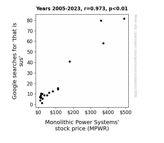
What else correlates?
Google searches for 'that is sus' · all google searches
Monolithic Power Systems' stock price (MPWR) · all stocks
Google searches for 'that is sus' · all google searches
Monolithic Power Systems' stock price (MPWR) · all stocks


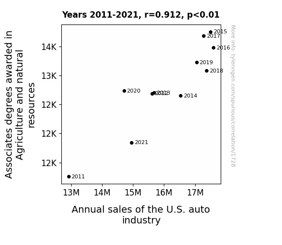
View details about correlation #1,728
Digging into the Dirt: How Associates Degrees in Agriculture and Natural Resources Plow the Path for U.S. Auto Industry Sales
As more people got involved in agriculture and natural resources, they realized the tractor-nology was advancing and it was time to plow money into buying new vehicles. This led to a growing demand for trucks and other auto vehicles, sowing the seeds for higher annual sales in the U.S. auto industry.


View details about correlation #2,781
Got Milk? An Udderly Surprising Connection: Assessing the Correlation Between Milk Consumption and Divorce Rates in Idaho
As Milk consumption decreased, people experienced fewer lactose-induced mood swings and marital disputes. This led to improved communication and harmony in relationships, ultimately lowering the divorce rate in Idaho. Remember, a dairy-free love life leads to a gouda time!

What else correlates?
Milk consumption · all food
The divorce rate in Idaho · all random state specific
Milk consumption · all food
The divorce rate in Idaho · all random state specific


View details about correlation #1,857
The Sonny Side of Bailiffs: A Statistical Analysis of Popularity and Professions in Kansas
Perhaps it's because every time someone called out for Sonny, a bailiff thought they were being summoned for duty. It seems the name Sonny was just bringing a whole lot of legal sunshine into Kansas!

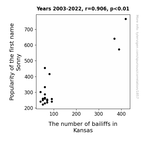
What else correlates?
Popularity of the first name Sonny · all first names
The number of bailiffs in Kansas · all cccupations
Popularity of the first name Sonny · all first names
The number of bailiffs in Kansas · all cccupations


View details about correlation #1,309
Connecting Cincinnati's Air Quality to Bulgaria's Jet Fuel: A Comical Correlation
The oxygen-rich, pristine air in Cincinnati inspired Bulgarian engineers to create a super-efficient jet fuel, leading to a decrease in overall usage. Remember, cleaner air means Bulgarians are now flying high on their own supply of innovation!
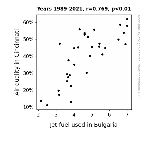
What else correlates?
Air quality in Cincinnati · all weather
Jet fuel used in Bulgaria · all energy
Air quality in Cincinnati · all weather
Jet fuel used in Bulgaria · all energy
Why this works
- Data dredging: I have 25,237 variables in my database. I compare all these variables against each other to find ones that randomly match up. That's 636,906,169 correlation calculations! This is called “data dredging.”
Fun fact: the chart used on the wikipedia page to demonstrate data dredging is also from me. I've been being naughty with data since 2014.
Instead of starting with a hypothesis and testing it, I instead tossed a bunch of data in a blender to see what correlations would shake out. It’s a dangerous way to go about analysis, because any sufficiently large dataset will yield strong correlations completely at random. - Lack of causal connection: There is probably no direct connection between these variables, despite what the AI says above.
Because these pages are automatically generated, it's possible that the two variables you are viewing are in fact causually related. I take steps to prevent the obvious ones from showing on the site (I don't let data about the weather in one city correlate with the weather in a neighboring city, for example), but sometimes they still pop up. If they are related, cool! You found a loophole.
This is exacerbated by the fact that I used "Years" as the base variable. Lots of things happen in a year that are not related to each other! Most studies would use something like "one person" in stead of "one year" to be the "thing" studied. - Observations not independent: For many variables, sequential years are not independent of each other. You will often see trend-lines form. If a population of people is continuously doing something every day, there is no reason to think they would suddenly change how they are doing that thing on January 1. A naive p-value calculation does not take this into account.
You will calculate a lower chance of "randomly" achieving the result than represents reality.
To be more specific: p-value tests are probability values, where you are calculating the probability of achieving a result at least as extreme as you found completely by chance. When calculating a p-value, you need to assert how many "degrees of freedom" your variable has. I count each year (minus one) as a "degree of freedom," but this is misleading for continuous variables.
This kind of thing can creep up on you pretty easily when using p-values, which is why it's best to take it as "one of many" inputs that help you assess the results of your analysis.
- Y-axes doesn't start at zero: I truncated the Y-axes of the graphs above. I also used a line graph, which makes the visual connection stand out more than it deserves.
Nothing against line graphs. They are great at telling a story when you have linear data! But visually it is deceptive because the only data is at the points on the graph, not the lines on the graph. In between each point, the data could have been doing anything. Like going for a random walk by itself!
Mathematically what I showed is true, but it is intentionally misleading. If you click on any of the charts that abuse this, you can scroll down to see a version that starts at zero. - Confounding variable: Confounding variables (like global pandemics) will cause two variables to look connected when in fact a "sneaky third" variable is influencing both of them behind the scenes.
- Outliers: Some datasets here have outliers which drag up the correlation.
In concept, "outlier" just means "way different than the rest of your dataset." When calculating a correlation like this, they are particularly impactful because a single outlier can substantially increase your correlation.
Because this page is automatically generated, I don't know whether any of the charts displayed on it have outliers. I'm just a footnote. ¯\_(ツ)_/¯
I intentionally mishandeled outliers, which makes the correlation look extra strong. - Low n: There are not many data points included in some of these charts.
You can do analyses with low ns! But you shouldn't data dredge with a low n.
Even if the p-value is high, we should be suspicious of using so few datapoints in a correlation.
Pro-tip: click on any correlation to see:
- Detailed data sources
- Prompts for the AI-generated content
- Explanations of each of the calculations (correlation, p-value)
- Python code to calculate it yourself


