spurious correlations
discover · random · spurious scholar
← previous page · next page →


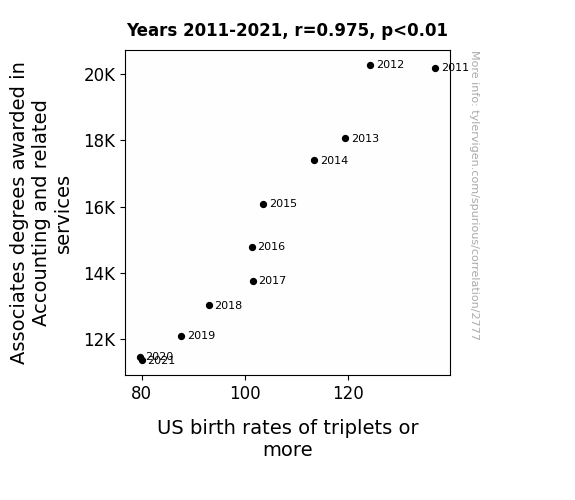
View details about correlation #2,777
Balancing the Books: An Examination of the Correlation between Associates Degrees in Accountancy and the Birth Rate of Triplets or More in the United States
Accountants realized they needed to balance their work-life equations, leading to a decrease in triple-net outcomes at home.

What else correlates?
Associates degrees awarded in Accounting · all education
US birth rates of triplets or more · all weird & wacky
Associates degrees awarded in Accounting · all education
US birth rates of triplets or more · all weird & wacky
. The chart goes from 2003 to 2021, and the two variables track closely in value over that time.")

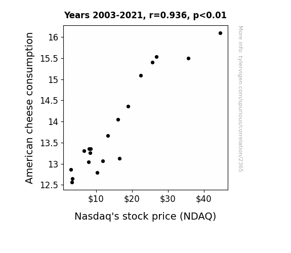
View details about correlation #2,365
Say Cheese: The Gouda, The Bad, and The Nasdaq - Exploring the Correlation Between American Cheese Consumption and NDAQ Stock Price
As more people indulged in gooey grilled cheese sandwiches, they found themselves in a euphoric state of cheesiness. This led to an increase in overall optimism, causing a spike in the stock market, including the Nasdaq. It seems like the phrase "say cheese" took on a whole new financial meaning!

What else correlates?
American cheese consumption · all food
Nasdaq's stock price (NDAQ) · all stocks
American cheese consumption · all food
Nasdaq's stock price (NDAQ) · all stocks


View details about correlation #3,618
A League of Their Own: The World Series Score Difference and the Search for ¡Hola! Realidades en Español
As the margin narrowed, the players' trash talk became more comprehensible and their insults cut even deeper, prompting an urgent need to understand and respond in the linguistic battle of wits.


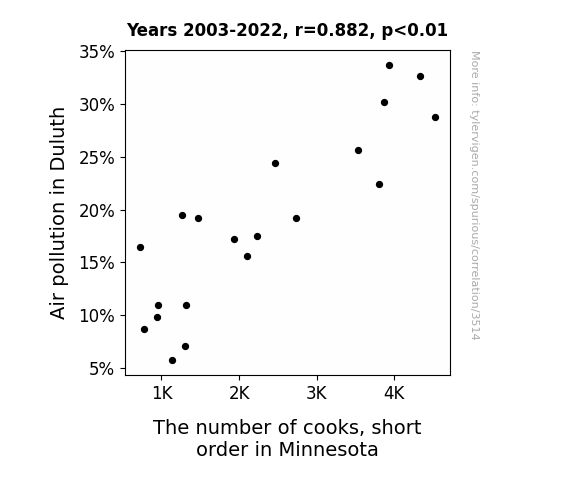
View details about correlation #3,514
The Airest of Them All: A Correlative Analysis of Air Pollution in Duluth and the Number of Short Order Cooks in Minnesota
The cleaner air in Duluth blew away all the short order cook's hat which demotivated all the cooks in Minnesota. They just couldn't seem to ketchup with the new cooking trends. They decided to skillet and look for greener pastures.
What else correlates?
Air pollution in Duluth · all weather
The number of cooks, short order in Minnesota · all cccupations
Air pollution in Duluth · all weather
The number of cooks, short order in Minnesota · all cccupations


View details about correlation #2,873
Blowin' in the Name: The Winds of Astrid and Energy Production in Ukraine
Every time someone named Astrid gained popularity, they unknowingly possessed the unique ability to harness the wind's energy. As more and more little Astrids ran around, a swirling cyclone of power was created, directly impacting the wind turbines in Ukraine. It seems that the name Astrid was just destined to blow everyone away with its electrifying influence on renewable energy!

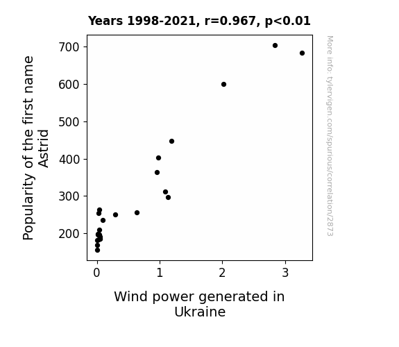
What else correlates?
Popularity of the first name Astrid · all first names
Wind power generated in Ukraine · all energy
Popularity of the first name Astrid · all first names
Wind power generated in Ukraine · all energy


View details about correlation #1,406
Associates in Piracy: The Relationship Between Security Science and Technology Degrees and Pirate Attacks in Indonesia
As the number of Associates degrees awarded in Security science and technology decreased, there was a corresponding drop in qualified individuals to "sea-cure" the pirate-infested areas. With less focus on maritime security, these budding buccaneers must have realized that their prospects for a successful plunder had "walked the plank"! The shortage of security-savvy graduates left the pirates feeling adrift, ultimately leading to a decrease in their daring escapades. Or perhaps the pirates simply heard that the job market was "drying up" for their particular skill set!

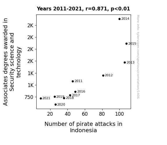
. The chart goes from 2009 to 2022, and the two variables track closely in value over that time.")

View details about correlation #1,336
Grain Gains: A Kernel of Truth in the Rice-Hershey Stock Connection
As global rice consumption rose, so did the demand for delicious chocolate. People couldn't resist pairing their rice dishes with a side of chocolate treats, leading to a surge in Hershey's sales. This unexpected connection left stock analysts in a bittersweet state, as they tried to wrap their heads around the link between grains and gains in the confectionery industry. It seems like when it comes to the stock market, the recipe for success might just be rice, rice, baby with a cocoa on top!

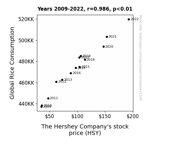
What else correlates?
Global Rice Consumption · all food
The Hershey Company's stock price (HSY) · all stocks
Global Rice Consumption · all food
The Hershey Company's stock price (HSY) · all stocks


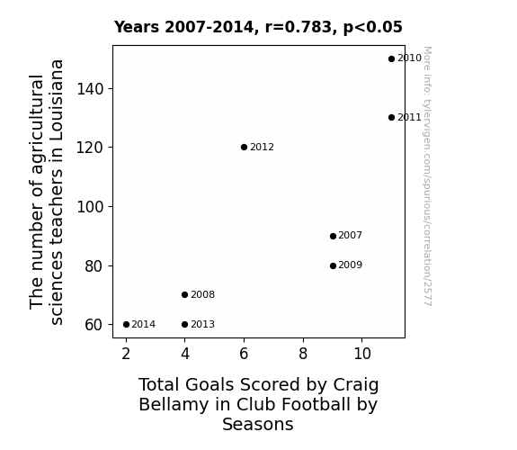
View details about correlation #2,577
Croppin' Goals: Exploring the Correlation Between Agricultural Sciences Teachers in Lousiana and Craig Bellamy's Club Football Performance
As the number of agricultural sciences teachers in Louisiana decreased, there was a corresponding decline in the availability of fresh corn. This led to a nationwide shortage of cornflakes, Craig Bellamy's favorite breakfast cereal. Without his usual pre-game bowl of cornflakes to fuel his performance, Craig Bellamy's energy and goal-scoring ability on the field were noticeably diminished across club football seasons. Remember, you can't expect top-tier athletic performance without a-maize-ing fuel!


View details about correlation #3,639
The Puzzling Partnership: Pinpointing the Correlation Between Air Pollution in Houma, Louisiana and Jet Fuel in Saint Vincent/Grenadines
As air pollution in Houma, Louisiana decreased, it created a cleaner environment for air travel. This led to reduced jet fuel usage in Saint Vincent/Grenadines as the planes didn't have to "de-tox" as much before takeoff.


What else correlates?
Air pollution in Houma, Louisiana · all weather
Jet fuel used in Saint Vincent/Grenadines · all energy
Air pollution in Houma, Louisiana · all weather
Jet fuel used in Saint Vincent/Grenadines · all energy


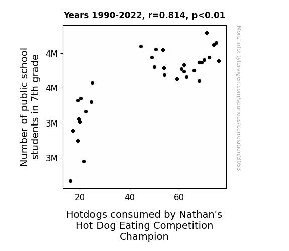
View details about correlation #3,053
The Seventh Grade Sausage Saga: A Statistical Study of Student Numbers and Sausage Consumption
As the number of 7th graders swells, so does the demand for knowledge...and hotdogs. It's a classic case of bun and learn – more students means more energy, leading to an upsurge in hotdog consumption. It seems the 7th grade truly is the wurst!


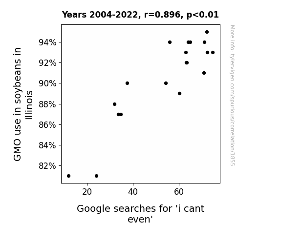
View details about correlation #1,855
Soy Much Drama: Exploring the GMO-Soybean-Google 'I Can't Even' Connection in Illinois
The GMO soybeans in Illinois were so advanced that even the internet couldn't handle it, leading people to exclaim, "I can't even, this soy is out of this world!"

What else correlates?
GMO use in soybeans in Illinois · all food
Google searches for 'i cant even' · all google searches
GMO use in soybeans in Illinois · all food
Google searches for 'i cant even' · all google searches


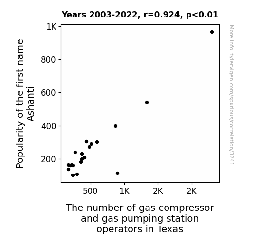
View details about correlation #3,241
Gasping for Air: The Ashanti Name Phenomenon and its Unlikely Correlation with Texas Gas Compressor and Pumping Station Operators
Due to fewer babies being named Ashanti, there was a shortage of potential future employees for gas compressor and pumping stations in Texas. The correlation highlights the little-known but crucial role that individuals with the name Ashanti were destined to play in the state's gas industry. It seems like Texas might have to start an "Ashanti" recruitment campaign to keep the gas flowing!


View details about correlation #2,728
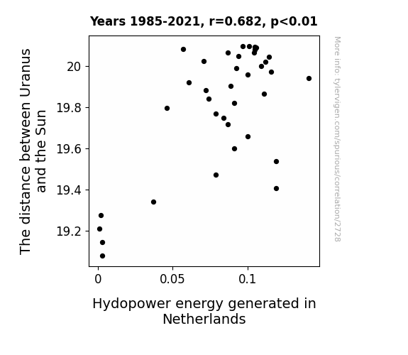
Shocking Solar Surges: A Celestial Serenade of Uranus' Distance and Dutch Hydropower Harvest
The gravity tug-of-war between Uranus and the Sun created a celestial domino effect, leading to a surge in Dutch hydroelectric power. As Uranus distanced itself, the cosmic ripples somehow amplified the water flow in Dutch rivers, spinning those turbines at an astronomical rate. It's as if the planets aligned to give a boost to renewable energy!

What else correlates?
The distance between Uranus and the Sun · all planets
Hydopower energy generated in Netherlands · all energy
The distance between Uranus and the Sun · all planets
Hydopower energy generated in Netherlands · all energy
. The chart goes from 2012 to 2021, and the two variables track closely in value over that time.")

View details about correlation #2,659
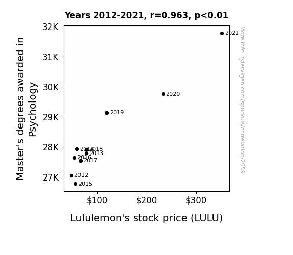
Mind Over Stock: The Psy-stock-ology of Lululemon's Success
As more people became qualified to analyze behavior, they discovered that the desire to wear stretchy pants while sipping a $12 green juice was deeply rooted in the human psyche. This insight led to a surge in demand for Lululemon products, driving up their stock price.

What else correlates?
Master's degrees awarded in Psychology · all education
Lululemon's stock price (LULU) · all stocks
Master's degrees awarded in Psychology · all education
Lululemon's stock price (LULU) · all stocks


View details about correlation #3,683
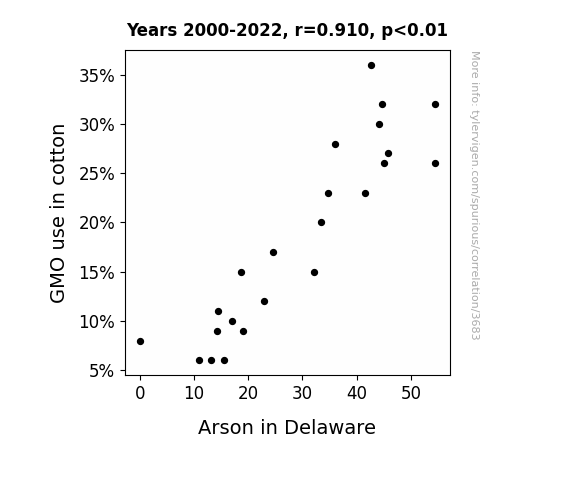
Cottoning On: The Genetically Modified Objection and Firestarter Phenomenon in Delaware
As GMO use in cotton decreased, it led to the production of softer, more breathable non-GMO cotton clothing. People in Delaware were just so much more comfortable in their non-GMO cotton clothing that they no longer felt the need to set anything on fire. It's amazing what a little extra comfort can do for fire prevention!

What else correlates?
GMO use in cotton · all food
Arson in Delaware · all random state specific
GMO use in cotton · all food
Arson in Delaware · all random state specific


View details about correlation #3,315
The Soleful Connection: The Association Between Shoe and Leather Workers in Maine and Google Searches for 'How to Hide a Body'
The increase in shoe and leather workers and repairers in Maine led to a surge in 'how to hide a body' Google searches because people realized they had the skills to make it look like the body had simply walked away. It seems the demand for soleful solutions to this dilemma was on the rise!


View details about correlation #3,516
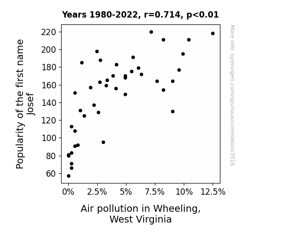
Josef: From Popular To Polluted - The Curious Case of Air Quality in Wheeling
Fewer people were requesting personalized "Josef" license plates, leading to a decrease in production at the local novelty plate factory. This, in turn, reduced the factory's energy usage and emissions, resulting in slightly cleaner air for the good people of Wheeling, West Virginia.

What else correlates?
Popularity of the first name Josef · all first names
Air pollution in Wheeling, West Virginia · all weather
Popularity of the first name Josef · all first names
Air pollution in Wheeling, West Virginia · all weather


View details about correlation #1,473
The Engineer's Salary Equation: Bridging the Gender Gap
As the number of Bachelor's degrees awarded in Engineering increased, so did the demand for engineers. With more engineers in the workforce, there was a sudden scarcity of pocket protectors, leading to a nationwide shortage. This, in turn, caused a spike in the retail price of pocket protectors, disproportionately affecting women who were often forced to pay more for the same item. And that, my friend, is how an increase in Bachelor's degrees awarded in Engineering led to a higher gender pay gap in the U.S.


What else correlates?
Bachelor's degrees awarded in Engineering · all education
Gender pay gap in the U.S. · all weird & wacky
Bachelor's degrees awarded in Engineering · all education
Gender pay gap in the U.S. · all weird & wacky


View details about correlation #1,987
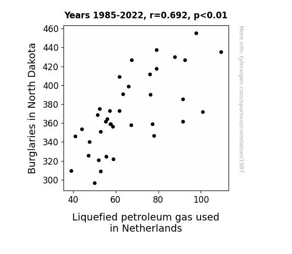
Bumbling Burglaries and Boisterous Butanes: A Bizarre Blend of North Dakota and Netherlands
The decrease in burglaries in North Dakota meant there were fewer thieves trying to steal propane, leading to a lower demand for Liquefied Petroleum Gas in the Netherlands. You could say the crime rate and the gas rate are both on the decline!

What else correlates?
Burglaries in North Dakota · all random state specific
Liquefied petroleum gas used in Netherlands · all energy
Burglaries in North Dakota · all random state specific
Liquefied petroleum gas used in Netherlands · all energy
. The chart goes from 2007 to 2021, and the two variables track closely in value over that time.")

View details about correlation #2,275
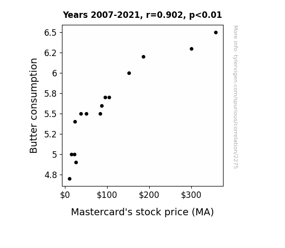
Spreading the Wealth: Melting Down the Connection Between Butter Consumption and Mastercard's Stock Price
As butter consumption increased, so did the demand for baked goods. This led to a wave of happiness as people indulged in delicious pastries, causing an overall improvement in mood. This increase in collective happiness somehow translated to a surge in confidence in the financial markets, including Mastercard's stock, leading to its rise. It's like a buttery, flaky domino effect on the economy!

What else correlates?
Butter consumption · all food
Mastercard's stock price (MA) · all stocks
Butter consumption · all food
Mastercard's stock price (MA) · all stocks
Why this works
- Data dredging: I have 25,237 variables in my database. I compare all these variables against each other to find ones that randomly match up. That's 636,906,169 correlation calculations! This is called “data dredging.”
Fun fact: the chart used on the wikipedia page to demonstrate data dredging is also from me. I've been being naughty with data since 2014.
Instead of starting with a hypothesis and testing it, I instead tossed a bunch of data in a blender to see what correlations would shake out. It’s a dangerous way to go about analysis, because any sufficiently large dataset will yield strong correlations completely at random. - Lack of causal connection: There is probably no direct connection between these variables, despite what the AI says above.
Because these pages are automatically generated, it's possible that the two variables you are viewing are in fact causually related. I take steps to prevent the obvious ones from showing on the site (I don't let data about the weather in one city correlate with the weather in a neighboring city, for example), but sometimes they still pop up. If they are related, cool! You found a loophole.
This is exacerbated by the fact that I used "Years" as the base variable. Lots of things happen in a year that are not related to each other! Most studies would use something like "one person" in stead of "one year" to be the "thing" studied. - Observations not independent: For many variables, sequential years are not independent of each other. You will often see trend-lines form. If a population of people is continuously doing something every day, there is no reason to think they would suddenly change how they are doing that thing on January 1. A naive p-value calculation does not take this into account.
You will calculate a lower chance of "randomly" achieving the result than represents reality.
To be more specific: p-value tests are probability values, where you are calculating the probability of achieving a result at least as extreme as you found completely by chance. When calculating a p-value, you need to assert how many "degrees of freedom" your variable has. I count each year (minus one) as a "degree of freedom," but this is misleading for continuous variables.
This kind of thing can creep up on you pretty easily when using p-values, which is why it's best to take it as "one of many" inputs that help you assess the results of your analysis.
- Y-axes doesn't start at zero: I truncated the Y-axes of the graphs above. I also used a line graph, which makes the visual connection stand out more than it deserves.
Nothing against line graphs. They are great at telling a story when you have linear data! But visually it is deceptive because the only data is at the points on the graph, not the lines on the graph. In between each point, the data could have been doing anything. Like going for a random walk by itself!
Mathematically what I showed is true, but it is intentionally misleading. If you click on any of the charts that abuse this, you can scroll down to see a version that starts at zero. - Confounding variable: Confounding variables (like global pandemics) will cause two variables to look connected when in fact a "sneaky third" variable is influencing both of them behind the scenes.
- Outliers: Some datasets here have outliers which drag up the correlation.
In concept, "outlier" just means "way different than the rest of your dataset." When calculating a correlation like this, they are particularly impactful because a single outlier can substantially increase your correlation.
Because this page is automatically generated, I don't know whether any of the charts displayed on it have outliers. I'm just a footnote. ¯\_(ツ)_/¯
I intentionally mishandeled outliers, which makes the correlation look extra strong. - Low n: There are not many data points included in some of these charts.
You can do analyses with low ns! But you shouldn't data dredge with a low n.
Even if the p-value is high, we should be suspicious of using so few datapoints in a correlation.
Pro-tip: click on any correlation to see:
- Detailed data sources
- Prompts for the AI-generated content
- Explanations of each of the calculations (correlation, p-value)
- Python code to calculate it yourself


