spurious correlations
discover · random · spurious scholar
← previous page · next page →


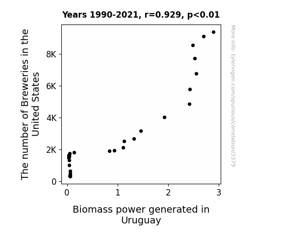
View details about correlation #3,379
Brewing Up Biomass: A Sudsy Connection Between Breweries in the United States and Biomass Power Generation in Uruguay
As the number of breweries in the United States hops up, there's a barley-able increase in spent grain production. This surplus of grain is then exported to Uruguay, where it's used as a fuel source for biomass power generation. In other words, it's a sudsy situation leading to a powerful impact - talk about a brew-tiful connection!

What else correlates?
The number of Breweries in the United States · all food
Biomass power generated in Uruguay · all energy
The number of Breweries in the United States · all food
Biomass power generated in Uruguay · all energy


View details about correlation #3,435
In Alabama, More Bio Profs, More xkcd guffaws: A Correlation Study
As the knowledge of biological science in Alabama dwindled, there were fewer individuals capable of understanding the subtle nuances of sarcasm. This led to a decline in demand for xkcd comics about sarcasm, prompting the creators to focus on other, more universally understandable, topics. Instead of laughing at biology-related sarcastic jokes in an informed manner, the audience had to shift their attention to general humor, much to the dismay of science enthusiasts. It was a real-life demonstration of natural selection, where only the most relatable and broadly comical comics survived in the academic ecosystem of entertainment.


View details about correlation #4,115
Avalanche of Ava: Unearthing the Interplay between Name Popularity and Hockey Prowess
As the name Ava gained popularity, more parents were inspired by its elegant simplicity, leading to a baby boom amongst hockey fans. This influx of new tiny supporters created a surge in demand for youth hockey programs, ultimately boosting the overall talent pool. With more skilled players hitting the ice, the competition intensified, and Nicklas Backstrom found himself engaged in longer, more intense regular season games. It's like the entire hockey world was saying, "Ava" reason to play harder and make every game count!


What else correlates?
Popularity of the first name Ava · all first names
Total regular season games played by Nicklas Backstrom · all sports
Popularity of the first name Ava · all first names
Total regular season games played by Nicklas Backstrom · all sports
. The chart goes from 2012 to 2021, and the two variables track closely in value over that time.")

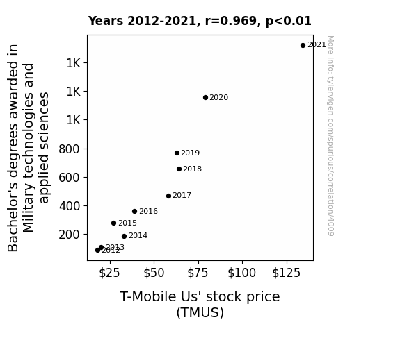
View details about correlation #4,009
Bachelor's Knowledge of Warfare and T-Mobile Stock Price: A Rhyme in Time
As more military technology experts graduate, they inadvertently invent a new way to boost T-Mobile's cell signal using top-secret, classified methods. This leads to superior network coverage and unprecedented customer satisfaction, causing a surge in T-Mobile subscribers and ultimately driving up the stock price.

What else correlates?
Bachelor's degrees awarded in Military technologies · all education
T-Mobile Us' stock price (TMUS) · all stocks
Bachelor's degrees awarded in Military technologies · all education
T-Mobile Us' stock price (TMUS) · all stocks


View details about correlation #1,346
Giddy Google Searches: Gangnam Style and Algerian Hydropower Hijinks
As the flow of hydropower dwindled, it dampened the energy in Algeria, leading to a decrease in Gangnam Style searches. It seems the nation just couldn't make a splash with the catchy tune anymore!


What else correlates?
Hydopower energy generated in Algeria · all energy
Google searches for 'Gangnam Style' · all google searches
Hydopower energy generated in Algeria · all energy
Google searches for 'Gangnam Style' · all google searches


View details about correlation #3,684
Unidentified Flying Patents: Exploring the UFO-Patent Connection in the United States
The increase in UFO sightings in Washington led to a surge in creativity among residents. As people gazed at the mysterious lights in the sky, their minds opened up to new possibilities. This surge in creativity sparked a wave of innovation, prompting more people to develop unique and unconventional ideas. Unable to explain the technology behind these UFOs, individuals and companies rushed to patent their own groundbreaking inventions, leading to a notable increase in patents granted in the US. Who knew that the key to technological advancement was simply looking up at the right moment!


What else correlates?
UFO sightings in Washington · all random state specific
Patents granted in the US · all weird & wacky
UFO sightings in Washington · all random state specific
Patents granted in the US · all weird & wacky


View details about correlation #3,940
Keeping it Safe, Scoring Big: The Occupational Health and Safety Technicians' Impact on the Buffalo Bills' Season Wins in New York
As the number of occupational health and safety technicians in New York increased, there was a corresponding surge in the manufacturing of tiny good luck charms in the shape of footballs. These charms, being distributed haphazardly in boxes of safety equipment, made their way to Buffalo where they inexplicably ended up in the pockets of the Buffalo Bills players. This led to a string of wins as the players unknowingly carried the tiny, luck-infused footballs onto the field, giving them an unexpected magical advantage. It seems like occupational health and safety took on a whole new meaning for the Buffalo Bills, as they found themselves not just protecting their physical well-being, but also inadvertently safeguarding their path to victory!


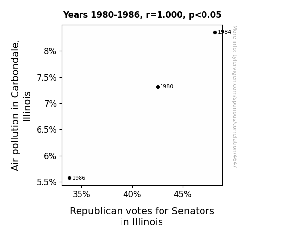
View details about correlation #4,647
Pollution Politics: The Smoggy Connection Between Air Quality and Republican Senate Votes in Carbondale, Illinois
As the skies cleared, so did the Republican votes. It seems the GOP lost their 'air' of support in the midst of cleaner politics. It's like they say, when the pollution's down, the re-election's in jeopardy. It must be a gas to see how environmental changes can lead to political ones.

What else correlates?
Air pollution in Carbondale, Illinois · all weather
Votes for Republican Senators in Illinois · all elections
Air pollution in Carbondale, Illinois · all weather
Votes for Republican Senators in Illinois · all elections


View details about correlation #1,549
Shedding Light on Solar-Powered Cheese: An Analysis of American Cheese Consumption and Solar Power Generation in Morocco
As American cheese consumption increased, the collective gaseous byproduct from all the cheese-loving individuals somehow wafted its way across the Atlantic to Morocco. Upon reaching the sunny land, this 'cheesy' gas managed to interact with the sunlight in such a whey that it inadvertently boosted the efficiency of solar panels. It’s like the cheese emissions provided a gouda energy source, leading to a provolone increase in solar power generated in Morocco. In reality, these two events are likely completely unrelated and just a coincidental correlation.


What else correlates?
American cheese consumption · all food
Solar power generated in Morocco · all energy
American cheese consumption · all food
Solar power generated in Morocco · all energy


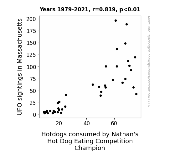
View details about correlation #1,716
UFOs, Hotdogs, and the Champion: Exploring the Surprising Connection Between Extraterrestrial Sightings in Massachusetts and Nathan's Hot Dog Eating Competition
The increase in UFO sightings in Massachusetts led to a surge in demand for aluminum foil, which in turn caused a shortage in the production of UFO-shaped balloons. This shortage prompted the state to host more hot air balloon festivals, leading to an increase in the availability of festival-style hotdogs. The reigning Nathan's Hot Dog Eating Competition Champion, being a fan of festive hotdogs, found himself with a greater supply of his preferred competition fuel, ultimately contributing to his record-breaking hot dog consumption.


View details about correlation #4,076
Pitch Perfect: The Lingua Franca of Dodgers' Victorious Vocabulary
As more students became fluent in foreign languages, they were able to communicate better with the Dodgers' diverse roster, leading to improved teamwork and a strong sense of unity. This linguistic advantage allowed them to "pitch" their ideas more effectively, leading to a major "home run" in their performance. As the players began to understand each other on a whole new level, they were able to "catch" onto strategies and game plans with ease, ultimately leading to a linguistic home field advantage and a season that was nothing short of "grammar" in the National League West Division.


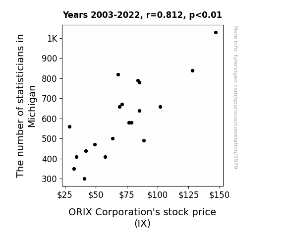
. The chart goes from 2003 to 2022, and the two variables track closely in value over that time.")

View details about correlation #2,979
Statistically Significant: The Number-Crunching Connection Between Statisticians in Michigan and ORIX Corporation's Stock Price
The statisticians in Michigan were really good at predicting data trends, so their mere presence statistiCAN lead to stock prices going up! They must have been working their statistiCAN'Ts off to make it happen.

What else correlates?
The number of statisticians in Michigan · all cccupations
ORIX Corporation's stock price (IX) · all stocks
The number of statisticians in Michigan · all cccupations
ORIX Corporation's stock price (IX) · all stocks


View details about correlation #1,496
Shining a Light on Sus-tainable Power: The Correlation Between Solar Energy Production in Bolivia and 'That is Sus' Google Searches
As the solar panels soaked up the Bolivian sunshine, they inadvertently beamed out a suspiciously strong energy field, making everyone question each other's actions in a lighthearted, yet perplexing manner. It's like the sun was shining a spotlight on all the sneakiness, creating a real-life game of solar suss among the Bolivian population. The power was just too sus-tenable to handle!


What else correlates?
Solar power generated in Bolivia · all energy
Google searches for 'that is sus' · all google searches
Solar power generated in Bolivia · all energy
Google searches for 'that is sus' · all google searches


View details about correlation #2,252
A Kernel of Truth: The Maize-ing Connection Between GMO Corn and Triplet Birth Rates in Wisconsin
The decrease in GMO use in Wisconsin corn led to a cornstalk uprising, where they formed secret alliances with storks, leading to a decrease in the delivery of multiple bundles of joy. Looks like the stalk market for triplets is down!


What else correlates?
GMO use in corn grown in Wisconsin · all food
US birth rates of triplets or more · all weird & wacky
GMO use in corn grown in Wisconsin · all food
US birth rates of triplets or more · all weird & wacky


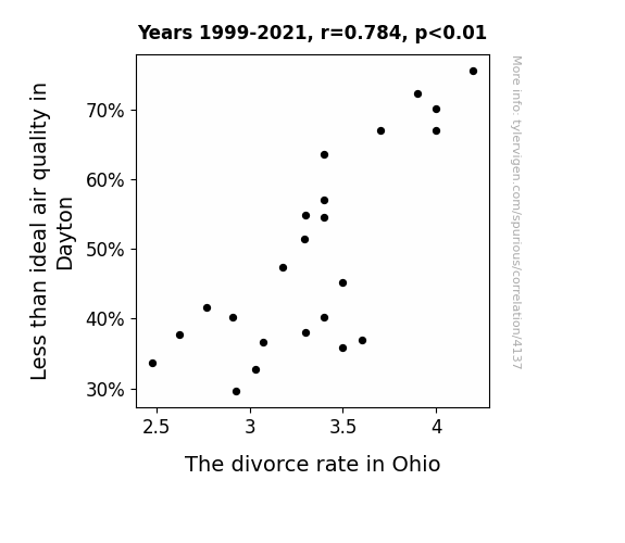
View details about correlation #4,137
When the Air Clears: Uncovering the Relationship Between Air Pollution in Dayton and the Divorce Rate in Ohio
When the air was murky, the spouses were in a haze, but as the skies cleared, so did their communication!

What else correlates?
Air pollution in Dayton · all weather
The divorce rate in Ohio · all random state specific
Air pollution in Dayton · all weather
The divorce rate in Ohio · all random state specific


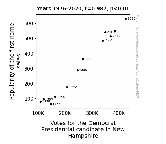
View details about correlation #4,407
Isaias Name Popularity and Democratic Votes in the Granite State: An Election Analysis
People just couldn't resist the 'Isaias' factor, you know, like the 'eye-zaahs' of the political world. It's as if every Isaias supporter was saying, "I say, yes!" to the Democratic candidate. It's like they cast a spell at the polls, turning the state into 'Isaias-Blue-Isas.'


View details about correlation #1,798
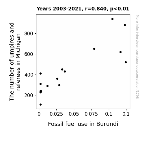
Refereeing the Fossil Fueled: The Unlikely Link Between Sports Officials in Michigan and Fossil Fuel Use in Burundi
As the number of umpires and referees in Michigan increased, there was a corresponding rise in whistle production. This led to a global shortage of plastic, forcing Burundi to ramp up fossil fuel use for alternative plastic production, and inadvertently blowing the situation out of proportion.

What else correlates?
The number of umpires and referees in Michigan · all cccupations
Fossil fuel use in Burundi · all energy
The number of umpires and referees in Michigan · all cccupations
Fossil fuel use in Burundi · all energy


View details about correlation #1,833
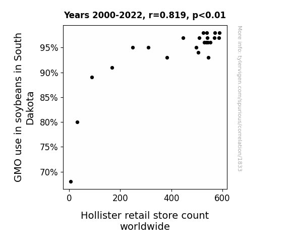
Genetically Modified Goop: Grasping the Galactic Connection between Soybeans and Surrealistic Stores
As soybean crops experienced a growth spurt from GMO use, it led to a surplus of soy material for clothing production. This, in turn, lowered the cost of manufacturing stylish yet affordable soy-based clothing, giving Hollister the perfect opportunity to expand its store count worldwide. You could say it really "soy-ced" up their expansion plans!

What else correlates?
GMO use in soybeans in South Dakota · all food
Hollister retail store count worldwide · all weird & wacky
GMO use in soybeans in South Dakota · all food
Hollister retail store count worldwide · all weird & wacky


View details about correlation #3,720
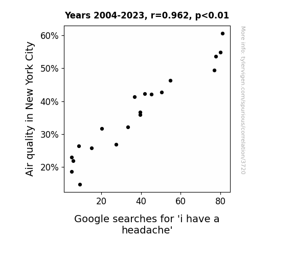
The City's Air and a Headache's Flair: A Correlation Between New York City Air Quality and Google Searches for 'I Have a Headache'
The increase in air quality led to an influx of tourists wearing strong cologne and perfume, overwhelming the senses of New Yorkers and causing their headaches to worsen. "They said to stop and smell the roses, but all I got was a headache from the tourists!"

What else correlates?
Air quality in New York City · all weather
Google searches for 'i have a headache' · all google searches
Air quality in New York City · all weather
Google searches for 'i have a headache' · all google searches
. The chart goes from 2002 to 2022, and the two variables track closely in value over that time.")

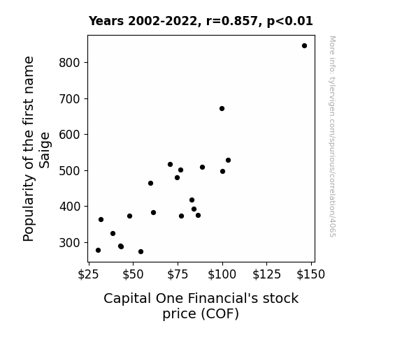
View details about correlation #4,065
From Saige to Stocks: The Surprising Saga of COF's Price with a Dash of Name Game
The name Saige became so trendy that all the cool kids wanted to open their first bank account, leading to a surge in new customers for Capital One. The demand for those coveted Capital One credit cards with quirky commercials featuring celebrities skyrocketed, causing the company's stock price to follow suit. It's a Saige sensation that even financial analysts can't fully explain!

What else correlates?
Popularity of the first name Saige · all first names
Capital One Financial's stock price (COF) · all stocks
Popularity of the first name Saige · all first names
Capital One Financial's stock price (COF) · all stocks
Why this works
- Data dredging: I have 25,237 variables in my database. I compare all these variables against each other to find ones that randomly match up. That's 636,906,169 correlation calculations! This is called “data dredging.”
Fun fact: the chart used on the wikipedia page to demonstrate data dredging is also from me. I've been being naughty with data since 2014.
Instead of starting with a hypothesis and testing it, I instead tossed a bunch of data in a blender to see what correlations would shake out. It’s a dangerous way to go about analysis, because any sufficiently large dataset will yield strong correlations completely at random. - Lack of causal connection: There is probably no direct connection between these variables, despite what the AI says above.
Because these pages are automatically generated, it's possible that the two variables you are viewing are in fact causually related. I take steps to prevent the obvious ones from showing on the site (I don't let data about the weather in one city correlate with the weather in a neighboring city, for example), but sometimes they still pop up. If they are related, cool! You found a loophole.
This is exacerbated by the fact that I used "Years" as the base variable. Lots of things happen in a year that are not related to each other! Most studies would use something like "one person" in stead of "one year" to be the "thing" studied. - Observations not independent: For many variables, sequential years are not independent of each other. You will often see trend-lines form. If a population of people is continuously doing something every day, there is no reason to think they would suddenly change how they are doing that thing on January 1. A naive p-value calculation does not take this into account.
You will calculate a lower chance of "randomly" achieving the result than represents reality.
To be more specific: p-value tests are probability values, where you are calculating the probability of achieving a result at least as extreme as you found completely by chance. When calculating a p-value, you need to assert how many "degrees of freedom" your variable has. I count each year (minus one) as a "degree of freedom," but this is misleading for continuous variables.
This kind of thing can creep up on you pretty easily when using p-values, which is why it's best to take it as "one of many" inputs that help you assess the results of your analysis.
- Y-axes doesn't start at zero: I truncated the Y-axes of the graphs above. I also used a line graph, which makes the visual connection stand out more than it deserves.
Nothing against line graphs. They are great at telling a story when you have linear data! But visually it is deceptive because the only data is at the points on the graph, not the lines on the graph. In between each point, the data could have been doing anything. Like going for a random walk by itself!
Mathematically what I showed is true, but it is intentionally misleading. If you click on any of the charts that abuse this, you can scroll down to see a version that starts at zero. - Confounding variable: Confounding variables (like global pandemics) will cause two variables to look connected when in fact a "sneaky third" variable is influencing both of them behind the scenes.
- Outliers: Some datasets here have outliers which drag up the correlation.
In concept, "outlier" just means "way different than the rest of your dataset." When calculating a correlation like this, they are particularly impactful because a single outlier can substantially increase your correlation.
Because this page is automatically generated, I don't know whether any of the charts displayed on it have outliers. I'm just a footnote. ¯\_(ツ)_/¯
I intentionally mishandeled outliers, which makes the correlation look extra strong. - Low n: There are not many data points included in some of these charts.
You can do analyses with low ns! But you shouldn't data dredge with a low n.
Even if the p-value is high, we should be suspicious of using so few datapoints in a correlation.
Pro-tip: click on any correlation to see:
- Detailed data sources
- Prompts for the AI-generated content
- Explanations of each of the calculations (correlation, p-value)
- Python code to calculate it yourself


