spurious correlations
discover · random · spurious scholar
← previous page · next page →


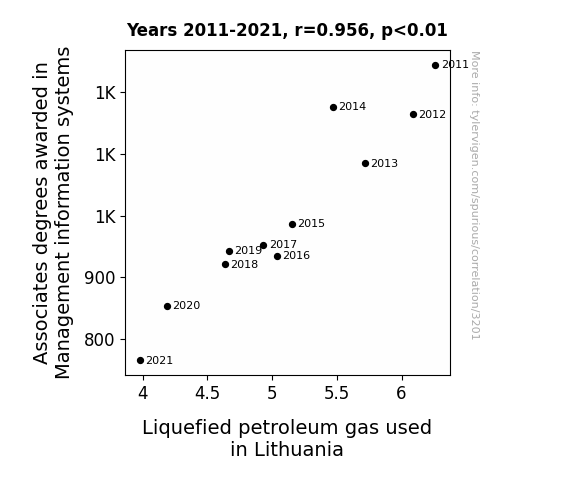
View details about correlation #3,201
Management Information Systems: A Gas-tly Connection to Liquefied Petroleum in Lithuania
As the saying goes, "less management information, more control of gas emission!" It seems that as the supply of Management Information Systems professionals has dwindled, there's been a natural gasp in the demand for Liquefied Petroleum Gas in Lithuania. It's a case of 'Ctrl Alt Deplete' as the decrease in qualified individuals has led to a 'disconnect' in the industry, creating a 'power outage' in the job market. Looks like they'll need to 'reboot' their strategies to avoid 'burning out' in this field! It's a 'system error' that's leaving everyone 'gasping' for a solution, and the job market is feeling the heat as a result. With fewer experts to 'navigate' the industry, it's clear that when it comes to Management Information Systems, the stakes are high - or should I say, the 'gas' is high! This correlation is really 'fired up' the debate about the impact of education on global industries. Looks like they'll need to 'streamline' their approach to education to avoid a 'deficit' in the workforce. It's a 'sector' where every 'byte' of knowledge counts, and the shortage of qualified professionals is definitely putting the industry in 'power-saving mode'.


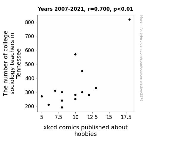
View details about correlation #2,576
The Social Science of Comics: An Analysis of the Correlation between College Sociology Teachers in Tennessee and xkcd Comics on Hobbies
As the college sociology teachers in Tennessee dwindled, there were fewer experts to analyze the intricate social dynamics of various hobbies. This led to a nationwide shortage of hobby-related societal insights, stifling the creative flow for xkcd comics in this niche. With no one to teach about the sociology of hobbies, the xkcd creator found themselves adrift in a sea of leisure activities, unable to craft the usual hilarious and relatable content.


View details about correlation #4,390
UnicorN and Unicorntrollers: A Correlation Analysis of Google Searches for 'Unicorns' and Average Number of Comments on The Game Theorists' YouTube Videos
As the fascination with unicorns grew, so did the desire to engage in discussions about fantastical concepts. Perhaps the mythical allure of unicorns sparked a sense of wonder and creativity, leading to more enthusiastic participation in The Game Theorists' video comments. Alternatively, maybe there's a hidden unicorn level in a video game that was just discovered, prompting fans to share their excitement and theories in the comments section. Or it's possible that unicorns, with their association to magic and mystery, somehow enchanted viewers into being more active and vocal about their thoughts on gaming. But in all seriousness, this correlation is purely coincidental and is just a lighthearted reminder that sometimes, the most improbable connections can make us smile.


. The chart goes from 2002 to 2022, and the two variables track closely in value over that time.")

View details about correlation #4,081
The Denver Dilemma: A Correlation between First Name Popularity and Intel's Stock Performance
As the number of babies named Denver rose, so did the demand for cute baby clothes emblazoned with the city's name. This unexpected boost in the infant fashion market caught the attention of Intel executives, who saw a lucrative opportunity to corner the baby technology sector with their new line of baby smart onesies. As news of Intel's foray into baby tech spread, investors couldn't resist the potential for a Diaper-DAQ boom, causing a surge in Intel's stock price.


What else correlates?
Popularity of the first name Denver · all first names
Intel's stock price (INTC) · all stocks
Popularity of the first name Denver · all first names
Intel's stock price (INTC) · all stocks


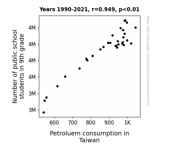
View details about correlation #2,073
Fueling the Line: Exploring the Relationship Between 9th Grade Enrollment and Petroleum Consumption in Taiwan
As more 9th graders entered public schools, there was a spike in science class enrollment. This led to an unexpected surge in the production of mini volcanoes for experiments, creating a lava-ly demand for petroleum-based products. Who knew that the nation's fuel dependency hinged on the fiery passion of young scientists-in-the-making! It's a crude awakening to the unexplored connection between education and oil production.

What else correlates?
Number of public school students in 9th grade · all education
Petroluem consumption in Taiwan · all energy
Number of public school students in 9th grade · all education
Petroluem consumption in Taiwan · all energy


View details about correlation #3,015
A Symphony of Data: The Harmonious Relationship between Music Directors in Tennessee and Las Vegas Hotel Room Check-Ins
As more music directors and composers flocked to Tennessee, word spread about the harmonious atmosphere. This led to a surge in musical-themed performances and events in Las Vegas, captivating tourists and prompting them to check in to hotel rooms for a chance to experience a truly symphonic stay. It's like the hotels were conducting a perfect melody of hospitality, enticing guests with a suite sound that they just couldn't resist. The composers may not have written a song specifically about Las Vegas, but their presence certainly orchestrated a crescendo of hotel bookings in a most unexpected, yet entertaining, way!


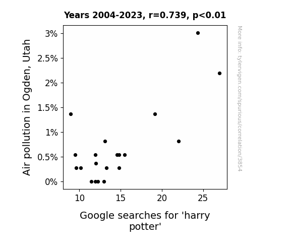
View details about correlation #3,854
The Peculiar Pondering of Potter: Air Pollution and the Pursuit of Magic in Ogden, Utah
The smog in Ogden cast a spell on residents, leading them to seek refuge in the magical world of Harry Potter. As air pollution levels rose, it became more difficult to see clearly, prompting people to turn to the boy who lived in a hazier, more enchanting environment. It's as if the city's air was saying, "Muggles, you can't see me!" So, they apparated to the internet, searching for a breath of fresh Hogwarts air. Clearly, in this case, the search for Harry Potter was nothing but a lot of smogic!

What else correlates?
Air pollution in Ogden, Utah · all weather
Google searches for 'harry potter' · all google searches
Air pollution in Ogden, Utah · all weather
Google searches for 'harry potter' · all google searches


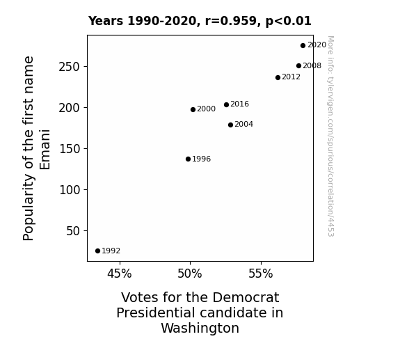
View details about correlation #4,453
Emani-tion and Political Affiliation: A Correlation Study of Emani's Popularity and Democrat Votes
More people were Emani-pulated into voting for the Democratic candidate!


View details about correlation #3,369
Spreading the Margarine of Progress: Unveiling the Churn of Butter Consumption on Biomass Power Generation in India
As butter consumption increased, so did the collective girth of the population. This led to more people getting stuck in doorways, prompting a surge in innovative energy solutions like biomass power to help grease their way out. So, in a way, butter literally helped India power through the challenges!


What else correlates?
Butter consumption · all food
Biomass power generated in India · all energy
Butter consumption · all food
Biomass power generated in India · all energy


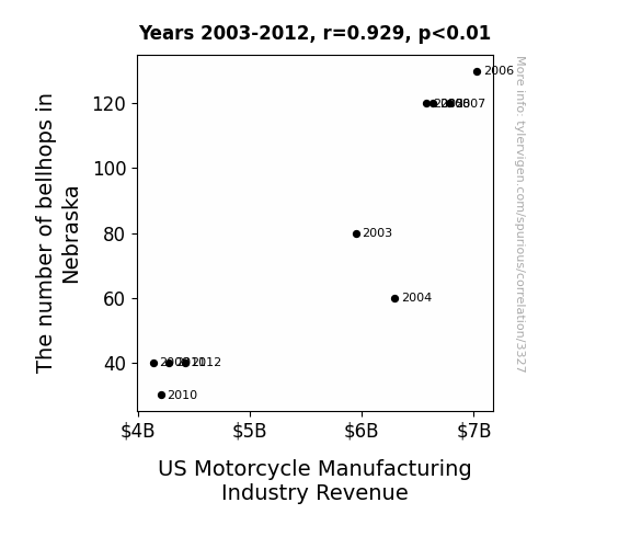
View details about correlation #3,327
Tinkling Bellhops and Motorbikes: A Ding-Dong Duet or Just a Bell Curve?
As the number of bellhops in Nebraska dwindled, there was a subsequent shortage of individuals skilled in the delicate art of ringing motorcycle handlebar bells. This led to a decline in the overall demand for motorcycles, as consumers were unable to experience the joy of customizable bell sounds while riding. The result was a revved-down revenue for the US Motorcycle Manufacturing Industry.

What else correlates?
The number of bellhops in Nebraska · all cccupations
US Motorcycle Manufacturing Industry Revenue · all weird & wacky
The number of bellhops in Nebraska · all cccupations
US Motorcycle Manufacturing Industry Revenue · all weird & wacky


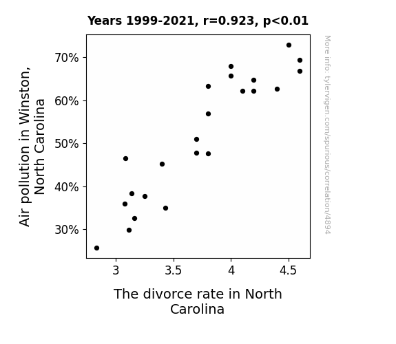
View details about correlation #4,894
Pollution and Acrimony: A Statistical Examination of How Air Quality in Winston Impacts the Divorce Rate in North Carolina
As the air quality improved, people in Winston-Salem were finally able to take a deep breath and reevaluate their relationships. With clearer lungs, they found it easier to see eye to eye and work out their differences, leading to a harmonious uptick in marital satisfaction. Who knew that cleaner air could lead to cleaner slates in love?!

What else correlates?
Air pollution in Winston, North Carolina · all weather
The divorce rate in North Carolina · all random state specific
Air pollution in Winston, North Carolina · all weather
The divorce rate in North Carolina · all random state specific
. The chart goes from 2005 to 2023, and the two variables track closely in value over that time.")

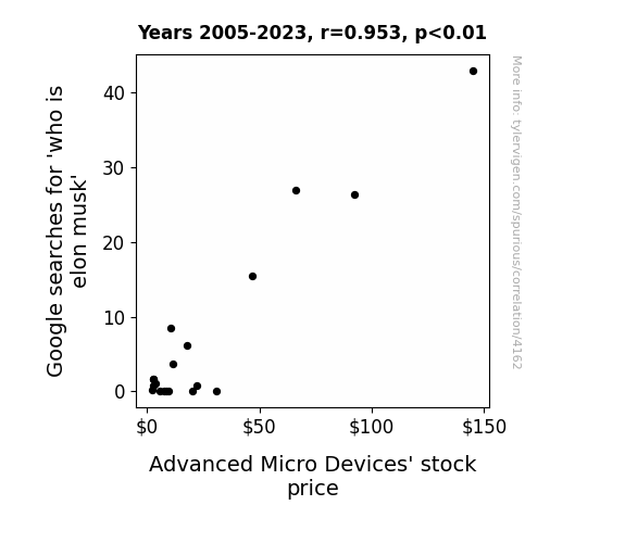
View details about correlation #4,162
Googling Elon Musk and Stock Hustle: A Quantitative Analysis of AMD's Market Moves
As more people became aware of Elon Musk, the demand for innovative and futuristic technology concepts skyrocketed. This increased interest created a ripple effect in the tech industry, leading to a surge in confidence and enthusiasm for companies like AMD that are at the forefront of creating the building blocks for the future. In essence, Elon Musk's expanding spotlight shone a positive light on the entire tech sector, including AMD, as investors and consumers alike clamored for the next big thing in technological advancement.

What else correlates?
Google searches for 'who is elon musk' · all google searches
Advanced Micro Devices' stock price (AMD) · all stocks
Google searches for 'who is elon musk' · all google searches
Advanced Micro Devices' stock price (AMD) · all stocks


View details about correlation #2,442
Solar Hoard in Croatia and US Cod Squad: A Rhyme and Reason for the Edible Fishery Season
The fish in the Adriatic Sea got a taste for adventure and decided to take a spontaneous trip across the Atlantic. The abundance of sunlight in Croatia must have given them a sudden burst of energy and wanderlust!


What else correlates?
Solar power generated in Croatia · all energy
US edible fishery product imports · all food
Solar power generated in Croatia · all energy
US edible fishery product imports · all food


View details about correlation #3,180
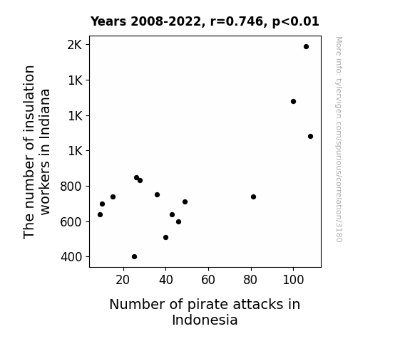
The Heat is On: Exploring the Link between Insulation Workers in Indiana and Pirate Attacks in Indonesia
As the insulation workers in Indiana became more skilled at keeping things under wraps, they inadvertently sparked a competitive trend. This led to a surge in pirate fashion in Indonesia, with a focus on stylish insulated jackets. The pirates couldn't resist the allure of being both fashionable and warm, so they decided to up their raiding game to acquire more insulation supplies. It seems that in this case, the Hoosier state's insulation industry truly did 'seas' the day in inspiring pirate activity in distant waters.

What else correlates?
The number of insulation workers in Indiana · all cccupations
Number of pirate attacks in Indonesia · all weird & wacky
The number of insulation workers in Indiana · all cccupations
Number of pirate attacks in Indonesia · all weird & wacky


View details about correlation #4,051
The Air-ly Goal Connection: A Study on the Relationship Between Air Pollution in Beaver Dam, Wisconsin, and Lukas Podolski's Domestic Match Goal Count
As air pollution in Beaver Dam, Wisconsin increased, the concentration of airborne particles created a thicker atmosphere. This thicker atmosphere coincidentally mimicked the conditions of a high-altitude training environment, allowing Lukas Podolski to develop stronger respiratory muscles and ultimately leading to an improved oxygen utilization efficiency. This meant that when he played domestic matches, he had a breath-taking performance, scoring more goals than before.


What else correlates?
Air pollution in Beaver Dam, Wisconsin · all weather
Lukas Podolski's domestic match goal count · all sports
Air pollution in Beaver Dam, Wisconsin · all weather
Lukas Podolski's domestic match goal count · all sports
. The chart goes from 2002 to 2022, and the two variables track closely in value over that time.")

View details about correlation #4,109
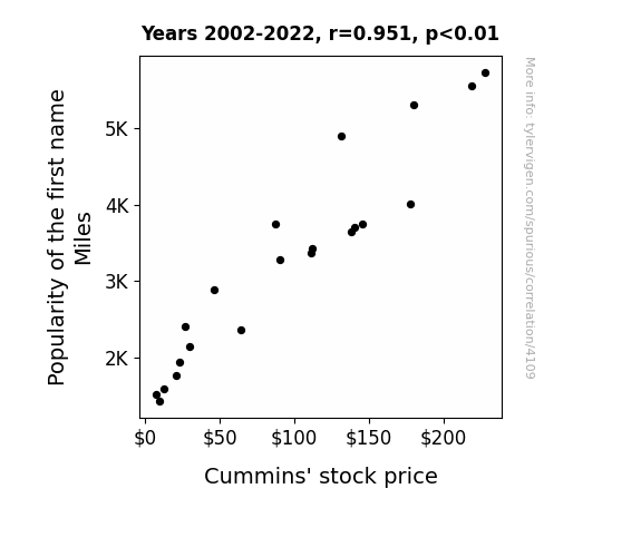
Stocking Up on Miles: The Correlation Between Miles' Popularity and Cummins Inc. Stock Price
Every time a baby is named Miles, a secret signal is sent to the stock market, prompting investors to buy Cummins' stock in anticipation of a future demand for miles of truck engines. This baby name trend has revved up the stock price, proving that when it comes to financial success, it's all about the journey, not the destination.

What else correlates?
Popularity of the first name Miles · all first names
Cummins' stock price (CMI) · all stocks
Popularity of the first name Miles · all first names
Cummins' stock price (CMI) · all stocks


View details about correlation #2,595
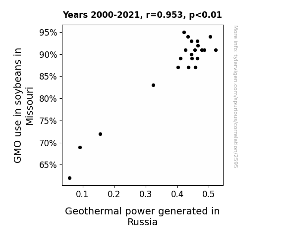
Toy Soy and Russian Boil: The Correlation Between GMO Soybean Cultivation in Missouri and Geothermal Power in Russia
The soybeans were so full of energy, they inadvertently transmitted a power-boosting gene to the Earth's core. As the soybeans multiplied, so did the underground power source, leading to an unexpected rise in geothermal activity in Russia. It's a case of leguminous legacies and subterranean soy shocks!

What else correlates?
GMO use in soybeans in Missouri · all food
Geothermal power generated in Russia · all energy
GMO use in soybeans in Missouri · all food
Geothermal power generated in Russia · all energy


View details about correlation #3,709
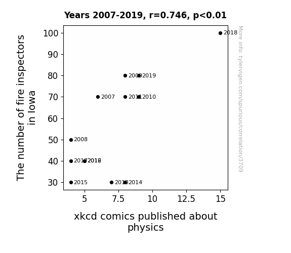
The Hot Pursuit of Physics: A Blaze of Insight into the Correlation Between Fire Inspectors in Iowa and xkcd Comics
The presence of fire inspectors in Iowa inspired a newfound appreciation for safety protocols. This, in turn, led to an increase in the number of scientifically inclined individuals who, while pondering the physics of firefighting, inspired Randall Munroe to create more physics-related xkcd comics. It's like they say, where there's smoke, there's comic inspiration!

What else correlates?
The number of fire inspectors in Iowa · all cccupations
xkcd comics published about physics · all weird & wacky
The number of fire inspectors in Iowa · all cccupations
xkcd comics published about physics · all weird & wacky


View details about correlation #4,881
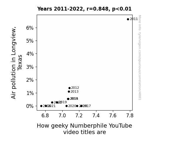
Air Pollution and Geeky Numberphile Videos: A Correlative Study
As the smog lifted, so did the standard deviation of video title quirkiness. It seems there's a direct correlation between clean air and a reduct-ion in nerdiness. It's like the atmosphere said, "Let's factor out the pollution and multiply the puns!" Now, instead of inhaling carbon particles, the residents are breathing a sigh of re-leaf as the city becomes a prime number place to live.

What else correlates?
Air pollution in Longview, Texas · all weather
How geeky Numberphile YouTube video titles are · all YouTube
Air pollution in Longview, Texas · all weather
How geeky Numberphile YouTube video titles are · all YouTube


View details about correlation #4,411
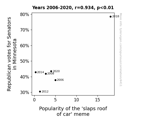
Republican Road Rage: A Correlational Study of Minnesota Senators and the 'Slaps Roof of Car' Meme Popularity
As Republican votes for Senators in Minnesota increased, so did the Popularity of the 'slaps roof of car' meme. This is because the Midwestern love for practical, no-nonsense vehicles and the tradition of using a good ol' car analogy in politics contributed to a heightened appreciation for the meme. Additionally, some believe that as political tensions revved up, the meme provided a much-needed opportunity for bipartisan chuckles, proving that no matter which side of the aisle you're on, a car salesperson's enthusiasm is universally meme-worthy.

What else correlates?
Votes for Republican Senators in Minnesota · all elections
Popularity of the 'slaps roof of car' meme · all memes
Votes for Republican Senators in Minnesota · all elections
Popularity of the 'slaps roof of car' meme · all memes
Why this works
- Data dredging: I have 25,237 variables in my database. I compare all these variables against each other to find ones that randomly match up. That's 636,906,169 correlation calculations! This is called “data dredging.”
Fun fact: the chart used on the wikipedia page to demonstrate data dredging is also from me. I've been being naughty with data since 2014.
Instead of starting with a hypothesis and testing it, I instead tossed a bunch of data in a blender to see what correlations would shake out. It’s a dangerous way to go about analysis, because any sufficiently large dataset will yield strong correlations completely at random. - Lack of causal connection: There is probably no direct connection between these variables, despite what the AI says above.
Because these pages are automatically generated, it's possible that the two variables you are viewing are in fact causually related. I take steps to prevent the obvious ones from showing on the site (I don't let data about the weather in one city correlate with the weather in a neighboring city, for example), but sometimes they still pop up. If they are related, cool! You found a loophole.
This is exacerbated by the fact that I used "Years" as the base variable. Lots of things happen in a year that are not related to each other! Most studies would use something like "one person" in stead of "one year" to be the "thing" studied. - Observations not independent: For many variables, sequential years are not independent of each other. You will often see trend-lines form. If a population of people is continuously doing something every day, there is no reason to think they would suddenly change how they are doing that thing on January 1. A naive p-value calculation does not take this into account.
You will calculate a lower chance of "randomly" achieving the result than represents reality.
To be more specific: p-value tests are probability values, where you are calculating the probability of achieving a result at least as extreme as you found completely by chance. When calculating a p-value, you need to assert how many "degrees of freedom" your variable has. I count each year (minus one) as a "degree of freedom," but this is misleading for continuous variables.
This kind of thing can creep up on you pretty easily when using p-values, which is why it's best to take it as "one of many" inputs that help you assess the results of your analysis.
- Y-axes doesn't start at zero: I truncated the Y-axes of the graphs above. I also used a line graph, which makes the visual connection stand out more than it deserves.
Nothing against line graphs. They are great at telling a story when you have linear data! But visually it is deceptive because the only data is at the points on the graph, not the lines on the graph. In between each point, the data could have been doing anything. Like going for a random walk by itself!
Mathematically what I showed is true, but it is intentionally misleading. If you click on any of the charts that abuse this, you can scroll down to see a version that starts at zero. - Confounding variable: Confounding variables (like global pandemics) will cause two variables to look connected when in fact a "sneaky third" variable is influencing both of them behind the scenes.
- Outliers: Some datasets here have outliers which drag up the correlation.
In concept, "outlier" just means "way different than the rest of your dataset." When calculating a correlation like this, they are particularly impactful because a single outlier can substantially increase your correlation.
Because this page is automatically generated, I don't know whether any of the charts displayed on it have outliers. I'm just a footnote. ¯\_(ツ)_/¯
I intentionally mishandeled outliers, which makes the correlation look extra strong. - Low n: There are not many data points included in some of these charts.
You can do analyses with low ns! But you shouldn't data dredge with a low n.
Even if the p-value is high, we should be suspicious of using so few datapoints in a correlation.
Pro-tip: click on any correlation to see:
- Detailed data sources
- Prompts for the AI-generated content
- Explanations of each of the calculations (correlation, p-value)
- Python code to calculate it yourself


