spurious correlations
discover · random · spurious scholar
← previous page · next page →


View details about correlation #3,250
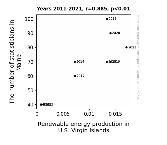
The Statistical Schmooze: Statisticians in the State of Maine and their Influence on Renewable Energy Production in the U.S. Virgin Islands
As the number of statisticians in Maine grew, so did their love for data analysis. This led to the 'Maine Statistician Effect,' where they discovered the shocking correlation between strong oceanic winds in U.S. Virgin Islands and the potential for wind energy. It turns out, they really knew how to *blow* those renewable energy production numbers through the roof!

What else correlates?
The number of statisticians in Maine · all cccupations
Renewable energy production in U.S. Virgin Islands · all energy
The number of statisticians in Maine · all cccupations
Renewable energy production in U.S. Virgin Islands · all energy


View details about correlation #1,186
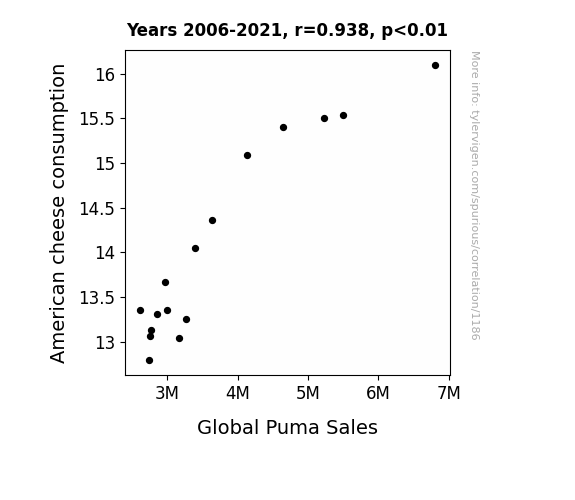
Say Cheese: Unveiling the Cheddar Connection Between American Cheese Consumption and Global Puma Sales
As American cheese consumption increased, more individuals experienced cheese-induced dreams where they were being chased by giant pumas. This led to a heightened awareness and subconscious desire for puma-related products, ultimately boosting global puma sales. The dreams, filled with suspense and cheddar, created a sharp increase in demand for the sleek and agile puma merchandise. Remember, you’re not dreaming – it's a gouda time to be in the puma business! However, there is no actual way that American cheese consumption could cause an increase in global puma sales.
What else correlates?
American cheese consumption · all food
Global Puma Sales · all weird & wacky
American cheese consumption · all food
Global Puma Sales · all weird & wacky


View details about correlation #4,339
Thaddeus for the Libertarianus: An Analysis of the Thaddeus Name Popularity and Presidential Votes in Kansas
As the popularity of the first name Thaddeus has risen, so has the preference for unconventional and lesser-known options. This has created a subconscious connection between the underdog status of the name Thaddeus and the appeal of the Libertarian candidate in Kansas. People seem to be subliminally swayed by the idea of embracing the overlooked and offbeat choice, leading to a surprising surge in support for the Libertarian party. Perhaps there's something about the name Thaddeus that just screams, "Let's shake things up!"


View details about correlation #4,265
Rain or Shine: Mark Rober's YouTube Titles Forecasting Precipitation in San Antonio
The rain in San Antonio increases the insightful nature of Mark Rober's YouTube video titles because the pitter-patter of the raindrops creates harmonious vibrations that directly stimulate the creative centers of his brain, leading to an influx of brilliant ideas for video content. As the petrichor permeates the air, it inexplicably triggers a surge of wisdom and ingenuity within Mark Rober, inspiring him to craft exceptionally thought-provoking titles that captivate and enlighten audiences. Remember, when it drizzles in Texas, it drizzles inspiration in Mark Rober's mind, ultimately leading to an outpouring of remarkably insightful video titles that leave viewers both amazed and educated.


What else correlates?
How insightful Mark Rober YouTube video titles are · all YouTube
Rain in San Antonio · all weather
How insightful Mark Rober YouTube video titles are · all YouTube
Rain in San Antonio · all weather


View details about correlation #2,268
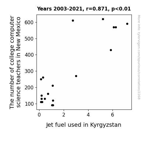
Code Networking: Exploring the Link Between Codeducators and Fuel Consumption in Kyrgyzstan
As the college computer science teacher population in New Mexico grew, so did the demand for office supplies like pens and paper. This led to a worldwide shortage of ink, prompting engineers in Kyrgyzstan to develop more fuel-efficient jet engines, thereby increasing the consumption of jet fuel. It's a classic case of the butterfly defect: when a computer science teacher in the desert flaps his programming textbook, a jet in the mountains of Central Asia gets its fuel efficiency upgraded!

What else correlates?
The number of college computer science teachers in New Mexico · all cccupations
Jet fuel used in Kyrgyzstan · all energy
The number of college computer science teachers in New Mexico · all cccupations
Jet fuel used in Kyrgyzstan · all energy


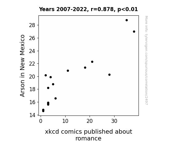
View details about correlation #2,497
Burning Love: Exploring the Relationship Between Arson in New Mexico and xkcd Comics on Romance
As the number of intentionally set fires in New Mexico decreased, there was a corresponding drop in the atmospheric levels of smoke and ash. This unexpected environmental change seemed to coincide with a decrease in the production of xkcd comics about romance. It's possible that the absence of smoky air disrupted the artist's creative process, leading to a temporary shortage of romantically themed comics. Alternatively, perhaps the lack of fiery imagery subconsciously extinguished the passion for drawing such content. Or maybe it's just a coincidental correlation, but we're inclined to believe that in this case, less arson quite literally means less burning love in the world of xkcd.

What else correlates?
Arson in New Mexico · all random state specific
xkcd comics published about romance · all weird & wacky
Arson in New Mexico · all random state specific
xkcd comics published about romance · all weird & wacky
. The chart goes from 2002 to 2022, and the two variables track closely in value over that time.")

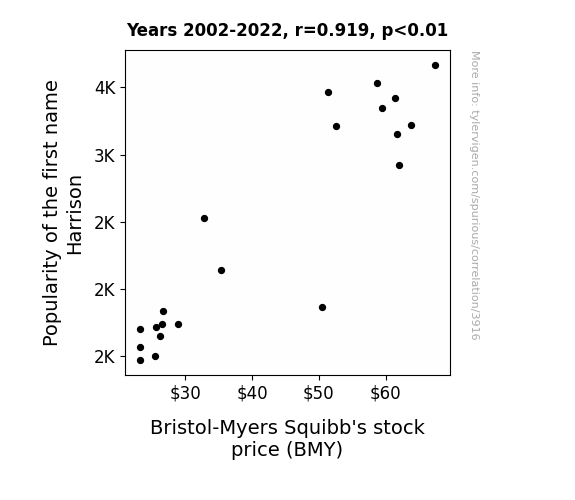
View details about correlation #3,916
Harrison's Handle: How a Name Nudges the Nasdaq
This increase could be because anyone named Harrison is actually a secret genius at biopharmaceutical investing, leading to a surge of Harrison-named individuals investing heavily in Bristol-Myers Squibb. Or possibly, there's a Harrison out there who accidentally discovered the elixir of stock price growth, and as more and more kids were named after him, the effect compounded, much like the interest on a savvy investment.

What else correlates?
Popularity of the first name Harrison · all first names
Bristol-Myers Squibb's stock price (BMY) · all stocks
Popularity of the first name Harrison · all first names
Bristol-Myers Squibb's stock price (BMY) · all stocks


View details about correlation #4,227
ET, GMO, and Cotton: Unearthing the Quest for Extraterrestrial Signals
As GMO use in cotton decreased in Georgia, the cotton plants became less appealing to extra-terrestrial life forms. You see, these aliens had been using the cotton fields as landing sites for their intergalactic communications. But with the non-GMO cotton being less attractive, E.T. and friends had to find a new preferred spot to phone home, leading to a decrease in Google searches for "E.T. phone home." It seems even aliens have strong opinions about organic produce! So, by embracing non-GMO cotton, Georgia inadvertently initiated the first contact with a fashion-conscious alien civilization. Who knew that the key to cosmic diplomacy lay in sustainable agricultural practices?


What else correlates?
GMO use in cotton in Georgia · all food
Google searches for 'E.T. phone home' · all google searches
GMO use in cotton in Georgia · all food
Google searches for 'E.T. phone home' · all google searches


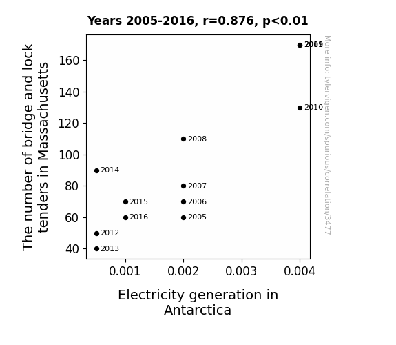
View details about correlation #3,477
Unlocking the Link: Bridge and Lock Tenders' Kink in Electricity Rink
As the number of bridge and lock tenders in Massachusetts increased, there was a corresponding surge in enthusiasm for operating machinery. This unexpected jolt of energy was mysteriously transmitted through the Earth's core to Antarctica, sparking a boom in electricity generation. It seems the power of Massachusetts' 'tender' loving care knows no bounds!

What else correlates?
The number of bridge and lock tenders in Massachusetts · all cccupations
Electricity generation in Antarctica · all energy
The number of bridge and lock tenders in Massachusetts · all cccupations
Electricity generation in Antarctica · all energy


View details about correlation #2,499
Out of This World Innovation: Uncovering the UFO-Patent Connection
The extra-terrestrial visitors were actually just patenting their advanced technologies, leading to a spike in US patent grants. Rhode Island has inadvertently become the new Silicon Valley of the galaxy.


What else correlates?
UFO sightings in Rhode Island · all random state specific
Patents granted in the US · all weird & wacky
UFO sightings in Rhode Island · all random state specific
Patents granted in the US · all weird & wacky
. The chart goes from 2002 to 2022, and the two variables track closely in value over that time.")

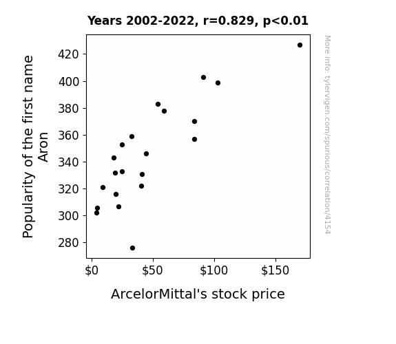
View details about correlation #4,154
Aron and ArcelorMittal: The A-Steel Connection!
Because every time someone named Aron introduced themselves, people couldn't help but respond with "Mittal-who?" This led to an overwhelming curiosity about ArcelorMittal, causing a surge in stock price as more and more individuals named Aron made connections with the company, unintentionally becoming walking, talking brand ambassadors.

What else correlates?
Popularity of the first name Aron · all first names
ArcelorMittal's stock price (MT) · all stocks
Popularity of the first name Aron · all first names
ArcelorMittal's stock price (MT) · all stocks


View details about correlation #4,688
When Theology Degrees Reign, Does Snowfall in New York Bring Divine Calling?
As the number of individuals pondering life's deeper questions rose, so did the collective spiritual energy. This inadvertently led to a higher chance of precipitation, as the universe found itself caught up in a metaphysical discussion about whether it was better to be water vapor or snowflakes.


What else correlates?
Master's degrees awarded in Theology and religious vocations · all education
Snowfall in New York · all weather
Master's degrees awarded in Theology and religious vocations · all education
Snowfall in New York · all weather


View details about correlation #2,336
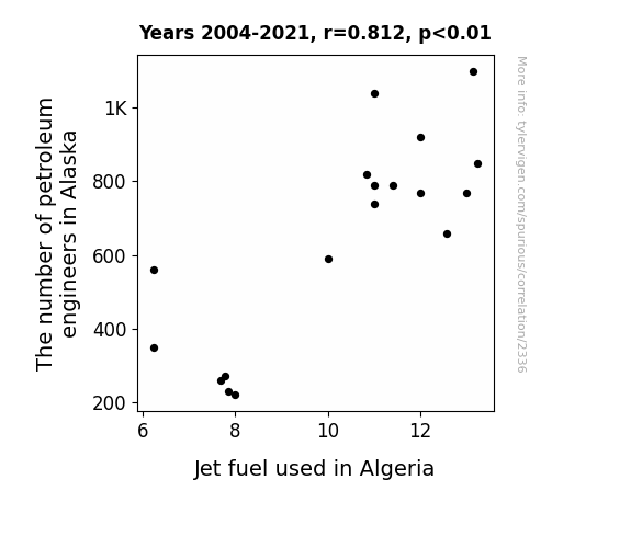
Fuel for Thought: The Crude Connection Between Petroleum Engineers in Alaska and Jet Fuel Usage in Algeria
Perhaps the petroleum engineers in Alaska kept accidentally redirecting the jet fuel pipelines to Algeria instead of working on local projects. It's like an unexpected bonus for Algeria's air travel industry!

What else correlates?
The number of petroleum engineers in Alaska · all cccupations
Jet fuel used in Algeria · all energy
The number of petroleum engineers in Alaska · all cccupations
Jet fuel used in Algeria · all energy


View details about correlation #1,255
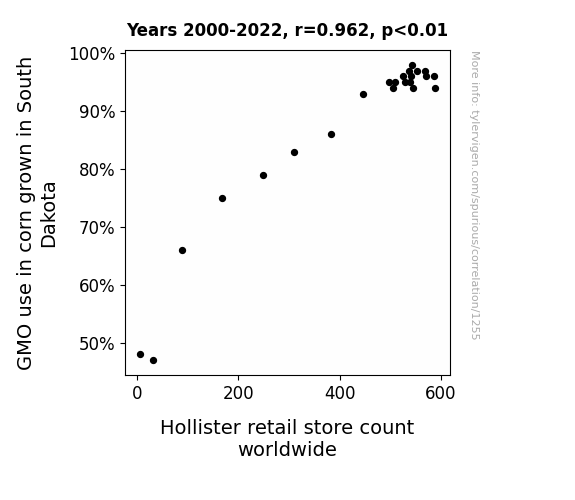
GMO Corn and Hollister: A Kernel of Truth in the Link Between Crop Modification and Retail Expansion
As GMO corn in South Dakota thrived, it led to a cornucopia of productivity. This excess corn somehow influenced the global demand for Hollister clothing, prompting a ripple effect that sprouted new store openings worldwide. It's as if the corn was cob-fidentially whispering fashion advice to people, creating a-maize-ing enthusiasm for Hollister! Who knew that the secret to sartorial success lay in the kernel of genetically modified corn?

What else correlates?
GMO use in corn grown in South Dakota · all food
Hollister retail store count worldwide · all weird & wacky
GMO use in corn grown in South Dakota · all food
Hollister retail store count worldwide · all weird & wacky


View details about correlation #4,352
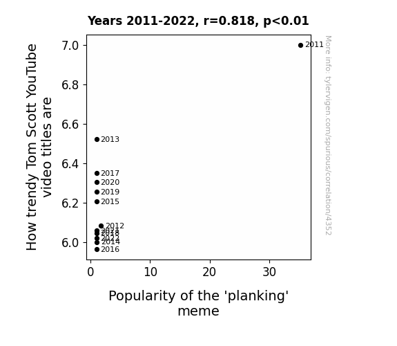
Tickling Trends: Tom Scott's Tantalizing Titles and the Triumph of the 'Planking' Phenomenon
As Tom Scott's video titles got less trendy, the world collectively decided that planking was so 2010, leading to a rapid decline in its popularity. It's as if the internet said, "Sorry plankers, but this trend is going to lie face down in the history books now."

What else correlates?
How trendy Tom Scott's YouTube video titles are · all YouTube
Popularity of the 'planking' meme · all memes
How trendy Tom Scott's YouTube video titles are · all YouTube
Popularity of the 'planking' meme · all memes


View details about correlation #3,759
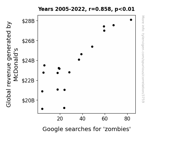
Flipping the Golden Arches: A McZombie Connection between Global Revenue and Google Searches
As McDonald’s global revenue increases, so does the consumption of their highly processed, preservative-packed food. This leads to a corresponding rise in metabolic imbalances and the reanimation of dormant brain cells in individuals, effectively creating a craving for human flesh. In other words, more money for McDonald's means more people craving 'McNuggets' of the undead, and thus an inexplicable surge in zombie interest. It's a McNightmare in the making!

What else correlates?
Global revenue generated by McDonald's · all stocks
Google searches for 'zombies' · all google searches
Global revenue generated by McDonald's · all stocks
Google searches for 'zombies' · all google searches


View details about correlation #3,020
Romeo Reactors: Exploring the Correlation Between Name Popularity and Nuclear Power Generation in Romania
As more babies were named Romeo, parents were subconsciously influenced by the romantic connotations of the name. This led to a baby boom, increasing the population of Romania. With a larger workforce and heightened passion for progress, there was a surge in productivity in all sectors, including the nuclear power industry. This ultimately resulted in a measurable uptick in nuclear power generation in Romania. Remember, a rose by any other name might just power a reactor!
What else correlates?
Popularity of the first name Romeo · all first names
Nuclear power generation in Romania · all energy
Popularity of the first name Romeo · all first names
Nuclear power generation in Romania · all energy


View details about correlation #3,375
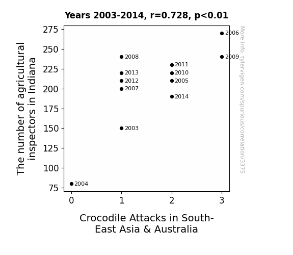
Investigating the Gator-Grader Connection: The Curious Link Between Agricultural Inspectors in Indiana and Crocodile Attacks in South-East Asia & Australia
The new agricultural inspectors brought a passion for exotic plants, inadvertently introducing a species of super-competitive, ultra-hungry, genetically modified super-crocodiles into the local waterways while inspecting imported produce. As the inspectors diligently checked each shipment, little did they know they were also unleashing a reptilian reign of terror in distant lands. This led to a rise in the crocodile population and a subsequent increase in crocodile attacks in South-East Asia & Australia. Who would have thought that a passion for agriculture would result in a reptilian invasion Down Under?


View details about correlation #3,741
Mysterious Milk: Mapping the Milk-Burglary Nexus in Wisconsin
As people consumed less milk, their bones became weaker, making it harder for them to break into homes, thus leading to a decrease in burglaries in Wisconsin. Remember, strong bones are udderly important for a wholesome life, but perhaps not for a life of crime!

What else correlates?
Milk consumption · all food
Burglaries in Wisconsin · all random state specific
Milk consumption · all food
Burglaries in Wisconsin · all random state specific


View details about correlation #4,116
The Bronx's Breathing: A Breath of Fresh Air for the New York Yankees - A Study on the Connection Between Air Pollution Levels in Muskogee, Oklahoma and the Victories of the New York Yankees
As air pollution in Muskogee, Oklahoma increased, it led to the proliferation of supercharged, turbo-charged, and nitrous-boosted mutant mosquitoes. These mosquitoes, with their newfound strength and pizzazz, flew all the way to New York and became the unofficial mascots of the Yankees. Their unwavering support and, quite literally, bloodthirsty enthusiasm, gave the Yankees the competitive edge they needed to secure more victories. Who would've thought that the real MVPs of the baseball world were actually tiny, airborne, insect-sized fans from a land far, far away?


What else correlates?
Air pollution in Muskogee, Oklahoma · all weather
New York Yankees' victories · all sports
Air pollution in Muskogee, Oklahoma · all weather
New York Yankees' victories · all sports
Why this works
- Data dredging: I have 25,237 variables in my database. I compare all these variables against each other to find ones that randomly match up. That's 636,906,169 correlation calculations! This is called “data dredging.”
Fun fact: the chart used on the wikipedia page to demonstrate data dredging is also from me. I've been being naughty with data since 2014.
Instead of starting with a hypothesis and testing it, I instead tossed a bunch of data in a blender to see what correlations would shake out. It’s a dangerous way to go about analysis, because any sufficiently large dataset will yield strong correlations completely at random. - Lack of causal connection: There is probably no direct connection between these variables, despite what the AI says above.
Because these pages are automatically generated, it's possible that the two variables you are viewing are in fact causually related. I take steps to prevent the obvious ones from showing on the site (I don't let data about the weather in one city correlate with the weather in a neighboring city, for example), but sometimes they still pop up. If they are related, cool! You found a loophole.
This is exacerbated by the fact that I used "Years" as the base variable. Lots of things happen in a year that are not related to each other! Most studies would use something like "one person" in stead of "one year" to be the "thing" studied. - Observations not independent: For many variables, sequential years are not independent of each other. You will often see trend-lines form. If a population of people is continuously doing something every day, there is no reason to think they would suddenly change how they are doing that thing on January 1. A naive p-value calculation does not take this into account.
You will calculate a lower chance of "randomly" achieving the result than represents reality.
To be more specific: p-value tests are probability values, where you are calculating the probability of achieving a result at least as extreme as you found completely by chance. When calculating a p-value, you need to assert how many "degrees of freedom" your variable has. I count each year (minus one) as a "degree of freedom," but this is misleading for continuous variables.
This kind of thing can creep up on you pretty easily when using p-values, which is why it's best to take it as "one of many" inputs that help you assess the results of your analysis.
- Y-axes doesn't start at zero: I truncated the Y-axes of the graphs above. I also used a line graph, which makes the visual connection stand out more than it deserves.
Nothing against line graphs. They are great at telling a story when you have linear data! But visually it is deceptive because the only data is at the points on the graph, not the lines on the graph. In between each point, the data could have been doing anything. Like going for a random walk by itself!
Mathematically what I showed is true, but it is intentionally misleading. If you click on any of the charts that abuse this, you can scroll down to see a version that starts at zero. - Confounding variable: Confounding variables (like global pandemics) will cause two variables to look connected when in fact a "sneaky third" variable is influencing both of them behind the scenes.
- Outliers: Some datasets here have outliers which drag up the correlation.
In concept, "outlier" just means "way different than the rest of your dataset." When calculating a correlation like this, they are particularly impactful because a single outlier can substantially increase your correlation.
Because this page is automatically generated, I don't know whether any of the charts displayed on it have outliers. I'm just a footnote. ¯\_(ツ)_/¯
I intentionally mishandeled outliers, which makes the correlation look extra strong. - Low n: There are not many data points included in some of these charts.
You can do analyses with low ns! But you shouldn't data dredge with a low n.
Even if the p-value is high, we should be suspicious of using so few datapoints in a correlation.
Pro-tip: click on any correlation to see:
- Detailed data sources
- Prompts for the AI-generated content
- Explanations of each of the calculations (correlation, p-value)
- Python code to calculate it yourself


