spurious correlations
discover · random · spurious scholar
← previous page · next page →


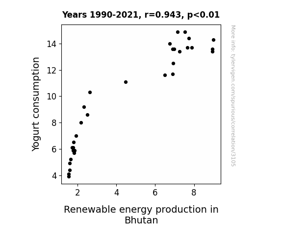
View details about correlation #3,105
Culture Meets Currents: Exploring the Connection between Yogurt Consumption and Renewable Energy Production in Bhutan
As yogurt consumption rose, it led to an increase in happy, energetic people. These folks were feeling so 'cultured' and 'probiotic' that they started a movement to generate more renewable energy in Bhutan. They were on a mission to 'power up' the nation and 'yogenerate' a brighter, 'whey' better future. It was a real 'dairy' good way to boost both their health and the environment!

What else correlates?
Yogurt consumption · all food
Renewable energy production in Bhutan · all energy
Yogurt consumption · all food
Renewable energy production in Bhutan · all energy


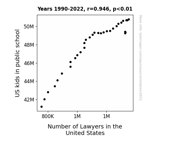
View details about correlation #2,651
The Legal Levy: A Statistical Examination of the Relationship Between Number of Lawyers in the United States and US Public School Kids
As the kids learned more about the law in school, they couldn't help but become "briefcase-ically" interested in pursuing a legal career. It's as if they were all getting a crash course in lawyering up, leading to a verdict of more lawyers in the US!

What else correlates?
US kids in public school · all education
Number of Lawyers in the United States · all weird & wacky
US kids in public school · all education
Number of Lawyers in the United States · all weird & wacky


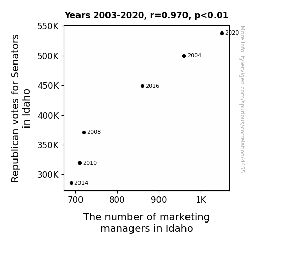
View details about correlation #4,455
A Tale of Red States and Marketing Fates: How Republican Votes Relate to the Number of Idaho Marketing Mates
As Republican votes for Senators in Idaho increase, there is a corresponding increase in the number of marketing managers in Idaho. This is because the captivating political campaigns inspire individuals to pursue careers in influential decision-making. The fervent debates and strategic advertising tactics indirectly motivate people to excel in the field of marketing. Ultimately, the growing support for Republican Senators creates a ripple effect, leading to a higher demand for professionals who can skillfully maneuver and shape public opinion, much like political candidates themselves. Remember, a well-orchestrated campaign doesn't just win votes – it also wins over consumers.

What else correlates?
Votes for Republican Senators in Idaho · all elections
The number of marketing managers in Idaho · all cccupations
Votes for Republican Senators in Idaho · all elections
The number of marketing managers in Idaho · all cccupations


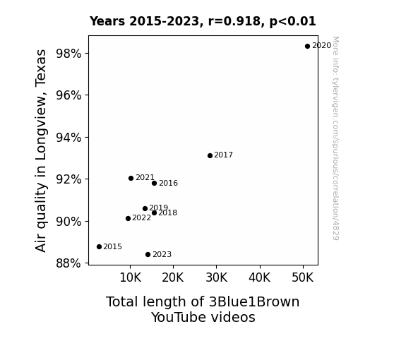
View details about correlation #4,829
Breathing in Math: Exploring the Link between Air Quality in Longview, Texas, and the Length of 3Blue1Brown YouTube Videos
As the air quality improved, more oxygen became available, leading to enhanced brain function and creativity in the creator of 3Blue1Brown. This resulted in longer, more detailed explanations and visually stunning content, ultimately elevating the total length of the videos. It's like a breath of fresh air for mathematical explanations!

What else correlates?
Air quality in Longview, Texas · all weather
Total length of 3Blue1Brown YouTube videos · all YouTube
Air quality in Longview, Texas · all weather
Total length of 3Blue1Brown YouTube videos · all YouTube


View details about correlation #3,244
MaIZE and EnergIZE: The Cob-nection Between GMO Corn in Illinois and Biomass Power in Austria
The genetically modified corn started producing energy-charged kernels, leading to more efficient biomass power generation in Austria. The corn literally became a-maize-ing fuel, creating a cob-bustion reaction in the power production process. This unexpected power plant growth spurt could only be attributed to the ear-resistible impact of GMO corn from Illinois, proving that when it comes to energy, it's all about that corn-verted power!


What else correlates?
GMO use in corn grown in Illinois · all food
Biomass power generated in Austria · all energy
GMO use in corn grown in Illinois · all food
Biomass power generated in Austria · all energy
. The chart goes from 2002 to 2022, and the two variables track closely in value over that time.")

View details about correlation #2,565
Fueling Financial Fluctuations: Exploring the Link between US Household Gasoline Spending and Freeport-McMoRan's Stock Price
As US household spending on gasoline increased, more people had to dig deep into their pockets, reminding them of Freeport-McMoRan, a leading producer of copper and gold. The association with digging and mining prompted a surge of interest in the company, leading to an unexpected uptick in its stock price. It's like a subconscious connection fueling the market!

What else correlates?
US household spending on gasoline · all weird & wacky
Freeport-McMoRan's stock price (FCX) · all stocks
US household spending on gasoline · all weird & wacky
Freeport-McMoRan's stock price (FCX) · all stocks


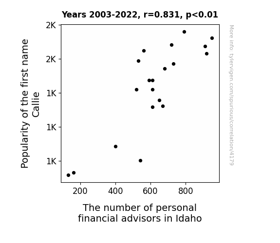
View details about correlation #4,179
Callie's Popularity and Idaho's Prosperity: A Rhyming Connection Between Names and Financial Advisors
As the number of Callies grew, so did the demand for personalized "Callie-fornia budgeting" advice services in Idaho, leading to a surge in financial advisors specializing in unique money management strategies for Callies and their specific lifestyle choices. It's a bull market for Callie-dential financial planning in the Gem State!

What else correlates?
Popularity of the first name Callie · all first names
The number of personal financial advisors in Idaho · all cccupations
Popularity of the first name Callie · all first names
The number of personal financial advisors in Idaho · all cccupations


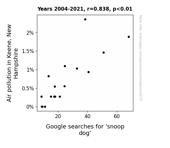
View details about correlation #4,270
Snoop Doggling for Connection: Air Pollution in Keene, New Hampshire and Google Searches for 'Snoop Dog'
As the air cleared in Keene, people could finally drop it like it's hot outdoors without fear of smog dogging their every move. With fewer pollutants to inhale, residents were no longer feeling gin and juice-sed, leading to a decrease in the need to snoop around for Snoop Dogg. It's a breath of fresh air for both the environment and the rap game!

What else correlates?
Air pollution in Keene, New Hampshire · all weather
Google searches for 'snoop dog' · all google searches
Air pollution in Keene, New Hampshire · all weather
Google searches for 'snoop dog' · all google searches


View details about correlation #3,126
Churning up Wind: Exploring the Butter-Wind Connection in Germany
As butter consumption went up, people's wind-breaking capacity also increased, leading to a higher percentage of windy days in Germany.


What else correlates?
Butter consumption · all food
Wind power generated in Germany · all energy
Butter consumption · all food
Wind power generated in Germany · all energy
. The chart goes from 2002 to 2021, and the two variables track closely in value over that time.")

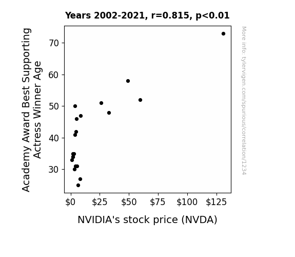
View details about correlation #1,234
A Supporting Role in the Market: A Statistical Study of the Connection Between Academy Award Best Supporting Actress Winner Age and NVIDIA's Stock Price
As Best Supporting Actress winners age, they yearn for roles in heartwarming, emotional films. This leads to increased demand for tissue products, causing a spike in the stock prices of companies like Kimberly-Clark, who make Kleenex. Now, NVIDIA's stock price is linked to the overall market performance, which is bolstered by the success of tissue companies. So, in a roundabout way, the age of these esteemed actresses is bringing a tear-jerking boost to NVIDIA's stock.

What else correlates?
Academy Award Best Supporting Actress Winner Age · all weird & wacky
NVIDIA's stock price (NVDA) · all stocks
Academy Award Best Supporting Actress Winner Age · all weird & wacky
NVIDIA's stock price (NVDA) · all stocks


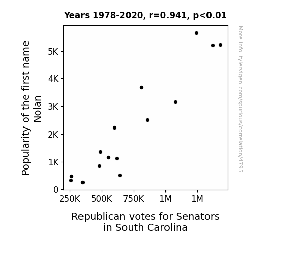
View details about correlation #4,795
Rollin' with Nolan: The Impact of the Name Nolan on Republican Senators' Votes in South Carolina
Every time someone said “Nolan” a nearby Republican in South Carolina felt a sudden inexplicable urge to cast their vote. It was like a secret trigger word, but for political participation.

What else correlates?
Popularity of the first name Nolan · all first names
Votes for Republican Senators in South Carolina · all elections
Popularity of the first name Nolan · all first names
Votes for Republican Senators in South Carolina · all elections


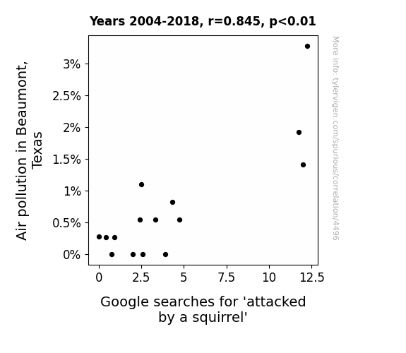
View details about correlation #4,496
Smoggy Squirrel Scares: Examining the Correlation Between Air Pollution in Beaumont, Texas, and Google Searches for 'Attacked by a Squirrel'
The decrease in air pollution led to squirrels in Beaumont, Texas having improved respiratory health, making them less irritable and less likely to lash out. Remember, only you can prevent squirrel-on-human violence!

What else correlates?
Air pollution in Beaumont, Texas · all weather
Google searches for 'attacked by a squirrel' · all google searches
Air pollution in Beaumont, Texas · all weather
Google searches for 'attacked by a squirrel' · all google searches


View details about correlation #1,823
More Library Assistants, More Petrol Pheasants: A Strange Connection Between North Dakota and Norway
As the number of library assistants in North Dakota dwindled, so too did their ability to shelve books efficiently. Unbeknownst to many, North Dakota library assistants were the unsung heroes of the "Library of Unnecessary Knowledge." This ripple effect led to a drastic decrease in the production of obscure Norwegian oil consumption manuals, thus lowering Norway's overall need for petroleum. With fewer librarian-led quests for unconventional information, Norway found innovative ways to reduce their reliance on oil, opting instead for eco-friendly alternatives like herring grease and fermented lingonberry juice to power their vehicles. It seems that in the global saga of knowledge and petroleum, the plot thickens in the most unexpected and overdue ways!


What else correlates?
The number of library assistants in North Dakota · all cccupations
Petroluem consumption in Norway · all energy
The number of library assistants in North Dakota · all cccupations
Petroluem consumption in Norway · all energy
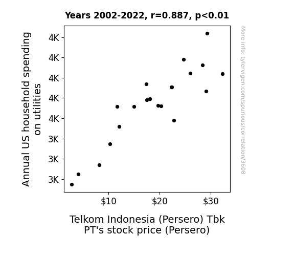
 Tbk PT's stock price (Persero). The chart goes from 2002 to 2022, and the two variables track closely in value over that time.")

View details about correlation #3,608
Electricity Bills and Stock Thrills: The Shocking Relationship Between Household Utilities Spending and Telkom Indonesia (Persero) Tbk PT Stock Price
As US household spending on utilities increased, more energy was being used, leading to a higher demand for telecommunications services in Indonesia. This put a spark in Telkom Indonesia's stock price as investors saw the potential for shocking profits. It's electrifying how these seemingly unrelated events are all connected in the high-voltage world of finance!


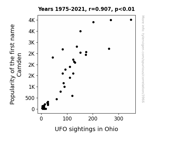
View details about correlation #3,966
The UFO-named Connection: Camden's Celestial Correlation in the Buckeye State
As more and more parents named their children after trendy urban areas, they unknowingly triggered a chain reaction in the cosmos. You see, the collective consciousness of these Camdens reached such a frequency that it inadvertently started attracting extraterrestrial attention. It's as if the universe mistook them for its own hip, up-and-coming neighborhood, prompting UFOs to descend upon Ohio in search of the latest hot spot. Who knew that a simple baby name fad could lead to close encounters of the Camden kind in the skies above the Buckeye State?

What else correlates?
Popularity of the first name Camden · all first names
UFO sightings in Ohio · all random state specific
Popularity of the first name Camden · all first names
UFO sightings in Ohio · all random state specific


View details about correlation #4,272
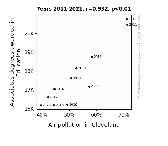
Breath of Fresh Careers: The Link Between Associates Degrees in Education and Air Pollution in Cleveland
As the number of Education Associates degrees decreased, there were fewer students blowing off steam, leading to a reduction in overall city-wide stress levels. This lower stress meant fewer people idling in traffic or revving their engines in fits of frustration, ultimately contributing to a decrease in air pollution in Cleveland. Remember, a calmer city is a cleaner city!

What else correlates?
Associates degrees awarded in Education · all education
Air pollution in Cleveland · all weather
Associates degrees awarded in Education · all education
Air pollution in Cleveland · all weather


View details about correlation #3,293
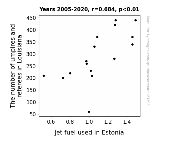
Refereeing Reality: Unraveling the Peculiar Correlation Between Umpire Numbers in Louisiana and Jet Fuel Consumption in Estonia
As more umpires and referees were needed in Louisiana, there was a surge in whistle production. This, in turn, led to an unexpected spike in demand for jet fuel in Estonia, as it was discovered that a secret ingredient in the environmentally friendly whistle fuel was actually refined Estonian jet fuel. So remember, the next time you hear a whistle, a little part of Estonia is flying high!

What else correlates?
The number of umpires and referees in Louisiana · all cccupations
Jet fuel used in Estonia · all energy
The number of umpires and referees in Louisiana · all cccupations
Jet fuel used in Estonia · all energy


View details about correlation #1,693
Got Milk? Exploring the Dairy-Accelerated DeforestHation in the Brazilian Amazon
As people drank less milk, there was a decrease in the production of cereal crops. This led to a reduced need for agricultural land, so farmers in Brazil cleared fewer forests for farming, causing the remaining forest cover in the Brazilian Amazon to decrease. Looks like the Amazon wasn't the only one getting a little low on 'moo'-d!


What else correlates?
Milk consumption · all food
Remaining Forest Cover in the Brazilian Amazon · all weird & wacky
Milk consumption · all food
Remaining Forest Cover in the Brazilian Amazon · all weird & wacky


View details about correlation #4,796
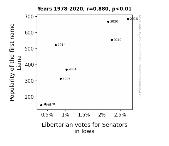
Liana-Fide Libertarians? Correlating the Popularity of the Name Liana with Libertarian Votes for Senators in Iowa
There are more Lianas, who are secretly lobbying for a government of, by, and for the Lianas. They're swinging the libertarian votes in Iowa by vine-ing and dining the voters with their persuasive charm. Remember, behind every Liana is a political agenda!

What else correlates?
Popularity of the first name Liana · all first names
Votes for Libertarian Senators in Iowa · all elections
Popularity of the first name Liana · all first names
Votes for Libertarian Senators in Iowa · all elections


View details about correlation #4,855
Drive My Graduation: The Relationship Between Bachelor's Degrees in Transportation and Air Pollution in Minneapolis
As more and more graduates entered the field, they were just so excited about operating big vehicles that they couldn't resist revving up those engines at every opportunity. With their newly acquired expertise, they ended up creating an unintentional smog-filled parade as they navigated the city, all while proudly exclaiming, "Look ma, no emissions standards can hold me back now!" It seems like their enthusiasm for transportation really got the pollution levels moving in Minneapolis!
What else correlates?
Bachelor's degrees awarded in Transportation · all education
Air pollution in Minneapolis · all weather
Bachelor's degrees awarded in Transportation · all education
Air pollution in Minneapolis · all weather
Why this works
- Data dredging: I have 25,237 variables in my database. I compare all these variables against each other to find ones that randomly match up. That's 636,906,169 correlation calculations! This is called “data dredging.”
Fun fact: the chart used on the wikipedia page to demonstrate data dredging is also from me. I've been being naughty with data since 2014.
Instead of starting with a hypothesis and testing it, I instead tossed a bunch of data in a blender to see what correlations would shake out. It’s a dangerous way to go about analysis, because any sufficiently large dataset will yield strong correlations completely at random. - Lack of causal connection: There is probably no direct connection between these variables, despite what the AI says above.
Because these pages are automatically generated, it's possible that the two variables you are viewing are in fact causually related. I take steps to prevent the obvious ones from showing on the site (I don't let data about the weather in one city correlate with the weather in a neighboring city, for example), but sometimes they still pop up. If they are related, cool! You found a loophole.
This is exacerbated by the fact that I used "Years" as the base variable. Lots of things happen in a year that are not related to each other! Most studies would use something like "one person" in stead of "one year" to be the "thing" studied. - Observations not independent: For many variables, sequential years are not independent of each other. You will often see trend-lines form. If a population of people is continuously doing something every day, there is no reason to think they would suddenly change how they are doing that thing on January 1. A naive p-value calculation does not take this into account.
You will calculate a lower chance of "randomly" achieving the result than represents reality.
To be more specific: p-value tests are probability values, where you are calculating the probability of achieving a result at least as extreme as you found completely by chance. When calculating a p-value, you need to assert how many "degrees of freedom" your variable has. I count each year (minus one) as a "degree of freedom," but this is misleading for continuous variables.
This kind of thing can creep up on you pretty easily when using p-values, which is why it's best to take it as "one of many" inputs that help you assess the results of your analysis.
- Y-axes doesn't start at zero: I truncated the Y-axes of the graphs above. I also used a line graph, which makes the visual connection stand out more than it deserves.
Nothing against line graphs. They are great at telling a story when you have linear data! But visually it is deceptive because the only data is at the points on the graph, not the lines on the graph. In between each point, the data could have been doing anything. Like going for a random walk by itself!
Mathematically what I showed is true, but it is intentionally misleading. If you click on any of the charts that abuse this, you can scroll down to see a version that starts at zero. - Confounding variable: Confounding variables (like global pandemics) will cause two variables to look connected when in fact a "sneaky third" variable is influencing both of them behind the scenes.
- Outliers: Some datasets here have outliers which drag up the correlation.
In concept, "outlier" just means "way different than the rest of your dataset." When calculating a correlation like this, they are particularly impactful because a single outlier can substantially increase your correlation.
Because this page is automatically generated, I don't know whether any of the charts displayed on it have outliers. I'm just a footnote. ¯\_(ツ)_/¯
I intentionally mishandeled outliers, which makes the correlation look extra strong. - Low n: There are not many data points included in some of these charts.
You can do analyses with low ns! But you shouldn't data dredge with a low n.
Even if the p-value is high, we should be suspicious of using so few datapoints in a correlation.
Pro-tip: click on any correlation to see:
- Detailed data sources
- Prompts for the AI-generated content
- Explanations of each of the calculations (correlation, p-value)
- Python code to calculate it yourself


