spurious correlations
discover · random · spurious scholar
← previous page · next page →


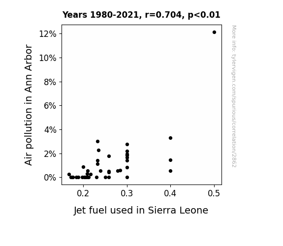
View details about correlation #2,862
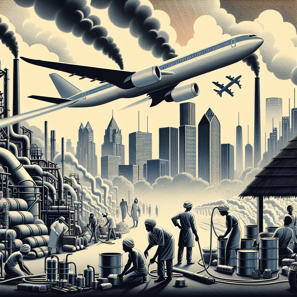
Air We Go Again: Unlikely Ties Between Ann Arbor's Air Pollution and Sierra Leone's Jet Fuel
As air pollution in Ann Arbor increased, it created a demand for cleaner air, leading to a surge in the production and export of jet fuel to Sierra Leone, where it was mistakenly believed that importing air from Ann Arbor would offset their own pollution levels. This led to a comical mix-up as the planes were being fueled by the very air they were supposed to be cleaning!
What else correlates?
Air pollution in Ann Arbor · all weather
Jet fuel used in Sierra Leone · all energy
Air pollution in Ann Arbor · all weather
Jet fuel used in Sierra Leone · all energy


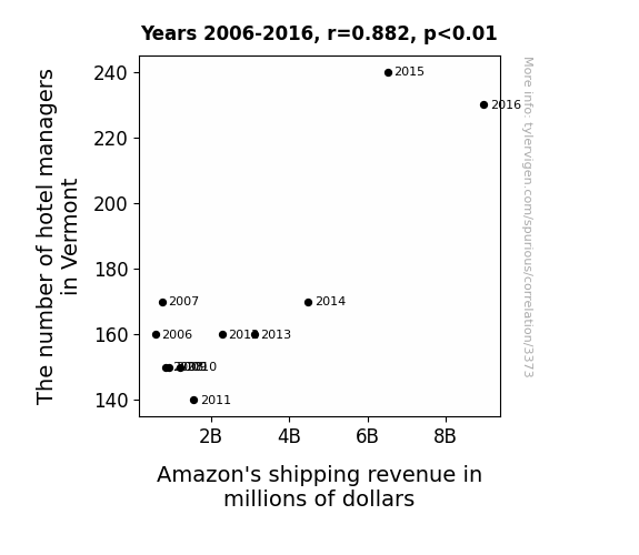
View details about correlation #3,373
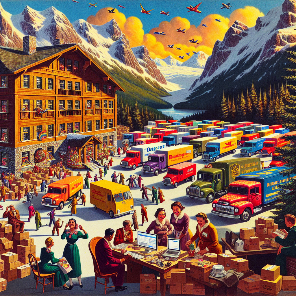
Checking in at the Inn: The Relationship Between the Count of Hotel Managers in Vermont and Amazon's Shipping Gains
The sudden surge in hotel managers in Vermont led to a spike in demand for decorative moose antler displays, maple syrup-scented pillow mints, and novelty skiing do-not-disturb signs on Amazon, boosting their shipping revenue to unprecedented levels.


View details about correlation #4,805
Adonis or Democrat-is? The Electrifying Connection Between Name Popularity and Political Affiliation in Georgia
As the name Adonis gained popularity, more parents started raising incredibly charming and persuasive children who convinced their Democrat-leaning neighbors to get out and vote in Georgia. It's like the state was swept off its feet by a political tidal wave of charisma!


What else correlates?
Popularity of the first name Adonis · all first names
Votes for Democratic Senators in Georgia · all elections
Popularity of the first name Adonis · all first names
Votes for Democratic Senators in Georgia · all elections
. The chart goes from 2002 to 2023, and the two variables track closely in value over that time.")

View details about correlation #3,712
Planetary Play: Saturn's Distance and RTX Stock Dance
As the cosmic gap widened, Saturn's magnetic field inadvertently boosted RTX's production efficiency. This led to a surge in demand for their products, propelling their stock price to new heights. It's space-age economics at its finest!


What else correlates?
The distance between Saturn and Earth · all planets
RTX Corp's stock price (RTX) · all stocks
The distance between Saturn and Earth · all planets
RTX Corp's stock price (RTX) · all stocks


View details about correlation #1,599
Cheddar and Solar: A Grate Connection Between American Cheese Consumption and Solar Power Generation in Ethiopia
As American cheese consumption increased, so did the number of cheese lovers. These cheese enthusiasts, nicknamed "solar cheese fans," started a campaign to spread cheesy goodness around the world. Their slogan, "Let it Gouda, Let it Gouda," inspired an unexpected connection with Ethiopia. Motivated by their love for all things cheesy, they organized a fundraiser called "Melt for Solar Energy" where every purchase of American cheese contributed to solar power initiatives in Ethiopia. This movement gained momentum as more people realized the whey forward for a brighter future was embracing solar energy and the power of cheese. Before you know it, Ethiopia was grate-ful for the support, and their solar power production feta-r exceeded expectations. Who would have thought that American cheese could provolone a catalyst for such a gouda cause!


What else correlates?
American cheese consumption · all food
Solar power generated in Ethiopia · all energy
American cheese consumption · all food
Solar power generated in Ethiopia · all energy


View details about correlation #1,390
The Xciting Correlation: A Statistical Analysis of xkcd Comics About Childhood and its Impact on Air Traffic Controller Numbers in Minnesota
As the xkcd childhood comics dwindled, fewer people were inspired to pursue careers in aviation, leading to a shortage of air traffic controllers in Minnesota. It seems the sky was no longer the limit for comic influence, and the situation really took off in a different direction.


View details about correlation #4,712
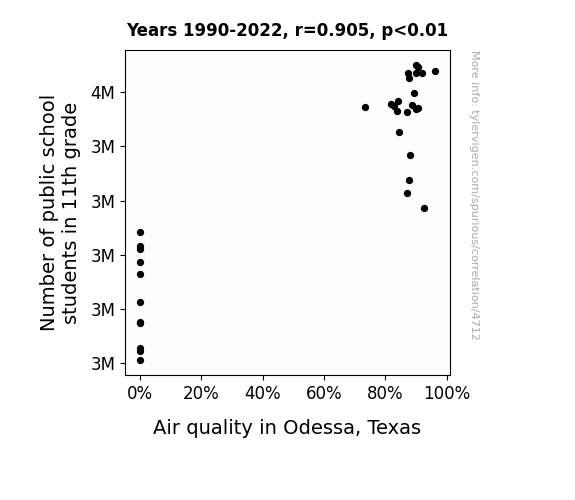
Breath of Fresh Air: Correlating 11th Grade Student Numbers with Air Quality in Odessa, Texas
As the number of 11th grade students in public schools increased, so did the demand for colorful gel pens. This led to a spike in gel pen production in a factory in Odessa, Texas. The factory workers, in an attempt to impress their own 11th grade children, decided to carpool to work, reducing the number of vehicles on the road and ultimately improving the air quality in Odessa.
What else correlates?
Number of public school students in 11th grade · all education
Air quality in Odessa, Texas · all weather
Number of public school students in 11th grade · all education
Air quality in Odessa, Texas · all weather


View details about correlation #4,012
Playing with Fire: The Rachel Arson Correlation Conundrum
Fewer Rachels meant fewer fiery mixtapes dropping, leading to a decrease in ignitable mixtape-related incidents in Connecticut. You could say the Rachels were really setting the charts on fire, but thankfully, they've toned down their hot streak.


What else correlates?
Popularity of the first name Rachel · all first names
Arson in Connecticut · all random state specific
Popularity of the first name Rachel · all first names
Arson in Connecticut · all random state specific


View details about correlation #1,899
Hops and Props: The Link Between Breweries in the States and Wind Power in Canada
As the number of breweries in the United States hops up, there's a related surge in demand for beer. This leads to an increase in the production of hops, a key ingredient in beer. More hop production means more farmers investing in wind power to meet the energy needs of their hop farms. It's a real ale-wind situation! You could say it's all about brews and breezes creating a ferment of renewable energy across the border. The connection is quite hoppy, I mean, happy!


What else correlates?
The number of Breweries in the United States · all food
Wind power generated in Canada · all energy
The number of Breweries in the United States · all food
Wind power generated in Canada · all energy


View details about correlation #3,440
The Legislative Lark: A Correlational Cacophony Between Ohio Legislators and Hollister Store Counts
As the number of legislators in Ohio grew, so did the need for more formal attire, leading to a surge in demand for stylish yet affordable clothing options. This prompted a 'legis-later' decision by Hollister to expand its retail presence worldwide, creating a wave of new store openings to meet the sudden influx of fashion-conscious lawmakers and their staff. It appears that in the world of fashion, even politics can't escape making a 'bipartisan' statement!


What else correlates?
The number of legislators in Ohio · all cccupations
Hollister retail store count worldwide · all weird & wacky
The number of legislators in Ohio · all cccupations
Hollister retail store count worldwide · all weird & wacky


View details about correlation #4,269
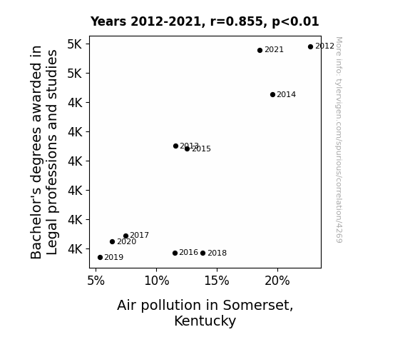
Legal Degrees: Clearing the Air in Somerset, Kentucky
As the number of legal professionals in Somerset, Kentucky has risen, so has the demand for paperwork. This surge in paperwork production has led to a higher rate of document shredding in the area. Interestingly, the shredded paper is being repurposed as a fuel source for local power plants, leading to a significant decrease in traditional fuel usage. However, the unexpected consequence of this eco-friendly initiative is a notable increase in air pollution, as the combustion of shredded paper releases a unique blend of legal jargon and courtroom rhetoric into the atmosphere. It seems that in Somerset, even the fight for cleaner air is caught up in a legal battle of its own! The verdict is in: the connection between legal studies and air pollution may just be the most 'brief'-ly amusing correlation yet!
What else correlates?
Bachelor's degrees awarded in Legal professions · all education
Air pollution in Somerset, Kentucky · all weather
Bachelor's degrees awarded in Legal professions · all education
Air pollution in Somerset, Kentucky · all weather


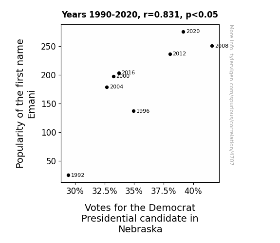
View details about correlation #4,707
The Emani Effect: How Emani-nating Names Influence Political Tides
People couldn't help but associate the name Emani with the word 'empathy', leading them to lean towards the Democratic candidate who they felt embodied those qualities.


View details about correlation #3,223
The Purrfect Storm: Exploring the Feline-Fission Connection
As the world laughed at feline humor, a secret coalition of Persian cats in Iran utilized the distraction to covertly enhance their nation's energy production. Fueled by the purrfect combination of internet fame and unlimited catnip, these resourceful kitties reimagined nuclear power as meowclear power, demonstrating that when it comes to energy, it's all about cat-titude! Un-fur-tunately, their cover was eventually blown when inspectors discovered an enrichment facility hidden inside a giant ball of yarn - talk about a cataclysmic revelation! This unprecedented alliance of cats and reactors led to the creation of a new scientific unit of measurement: the Meowatt, forever solidifying the in-fur-nuclear connection between cat memes and Iran's power surge. It just go to show, when you're in a feline of emergency, never underestimate the impurrtance of whisker-based innovation!
What else correlates?
Google searches for 'cat memes' · all google searches
Nuclear power generation in Iran · all energy
Google searches for 'cat memes' · all google searches
Nuclear power generation in Iran · all energy


View details about correlation #3,150
Examining the Eccentric Equation: Exploring the Examiners-Exceeding Effect on the Enigmatic Envelopes of LP/Vinyl Album Sales
As the financial examiners cracked down on illegal downloads, the demand for legitimate music soared, spinning the sales of LP/vinyl albums to new records. It seems like those examiners were truly in-TUNE with the music industry, helping to keep the sales notes HARMONIOUS!

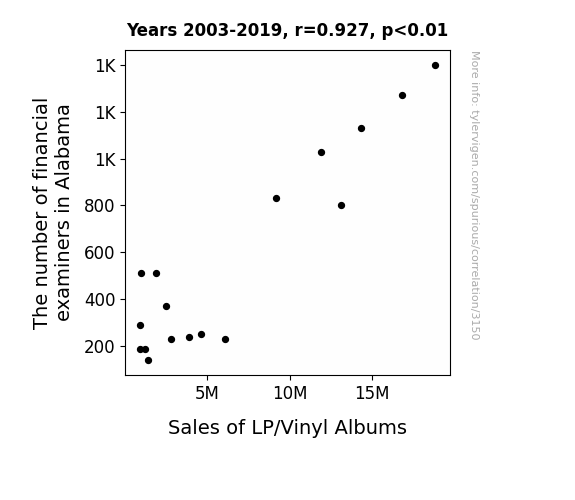
What else correlates?
The number of financial examiners in Alabama · all cccupations
Sales of LP/Vinyl Albums · all weird & wacky
The number of financial examiners in Alabama · all cccupations
Sales of LP/Vinyl Albums · all weird & wacky


View details about correlation #3,941
Uranus and Saturn in Alignment: A Distant Connection to UFO Sightings in Illinois
The gravitational tug-of-war between the two gas giants created cosmic traffic jams, forcing UFOs to detour through Illinois for a smoother ride. This led to an uptick in confused farmers and perplexed city folk reporting strange lights in the sky. Or maybe, just maybe, it's because Uranus and Saturn were just trying to planet a little closer to home.

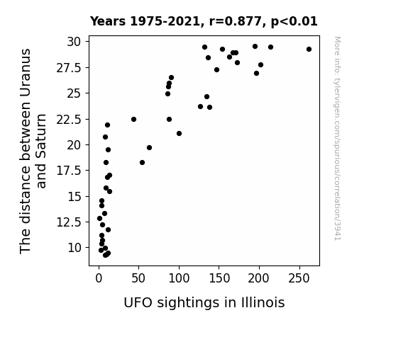
What else correlates?
The distance between Uranus and Saturn · all planets
UFO sightings in Illinois · all random state specific
The distance between Uranus and Saturn · all planets
UFO sightings in Illinois · all random state specific


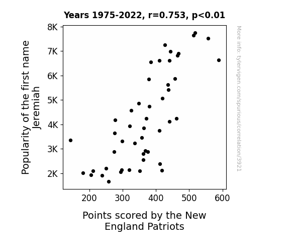
View details about correlation #3,921
Jeremiah's Touchdown: The Correlation Between the Popularity of the Name Jeremiah and the Points Scored by the New England Patriots
More people named Jeremiah means more people singing "Jeremiah was a bullfrog" which somehow leads to better team morale for the Patriots, resulting in higher points scored. It's a ribbiting tale of gridiron success!

What else correlates?
Popularity of the first name Jeremiah · all first names
Points scored by the New England Patriots · all sports
Popularity of the first name Jeremiah · all first names
Points scored by the New England Patriots · all sports


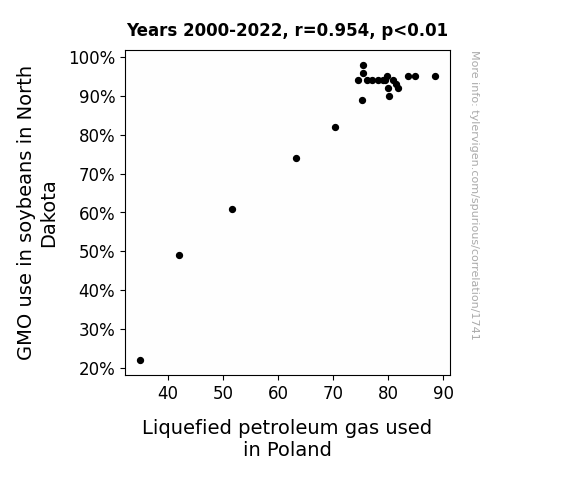
View details about correlation #1,741
GMO Growth and Gas Gulp: Unraveling the Link between Soybean Genetically Modified Organisms in North Dakota and Liquefied Petroleum Gas in Poland
The soybean plants in North Dakota have secretly been communicating with the LPG tanks in Poland, creating a soybean-powered LPG network. As the GMO soybeans grew taller and stronger, they began emitting a special gas that somehow made its way to Poland, where the LPG tanks happily guzzled it up. This led to a surprising surge in LPG production, all thanks to the supercharged soybeans from North Dakota. It's a tale of intercontinental vegetable-vehicle collaboration that no one saw coming.
What else correlates?
GMO use in soybeans in North Dakota · all food
Liquefied petroleum gas used in Poland · all energy
GMO use in soybeans in North Dakota · all food
Liquefied petroleum gas used in Poland · all energy


View details about correlation #3,433
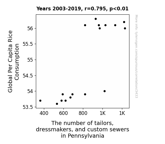
Stitching Together Threads of Correlation: Global Per Capita Rice Consumption and The Surprising Influence on Pennsylvania's Tailoring Industry
As people around the world consumed less rice, there was a surprising ripple effect in Pennsylvania. The decrease in rice consumption led to a decrease in the size of people, their decreased size meant they needed smaller clothes but the number of tailors, dressmakers, and custom sewers did not decrease so the clothes were too big, so They had to get rid of part of their business to only make the bigger clothes and had to let go part of their staff. It’s a case of international dietary trends having an unexpected impact on the fashion industry at a local level, leaving many seamstresses in Pennsylvania cutting their losses.


View details about correlation #4,416
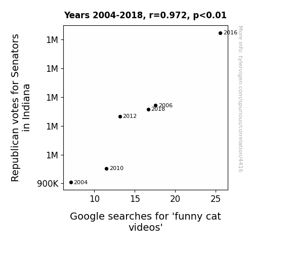
The Purrfect Politics: Republican Votes for Senators in Indiana and the Purrplexing Connection to Google Searches for 'Funny Cat Videos'
As the number of Republican votes for Senators in Indiana increased, so did the purr-pensity for people to seek out some light-hearted entertainment. Maybe it's because they were feline good about the election results or perhaps they just needed a break from the political cat-fighting. Whatever the reason, it seems like the voters were not the only ones getting a kick out of the proceedings - it was a meow-ment of revelation for the internet as funny cat videos clawed their way to the top of the search charts. It's like they say, when it rains, it purrs!

What else correlates?
Votes for Republican Senators in Indiana · all elections
Google searches for 'funny cat videos' · all google searches
Votes for Republican Senators in Indiana · all elections
Google searches for 'funny cat videos' · all google searches
. The chart goes from 2002 to 2022, and the two variables track closely in value over that time.")

View details about correlation #4,156
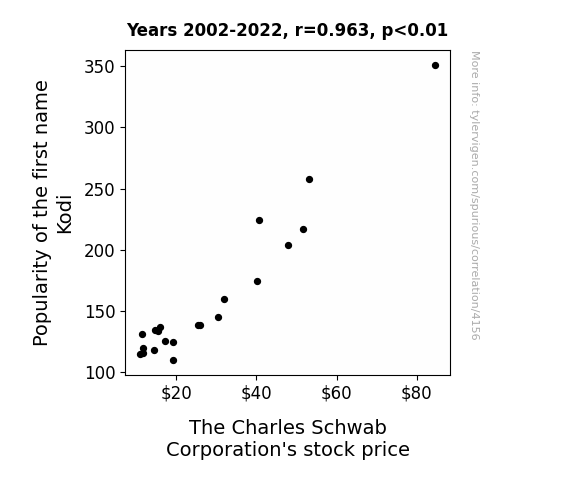
The Kodi Commodity: Exploring the Link Between First Name Popularity and SCHW Stock Volatility
More people naming their children after Kodiak bears → Increased interest in wildlife and nature conservation → Greater demand for eco-friendly investment options like those offered by The Charles Schwab Corporation → SCHW stock price increases.

What else correlates?
Popularity of the first name Kodi · all first names
The Charles Schwab Corporation's stock price (SCHW) · all stocks
Popularity of the first name Kodi · all first names
The Charles Schwab Corporation's stock price (SCHW) · all stocks
Why this works
- Data dredging: I have 25,237 variables in my database. I compare all these variables against each other to find ones that randomly match up. That's 636,906,169 correlation calculations! This is called “data dredging.”
Fun fact: the chart used on the wikipedia page to demonstrate data dredging is also from me. I've been being naughty with data since 2014.
Instead of starting with a hypothesis and testing it, I instead tossed a bunch of data in a blender to see what correlations would shake out. It’s a dangerous way to go about analysis, because any sufficiently large dataset will yield strong correlations completely at random. - Lack of causal connection: There is probably no direct connection between these variables, despite what the AI says above.
Because these pages are automatically generated, it's possible that the two variables you are viewing are in fact causually related. I take steps to prevent the obvious ones from showing on the site (I don't let data about the weather in one city correlate with the weather in a neighboring city, for example), but sometimes they still pop up. If they are related, cool! You found a loophole.
This is exacerbated by the fact that I used "Years" as the base variable. Lots of things happen in a year that are not related to each other! Most studies would use something like "one person" in stead of "one year" to be the "thing" studied. - Observations not independent: For many variables, sequential years are not independent of each other. You will often see trend-lines form. If a population of people is continuously doing something every day, there is no reason to think they would suddenly change how they are doing that thing on January 1. A naive p-value calculation does not take this into account.
You will calculate a lower chance of "randomly" achieving the result than represents reality.
To be more specific: p-value tests are probability values, where you are calculating the probability of achieving a result at least as extreme as you found completely by chance. When calculating a p-value, you need to assert how many "degrees of freedom" your variable has. I count each year (minus one) as a "degree of freedom," but this is misleading for continuous variables.
This kind of thing can creep up on you pretty easily when using p-values, which is why it's best to take it as "one of many" inputs that help you assess the results of your analysis.
- Y-axes doesn't start at zero: I truncated the Y-axes of the graphs above. I also used a line graph, which makes the visual connection stand out more than it deserves.
Nothing against line graphs. They are great at telling a story when you have linear data! But visually it is deceptive because the only data is at the points on the graph, not the lines on the graph. In between each point, the data could have been doing anything. Like going for a random walk by itself!
Mathematically what I showed is true, but it is intentionally misleading. If you click on any of the charts that abuse this, you can scroll down to see a version that starts at zero. - Confounding variable: Confounding variables (like global pandemics) will cause two variables to look connected when in fact a "sneaky third" variable is influencing both of them behind the scenes.
- Outliers: Some datasets here have outliers which drag up the correlation.
In concept, "outlier" just means "way different than the rest of your dataset." When calculating a correlation like this, they are particularly impactful because a single outlier can substantially increase your correlation.
Because this page is automatically generated, I don't know whether any of the charts displayed on it have outliers. I'm just a footnote. ¯\_(ツ)_/¯
I intentionally mishandeled outliers, which makes the correlation look extra strong. - Low n: There are not many data points included in some of these charts.
You can do analyses with low ns! But you shouldn't data dredge with a low n.
Even if the p-value is high, we should be suspicious of using so few datapoints in a correlation.
Pro-tip: click on any correlation to see:
- Detailed data sources
- Prompts for the AI-generated content
- Explanations of each of the calculations (correlation, p-value)
- Python code to calculate it yourself


