spurious correlations
discover · random · spurious scholar
← previous page · next page →


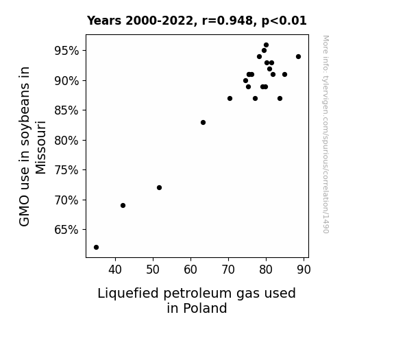
View details about correlation #1,490
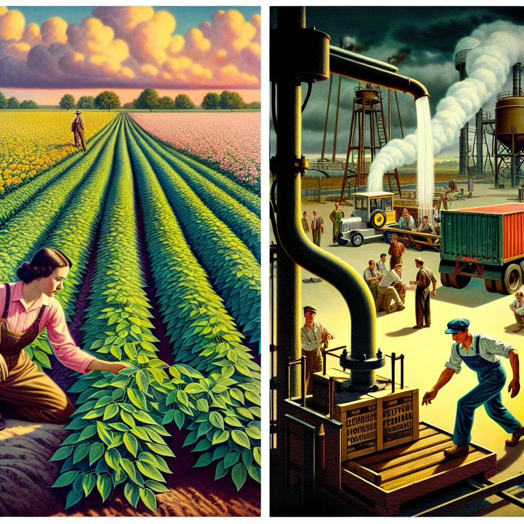
Soy to the World: Exploring the GMO-Soybean and LPGas Connection
As the soybeans in Missouri became more genetically modified, they developed a surprising side effect - they started emitting gas that was quickly liquefying in the fields. This led to an unexpected boost in the production of Liquefied Petroleum Gas, which somehow made its way all the way to Poland. It's a classic case of legume-induced gas escalation leading to an international energy connection! Who would have thought that GMO soybeans could have such a slippery impact on the LPG industry in Poland?
What else correlates?
GMO use in soybeans in Missouri · all food
Liquefied petroleum gas used in Poland · all energy
GMO use in soybeans in Missouri · all food
Liquefied petroleum gas used in Poland · all energy


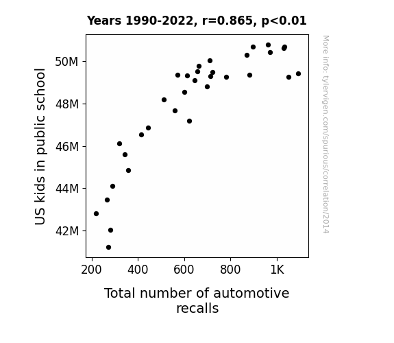
View details about correlation #2,014
Schooling the Auto Industry: Exploring the Correlation Between US Public School Kids and Automotive Recalls
As the number of US kids in public school increases, so does the total number of automotive recalls. This is because as more children attend school, the demand for parent volunteers for field trips and school events also rises. These parents, in an effort to impress other parents with their automotive prowess, start nitpicking at every little car issue, leading to a surge in reported problems. This ultimately overwhelms the automotive industry, forcing them to issue a higher number of recalls to appease the minivan-driving, snack-carrying army of parent volunteers. As a result, the roads become safer for school pickups, but also more congested with recalled vehicles, creating a peculiarly chaotic carpool paradox.

What else correlates?
US kids in public school · all education
Total number of automotive recalls · all weird & wacky
US kids in public school · all education
Total number of automotive recalls · all weird & wacky


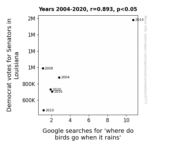
View details about correlation #4,777
Tweet from the Nest: The Correlation Between Democrat Votes for Senators in Louisiana and Google Searches for 'Where Do Birds Go When It Rains'
The Democratic senators made it rain with their policies for a bird-friendly environment, so the birds were more inclined to seek shelter in their state! It's like they were saying, "Louisiana's the peli-canopy we need!"

. The chart goes from 2003 to 2018, and the two variables track closely in value over that time.")

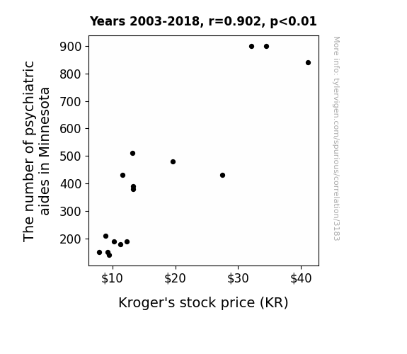
View details about correlation #3,183
Mental Health Matters: The Psychiatric Aide-Stock Price Nexus in Minnesota
As the psychiatric aides in Minnesota found new ways to keep their patients calm, they unknowingly sparked a wave of zen-like tranquility that spread across the state. This unexpected peace and serenity led to a significant decrease in stress-induced grocery shopping, causing more people to opt for a leisurely and budget-conscious experience at Kroger. With an influx of unusually relaxed customers, Kroger's stock price soared as investors couldn't help but buy into the newfound aura of grocery shopping bliss. It's like the ripple effect of inner peace and discounted produce had finally found its home in the aisles of Kroger, turning the stock into the ultimate symbol of grocery store enlightenment.
What else correlates?
The number of psychiatric aides in Minnesota · all cccupations
Kroger's stock price (KR) · all stocks
The number of psychiatric aides in Minnesota · all cccupations
Kroger's stock price (KR) · all stocks


View details about correlation #1,367
Maizey Connections: Exploring the Correlation between GMO Corn in Missouri and Liquefied Petroleum Gas Usage in Kosovo
It turns out, GMO corn in Missouri has been secretly emitting LPG as a byproduct. So, as the GMO use decreased, there was a lot less corny LPG to go around, leaving Kosovo feeling a-maize-ingly cleaner.


What else correlates?
GMO use in corn grown in Missouri · all food
Liquefied petroleum gas used in Kosovo · all energy
GMO use in corn grown in Missouri · all food
Liquefied petroleum gas used in Kosovo · all energy


View details about correlation #1,304
The Pollution Predicament: How BMW Recalls Drive Through NYC Air Quality
As the air quality in New York City improved, it led to the spontaneous manifestation of aero-kinetic energy fields. These invisible energy fields, in a quirky turn of events, interacted specifically with BMW vehicles, causing their automotive components to unexpectedly rev up and demand a recall. This phenomenon, now known as the "Manhattan Motorized Manifestation," has left both engineers and yoga enthusiasts baffled as they try to strike a balance between emissions and automotive om-otions.


What else correlates?
Air quality in New York City · all weather
Automotive recalls issued by BMW of North America · all weird & wacky
Air quality in New York City · all weather
Automotive recalls issued by BMW of North America · all weird & wacky


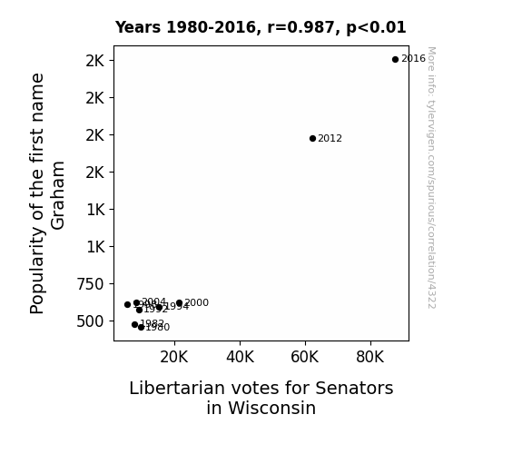
View details about correlation #4,322
Graham's Number: An Examination of the Correlation between the Name Graham and Libertarian Votes for Senators in Wisconsin
As the popularity of the name Graham rose, more and more babies were given this distinguished moniker. This sparked a peculiar chain of events - every time a baby named Graham was born, a small but influential group of libertarians in Wisconsin felt a sudden, inexplicable urge to cast their votes for Senatorial candidates. Some say it's because the name Graham exudes a certain air of individualism and self-reliance, qualities highly valued by libertarians. Who would have thought that baby names could have such a 'senatorial' impact on the political landscape!

What else correlates?
Popularity of the first name Graham · all first names
Votes for Libertarian Senators in Wisconsin · all elections
Popularity of the first name Graham · all first names
Votes for Libertarian Senators in Wisconsin · all elections


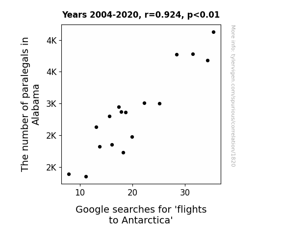
View details about correlation #1,820
From Paralegals to Penguins: Investigating the Relationship Between Paralegal Employment in Alabama and Google Searches for 'Flights to Antarctica'
The influx of paralegals in Alabama has led to a surge in penguin-related lawsuits. As a result, more people are seeking flights to Antarctica to attend these unconventional court cases. With penguin paternity disputes and ice theft on the rise, it's no wonder there's a sudden demand for legal representation in the South Pole. Remember, when it comes to bird law, the Antarctic legal system is truly taking flight!

What else correlates?
The number of paralegals in Alabama · all cccupations
Google searches for 'flights to Antarctica' · all google searches
The number of paralegals in Alabama · all cccupations
Google searches for 'flights to Antarctica' · all google searches


View details about correlation #3,434
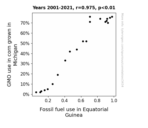
Maize-y Business: The Corny Connection Between GMO Use in Michigan and Fossil Fuel Usage in Equatorial Guinea
As the GMO corn in Michigan grew taller and stronger, it somehow emitted a corny signal that attracted Equatorial Guinea to rev up their fossil fuel usage in a maize-ing competition for who could be the 'ear'-resistible leader in energy production. "We really corn't husk around with our fuel choices anymore!"

What else correlates?
GMO use in corn grown in Michigan · all food
Fossil fuel use in Equatorial Guinea · all energy
GMO use in corn grown in Michigan · all food
Fossil fuel use in Equatorial Guinea · all energy
. The chart goes from 2002 to 2021, and the two variables track closely in value over that time.")

View details about correlation #3,279
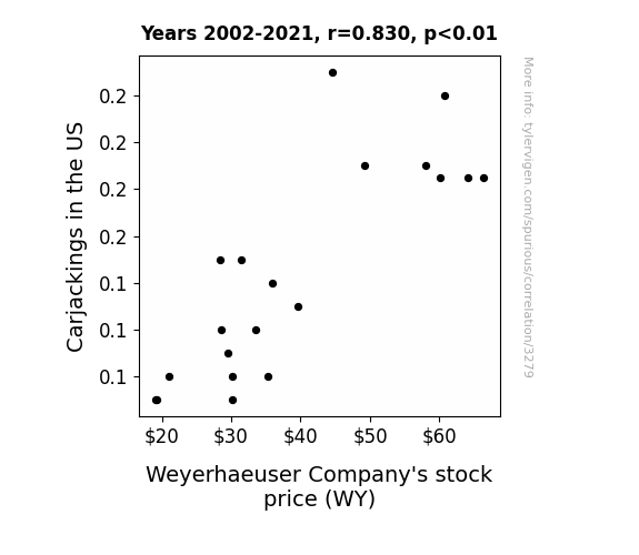
Wielding WY: Unveiling the Link Between Carjackings and Weyerhaeuser Company's Stock Price
As carjackings decreased, there was a reduced demand for replacement car parts, leading to a decrease in the need for Weyerhaeuser's wood products in the manufacturing of those parts. This reduced demand for their products caused investors to anticipate lower revenue for the company, leading to a decrease in Weyerhaeuser Company's stock price. Remember, this is all in good fun and not to be taken seriously!

What else correlates?
Carjackings in the US · all weird & wacky
Weyerhaeuser Company's stock price (WY) · all stocks
Carjackings in the US · all weird & wacky
Weyerhaeuser Company's stock price (WY) · all stocks


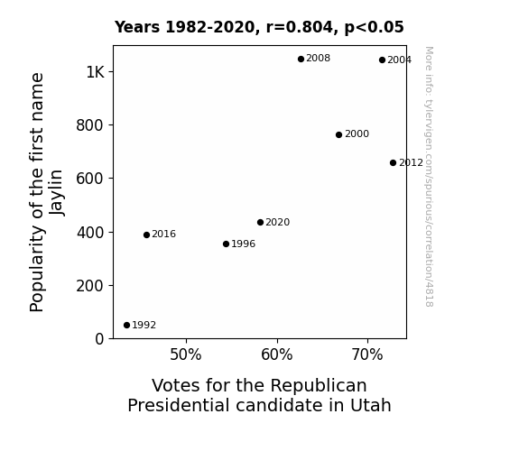
View details about correlation #4,818
Jaylin's Popularity in Utah is a Republican's Go-To: A Name Fame Game
As the popularity of the name Jaylin rose, so did the preference for J-names, subconsciously reminding people of former President Ronald Reagan, a prominent Republican. It seems the Jaylin craze inadvertently led to a Rea-gan resurgence in Utah. It's like the name Jaylin cast a Rea-ganomic spell on the voters, creating a conservative wave that couldn't be Jaylin-ed.


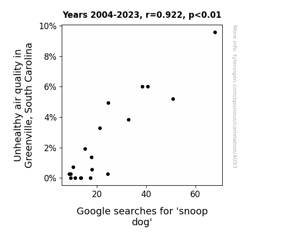
View details about correlation #4,093
Dirty Air in the Chair: Air Pollution in Greenville, South Carolina and Google Searches for Snoop Dogg
As the air became cleaner, the local dogs no longer felt the need to snoop around for aromatic garbage, leading to a decrease in snoop dog activity.
What else correlates?
Air pollution in Greenville, South Carolina · all weather
Google searches for 'snoop dog' · all google searches
Air pollution in Greenville, South Carolina · all weather
Google searches for 'snoop dog' · all google searches


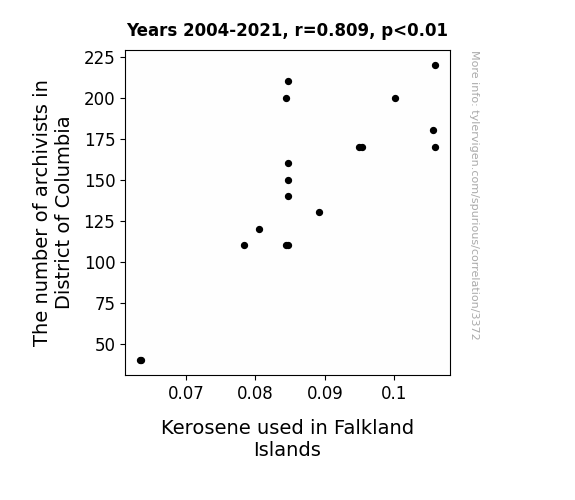
View details about correlation #3,372
The Cataloging Conundrum: Unearthing the Unlikely Link Between Archivists in the District of Columbia and Kerosene Consumption in the Falkland Islands
As the number of archivists in the District of Columbia grows, so too does their love for historical documents. This passion has led to a spike in reenactments of old-fashioned tasks, including churning butter. Consequently, there is a rising demand for authentic lighting methods, hence the increased use of kerosene in the Falkland Islands. Remember, behind every historical reenactment is a group of archivists with a burning passion for the past!

What else correlates?
The number of archivists in District of Columbia · all cccupations
Kerosene used in Falkland Islands · all energy
The number of archivists in District of Columbia · all cccupations
Kerosene used in Falkland Islands · all energy


View details about correlation #3,304
The Wurst of Both Worlds: A Correlational Examination of GMO Soybeans in Nebraska and Nathan's Hot Dog Eating Contest Champions
The GMO soybeans in Nebraska mutated to produce a secret ingredient that triggered an insatiable craving for hotdogs in competitive eaters. This led to a surge in hotdog consumption, propelling the champions to new records in the Nathan's Hot Dog Eating Competition.


View details about correlation #4,973
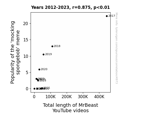
Mocking Memes and Monetized Minutes: The Correlation between the Popularity of the 'Mocking Spongebob' Meme and the Total Length of MrBeast YouTube Videos
As the mocking spongebob meme gained popularity, it emitted waves of absurdity into the internet, which were secretly harvested by MrBeast to create even longer and more outrageous content. It's as if each meme laughingly whispered, "Challenge accepted!" into MrBeast's ear, compelling him to elevate his video lengths to match the memetic level of mockery. In a strange twist of internet fate, the meme's mocking essence became the unexpected fuel for MrBeast's epic video sagas, leaving viewers both bemused and entertained by the inexplicably linked phenomena.

What else correlates?
Popularity of the 'mocking spongebob' meme · all memes
Total length of MrBeast's YouTube videos · all YouTube
Popularity of the 'mocking spongebob' meme · all memes
Total length of MrBeast's YouTube videos · all YouTube
. The chart goes from 2011 to 2021, and the two variables track closely in value over that time.")

View details about correlation #3,937
Gender Studies: A Trane-sformational Effect on Trane Technologies' Stock Price
As more people became knowledgeable about gender studies, they also gained a deeper understanding of the concept of fluidity and adaptability. This newfound perspective translated seamlessly to Trane Technologies, a company specializing in climate technology. The market saw the potential for a more inclusive approach to HVAC solutions, leading to greater investor confidence and ultimately driving up Trane Technologies' stock price. It's clear that when it comes to shaping the economy, even the tiniest degree can have a significant impact.


What else correlates?
Associates degrees awarded in gender studies · all education
Trane Technologies' stock price (TT) · all stocks
Associates degrees awarded in gender studies · all education
Trane Technologies' stock price (TT) · all stocks


View details about correlation #2,687
Estimating the Net Work: A Statistical Examination of Social Work Teachers in Louisiana and Kerosene Consumption in Iraq
As the number of social work teachers in Louisiana increased, so did the amount of emotional support available. This led to a ripple effect of heightened positivity around the world. Eventually, this positivity found its way to Iraq, where the need for kerosene decreased due to the sudden surge in warmth and fuzziness, resulting in a surplus of kerosene.


What else correlates?
The number of social work teachers in Louisiana · all cccupations
Kerosene used in Iraq · all energy
The number of social work teachers in Louisiana · all cccupations
Kerosene used in Iraq · all energy


View details about correlation #1,579
Spreading the Risk: A Slippery Situation - The Butter-Shipwreck Connection
As butter consumption increased, more people engaged in recreational baking, leading to a nationwide shortage of wooden spoons. This, in turn, prompted a surge in illegal spoon harvesting, causing deforestation at an unprecedented rate. The loss of trees destabilized the earth's crust, leading to an upsurge in tectonic activity, which ultimately contributed to more frequent global shipwrecks as the seas became choppier.


What else correlates?
Butter consumption · all food
Global shipwrecks · all weird & wacky
Butter consumption · all food
Global shipwrecks · all weird & wacky


View details about correlation #4,600
More people were curious to find out who might be stealing votes from the major party candidates.

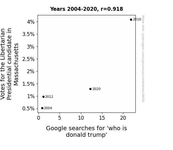
. The chart goes from 2012 to 2021, and the two variables track closely in value over that time.")

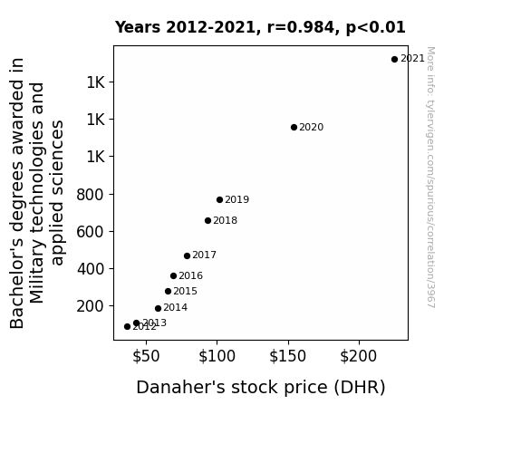
View details about correlation #3,967
Mind the Grind: Unwinding the Correlation Between Military Degree Inclination and Danaher's Stock Price Cognition
As more students became versed in military tech, they started a rumor that Danaher had developed a top-secret robot army. This led to a spike in demand for Danaher's stock as investors clamored to get in on the potential robot uprising. The rumor mill churned out more hype than a turbo-charged drone, propelling Danaher's stock price to new heights.

What else correlates?
Bachelor's degrees awarded in Military technologies · all education
Danaher's stock price (DHR) · all stocks
Bachelor's degrees awarded in Military technologies · all education
Danaher's stock price (DHR) · all stocks
Why this works
- Data dredging: I have 25,237 variables in my database. I compare all these variables against each other to find ones that randomly match up. That's 636,906,169 correlation calculations! This is called “data dredging.”
Fun fact: the chart used on the wikipedia page to demonstrate data dredging is also from me. I've been being naughty with data since 2014.
Instead of starting with a hypothesis and testing it, I instead tossed a bunch of data in a blender to see what correlations would shake out. It’s a dangerous way to go about analysis, because any sufficiently large dataset will yield strong correlations completely at random. - Lack of causal connection: There is probably no direct connection between these variables, despite what the AI says above.
Because these pages are automatically generated, it's possible that the two variables you are viewing are in fact causually related. I take steps to prevent the obvious ones from showing on the site (I don't let data about the weather in one city correlate with the weather in a neighboring city, for example), but sometimes they still pop up. If they are related, cool! You found a loophole.
This is exacerbated by the fact that I used "Years" as the base variable. Lots of things happen in a year that are not related to each other! Most studies would use something like "one person" in stead of "one year" to be the "thing" studied. - Observations not independent: For many variables, sequential years are not independent of each other. You will often see trend-lines form. If a population of people is continuously doing something every day, there is no reason to think they would suddenly change how they are doing that thing on January 1. A naive p-value calculation does not take this into account.
You will calculate a lower chance of "randomly" achieving the result than represents reality.
To be more specific: p-value tests are probability values, where you are calculating the probability of achieving a result at least as extreme as you found completely by chance. When calculating a p-value, you need to assert how many "degrees of freedom" your variable has. I count each year (minus one) as a "degree of freedom," but this is misleading for continuous variables.
This kind of thing can creep up on you pretty easily when using p-values, which is why it's best to take it as "one of many" inputs that help you assess the results of your analysis.
- Y-axes doesn't start at zero: I truncated the Y-axes of the graphs above. I also used a line graph, which makes the visual connection stand out more than it deserves.
Nothing against line graphs. They are great at telling a story when you have linear data! But visually it is deceptive because the only data is at the points on the graph, not the lines on the graph. In between each point, the data could have been doing anything. Like going for a random walk by itself!
Mathematically what I showed is true, but it is intentionally misleading. If you click on any of the charts that abuse this, you can scroll down to see a version that starts at zero. - Confounding variable: Confounding variables (like global pandemics) will cause two variables to look connected when in fact a "sneaky third" variable is influencing both of them behind the scenes.
- Outliers: Some datasets here have outliers which drag up the correlation.
In concept, "outlier" just means "way different than the rest of your dataset." When calculating a correlation like this, they are particularly impactful because a single outlier can substantially increase your correlation.
Because this page is automatically generated, I don't know whether any of the charts displayed on it have outliers. I'm just a footnote. ¯\_(ツ)_/¯
I intentionally mishandeled outliers, which makes the correlation look extra strong. - Low n: There are not many data points included in some of these charts.
You can do analyses with low ns! But you shouldn't data dredge with a low n.
Even if the p-value is high, we should be suspicious of using so few datapoints in a correlation.
Pro-tip: click on any correlation to see:
- Detailed data sources
- Prompts for the AI-generated content
- Explanations of each of the calculations (correlation, p-value)
- Python code to calculate it yourself


